

The 12 customer service KPIs worth tracking in 2026 are first response time, resolution time, first contact resolution, CSAT, NPS, customer effort score, ticket volume, backlog ratio, average handle time, service level, churn rate, and cost per contact. Each has a defined formula and benchmark, and a ready-made dashboard template can calculate them for you.
Last updated: September 2026
Key takeaways
- The 12 customer service KPIs every team should track fall into three groups: speed (first response time, resolution time, average handle time, service level), quality (first contact resolution, CSAT, NPS, customer effort score), and cost/volume (ticket volume, backlog ratio, churn rate, cost per contact).
- Benchmarks that hold up in 2026: first contact resolution around 70–75%, CSAT of 75–85%, and a support backlog ratio under 10% of tickets received.
- The most common measurement mistake is optimising average handle time downward, which quietly destroys first contact resolution because fast-but-unresolved tickets simply come back.
- Eight NextGenTemplates dashboards already calculate these KPIs — from the IT Support Ticket Dashboard in Google Sheets at $9.99 to the Customer Service & Support Bundle at $73.99.
- Buy the individual dashboard that matches your stack (Excel, Power BI, Google Sheets or HTML) for $9.99–$17.99, or take the 8-template bundle at $73.99 and save 40% versus buying each separately.
Customer service KPI dashboard templates compared
| Template | Format | Best for | Price |
|---|---|---|---|
| Customer Service & Support Revenue Tracking KPI Dashboard (Best overall) | Excel | Tracking the widest set of service KPIs in one Excel file | $14.99 |
| Customer Service & Support Bundle (8 templates) (Best value) | Excel + Google Sheets | Teams that want every dashboard at once | $73.99 |
| IT Support Ticket Dashboard | Power BI | Interactive, drill-down analytics | $17.99 |
| Customer Service & Support Financial Health KPI Dashboard | Excel | Cost per contact and budget KPIs | $14.99 |
| IT Support Ticket Dashboard | Google Sheets | Cheapest option and live collaboration | $9.99 |
| IT Support Ticket Dashboard | HTML | Embedding a dashboard on the web | $12.99 |
| Customer Service & Support Market Expansion KPI Dashboard | Excel | Multi-region and scaling support teams | $14.99 |
| Customer Service & Support Sustainability KPI Dashboard | Excel | Long-term and ESG-linked service goals | $14.99 |
Every template is a one-time purchase with no subscription. Prices are in USD and were current at the last update above. If you are weighing formats first, our guide to Excel vs Google Sheets vs Power BI dashboards explains the trade-offs in detail.
How we picked these
We searched the full NextGenTemplates catalogue of roughly 6,900 published templates and filtered to products that natively calculate at least four of the 12 customer service KPIs defined below, ship with sample data so you can see the formulas working, and cover the four formats teams actually run on: Excel, Power BI, Google Sheets and HTML.
We excluded generic business dashboards that merely mention “support”, single-metric widgets that track only one KPI, and any template without a documented formula behind each number. The eight that remain are the dashboards a service leader can hand to an analyst and trust the maths. We also cross-checked each price and permalink against the live store on the update date.
The 12 customer service KPIs to track in 2026
Below is the definition, the exact formula, a realistic 2026 benchmark range and the mistake teams most often make for each metric. The summary table follows; every KPI maps to at least one dashboard in the second half of this guide.
| Metric | Formula | Benchmark (2026) | Where to see it |
|---|---|---|---|
| First response time | Σ(first reply − created) ÷ tickets | Live chat <60s; email <1–12h | IT Support Ticket Dashboard |
| Resolution time | Σ(resolved − created) ÷ resolved tickets | Tier-1 <24h; complex <3 days | IT Support Ticket Dashboard |
| First contact resolution | (resolved on first contact ÷ total) × 100 | 70–75% good; 80%+ elite | Revenue Tracking KPI Dashboard |
| CSAT | (satisfied responses ÷ total responses) × 100 | 75–85% typical; 90%+ excellent | Customer Satisfaction / Support Dashboard |
| NPS | % promoters (9–10) − % detractors (0–6) | >30 favourable; >50 excellent | Revenue Tracking KPI Dashboard |
| Customer effort score | Σ(effort ratings) ÷ responses (1–7) | Avg ≥5 of 7 is strong | Customer Satisfaction Dashboard |
| Ticket volume | Count of tickets created in period | Trend vs baseline; per-customer ratio | IT Support Ticket Dashboard |
| Backlog ratio | (unresolved ÷ total received) × 100 | <10% healthy | IT Support Ticket Dashboard |
| Average handle time | (handle + hold + wrap-up) ÷ contacts | Voice ~6 min; varies by complexity | Financial Health KPI Dashboard |
| Service level | (answered within target ÷ total) × 100 | Classic 80/20; SLA 90%+ | IT Support Ticket Dashboard |
| Churn rate | (customers lost ÷ customers at start) × 100 | SaaS 5–7%/yr; SMB <1%/mo | Revenue Tracking KPI Dashboard |
| Cost per contact | Total support cost ÷ contacts handled | ~$2–$15+ by channel | Financial Health KPI Dashboard |
1. First response time (FRT)
Definition: the average time between a customer submitting a ticket and the first human reply. Formula: FRT = Σ(time of first reply − time ticket created) ÷ number of tickets. Benchmark (2026): under 60 seconds on live chat, under one hour on email is excellent, and under 12 hours is acceptable for email queues. Common mistake: counting an automated “we received your ticket” acknowledgement as the first response, which flatters the number while the customer is still waiting for a human.
2. Resolution time (time to resolution)
Definition: the mean elapsed time from a ticket opening to it being closed as resolved. Formula: Resolution time = Σ(resolved timestamp − created timestamp) ÷ number of resolved tickets. Benchmark: under 24 hours for tier-1 issues; complex, cross-team tickets under three business days. Common mistake: failing to pause the clock during “pending customer” states, so slow customer replies inflate your team’s apparent resolution time and hide the real bottleneck.
3. First contact resolution (FCR)
Definition: the share of tickets fully resolved in a single interaction with no follow-up. Formula: FCR = (tickets resolved on first contact ÷ total tickets) × 100. Benchmark: 70–75% is the widely cited “good” band; 80%+ is elite. Common mistake: marking a ticket as first-contact-resolved when the customer simply stopped replying — silence is not the same as a solved problem, and treating it that way masks repeat contacts.
4. Customer satisfaction score (CSAT)
Definition: the percentage of surveyed customers who rate a resolved interaction satisfactory. Formula: CSAT = (satisfied responses, typically 4–5 on a 5-point scale ÷ total responses) × 100. Benchmark: 75–85% is typical; above 90% is excellent. Common mistake: ignoring a low survey response rate — if only your happiest customers reply, CSAT is biased upward and you are managing to a vanity number.
5. Net promoter score (NPS)
Definition: a measure of how willing customers are to recommend you, on a 0–10 scale. Formula: NPS = % promoters (9–10) − % detractors (0–6); passives (7–8) are excluded. Benchmark: any score above 0 is positive, above 30 is favourable and above 50 is excellent, per Bain & Company, who created the NPS system. Common mistake: treating NPS as a per-ticket support metric; it tracks the whole relationship, not one interaction, so pair it with CSAT for transactional insight.
6. Customer effort score (CES)
Definition: how much effort a customer had to expend to get their issue resolved. Formula: CES = Σ(effort ratings) ÷ number of responses, usually on a 1–7 “easy to deal with” scale. Benchmark: an average of 5 or higher out of 7 is strong; low-effort experiences are among the best predictors of loyalty. Common mistake: sending the CES survey days after resolution, when recall of the effort involved has already faded and the score becomes noise.
7. Ticket volume
Definition: the total number of contacts your team received in a period, ideally segmented by channel and issue type. Formula: Ticket volume = count of tickets created in the period. Benchmark: there is no universal target — track it against your own baseline and as a ratio to customers or orders. Common mistake: celebrating a drop in volume without checking whether customers deflected to self-service or simply gave up and churned.
8. Backlog ratio (open ticket ratio)
Definition: the proportion of received tickets still unresolved at the end of a period. Formula: Backlog ratio = (unresolved tickets ÷ total tickets received) × 100. Benchmark: under 10% is healthy; a ratio that climbs week over week signals a capacity gap before CSAT falls. Common mistake: watching absolute backlog count instead of the ratio and trendline, so a growing customer base hides a worsening service problem.
9. Average handle time (AHT)
Definition: the average time an agent actively spends on a single contact. Formula: AHT = (total handle time + hold time + after-contact wrap-up) ÷ number of contacts. Benchmark: voice contacts commonly average around six minutes, but this varies enormously with complexity. Common mistake: driving AHT down as a goal in itself, which sacrifices first contact resolution — fast but unresolved contacts just return and raise total cost.
10. Service level (SLA compliance)
Definition: the percentage of contacts answered or resolved within the agreed target time. Formula: Service level = (contacts answered within target ÷ total contacts) × 100; the classic call-centre standard is “80/20” — 80% of calls answered within 20 seconds. Benchmark: 80/20 for voice, and 90%+ SLA compliance for ticketed queues. Common mistake: applying one SLA to every priority; a P1 outage and a password reset should never share the same clock.
11. Customer churn rate
Definition: the percentage of customers lost during a period, and specifically the portion attributable to service failures. Formula: Churn rate = (customers lost during period ÷ customers at start of period) × 100. Benchmark: SaaS annual churn of 5–7% is considered good; monthly churn under 1% is healthy for SMB. Common mistake: blaming all churn on support — isolate service-driven churn with exit-reason coding, which we cover in the 10 churn and retention metrics guide.
12. Cost per contact
Definition: the fully loaded cost to handle one contact. Formula: Cost per contact = total support operating cost ÷ number of contacts handled. Benchmark: roughly $2 to $15+ per contact depending on channel, with phone the most expensive and self-service the cheapest. Common mistake: comparing cost per contact across channels without factoring resolution quality — the cheap channel that fails FCR is not actually cheap once repeat contacts are counted.
The 8 best customer service KPI dashboard templates for 2026
Each dashboard below already calculates a block of the 12 KPIs, ships with sample data, and links straight to the product page. Prices are one-time and in USD.
1. Customer Service & Support Revenue Tracking KPI Dashboard in Excel — best overall
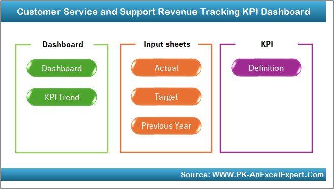
What it is: a single Excel workbook that tracks the widest set of the 12 KPIs — FCR, CSAT, NPS, resolution time and churn — alongside the revenue those service outcomes drive. It is our best overall pick because it covers more of the 12 metrics than any other single file, at the lowest single-dashboard price, with no subscription.
Who it is for: service leaders who want one Excel file on their desktop that connects support quality to revenue.
- Pre-built KPI cards with formulas you can inspect and edit
- Monthly trend charts for each metric
- Sample data included so the maths is visible day one
- Works offline in any modern Excel
Use cases: track FCR against the 70–75% benchmark month over month; correlate a CSAT dip with a revenue drop; report churn to the board with the exact formula attached.
Price: $14.99. Buy the Revenue Tracking KPI Dashboard in Excel. Best for: the widest KPI coverage in one affordable Excel file.
2. Customer Service & Support Bundle — best value
What it is: all eight premium Excel and Google Sheets service dashboards in one purchase, at 40% off versus buying each separately. Between them they calculate every one of the 12 KPIs in this guide.
Who it is for: teams standing up a full service-analytics stack from scratch.
- Eight dashboards spanning tickets, satisfaction, cost and revenue
- Excel and Google Sheets formats included
- Save 40% against individual pricing
Use cases: equip a new support team in one download; standardise KPI definitions across regions; hand analysts a matched Excel-and-Sheets set.
Price: $73.99. Get the Customer Service & Support Bundle. Best for: the lowest cost per dashboard.
3. IT Support Ticket Dashboard in Power BI — best for interactive analytics
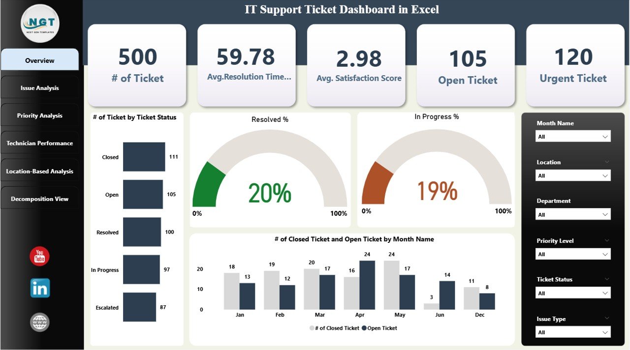
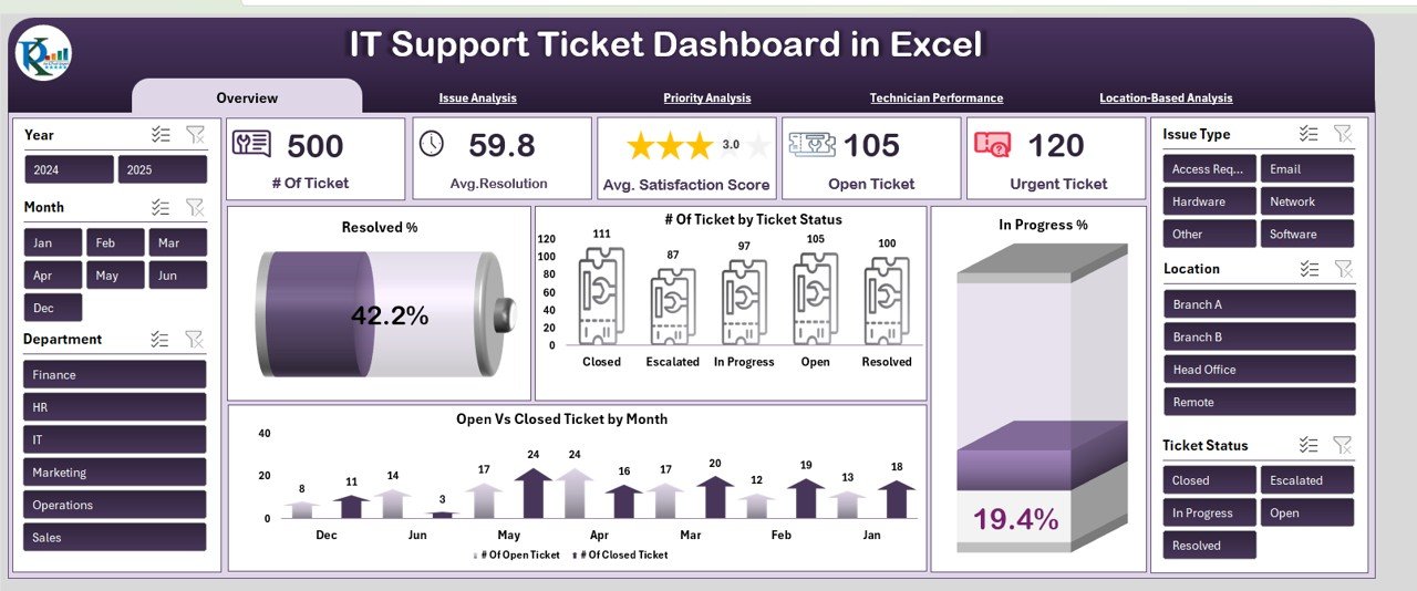
What it is: a Power BI report built around ticket data — first response time, resolution time, ticket volume, backlog ratio and service level — with full drill-down and filtering. Who it is for: data teams that live in Power BI and want to slice KPIs by agent, channel and priority.
- Interactive slicers for channel, priority and agent
- Backlog and SLA-compliance visuals
- Refreshable from your own ticket export
Use cases: spot the queue breaching the 80/20 service level; find which agent segment drags first response time; watch backlog ratio trend live.
Price: $17.99. Buy the IT Support Ticket Dashboard in Power BI. Best for: interactive, filterable ticket analytics.
4. Customer Service & Support Financial Health KPI Dashboard in Excel — best for cost KPIs
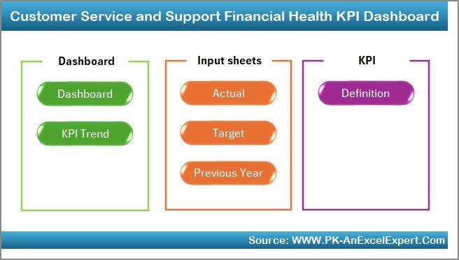
What it is: the dashboard for the money side of service — cost per contact, average handle time and budget-versus-actual. Who it is for: support managers who have to defend the department’s cost line.
- Cost-per-contact and cost-per-channel breakdowns
- AHT tracking tied to cost
- Budget variance views
Use cases: prove self-service is cheaper than phone; model the cost impact of cutting AHT; build the business case for a chatbot.
Price: $14.99. Buy the Financial Health KPI Dashboard. Best for: cost per contact and efficiency KPIs.
5. IT Support Ticket Dashboard in Google Sheets — cheapest and best for collaboration

What it is: the same ticket-KPI logic in Google Sheets, at the lowest price in the range. Who it is for: distributed teams that need several people editing one live dashboard.
- Real-time collaboration in the browser
- No software to install
- Share view-only links with stakeholders
Use cases: a remote support pod tracking backlog together; a founder-led team with no Excel licence; a quick shared SLA tracker.
Price: $9.99. Buy the IT Support Ticket Dashboard in Google Sheets. Best for: the cheapest, most collaborative option.
6. IT Support Ticket Dashboard in HTML — best for web embedding
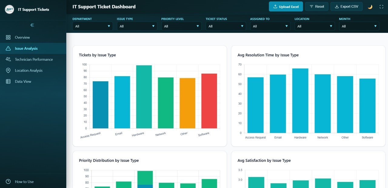
What it is: a self-contained HTML dashboard you can host or embed in an internal portal. Who it is for: teams that want a KPI screen on a wall display or intranet without a BI licence.
- Runs in any browser, no dependencies
- Easy to embed in a portal or wallboard
- Editable with basic web skills
Use cases: a live support wallboard in the office; an embedded KPI panel in an internal tool; a lightweight client-facing status view.
Price: $12.99. Buy the IT Support Ticket Dashboard in HTML. Best for: embedding a dashboard on the web.
7. Customer Service & Support Market Expansion KPI Dashboard in Excel — best for scaling teams

What it is: a dashboard for tracking service KPIs across regions and new markets. Who it is for: teams expanding support into new geographies who need per-market CSAT, volume and resolution time.
- Region and market segmentation
- Per-market KPI comparison
- Volume and satisfaction by geography
Use cases: compare CSAT across three regions; spot which new market has the worst backlog; plan headcount by market volume.
Price: $14.99. Buy the Market Expansion KPI Dashboard. Best for: multi-region service teams.
8. Customer Service & Support Sustainability KPI Dashboard in Excel — best for long-term goals
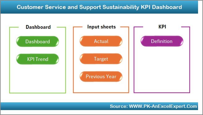
What it is: a dashboard that frames service KPIs against long-term and ESG-linked targets. Who it is for: organisations that report service quality as part of a sustainability or long-horizon strategy.
- Long-range trend tracking
- Goal-versus-actual against multi-year targets
- Links service KPIs to broader objectives
Use cases: report service quality in an annual ESG update; track a three-year CSAT goal; align support metrics with company strategy.
Price: $14.99. Buy the Sustainability KPI Dashboard. Best for: long-term and ESG-linked service reporting.
Ready to start tracking? The Revenue Tracking KPI Dashboard in Excel is $14.99, or take all eight in the Customer Service & Support Bundle for $73.99 and save 40%.
How to choose between them
| If you… | Choose | Price |
|---|---|---|
| Want the widest KPI coverage in one file | Revenue Tracking KPI Dashboard (Excel) | $14.99 |
| Want every dashboard and the lowest cost each | Customer Service & Support Bundle | $73.99 |
| Live in Power BI and need drill-down | IT Support Ticket Dashboard (Power BI) | $17.99 |
| Need to defend the cost line | Financial Health KPI Dashboard | $14.99 |
| Have no Excel licence / need collaboration | IT Support Ticket Dashboard (Google Sheets) | $9.99 |
| Need a wallboard or embedded view | IT Support Ticket Dashboard (HTML) | $12.99 |
Rule of thumb: match the format to where your data already lives. If your ticket export is a CSV, any of these ingest it; if your whole company runs Google Workspace, start with the Sheets version. For a wider view of options, see our roundup of customer management and service templates and our Freshdesk alternatives in Excel and Sheets.
When a template is NOT the right answer
A spreadsheet dashboard is the right tool for measuring and reporting KPIs, not for running a live queue. Be honest about the limits:
- You need real-time routing and SLAs enforced automatically. Buy a help desk platform (Zendesk, Freshdesk, Intercom). A template reports the SLA; it does not enforce it.
- You handle thousands of tickets a day. At that scale you need a data warehouse and a live BI connection, not a manual CSV import into Excel.
- You want customers to self-serve. That is a knowledge-base and chatbot problem, not a dashboard problem.
- Your data is scattered across five tools with no export. Fix the data plumbing first; a dashboard on bad data is worse than none.
Where a template wins is the reporting layer on top of whatever system you already run: a clean, formula-transparent view of the 12 KPIs that you own outright, with no per-seat fee. If you are comparing full platforms, our ServiceNow alternatives guide and CRM in Excel guide cover the trade-offs.
Frequently asked questions
What are the most important customer service KPIs?
The most important customer service KPIs are first contact resolution, CSAT, first response time and resolution time, because together they capture whether you solved the problem, whether the customer was happy, and how fast you moved. Cost per contact and churn rate then tie service quality to the business result.
What is a good first contact resolution rate in 2026?
A good first contact resolution rate is 70–75%, and elite teams reach 80% or higher. Measure it as tickets resolved on first contact divided by total tickets, times 100. Avoid counting tickets where the customer simply stopped replying, because silence is not the same as a genuine resolution.
How do you calculate CSAT?
CSAT is calculated as the number of satisfied responses (typically ratings of 4 or 5 on a 5-point scale) divided by the total number of responses, multiplied by 100. A score of 75–85% is typical and above 90% is excellent. Watch your response rate, because a low one biases the score upward.
What is the difference between CSAT, NPS and CES?
CSAT measures satisfaction with a specific interaction, NPS measures loyalty to the whole relationship on a 0–10 recommend scale, and CES measures how much effort the customer had to expend. Use CSAT and CES for transactional support quality and NPS for the overall customer relationship.
What is a healthy support ticket backlog?
A healthy backlog ratio is under 10% of tickets received in the period, calculated as unresolved tickets divided by total received, times 100. More important than the absolute number is the trend: a ratio climbing week over week warns of a capacity gap before CSAT starts to fall.
Why shouldn’t I just minimise average handle time?
Minimising average handle time in isolation destroys first contact resolution, because agents rush and close tickets that then reopen. The repeat contact costs more than the time saved. Track AHT alongside FCR and CSAT so speed never comes at the expense of actually solving the customer’s problem.
Which format should I choose — Excel, Google Sheets, Power BI or HTML?
Choose the format where your data already lives. Excel suits offline analysts, Google Sheets suits collaborative remote teams and costs the least at $9.99, Power BI suits data teams needing drill-down at $17.99, and HTML suits wallboards and embedded views. All four ingest a standard ticket CSV export.
How often should I review these KPIs?
Review speed and volume KPIs (first response time, backlog ratio, service level) daily or weekly, and quality and outcome KPIs (CSAT, NPS, FCR, churn, cost per contact) monthly. Daily review of quality metrics adds noise; monthly review of backlog lets a problem grow. Match the cadence to how fast the metric moves.
Do these dashboards work with my help desk data?
Yes. Every dashboard is built to ingest a standard ticket export (CSV or Excel) from tools like Zendesk, Freshdesk or a spreadsheet log. Map your columns to the template’s input sheet once, and the KPI cards and charts populate automatically. Sample data is included so you can see the expected format first.
Is a one-time template cheaper than a KPI software subscription?
For the reporting layer, yes. These dashboards are a one-time purchase of $9.99–$17.99, or $73.99 for all eight, with no per-seat fee. A KPI or BI subscription makes sense once you need automated data refresh and live routing, but for measuring and reporting the 12 KPIs, an owned template is far cheaper.
Related: Watch your liquidity too — see our guide to the 10 cash flow KPIs to track in 2026 and the ready-made dashboard templates that calculate them.
Get more customer service KPI templates
Track all 12 KPIs today: start with the Customer Service & Support Revenue Tracking KPI Dashboard in Excel at $14.99, or get every dashboard in this guide with the Customer Service & Support Bundle at $73.99 and save 40%. For more KPI playbooks in this series, see our 10 recruitment KPIs, 15 finance KPIs and 10 churn and retention metrics guides. Watch template walkthroughs on our YouTube channel, NextGenTemplates.