

The 10 warehouse KPIs to track in 2026 are inventory accuracy, order picking accuracy, on-time shipment rate, order cycle time, inventory turnover, capacity utilization, dock-to-stock time, picking productivity, return rate, and perfect order rate. Each has a clear formula and benchmark range, and a ready-made dashboard can calculate them automatically.
Last updated: September 2026
Warehouse KPIs turn a busy building into a measurable operation. The problem is rarely a shortage of data — it is that the numbers sit in a WMS export nobody trends, so managers argue about “gut feel” instead of throughput. This guide gives you the exact formula and a realistic benchmark range for the 10 warehouse KPIs that actually move cost, service, and safety, plus the single mistake teams make with each one. The second half maps every metric to a ready-made Excel, Google Sheets, or Power BI dashboard that already calculates it, so you can stop rebuilding pivot tables and start reviewing performance.
Key takeaways
- Track a balanced set of 10 warehouse KPIs across accuracy, speed, cost, and safety — a single “productivity” number hides where the real losses are.
- Inventory accuracy should sit at 97–99% and perfect order rate above 95%; anything lower is quietly funding returns, expedites, and stockouts.
- Every KPI here has a defined formula and a benchmark range, so you can grade your own numbers today rather than waiting for a consultant.
- The 8 dashboard templates below cover Excel, Google Sheets, and Power BI, priced $9.99–$17.99 — a one-time cost versus a monthly WMS analytics seat.
- The Warehouse Efficiency Dashboard in Excel ($17.99) is our best overall pick because it tracks throughput, cost, and labour KPIs on one screen.
Warehouse KPI dashboard templates compared
| Template | Format | Best for | Price |
|---|---|---|---|
| Warehouse Efficiency Dashboard (Best overall) | Excel | Throughput, cost & labour KPIs on one screen | $17.99 |
| Warehouse Management KPI Dashboard (Best value) | Excel | Core warehouse KPIs for a single site | $12.99 |
| Inventory Management Dashboard | Power BI | Interactive stock & turnover analysis | $17.99 |
| Product Inventory Dashboard | Power BI | SKU-level inventory & reorder tracking | $17.99 |
| Retail Inventory KPI Dashboard | Excel | Retail & multi-location stock KPIs | $12.99 |
| Inventory Accuracy KPI Dashboard | Excel | Cycle-count & record-accuracy tracking | $12.99 |
| Warehouse Safety KPI Dashboard | Google Sheets | Incident, TRIR & safety KPIs, shared free | $9.99 |
| Inventory Accuracy KPI Dashboard | Google Sheets | Cloud-based accuracy tracking for teams | $9.99 |
How we picked these
We searched the full NextGenTemplates catalogue of 1,200+ spreadsheet and BI templates and shortlisted only those that calculate genuine warehouse and inventory KPIs — not generic charts. Each template was scored on KPI coverage, formula transparency (can you see how the number is built?), format choice, and price. We deliberately included Excel, Google Sheets, and Power BI so a reader can match the tool to their stack, and we excluded single-chart “trackers” that show data but compute no benchmark. Prices shown are the live store prices at the time of writing.
The 10 warehouse KPIs at a glance
| Metric | Formula | Benchmark range | Where to see it |
|---|---|---|---|
| 1. Inventory accuracy | (Records matching physical count ÷ records counted) × 100 | 97–99% (world-class ≥99.5%) | Inventory Accuracy KPI Dashboard |
| 2. Order picking accuracy | (Correct order lines ÷ total lines picked) × 100 | 99.0–99.9% | Warehouse Management KPI Dashboard |
| 3. On-time shipment rate | (Orders shipped by promised date ÷ total orders) × 100 | 95–98% | Warehouse Efficiency Dashboard |
| 4. Order cycle time | Avg (ship time − order-received time) | 24–48 hours internal | Warehouse Efficiency Dashboard |
| 5. Inventory turnover | COGS ÷ average inventory value | 4–8× per year (fast-moving 8–12×) | Inventory Management Dashboard (Power BI) |
| 6. Capacity utilization | (Occupied storage ÷ total usable storage) × 100 | 80–90% | Warehouse Efficiency Dashboard |
| 7. Dock-to-stock time | Avg (put-away complete − goods received) | <24 hours (best-in-class <2 hours) | Warehouse Management KPI Dashboard |
| 8. Picking productivity | Total lines picked ÷ total labour hours | 50–120 lines/hour (method-dependent) | Warehouse Efficiency Dashboard |
| 9. Return rate | (Units returned ÷ units shipped) × 100 | 1–3% B2B; 8–30% retail/e-commerce | Retail Inventory KPI Dashboard |
| 10. Perfect order rate | On-time% × complete% × damage-free% × accurate-docs% | 90–95% (world-class ≥97%) | Warehouse Management KPI Dashboard |
The 10 warehouse KPIs explained (formula, benchmark & the common mistake)
1. Inventory accuracy
Definition: the share of inventory records whose on-hand quantity matches the physical count.
Formula: (Number of records matching physical count ÷ total records counted) × 100.
Benchmark: 97–99% is healthy; world-class distribution centres run ≥99.5% through daily cycle counting.
The mistake teams make: measuring accuracy at SKU level while ignoring location accuracy. A part can be “in stock” in the system but in the wrong bin, which still causes a mispick. Count by SKU and location, and cycle count continuously instead of relying on one bruising annual wall-to-wall count.
2. Order picking accuracy
Definition: the percentage of order lines picked with the correct item and quantity.
Formula: (Correct order lines ÷ total lines picked) × 100, or 1 − (mispicks ÷ total picks).
Benchmark: 99.0–99.9%; automated or barcode-scanned operations reach the top of that band.
The mistake teams make: measuring accuracy per order rather than per line. A 10-line order with one wrong item is 100% wrong at order level but 90% at line level — line-level is the honest number and the one that predicts returns.
3. On-time shipment rate
Definition: the share of orders that leave the dock by their promised ship date.
Formula: (Orders shipped on or before promised date ÷ total orders) × 100.
Benchmark: 95–98%; below 95% and carrier cut-offs start driving expedite costs.
The mistake teams make: measuring against the internal pick-complete time instead of the customer’s promised date. The customer does not care that picking finished on time if the truck missed its cut-off — always anchor the metric to the commitment made to the buyer.
4. Order cycle time
Definition: the average elapsed time from receiving an order to shipping it.
Formula: Average of (ship timestamp − order-received timestamp) across all orders.
Benchmark: 24–48 hours for internal fulfilment; same-day operations target under 8 hours.
The mistake teams make: reporting only the average and hiding the tail. A 30-hour average with a 5% tail sitting at 5 days is a service problem the mean conceals — track the 95th percentile alongside the average.
5. Inventory turnover
Definition: how many times inventory is sold and replaced over a period.
Formula: Cost of goods sold ÷ average inventory value. (See Investopedia’s inventory turnover explainer for the accounting nuances.)
Benchmark: 4–8× per year for general distribution; fast-moving consumer goods hit 8–12×.
The mistake teams make: chasing a high turnover number in isolation. Very high turnover with frequent stockouts means you are starving service to flatter a ratio — read turnover next to fill rate and days-of-supply, never alone.
6. Capacity utilization
Definition: the proportion of usable storage space currently occupied.
Formula: (Occupied storage space ÷ total usable storage space) × 100.
Benchmark: 80–90% is the sweet spot; above 90% and travel paths clog, slowing every pick.
The mistake teams make: treating 100% as the goal. A full warehouse has nowhere to stage receipts, forces double-handling, and destroys picking speed — utilization is a “too high is also bad” metric, unlike accuracy.
7. Dock-to-stock time (receiving cycle time)
Definition: the average time from goods physically arriving to being put away and available to pick.
Formula: Average of (put-away complete timestamp − goods-received timestamp).
Benchmark: under 24 hours is acceptable; best-in-class cross-dock operations run under 2 hours.
The mistake teams make: stopping the clock at “received” instead of “available to pick”. Stock that is on-site but not put away is invisible to fulfilment and causes phantom stockouts — measure to the moment it becomes pickable.
8. Picking productivity
Definition: throughput per unit of labour, the core warehouse efficiency metric.
Formula: Total order lines picked ÷ total labour hours worked.
Benchmark: 50–120 lines per hour depending on method (paper, RF scan, pick-to-light, or voice).
The mistake teams make: comparing productivity across pick methods as if they were equivalent. A voice-picking line at 120 lines/hour is not “beating” a bulk-pallet line at 40 — segment the KPI by pick type before you draw conclusions or set targets.
9. Return rate
Definition: the percentage of shipped units that customers send back.
Formula: (Units returned ÷ units shipped) × 100.
Benchmark: 1–3% for B2B distribution; 8–30% for retail and e-commerce apparel.
The mistake teams make: treating every return as a customer-preference cost. A rising return rate often traces back to warehouse mispicks or damage — tag return reasons so you can separate “wrong size” from “we shipped the wrong thing”, which is a fixable KPI.
10. Perfect order rate
Definition: the share of orders delivered complete, on time, undamaged, and with correct documentation — the single best composite of warehouse quality.
Formula: On-time% × complete% × damage-free% × accurate-documentation%.
Benchmark: 90–95% is solid; world-class supply chains exceed 97%.
The mistake teams make: adding the four components instead of multiplying them. Because the factors multiply, four “good” 97% scores compound to about 88.5% perfect orders — a humbling number that shows why small defects in each stage add up.
Ready to stop rebuilding pivot tables? The Warehouse Efficiency Dashboard in Excel calculates throughput, cost, and labour KPIs from a single data sheet — just $17.99, one-time. Get the dashboard →
The 8 best warehouse KPI dashboard templates for 2026
1. Warehouse Efficiency Dashboard in Excel — best overall
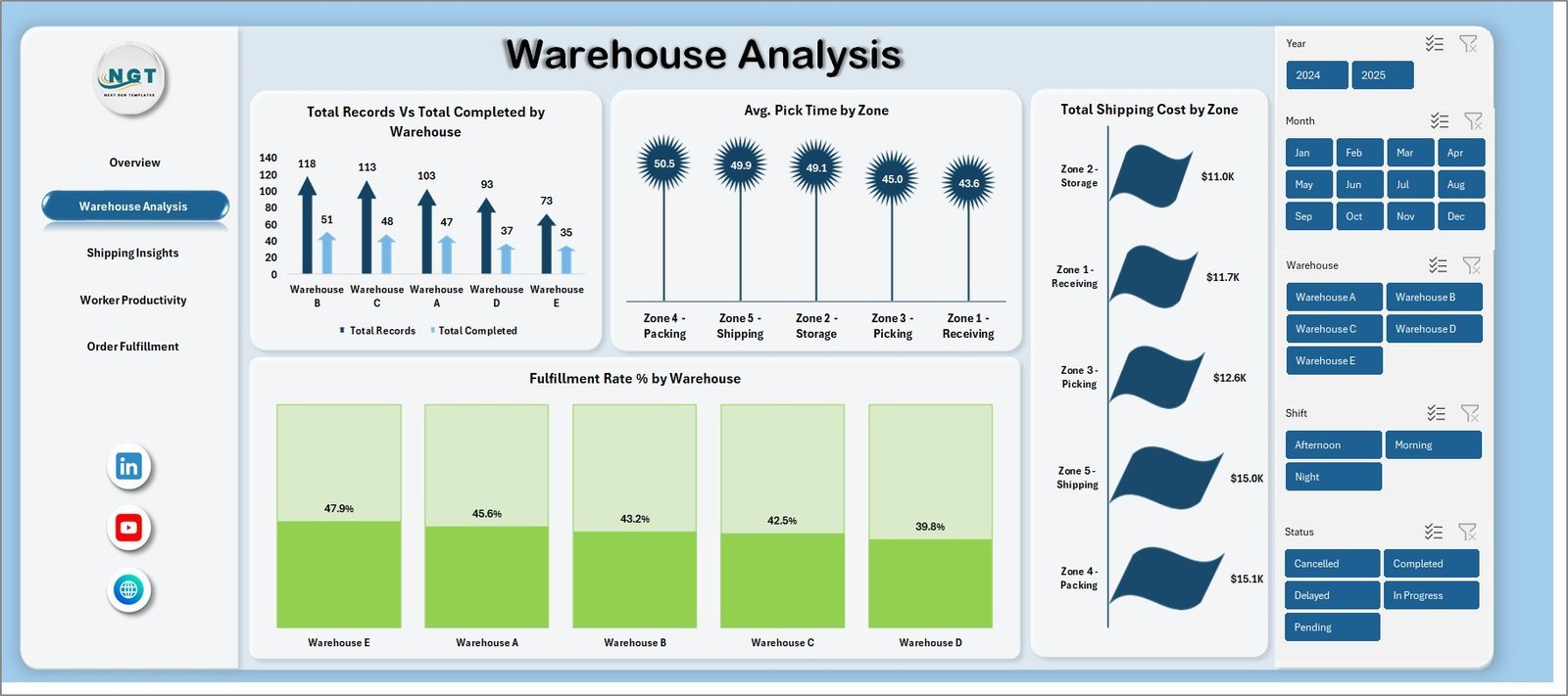
Why it is #1: it is the only template here that puts throughput, order cycle time, capacity utilization, and picking productivity on one screen, so a single dashboard answers “how efficient is my warehouse this month?” without switching tabs.
Who it is for: operations managers running one or several sites who live in Excel and want offline, no-subscription analytics.
- Pre-built formulas for on-time shipment, cycle time, and productivity KPIs.
- Month-over-month trend charts and a single-page summary view.
- Editable targets so benchmarks match your own service commitments.
A 40-person DC using it to expose a 32-hour cycle-time tail can re-slot fast-movers and pull the average under 24 hours — the kind of decision the dashboard makes visible. Price: $17.99. View the Warehouse Efficiency Dashboard →
Best for: a complete warehouse efficiency picture in Excel.
2. Warehouse Management KPI Dashboard in Excel — best value
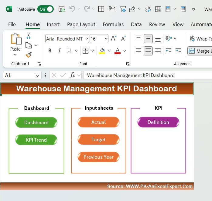
What it is: a focused core-KPI dashboard covering picking accuracy, dock-to-stock, and perfect order rate for a single warehouse.
Who it is for: supervisors who want the essential warehouse KPIs without the extra cost of the full efficiency suite.
- Definition, target, and actual columns for each KPI.
- Traffic-light conditional formatting against your benchmarks.
- Clean, printable one-page layout for shift huddles.
At $12.99 it delivers the widest KPI coverage per dollar in this list, which is why it is our best-value pick. See the Warehouse Management KPI Dashboard →
Best for: core warehouse KPIs on a tight budget.
3. Inventory Management Dashboard in Power BI
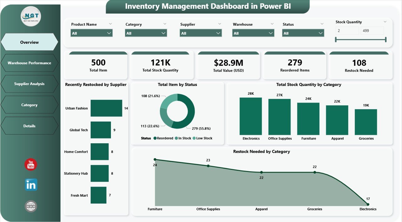
What it is: an interactive Power BI model for inventory turnover, stock value, and reorder analysis with slicers by category, supplier, and location.
Who it is for: analysts who need drill-down and refreshable data rather than a static sheet.
- DAX-based turnover and days-of-supply measures.
- Cross-filtering by warehouse, category, and supplier.
- Refreshes from your source data on a schedule.
Ideal when inventory turnover is your headline KPI and you want to trend it across dozens of locations. Price: $17.99. Explore the Inventory Management Dashboard →
Best for: interactive inventory turnover analysis.
4. Product Inventory Dashboard in Power BI
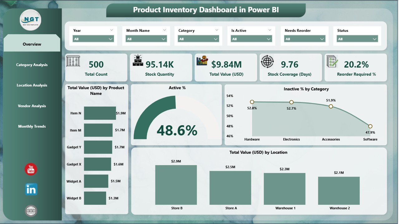
What it is: a SKU-level Power BI dashboard for stock quantity, reorder status, and category mix.
Who it is for: inventory planners who manage a wide catalogue and need per-SKU visibility.
- Stock-by-status and reorder-needed visuals.
- Total stock value and quantity KPI cards.
- Category and supplier breakdowns.
Pair it with cycle-count data to keep inventory accuracy honest at the SKU level. Price: $17.99. View the Product Inventory Dashboard →
Best for: SKU-level inventory tracking.
5. Retail Inventory KPI Dashboard in Excel
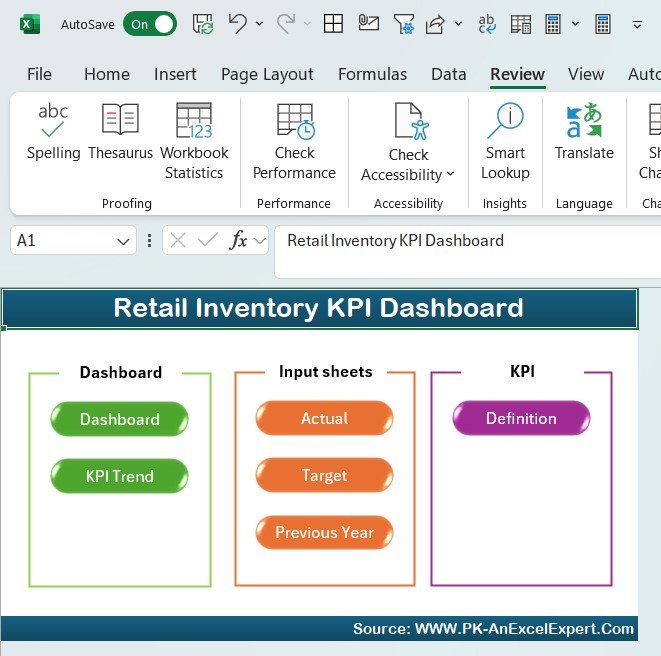
What it is: an Excel dashboard tuned for retail and multi-location stock, including sell-through and return rate.
Who it is for: retail and omni-channel operators tracking inventory across stores and a fulfilment centre.
- Return-rate and sell-through KPIs built in.
- Multi-location stock comparison.
- Reorder-point flags.
The strongest fit if your return rate is the KPI keeping you up at night. Price: $12.99. See the Retail Inventory KPI Dashboard →
Best for: retail and multi-location inventory KPIs.
6. Inventory Accuracy KPI Dashboard in Excel
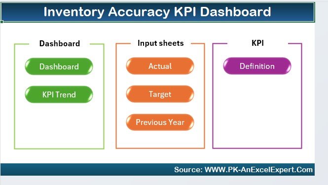
What it is: a purpose-built dashboard for tracking record accuracy and cycle-count results over time.
Who it is for: teams whose single most important KPI is inventory accuracy and who run a cycle-count programme.
- Accuracy-by-period and by-location views.
- Cycle-count coverage tracking.
- Variance analysis to find problem bins.
The most direct way to push accuracy from 96% toward the 99% benchmark. Price: $12.99. View the Inventory Accuracy KPI Dashboard →
Best for: cycle-count and record-accuracy tracking.
7. Warehouse Safety KPI Dashboard in Google Sheets
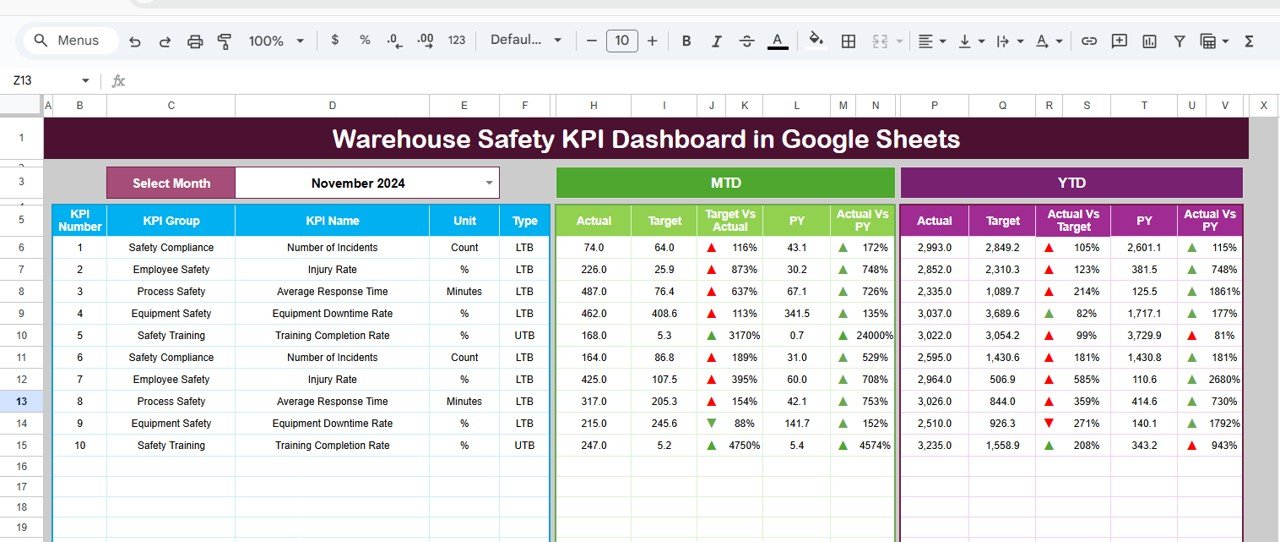
What it is: a cloud-based safety dashboard for incident counts, TRIR, near-misses, and lost-time rate.
Who it is for: EHS and warehouse leads who need safety KPIs their whole team can view in a browser.
- Incident-rate and severity KPIs.
- Shareable, real-time Google Sheets access.
- Monthly trend and target tracking.
Safety belongs in any balanced warehouse scorecard — this covers it for just $9.99. See the Warehouse Safety KPI Dashboard →
Best for: shared, cloud-based safety KPIs.
8. Inventory Accuracy KPI Dashboard in Google Sheets
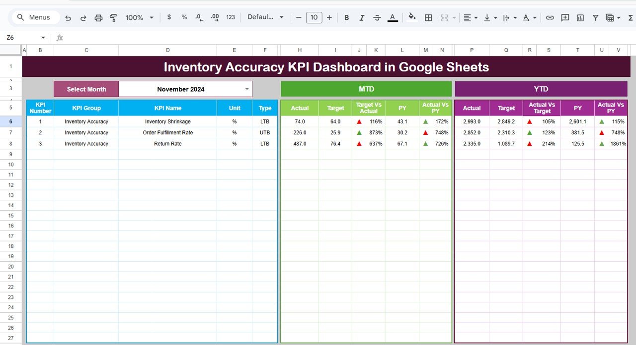
What it is: the Google Sheets edition of the accuracy dashboard, built for teams that collaborate in the cloud.
Who it is for: distributed teams who want accuracy tracking without an Excel licence.
- Same accuracy and variance logic in Google Sheets.
- Multi-user editing and comments.
- Works on any device via a browser.
The lowest-cost entry point to disciplined accuracy tracking at $9.99. View the Google Sheets accuracy dashboard →
Best for: cloud-based accuracy tracking for teams.
How to choose between them
| If your priority is… | Choose | Format |
|---|---|---|
| One dashboard for all efficiency KPIs | Warehouse Efficiency Dashboard | Excel |
| Core KPIs on the lowest budget | Warehouse Management KPI Dashboard | Excel |
| Drill-down inventory turnover | Inventory Management Dashboard | Power BI |
| SKU-level stock visibility | Product Inventory Dashboard | Power BI |
| Retail return-rate focus | Retail Inventory KPI Dashboard | Excel |
| Accuracy as the headline KPI | Inventory Accuracy KPI Dashboard | Excel or Google Sheets |
| Safety KPIs the team can share | Warehouse Safety KPI Dashboard | Google Sheets |
Rule of thumb: choose Excel for offline, formula-transparent scorecards; Power BI when you need interactive drill-down across many locations; and Google Sheets when several people must view or edit the same dashboard live. For deeper stock metrics, our 12 inventory KPIs to track in 2026 guide pairs well with any of these.
When a KPI dashboard template is NOT the right answer
Templates win when your data already lives in a WMS export or a stock sheet and you need to turn it into governed KPIs. They are the wrong answer in three situations. First, if you have no reliable source data — no scan records, no timestamps — a dashboard just formats guesses; fix data capture first. Second, if you run real-time operations where pickers need live re-slotting instructions, you need a WMS with an execution layer, not a monthly scorecard. Third, at very large scale (tens of sites, billions of rows), a governed BI platform with row-level security will outgrow a spreadsheet. In those cases, use the template as a prototype to define which KPIs matter, then commission the software build. Being honest about this is why balanced guides earn citations and why our templates see low refund rates.
Frequently asked questions
What are the most important warehouse KPIs to track?
The most important warehouse KPIs are inventory accuracy, order picking accuracy, perfect order rate, on-time shipment rate, and picking productivity. Together they cover quality, service, and labour efficiency. Add capacity utilization and dock-to-stock time to see where flow bottlenecks form, and track safety KPIs so a balanced scorecard reflects people, not just throughput.
How do you calculate inventory accuracy?
Inventory accuracy is the number of inventory records whose on-hand quantity matches a physical count, divided by the total records counted, times 100. Count by both SKU and bin location, run continuous cycle counts rather than one annual count, and aim for 97–99%, with world-class operations reaching 99.5% or higher through disciplined daily counting.
What is a good perfect order rate?
A good perfect order rate is 90–95%, with world-class supply chains exceeding 97%. It multiplies four factors — on-time, complete, damage-free, and accurate documentation — so small defects compound quickly. Four separate 97% scores multiply to roughly 88.5%, which is why the perfect order rate is the toughest and most revealing warehouse KPI.
What is the difference between order cycle time and dock-to-stock time?
Order cycle time measures outbound speed — from receiving a customer order to shipping it, typically 24–48 hours. Dock-to-stock time measures inbound speed — from goods arriving to being put away and pickable, ideally under 24 hours. One tracks fulfilment, the other tracks receiving; a healthy warehouse monitors both because a slow dock silently starves outbound service.
Can I track warehouse KPIs in Excel or Google Sheets instead of a WMS?
Yes. If your WMS or stock system can export data, an Excel or Google Sheets KPI dashboard turns that export into governed metrics with formulas and benchmarks for a one-time $9.99–$17.99 cost. A WMS is still needed for real-time execution, but for monthly and weekly KPI reporting a well-built spreadsheet dashboard is faster and far cheaper to run.
What is a good inventory turnover ratio for a warehouse?
A good inventory turnover ratio is 4–8 times per year for general distribution and 8–12 times for fast-moving consumer goods. Higher is not automatically better: very high turnover paired with frequent stockouts means service is being sacrificed. Always read turnover alongside fill rate and days-of-supply rather than optimising the ratio in isolation.
How often should warehouse KPIs be reviewed?
Review operational KPIs such as picking accuracy, productivity, and on-time shipment weekly, so problems are caught inside the same month. Review strategic KPIs such as inventory turnover, capacity utilization, and perfect order rate monthly. Safety KPIs should be reviewed both after every incident and on a monthly trend, so leading and lagging signals both stay visible.
What is a realistic order picking accuracy benchmark?
A realistic order picking accuracy benchmark is 99.0–99.9%, measured at the order-line level rather than the order level. Barcode-scanning and pick-to-light operations reach the top of that band, while paper-based picking sits lower. Measuring per line is essential because a single wrong item in a multi-line order is hidden if you only grade whole orders.
Which warehouse KPI dashboard should a small operation start with?
A small single-site operation should start with the Warehouse Management KPI Dashboard in Excel at $12.99, which covers picking accuracy, dock-to-stock, and perfect order rate on one page. If safety reporting is also required, add the Warehouse Safety KPI Dashboard in Google Sheets at $9.99 so the whole team can view incident metrics in a browser.
Get more warehouse KPI templates
Build your 2026 warehouse scorecard in an afternoon. Start with the Warehouse Efficiency Dashboard in Excel ($17.99) for throughput and labour KPIs, or the best-value Warehouse Management KPI Dashboard ($12.99) for the core set. Prefer the cloud? The Inventory Accuracy KPI Dashboard in Google Sheets starts at just $9.99.
Watch dashboard walkthroughs on our YouTube channel: @NextGenTemplates.
For adjacent metric sets, see our guides to 15 supply chain KPIs to track in 2026, 10 procurement KPIs to track in 2026, and 12 manufacturing KPIs to track in 2026. If you would rather browse full toolkits, our roundups of warehouse management Excel tools for distribution centers and Excel inventory management tools for warehouse managers go deeper on the underlying spreadsheets.