

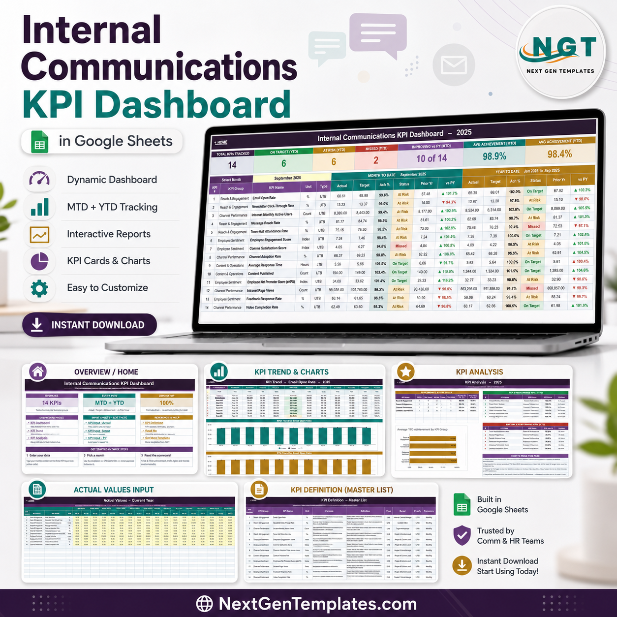
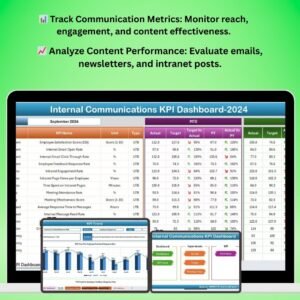
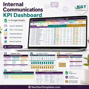
The Internal Communications KPI Dashboard in Google Sheets tracks 14 internal communications KPIs across four groups – Reach & Engagement, Channel Performance, Employee Sentiment, and Content & Operations – and puts every one of them on screen at MTD and YTD against Target and Prior Year. Change one dropdown and the seven header cards, all 14 KPI rows, the KPI Trend page and the KPI Analysis page recalculate together. There is no add-on, no Apps Script and no connector to install: the workbook is native Google Sheets formulas end to end. It is a one-time payment of $8.99 (regular $13.99), delivered as an instant PDF download that carries a Make a copy link, so your own editable copy lands in your Google Drive in about a minute. More than 1,400 templates have shipped from NextGenTemplates, and every one is hand-built and opened before release.
Which template is this? This is the KPI scorecard build – a month picker, a traffic-light table, a KPI Trend page and a KPI Analysis page. It is not the analytical, pivot-and-slicer style build. If you want to slice raw message-level records instead of reviewing monthly results, look at the Office Communication Dashboard in Google Sheets. The two are different templates and many teams keep both.
Key Features of the Internal Communications KPI Dashboard
- 14 KPIs, four groups. Email Open Rate, Newsletter Click-Through Rate, Message Reach Rate and Town-Hall Attendance Rate sit under Reach & Engagement; Intranet Monthly Active Users, Intranet Page Views, Channel Adoption Rate and Video Completion Rate under Channel Performance; Employee Engagement Score, Comms Satisfaction Score, Employee Net Promoter Score (eNPS) and Feedback Response Rate under Employee Sentiment; Average Response Time and Content Published under Content & Operations.
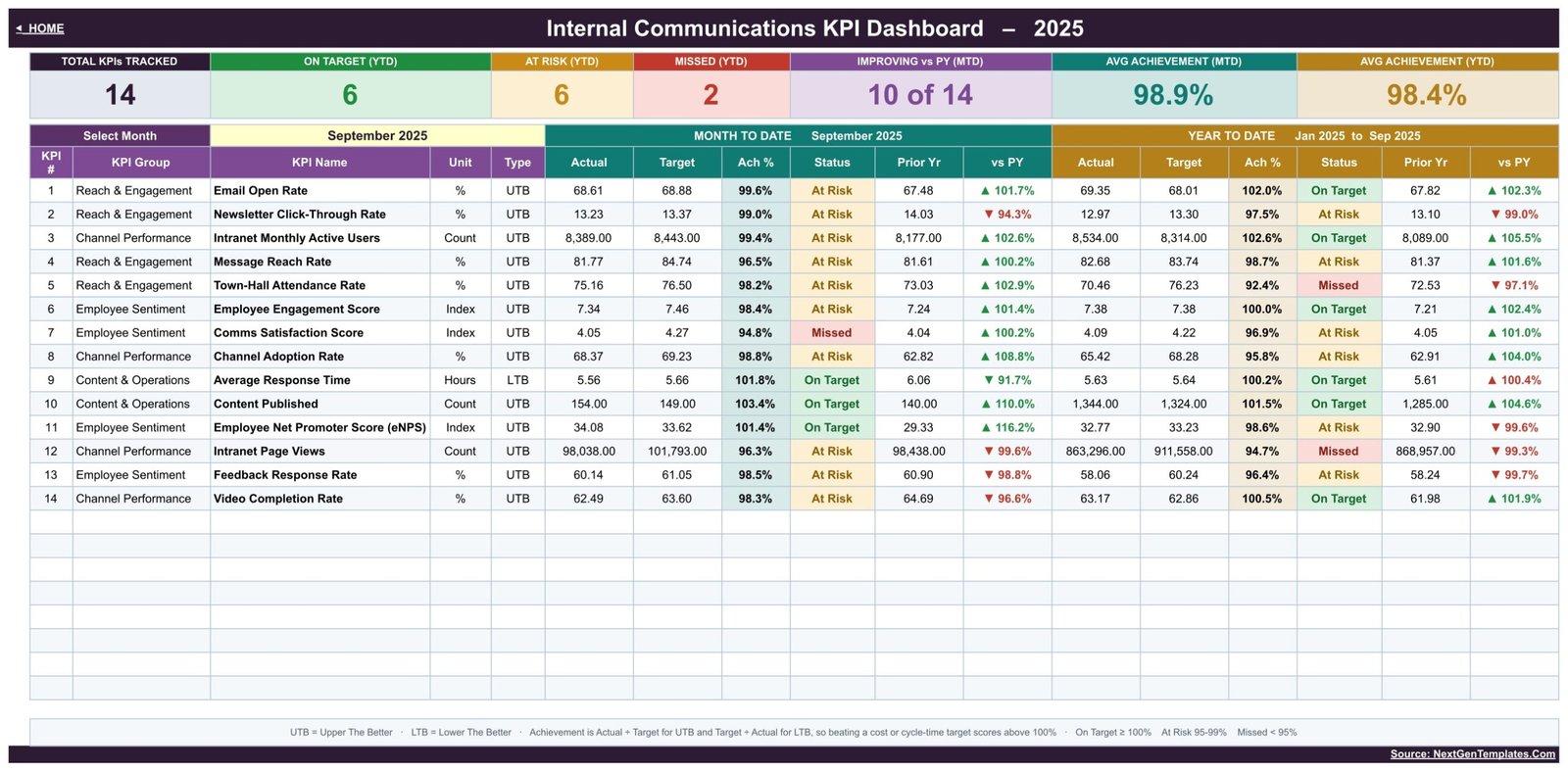
- Seven header cards. Total KPIs Tracked, On Target (YTD), At Risk (YTD), Missed (YTD), Improving vs PY (MTD), Avg Achievement (MTD) and Avg Achievement (YTD).
- UTB and LTB handling. Achievement is Actual divided by Target for upper-the-better KPIs and Target divided by Actual for lower-the-better ones, so beating a response-time target scores above 100% instead of below it. Average Response Time is the LTB KPI in the shipped sample.
- vs Prior Year on every row, at MTD and YTD, with up and down arrows.
- Editable thresholds. On Target from 100%, At Risk 95% to 99%, Missed under 95% – all set in the Status formulas on the KPI Dashboard sheet.
- YTD that respects the KPI. Rates roll up as an average; counts such as Content Published and Intranet Page Views roll up as a sum.
- Owner, priority and frequency stored per KPI, so a review meeting can go straight to the person accountable.
What’s Inside the Internal Communications KPI Dashboard
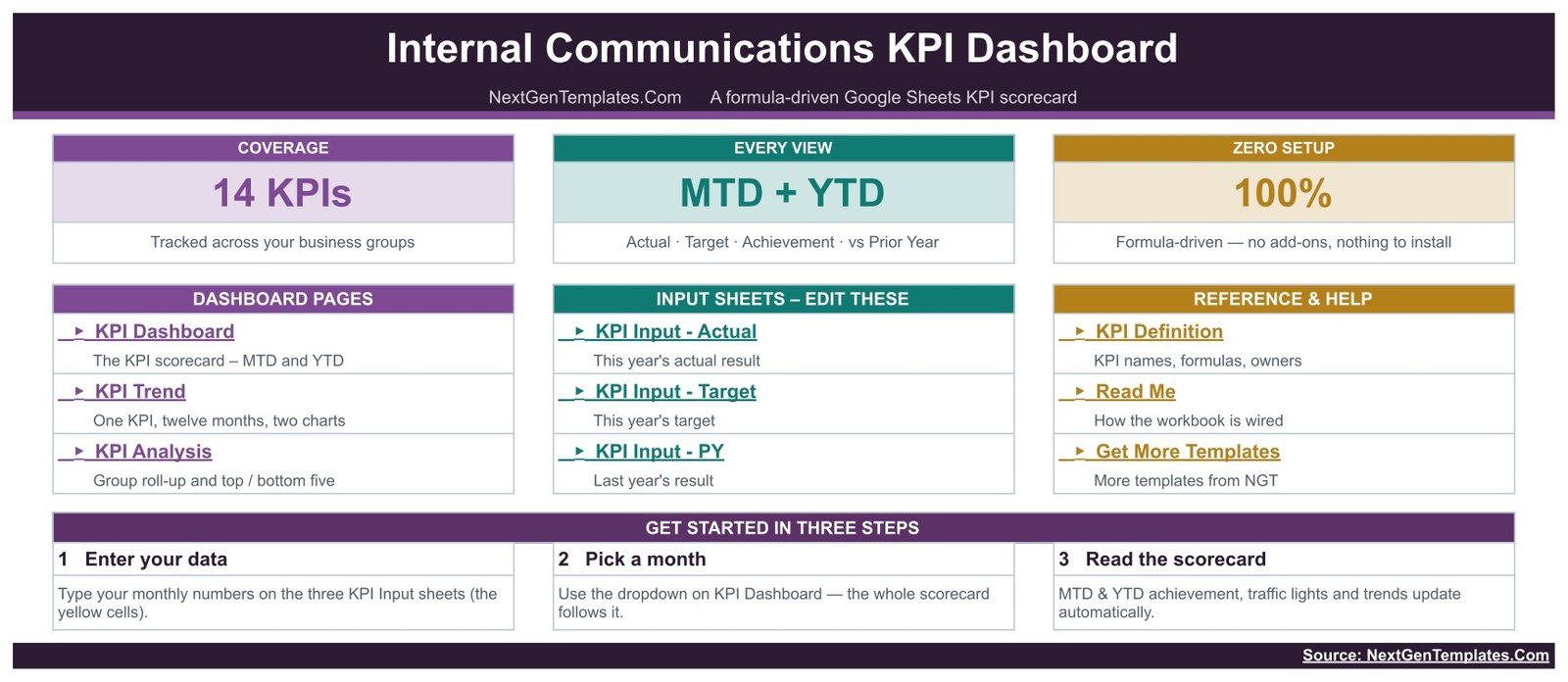
1. Home. The index page. It links to the three dashboard pages, the three input sheets, the KPI Definition sheet, a Read Me and Get More Templates, and spells out the three-step start: enter your data, pick a month, read the scorecard.
2. KPI Dashboard. The scorecard. Select Month sits at the top; the sample ships on September 2025. Each of the 14 rows carries KPI Group, KPI Name, Unit and Type, then a Month-to-Date block (Actual, Target, Ach %, Status, Prior Yr, vs PY) and a Year-to-Date block with the same six columns for January to the selected month.
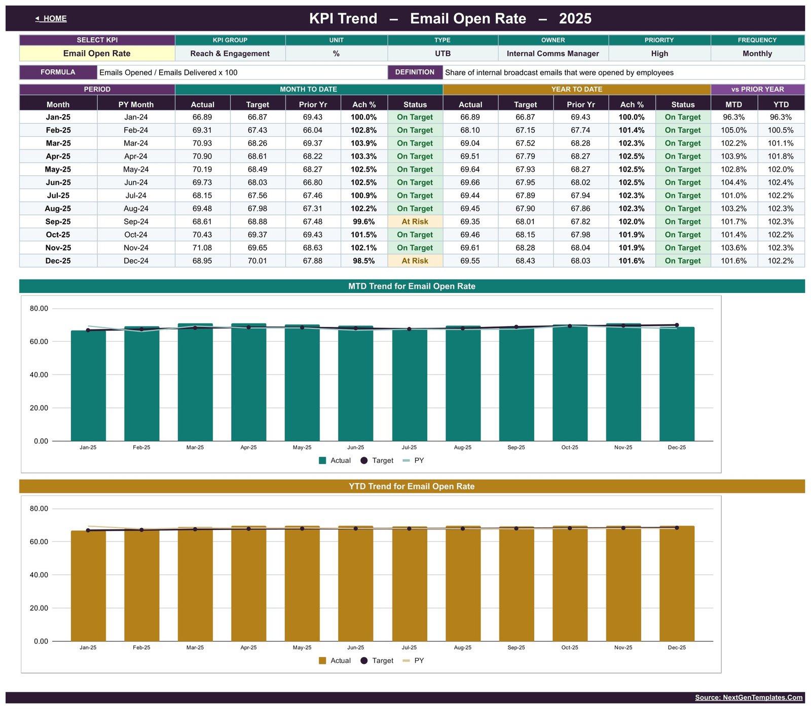
3. KPI Trend. Choose one KPI from the dropdown and read all twelve months: MTD Actual, Target, Prior Yr, Ach % and Status, the matching YTD block, and vs Prior Year for both. Two charts sit underneath – MTD Trend for Email Open Rate and YTD Trend for Email Open Rate in the shipped sample – each plotting Actual bars against Target and PY lines. The header restates that KPI’s group, unit, type, owner, priority, frequency, formula and definition.
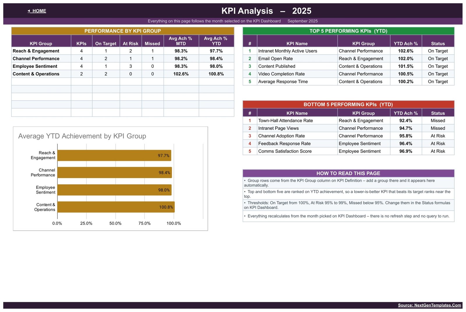
4. KPI Analysis. Performance by KPI Group counts the KPIs, On Target, At Risk and Missed in each group and averages MTD and YTD achievement. Beside it, Top 5 and Bottom 5 Performing KPIs are ranked on YTD achievement. The Average YTD Achievement by KPI Group bar chart sits below, and a How To Read This Page box explains the ranking and the thresholds.
5. KPI Input – Actual. The typing sheet. Every KPI is a row, every month is an MTD column with its YTD column calculated beside it. Cell E3 holds the first month of your reporting year, so a April-to-March year is one edit away.
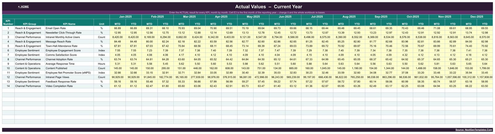
6. KPI Input – Target and 7. KPI Input – PY. The same grid twice more: this year’s target, and last year’s result for the year-over-year columns.
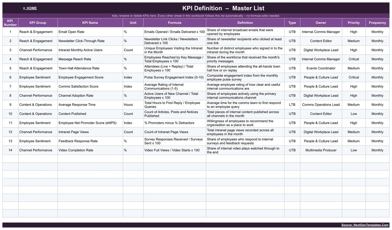
8. KPI Definition. The master list, and the sheet that makes this template yours. Add, rename or delete a KPI here – with its group, unit, formula, definition, type, owner, priority and frequency – and every other sheet follows without a single formula edit.
Google Sheets vs. Excel vs. Paid Comms Platforms – Where This Fits
| This template (Google Sheets) | Excel KPI dashboard | Paid comms platform (Staffbase, Poppulo) | |
|---|---|---|---|
| Cost | $8.99 one time | $12.99 one time | Per-employee annual licence, quoted on request |
| Platform | Browser, any device with Google Sheets | Microsoft Excel desktop | Vendor web app plus mobile app |
| Setup time | Under an hour once your numbers are to hand | Under an hour | Weeks – IT review, SSO, directory sync |
| Real-time team collaboration | Yes, native multi-user editing | Only via OneDrive co-authoring | Yes |
| Mobile access | Yes, Google Sheets app | Limited | Yes |
| Customisable KPIs | Yes – edit the KPI Definition list | Yes | Fixed to the vendor’s metric set |
| Share with a link | Yes | File must be sent or synced | Yes, inside the platform |
| Year-1 cost at 5 users | $8.99 | $12.99 | Typically five figures |
| Month picker recalculates the whole pack | Yes | Yes | Date range filters |
| Who holds the raw numbers | You, in your own Drive | You, on your machine | The vendor |
| Collects the data for you | No – you type it in | No | Yes, it instruments the channels |
Who This Template Is For – and Who It’s Not For
It fits an internal communications manager or comms team of one to ten who already pull open rates from a mail tool, intranet numbers from analytics and sentiment scores from a pulse survey, and need one monthly pack that puts them together. It fits an HR or People & Culture lead who reports engagement and eNPS to a leadership meeting. It fits a digital workplace lead measuring adoption of a new channel. And it fits any organisation that wants its own numbers to stay in its own Drive.
It is not for you if you expect the template to collect the data. It does not connect to Outlook, Gmail, SharePoint, Viva Engage, Slack or your intranet – you type the monthly totals in, or paste them from an export. It is also not the right tool if you need daily or per-message reporting, if you need more than roughly 30 KPIs, or if you want message-level drill-down; for slicing raw records, the analytical Office Communication Dashboard in Google Sheets is the better fit.
Please read this before you buy. This is a manual tracking and visualisation template over numbers you enter yourself. It is not an employment-law, HR-compliance or record-keeping system, it makes no compliance guarantee, and it should not be relied on as one. The Employee Engagement Score, Comms Satisfaction Score and eNPS rows are simply places to record whatever figure your own survey produced – they are not validated psychometric instruments, the template does not run or score a survey, and no benchmark is implied. All numbers in the screenshots are illustrative sample data.
How to Use the Internal Communications KPI Dashboard
- Make your copy. Open the PDF in your download and click the Make a copy link. The workbook lands in your own Google Drive.
- Set your KPI list. On KPI Definition, keep the 14 shipped KPIs or replace them with yours. Fill in group, unit, formula, definition, type (UTB or LTB), owner, priority and frequency.
- Set your year start. Cell E3 on KPI Input – Actual holds the first month of the reporting year. Change it and the whole workbook re-bases.
- Type the numbers. Enter this year’s monthly actuals, then the same grid of targets on KPI Input – Target and last year’s results on KPI Input – PY. Only the yellow cells take input.
- Pick a month. Use the Select Month dropdown on KPI Dashboard. Every card, row, status, chart and the KPI Analysis page follow it.
- Run the review. Read the Missed and At Risk rows first, open KPI Trend for each of them to see whether the month is a blip or a slide, then use KPI Analysis to see which group is dragging.
Real-World Use Cases
Priya, Internal Comms Manager at a 900-person insurer. On the first Tuesday of the month she pastes last month’s open and click rates from the mail platform, the intranet MAU and page views from analytics, and the pulse survey index. She sets Select Month, screenshots the KPI Dashboard, and takes it to the leadership stand-up. When Town-Hall Attendance Rate turns red she opens KPI Trend for it and can show whether it is one bad month or a four-month decline.
Daniel, Digital Workplace Lead rolling out a new intranet. Channel Adoption Rate and Intranet Monthly Active Users are his two board metrics. He keeps a stretch target in KPI Input – Target and uses the vs PY columns to show the steering group how far the new channel has moved against last year’s platform.
Sofia, People & Culture Lead at a 40-person agency. She owns four of the 14 rows – engagement, comms satisfaction, eNPS and feedback response. She hides the rest, keeps her four in the same workbook the comms team uses, and stops maintaining a separate deck.Internal Communications KPI Dashboard in Google Sheets
Frequently Asked Questions
Does this connect to Outlook, Gmail, Slack or my intranet?
No. It is a manual-entry template. You type or paste the monthly totals from whatever tools you already use. That is deliberate – it means no admin consent, no API keys and no IT review before you can start.
Can I change the 14 KPIs to my own?
Yes, and it is the normal thing to do. Edit the KPI Definition sheet: add, rename or delete rows there and the dashboard, trend page, analysis page and all three input sheets follow automatically. No formula editing.
My financial year starts in April. Does that work?
Yes. Cell E3 on KPI Input – Actual is the first month of the reporting year. Change it and every month column, the YTD roll-up and the prior-year comparison re-base to your year.
What do On Target, At Risk and Missed mean?
On Target is 100% achievement and above, At Risk is 95% to 99%, Missed is below 95%. Achievement is Actual over Target for upper-the-better KPIs and Target over Actual for lower-the-better ones. All three thresholds live in the Status formulas and you can change them.Internal Communications KPI Dashboard in Google Sheets
Do I need an add-on, Apps Script or a paid Google Workspace plan?
No. Everything runs on built-in Google Sheets formulas and charts, and it works on a free personal Google account.Internal Communications KPI Dashboard in Google Sheets
Is this the same as your Internal Communications KPI Dashboard in Excel or in Power BI?
Same KPI thinking, different build. If your team lives in Microsoft, the Excel version and the Power BI version cover the same ground on those platforms.Internal Communications KPI Dashboard in Google Sheets
Can several people edit it at once?
Yes. It is an ordinary Google Sheets file, so share it the way you share any other – and give the comms, HR and digital workplace owners edit access to their own input rows.Internal Communications KPI Dashboard in Google Sheets
About the Author
Built by PK – Microsoft Certified Professional with 15+ years of Excel, Google Sheets, and Power BI experience. Founder of NextGenTemplates, reaching 300K+ subscribers across YouTube channels. Every template is hand-built and tested before release.Internal Communications KPI Dashboard in Google Sheets
Explore Related Templates
- Conflict Resolution KPI Dashboard in Google Sheets – the same scorecard build for grievance and dispute handling.
- Employee Benefits Utilization KPI Dashboard in Google Sheets – take-up and cost per benefit, month by month.
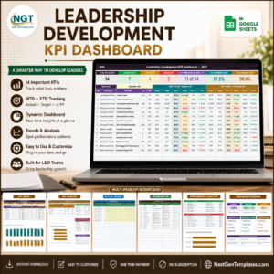
- Leadership Development KPI Dashboard in Google Sheets – programme completion, succession cover and promotion readiness.
- Diversity & Inclusion Dashboard in Google Sheets – the analytical companion for representation reporting.
- Browse every Google Sheets KPI Dashboard, or the full Google Sheets template library.
Get the Internal Communications KPI Dashboard in Google Sheets for $8.99 (regular $13.99). Instant download, one-time payment, lifetime access, and the Make a copy link puts an editable workbook in your Drive in about a minute. A full walkthrough is on the blog: Internal Communications KPI Dashboard in Google Sheets.
Watch the step-by-step video Demo:
Last updated: 20 August 2026.



Reviews
There are no reviews yet.