

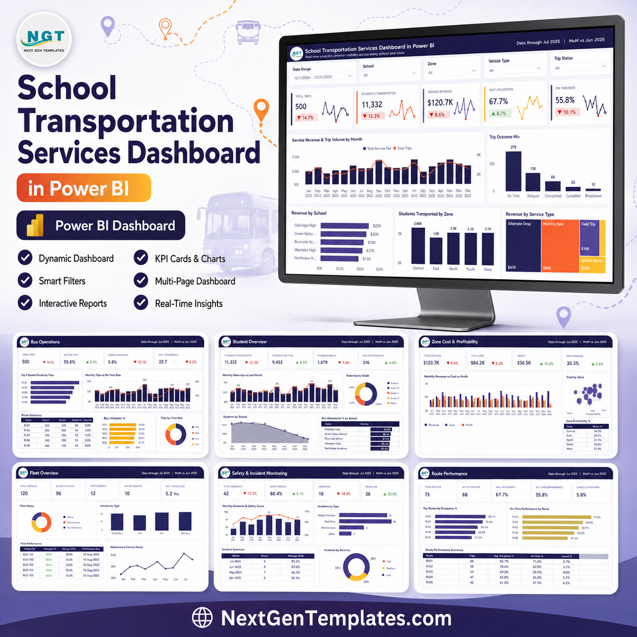
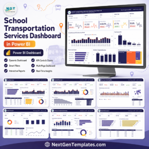
Last updated: August 9, 2026. The School Transportation Services Dashboard in Power BI gives school transport teams 5 report pages, 5 executive KPI cards, 22 operational charts, and slicer-based filtering in one ready-to-use Power BI dashboard. Built by PK, a Microsoft Certified Professional with 15+ years of Excel, Google Sheets, and Power BI experience and 300K+ tutorial subscribers, this template helps you review trips, students, revenue, seat utilisation, on-time performance, route demand, fleet costs, profitability, complaints, driver incidents, and safety ratings without a recurring transport analytics subscription. Download once, open the .pbix file in Power BI Desktop, replace the sample data, and use it for route reviews, school reporting, monthly management meetings, and safety follow-up.
Key Features of School Transportation Services Dashboard in Power BI
- 5 KPI cards: Total Trips, Students Transported, Service Revenue, Seat Utilisation, and On-Time Rate.
- 5 Power BI pages: Overview, Route Operations, School Demand and Capacity, Fleet Cost and Profitability, and Safety and Incident Monitoring.
- 22 visual analyses: review revenue, trip volume, route ranking, ridership, seat fill, operating cost, profit margin, complaints, incidents, and safety scores.
- Interactive slicers: filter pages quickly by route, school, zone, month, service type, vehicle, driver, and other available fields.
- Power BI workflow: built for Power BI Desktop, so teams can customize visuals, measures, pages, and data model logic as needed.
- One-time purchase: no per-user SaaS contract, no locked reporting portal, and no repeated subscription for the dashboard file.
What’s Inside the School Transportation Services Dashboard in Power BI
1 – Overview Page
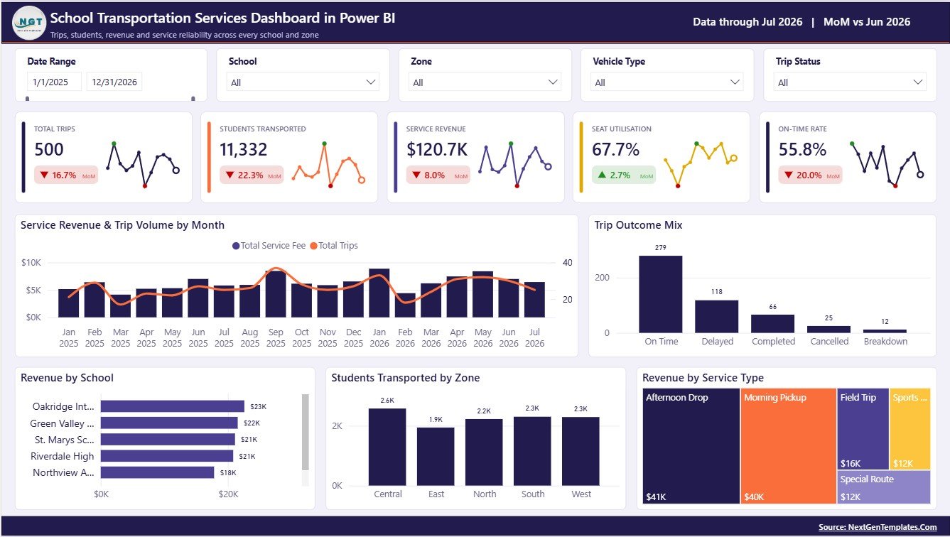
The Overview Page is the executive summary for school transportation leaders. Total Trips shows the full trip count under the current filters, Students Transported tracks student movement, Service Revenue summarizes revenue, Seat Utilisation shows how efficiently available capacity is used, and On-Time Rate highlights service reliability.
Service Revenue and Trip Volume by Month: This chart compares revenue movement with trip activity across months. Use it to see whether higher trip volume is converting into stronger service revenue.
Trip Outcome Mix by Trip Status: This visual breaks trips into outcome groups such as completed, delayed, cancelled, or other status values. It helps operations teams identify service issues that need follow-up.
Revenue by School: This chart compares revenue contribution by school. It helps finance and transport managers understand which campuses drive the largest service value.
Students Transported by Zone: This visual shows student movement by zone. Use it to compare regional demand and plan vehicle capacity by operating area.
Revenue by Service Type: This chart compares revenue across service categories. It helps leaders understand which transportation services contribute most to income.
2 – Route Operations
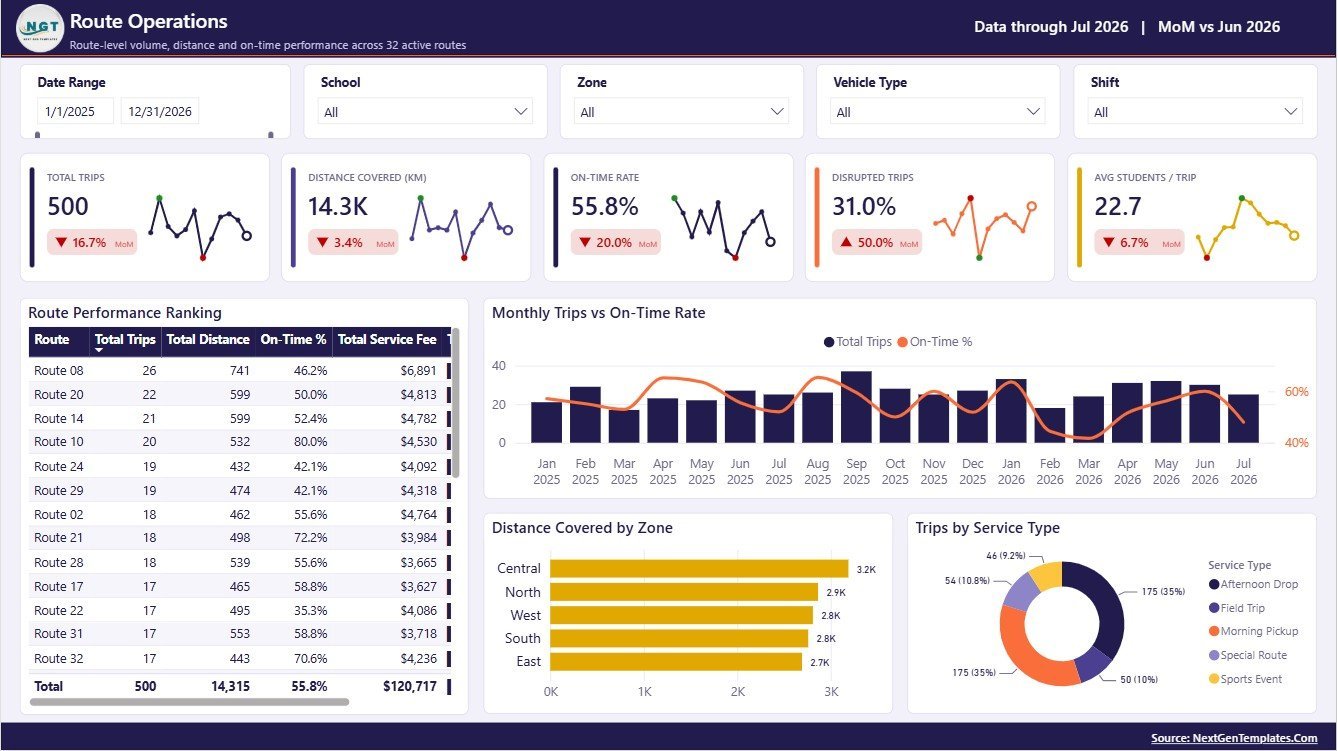
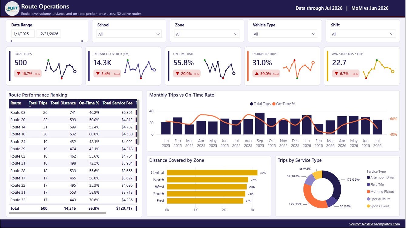
Route Performance Ranking by Route: This chart ranks routes by performance so coordinators can identify strong and weak route groups. It supports route reviews, staffing checks, and recurring operational follow-up.
Monthly Trips and On-Time Rate by Month: This visual compares monthly activity with service punctuality. It helps determine whether busy months are creating reliability pressure.
Distance Covered by Zone: This chart shows the distance load by zone. It is useful for fuel planning, route redesign, and zone-level cost discussions.
Trips by Service Type: This visual compares trip count across service categories. It helps teams understand which services create the largest daily operating workload.
3 – School Demand and Capacity
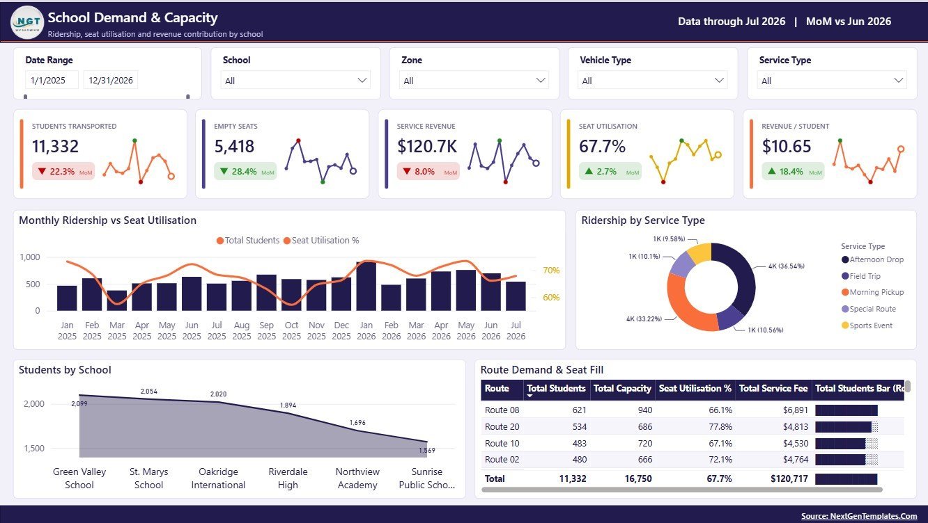
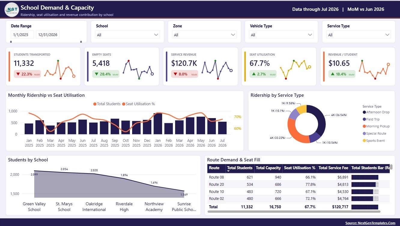
Monthly Ridership and Seat Utilisation by Month: This chart compares student ridership with seat usage across months. It helps administrators see whether capacity is aligned with demand.
Ridership by Service Type: This visual shows how students are distributed across transportation service categories. It supports planning for regular, special, after-school, or custom services.
Students by School: This chart compares student volume by school. It helps teams prioritize high-demand campuses and review capacity allocations.
Route Demand and Seat Fill by Route: This visual compares route-level demand with seat fill performance. Use it to spot underfilled routes, overloaded routes, and opportunities for adjustment.
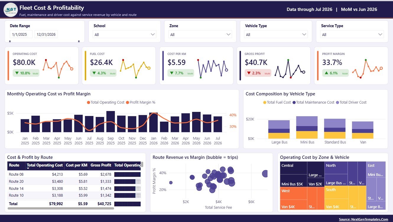
4 – Fleet Cost and Profitability
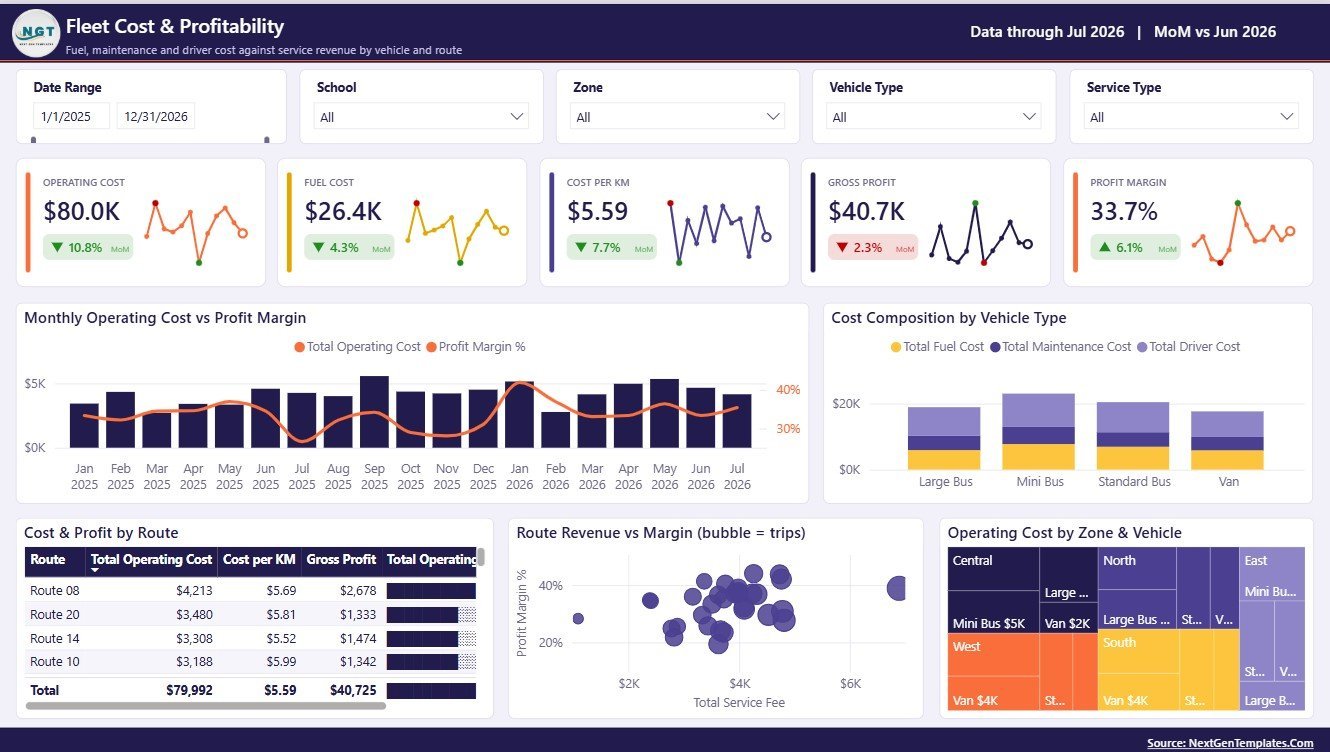
Monthly Operating Cost and Profit Margin by Month: This chart compares cost movement with profit margin over time. It helps finance teams identify months where cost pressure reduces profitability.
Cost Composition by Vehicle Type: This visual shows how costs are distributed across vehicle groups. It supports fleet planning, maintenance review, and vehicle-type comparison.
Cost and Profit by Route: This chart compares route cost and profit together. It helps managers identify routes that need pricing, capacity, or cost review.
Route Revenue and Margin by Route: This visual shows how route revenue compares with margin performance. It helps separate high-revenue routes from routes that are truly profitable.
Operating Cost by Zone and Vehicle: This chart breaks operating cost across zones and vehicle categories. Use it to locate cost-heavy areas and vehicle groups.
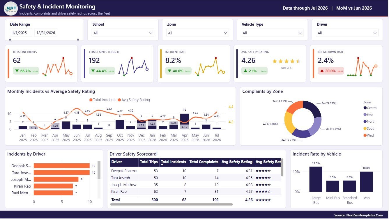
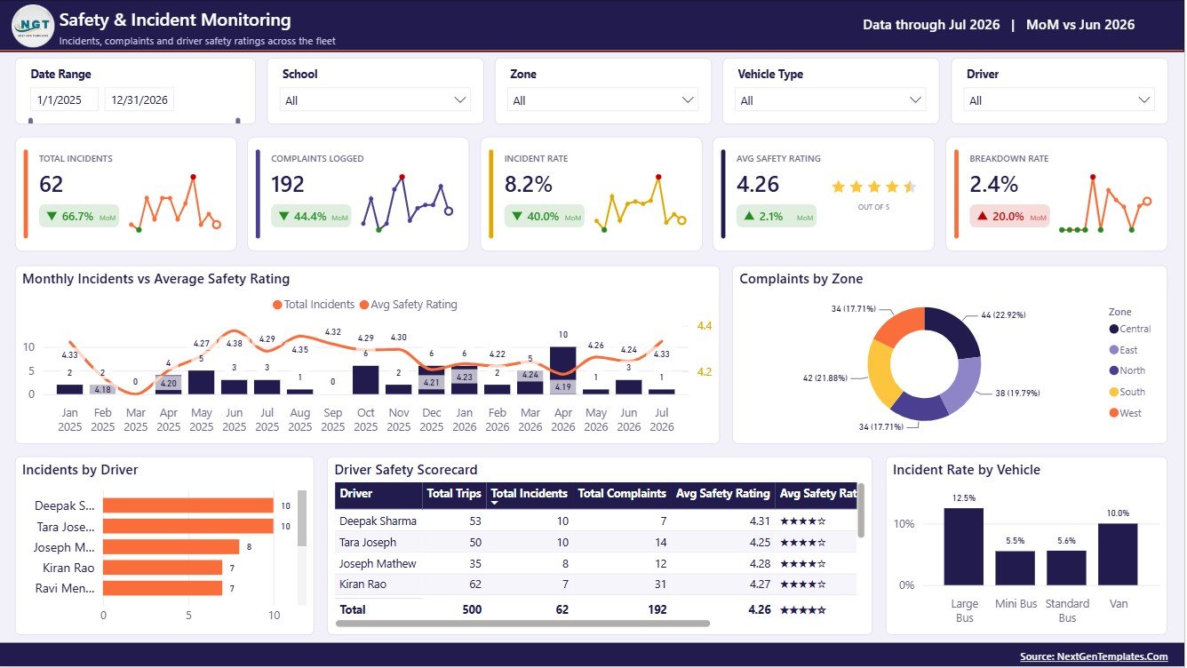
5 – Safety and Incident Monitoring
Monthly Incidents and Average Safety Rating by Month: This chart compares incident counts with safety rating trends. It helps safety teams identify whether incidents are rising while ratings fall.
Complaints by Zone: This visual compares complaint volume by zone. It helps teams focus investigation and service improvement on the areas with the highest complaint pressure.
Incidents by Driver: This chart shows incident counts by driver. It supports coaching, training review, and driver-level follow-up.
Driver Safety Scorecard by Driver: This scorecard compares driver safety performance in a structured view. It helps supervisors recognize strong performers and identify improvement needs.
Incident Rate by Vehicle: This visual compares incident rate across vehicles. It helps fleet teams spot vehicles that may need maintenance review, replacement planning, or closer monitoring.
School Transportation Services Dashboard in Power BI vs. Tableau vs. Paid School Transport SaaS – Where This Fits
| Feature | This Power BI dashboard | Tableau alternative | Paid school transport SaaS |
|---|---|---|---|
| Cost | $17.99 one-time sale price | Requires Tableau access plus dashboard build time | Usually monthly, annual, or per-student pricing |
| Platform | Power BI Desktop and Power BI ecosystem | Tableau Desktop or Tableau Cloud | Vendor-hosted transport platform |
| Setup time | Open .pbix, replace sample data, refresh | Build or adapt workbook and data model | Account setup, configuration, training, and data migration |
| Customizable fields | Edit pages, visuals, data model, and measures | Editable if you build or own the Tableau workbook | Limited by vendor configuration |
| Share with link | Possible through Power BI Service when published | Possible through Tableau Server or Cloud | Usually included inside the vendor app |
| Year-1 cost at 5 users | $17.99 before any Microsoft licensing | Template/build cost plus Tableau licensing | Can grow with users, buses, routes, or students |
| School transport focus | Built around trips, students, routes, zones, fleet cost, safety, and incidents | Must be built or customized for school transport | Often includes operational modules beyond reporting |
Who This Template Is For – and Who It’s Not For
This template is for school administrators, transportation coordinators, route operations managers, fleet supervisors, safety officers, finance teams, and education service providers that need a clean Power BI reporting layer for school bus and student transportation performance.
It is not a live GPS tracking system, dispatch console, parent notification app, route optimizer, payment gateway, driver payroll system, or legal compliance tool. Use it for reporting, management review, trend analysis, and decision support, not for controlling live vehicle movement.
How to Use the School Transportation Services Dashboard in Power BI
- Download and unzip the file after purchase.
- Open the .pbix file in Power BI Desktop.
- Review the sample data structure and replace it with your own school transportation data source.
- Refresh the report so the cards, slicers, and visuals update.
- Use the Overview page for executive review, then move into route, capacity, cost, and safety pages for deeper analysis.
- Customize visuals, measures, colors, and page layout if your school district or transport provider uses different reporting names.
Real-World Use Cases
Anita, school operations manager: checks Total Trips, Students Transported, and On-Time Rate before the weekly route review meeting.
Marcus, fleet supervisor: uses Fleet Cost and Profitability to compare vehicle type cost, route cost, and zone operating pressure before maintenance planning.
Priya, finance officer: reviews Service Revenue by Month, Revenue by School, and Route Revenue and Margin before preparing the monthly management report.
Frequently Asked Questions
What does the School Transportation Services Dashboard in Power BI track?
It tracks trips, transported students, service revenue, seat utilisation, on-time rate, route performance, distance, ridership, operating cost, profit margin, complaints, incidents, drivers, vehicles, and safety ratings based on the available data fields.
How many report pages are included?
The dashboard includes 5 Power BI pages: Overview, Route Operations, School Demand and Capacity, Fleet Cost and Profitability, and Safety and Incident Monitoring.
Do I need Power BI Desktop?
Yes. Open the .pbix file in Power BI Desktop, which is free from Microsoft, then replace or connect your data source and refresh the report.
Can I customize the Power BI visuals?
Yes. Because this is a Power BI dashboard file, you can edit visuals, pages, measures, colors, slicers, and data model logic if you are comfortable working in Power BI.
Does this dashboard include live bus tracking?
No. It is a reporting and analysis dashboard. It does not provide GPS tracking, dispatch automation, parent alerts, or live route optimization.
Can I use it for private bus operators?
Yes. Any school transport provider can adapt the sample structure if their data includes trips, schools, zones, routes, service types, vehicles, drivers, costs, revenue, and safety fields.
About the Author
Built by PK – Microsoft Certified Professional with 15+ years of Excel, Google Sheets, and Power BI experience. Founder of NextGenTemplates, reaching 300K+ subscribers across YouTube channels. Every template is hand-built and tested before release.
Explore Related Templates
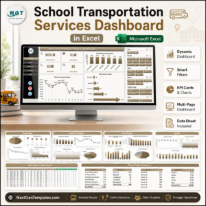
- School Transportation Services Dashboard in Excel for teams that prefer workbook-based reporting.
- Transportation Services KPI Dashboard in Excel for transportation KPI tracking.
- Browse Power BI templates.
- Browse Power BI dashboard templates.
Download the School Transportation Services Dashboard in Power BI to monitor trips, revenue, routes, school demand, fleet cost, profitability, incidents, and safety performance in one editable Power BI report.
Last updated: August 9, 2026.





Reviews
There are no reviews yet.