

The best airline operations dashboard for most aviation teams in 2026 is the Aviation Operations KPI Dashboard in Excel ($12.99). It tracks flight punctuality, aircraft utilization, fuel efficiency, load factor and crew productivity against target and last year. Airlines reporting to leadership in Power BI should pick the Airlines KPI Dashboard in Power BI ($11.99).
Last updated: October 2026
Key takeaways
- Our top pick is the Aviation Operations KPI Dashboard in Excel ($12.99). It covers 10 flight-operations KPIs, including On-time Departure Rate, Passenger Load Factor and Fuel Efficiency, with MTD and YTD views.
- For executive reporting, the Airlines KPI Dashboard in Power BI ($11.99) tracks 12 KPIs, including RASM, CASM, Baggage Mishandling Rate and Accident Rate per 100k flights.
- Airport authorities should start with the Airport Infrastructure KPI Dashboard in Excel ($14.99): gate utilization, runway downtime, security screening time and cost per passenger.
- All six templates cost $9.99 to $14.99 once. Airline operations, MRO and airport management software is usually sold on quoted multi-year contracts.
- The cheapest option is the Aviation Operations KPI Dashboard in Google Sheets at $9.99. It suits teams that share one live scorecard across stations by link.
Airline and airport operations templates compared
| Template | Format | Best For | Price |
|---|---|---|---|
| Aviation Operations KPI Dashboard (Best overall) | Excel | Flight ops: punctuality, utilization, fuel, load factor | $12.99 |
| Airlines KPI Dashboard | Power BI | Airline leadership: RASM, CASM, safety, completion rate | $11.99 |
| Airport Infrastructure KPI Dashboard | Excel | Airport authorities: gates, runways, throughput, screening | $14.99 |
| Aviation Maintenance KPI Dashboard | Excel | MRO and engineering: dispatch reliability, MTBF, AOG | $14.99 |
| Airline Catering KPI Dashboard | Excel | In-flight catering: meal cost, wastage, on-time delivery | $14.99 |
| Aviation Operations KPI Dashboard (Best value) | Google Sheets | Multi-station teams sharing one live scorecard | $9.99 |
Airline and airport operations teams have the same problem everywhere. The numbers that decide a good month are split across departments. Flight operations has punctuality and block hours. Engineering keeps defect and AOG logs. The station manager tracks turnaround and baggage, and finance sits on cost per seat mile. When the accountable manager asks why on-time performance dropped in August, someone spends two days merging exports.
The enterprise fix is dedicated aviation software: an operations control or flight-planning suite from vendors such as Sabre or Amadeus, an MRO system such as AMOS, TRAX or Ramco Aviation, or an airport operational database. These are capable platforms. They are also sold on quoted, multi-year contracts with implementation projects attached, and that is out of reach for a regional carrier, charter operator, ground handler or small airport. An airline operations dashboard you buy once for $9.99–$14.99 will not replace those systems. It does give you the monthly KPI review those systems are often bought to produce.
How we picked these
We searched the NextGenTemplates catalog for products built for airlines, airports, aviation maintenance and aviation services, which came to about 25 paid templates. We kept the KPI scorecards that model real aviation work: flight punctuality, utilization, load factor, maintenance reliability, airport infrastructure and catering. Generic logistics and travel-agency templates were left out, along with $3.49 airport checklists, which are packing lists for travellers rather than operations tools.
Every pick has a live product page, a one-time price, a documented worksheet structure and a KPI definition sheet with formulas. We ranked them by how much of an operation each covers, then by fit for one specific team, then by price. We also note where a richer transactional dashboard exists in the same family.
The 6 best airline operations dashboard templates for 2026
1. Aviation Operations KPI Dashboard in Excel: best overall
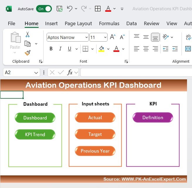
This is the airline operations dashboard we would give a new head of operations first. It covers the KPIs that move an airline’s monthly result: is the schedule running on time, are the aircraft flying enough hours, how much fuel each flight burns, and how full the cabins are. You pick a month from a dropdown, and every KPI shows its MTD and YTD actual against target and against the previous year, with up and down arrows.
Who it is for: airline operations managers, fleet managers, charter and regional operators, and aviation analysts who already report in Microsoft Excel.
What is inside:
- 10 pre-loaded KPIs: Flight Punctuality, Aircraft Utilization (hours per day), Fuel Efficiency (litres per flight), Maintenance Costs, Passenger Load Factor, Operational Efficiency, Baggage Handling Time, Customer Satisfaction, On-time Departure Rate and Crew Productivity
- A home sheet with navigation buttons, a Dashboard, a KPI Trend sheet, and Actual, Target and Previous Year input sheets
- A KPI Definition sheet that records each KPI’s group, unit, formula and whether it is upper-the-better (UTB) or lower-the-better (LTB)
- Works in desktop Excel with no add-ins and no internet connection
Concrete uses: check whether aircraft utilization has slipped below your 10-hour daily plan after a schedule change. You can also see whether fuel burn per flight rose as load factor climbed, show the board YTD on-time departure rate against last year on one screen, and flag that baggage handling time is drifting before complaints arrive. If you want transaction-level analysis by airline, aircraft and seat class as well, the Airlines Dashboard in Excel ($13.99) is the companion file.
Price: $12.99. Buy the Aviation Operations KPI Dashboard in Excel.
Best for: a single monthly scorecard for an airline or charter operator’s flight operations.
2. Airlines KPI Dashboard in Power BI: best for airline leadership
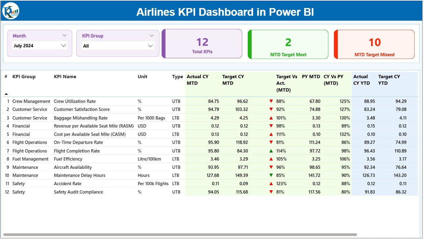
Pick #1 runs the operations review. This one is built for the executive meeting. It is a Power BI report fed by a structured Excel file. The Summary page opens with three cards (Total KPIs, MTD Target Met, MTD Target Missed) above a KPI table with MTD and YTD actuals, targets and previous-year comparisons. Month and KPI Group slicers filter everything.
Who it is for: airline management, finance and cost-control teams, revenue management and network planning. It also suits any airline already on Microsoft 365 that wants to publish one report to the Power BI Service.
What is inside:
- 12 KPIs across crew, customer service, finance, flight operations, fuel, maintenance and safety, including Crew Utilization Rate, Revenue per Available Seat Mile (RASM), Cost per Available Seat Mile (CASM), Flight Completion Rate and Safety Audit Compliance
- Baggage Mishandling Rate per 1,000 bags and Accident Rate per 100k flights, reported the way regulators and the industry normally quote them
- Three pages (Summary, KPI Trend with combo charts of current year, previous year and target, and a drill-through KPI Definition page)
- The .pbix file plus an Excel dataset with Input_Actual, Input_Target and KPI Definition sheets
Concrete uses: show leadership that CASM rose faster than RASM this quarter, or drill from a missed On-Time Departure Rate into its definition and trend. You can also count how many of the 12 KPIs missed target this month, and share the report on a phone before the morning call. For flight-level analysis by aircraft type, promo and seat class, see the Airlines Dashboard in Power BI ($17.99).
Price: $11.99. Get the Airlines KPI Dashboard in Power BI.
Best for: airline executives who want an interactive, shareable KPI report rather than a workbook.
3. Airport Infrastructure KPI Dashboard in Excel: best for airports
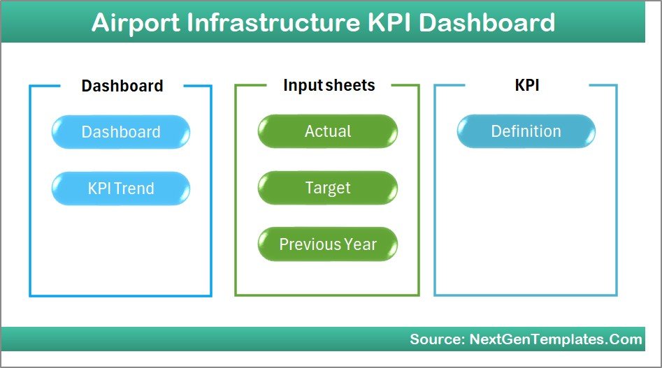
Airlines measure flights; airports measure the infrastructure those flights depend on. This scorecard is written for an airport authority. It covers how many passengers moved through, how busy the gates were, how long security queues took, and how many hours a runway or piece of equipment was out of service.
Who it is for: airport operations managers, infrastructure planning teams, airport maintenance departments, airport finance and the analysts who prepare reports for the airport board or regulator.
What is inside:
- 12 KPIs: On-Time Performance, Safety Incidents, Passenger Throughput (thousands), Equipment Uptime, Passenger Satisfaction, Gate Utilization, Revenue per Passenger, Security Screening Time, Baggage Handling Efficiency, Runway Downtime (hours), Noise Compliance and Cost per Passenger
- Seven worksheets: Home, Dashboard, KPI Trend, Actual Numbers Input, Target, Previous Year Numbers and KPI Definition
- MTD and YTD actual vs target and actual vs previous year, with conditional-format arrows
- KPI groups for operations, safety, maintenance, customer service, finance and environmental compliance
Concrete uses: plot runway downtime hours by month to plan resurfacing outside the peak season. You can also compare cost per passenger with revenue per passenger to brief the airport board, catch security screening time creeping above target before the summer peak, and report noise compliance in the same file as operations. For a transactional view by airline, airport code and region, the Airports Dashboard in Power BI ($17.99) adds delay and baggage-issue analysis.
Price: $14.99. Buy the Airport Infrastructure KPI Dashboard in Excel.
Best for: airport authorities reviewing infrastructure, throughput and service KPIs monthly.
Not sure which to buy? For flight operations, the Aviation Operations KPI Dashboard in Excel is $12.99. For an executive report in Power BI, the Airlines KPI Dashboard in Power BI is $11.99. Running an airport? The Airport Infrastructure KPI Dashboard is $14.99.
4. Aviation Maintenance KPI Dashboard in Excel: best for MRO and engineering

Maintenance drives most of the delays that operations cannot fix. A technical delay grounds the aircraft, then cascades through the rotation. This scorecard gives engineering its own monthly review, with a formula behind every KPI so the quality team and the operations team are measuring the same thing.
Who it is for: maintenance managers, aircraft engineers, maintenance planning and MIS teams, compliance and safety teams at airlines, MROs and charter operators.
What is inside:
- 12 KPIs with documented formulas: Dispatch Reliability, Technical Delay Rate, Regulatory Audit Findings, Maintenance Cost per Flight Hour, Spare Parts Availability, Inventory Turnover, Mean Time Between Failures, Mean Time To Repair, Scheduled Maintenance Compliance, AOG Events, Repeat Defect Rate and Maintenance Man-hours per Check
- KPI groups for aircraft reliability, compliance, cost control, inventory, maintenance efficiency and planning, safety and quality, and workforce productivity
- Seven sheets: Home, Dashboard, KPI Trend, Actual Numbers Input, Target, Previous Year Number and KPI Definition
- No macros and no Power BI. It is plain Excel formulas, so IT approval is simple
Concrete uses: show the director of maintenance that dispatch reliability fell because repeat defects rose, not because of AOG events. You can also track maintenance cost per flight hour against budget by month, prove scheduled maintenance compliance to an auditor in one screen, and see whether spare parts availability explains a rise in mean time to repair. A transactional Aviation Maintenance Dashboard in Excel ($17.99) is available for work-order-level analysis.
Price: $14.99. Buy the Aviation Maintenance KPI Dashboard in Excel.
Best for: engineering and MRO teams reporting reliability and maintenance cost every month.
5. Airline Catering KPI Dashboard in Excel: best for in-flight catering
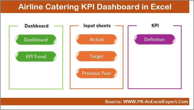
Catering is a narrow function but a visible one: a late catering truck delays a departure, and a poor meal shows up in the satisfaction survey. This scorecard is built for the catering unit or the airline’s catering contract manager. It covers cost, efficiency, quality and food safety in one file.
Who it is for: airline catering managers, flight kitchen operators, in-flight service teams and the cost-control staff who manage catering contracts.
What is inside:
- 12 KPIs, including Total Catering Cost, Passenger Satisfaction, Meal Preparation Time, Wastage Rate, Meals Prepared, Meals Delivered On-Time, Flight Catering Coverage, Food Quality Score and Food Safety Incidents
- KPI groups for compliance, cost, customer, efficiency, operations and quality
- Seven worksheets: Summary with navigation buttons, Dashboard, Trend, Actual Numbers, Target, Previous Year and KPI Definition
- Month selector in cell D3; every comparison recalculates automatically
Concrete uses: tie a rise in wastage rate to a schedule change that left more meals unconsumed, or prove to an airline client that meals delivered on time met the contract target. You can also catch a food safety incident trend before an audit, and compare catering cost with passenger satisfaction to defend a menu upgrade.
Price: $14.99. Buy the Airline Catering KPI Dashboard in Excel.
Best for: flight kitchens and airline catering managers reporting cost, quality and punctuality.
6. Aviation Operations KPI Dashboard in Google Sheets: best value for shared teams
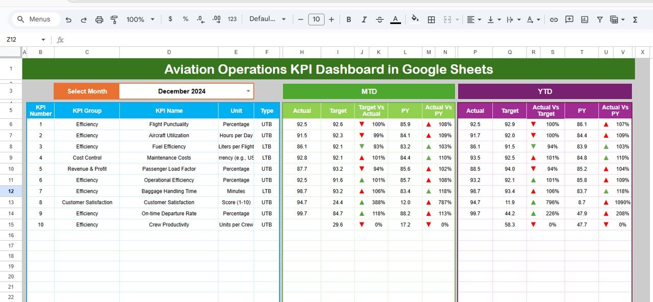
This is the flight-operations scorecard from pick #1, rebuilt in Google Sheets. The difference is collaboration: a station manager in one city and the operations director at head office can edit and read the same scorecard at the same time, without emailing workbooks back and forth.
Who it is for: ground handlers, multi-base charter operators, small airlines on Google Workspace, and aviation service providers reporting the same KPIs for several clients.
What is inside:
- Dashboard tab with a month dropdown in cell D3, MTD and YTD actual, target and previous year, and variance arrows
- KPI Trend tab showing each KPI’s group, unit, type (LTB/UTB), formula and definition, for example Passenger Load Factor = (Passengers ÷ Available Seat Kilometres) × 100
- Actual Number, Target, Previous Year Number and KPI Definition tabs
- Runs in any browser; access is controlled with normal Google Drive sharing
Concrete uses: let each station enter its own monthly actuals while head office watches the consolidated view. You can also give the client airline view-only access to your ground-handling KPIs, and review the dashboard on a tablet on the ramp without installing anything.
Price: $9.99. Get the Aviation Operations KPI Dashboard in Google Sheets.
Best for: distributed aviation teams that want one live, shared scorecard at the lowest price.
Which KPIs should an airline operations dashboard track?
Whichever template you choose, the scorecard is only as useful as its definitions. These are the airline and airport KPIs that appear across the six templates, with the standard formula and a commonly cited benchmark range. Treat the ranges as orientation, not targets, because route network, fleet and business model move them a lot.
| KPI | Formula | Commonly cited range |
|---|---|---|
| On-time performance | Flights arriving within 15 minutes of schedule ÷ scheduled flights | Roughly 75–85% for large US carriers in recent years |
| Passenger load factor | Revenue passenger km ÷ available seat km × 100 | Around 80–85% on full-year global traffic |
| Aircraft utilization | Block hours ÷ aircraft in service ÷ days | Often 9–12 hours a day for short-haul narrow-bodies |
| CASM / RASM | Operating cost (or revenue) ÷ available seat miles | Profit needs RASM above CASM; compare like-for-like stage length |
| Flight completion rate | Flights operated ÷ flights scheduled | Typically above 98% outside disruption periods |
| Dispatch reliability | Departures without a technical delay ÷ total departures | Typically above 99% for modern narrow-body fleets |
| Mishandled baggage rate | Mishandled bags ÷ passengers (per 1,000) | Around 6–7 per 1,000 passengers globally in recent industry reports |
| Turnaround time | On-block to off-block time at the gate | About 25–45 minutes for narrow-body short-haul |
The 15-minute on-time definition is the one used by the US Department of Transportation. You can compare your own numbers with national data in the Bureau of Transportation Statistics airline on-time statistics. Note that the Excel and Google Sheets templates ship with sample numbers, so replace them with your own before you read any variance.
How to choose between them
| If you are… | Choose | Price |
|---|---|---|
| An airline or charter operations manager working in Excel | Aviation Operations KPI Dashboard (Excel) | $12.99 |
| Airline leadership or finance on Power BI | Airlines KPI Dashboard (Power BI) | $11.99 |
| An airport authority or airport operator | Airport Infrastructure KPI Dashboard (Excel) | $14.99 |
| An engineering, MRO or CAMO team | Aviation Maintenance KPI Dashboard (Excel) | $14.99 |
| A flight kitchen or catering contract manager | Airline Catering KPI Dashboard (Excel) | $14.99 |
| A ground handler or multi-station team on Google Workspace | Aviation Operations KPI Dashboard (Google Sheets) | $9.99 |
A simple rule: buy the scorecard for the team that owns the number you are asked about most often. Many airlines combine pick #1 for operations with pick #4 for engineering for $27.98 in total. That puts punctuality and the technical delays behind it side by side in the monthly review.
If your organisation is choosing between formats more generally, our guide to Power BI dashboard templates ranked by industry compares the Power BI option across sectors. Our list of Google Sheets templates for teams explains when browser-based sharing beats a desktop workbook.
When a template is NOT the right answer
An airline operations dashboard in Excel, Sheets or Power BI is a reporting tool. Be clear about what it cannot do before you buy:
- Real-time operations control. If you need live flight tracking, crew legality checks or disruption re-planning by the minute, you need an operations control system. These templates are monthly scorecards that you update with actuals.
- Regulated maintenance records. Airworthiness records, task cards and component tracking under an approved maintenance organisation belong in an approved MRO or CAMO system. The maintenance dashboard reports on that data; it is not the system of record.
- Automated data feeds. None of the six connects to an ACARS, departure control or airport operational database out of the box. Data is entered or pasted monthly, or refreshed from an Excel file in the Power BI version.
- Large network carriers. An airline with hundreds of aircraft and a data warehouse should build on it directly. A template is most useful to regional carriers, charter operators, ground handlers, flight kitchens and small to mid-sized airports.
If those limits don’t apply to you, a $9.99–$14.99 scorecard gives you the monthly KPI review now, and you can still buy enterprise software later.
Frequently asked questions
What is an airline operations dashboard?
An airline operations dashboard is a report that brings flight-operations KPIs into one view. Typical KPIs are on-time performance, aircraft utilization, load factor, fuel efficiency, completion rate and crew productivity. It compares each KPI with its target and the previous year, so managers can see which areas improved or declined this month.
Which KPIs should an airline track every month?
Track on-time performance, flight completion rate, passenger load factor, aircraft utilization, fuel efficiency, CASM and RASM, mishandled baggage rate, customer satisfaction and safety indicators. Engineering should add dispatch reliability, technical delay rate and AOG events, because maintenance problems cause many of the delays operations cannot fix.
How is airline on-time performance calculated?
Divide the number of flights that arrived within 15 minutes of their scheduled time by the total scheduled flights, then multiply by 100. For example, 1,640 on-time arrivals out of 2,000 scheduled flights gives 82 percent. The US Department of Transportation uses the same 15-minute rule.
How do you calculate passenger load factor?
Divide revenue passenger kilometres by available seat kilometres and multiply by 100. If an airline flew 8.2 million revenue passenger kilometres on 10 million available seat kilometres, its load factor is 82 percent. Higher is better, but a very high load factor can mean you are turning away demand.
Can I build an airline operations dashboard in Excel?
Yes. The Aviation Operations KPI Dashboard in Excel already includes 10 flight-operations KPIs, MTD and YTD comparisons, a trend sheet and a KPI definition sheet. You enter monthly actuals, targets and previous-year numbers, choose a month from the dropdown, and every comparison and arrow updates automatically.
Excel, Google Sheets or Power BI: which suits aviation teams?
Choose the tool your team already uses. Excel suits one owner preparing a monthly report. Google Sheets suits several stations entering data into one shared file. Power BI suits leadership teams that want interactive drill-through and a report published to phones and the Power BI Service.
Do these templates work for airports as well as airlines?
Yes. The Airport Infrastructure KPI Dashboard is built for airport authorities, with gate utilization, runway downtime, passenger throughput, security screening time, noise compliance and cost per passenger. The aviation operations templates also suit ground handlers, because they track baggage handling time and on-time departure.
How much do these aviation templates cost?
The six templates cost between 9.99 and 14.99 US dollars as one-time purchases, with no subscription. Buying the operations and maintenance scorecards together costs 27.98 dollars. Enterprise airline, MRO and airport software is normally sold on quoted multi-year contracts, often with separate implementation fees.
Can I change the KPIs in these dashboards?
Yes. Each KPI scorecard has a KPI Definition sheet where you can rename a KPI, change its unit, formula and group, and set whether higher or lower is better. Add your own actuals, targets and previous-year values and the dashboard and trend charts follow your definitions.
Get more airline and airport operations templates
Start with the Aviation Operations KPI Dashboard in Excel for $12.99, or add the Aviation Maintenance KPI Dashboard ($14.99) to report operations and engineering side by side. Airport teams should begin with the Airport Infrastructure KPI Dashboard at $14.99.
Browse every template in the NextGenTemplates shop, and watch walkthroughs on the NextGenTemplates YouTube channel.
Looking at another industry? See our restaurant and hospitality dashboard templates for F&B operations, our K-12 school administration templates, the IT asset management dashboards, the production planning dashboard in Power BI, our premium Power BI templates under $20 and the 25 best-selling business templates on NextGenTemplates.