

The 15 healthcare KPIs worth tracking in 2026 span four areas: patient flow (length of stay, bed occupancy, ED wait time, bed turnover), clinical quality (readmissions, mortality, infection rate, patient satisfaction), revenue-cycle (claim denial rate, days in A/R, cost per case, operating margin) and workforce (nurse-to-patient ratio, staff turnover, no-show rate). Each has a defined formula and benchmark, and all are pre-built into the eight NGT dashboards below (from $9.99).
Last updated: September 2026
Key takeaways
- Track healthcare KPIs across four buckets — flow, quality, revenue cycle and workforce — not just finance, or you optimise cost while readmissions climb.
- The single most penalised metric in 2026 is the 30-day readmission rate; a benchmark of 15–18% and a CMS-set expected ratio near 1.0 decide whether you lose reimbursement.
- Bed occupancy has a sweet spot of 80–85% — chasing 100% removes the surge capacity that keeps ED wait times under 30 minutes.
- The Healthcare & Hospital Management Bundle ($79.99) packages all eight dashboards and saves 38% versus buying them one at a time.
- Cheapest entry point is the Hospital Patient Flow Dashboard in Google Sheets at $9.99 — no software licence, opens in any browser.
Healthcare KPI dashboard templates compared
| Template | Format | Best for | Price |
|---|---|---|---|
| Healthcare Performance KPI Dashboard (Best overall) | Excel | A single scorecard for quality + operational KPIs | $14.99 |
| Hospital Patient Flow Dashboard | Excel | Length of stay, occupancy, throughput, bed turnover | $17.99 |
| Healthcare & Hospital Management Bundle (Best value) | Excel (8 templates) | Whole department — save 38% | $79.99 |
| Hospital Patient Flow Dashboard | Power BI | Interactive drill-down and refresh from live data | $17.99 |
| Healthcare KPI Dashboard | Google Sheets | Cloud sharing with no licence | $12.99 |
| Medical Research KPI Dashboard | Excel | Trials, studies and research-output metrics | $14.99 |
| Hospital Patient Flow Dashboard | HTML | Embedding in a portal or intranet | $12.99 |
| Hospital Patient Flow Dashboard | Google Sheets | Lowest-cost start, any browser | $9.99 |
How we picked these
We searched the full NextGenTemplates catalogue of 900+ paid templates for products that calculate the healthcare KPIs in this guide directly — no generic business dashboards retrofitted to a hospital. The eight below were chosen because each one ships with the formulas already wired to input sheets, so you enter actuals and the benchmark comparison, trend line and traffic-light status update automatically.
We excluded free templates (no formula documentation, no support) and single-metric spreadsheets that only chart one number. We prioritised multi-format coverage — the same patient-flow model exists in Excel, Power BI, Google Sheets and HTML — so you can pick the tool your team already runs rather than switching platforms to adopt a dashboard.
The 15 healthcare KPIs to track in 2026
Below is the reference table, then a short entry for each metric: a one-sentence definition, the exact formula, a realistic benchmark range, and the mistake teams most often make. Benchmarks are US acute-care norms; adjust for your setting and case mix.
| # | Metric | Formula | Benchmark | Where to see it |
|---|---|---|---|---|
| 1 | Average Length of Stay (ALOS) | Total inpatient days ÷ Total discharges | 4.5–5.5 days | Patient Flow Dashboard |
| 2 | Bed Occupancy Rate | (Occupied bed-days ÷ Available bed-days) × 100 | 80–85% | Patient Flow Dashboard |
| 3 | ED Wait Time (door-to-provider) | Provider time − Arrival time | < 30 min | Patient Flow Dashboard |
| 4 | 30-Day Readmission Rate | (30-day readmissions ÷ Discharges) × 100 | 15–18% | Healthcare Performance KPI |
| 5 | Patient Satisfaction (HCAHPS top-box) | Top-box responses ÷ Total responses × 100 | ≥ 70% “would recommend” | Healthcare Performance KPI |
| 6 | Risk-Adjusted Mortality Rate | (Deaths ÷ Admissions) × 100; O/E ratio ≈ 1.0 | 1.5–2.5% | Healthcare Performance KPI |
| 7 | Hospital-Acquired Infection (HAI) Rate | (HAIs ÷ Patient-days) × 1,000; SIR < 1.0 | SIR < 1.0 | Healthcare Performance KPI |
| 8 | Bed Turnover Rate | Discharges ÷ Available beds (period) | 5–7 / month | Patient Flow Dashboard |
| 9 | Average Cost per Case | Total operating cost ÷ Number of cases | Trend down | Healthcare KPI (Sheets) |
| 10 | Operating Margin | (Operating income ÷ Operating revenue) × 100 | 2–4% | Healthcare KPI (Sheets) |
| 11 | Claim Denial Rate | (Denied claims ÷ Claims submitted) × 100 | < 5% (best < 2%) | Healthcare KPI (Sheets) |
| 12 | Days in Accounts Receivable | Net A/R ÷ Average daily net revenue | 30–50 days | Healthcare KPI (Sheets) |
| 13 | Nurse-to-Patient Ratio | Nurses on shift ÷ Patients on shift | 1:4 med-surg, 1:2 ICU | Healthcare Performance KPI |
| 14 | Staff Turnover Rate | (Separations ÷ Average headcount) × 100 | < 18% | Healthcare Performance KPI |
| 15 | Appointment No-Show Rate | (No-shows ÷ Scheduled appointments) × 100 | 5–15% | Healthcare KPI (Sheets) |
1. Average Length of Stay (ALOS)
The average number of days an admitted patient stays before discharge. Formula: Total inpatient days ÷ Total discharges. Benchmark: 4.5–5.5 days for US acute care. The mistake teams make: comparing a raw ALOS against a national figure without risk-adjusting for case mix — a tertiary hospital treating complex cases will always look “worse” than a community hospital, so track your own trend and case-mix-adjusted ALOS instead.
2. Bed Occupancy Rate
The share of available beds that are occupied over a period. Formula: (Occupied bed-days ÷ Available bed-days) × 100. Benchmark: 80–85%. The mistake teams make: chasing 100%. Full occupancy sounds efficient but leaves zero surge capacity, so a single busy night blows out ED wait times and forces boarding. Above ~85%, delays rise non-linearly.
3. ED Wait Time (door-to-provider)
Time from a patient arriving in the emergency department to being seen by a provider. Formula: Provider-contact time − Arrival time. Benchmark: under 30 minutes. The mistake teams make: reporting the mean. A handful of fast fast-track cases hides long waits for everyone else — track the median and the 90th percentile, which is where complaints and left-without-being-seen rates come from.
4. 30-Day Readmission Rate
The percentage of discharged patients readmitted within 30 days. Formula: (Unplanned 30-day readmissions ÷ Total discharges) × 100. Benchmark: 15–18% overall; the CMS Hospital Readmissions Reduction Program penalises hospitals whose observed rate exceeds the expected. The mistake teams make: counting planned readmissions (staged procedures, chemotherapy) as failures, which inflates the number and hides the avoidable cases you can actually fix.
5. Patient Satisfaction (HCAHPS top-box)
The share of patients giving the most positive (“top-box”) survey response. Formula: Top-box responses ÷ Total responses × 100. Benchmark: 70%+ on “would definitely recommend”. The mistake teams make: ignoring response bias — very satisfied and very unhappy patients answer at higher rates, so a small sample swings wildly. Segment by unit and track response rate alongside the score.
6. Risk-Adjusted Mortality Rate
In-hospital deaths as a share of admissions, adjusted for how sick patients were. Formula: (Deaths ÷ Admissions) × 100, then compare the observed-to-expected (O/E) ratio against 1.0. Benchmark: 1.5–2.5% raw for acute care; O/E near or below 1.0. The mistake teams make: publishing the raw rate. Without risk adjustment, units taking the sickest patients look dangerous when they may be performing better than expected.
7. Hospital-Acquired Infection (HAI) Rate
Infections patients acquire during their stay, per 1,000 patient-days. Formula: (HAIs ÷ Patient-days) × 1,000; report the Standardised Infection Ratio (SIR). Benchmark: SIR below 1.0 (fewer infections than predicted). See the AHRQ HAI guidance for definitions. The mistake teams make: reporting a raw count instead of a rate per patient-days, so a busy month looks like an outbreak when volume simply rose.
8. Bed Turnover Rate
How many patients each bed serves in a period. Formula: Discharges ÷ Available beds. Benchmark: roughly 5–7 per bed per month, depending on ALOS. The mistake teams make: ignoring turnaround (cleaning) time. A high turnover with slow bed-cleaning still leaves patients waiting in the ED, so pair this with a discharge-to-clean cycle-time measure.
9. Average Cost per Case
Total operating cost divided by cases treated. Formula: Total operating cost ÷ Number of cases. Benchmark: no universal figure — track the trend and compare like service lines. The mistake teams make: excluding overhead and allocated costs, which makes a service line look cheaper than it is and distorts where to invest.
10. Operating Margin
Operating profit as a share of operating revenue. Formula: (Operating income ÷ Operating revenue) × 100. Benchmark: 2–4% for non-profit hospitals. The mistake teams make: confusing operating margin with net margin — investment income and one-off gains flatter net margin and hide a weak core operation.
11. Claim Denial Rate
The share of submitted claims a payer denies on first pass. Formula: (Denied claims ÷ Claims submitted) × 100. Benchmark: under 5%, with best-in-class below 2%. The mistake teams make: tracking one blended number. Denials cluster by payer and reason code — segment them or you never find the two root causes driving most of the lost revenue.
12. Days in Accounts Receivable (A/R)
How long it takes, on average, to collect revenue. Formula: Net A/R ÷ Average daily net revenue. Benchmark: 30–50 days. The mistake teams make: reading the single number without aging buckets. A healthy average can hide a growing pile of 90-day-plus receivables that are close to being written off.
13. Nurse-to-Patient Ratio
Nursing staff on a shift relative to patients. Formula: Nurses on shift ÷ Patients on shift. Benchmark: around 1:4 on med-surg and 1:2 in ICU. The mistake teams make: averaging across a whole day, which buries the unsafe night shift under a well-staffed day shift. Measure per shift and per unit.
14. Staff Turnover Rate
The rate at which staff leave and must be replaced. Formula: (Separations ÷ Average headcount) × 100. Benchmark: under 18% overall; registered-nurse turnover runs higher nationally. The mistake teams make: lumping voluntary and involuntary separations together, which hides whether you have a retention problem or a performance-management one.
15. Appointment No-Show Rate
The share of booked appointments where the patient does not attend. Formula: (No-shows ÷ Scheduled appointments) × 100. Benchmark: 5–15% depending on specialty. The mistake teams make: counting cancellations as no-shows. A cancellation frees the slot for rebooking; a true no-show wastes it — the interventions for each are completely different.
The 8 ready-made healthcare KPI dashboards
Every metric above is already calculated in one of these templates. They are ranked by how well they cover the 15 healthcare KPIs out of the box.
1. Healthcare Performance KPI Dashboard in Excel — best overall
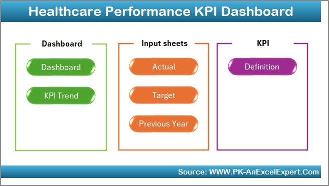
What it is: a single-workbook scorecard that tracks quality and operational healthcare KPIs against target and prior year, with traffic-light status and a trend page.
Who it is for: quality managers and department heads who want one board-ready view rather than ten spreadsheets.
- Actual / Target / Previous-Year input sheets feed every tile automatically
- Readmission, mortality, HAI and satisfaction KPIs pre-wired
- Nurse-to-patient ratio and turnover on the workforce panel
- KPI Trend page for month-over-month movement
Use it to run a monthly quality review, flag any KPI that slips into red, and show the board a readmission trend without rebuilding a chart each cycle. Price: $14.99. View the Healthcare Performance KPI Dashboard →
Best for: the quickest path to a complete healthcare KPI scorecard in Excel.
2. Hospital Patient Flow Dashboard in Excel
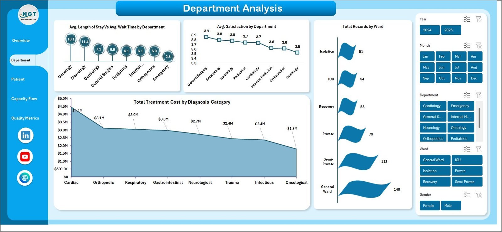
What it is: an operational dashboard built around the flow metrics — average length of stay, bed occupancy, ED wait time and bed turnover.
Who it is for: operations and bed-management teams who live in throughput numbers.
- ALOS and occupancy trended by ward
- Door-to-provider wait time with percentile view
- Admissions vs discharges balance
- Bed turnover and turnaround time
Track occupancy against the 80–85% band, catch the days it tips over, and tie ED delays back to bed availability. Price: $17.99. View the Hospital Patient Flow Dashboard in Excel →
Best for: capacity and throughput management.
3. Healthcare & Hospital Management Bundle — best value
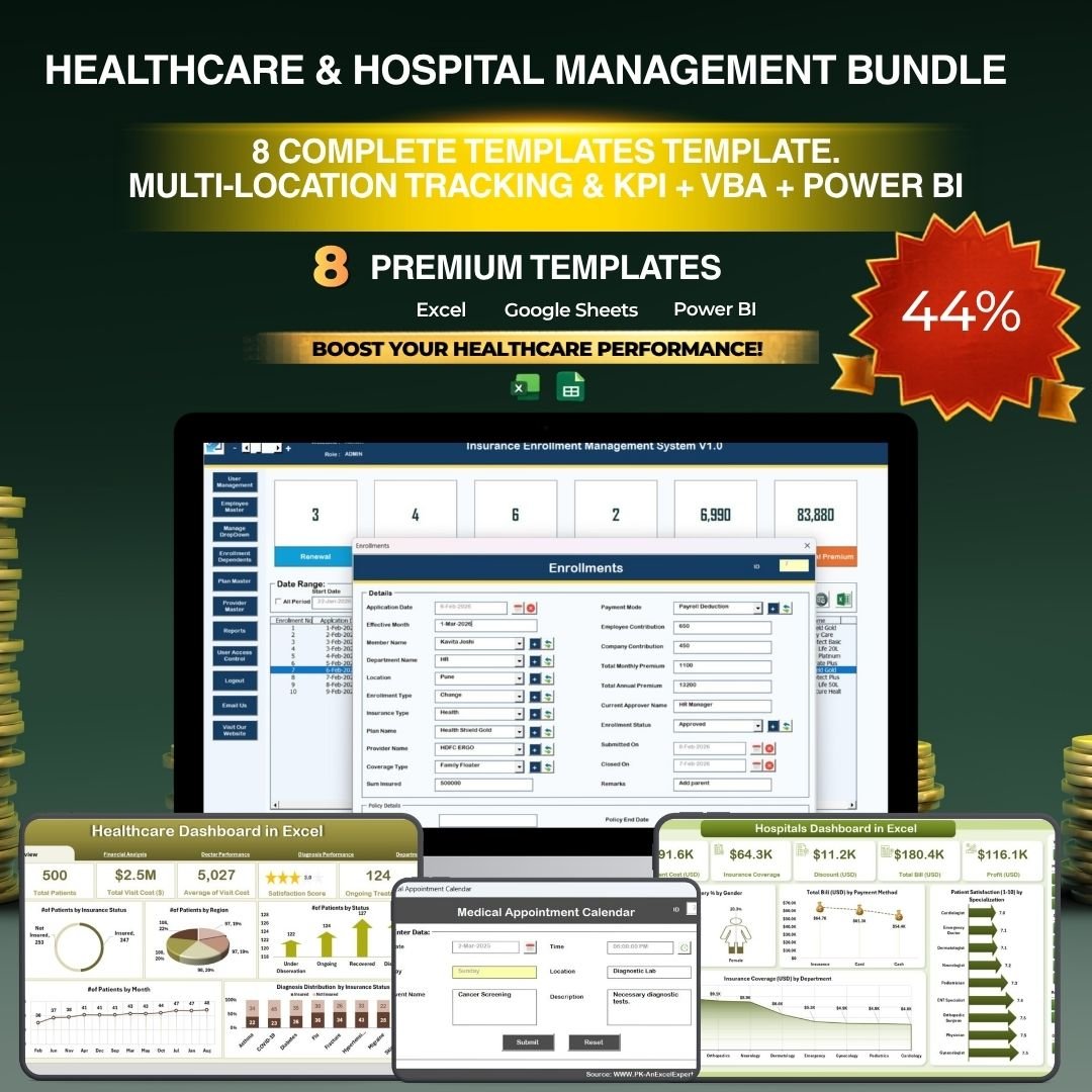
What it is: eight premium healthcare templates in one purchase, covering flow, quality, KPIs and management — a 38% saving versus buying separately.
Who it is for: a whole department or a consultant standing up reporting for a new client.
- All the patient-flow and KPI models in one download
- Consistent formatting so boards read the same way
- One licence for the department
- Best cost per template in the catalogue
If you need more than two of these dashboards, the bundle is cheaper than buying them individually. Price: $79.99. View the Healthcare & Hospital Management Bundle →
Best for: teams that want the complete set at the lowest per-template cost.
4. Hospital Patient Flow Dashboard in Power BI
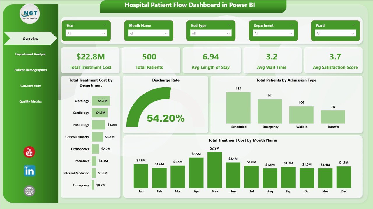
What it is: the same patient-flow model as an interactive Power BI report you can filter and refresh from a data source.
Who it is for: analysts who want drill-down by ward, day and shift, and a refresh from the EHR export.
- Slice occupancy and ALOS by unit and period
- Refresh from CSV or database on a schedule
- Publish to the Power BI service for viewers
- Tooltip detail pages for context
Price: $17.99. View the Power BI patient flow dashboard →
Best for: interactive analysis and scheduled refresh.
5. Healthcare KPI Dashboard in Google Sheets
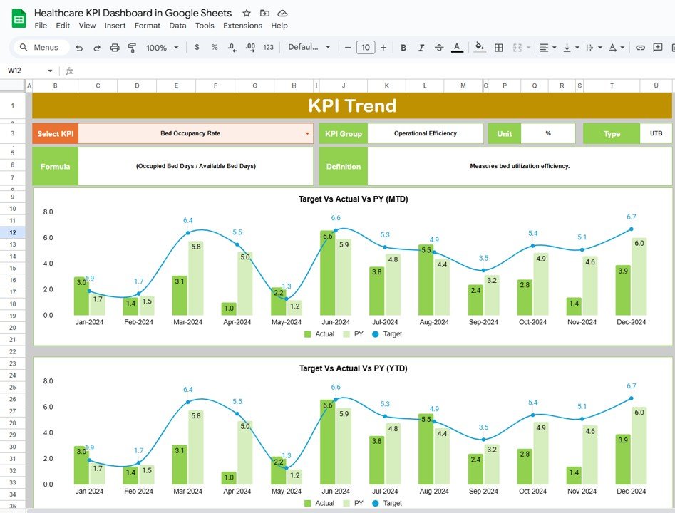
What it is: a cloud KPI dashboard covering the finance and revenue-cycle metrics — cost per case, operating margin, denial rate, days in A/R and no-show rate.
Who it is for: clinics and small groups that share by link and have no Excel or Power BI licence.
- Runs in any browser, nothing to install
- Share view or edit access by link
- Revenue-cycle KPIs pre-built
- Auto-updating charts
Price: $12.99. View the Healthcare KPI Dashboard in Google Sheets →
Best for: cloud-first teams and revenue-cycle tracking.
6. Medical Research KPI Dashboard in Excel

What it is: a KPI dashboard aimed at research teams — enrolment, study milestones, output and funding metrics rather than bedside care.
Who it is for: academic medical centres, trial coordinators and research offices.
- Enrolment and milestone tracking
- Output and publication metrics
- Budget vs actual per study
- Portfolio roll-up view
Price: $14.99. View the Medical Research KPI Dashboard →
Best for: research and clinical-trial reporting.
7. Hospital Patient Flow Dashboard in HTML
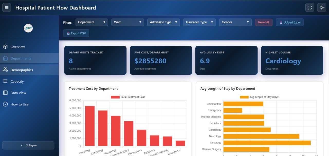
What it is: the patient-flow dashboard as a self-contained HTML page you can host or embed in an intranet.
Who it is for: IT teams that want a display board on a wall screen or inside a portal with no Office dependency.
- Opens in any browser, no licence
- Embed in SharePoint, an intranet or a wall display
- Edit the data file to update
- Lightweight and responsive
Price: $12.99. View the HTML patient flow dashboard →
Best for: portal and wall-display embedding.
8. Hospital Patient Flow Dashboard in Google Sheets
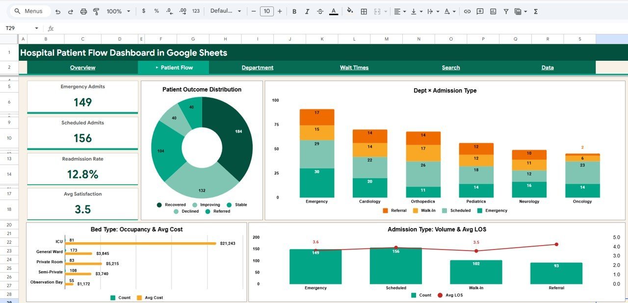
What it is: the lowest-cost way into the patient-flow model — the full flow dashboard in Google Sheets at $9.99.
Who it is for: anyone who wants to start tracking healthcare KPIs today without an Excel or BI licence.
- Cheapest entry point at $9.99
- Cloud-native, share by link
- Same flow metrics as the Excel version
- Works on any device
Price: $9.99. View the Google Sheets patient flow dashboard →
Best for: the lowest-cost start.
For dentistry specifically, we compare six ready-made options in our dental practice management template roundup, including KPI dashboards for new patients, collection rate and chair utilization.
How to choose between them
| If you want to… | Choose | Price |
|---|---|---|
| One scorecard for quality + operational KPIs | Healthcare Performance KPI Dashboard (Excel) | $14.99 |
| Manage capacity, ALOS and ED flow | Hospital Patient Flow Dashboard (Excel) | $17.99 |
| Interactive drill-down and refresh | Patient Flow Dashboard (Power BI) | $17.99 |
| Cloud sharing, no licence | Healthcare KPI Dashboard (Google Sheets) | $12.99 |
| Everything, at the lowest per-template cost | Healthcare & Hospital Management Bundle | $79.99 |
| The cheapest possible start | Patient Flow Dashboard (Google Sheets) | $9.99 |
Rule of thumb: if you need two or more of these dashboards, buy the bundle — it costs less than three of them separately. If you need one, match the format to the tool your team already opens every day. For a broader view of the range, see our healthcare and hospital management templates overview.
When a template is NOT the right answer
A spreadsheet dashboard is the right tool for reporting and review, not for real-time clinical operations. Buy or license dedicated software instead when:
- You need live bed status. A dashboard refreshed from a nightly export cannot run minute-by-minute bed management — that is an EHR/ADT function.
- You are reporting regulated quality measures for submission. CMS and Joint Commission submissions need validated, audited systems, not a manual workbook.
- Data volumes are huge or highly relational. Millions of rows across many facilities belong in a data warehouse with Power BI or a BI platform on top, not a single sheet.
- You need role-based access and an audit trail on PHI. Spreadsheets have weak access control; keep identifiable patient data out of them and track only aggregated KPIs.
For everything short of that — monthly quality reviews, board packs, departmental scorecards — a ready-made template is faster and cheaper than building custom software. These dashboards are designed for de-identified, aggregated KPI values, which is exactly what a review needs.
Running an animal hospital rather than a human one? See our comparison of the best veterinary clinic management templates for 2026, which covers revenue per vet, average transaction charge and no-show tracking.
Frequently asked questions
What are the most important healthcare KPIs to track in 2026?
The core set is the 30-day readmission rate, average length of stay, bed occupancy, patient satisfaction (HCAHPS), risk-adjusted mortality and hospital-acquired infection rate. Add claim denial rate and days in A/R for the revenue cycle, and nurse-to-patient ratio for workforce. Those ten drive most reimbursement and quality outcomes.
What is a good hospital bed occupancy rate?
Around 80–85%. That range keeps beds productive while leaving surge capacity for admission spikes. Running consistently above 85% pushes ED boarding and longer waits up sharply, while sitting well below 80% usually signals excess capacity or demand problems worth investigating.
How is the 30-day readmission rate calculated?
Divide unplanned readmissions within 30 days of discharge by total discharges, then multiply by 100. Exclude planned readmissions such as staged procedures. Compare your observed rate against the CMS expected rate; exceeding it triggers penalties under the Hospital Readmissions Reduction Program.
What is a healthy claim denial rate for a hospital?
Under 5% on first-pass submission, with best-in-class revenue-cycle teams below 2%. Track denials by payer and by reason code rather than as one blended figure — most lost revenue comes from a small number of recurring root causes you can only see once the number is segmented.
Do these dashboards work with my EHR or hospital system?
They read data you export from your EHR, billing or scheduling system as a spreadsheet or CSV. You paste or link the export into the input sheet and the KPIs recalculate. The Power BI version can refresh automatically from a file or database; there is no direct clinical-system integration.
Can I track healthcare KPIs in Google Sheets instead of Excel?
Yes. The Healthcare KPI Dashboard in Google Sheets ($12.99) and the Hospital Patient Flow Dashboard in Google Sheets ($9.99) give you the same metrics in the cloud with no licence, shareable by link and open on any device.
Is it safe to put patient data in a spreadsheet dashboard?
Keep identifiable patient data (PHI) out of these dashboards. They are built for aggregated, de-identified KPI values — counts, rates and averages — which is what a management review needs. For record-level PHI you need a system with role-based access and an audit trail, not a shared spreadsheet.
How often should healthcare KPIs be reviewed?
Operational flow metrics — occupancy, ED wait time, bed turnover — benefit from daily or weekly review. Quality and financial KPIs such as readmissions, mortality, denial rate and margin are reviewed monthly against target and prior year, which is how these scorecard templates are structured.
What is the difference between the Excel and Power BI patient flow dashboards?
The Excel version is a self-contained workbook you update by editing input sheets — ideal for a monthly pack. The Power BI version is interactive: you filter by ward and period, drill into detail, and refresh from a data source on a schedule. Both cost $17.99; choose the tool your team already uses.
Which template gives the best value for money?
The Healthcare & Hospital Management Bundle at $79.99. It packs eight premium templates and saves 38% versus buying individually, so it pays off the moment you need three or more of the dashboards in this guide.
Get more healthcare KPI templates
Start with the Healthcare Performance KPI Dashboard ($14.99) for a complete scorecard, or take the whole set with the Healthcare & Hospital Management Bundle ($79.99, save 38%). Browse the full healthcare and hospital management templates collection for more.
Tracking metrics in another function too? See our guides to 15 finance KPIs, 15 sales KPIs, 15 marketing KPIs, 15 HR KPIs and 12 inventory KPIs to track in 2026.
Prefer to watch a dashboard being built? Subscribe to NextGenTemplates on YouTube for walkthroughs of these healthcare KPI templates and more.