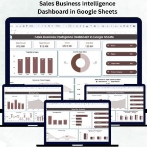
In competitive markets, managing sales targets and productivity requires precision, agility, and visibility. The Sales Productivity & Target Management Dashboard in Google Sheets delivers exactly that — a smart, data-driven tool that enables you to track sales performance, monitor targets, and evaluate productivity across teams, regions, and products in real time.
Built entirely in Google Sheets, this ready-to-use dashboard turns raw data into clear, actionable insights — helping sales leaders and managers make informed decisions without relying on expensive CRM or BI systems.
📘 What Is a Sales Productivity & Target Management Dashboard in Google Sheets?
A Sales Productivity & Target Management Dashboard is an interactive analytics system that visualizes how effectively your sales teams perform against set targets.
It helps answer key questions like:
-
Are regional and individual sales goals being achieved?
-
Which products are overperforming or underperforming?
-
Who are the top-performing sales reps this quarter?
Since it’s built in Google Sheets, this tool provides cloud-based accessibility, automation, and customization — making it ideal for any business size.
📊 Dashboard Structure Overview
The dashboard consists of multiple structured worksheet tabs designed to provide comprehensive, real-time analysis of your sales performance.
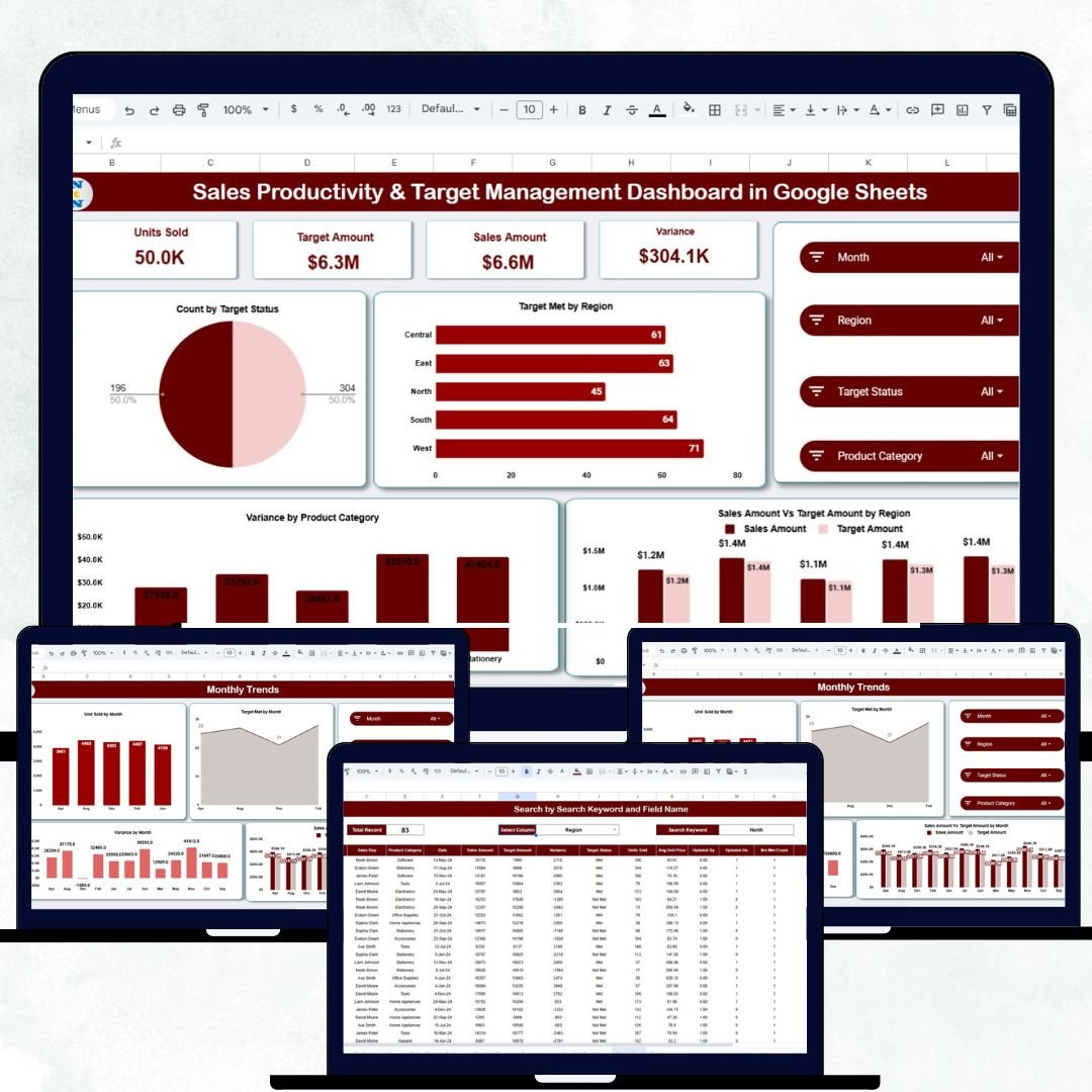
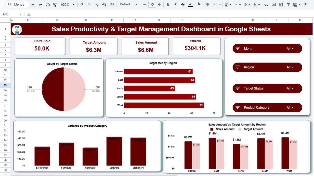
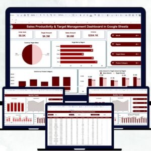
1️⃣ Overview Sheet Tab
The Overview Sheet acts as the command center of the dashboard — presenting your sales health at a glance through KPI cards and dynamic charts.
KPI Cards Display:
-
Units Sold – Total number of items or services sold.
-
Target Amount – The target revenue or volume goal for the selected month.
-
Sales Amount – The total actual revenue achieved.
-
Variance – Difference between actual and target (with up/down arrows and color coding).
Charts in the Overview:
-
📈 Count by Target Status: Visualizes how many products, reps, or regions met their goals.
-
🌍 Target Met by Region: Shows geographical performance across territories.
-
💰 Sales vs Target Amount by Region: Compares side-by-side bars for easy variance analysis.
-
📦 Variance by Product Category: Reveals top-performing and lagging product categories.
All visuals update automatically as new data is entered — ensuring you always have real-time performance visibility.
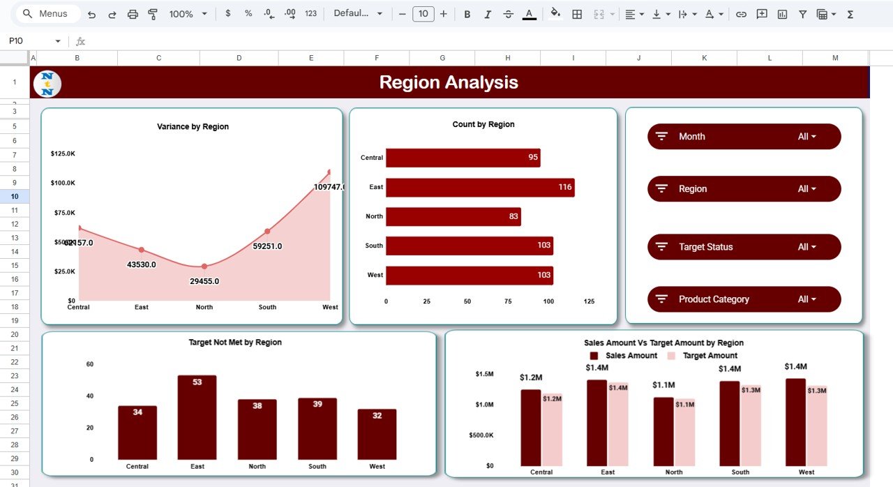
2️⃣ Region Analysis Sheet
The Region Analysis Tab provides a deeper dive into geographic performance.
Charts Include:
-
Variance by Region – Highlights overachieving and underperforming regions.
-
Count by Region – Displays total number of sales activities or deals by location.
-
Sales Amount vs Target Amount by Region – Measures sales contribution per region.
-
Target Not Met by Region – Identifies areas that need corrective action.
This tab empowers regional heads to realign strategies and allocate resources efficiently.
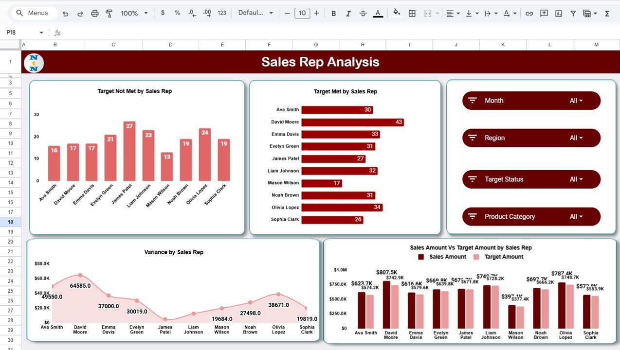
3️⃣ Sales Representative Analysis Sheet
This tab focuses on individual productivity.
Charts Include:
-
Target Not Met by Sales Rep – Detects underperformers needing support.
-
Target Met by Sales Rep – Highlights achievers and goal exceeders.
-
Sales vs Target by Sales Rep – Compares individual results in real time.
-
Variance by Sales Rep – Quantifies performance gaps.
This section drives transparency and motivation within the sales team while aiding performance reviews.
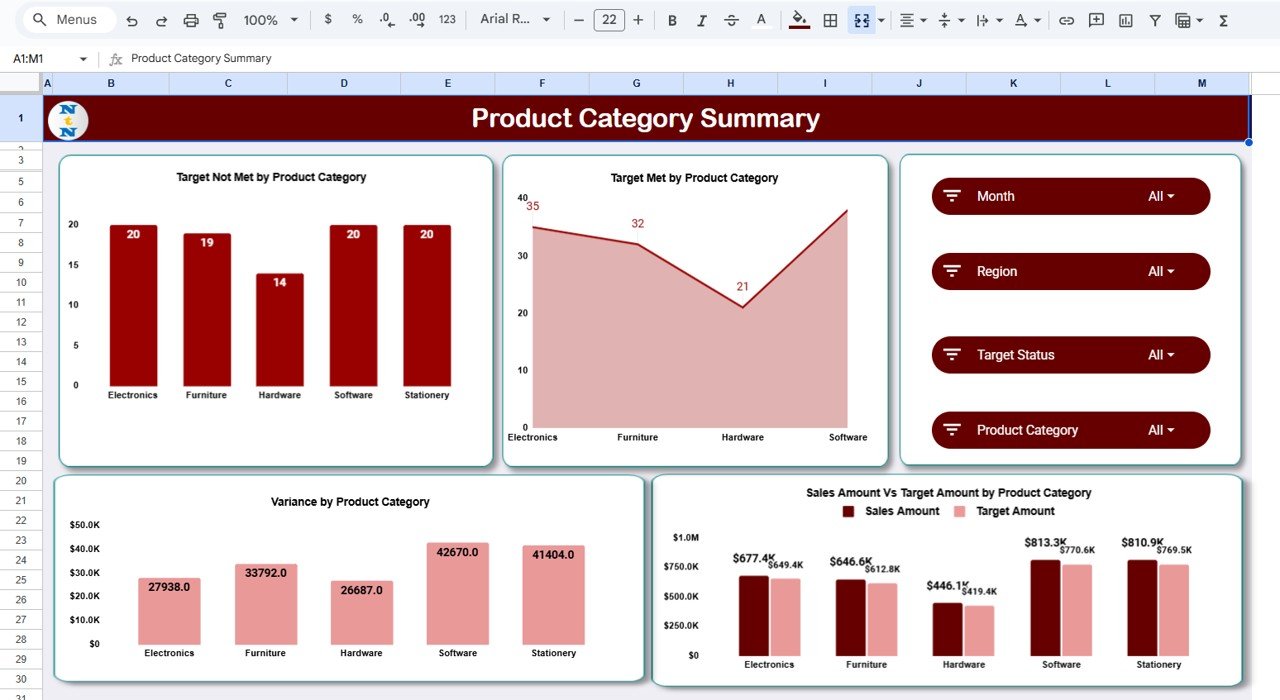
4️⃣ Product Category Summary
Understand which products fuel your success and which ones need attention.
Charts Include:
-
Target Not Met by Product Category
-
Target Met by Product Category
-
Sales vs Target by Product Category
-
Variance by Product Category
Perfect for product managers and marketing strategists, this section reveals insights into market trends and product portfolio efficiency.
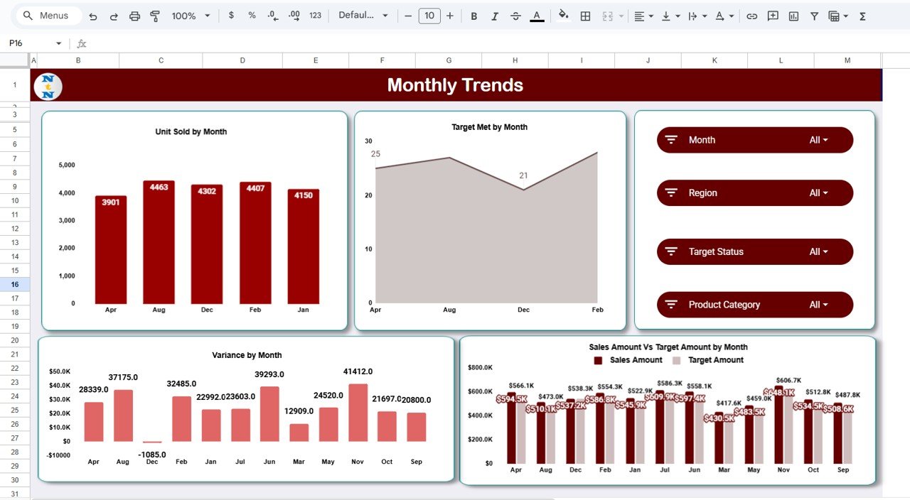
5️⃣ Monthly Trends
The Monthly Trends Tab analyzes sales performance over time to uncover seasonality and growth trends.
Charts Include:
-
📅 Units Sold by Month – Monitors overall sales activity.
-
🎯 Target Met by Month – Highlights months achieving goals.
-
💵 Sales vs Target Amount by Month – Tracks target achievement month-over-month.
-
📊 Variance by Month – Detects fluctuations or emerging opportunities.
This view enables better forecasting and proactive strategy planning.
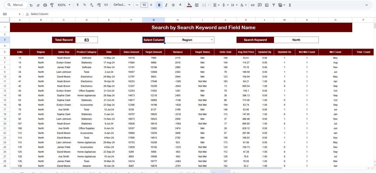
6️⃣ Search Feature
The Search Sheet allows users to instantly filter data by keyword or field, such as “Region,” “Sales Rep,” or “Product.”
For instance:
-
Type “John Smith” → to view one salesperson’s performance.
-
Type “North Region” → to isolate a territory’s sales.
-
Type “Electronics” → to check product category sales only.
This feature saves valuable time for managers reviewing large sales datasets.
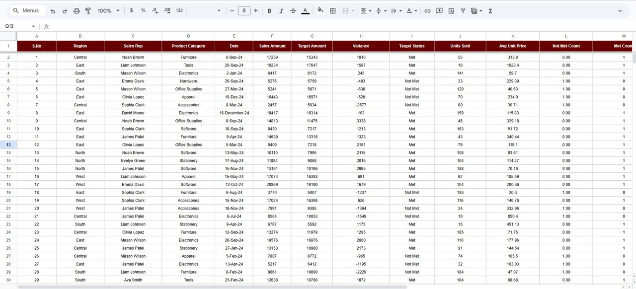
7️⃣ Data Sheet Tab
The Data Sheet is the heart of the dashboard — it contains all the raw data powering charts and summaries.
Columns Include:
Date | Region | Sales Rep | Product Category | Units Sold | Target Amount | Sales Amount | Variance | Target Status
Once entered, all metrics and visuals update instantly across the entire file.
🌟 Advantages of the Dashboard
-
📈 Comprehensive Monitoring: Multi-dimensional insights by region, rep, and product.
-
🎯 Target Alignment: Instantly identifies teams meeting or missing goals.
-
⚡ Real-Time Updates: Charts refresh automatically with every data entry.
-
🤝 Collaborative Cloud Access: Multiple users can update and review together.
-
🧩 Flexible Design: Add custom KPIs or new analysis tabs easily.
-
📊 Data Visualization: Beautiful charts with performance color indicators.
🚀 Opportunities for Improvement
Enhance your dashboard further with:
-
Google Apps Script Automation: Trigger auto-alerts for missed targets.
-
CRM Integration: Sync data directly from Salesforce or HubSpot.
-
Commission Tracking: Add incentive calculations for sales reps.
-
Forecasting Tools: Incorporate predictive charts for upcoming sales.
-
Role-Based Access: Secure sensitive data by user permission.
💡 Best Practices
✅ Update sales data weekly or monthly.
✅ Standardize naming conventions and date formats.
✅ Use SMART targets — specific, measurable, achievable, relevant, time-bound.
✅ Review reports monthly to track trends and refine strategy.
✅ Protect data ranges for accurate performance metrics.
👥 Who Can Use This Dashboard
-
Sales Managers and Team Leads
-
Business Development Heads
-
Regional Managers
-
Product and Marketing Teams
-
Small Business Owners tracking multi-product sales
✅ Conclusion
The Sales Productivity & Target Management Dashboard in Google Sheets is a complete performance management solution — combining real-time analytics, automation, and collaboration into one easy-to-use platform.
It empowers sales leaders to monitor KPIs, optimize productivity, and foster accountability across their teams — without needing any expensive BI software.
If your goal is to align sales performance with strategy, this dashboard is your perfect companion for measurable success.
Click here read detailed Blog post
Watch the step-by-step video Demo:

Reviews
There are no reviews yet.