


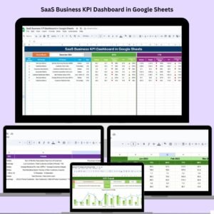
In the high-stakes world of SaaS, every subscription, retention rate, and revenue dollar counts. To scale successfully, you need more than just spreadsheets—you need insights. That’s exactly what the SaaS Business KPI Dashboard in Google Sheets delivers.
This fully interactive, ready-to-use dashboard template helps SaaS businesses of all sizes track their most critical KPIs—such as Monthly Recurring Revenue (MRR), Customer Churn Rate, Lifetime Value (LTV), and Customer Acquisition Cost (CAC). Whether you’re an early-stage startup or a growing SaaS enterprise, this dashboard enables data-driven decisions, faster reporting, and crystal-clear visualizations.

📌 Key Features of the SaaS Business KPI Dashboard
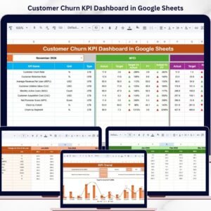
🏠 1. Dashboard Sheet Tab
-
Month Selector (D3): Pick the reporting month to view corresponding MTD and YTD data.
-
Cards Overview: Instantly see your MTD/YTD Actuals, Targets, and Previous Year data.
-
Conditional Formatting: Arrows and color cues show whether KPIs are improving or falling short.
-
Ideal For: Quick performance health-checks at the leadership level.
📈 2. KPI Trend Sheet Tab
-
Dropdown KPI Selector (C3): Choose the KPI you want to examine over time.
-
KPI Details: View KPI Group (e.g., Finance, Customers), Unit, Type (LTB/UTB), Formula, and Definition.
-
Trend Chart: Visualize how metrics evolve monthly to spot patterns or concerns.
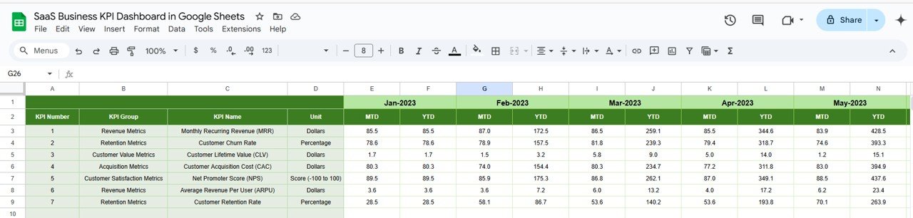
📥 3. Actual Numbers Sheet Tab
-
Editable Data Inputs: Log your MTD and YTD actuals each month.
-
Start Month Selector (E1): Choose the fiscal or calendar start month for automated tracking.
🎯 4. Target Sheet Tab
-
Set Monthly & YTD Goals: Define your KPIs by inputting target values.
-
Auto-Comparison: The dashboard auto-compares targets vs actuals to highlight gaps or achievements.
📊 5. Previous Year Numbers Sheet Tab
-
Enter Historical Data: Compare this year’s performance against the same period last year.
-
Analyze Growth: Identify where your growth strategies are paying off.
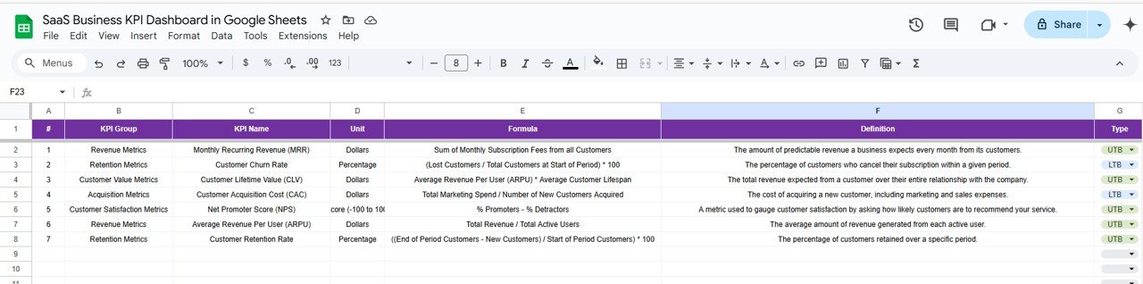
📘 6. KPI Definition Sheet Tab
-
KPI Catalog: Includes Name, Group, Unit, LTB/UTB Type, Formula, and Definition.
-
Great for Teams: Ensure consistency across finance, marketing, and CX teams with clear KPI definitions.
🎯 Sample KPIs Tracked in the Dashboard
-
Monthly Recurring Revenue (MRR)
-
Churn Rate (%)
-
Customer Acquisition Cost (CAC)
-
Customer Lifetime Value (LTV)
-
Net Revenue Retention (NRR)
-
Average Revenue per Account (ARPA)
-
Trial-to-Paid Conversion Rate
-
Customer Engagement Score
-
Support Ticket Resolution Time
-
Active Users (Daily/Monthly)
Each KPI is labeled as UTB (Upper the Better) or LTB (Lower the Better), helping teams stay focused on what truly matters.
🎁 Key Advantages
✅ All-in-One Dashboard: Track finance, retention, acquisition, and user engagement KPIs
✅ Real-Time Performance: Input monthly data and see instant updates across all visuals
✅ Decision-Ready Insights: Spot trends, identify red flags, and allocate resources wisely
✅ Google Sheets-Based: Access anywhere, collaborate in real time—no Excel license needed
✅ Customizable Structure: Add new KPIs or change layout to fit your team’s workflow
💡 Opportunities for Improvement
-
🔗 Automated Integrations: Connect with CRM or financial systems like Stripe or HubSpot for auto-updates
-
📱 Mobile Dashboard View: Track KPIs on the go via Google Sheets mobile app
-
📊 Predictive Analytics: Add forecasting for MRR, churn, or usage behavior
-
📤 Email Sharing & Reports: Set up auto-email reporting for weekly/monthly updates
🧠 Best Practices
-
Update Regularly: Input data monthly to ensure real-time visibility
-
Set Achievable Targets: Align targets with your revenue and retention goals
-
Collaborate Across Teams: Share with Sales, Marketing, and Success teams
-
Use Trends Strategically: React early to churn spikes or conversion drops
-
Keep Definitions Clear: Use the KPI sheet to educate your team on what matters and why
📺 Step-by-Step Demo on YouTube
👉 YouTube.com/@NeotechNavigators

Reviews
There are no reviews yet.