

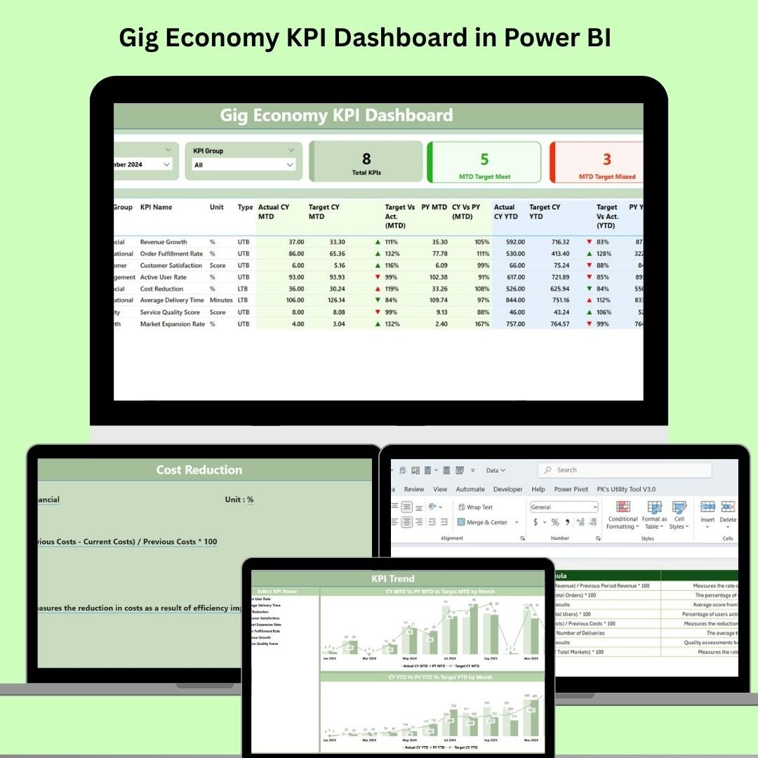
Managing a gig workforce? Whether it’s freelancers, delivery agents, ride-share drivers, or remote specialists—data is your most powerful tool. And when it comes to monitoring performance, hitting targets, and making informed decisions, the Gig Economy KPI Dashboard in Power BI is the ultimate solution. 💼📊
This dynamic dashboard is designed specifically for gig economy managers and operations leaders. Built on Power BI and fueled by Excel, it lets you visualize trends, monitor KPIs in real-time, and track performance without writing a single line of code.
If you’re ready to move from scattered spreadsheets to a centralized, smart dashboard—this is your answer.
✨ Key Features of Gig Economy KPI Dashboard
📍 Interactive Filters – Slice data by month or KPI group to view performance in any dimension
📍 Summary Cards – Instantly see total KPIs, how many hit their target, and which ones didn’t
📍 Target vs Actual Visuals – Clear green ▲ or red ▼ indicators based on performance
📍 Auto-calculated Metrics – Compare current year MTD/YTD with targets and previous years
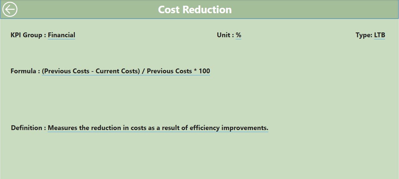
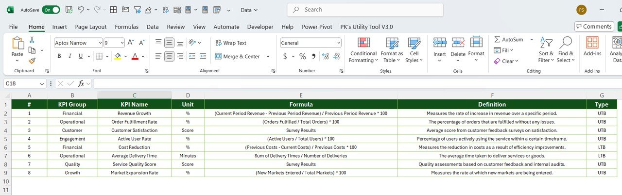
📍 Drill-Through Capability – Right-click any KPI to view its full definition and formula
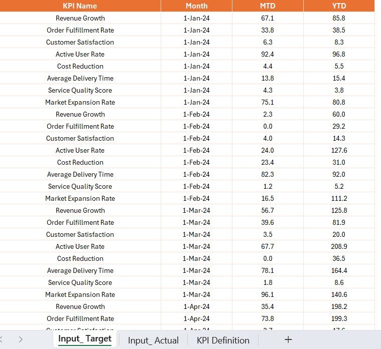
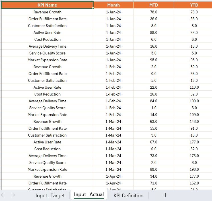
📍 Fully Excel-Driven – Update your KPIs with a few clicks—no database needed
📍 Simple Setup – Just update Excel files, refresh Power BI, and go!
📍 No Coding Required – Perfect for managers, not just data analysts
📂 What’s Inside the Gig Economy KPI Dashboard
This Power BI tool comes with three intelligent dashboard pages, each built for insight and simplicity:
1️⃣ Summary Page – All KPIs in One Place
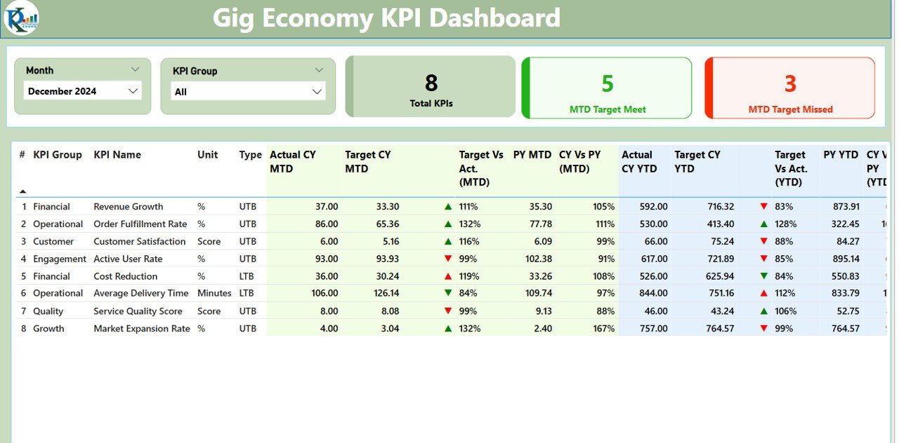
Your KPI command center. Apply filters and monitor MTD/YTD progress, goal achievement, and visual status icons at a glance. Includes:
KPI name, group, unit, and formula
Actual vs Target vs Previous Year
Icon-based performance indicators
CY MTD and CY YTD summaries
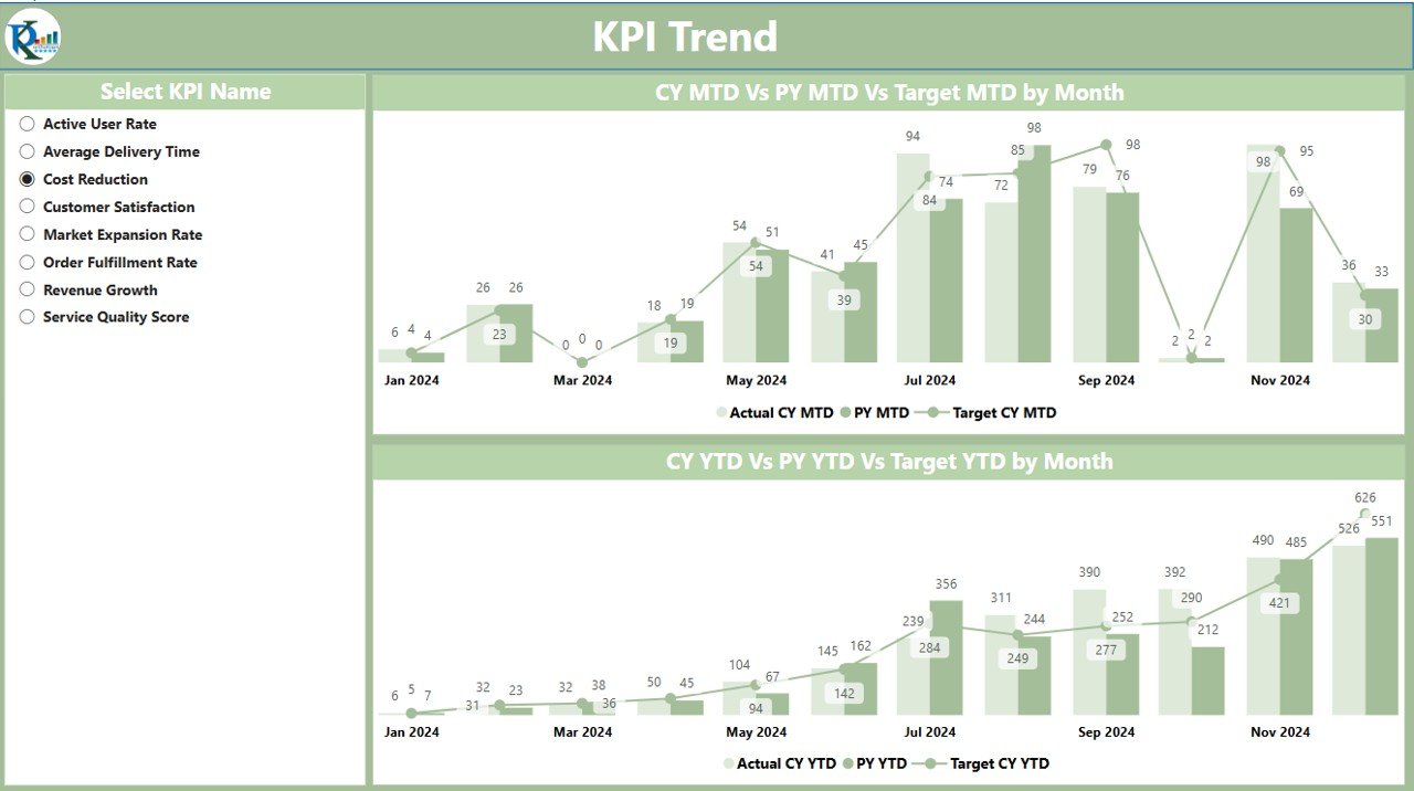
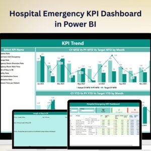
2️⃣ KPI Trend Page – Discover Patterns Over Time
Don’t just track numbers—see the why behind them. This page provides:
Monthly trend charts for each KPI
Year-to-date comparison visuals
Combo charts showing actuals vs targets
Drill-down by metric using slicers
3️⃣ KPI Definition Page – Clarity at Your Fingertips
Want to know exactly what you’re measuring? This hidden page gives you:
KPI name, group, and unit
Full formula
Definition and whether it’s UTB or LTB
Accessed via right-click > Drill Through
🧾 How to Use the Gig Economy KPI Dashboard
💡 Step 1: Open the provided Excel file and enter your KPI Actuals and Targets
💡 Step 2: Add or update KPI definitions as needed
💡 Step 3: Refresh the Power BI dashboard
💡 Step 4: Use filters to slice your data
💡 Step 5: Click any KPI to see definitions and historical performance
It’s that simple—no setup headaches or complex formulas to manage.
👩💼 Who Can Benefit from This Product?
This dashboard is ideal for:
🚴♂️ Gig Economy Platform Managers – Track rider, driver, or freelancer metrics
🛍️ Delivery Ops Teams – Monitor service levels, delivery times, and performance
🧑💻 HR/People Teams – Track onboarding, churn, and retention KPIs
🌐 Remote-First Organizations – Keep tabs on distributed workforce KPIs
🧩 Freelancer Platforms – Analyze satisfaction, task completion, and availability
If your team includes contractors or part-timers—you need this tool.
🔗 Click here to read the Detailed blog post
🎥 Visit our YouTube channel to learn step-by-step video tutorials
Watch the step-by-step video tutorial:
Compatibility and Requirements
- Works in Power BI Desktop, which is free. Microsoft explains the download in Get Power BI Desktop.
- You enter your KPI actuals, targets and definitions in the provided Excel file, so you also need Microsoft Excel.
Frequently Asked Questions
How many dashboard pages are included?
Three pages: Summary, KPI Trend and KPI Definition. The KPI Definition page is hidden and opens through right-click and Drill Through.
How do I update the dashboard with my own numbers?
Open the provided Excel file, enter your KPI actuals and targets, and add or edit KPI definitions if needed. Then refresh the Power BI dashboard.
Do I need to write code or build a database?
No. The dashboard runs from Excel files, so you update the data there and refresh Power BI.
Can I see how a KPI is calculated?
Yes. Right-click a KPI and choose Drill Through to open the KPI Definition page. It shows the KPI name, group, unit, formula, definition and whether it is UTB or LTB.
Is there an Excel or Google Sheets version?
Yes. See the Gig Economy KPI Dashboard in Excel and the Gig Economy KPI Dashboard in Google Sheets.
Related Gig Economy and KPI Templates
- Gig Economy KPI Dashboard in Excel: the same KPIs in Excel
- Gig Economy KPI Dashboard in Google Sheets: the Google Sheets edition
- Gig Economy KPI Scorecard in Excel: a scorecard view of gig metrics
- Operations KPI Dashboard in Power BI: another Power BI KPI dashboard for operations teams
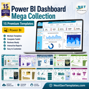
- Power BI Dashboard Mega Collection: 15 Power BI templates in one download
Browse all Power BI KPI dashboards.





Reviews
There are no reviews yet.