

Customer churn rate is the percentage of customers who stop paying over a set period, calculated as customers lost divided by customers at the start, multiplied by 100. In 2026, healthy subscription businesses keep monthly customer churn under 2%; anything above 5% signals a retention problem worth fixing before you spend more on acquisition.
Last updated: September 2026
Key takeaways
- Monthly customer churn rate under 2% is healthy for most subscription businesses; SMB tools often sit at 3–5%, and anything above 5% means retention needs work before more ad spend.
- Track churn and retention as a pair: logo (customer) churn tells you how many accounts leave, while revenue churn and Net Revenue Retention tell you what those accounts were worth.
- Net Revenue Retention above 100% is the single strongest signal of a durable subscription business — best-in-class SaaS runs at 120%+ because expansion outpaces churn.
- The 8 dashboards in this guide already calculate every metric below, from $9.99 (Subscription Retention KPI Dashboard in Google Sheets) to $14.99 (Subscription Retention KPI Dashboard in Excel — our best overall pick).
- You do not need to build churn formulas from scratch: a ready-made KPI dashboard turns a raw subscription export into monthly churn, retention and NRR in minutes.
Churn & retention dashboard templates compared
| Template | Format | Best for | Price |
|---|---|---|---|
| Subscription Retention KPI Dashboard in Excel (Best overall) | Excel | Tracking all 10 churn & retention metrics in one workbook | $14.99 |
| Subscription Business KPI Dashboard in Excel | Excel | MRR, ARR and churn on one screen for founders | $14.99 |
| Customer Churn KPI Dashboard in Excel | Excel | A focused deep-dive on customer churn rate | $14.99 |
| SaaS Renewal KPI Dashboard in Excel | Excel | Renewal rate and gross revenue retention | $14.99 |
| Subscription Retention KPI Dashboard in Power BI | Power BI | Interactive retention analytics for data teams | $11.99 |
| Subscription Business KPI Dashboard in Power BI | Power BI | Board-ready subscription reporting | $11.99 |
| Subscription Retention KPI Dashboard in Google Sheets (Best value) | Google Sheets | Free, cloud-based, team-shared retention tracking | $9.99 |
| Subscription Business KPI Dashboard in Google Sheets | Google Sheets | Collaborative subscription KPIs in the cloud | $12.99 |
How we picked these
We searched the NextGenTemplates catalog of roughly 6,900 published templates for dashboards that actually calculate churn and retention — not generic sales or finance dashboards that mention them in passing. The eight below were chosen because each one takes a raw subscription or customer export and returns at least four of the ten metrics in this guide without manual formula-building.
We excluded single-metric widgets, dashboards locked to one industry (for example gym-only or airline-only retention tools), and anything that required a paid add-on to refresh. Every template here is a self-contained file you own outright, priced between $9.99 and $14.99, and available in Excel, Power BI or Google Sheets so the format matches the tools your team already uses.
The 10 churn & retention metrics to track in 2026
These are the ten metrics every subscription, membership or SaaS business should watch. For each one below you get a one-sentence definition, the exact formula, a realistic 2026 benchmark range, and the mistake teams most often make. The table maps each metric to the dashboard tab where you can see it live.
| Metric | Formula | Benchmark (2026) | Where to see it |
|---|---|---|---|
| 1. Customer Churn Rate | (Customers lost in period ÷ Customers at start) × 100 | <2% monthly healthy; 3–5% SMB; >5% concerning | Customer Churn KPI Dashboard |
| 2. Revenue (MRR) Churn Rate | (MRR lost in period ÷ MRR at start) × 100 | <2% monthly gross MRR churn is strong | Subscription Business KPI Dashboard |
| 3. Net Revenue Retention (NRR) | ((Start MRR + Expansion − Contraction − Churn) ÷ Start MRR) × 100 | 100% floor; 110%+ good; 120%+ best-in-class | Subscription Retention KPI Dashboard |
| 4. Gross Revenue Retention (GRR) | ((Start MRR − Contraction − Churn) ÷ Start MRR) × 100 | 90%+ enterprise; 80–90% SMB | SaaS Renewal KPI Dashboard |
| 5. Customer Retention Rate | ((Customers at end − New customers) ÷ Customers at start) × 100 | 90%+ annual is healthy for most SaaS | Subscription Retention KPI Dashboard |
| 6. Customer Lifetime Value (CLV) | ARPU × Gross margin % ÷ Customer churn rate | LTV:CAC of 3:1 or better is healthy | Subscription Business KPI Dashboard |
| 7. Average Revenue Per User (ARPU) | Total MRR ÷ Number of active customers | No universal figure — track the trend upward | Subscription Business KPI Dashboard |
| 8. Renewal Rate | (Contracts renewed ÷ Contracts up for renewal) × 100 | 85–95% for annual contracts | SaaS Renewal KPI Dashboard |
| 9. Expansion MRR Rate | (Expansion MRR ÷ MRR at start) × 100 | Best SaaS: 20–30% of new MRR from expansion | Subscription Business KPI Dashboard |
| 10. Customer Health Score | Weighted index of usage, support, payment & NPS signals | Composite — set your own red/amber/green bands | Subscription Retention KPI Dashboard |
1. Customer Churn Rate
Definition: The percentage of customers who cancel or stop paying during a period.
Formula: (Customers lost during the period ÷ Customers at the start of the period) × 100.
Benchmark: Under 2% monthly is healthy for most subscription businesses; SMB-focused tools commonly run 3–5%, while best-in-class enterprise SaaS keeps monthly logo churn below 1%. Above 5% monthly usually means the product or onboarding is leaking value.
Common mistake: Counting new customers acquired during the period in the denominator. Churn rate should measure how many of the customers you started with left — mixing in new signups masks the problem and flatters the number.
2. Revenue (MRR) Churn Rate
Definition: The percentage of recurring revenue lost to cancellations and downgrades in a period.
Formula: (MRR lost during the period ÷ MRR at the start of the period) × 100.
Benchmark: Gross MRR churn below 2% per month is strong. Because a handful of large accounts can carry disproportionate revenue, revenue churn often tells a very different story from customer churn.
Common mistake: Watching only customer (logo) churn. If you lose 10 tiny accounts but keep every enterprise contract, logo churn looks bad while revenue churn is fine — and the reverse can hide a serious revenue leak behind a healthy-looking customer count.
3. Net Revenue Retention (NRR)
Definition: The percentage of recurring revenue retained from existing customers over a period, including expansion, contraction and churn.
Formula: ((Starting MRR + Expansion MRR − Contraction MRR − Churned MRR) ÷ Starting MRR) × 100.
Benchmark: 100% is the floor (you replaced what you lost), 110%+ is good, and 120%+ is best-in-class — it means your existing customer base grows revenue even before you add a single new customer.
Common mistake: Including new-customer revenue in NRR. NRR measures only the cohort you already had; adding new logos turns it into a growth-vanity metric instead of a retention metric.
4. Gross Revenue Retention (GRR)
Definition: The percentage of recurring revenue retained from existing customers, excluding any expansion.
Formula: ((Starting MRR − Contraction MRR − Churned MRR) ÷ Starting MRR) × 100.
Benchmark: 90%+ is excellent for enterprise, 80–90% is typical for SMB. GRR can never exceed 100%, which is exactly why it is the honest companion to NRR.
Common mistake: Reporting only NRR to the board. A company can post 115% NRR while GRR sits at 82% — meaning strong upsells are masking a real churn problem underneath. Always show them side by side.
5. Customer Retention Rate
Definition: The percentage of customers you keep over a period — the mirror image of churn rate.
Formula: ((Customers at end of period − New customers acquired) ÷ Customers at start of period) × 100.
Benchmark: 90%+ annual retention is healthy for most SaaS, though consumer subscriptions and memberships run lower. According to Harvard Business Review research on retention economics, even small retention gains compound into large profit swings.
Common mistake: Measuring retention only annually. Monthly cohorts reveal when customers leave — a spike in month-2 churn points straight at onboarding, which an annual number hides completely.
6. Customer Lifetime Value (CLV)
Definition: The total gross-margin revenue you expect from an average customer across their entire relationship.
Formula: (ARPU × Gross margin %) ÷ Customer churn rate.
Benchmark: There is no universal CLV figure, but the LTV:CAC ratio should be 3:1 or better — you should earn at least three dollars of lifetime value for every dollar spent acquiring a customer.
Common mistake: Using revenue instead of gross margin in the formula. CLV built on top-line revenue overstates each customer’s real worth and leads teams to overspend on acquisition.
7. Average Revenue Per User (ARPU)
Definition: The average recurring revenue generated by each active customer in a period.
Formula: Total MRR ÷ Number of active customers.
Benchmark: No cross-industry benchmark applies — what matters is the trend. Rising ARPU alongside stable churn is the healthiest signal a subscription business can show.
Common mistake: Comparing ARPU across companies with different pricing models. ARPU is only meaningful against your own history and your own segments, not against a competitor with a different plan structure.
8. Renewal Rate
Definition: The percentage of contracts up for renewal that actually renew.
Formula: (Contracts renewed ÷ Contracts due for renewal) × 100.
Benchmark: 85–95% is typical for annual B2B contracts. Renewal rate is the leading edge of churn for businesses that bill yearly rather than monthly.
Common mistake: Measuring renewal rate by customer count when contract values vary wildly. A 90% renewal rate that misses your three biggest accounts is a revenue disaster dressed up as a good number — weight it by contract value too.
9. Expansion MRR Rate
Definition: The percentage of recurring revenue growth that comes from existing customers upgrading, adding seats or buying add-ons.
Formula: (Expansion MRR ÷ MRR at start of period) × 100.
Benchmark: In strong SaaS businesses, 20–30% of new MRR comes from expansion rather than new logos. High expansion is what pushes NRR above 100%.
Common mistake: Treating expansion as free growth and ignoring the customers who are contracting. Net expansion (expansion minus contraction) is the figure that actually moves retention.
10. Customer Health Score
Definition: A composite index that predicts churn risk from product usage, support tickets, payment behaviour and satisfaction signals.
Formula: A weighted index — for example (0.4 × usage) + (0.2 × support) + (0.2 × payment) + (0.2 × NPS) — scored red / amber / green.
Benchmark: There is no external benchmark; you set your own red/amber/green bands and validate them against customers who actually churned.
Common mistake: Building a health score and never testing it against real outcomes. If your “green” accounts churn at the same rate as your “red” ones, the score is decoration — recalibrate the weights against historical churn.
The 8 best churn & retention dashboard templates for 2026
Every metric above is already built into the dashboards below. These are ranked by how completely they cover the ten metrics and how quickly you can go from a raw export to a finished retention view.
1. Subscription Retention KPI Dashboard in Excel — best overall
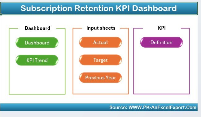
What it is: A complete Excel workbook that turns a subscription export into monthly churn, retention, NRR and cohort views. It is our best overall pick because it covers more of the ten metrics on one screen than any other file here.
Who it is for: Founders, RevOps and finance teams who live in Excel and want the full retention picture without a BI tool.
What is inside:
- Customer churn rate and revenue churn, monthly and annualised
- Net and gross revenue retention with expansion/contraction breakdown
- Cohort retention grid and a customer health score tab
- Editable assumptions so benchmarks match your model
Drop in a 500-row subscription export and the dashboard returns your monthly churn, a 12-month NRR trend and a cohort grid without a single new formula. A SaaS team tracking 2,000 accounts can spot a month-2 onboarding leak in minutes, and a membership business can see which join-month cohorts retain best. Price: $14.99. View the Subscription Retention KPI Dashboard in Excel.
Best for: Teams that want every churn and retention metric in one owned Excel file.
2. Subscription Business KPI Dashboard in Excel
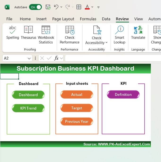
What it is: A founder-facing Excel dashboard that puts MRR, ARR, ARPU, CLV and churn on a single screen.
Who it is for: Early-stage subscription founders and operators who need one board-ready number set.
What is inside:
- MRR and ARR movement with new/expansion/churned breakdown
- ARPU and CLV with an editable LTV:CAC ratio
- Monthly customer and revenue churn
- A clean summary tab you can screenshot for investors
This is the file to reach for when someone asks “how is the business doing?” and wants one page. A pre-seed startup can show investors an ARR bridge and an LTV:CAC of 3.4:1 in the same view, while an operator can watch ARPU climb as churn holds. It pairs naturally with our guide to the 15 finance KPIs to track in 2026. Price: $14.99. View the Subscription Business KPI Dashboard in Excel.
Best for: Founders who want subscription economics and churn on one page.
3. Customer Churn KPI Dashboard in Excel

What it is: A focused Excel dashboard built around the customer churn rate — the single metric this guide is named for.
Who it is for: Retention and customer-success teams whose one job this quarter is to bring churn down.
What is inside:
- Monthly, quarterly and annualised customer churn rate
- Churn by segment, plan and tenure
- Revenue churn alongside logo churn
- Reason-code analysis so you can act on why customers leave
Where the retention dashboard gives you the whole picture, this one goes deep on churn itself. A customer-success lead can slice churn by plan to find that annual plans churn at 1.2% while monthly plans churn at 6%, then build a migration offer around it. Price: $14.99. View the Customer Churn KPI Dashboard in Excel.
Best for: A dedicated push to understand and reduce customer churn rate.
4. SaaS Renewal KPI Dashboard in Excel
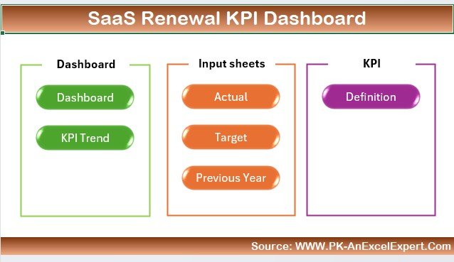
What it is: An Excel dashboard purpose-built for renewal rate and gross revenue retention on annual contracts.
Who it is for: B2B SaaS and services teams that bill yearly and manage a renewal pipeline.
What is inside:
- Renewal rate by count and by contract value
- Gross revenue retention and at-risk contract flags
- Upcoming-renewal calendar with days-to-renewal
- Won/lost renewal analysis
For a company that bills annually, renewals are where churn actually happens. This dashboard shows that a 91% renewal rate by count hides an 84% rate by value because two large accounts lapsed — the kind of insight that changes where the CS team spends its week. Price: $14.99. View the SaaS Renewal KPI Dashboard in Excel.
Best for: Annual-contract businesses that manage renewals as their churn front line.
5. Subscription Retention KPI Dashboard in Power BI
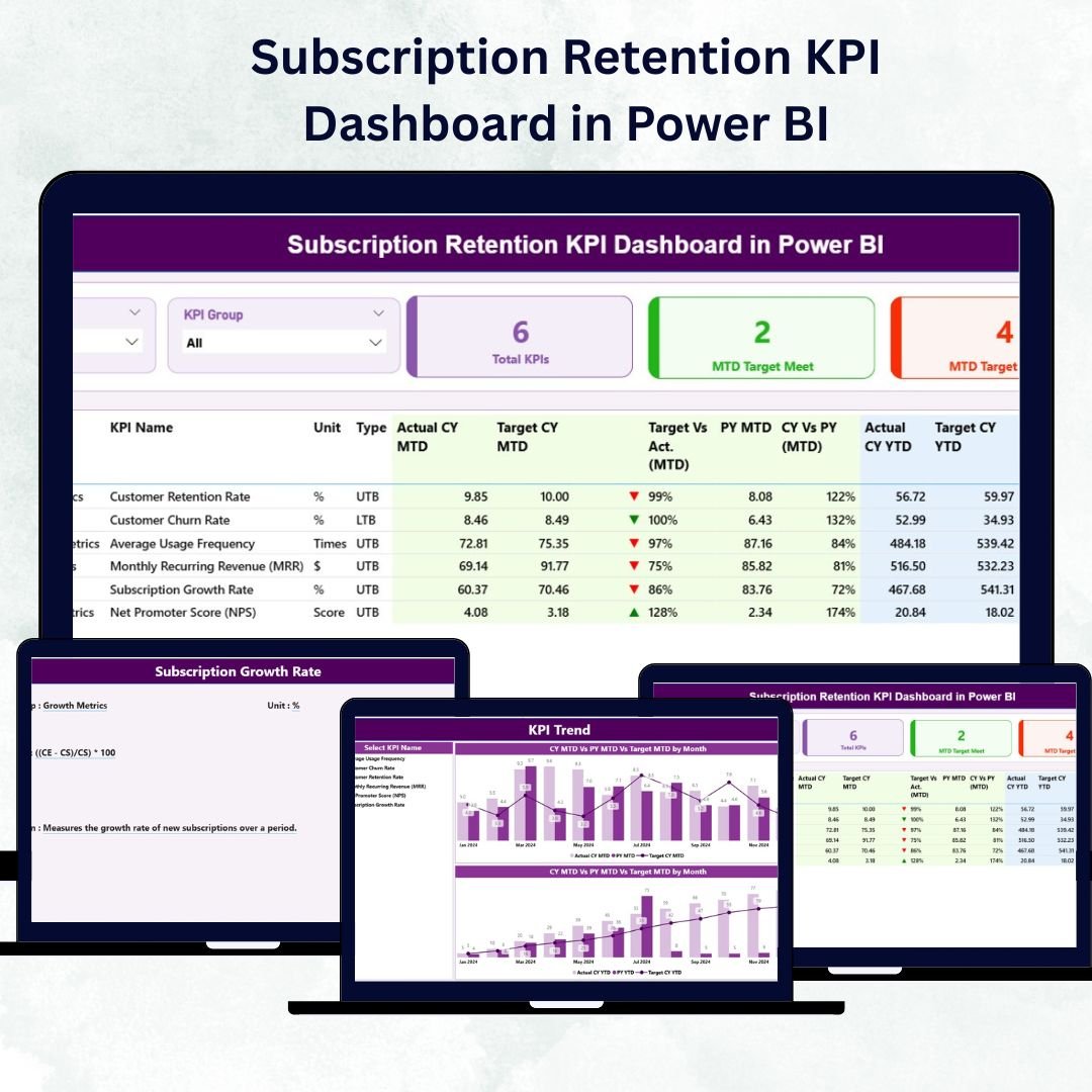
What it is: The retention dashboard rebuilt in Power BI, with interactive slicers for segment, plan and cohort.
Who it is for: Data teams that want to explore churn and retention interactively rather than in static cells.
What is inside:
- Drillable churn, retention and NRR visuals
- Cohort retention heatmap
- Segment and plan slicers
- Refreshable data model you point at your own export
Point it at your subscription table, hit refresh, and every visual updates. An analyst can click a single acquisition channel and watch the entire retention curve re-draw for that cohort — something a static workbook cannot do. Price: $11.99. View the Subscription Retention KPI Dashboard in Power BI.
Best for: Analysts who want interactive, refreshable retention analytics.
6. Subscription Business KPI Dashboard in Power BI
What it is: A board-ready Power BI report covering MRR, ARR, ARPU, CLV and churn with full interactivity.
Who it is for: Companies that already run Power BI and want subscription economics in the same stack.
What is inside:
- MRR/ARR bridge with new, expansion, contraction and churn
- ARPU and CLV cards with trend sparklines
- Customer and revenue churn visuals
- Executive summary page for monthly reporting
This is the version to publish to a Power BI workspace so leadership can self-serve the numbers between board meetings. It slots neatly beside our round-up of 12 customer service KPIs to track in 2026 when you want the support and revenue stories in one place. Price: $11.99. View the Subscription Business KPI Dashboard in Power BI.
Best for: Power BI shops that want self-serve subscription reporting.
7. Subscription Retention KPI Dashboard in Google Sheets — best value

What it is: The retention dashboard in Google Sheets — cloud-based, shareable and, at $9.99, the best value in this guide.
Who it is for: Distributed teams and lean startups that live in Google Workspace and want no software to install.
What is inside:
- Churn, retention and NRR that recalculate as the sheet updates
- Cohort retention grid
- Shareable with view/edit permissions for the whole team
- Works on any device with a browser
Because it lives in the cloud, your CS lead in one time zone and your finance lead in another can look at the same live churn number without emailing a file around. It is the cheapest way to get a real retention dashboard running today. Price: $9.99. View the Subscription Retention KPI Dashboard in Google Sheets.
Best for: Cloud-first teams that want shared retention tracking on a budget.
8. Subscription Business KPI Dashboard in Google Sheets
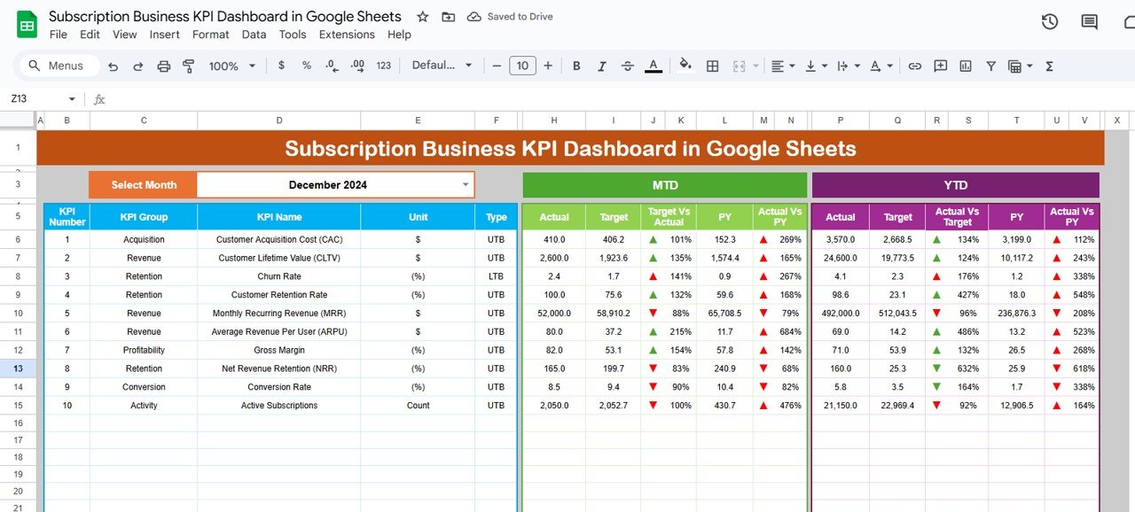
What it is: A collaborative Google Sheets dashboard covering the full set of subscription economics and churn.
Who it is for: Teams that want the founder-level KPI set of the Excel version but in the cloud.
What is inside:
- MRR, ARR, ARPU and CLV
- Customer and revenue churn
- Live collaboration and comments
- A summary tab built for weekly stand-ups
When a whole team needs to see the same MRR and churn figures during a weekly review, this is the version that keeps everyone on one live page. It is a natural fit for startups already running their CRM in a spreadsheet rather than in expensive software. Price: $12.99. View the Subscription Business KPI Dashboard in Google Sheets.
Best for: Collaborative teams wanting subscription KPIs live in Google Sheets.
How to choose between them
| If you… | Choose |
|---|---|
| Want every churn & retention metric in one owned file | Subscription Retention KPI Dashboard in Excel ($14.99) |
| Need MRR, ARR and churn for investors on one page | Subscription Business KPI Dashboard in Excel ($14.99) |
| Are running a dedicated churn-reduction project | Customer Churn KPI Dashboard in Excel ($14.99) |
| Bill annually and manage renewals | SaaS Renewal KPI Dashboard in Excel ($14.99) |
| Already use Power BI and want interactivity | Subscription Retention KPI Dashboard in Power BI ($11.99) |
| Want the cheapest cloud-based, team-shared option | Subscription Retention KPI Dashboard in Google Sheets ($9.99) |
The short version: pick your format first (Excel if you want a self-contained file, Power BI for interactivity, Google Sheets for cloud collaboration), then pick your focus — the retention dashboards give you the widest metric coverage, while the churn and renewal dashboards go deeper on their one job.
When a template is NOT the right answer
A spreadsheet or Power BI dashboard is the right tool when your subscription data lives in exports you can drop into a file and refresh monthly. It is the wrong tool in three situations, and being honest about them saves you a refund and a headache.
- You need churn calculated in real time on live billing data. If you want churn to update the instant a customer cancels in Stripe, Chargebee or Recurly, use a dedicated subscription-analytics platform that connects to your billing system by API. A template refreshes when you refresh it, not automatically.
- You have millions of subscription events. Excel and Google Sheets slow down well before that scale. A data warehouse plus a BI tool is the better home for very high-volume event data — though a Power BI model handles far more than a spreadsheet.
- You need triggered retention workflows, not just measurement. If the goal is to automatically email at-risk customers or fire a Slack alert when a health score drops, that is a customer-success automation job. Use the dashboard to find the at-risk cohort, then hand it to a tool built to act on it.
For everything else — a founder, operator or CS team that wants to see churn, retention and NRR clearly every month without building formulas from scratch — a ready-made dashboard is the fastest, cheapest route there is.
Frequently asked questions
What is a good customer churn rate?
For most subscription businesses, a monthly customer churn rate under 2% is healthy. SMB-focused tools often run 3–5%, while best-in-class enterprise SaaS keeps monthly logo churn below 1%. Above 5% monthly usually signals a product, pricing or onboarding problem worth fixing before spending more on acquisition.
How do you calculate customer churn rate?
Divide the number of customers lost during a period by the number of customers you had at the start of that period, then multiply by 100. For example, losing 15 of 500 starting customers in a month is a 3% monthly churn rate. Exclude new customers acquired during the period from the calculation.
What is the difference between customer churn and revenue churn?
Customer (logo) churn counts how many accounts you lose; revenue churn measures how much recurring revenue you lose. They diverge when account values vary — you can lose many small customers (high logo churn) while keeping revenue steady, or lose one large account (high revenue churn) while logo churn looks fine. Track both.
What is Net Revenue Retention and why does it matter?
Net Revenue Retention (NRR) is the percentage of recurring revenue retained from existing customers, including expansion, contraction and churn. Above 100% means your current customers grow revenue on their own. It matters because 120%+ NRR lets a business grow even with zero new customers — the strongest signal of a durable subscription model.
What is the difference between gross and net revenue retention?
Gross revenue retention (GRR) excludes expansion and can never exceed 100%, so it shows pure churn and contraction. Net revenue retention (NRR) includes expansion and can exceed 100%. Reporting both side by side prevents strong upsells from masking an underlying churn problem — a common board-reporting mistake.
How often should I measure churn and retention?
Measure monthly at minimum. Monthly cohorts reveal when customers leave — a spike in month-2 churn points to onboarding, while later churn points to value delivery. Annual-only measurement hides these patterns. Businesses on annual contracts should also track renewal rate as their leading churn indicator.
Can I track all 10 metrics in Excel or Google Sheets?
Yes. The Subscription Retention KPI Dashboard in Excel ($14.99) and Google Sheets ($9.99) both calculate churn, retention, NRR, GRR and cohort views from a subscription export. You drop in your data and the formulas return every metric — no manual formula-building required.
What is a healthy Net Revenue Retention rate in 2026?
100% is the floor, 110%+ is good, and 120%+ is best-in-class. A rate under 100% means your existing customer base is shrinking in revenue terms and you are relying entirely on new customers to grow, which is expensive and fragile.
How do churn and retention metrics affect customer lifetime value?
Churn rate is the denominator of the CLV formula (ARPU × gross margin ÷ churn rate), so lowering churn directly raises lifetime value. Halving your churn roughly doubles CLV, which is why retention improvements often pay back faster than acquisition spend.
Which dashboard should a small subscription startup buy first?
Start with the Subscription Retention KPI Dashboard in Google Sheets at $9.99 — it is the cheapest way to get churn, retention and NRR running in the cloud, and it shares easily across a small team. Move to the Excel or Power BI versions as your data and team grow.
Get more churn & retention templates
All eight dashboards in this guide are ready-made, fully editable, and yours to own outright — from the $9.99 Subscription Retention KPI Dashboard in Google Sheets to our best-overall $14.99 Subscription Retention KPI Dashboard in Excel. Each one turns a raw subscription export into monthly churn, retention and NRR in minutes.
Browse the full range of retention and subscription tools in our customer management and service templates collection, and see the same series format applied to hiring in our 10 recruitment KPIs to track in 2026 guide. For walkthroughs of these dashboards in action, subscribe to the NextGenTemplates YouTube channel.