


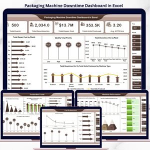
The Packaging Machine Downtime Dashboard in Excel tracks 5 headline KPIs across 5 interactive analysis pages, with 15+ pre-built charts and multiple slicers driving every view. Setup takes under 10 minutes — just replace the sample data in the Data sheet, refresh pivots, and every dashboard page updates automatically.
🌍 Join 8,400+ teams in 40+ countries using Nextgen Templates to replace paid SaaS tools with one-time-purchase Excel, Google Sheets, Power BI, and HTML templates.
✅ Instant download · One-time payment · No subscription · No per-user fees · Lifetime access
🔑 Key Features of Packaging Machine Downtime Dashboard in Excel
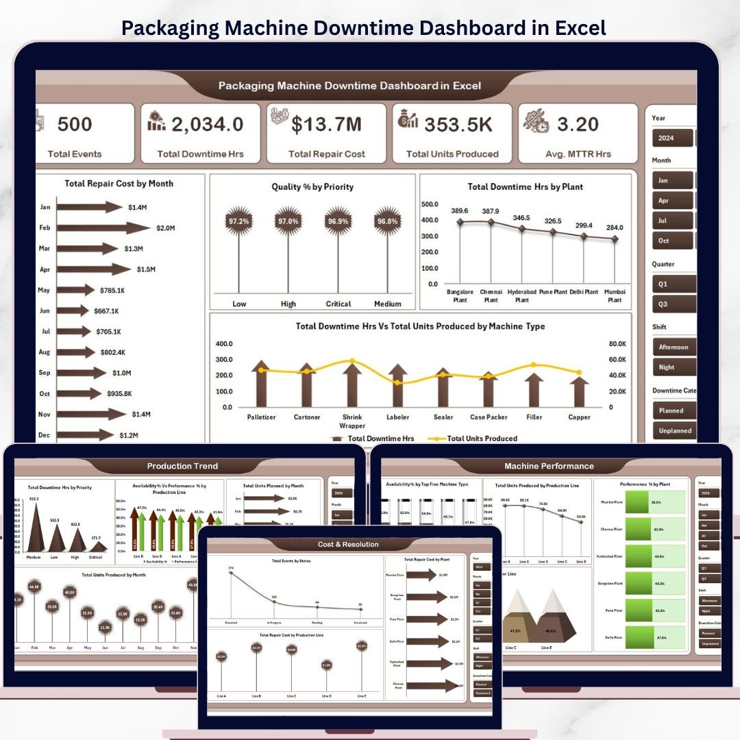
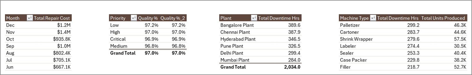
📊 5 Headline KPI Cards — The Overview page displays Total Events, Total Downtime Hrs, Total Repair Cost, Total Units Produced, and Avg. MTTR Hrs so maintenance managers and plant engineers see the full operational picture in a single glance without running manual reports.
🎛️ Multi-Slicer Filtering — Slicers on every page let you instantly filter the entire dashboard by machine type, plant, production line, priority, or shift without writing any formulas. This Packaging Machine Downtime Dashboard in Excel supports cross-tab analysis across all 5 analysis pages simultaneously.
🏭 Packaging-Specific Downtime Metrics — Availability %, Performance %, MTTR (Mean Time To Repair), Quality % by Priority, Total Repair Cost by Plant, and Total Events by Status — all built specifically for packaging line managers and OEE analysts. This dashboard tracks 5 headline KPIs plus 15+ derived metrics across 5 analysis pages.
🔄 Pivot-Driven Refresh — Every chart across all 5 pages is fed by pivot tables on a hidden Support sheet. Use Data → Refresh All after updating the Data sheet and the entire dashboard recalculates in seconds — no manual editing needed.
📦 What’s Inside the Packaging Machine Downtime Dashboard in Excel
1. Overview Page
The landing page shows 5 KPI cards — Total Events, Total Downtime Hrs, Total Repair Cost, Total Units Produced, and Avg. MTTR Hrs — followed by 4 charts and multiple slicers. 📅 Total Repair Cost by Month tracks repair spend across the year. 🎯 Quality % by Priority reveals which priority levels are producing the highest quality losses. 🏗️ Total Downtime Hrs by Plant compares plant-level downtime for multi-site operations. 🔩 Total Downtime Hrs Vs Total Units Produced by Machine Type shows which machine types are bottlenecking production output.
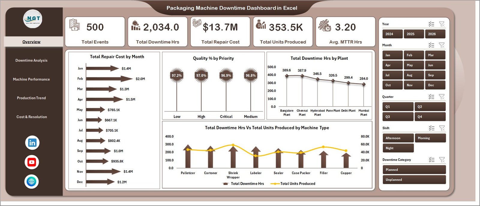
Overview Page
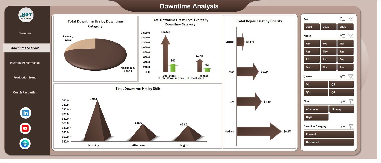
2. Downtime Analysis
Deep-dive into failure root causes and shift patterns. 🔧 Total Downtime Hrs by Downtime Category identifies whether mechanical, electrical, or operator-related failures are driving the most lost hours. 📊 Total Downtime Hrs Vs Total Events by Downtime Category shows whether a category has many short events or fewer but longer breakdowns. 💰 Total Repair Cost by Priority separates emergency repairs from planned maintenance by cost impact. ⏰ Total Downtime Hrs by Shift pinpoints whether night shifts or day shifts experience higher downtime frequency.
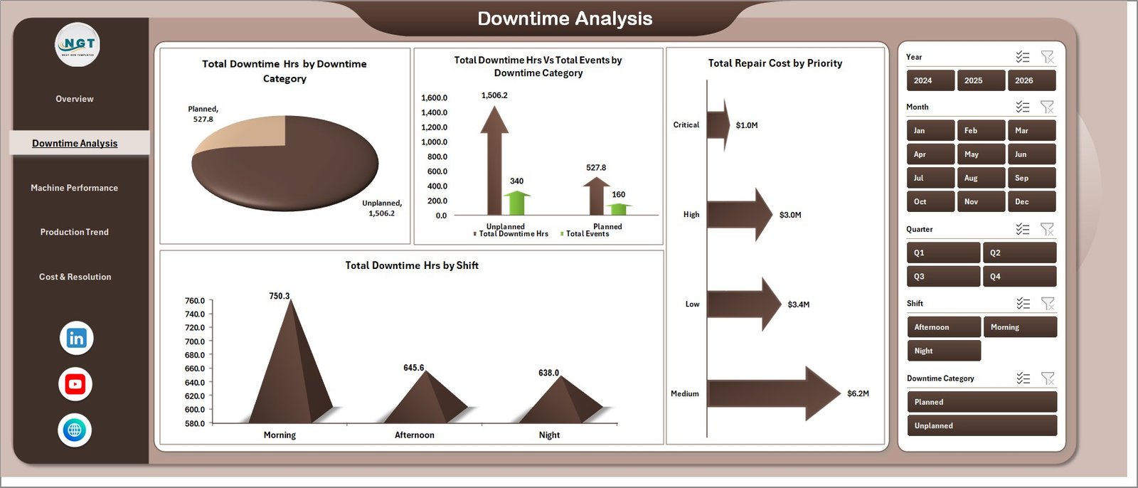
Downtime Analysis
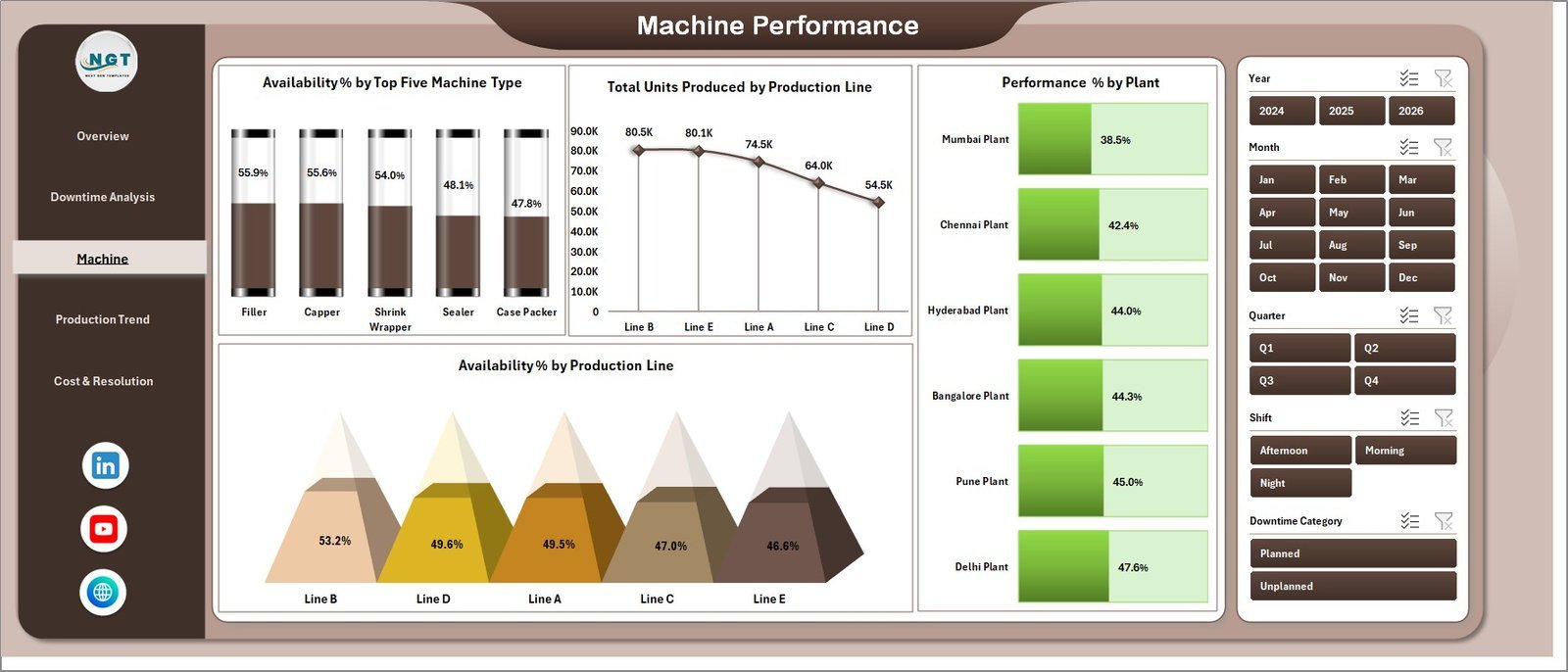
3. Machine Performance
OEE-style performance view at the machine and production line level. ⚙️ Availability % by Top Five Machine Type ranks your highest-impact machines so maintenance teams prioritize resources correctly. 📦 Total Units Produced by Production Line shows which lines are delivering throughput vs. underperforming. 🏭 Performance % by Plant benchmarks plant-to-plant operational efficiency. 🔗 Availability % by Production Line surfaces line-level availability gaps for corrective action.
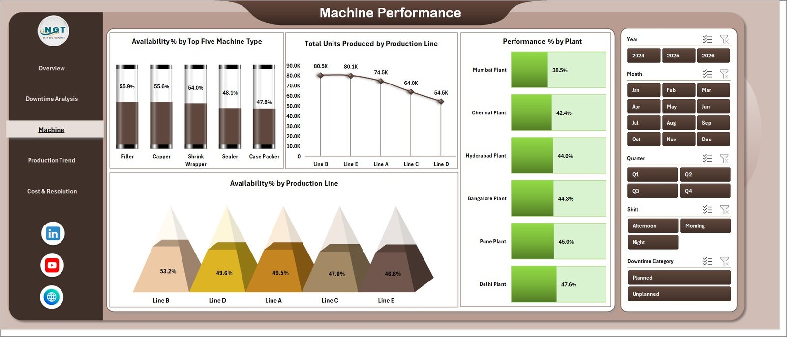
Machine Performance
4. Production Trend
Monthly trend and availability-vs-performance cross-analysis. 📈 Total Downtime Hrs by Priority tracks whether critical-priority events are trending up or down over time. 🔄 Availability % Vs Performance % by Production Line identifies lines where availability is high but throughput is low — a classic hidden capacity problem. 📅 Total Units Planned vs Total Units Produced by Month measures plan adherence and flags months where downtime events caused significant production shortfalls.
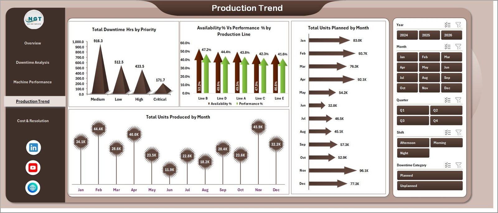
Production Trend
5. Cost & Resolution
Financial and resolution tracking view. 🔖 Total Events by Status splits open, in-progress, and resolved events so maintenance managers see the backlog at a glance. 💵 Total Repair Cost by Production Line identifies which lines are the most expensive to maintain. 🗺️ Total Repair Cost by Plant supports multi-site cost allocation and budget forecasting for maintenance departments.
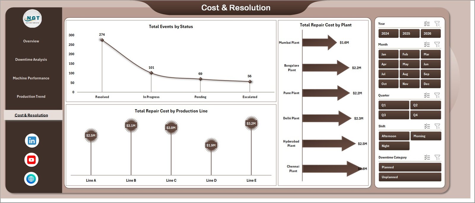
Cost & Resolution
6. Data Sheet
The input layer for the entire dashboard. Add your actual downtime event records in the same column structure as the sample data — Machine ID, Machine Type, Plant, Production Line, Downtime Category, Downtime Hrs, Repair Cost, Units Produced, Status, Shift, Priority, and more. Keep the column headers intact and the dashboard rebuilds automatically on refresh.

Data Sheet tab
7. Support Sheet
The pivot engine powering every chart. All pivot tables sit here, feeding every visual across the 5 analysis pages. Go to the Data tab in the Excel Ribbon and click Refresh All after updating the Data sheet — all pivots refresh and every chart updates automatically. Keep this sheet hidden in production.
Support sheet tab
📊 Packaging Machine Downtime Dashboard in Excel vs. Google Sheets vs. Paid CMMS — Where This Fits
| Feature | Packaging Machine Downtime Dashboard in Excel | Google Sheets Equivalent | Paid CMMS (Limble / UpKeep / Fiix) |
|---|---|---|---|
| Cost | $17.99 one-time | $15–20 one-time | $45–175 / user / month |
| Platform | Microsoft Excel (offline) | Google Sheets (cloud) | Cloud SaaS |
| Setup time | Under 10 minutes | Under 10 minutes | 2–8 weeks onboarding |
| Multi-slicer filtering | ✅ Yes — every page | Limited | ✅ Yes |
| Offline access | ✅ Yes | ❌ No | ❌ No |
| MTTR / Availability % tracking | ✅ Built-in | ✅ Built-in | ✅ Yes |
| Customizable fields | ✅ Fully editable | ✅ Fully editable | Limited by plan |
| Repair cost by Plant / Line | ✅ Built-in | ✅ Built-in | ✅ Yes |
| Year-1 cost at 5 users | $17.99 | $15–20 | $2,700–$10,500 |
For packaging plant teams that want MTTR, availability, and repair cost visibility without paying Limble or UpKeep subscription fees, the Packaging Machine Downtime Dashboard in Excel sits in the sweet spot.
👥 Who This Template Is For — and Who It’s Not For
✅ This template is built for:
- Maintenance managers at packaging plants tracking 10–500 downtime events per month
- Production engineers analyzing machine availability and OEE across multiple lines or plants
- Reliability engineers calculating MTTR and identifying repeat-failure machines
- Operations managers building monthly maintenance KPI reports for leadership
- Small-to-mid packaging companies replacing ad-hoc spreadsheets with a structured downtime tracker
❌ This template is NOT for:
- Enterprise manufacturers needing real-time SCADA integration or ISO 55000-compliant asset management
- Teams requiring multi-user concurrent editing on the same file (use Google Sheets version instead)
- Plants with 50,000+ downtime records annually — Excel’s performance degrades at extreme row counts
⚙️ How to Use the Packaging Machine Downtime Dashboard in Excel
- Download and open the file in Microsoft Excel 2016 or later.
- Go to the Data sheet and replace the sample records with your actual downtime event data — keep the column structure intact.
- Click Data → Refresh All on the Excel Ribbon. All pivot tables on the Support sheet refresh, and every chart across the 5 analysis pages updates automatically.
- Use the slicers on any page to filter by machine type, plant, production line, shift, or priority — the entire page reflows instantly.
- Keep the Support sheet hidden in production so your maintenance team only sees the clean analysis pages.
💼 Real-World Use Cases
Anita is a maintenance manager at a PET bottle packaging plant in Pune running 8 production lines. She uses the Packaging Machine Downtime Dashboard in Excel to track MTTR by machine type, flag which lines have the highest repeat failures, and present the Cost & Resolution page to plant leadership every Monday — without paying ₹4,000/user/month for UpKeep CMMS.
Carlos is the OEE analyst at a food and beverage packaging facility in São Paulo with 4 plants. He loads weekly downtime logs into the Data sheet, refreshes the dashboard, and uses the Machine Performance page to compare Availability % and Performance % across production lines — catching hidden capacity losses before they impact delivery commitments.
Sarah runs operations at a mid-size pharmaceutical packaging company in the UK. She uses the Production Trend page each month to track planned vs. actual units produced and quantify the production loss caused by downtime events — the data feeds directly into her monthly maintenance budget review with the CFO.
❓ Frequently Asked Questions
What KPIs does the Packaging Machine Downtime Dashboard in Excel track?
The Packaging Machine Downtime Dashboard in Excel tracks 5 headline KPIs — Total Events, Total Downtime Hrs, Total Repair Cost, Total Units Produced, and Avg. MTTR Hrs — plus derived metrics including Availability %, Performance %, Quality %, and Repair Cost by Plant across 5 interactive analysis pages.
How long does setup take?
Setup takes under 10 minutes. Replace the sample records in the Data sheet with your actual downtime event data, click Data → Refresh All on the Excel Ribbon, and every chart and slicer across all 5 pages updates automatically. No formulas or VBA knowledge needed.
How does this compare to Limble CMMS or UpKeep?
Limble and UpKeep charge $45–$175 per user per month, reaching $2,700–$10,500 per year at 5 users. The Packaging Machine Downtime Dashboard in Excel is a $17.99 one-time purchase with no subscription, no per-user fees, full offline access, and completely customizable fields and charts.
Can I add more plants, production lines, or machine types?
Yes. Add any new plants, machine types, production lines, or downtime categories directly to your Data sheet. After adding rows, click Refresh All and slicers and charts across all 5 pages automatically pick up the new values — no formula editing required.
Does it work on Mac and Excel Online?
The Packaging Machine Downtime Dashboard in Excel runs on Excel 2016+ for Windows and Mac. Slicers and pivot tables also function in Excel Online, though refreshing large datasets is faster in the desktop version.
Is this a one-time purchase?
Yes — $17.99 today, yours forever. No subscription, no auto-renewal, no per-user fees. Download the file, use it across unlimited packaging lines and plants, and share it with your entire maintenance team.
What Excel version is required?
Microsoft Excel 2016 or later (Windows or Mac) is recommended. Excel 2019, Excel 2021, and Microsoft 365 all work perfectly with all pivot tables, slicers, and charts.
👤 About the Author
Built by PK — Microsoft Certified Professional with 15+ years of Excel, Google Sheets, and Power BI experience. Founder of Nextgen Templates, reaching 300K+ subscribers across YouTube channels (@PK-AnExcelExpert, @NextGenTemplates, @NeoTechNavigators). Every template is hand-built and tested before release.
🔗 Explore Related Templates
💎 Save 40% — Get the Manufacturing Excellence Bundle — 8 Premium Templates (Excel + Power BI) and get enterprise-grade manufacturing analytics for one bundle price.
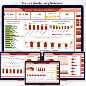
🔩 Contract Manufacturing Dashboard in Excel — Track OEM contract value, production cost, defects, and delivery status across multiple clients.
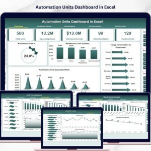
⚙️ Automation Units Dashboard in Excel — Analyze automation performance, output rates, and unit efficiency across production cells.
Browse all Excel Dashboard Templates or the full Manufacturing Templates catalog.
📖 Click here to read the Detailed Blog Post
🎥 Visit our YouTube channel for step-by-step video tutorials
👉 YouTube.com/@NextGenTemplates
📅 Last updated: May 2026
Watch the step-by-step video tutorial:
YouTube


Reviews
There are no reviews yet.