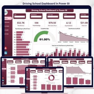
The Driving School Dashboard in Power BI tracks 5 headline KPIs across 5 interactive report pages, with 16 pre-built visuals and multi-dimensional slicers covering branches, instructors, courses, and students. Setup takes under 15 minutes — load your booking data into Power Query, click Refresh, and every visual on every page updates automatically with full cross-filtering and drill-through.
🌍 Join 8,400+ teams in 40+ countries using NextGenTemplates to replace paid SaaS tools with one-time-purchase Excel, Google Sheets, Power BI, and HTML templates.
✅ Instant download · One-time payment · No subscription · No per-user fees · Lifetime access
🔑 Key Features of the Driving School Dashboard in Power BI
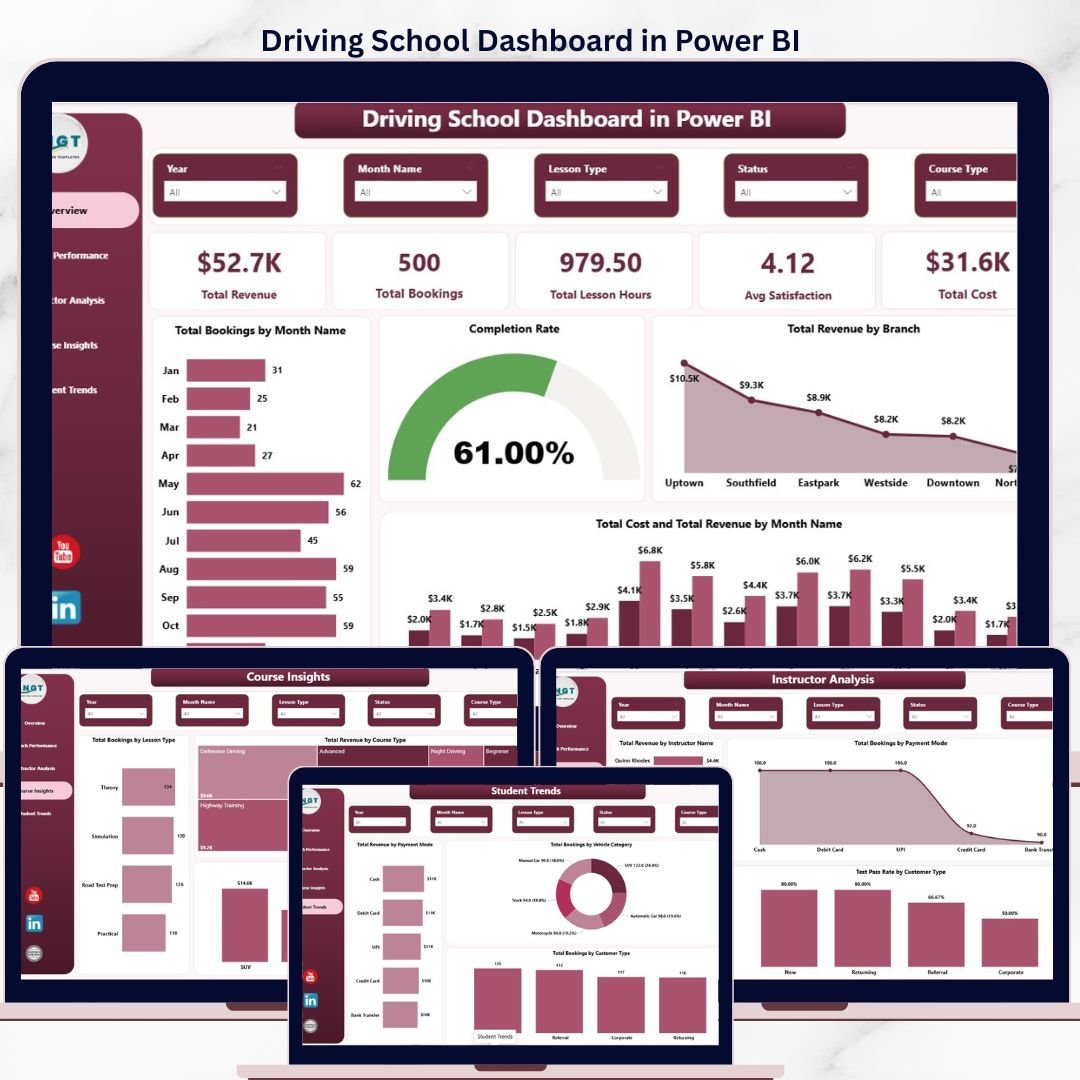
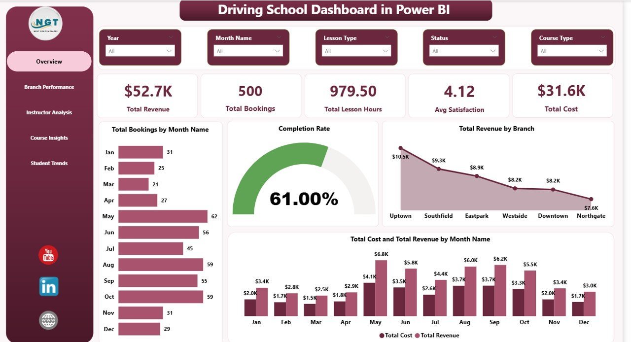
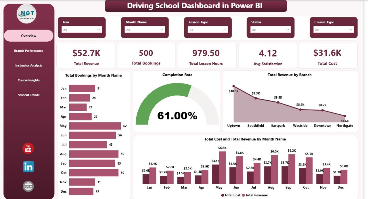
🚗 5 Headline KPI Cards on the Overview Page — Total Revenue, Total Bookings, Total Lesson Hours, Average Satisfaction, and Total Cost give driving school owners an instant pulse check on operational health and profitability in a single canvas.
📊 5 Interactive Report Pages — Overview, Branch Performance, Instructor Analysis, Course Insights, and Student Trends. Each page answers a specific business question, from branch profitability to vehicle category mix and customer-type test pass rates.
🎯 16 Pre-Built Power BI Visuals — Total Bookings by Month, Completion Rate, Total Cost and Total Revenue by Month, Total Revenue by Branch, Total Revenue by Instructor Name, Test Pass Rate by Customer Type, Total Revenue by Vehicle Category, and 9 others — all driven by a single data model with cross-filtered slicers.
🔄 Power Query Auto-Refresh — Replace the sample dataset with your own Excel or CSV booking file, click Refresh in Power BI Desktop, and every card and visual recalculates instantly. No DAX edits, no relationships to rebuild.
🎚️ Cross-Page Slicers — Filter the entire report by Branch, Course Type, Instructor Name, Payment Mode, Customer Type, or date range. Slicers sync across pages so you can move between Branch Performance and Instructor Analysis without losing context.
💼 Publish to Power BI Service — The .pbix file is ready to publish to your Power BI workspace for browser and mobile access. Your team can view the same report on desktop, web, or the Power BI mobile app without buying additional seats from a paid driving school SaaS.
📦 What’s Inside the Driving School Dashboard in Power BI
The .pbix file ships with 5 fully-formatted report pages connected to a clean star-schema data model. Every visual is pre-built — just refresh against your data source.
Overview Page — Displays 5 KPI cards (Total Revenue, Total Bookings, Total Lesson Hours, Avg Satisfaction, Total Cost) and 4 visuals: Total Bookings by Month Name, Completion Rate, Total Revenue by Branch, and Total Cost and Total Revenue by Month Name. Slicers sit above the canvas for report-wide filtering.
Driving School Dashboard in Power BI
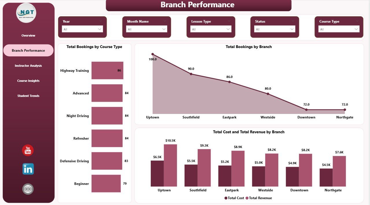
Branch Performance — 3 visuals covering Total Bookings by Course Type, Total Bookings by Branch, and Total Cost and Total Revenue by Branch. Use this page to spot your highest-margin locations and which course types drive bookings at each branch.

Branch Performance
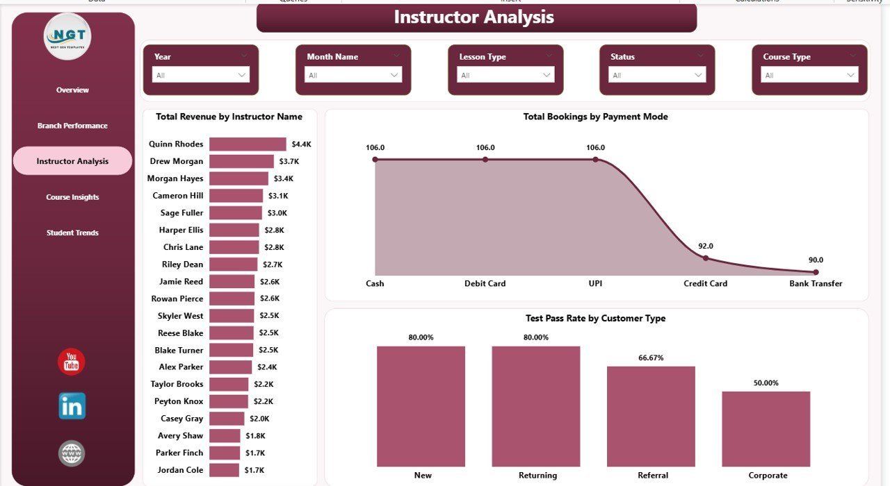
Instructor Analysis — 3 visuals: Total Revenue by Instructor Name, Total Bookings by Payment Mode, and Test Pass Rate by Customer Type. This page is built for training managers who need to rank instructor performance and see which customer segments pass their tests at the highest rates.
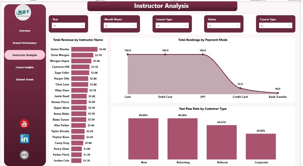
Instructor Analysis
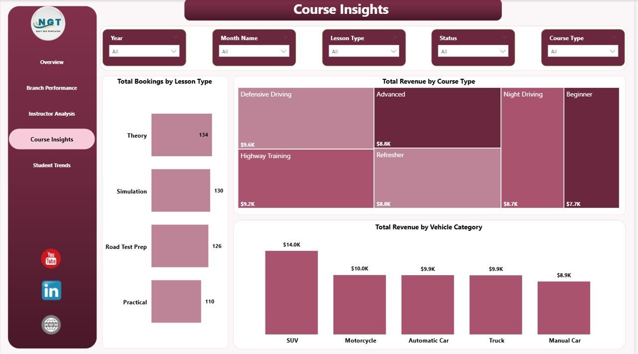
Course Insights — 3 visuals: Total Bookings by Lesson Type, Total Revenue by Course Type, and Total Revenue by Vehicle Category. Helps academy owners understand which course types and vehicle categories generate the most revenue per booking.
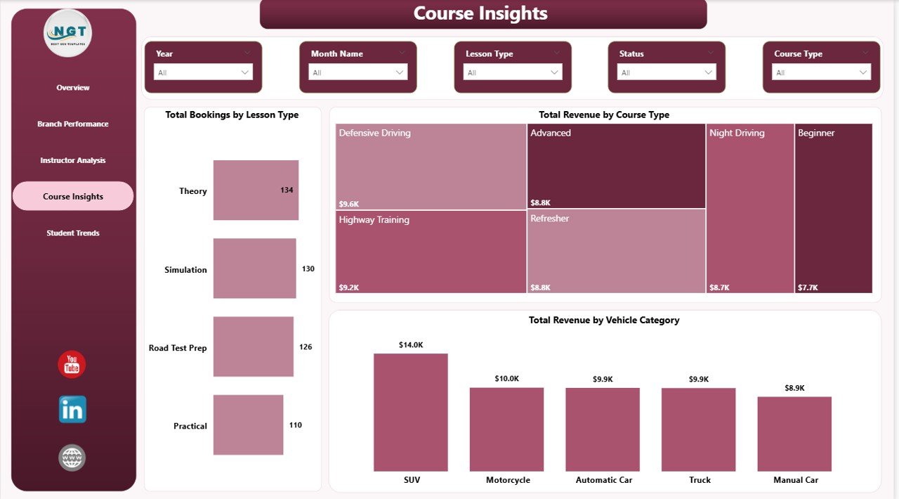
Course Insights
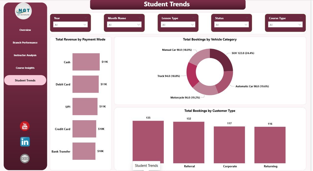
Student Trends — 3 visuals: Total Revenue by Payment Mode, Total Bookings by Vehicle Category, and Total Bookings by Customer Type. Surfaces demographic and payment patterns so marketing spend can be directed at the highest-value student segments.

Student Trends
📊 Driving School Dashboard in Power BI vs. Tableau / Qlik vs. Paid Driving School SaaS — Where This Fits
| Feature | Driving School Dashboard in Power BI | Tableau / Qlik build | Paid Driving School SaaS (DriveScout / TotalDrive) |
|---|---|---|---|
| Cost | $17.99 one-time ✅ | $70+ / user / month + build cost | $49–$129 / month per branch |
| Platform | Power BI Desktop (free) + optional Power BI Service ✅ | Tableau Desktop / Qlik Sense | Web + mobile app |
| Setup time | Under 15 minutes ✅ | 3–6 weeks build cycle | 2–4 weeks onboarding |
| Mobile access | Free Power BI mobile app ✅ | Tableau Mobile / Qlik mobile | Vendor mobile app |
| Customizable KPIs & visuals | Unlimited — it’s your .pbix ✅ | Unlimited | Limited to vendor’s data model |
| Multi-branch analysis | Built-in Branch Performance page ✅ | Available with custom build | Available |
| Instructor ranking & pass-rate analysis | Built-in Instructor Analysis page ✅ | Custom build required | Available |
| Year-1 cost at 3 branches | $17.99 ✅ | $2,520+ in licenses | $1,764–$4,644 |
| Data ownership | 100% local .pbix, no cloud lock-in ✅ | Mixed (cloud + extract) | Vendor cloud only |
For driving schools that want branch, instructor, and course analytics without paying $50–$130 per branch every month, the Driving School Dashboard in Power BI sits in the sweet spot.
👥 Who This Template Is For — and Who It’s Not For
✅ This template is built for:
- Driving school owners running 1–15 branches who already have Power BI Desktop installed and want monthly revenue and branch-level profitability reports
- Training managers tracking instructor performance, test pass rates, and lesson hours across multiple instructors and customer segments
- Multi-vehicle driving academies offering courses across car, motorcycle, truck, and commercial vehicle categories
- Franchise driving school operators who need a consistent KPI report template they can publish to Power BI Service for managers across locations
- Power BI-literate analysts at driver training networks who prefer owning their .pbix locally instead of subscribing to paid driving school SaaS
❌ This template is NOT for:
- Teams that don’t use Power BI Desktop and aren’t willing to install the free Microsoft client
- Driving schools that need an integrated booking engine, payment processor, or student-facing portal (this is reporting, not operations)
- Enterprise networks with 50+ branches needing real-time row-level security across thousands of records (this is a starter star schema, not an enterprise build)
- Users who have never opened Power BI Desktop and aren’t comfortable refreshing data sources
⚙️ How to Use the Driving School Dashboard in Power BI
- Download and install Power BI Desktop free from Microsoft if you don’t already have it.
- Open the .pbix file after purchase. Click “Transform data” to inspect the data source path in Power Query.
- Replace the sample data source by editing the source step to point to your own booking Excel or CSV file with the same column structure.
- Click Refresh on the Home ribbon. Every card and visual on all 5 report pages will update against your data.
- Use the slicers at the top of the Overview page to filter by Branch, Course Type, Instructor, or date range — filters sync across all pages.
- Publish to Power BI Service (optional) so managers can view the report in a browser or via the Power BI mobile app.
💼 Real-World Use Cases
Ravi runs a 4-branch driving school in Pune. He uses the Driving School Dashboard in Power BI every Monday morning to review Total Cost and Total Revenue by Branch and Completion Rate on the Overview page. In the first 90 days of use, he identified that his Kothrud branch had a noticeably lower completion rate, drilled into Instructor Analysis to see Total Revenue by Instructor Name, and rebalanced assignments — saving roughly $14,000 a year he would have otherwise spent on DriveScout’s 4-branch subscription.
Priya manages instructor performance at a commercial vehicle training academy. She uses the Instructor Analysis page to rank her 18 instructors on Total Revenue by Instructor Name and Test Pass Rate by Customer Type. The pass-rate visual revealed that her academy’s pass rate for corporate clients was meaningfully higher than individual students — insight she used to pitch B2B contracts that now account for a significant share of revenue.
Anil operates a motorcycle training school with 2 locations. He uses the Course Insights page’s Total Revenue by Vehicle Category and Total Revenue by Course Type visuals to decide which courses deserve more marketing budget. When he saw which vehicle categories generated the highest revenue, he doubled down on Facebook ads targeting heavy motorcycle license seekers.
❓ Frequently Asked Questions
What KPIs does the Driving School Dashboard in Power BI track?
The Driving School Dashboard in Power BI tracks 5 headline KPIs on the Overview page — Total Revenue, Total Bookings, Total Lesson Hours, Avg Satisfaction, and Total Cost. It also includes 16 deeper analysis visuals across Branch, Instructor, Course, and Student pages covering revenue, cost, completion rate, payment mode, vehicle category, course type, and customer type.
How long does setup take for a new driving school?
Setup of the Driving School Dashboard in Power BI takes under 15 minutes. You install free Power BI Desktop, open the .pbix file, point Power Query at your own booking Excel or CSV file with the same column structure, and click Refresh. Every visual and KPI across all 5 report pages updates automatically — no DAX edits required.
How does the Driving School Dashboard in Power BI compare to DriveScout or TotalDrive?
The Driving School Dashboard in Power BI is a one-time $17.99 reporting template focused on KPI analytics, while DriveScout and TotalDrive are $49–$129 per month per branch full operations platforms. For driving schools that only need analytics and already manage bookings elsewhere, the Power BI dashboard saves $1,500–$4,500 per year at 3 branches.
Can I track multiple branches in the same .pbix file?
Yes. The Driving School Dashboard in Power BI has a dedicated Branch Performance page with Total Bookings by Branch, Total Bookings by Course Type, and Total Cost and Total Revenue by Branch. You can analyze unlimited branches as long as each booking record has a Branch column populated in your source data.
Does it work on Power BI Service and the mobile app?
Yes. The Driving School Dashboard in Power BI publishes cleanly to Power BI Service from Power BI Desktop. Once published, your team can view the report in a browser or on the free Power BI mobile app for iOS and Android — no additional licenses needed beyond standard Power BI access.
Can I add custom visuals or change the existing ones?
Yes. The Driving School Dashboard in Power BI is fully editable in Power BI Desktop. Add new measures with DAX, drag in additional visuals, change the colour theme, or add custom visuals from AppSource. Every chart, KPI card, and slicer is unlocked — you own the .pbix file.
Do I need advanced Power BI skills to use this dashboard?
No. The Driving School Dashboard in Power BI is designed for intermediate Power BI users. If you can install Power BI Desktop, point Power Query at a file, and click Refresh, you can use the dashboard. Advanced features like custom DAX measures and bookmarks are optional for users who want to extend the template.
👤 About the Author
Built by PK — Microsoft Certified Professional with 15+ years of Excel, Google Sheets, and Power BI experience. Founder of NextGenTemplates, reaching 300K+ subscribers across YouTube channels (@PK-AnExcelExpert, @NextGenTemplates, @NeoTechNavigators). Every template is hand-built and tested before release.
🔗 Explore Related Templates
- Driving School Dashboard in Excel — Same KPIs and pages built natively in Microsoft Excel with pivot tables.
- Tutoring Business Dashboard in Power BI — 5-page Power BI report for tutoring businesses with revenue, attendance, and tutor performance.
- Music School Dashboard in Power BI — Sister education-services dashboard for music academies and private studios.
- Coaching & Tutoring Dashboard in Power BI — Multi-page Power BI dashboard for coaching and tutoring institutes.
- Browse our complete library of Power BI Dashboard Templates on NextGenTemplates.
📖 Click here to read the Detailed Blog Post
Watch the step-by-step video tutorial:
🎥 Visit our YouTube channel for step-by-step video tutorials
👉 YouTube.com/@NextGenTemplates


Reviews
There are no reviews yet.