

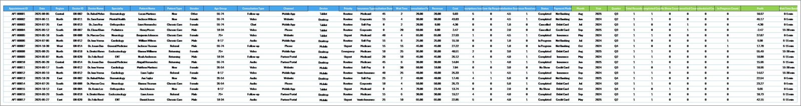
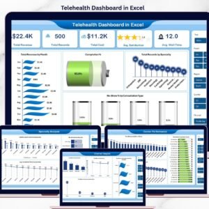
The Telehealth Dashboard in Excel tracks 5 high-level KPIs and 16 interactive charts across 5 analysis pages, covering telehealth revenue, appointment completion, consultation type, specialty mix, doctor performance, and patient demographics. Setup takes under 10 minutes — replace the sample rows in the Data sheet, click “Refresh All” in the Data tab, and every card, chart, and slicer updates automatically.
🌍 Join 8,400+ teams in 40+ countries using NextGenTemplates to replace paid SaaS tools with one-time-purchase Excel, Google Sheets, Power BI, and HTML dashboards.
✅ Instant download · One-time payment · No subscription · No per-user fees · Lifetime access
🔑 Key Features of the Telehealth Dashboard in Excel
📊 5 KPI cards on the Overview page — Total Revenue, Total Records, Total Cost, Avg. Satisfaction, and Avg. Wait Time — update instantly when you refresh the pivots. These five numbers give clinic admins, telehealth program directors, and finance leads a real-time read on financial and patient-experience health in one glance.
🩺 16 pre-built pivot charts across 5 pages covering Specialty Analysis, Doctor Performance, Channel Insights, and Patient Trends. Every chart is driven by a pivot table on the hidden Support sheet, so adding a new row to the Data sheet and clicking “Refresh All” propagates the change across every visual — no formula rewriting, no re-linking.
🎛️ Interactive slicers on every page let you filter by specialty, consultation type, channel, device, patient type, age group, or insurance type and watch the Overview page re-draw in under a second. The slicers make it easy to answer questions like “what’s our no-show rate on video consultations for cardiology patients aged 45-60?” without writing a single formula.
💾 Works 100% offline in Microsoft Excel (2016 or later, including Microsoft 365). No macros, no add-ins, no internet connection required. The workbook is unprotected — you own the file outright and can rename sheets, add columns, or re-skin the dashboard to match your brand.
📦 What’s Inside the Telehealth Dashboard in Excel
This dashboard shows multiple types of pages.
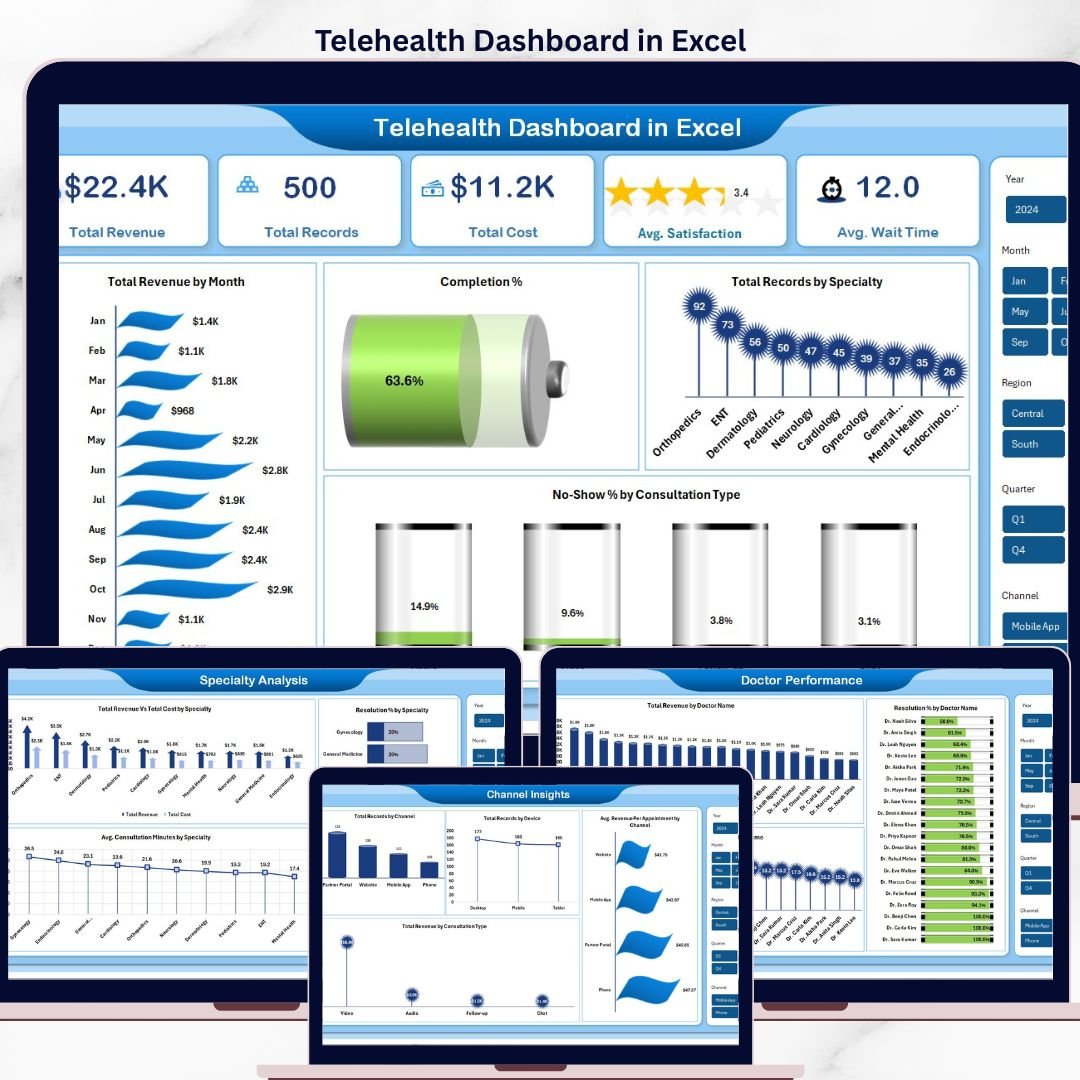
1 — Overview Page
On the top of the sheet, we have the cards below to show high-level information. We have created charts to show the analysis and multiple slicers to apply filters and see the filtered dashboard quickly.
Cards on the Overview page:
🔹 Total Revenue
🔹 Total Records
🔹 Total Cost
🔹 Avg. Satisfaction
🔹 Avg. Wait Time
Charts on the Overview page:
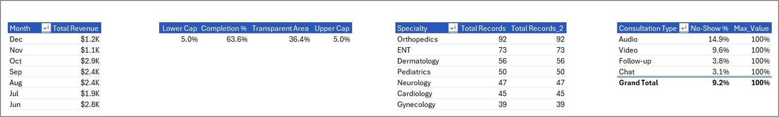
🔹 Total Revenue by Month
🔹 Completion % by Appointments
🔹 Total Records by Specialty
🔹 No-Show % by Consultation Type
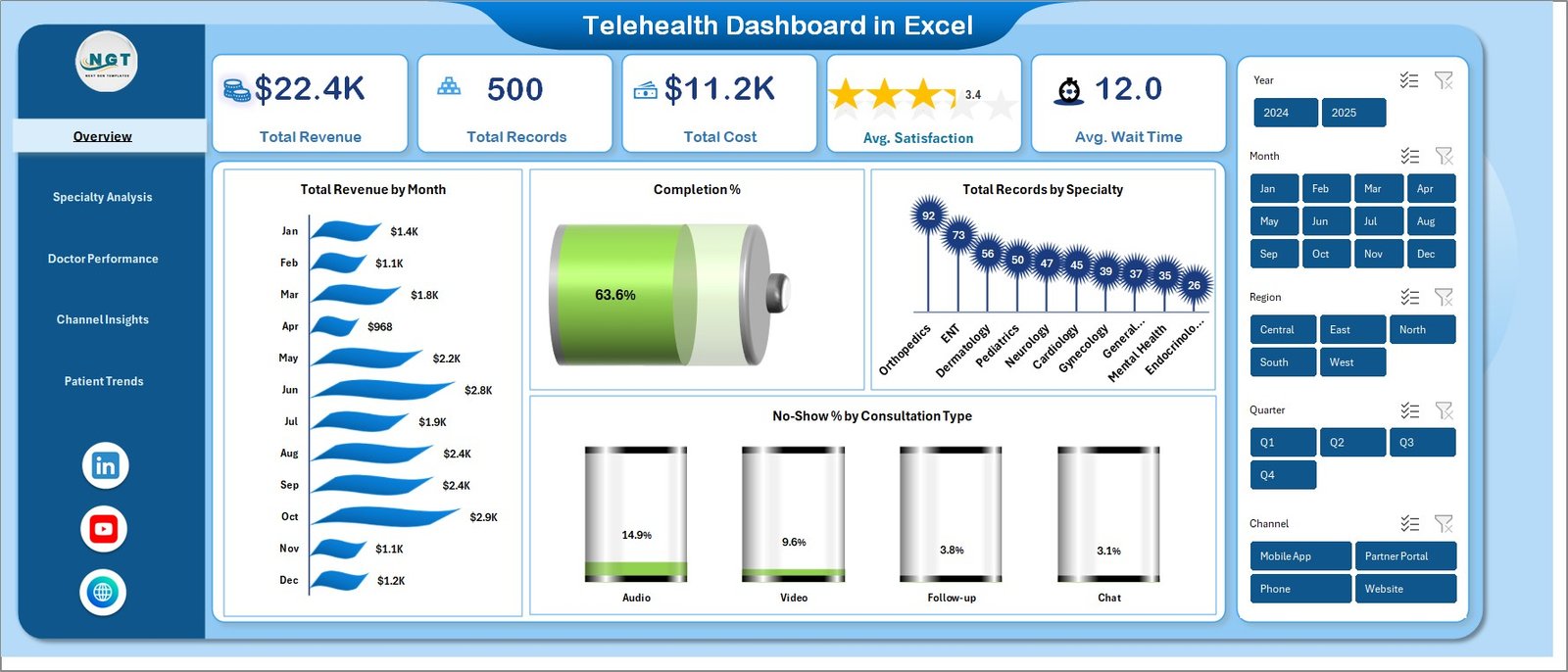
Telehealth Dashboard in Excel
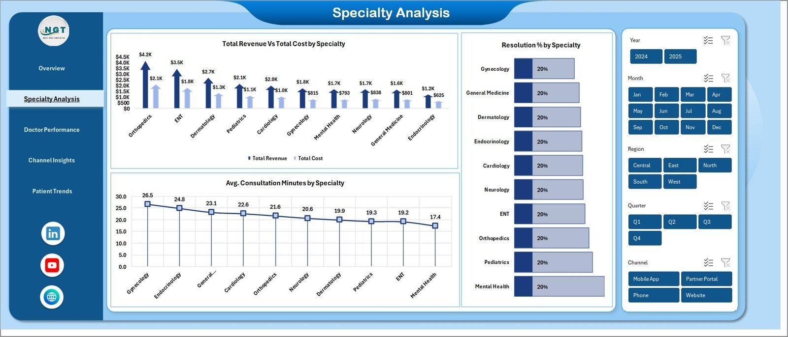
2 — Specialty Analysis
On this sheet tab, we have created the following analysis:
🔹 Total Revenue Vs Total Cost by Specialty
🔹 Avg. Consultation Minutes by Specialty
🔹 Resolution % by Specialty

Specialty Analysis
3 — Doctor Performance
On this sheet tab, we have created the following analysis:
🔹 Total Revenue by Doctor Name
🔹 Avg. Consultation Minutes by Doctor Name
🔹 Resolution % by Doctor Name
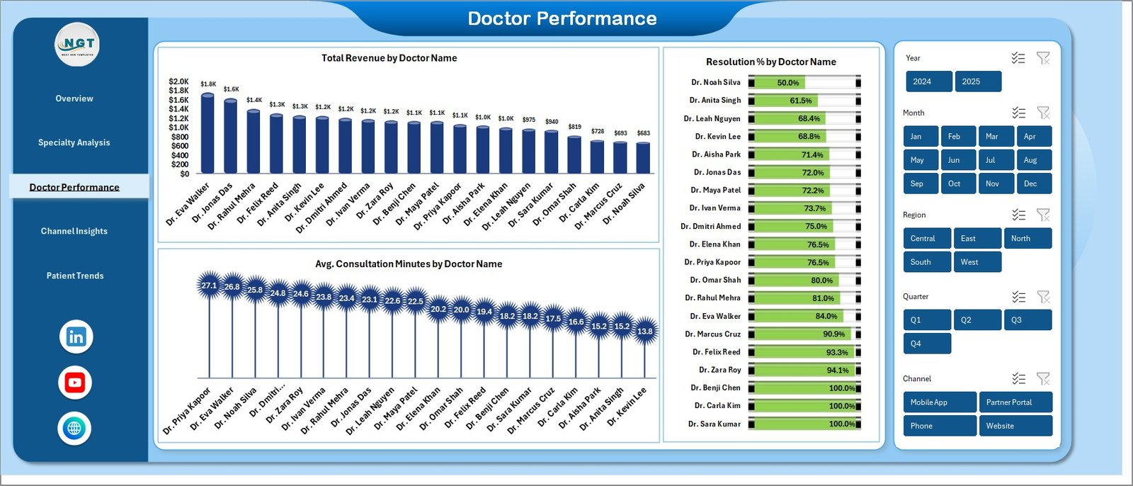
Doctor Performance
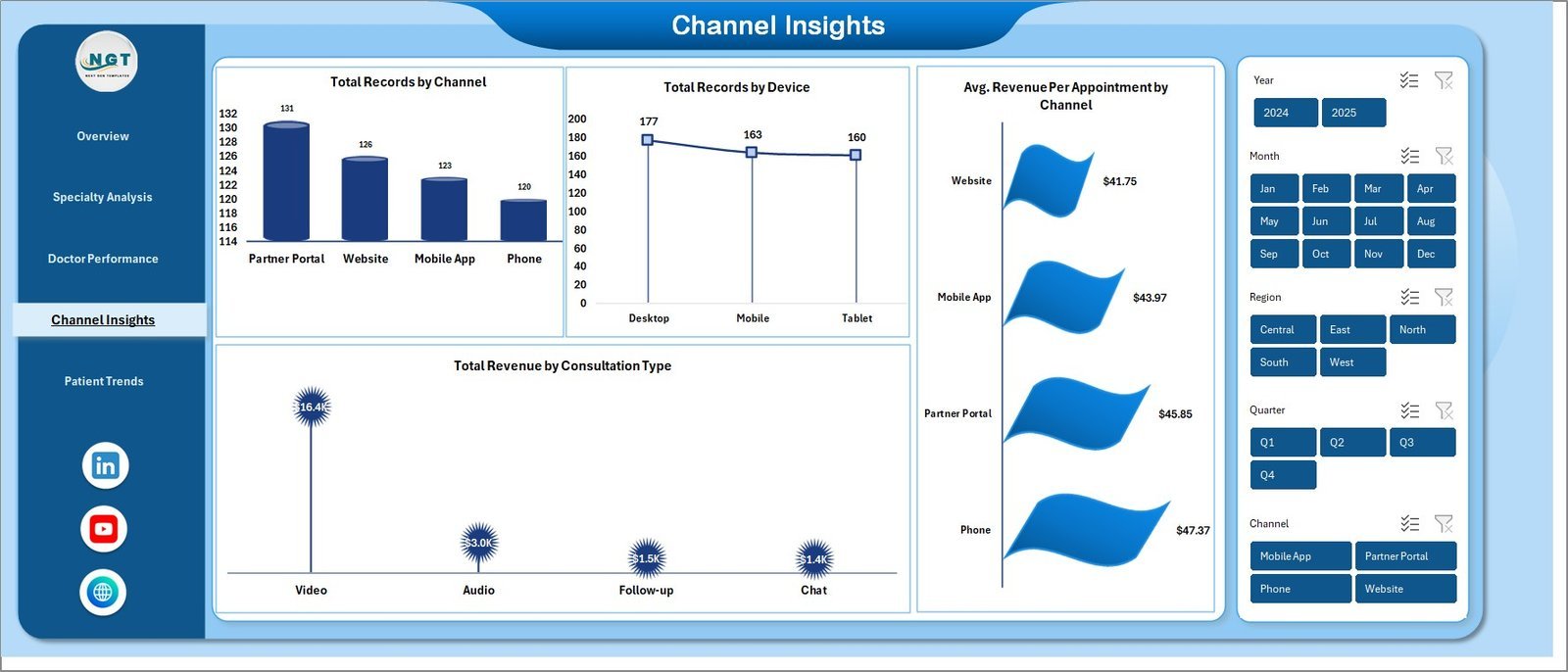
4 — Channel Insights
On this sheet tab, we have created the following analysis:
🔹 Total Records by Channel
🔹 Total Records by Device
🔹 Avg. Revenue Per Appointment by Channel
🔹 Total Revenue by Consultation Type

Channel Insights
5 — Patient Trends
On this sheet tab, we have created the following analysis:
🔹 Total Records by Patient Type
🔹 Total Records by Age Group
🔹 Total Revenue by Insurance Type
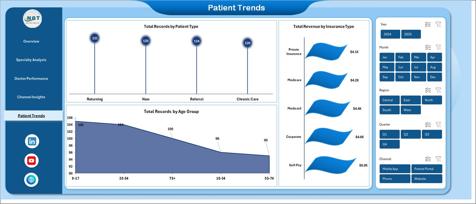
Patient Trends
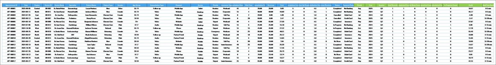
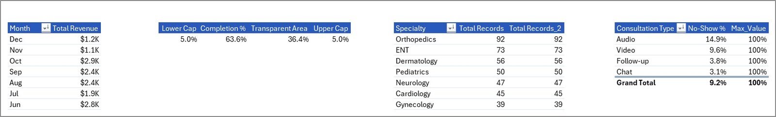
6 — Data Sheet Tab
This is the Data sheet. Add your own data in the same column format. All pivots and charts will pick it up after a refresh.
Data Sheet tab
7 — Support Sheet
On this sheet, we have created multiple pivot tables that drive the entire dashboard dynamically. After updating the Data sheet, go to the Data tab in the Excel Ribbon and click “Refresh All” — every pivot refreshes and every chart updates. You can keep this sheet hidden.
Support sheet tab
📊 Telehealth Dashboard in Excel vs. Power BI Equivalent vs. Paid Telehealth Analytics SaaS — Where This Fits
| Feature | Telehealth Dashboard in Excel | Power BI Telehealth Dashboard | Paid Telehealth Analytics SaaS (Athenahealth / Kareo / eClinicalWorks BI) |
|---|---|---|---|
| Cost | $17.99 one-time | $11.99–$17.99 one-time | $140–$700 / provider / month |
| Platform | Microsoft Excel (offline) | Power BI Desktop + optional Pro | Cloud SaaS, vendor-hosted |
| Setup time | Under 10 minutes | 15–20 minutes | 2–6 weeks implementation |
| Works offline | ✅ | ⚠️ Limited (Power BI Desktop only) | ❌ Internet required |
| Customizable fields | ✅ Full edit access | ✅ Full edit access | ⚠️ Admin-only, vendor-gated |
| Share with link | Email the .xlsx file | Requires Power BI Pro license | ✅ Built-in |
| Per-user fees | ✅ None — unlimited users | Power BI Pro ~$10 / user / month to share | $140+ / provider / month |
| Year-1 cost at 5 providers | $17.99 total | ~$600 | $8,400–$42,000 |
| Best for | Small clinics and telehealth startups | Multi-clinic groups with BI analysts | Large hospital systems with EHR integrations |
For telehealth clinics that want daily KPI visibility without a five-figure analytics bill, the Telehealth Dashboard in Excel sits in the sweet spot.
👥 Who This Template Is For — and Who It’s Not For
✅ This template is built for:
- Telehealth startups and virtual-care clinics with 2–50 providers tracking revenue, no-show rates, and satisfaction weekly
- Practice managers at multi-specialty clinics running hybrid (in-person + video) consultations
- Digital health operations leads who need to report specialty-level revenue and doctor productivity to investors or leadership
- Health tech consultants building client-ready telehealth performance reports
❌ This template is NOT for:
- Hospital systems needing HIPAA-audited, FHIR/HL7-integrated BI (use Epic, Cerner, or Athenahealth BI)
- Teams that need real-time streaming data from an EHR — this dashboard is refresh-based, not real-time
- Users who don’t have Microsoft Excel 2016+ or Microsoft 365 — try the Telemedicine Platforms KPI Dashboard in Power BI instead
⚙️ How to Use the Telehealth Dashboard in Excel
- Download the .zip file, unzip it, and open the .xlsx file in Microsoft Excel 2016 or later.
- Go to the Data sheet and replace the sample rows with your own telehealth appointment records, keeping the column headers intact.
- Go to the Data tab in the Excel Ribbon and click “Refresh All” — every pivot table on the Support sheet recalculates.
- Open the Overview, Specialty Analysis, Doctor Performance, Channel Insights, and Patient Trends sheets to read the refreshed dashboard.
- Use the slicers on any page to filter by specialty, consultation type, channel, or insurance type.
💼 Real-World Use Cases
Dr. Priya runs a 12-provider virtual cardiology and dermatology clinic. She uses the Telehealth Dashboard in Excel every Monday to pull last week’s completion rate, no-show percentage, and revenue-by-specialty numbers for her 15-minute leadership stand-up — replacing a $280/month Kareo analytics add-on her clinic was paying before.
Marcus is a healthcare operations consultant. He rebuilds this dashboard for each of his four telehealth clients every quarter, dropping their appointment exports into the Data sheet and delivering specialty and doctor-level performance decks in under an hour — work that used to take him a full afternoon in Tableau.
Leena is the founder of a two-person telehealth startup. She uses the Patient Trends page to show investors how her payer mix and age-group distribution are shifting month over month, without paying for a BI seat she can’t yet justify.
❓ Frequently Asked Questions
What KPIs does the Telehealth Dashboard in Excel track?
The Telehealth Dashboard in Excel tracks 5 headline KPIs — Total Revenue, Total Records, Total Cost, Avg. Satisfaction, and Avg. Wait Time — plus 16 drill-down charts covering specialty revenue, doctor performance, no-show %, channel mix, and patient demographics. All metrics refresh automatically after you update the Data sheet.
How long does setup take?
Setup takes under 10 minutes. Download the .zip, open the .xlsx in Excel, paste your appointment data into the Data sheet in the same column format, and click “Refresh All” on the Data tab. Every card, chart, and slicer in the Telehealth Dashboard in Excel updates automatically.
How does this compare to paid telehealth SaaS like Athenahealth or Kareo?
The Telehealth Dashboard in Excel is a one-time $17.99 purchase with unlimited users, versus $140–$700 per provider per month for cloud SaaS. For small-to-mid telehealth clinics that don’t need EHR integration or HIPAA-audited hosting, the Excel dashboard delivers 80% of the same reporting at less than 1% of the year-one cost.
Do I need macros or special add-ins to use the Telehealth Dashboard in Excel?
No macros, no add-ins, no internet connection required. The Telehealth Dashboard in Excel runs on standard Excel pivot tables, charts, and slicers — everything works in Microsoft Excel 2016, 2019, 2021, and Microsoft 365 on Windows and Mac.
Can I customize the charts, colors, or add my own KPIs?
Yes — the workbook is unprotected. You can change chart colors to match your brand, add new pivot fields on the Support sheet, insert new slicers, or add extra columns to the Data sheet. Click “Refresh All” after any Data-sheet change to propagate updates across the Telehealth Dashboard in Excel.
Does the dashboard work on Mac and Excel for the web?
Yes on Mac (Excel 2016+ and Microsoft 365). Excel for the web supports viewing and basic filtering, but slicer interactivity and “Refresh All” work best in the Excel desktop app. For mobile viewing, pair the Telehealth Dashboard in Excel with Excel on iPad or iPhone.
Is my patient data safe — does anything leave my computer?
Nothing leaves your computer. The Telehealth Dashboard in Excel is a standalone .xlsx file that runs 100% offline. No telemetry, no cloud sync, no external data connections. You control the file and can store it on an encrypted drive or internal SharePoint like any other Excel workbook.
👤 About the Author
Built by PK — Microsoft Certified Professional with 15+ years of Excel, Google Sheets, and Power BI experience. Founder of NextGenTemplates, reaching 300K+ subscribers across YouTube channels (@PK-AnExcelExpert, @NextGenTemplates, @NeoTechNavigators). Every template is hand-built and tested before release.
🔗 Explore Related Templates
💎 Save 38% — Get 8 healthcare dashboards in the Healthcare & Hospital Management Bundle covering medical practice, pharmacy, hospital patient flow, and more.
Also explore the Medical Practice Dashboard in Excel for in-person clinic operations, the Pharmacy Dashboard in Excel for pharmacy revenue tracking, and the Telehealth KPI Scorecard in Excel for monthly MTD/YTD telehealth scorecarding.
Also available as: Telemedicine Platforms KPI Dashboard in Power BI · Hospital Patient Flow Dashboard in Google Sheets. Browse all Excel Dashboard Templates and Power BI Dashboards.
📖 Click here to read the Detailed Blog Post
Watch the step-by-step video tutorial:
🎥 Visit our YouTube channel for step-by-step video tutorials
👉 YouTube.com/@NextGenTemplates
📅 Last updated: April 2026


Reviews
There are no reviews yet.