Healthcare Dialysis Centers KPI Dashboard continuously work to improve patient care quality, operational efficiency, and financial sustainability. Dialysis centers play an especially critical role in the healthcare system because they provide life-sustaining treatments for patients suffering from chronic kidney disease and kidney failure. These facilities must carefully monitor multiple performance indicators to ensure treatments remain safe, efficient, and effective.
However, many dialysis centers still rely on manual reports, disconnected spreadsheets, and delayed performance monitoring systems. As a result, administrators often struggle to analyze operational performance, treatment outcomes, and patient satisfaction in a timely manner. When data is scattered across multiple sources, identifying performance gaps and making informed decisions becomes challenging.
To overcome this issue, healthcare organizations increasingly adopt data-driven analytics dashboards that consolidate operational data into one centralized reporting system. One powerful solution designed for this purpose is the Dialysis Centers KPI Dashboard in Power BI.
The Dialysis Centers KPI Dashboard in Power BI is a ready-to-use business intelligence solution that helps dialysis center administrators monitor key performance indicators through interactive charts, KPI indicators, and visual analytics. Using Microsoft Power BI’s powerful data visualization capabilities, the dashboard converts raw operational data into meaningful insights that support better decision-making.
This dashboard collects data from structured sources such as Excel files and transforms it into dynamic reports. As a result, healthcare administrators can easily analyze performance metrics, identify trends, and evaluate whether operational targets are being achieved.
The dashboard allows dialysis centers to monitor important metrics such as:
-
Patient treatment volumes
-
Dialysis machine utilization rates
-
Treatment success rates
-
Infection control indicators
-
Patient satisfaction scores
-
Operational efficiency metrics
By organizing this information into visual reports, healthcare teams can analyze monthly performance trends, yearly progress, and comparisons with previous years.
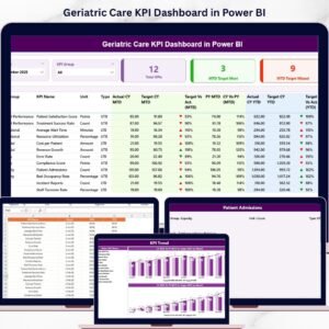
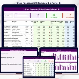
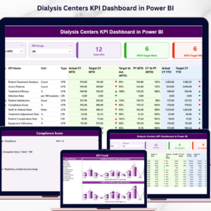
The Dialysis Centers KPI Dashboard in Power BI contains three main analytical pages, each designed to provide a different perspective on dialysis center performance.
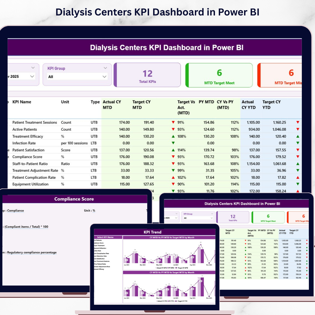
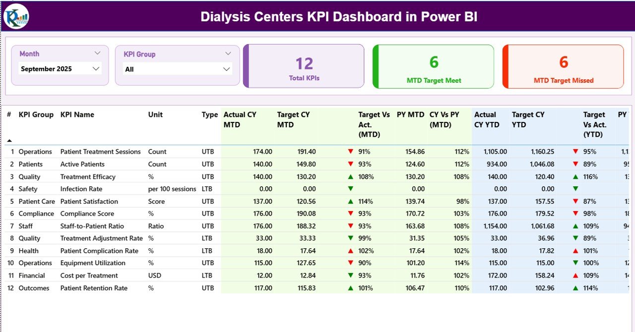
The Summary Page serves as the main dashboard interface where users can view an overview of all KPIs. At the top of the dashboard, users can select filters such as the Month slicer and KPI Group slicer. These filters allow administrators to analyze performance based on specific time periods or KPI categories.
The Summary Page also displays three key KPI cards:
-
Total KPIs Count – The total number of KPIs being tracked.
-
MTD Target Meet Count – The number of KPIs that achieved their monthly targets.
-
MTD Target Missed Count – The number of KPIs that failed to meet their targets.
Below the KPI cards, the dashboard provides a detailed KPI performance table. This table includes important KPI information such as KPI number, KPI group, KPI name, unit of measurement, KPI type, actual performance values, target values, and comparisons with previous year performance.
The dashboard also uses visual performance indicators. A green upward arrow indicates that the KPI has met or exceeded its target, while a red downward arrow indicates that the KPI has missed the target.
In addition to monthly performance monitoring, the dashboard tracks Year-to-Date (YTD) metrics. These metrics allow administrators to evaluate long-term performance trends and compare them with historical data.
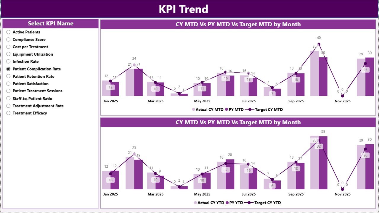
The second page, KPI Trend Page, focuses on analyzing performance trends over time. This page contains two combo charts that display comparisons between current year actual values, previous year actual values, and target values. Users can select a specific KPI from the slicer, and the charts automatically update to display the trend analysis for that KPI.
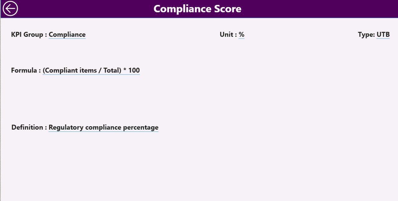
The third page, KPI Definition Page, serves as a drill-through page that provides detailed documentation for each KPI. This page displays the KPI formula, definition, unit of measurement, and category. Users can access this page by drilling through from the Summary Page and return to the main dashboard using the back button.
The dashboard uses an Excel file as its primary data source. This Excel file contains three worksheets:
-
Input_Actual Sheet – Stores actual KPI performance values.
-
Input_Target Sheet – Stores target KPI values.
-
KPI Definition Sheet – Stores metadata related to each KPI.
By updating the Excel data source, Power BI automatically refreshes the dashboard visuals.
This dashboard is ideal for dialysis center administrators, healthcare operations managers, clinical directors, and hospital management teams who need clear insights into dialysis center performance.
By transforming complex operational data into clear visual insights, the Dialysis Centers KPI Dashboard in Power BI helps healthcare organizations improve operational efficiency, enhance patient care quality, and make faster data-driven decisions.
Key Features of Dialysis Centers KPI Dashboard in Power BI
📊 Interactive Healthcare KPI Monitoring
Track dialysis center performance using dynamic Power BI visualizations.
📈 MTD & YTD Performance Tracking
Analyze both monthly and yearly KPI performance.
🧠 Clinical & Operational KPI Insights
Monitor treatment outcomes, infection control, and operational efficiency.
🎯 Target vs Actual KPI Comparison
Instantly evaluate whether KPIs meet performance targets.
📉 Previous Year Performance Analysis
Compare current results with historical performance.
📊 Detailed KPI Performance Table
View comprehensive KPI information in a structured format.
📈 KPI Trend Analysis
Analyze performance trends using interactive charts.
📚 KPI Definition Documentation
Understand KPI formulas, units, and definitions through drill-through pages.
⚡ Automated Data Visualization
Power BI automatically converts raw data into visual insights.
📊 Excel Data Source Integration
Easily update KPI data using Excel input sheets.
What’s Inside the Dialysis Centers KPI Dashboard in Power BI
The dashboard contains three analytical pages designed to analyze dialysis center performance.
Summary Page – Overall KPI Performance
The Summary Page acts as the main dashboard interface.
Users can filter data using:
-
Month slicer
-
KPI Group slicer
This page displays three KPI cards:
-
Total KPIs Count
-
MTD Target Meet Count
-
MTD Target Missed Count
Below these cards, the dashboard shows a detailed KPI performance table with comparisons between actual values, targets, and previous year results.
KPI Trend Page – Performance Trend Analysis
The KPI Trend Page analyzes how KPIs perform over time.
This page contains two combo charts that compare:
-
Current Year Actual values
-
Previous Year Actual values
-
Target values
Users can select a KPI from the slicer to view its performance trends.
KPI Definition Page – KPI Documentation
The KPI Definition Page provides detailed documentation for each KPI.
Information displayed includes:
-
KPI Formula
-
KPI Definition
-
KPI Unit
-
KPI Category
Users can access this page through the drill-through feature.
How to Use the Dialysis Centers KPI Dashboard
1️⃣ Enter actual KPI values in the Input_Actual Excel sheet.
2️⃣ Enter target values in the Input_Target sheet.
3️⃣ Define KPIs in the KPI Definition sheet.
4️⃣ Refresh the Power BI report to update the dashboard.
5️⃣ Use slicers to analyze KPI performance.
Who Can Use This Dashboard
This dashboard is ideal for healthcare professionals responsible for dialysis center operations.
🏥 Dialysis Center Administrators
👨⚕️ Healthcare Operations Managers
📊 Hospital Management Teams
📈 Clinical Performance Analysts
💼 Healthcare Data Analysts
These professionals can use the dashboard to monitor operational performance, improve patient outcomes, and optimize healthcare processes.
Click here to read the Detailed blog post
Visit our YouTube channel to learn step-by-step video tutorials
https://youtube.com/@PKAnExcelExpert