


US manufacturers now lose an average of $260,000 per hour of unplanned downtime, with Fortune 500 plants bleeding roughly $1.5 trillion annually (about 11% of revenue) to equipment failures and schedule slippage. Yet fewer than one in three manufacturers track Overall Equipment Effectiveness (OEE) with real-time data — most still build monthly performance reviews in Excel or PowerPoint, two to four weeks after the shift that produced the data. The Manufacturing Efficiency Dashboard in Power BI is a ready-to-use .pbix template that plugs into your production data and gives operations managers, plant supervisors, and COOs a live view of OEE, machine uptime, throughput, and cost-per-unit — without a $100,000+ MES project or a dedicated data engineering team.
This is the Power BI sister to our Manufacturing Dashboard in Excel. If your team already has Power BI Pro licenses ($14/user/month) or Microsoft 365 E5, you can open this file, swap in your production data, and have a publishable plant dashboard live in the same afternoon. DAX measures, page layouts, drill-throughs, and slicers are all pre-built.

Why US Manufacturers Need Live OEE Dashboards in 2026
- Unplanned downtime costs US manufacturers an average of $260,000 per hour, with 19% of companies reporting losses exceeding $500,000/hour (MaintainX and Siemens 2024 State of Industrial Maintenance).
- Equipment failure accounts for roughly 42% of all unplanned downtime, and the average manufacturer loses 800 hours of production per year to unplanned stops.
- Only 34% of manufacturers achieve world-class OEE (85%+), while the industry average hovers around 60% — meaning most plants leave 15-25 percentage points of capacity on the table every shift.
- Reactive maintenance costs 3-10× more than scheduled maintenance per Siemens’ True Cost of Downtime research. Live visibility is the first step to flipping that ratio.
Enterprise MES platforms like Siemens Opcenter, SAP Digital Manufacturing, and Plex solve this problem — but their typical implementations run $200,000-$1.5 million with 12-18 month deployment windows, and only about 34% of MES buyers end up selecting the right platform on the first attempt. For mid-market manufacturers and single-plant operations that already own Power BI through Microsoft 365, a structured .pbix dashboard delivers 80% of the operational visibility for less than 1% of the cost.
What’s Inside the Manufacturing Efficiency Dashboard
📊 OEE & Production Efficiency Page
The headline page surfaces your Overall Equipment Effectiveness broken into the three core components: Availability (uptime ÷ planned production time), Performance (actual run rate ÷ ideal rate), and Quality (good units ÷ total units). KPI cards show current OEE against target, with trend sparklines for the last 12 weeks.
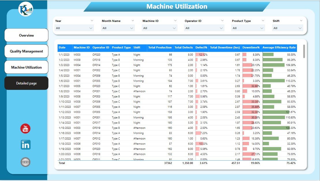
⚙️ Machine Utilization & Downtime Analysis
A machine-by-machine view of uptime, downtime, and scheduled vs unscheduled stops. Downtime reasons are categorized (mechanical, electrical, changeover, material, operator) so you can see whether a spike this week came from aging equipment, supply chain issues, or training gaps.
📈 Throughput & Production Rate Trends
Daily, weekly, and monthly throughput charts with ideal-vs-actual run rate comparisons. Drill down from monthly totals to a specific shift on a specific line in two clicks.
💰 Operational Cost Tracking
Cost-per-unit calculations, direct labor variance, and scrap/rework cost visuals so finance and operations share the same source of truth during monthly reviews.
🔄 Interactive Slicers & Filters
Time period, shift, production line, product family, and site-level slicers feed every visual on every page. Deploy to a corporate workspace and each plant manager sees their own numbers while leadership sees the roll-up.
🧩 Pre-Built DAX Measures
The heavy lifting is already done: OEE, Availability, Performance, Quality, MTBF, MTTR, First Pass Yield, Standard Cost Variance, and rolling 30/60/90-day comparisons are all written as reusable measures you can drop into your own custom pages.
🏭 Stop reviewing plant performance a month after the fact.
Get a live OEE, downtime, and cost-per-unit dashboard in Power BI — with DAX measures, slicers, and drill-throughs pre-built. Plug in your data and publish the same day.
Manufacturing Efficiency Dashboard vs. Full MES vs. Tableau
| Feature | Our Power BI Dashboard | Tableau / Qlik Equivalent | Full MES (Siemens Opcenter / SAP DMC / Plex) |
|---|---|---|---|
| Template Cost | One-time $17.99 | Custom builds typically $5,000-$30,000 | $200,000-$1.5M implementation |
| Platform License | Power BI Pro $14/user/mo (or included in M365 E5) | Tableau Creator $75/user/mo + Explorer $42 + Viewer $15 | Enterprise contracts, annual six-figure |
| Deployment Time | Same day (plug in data, publish) | 2-8 weeks of custom work | 12-18 months typical |
| OEE Measures | Pre-built DAX (Availability/Performance/Quality) | Built per project in LOD expressions | Native, with shop-floor sensor integration |
| Data Refresh | Power BI Pro: 8 refreshes/day; PPU: 48/day | Extract-based, scheduled via Tableau Server | Real-time from PLCs and SCADA |
| Shop-Floor Sensor Integration | Via Azure IoT / Fabric (extra setup) | Via Tableau data sources | Native, purpose-built |
| Work Order Execution | ❌ Reporting only | ❌ Reporting only | ✅ End-to-end MES workflow |
| Best For | Mid-market plants already on Microsoft 365 | Organizations already standardized on Tableau | Large multi-site operations needing full MES |
Honest positioning — this is a reporting and analysis dashboard, not a full MES. If you need PLC integration, electronic batch records, real-time operator instructions, genealogy tracking, or regulated Part 11 environments, a proper MES platform is the right tool. If you need a fast, shared view of OEE, downtime, and cost across your plant that finance, ops, and the shop floor can all read from the same source, this dashboard is the fastest path there.
Who Uses This Dashboard
| Role / Industry | Primary Use Case |
|---|---|
| Plant & Operations Managers | Daily OEE review, shift performance comparison, downtime root cause analysis |
| Manufacturing COOs & VPs | Multi-site roll-up, quarterly board presentations, capacity planning |
| Production Supervisors | Real-time throughput tracking, shift handoff briefings, corrective action lists |
| Continuous Improvement / Lean Teams | Kaizen event tracking, baseline vs improvement measurement, value-stream reviews |
| Finance & FP&A Teams | Standard cost variance analysis, direct labor and overhead reconciliation |
| Quality & Reliability Engineers | MTBF, MTTR, first pass yield trending, scrap and rework analysis |
| Industry 4.0 / IT Teams | Starter dashboard before full Azure IoT + Fabric rollout |
| Consultants & Systems Integrators | Baseline template for client engagements, branded and customized per engagement |
Benefits You’ll See in the First 30 Days
- 📊 Plant-wide OEE visibility — same number at finance meeting, ops standup, and the CEO’s board deck
- ⚡ Shift performance comparison — see which shift, line, or crew is consistently above (or below) target
- 🔍 Downtime root cause surfacing — categorized reason codes make patterns visible in the first week
- 💸 Standard cost variance isolated — labor, scrap, and material variances separated cleanly
- 📈 Trend over time — 12-week rolling windows show whether improvements are sustained or temporary
- 🤝 Shared source of truth — finance, ops, and quality all reading the same DAX measures
- 🎯 Target-vs-actual KPI cards — visual color coding flags misses before they compound
How to Use the Dashboard (Step-by-Step)
- Download and open the .pbix file in Power BI Desktop (free download from Microsoft).
- Review the sample data to understand the schema — fact table, dimension tables, date table.
- Swap your production data into the existing tables, or point the queries at your own SQL Server, Excel, CSV, or ERP connector.
- Verify the DAX measures calculate correctly against your data (OEE, Availability, Performance, Quality).
- Customize colors and branding to match your corporate theme — edit the theme JSON or use the Format pane.
- Publish to Power BI Service and share with your team via a workspace or app.
- Set up scheduled refresh (up to 8 times/day on Pro, 48 times/day on PPU).
- Pin key visuals to a corporate dashboard for executive viewing.
- Review weekly with the plant team — treat it as a living operational document, not a report.
Optional Upgrades You Can Add Later
- Azure IoT connector — stream PLC and sensor data directly for near-real-time refresh.
- Power Automate triggers — auto-email shift leads when OEE drops below threshold.
- Fabric capacity upgrade — for large plants needing unlimited viewers and 48+ refreshes/day.
- Row-level security (RLS) — so each plant manager sees only their own site’s data.
- Copilot integration — natural-language Q&A on your production data (Fabric SKUs).
- Multi-site roll-up page — aggregate KPIs across plants with site-level drill-through.
Best Practices From High-Performing Manufacturing Teams
- Start with OEE, not with downtime. OEE gives you one headline number. Once the team is aligned on it, drill into which of Availability / Performance / Quality is dragging it down.
- Track MTBF and MTTR every week. Rising Mean Time Between Failures proves preventive maintenance is working; falling Mean Time To Repair proves training is working.
- Categorize downtime consistently. The same downtime event reported as “machine breakdown” one week and “mechanical failure” the next destroys trend analysis. Lock the reason-code list.
- Compare shift to shift, not just month to month. Most performance gaps in mid-market plants are crew or shift variability, not long-term trends.
- Never let the dashboard go a week without use. Unviewed dashboards become unmaintained dashboards. Review cadence is the difference between live ops tool and dead link.
Related Templates You May Need
- Manufacturing Dashboard in Excel — Excel sister of this Power BI dashboard, $17.99
- Manufacturing Production Variance Analysis in Excel — pair with standard cost variance
- Procurement Dashboard in Power BI — link supplier performance to production
- Transportation & Logistics Dashboard in Power BI — outbound logistics view
- Procurement Dashboard in Excel — Excel version of procurement
- Equipment Maintenance Log Tracker in Excel — pair with maintenance reason codes
- All Power BI Dashboards — full catalog
- All Excel & Power BI Dashboards
Frequently Asked Questions
Do I need a Power BI license to use this dashboard?
You can open and edit the .pbix file in Power BI Desktop (free). To publish and share with your team, you’ll need Power BI Pro ($14/user/month) or Microsoft 365 E5 (which includes Pro). For unlimited viewers across a large plant, Fabric F64 capacity (~$5,000/month) is typically more cost-effective than per-user Pro licensing at 400+ viewers.
Can this replace a full MES like Siemens Opcenter or SAP DMC?
No — this is a reporting and analysis layer, not a Manufacturing Execution System. A full MES handles work-order execution, real-time operator instructions, electronic batch records, and genealogy. This dashboard is designed to consume data from your existing MES, ERP, or manually-maintained production logs and present it cleanly. If you’re regulated (FDA Part 11, pharma, medical device), you need a real MES.
What data sources does it connect to?
Power BI natively connects to SQL Server, Excel, CSV, Azure Synapse, Snowflake, SAP BW, Oracle, Dynamics 365, and 200+ other sources. The template ships with Excel-based sample data for easy starting, but you can repoint the queries at any supported source in Power Query.
How is this different from the Manufacturing Dashboard in Excel?
Our Manufacturing Dashboard in Excel is built with native Excel pivot tables, slicers, and formulas — great for single-site plants where Excel is already the standard. This Power BI version adds: shared publishing, scheduled refresh, role-based access (RLS), better performance on large datasets (>1M rows), and native mobile viewing. Choose Excel for quick local use, Power BI for shared team deployment.
Does it include OEE calculations out of the box?
Yes — Availability, Performance, and Quality are written as DAX measures, with OEE as the multiplicative product. The calculations follow the Fiix/Vorne industry-standard OEE formula so your numbers will match published benchmarks.
Can I connect it to real-time PLC or SCADA data?
Not natively — Power BI Pro scheduled refresh maxes at 8 refreshes/day, PPU at 48/day. For true real-time, you’d need Azure IoT Hub + Fabric streaming datasets, which is an additional project. For most plant operations, 15-minute refresh intervals via PPU are sufficient.
How customizable is the layout?
Fully customizable. Every visual, color, slicer, and page is editable in Power BI Desktop. The underlying data model uses a star schema, so adding new measures or visuals doesn’t break existing ones.
Will this work for process manufacturing (chemical, food, pharma) or only discrete (automotive, electronics)?
The core OEE and cost tracking works for both. The sample data and visual examples are discrete-manufacturing flavored, but you can relabel “units produced” as “batches completed” or “kilograms output” and the math is identical. For regulated process industries (GMP pharma, FDA-regulated food), you’ll still need a compliant MES for batch records — this dashboard is complementary, not a substitute.
Can I embed this in SharePoint, Teams, or a web portal?
Yes. Power BI reports embed natively in Microsoft Teams channels, SharePoint pages, and public-web portals (with Publish to Web, for non-sensitive data only). For authenticated external embedding, you’ll need Power BI Embedded (A-SKU) licensing.
How is this different from building my own Power BI dashboard?
The DAX measures, data model, and page layouts represent roughly 40-80 hours of development work for a Power BI developer (the going rate for external developers is $150-$250/hour). At $17.99, this template pays for itself the moment your team saves a single hour of development time. More importantly, the measures are correct — OEE is deceptively easy to calculate wrong, and bad OEE is worse than no OEE.
Read the Full Blog Post on PK: An Excel Expert
For a detailed walkthrough, screenshots of each page, and DAX measure explanations, read the full guide on our Excel blog: Manufacturing Efficiency Dashboard in Power BI — Full Guide.
Watch the Walkthrough Video
See the dashboard in action — OEE review, downtime drill-through, machine utilization analysis, and cost variance page:
🎥 Subscribe to YouTube.com/@PKAnExcelExpert for weekly Excel dashboard tutorials, Power BI walkthroughs, and business template reviews.
Ready to stop reviewing plant performance a month late?
Download the Manufacturing Efficiency Dashboard in Power BI — one-time $17.99, .pbix with DAX measures built in, works with your existing Power BI Pro licenses.


Reviews
There are no reviews yet.