
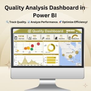
The Quality Analysis Dashboard in Power BI is a powerful tool designed to track, monitor, and improve the quality of processes, products, and employee performance. It provides real-time insights into key quality metrics, helping businesses make informed decisions to reduce defects, enhance efficiency, and optimize overall performance.
Key Features: Quality Analysis Dashboard in Power BI
✅ Comprehensive Quality Overview:
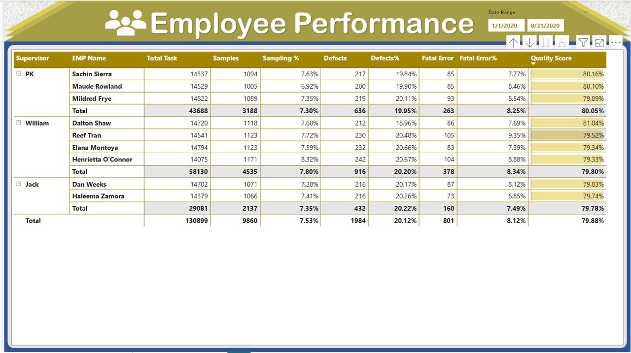
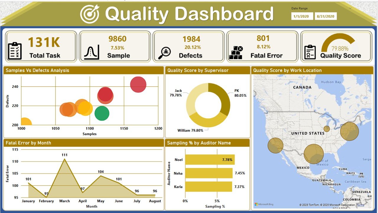
The main dashboard offers a snapshot of quality metrics, including Total Task Count, Defects, Fatal Errors, and Quality Scores. With interactive visuals, businesses can instantly assess performance and identify problem areas.
✅ Samples vs. Defects Analysis:
A dedicated bubble chart provides a comparative view of samples tested against defects identified, allowing quality managers to pinpoint high-risk areas and take proactive measures.
✅ Performance by Supervisor & Work Location:
Monitor quality scores by supervisor to evaluate team efficiency and training needs. Additionally, a geo-map visualization provides insights into quality performance across different locations, helping businesses optimize regional quality management.
✅ Trend Analysis & Fatal Errors by Month:
A trend line showcases how quality performance evolves over time, making it easy to identify seasonal patterns and improvements. The fatal error tracker helps pinpoint critical defects, reducing future risks.
✅ Sampling Percentage by Auditor Name:
A bar chart visualization ranks auditors based on their sampling percentage, offering insights into auditing efficiency and potential discrepancies.
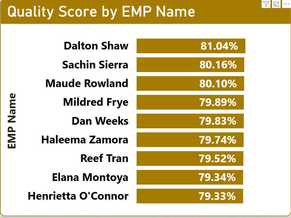
✅ Employee Performance Scorecard:
A detailed tabular view presents a breakdown of employee performance, showing total tasks completed, sampling percentages, defect rates, and final quality scores. This makes it easy to identify top performers and employees requiring further training.
✅ Interactive & User-Friendly Navigation:
The dashboard includes interactive filters, slicers, and drill-down features, allowing users to dynamically explore data based on time frames, supervisors, work locations, and employee names.
✅ Data-Driven Decision Making:
By leveraging Power BI’s powerful DAX measures and data modeling capabilities, the dashboard transforms raw data into actionable insights, empowering organizations to enhance quality control and reduce operational risks.
How This Dashboard Benefits Your Business
✔ Monitor Quality Performance in Real-Time – Get instant updates on quality metrics and defect rates.
✔ Identify Process Improvement Areas – Use trend analysis and defect tracking to improve workflows.
✔ Enhance Employee Productivity – Evaluate performance by individual employees and supervisors.
✔ Reduce Quality Defects & Errors – Spot recurring issues and take corrective actions early.
✔ Make Data-Driven Quality Decisions – Interactive reports make it easy to drill down into key data points.
💡 Bonus! Need help setting up the dashboard? Watch our full Power BI tutorial on YouTube for step-by-step guidance!
Click here to read the detailed blog post Quality Analysis Dashboard in Power BI
Watch the step-by-step video tutorial: Quality Analysis Dashboard in Power BI
Also check our Comparative Analysis Dashboard in Excel


Reviews
There are no reviews yet.