

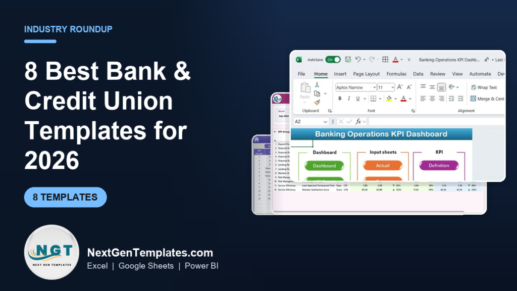
The best banking KPI dashboard Excel template for most teams in 2026 is the Banking Operations KPI Dashboard in Excel ($12.99): it tracks net interest margin, efficiency ratio, loan-to-deposit and 20+ metrics out of the box. Below are eight bank and credit union templates ranked by use case, format and price.
Last updated: September 2026
Key takeaways
- Our top pick is the Banking Operations KPI Dashboard in Excel ($12.99) — it covers deposits, lending, risk and service efficiency in one workbook, so most banks and credit unions never need a second tool.
- The eight templates span Excel, Power BI and Google Sheets and cost $9.99 to $14.99 — a one-time price against $50–$300 per user per month for banking BI SaaS.
- Best value is the Banking KPI Dashboard in Google Sheets at $9.99, ideal for branch teams that need a shareable link with no software to install.
- Credit unions should start with the Credit Unions KPI Dashboard in Power BI ($11.99), which is built around net worth ratio and loan-to-share rather than shareholder metrics.
- Every template is a spreadsheet you own outright — no seat licences, no data leaving your control, and full formula transparency for auditors and examiners.
Bank and credit union templates compared
| Template | Format | Best For | Price |
|---|---|---|---|
| Banking Operations KPI Dashboard (Best overall) | Excel | Whole-bank operations reporting | $12.99 |
| Credit Unions KPI Dashboard | Power BI | Credit union boards and CFOs | $11.99 |
| Investment Banking KPI Dashboard | Excel | Deal, advisory and capital-markets teams | $14.99 |
| Banking KPI Dashboard | Power BI | Retail bank executive reporting | $11.99 |
| Loan Recovery Services KPI Dashboard | Excel | Collections and recovery units | $14.99 |
| Microfinance KPI Dashboard | Excel | Microfinance and community lenders | $12.99 |
| Banking KPI Dashboard (Best value) | Google Sheets | Branch teams needing a shareable link | $9.99 |
| Banking Operations KPI Dashboard | Google Sheets | Cloud-first operations teams | $9.99 |
Bank and credit union teams share one operational pain: the numbers examiners, boards and branch managers need all live in different core-banking exports. Pulling net interest margin from one report, delinquency from another and deposit growth from a third — every month, by hand — is where a week disappears. A pre-built dashboard collapses that into a single refresh. The paid alternative is banking-specific business intelligence software that typically runs $50–$300 per user per month; ten seats is $6,000–$36,000 a year for reporting you can own once for under $15.
How we picked these
We searched the NextGenTemplates catalog of roughly 6,900 published templates for products tagged to banking, credit unions, lending and finance, then filtered to those that model genuine banking KPIs — net interest margin, efficiency ratio, loan-to-deposit, delinquency and net worth — rather than generic finance charts. We required a real, live product page, a working price under $15, and coverage of at least one of the three formats banks actually use (Excel, Power BI, Google Sheets).
We excluded look-alikes that shared the word “bank” but not the domain — for example a stem-cell biobank dashboard — and personal-finance trackers aimed at consumers rather than institutions. What remained are eight tools a bank, credit union or lender can open, connect to a core export, and present to a board or examiner the same week.
The 8 best banking KPI dashboard Excel and BI templates for 2026
1. Banking Operations KPI Dashboard in Excel — best overall
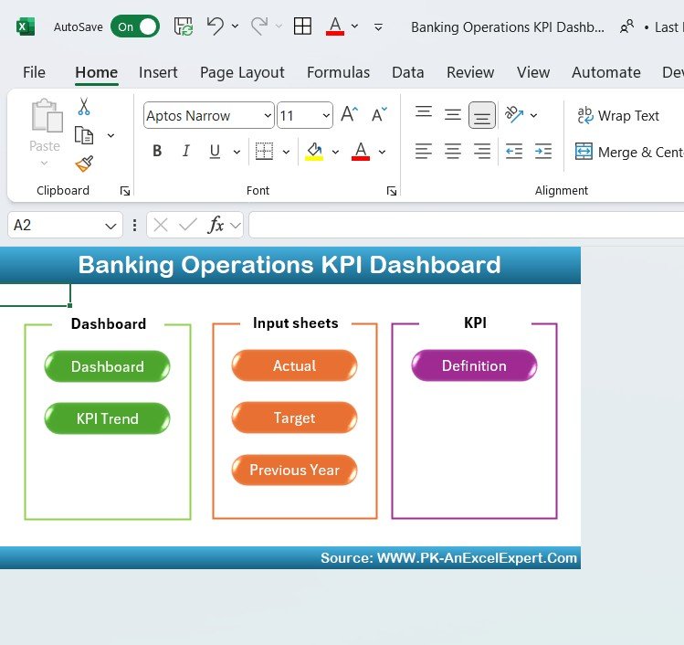
This is the flagship banking KPI dashboard Excel workbook and our best overall because it covers the entire operation — deposits, lending, risk and service — in one file, with an input sheet, a KPI definition sheet and a formatted dashboard that refreshes when you paste new figures.
Who it is for: operations managers and CFOs at retail and commercial banks who want one monthly report instead of five.
What is inside:
- 20+ operational KPIs including net interest margin, efficiency ratio and loan-to-deposit
- Traffic-light conditional formatting against your own targets
- Separate Actual / Definition / Dashboard sheets so numbers and design never collide
- Loan approval turnaround time and member-satisfaction tracking
Concrete uses: track the efficiency ratio toward the sub-60% best-practice band; watch loan-to-deposit stay inside a healthy 80–90% window; flag when net charge-offs cross 0.5%; and cut a board pack from three days of copy-paste to a 20-minute refresh.
Price: $12.99 — buy the Banking Operations KPI Dashboard in Excel.
Best for: the single dashboard a whole bank operations team can standardise on.
2. Credit Unions KPI Dashboard in Power BI — best for credit unions
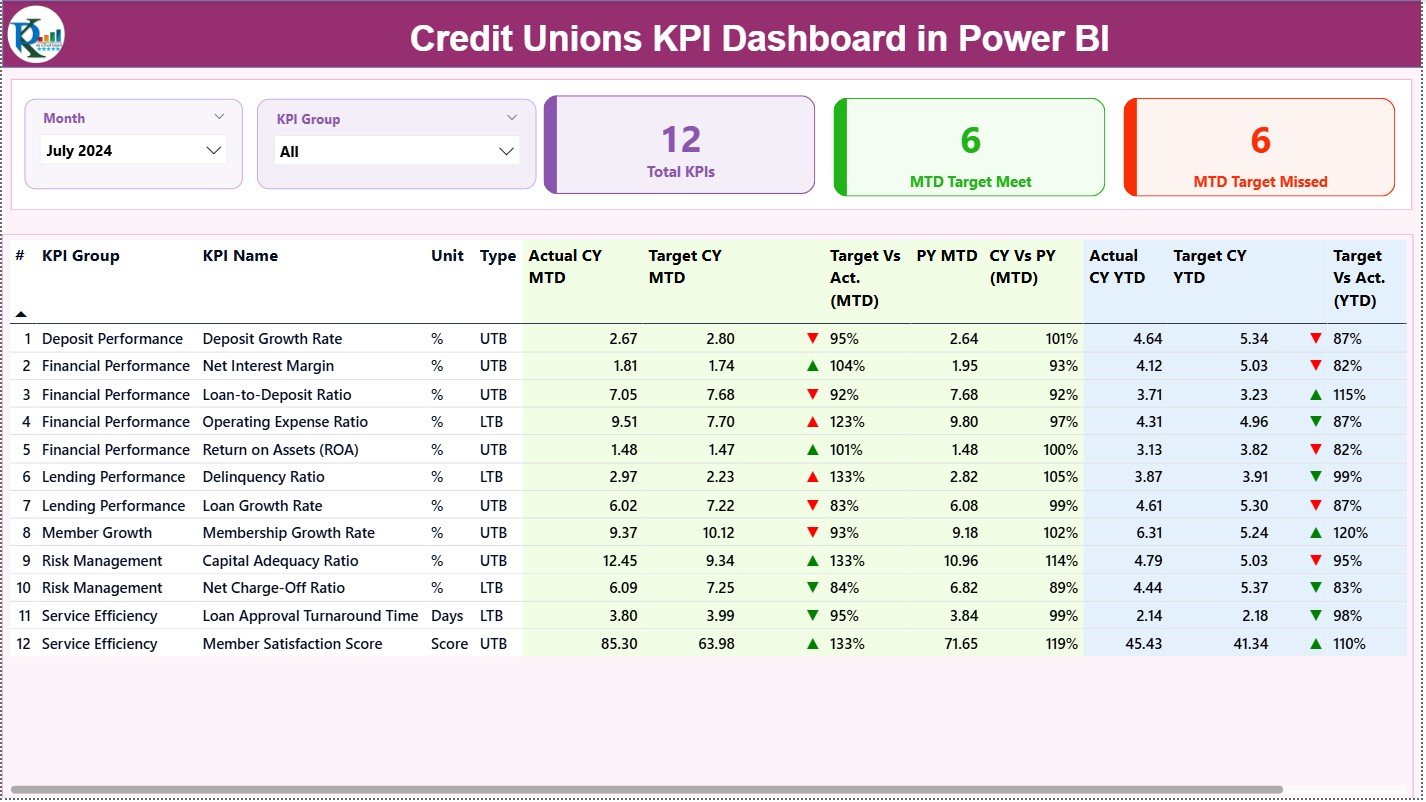
Credit unions are member-owned, so the metrics that matter are different: net worth ratio, loan-to-share and member growth, not earnings per share. This Power BI template is built around exactly those, which is why it is our credit union pick.
Who it is for: credit union CFOs and boards who report against NCUA-style measures and want interactive filtering.
What is inside:
- Net worth ratio tracking against the 7% well-capitalized threshold
- Loan-to-share, delinquency and member-growth visuals
- Interactive slicers by branch, product and period
- Refreshable data model that connects to your core-banking export
Concrete uses: prove you stay above the NCUA 7% net-worth floor at a glance; slice delinquency by loan product to find the leaking category; show the board twelve months of member growth on one page; and drill from a total into a branch in two clicks. Public benchmarks for comparison are on the NCUA call-report data portal.
Price: $11.99 — get the Credit Unions KPI Dashboard in Power BI.
Best for: member-owned institutions that report on net worth and loan-to-share.
3. Investment Banking KPI Dashboard in Excel — best for deal teams
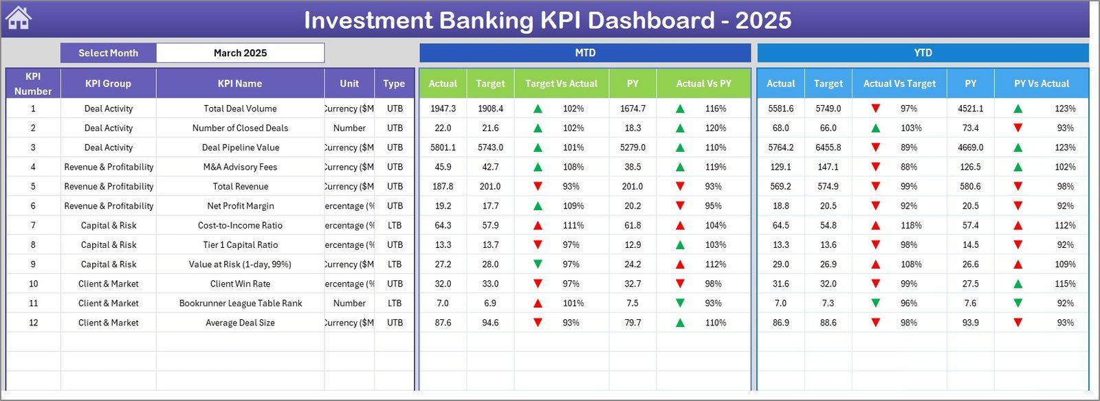
Investment and advisory teams live by a different scoreboard: deal pipeline, mandate win rate, fee revenue and revenue per banker. This Excel dashboard models capital-markets economics rather than deposit-and-loan banking.
Who it is for: boutique advisory firms, M&A desks and capital-markets teams tracking deals and fees.
What is inside:
- Deal pipeline by stage, sector and expected close
- Mandate win rate and average fee per transaction
- Revenue-per-banker and utilisation views
- League-table style ranking of active engagements
Concrete uses: forecast quarterly fee revenue from a weighted pipeline; spot which sector converts mandates fastest; compare revenue per banker across the desk; and give partners a one-page view before every Monday deal meeting.
Price: $14.99 — buy the Investment Banking KPI Dashboard in Excel.
Best for: deal-driven advisory and capital-markets teams, not deposit-taking banks.
4. Banking KPI Dashboard in Power BI — best for executive reporting
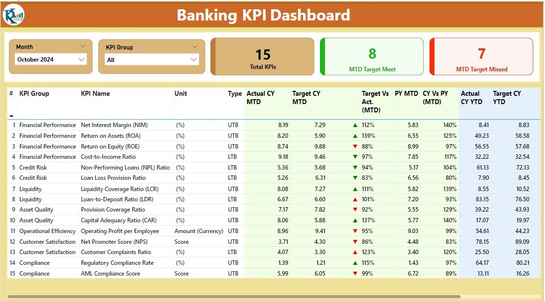
When leadership wants an interactive, refreshable view rather than a static workbook, this Power BI dashboard is the retail-banking answer. It presents the same core KPIs as our top pick but with slicers, drill-down and a scheduled refresh.
Who it is for: executives and analysts at retail or commercial banks already invested in the Microsoft BI stack.
What is inside:
- Return on assets, return on equity and net interest margin visuals
- Deposit and loan portfolio breakdowns with slicers
- Trend pages that hold twelve months on one screen
- A data model designed to connect to a core-banking or data-warehouse feed
Concrete uses: track ROA toward the 1.0% strong-performance mark; watch ROE inside a 10–15% target band; let executives filter the whole report by region without touching a formula; and publish to the Power BI service for phone access.
Price: $11.99 — get the Banking KPI Dashboard in Power BI.
Best for: Microsoft-first banks that want interactivity over a static file.
5. Loan Recovery Services KPI Dashboard in Excel — best for collections
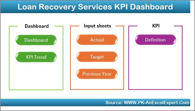
Recovery and collections teams need a scoreboard aimed at delinquency, roll rates and cash recovered — not deposits. This Excel dashboard is purpose-built for the recovery unit and for lenders with a meaningful delinquent book.
Who it is for: collections managers, recovery agencies and lending risk teams.
What is inside:
- Recovery rate, promise-to-pay kept rate and cost of collection
- Delinquency buckets (30/60/90+ days) and roll-rate tracking
- Agent and portfolio performance comparison
- Recovered-amount trend against target
Concrete uses: lift recovery rate by finding which delinquency bucket leaks most; benchmark cost of collection against dollars recovered; rank agents on promise-kept rate; and give risk a monthly view of the 90+ day roll rate before it becomes a charge-off.
Price: $14.99 — buy the Loan Recovery Services KPI Dashboard in Excel.
Best for: collections and recovery units inside banks, credit unions and lenders.
6. Microfinance KPI Dashboard in Excel — best for community lenders
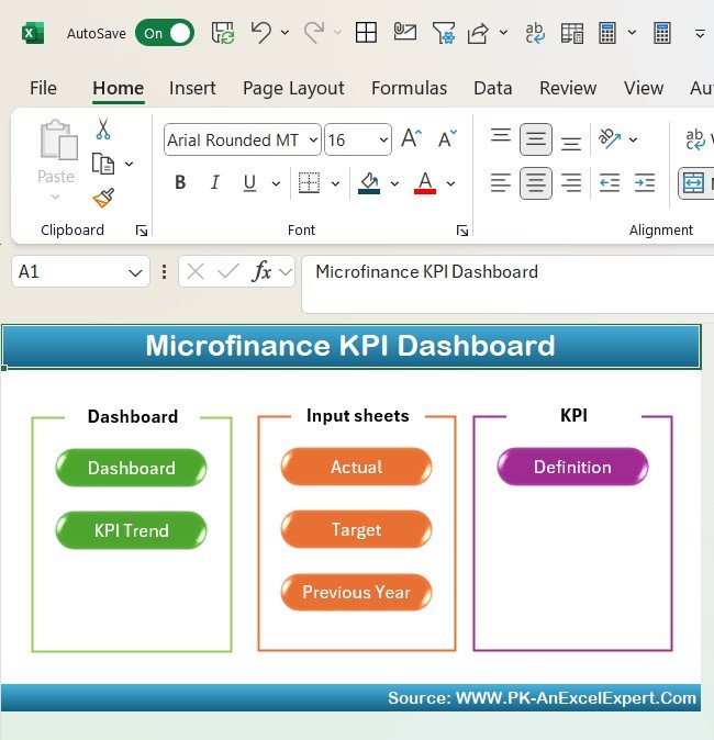
Microfinance and community lenders measure success by outreach and portfolio quality, so this Excel dashboard centres on portfolio at risk, active borrowers and operational self-sufficiency — the sector’s defining metrics.
Who it is for: microfinance institutions, CDFIs and small community lenders.
What is inside:
- Portfolio at risk (PAR>30) tracking, the sector’s headline quality metric
- Active borrowers, average loan size and outreach growth
- Operational self-sufficiency and cost-per-borrower
- Repayment rate and write-off ratio views
Concrete uses: keep PAR>30 under the 5% caution line most funders watch; prove operational self-sufficiency above 100% to donors and investors; track cost per borrower as you scale outreach; and show repayment rate trends to a board in one page.
Price: $12.99 — get the Microfinance KPI Dashboard in Excel.
Best for: mission-driven lenders measuring outreach and portfolio at risk.
7. Banking KPI Dashboard in Google Sheets — best value

At $9.99 this is the best value on the list and the right pick when the priority is sharing. As a Google Sheet it opens in a browser, needs nothing installed, and can be shared with a link and locked to view-only for branch managers.
Who it is for: branch networks and finance teams that live in Google Workspace.
What is inside:
- Core banking KPIs — NIM, efficiency ratio, deposit and loan growth
- Cloud-native charts that update as you type
- Shareable, permission-controlled access with no software install
- Works on any device with a browser
Concrete uses: give every branch manager a live view without buying seats; collaborate on the monthly numbers in real time; comment directly on a metric that slipped; and cut email attachments out of the reporting cycle entirely.
Price: $9.99 — buy the Banking KPI Dashboard in Google Sheets.
Best for: teams that value a shareable link over desktop software.
8. Banking Operations KPI Dashboard in Google Sheets — best for cloud ops teams

This is the operations depth of our top pick delivered in Google Sheets. If your team is cloud-first but still needs the full deposits-lending-risk-service scorecard, this $9.99 template is the match.
Who it is for: operations teams standardised on Google Workspace rather than Microsoft Office.
What is inside:
- Full operations KPI set: deposits, lending, risk and service efficiency
- Input and dashboard tabs mirroring the Excel edition
- Real-time collaboration and view-only sharing
- No install, no licence, works on any browser
Concrete uses: run the same operational scorecard as the Excel flagship without leaving Google Workspace; let two analysts update inputs at once; share a read-only board version with a single link; and keep the file version-history that Sheets tracks automatically.
Price: $9.99 — get the Banking Operations KPI Dashboard in Google Sheets.
Best for: cloud-first operations teams that want the full scorecard in Sheets.
Not sure which to buy? Most banks and credit unions should start with the Banking Operations KPI Dashboard in Excel at $12.99 — it is the broadest tool here. Prefer a shareable link over a file? The Banking KPI Dashboard in Google Sheets is just $9.99.
How to choose between them
Use this quick decision path:
- Retail or commercial bank, want one file: Banking Operations KPI Dashboard in Excel ($12.99).
- Credit union or member-owned: Credit Unions KPI Dashboard in Power BI ($11.99).
- Deal, advisory or capital-markets team: Investment Banking KPI Dashboard in Excel ($14.99).
- Executives want interactive drill-down: Banking KPI Dashboard in Power BI ($11.99).
- Collections or recovery unit: Loan Recovery Services KPI Dashboard in Excel ($14.99).
- Microfinance or community lender: Microfinance KPI Dashboard in Excel ($12.99).
- Need a shareable link, tightest budget: Banking KPI Dashboard in Google Sheets ($9.99).
If you are still weighing spreadsheet formats generally, our buying guide on how to evaluate an Excel dashboard before you pay walks through the checks that matter, and 7 reasons to use a quality KPI dashboard across Excel, Power BI and Google Sheets covers why format choice follows your stack, not the other way round.
When a template is NOT the right answer
A spreadsheet dashboard is the wrong buy in three situations. First, if you need real-time balances and transaction-level feeds straight from a core-banking system, buy purpose-built banking BI or a data-warehouse connector — a manual monthly refresh will always lag. Second, if examiners require an immutable audit trail of who changed which figure and when, a governed BI platform with row-level security and change logging beats a shared file. Third, if you have hundreds of concurrent editors across many branches, a spreadsheet becomes a version-control problem.
For everything short of that — monthly board packs, branch scorecards, a CFO’s operating view, a recovery team’s weekly numbers — a $10–$15 template does the job that six-figure software is oversized for. Be honest about which side of that line you sit on before you spend. Teams outside banking can browse our manufacturing dashboard templates, logistics dashboard templates or project management dashboard templates for the same one-time-price model.
Frequently asked questions
What is a banking KPI dashboard in Excel?
A banking KPI dashboard Excel template is a pre-built workbook that turns raw core-banking exports into a single formatted view of key metrics — net interest margin, efficiency ratio, loan-to-deposit, delinquency and deposit growth. You paste your figures into an input sheet and the dashboard refreshes automatically, replacing hours of manual report-building each month.
Which banking KPIs should a bank track first?
Start with five: net interest margin (typically 2.5–4.0%), efficiency ratio (target under 60%), return on assets (1.0% is strong), loan-to-deposit ratio (a healthy 80–90%), and the non-performing loan ratio (under 1% is healthy). Together they cover profitability, cost control, liquidity and credit risk in one glance.
What KPIs matter most for credit unions?
Credit unions are member-owned, so track net worth ratio (stay above the 7% well-capitalized threshold), loan-to-share, delinquency ratio, member growth and return on assets. The Credit Unions KPI Dashboard in Power BI is built around these measures rather than the shareholder metrics banks use.
Excel, Power BI or Google Sheets — which format is best?
Choose by your stack. Excel suits teams that want one self-contained file; Power BI suits Microsoft-first shops wanting interactive drill-down and scheduled refresh; Google Sheets suits Workspace teams that value a shareable link and live collaboration. All three appear on this list at $9.99–$14.99, so format need not drive up the price.
How much do these bank and credit union templates cost?
Every template here costs between $9.99 and $14.99 as a one-time purchase — you own the file outright with no subscription. That compares with roughly $50–$300 per user per month for banking-specific BI software, which reaches thousands of dollars a year once you licence a full reporting team.
Can I connect a template to my core-banking system?
The Excel and Google Sheets templates use a paste-and-refresh workflow: you export from your core system, drop the figures into the input sheet, and the dashboard updates. The Power BI templates include a data model you can point at a core export or data-warehouse table for scheduled refresh, which suits larger institutions.
Are these templates suitable for examiners and auditors?
Yes for presentation and analysis — every formula is visible and editable, so an examiner can trace any number to its source. For a tamper-proof audit trail of edits, pair the template with your governed systems; a spreadsheet is transparent but does not log who changed what, which matters for formal compliance.
Do I need advanced Excel or Power BI skills to use them?
No. The dashboards are designed for finance staff, not developers: you enter figures on a clearly labelled input sheet and the visuals update. Basic spreadsheet familiarity is enough for the Excel and Google Sheets tools; the Power BI files open in the free Power BI Desktop and refresh with a click.
What is a good loan recovery rate to target?
Recovery rate varies by book and vintage, but collections teams typically watch cost of collection against dollars recovered and aim to keep the 90+ day roll rate low. The Loan Recovery Services KPI Dashboard in Excel tracks recovery rate, promise-to-pay kept rate and delinquency buckets so you can set a target from your own baseline.
Can multiple branches use the same dashboard?
Yes. The Google Sheets templates are built for this — share one link, set branch managers to view-only, and everyone sees the same live numbers. For Excel and Power BI, store the file centrally or publish the Power BI report to the service so branches read a single source rather than emailed copies.
Get more bank and credit union templates
Ready to standardise your banking reporting? The Banking Operations KPI Dashboard in Excel ($12.99) is the fastest way to replace five monthly reports with one, and credit unions should grab the Credit Unions KPI Dashboard in Power BI ($11.99). On the tightest budget, the Banking KPI Dashboard in Google Sheets is $9.99.
See every dashboard in action on our YouTube channel, @NextGenTemplates, and explore related picks like our training and learning dashboard templates and the clinic contract management dashboard in Power BI and Excel.