

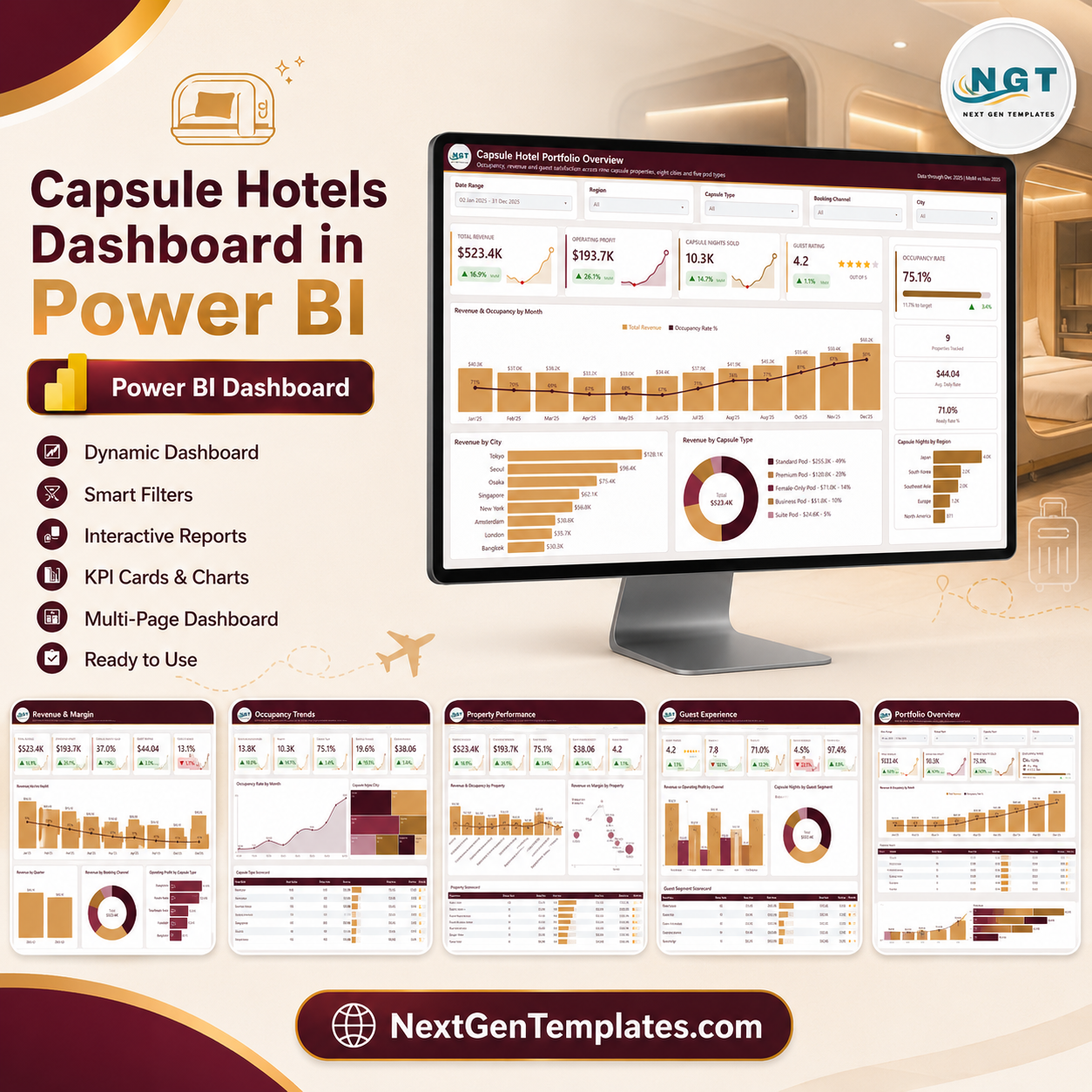
The Capsule Hotels Dashboard in Power BI is a finished .pbix file, not a starter frame. It ships with a 500-row, 19-column sample stay table spanning nine capsule properties, eight cities and five pod types, and it renders nine report pages on 33 DAX measures referenced by the report visuals. Five of those pages are the ones you navigate; the rest are a Get More Dashboards page, a Details drillthrough bound on eight fields, and two 280×360 tooltip pages. Built by NextGenTemplates, whose YouTube channels reach 300K+ subscribers. Every screenshot below was exported from the exact file you download – no mockups, no invented numbers. Nothing is locked: no macros, no add-ins, no sign-in. Open it in the free Power BI Desktop, repoint the query at your own export, and the pages redraw.

One thing to say plainly: this workbook reports what you load into it. It does not certify occupancy against an industry benchmark, does not define average daily rate or revenue per available capsule to any external standard, and makes no statement about fire safety, building codes, lodging licences or guest-data handling. The measures are ordinary DAX in a file you own, and you should check each definition against your own reporting rules before the numbers leave your desk.
Key Features of the Capsule Hotels Dashboard in Power BI
- Five slicers per page, synced across the report. Date Range plus Region, Capsule Type and Booking Channel are constant; the fifth slot changes with the page – City on Overview and Property Performance, Guest Segment on Revenue & Margin, Housekeeping on Occupancy Trends, Guest Origin on Guest Experience.
- SVG KPI cards with month-on-month deltas and sparklines. Each card carries its own trend line and a coloured MoM arrow, so a card reads as a direction, not just a number.
- A Details drillthrough on eight fields. Region, City, Property, Capsule Type, Guest Segment, Booking Channel, Guest Origin and Housekeeping Status all route to the same hidden Details page.
- Two tooltip pages. Category Detail and Trend Detail are 280×360 hidden pages that surface on hover instead of the default black box.
- Three scorecard tables. Capsule Type, Property and Guest Segment each get a sortable table with in-cell revenue bars and star ratings.
- A dedicated Date table. The model carries a proper date dimension, so month, quarter and Year-Month sort correctly rather than alphabetically.
What’s Inside the Capsule Hotels Dashboard in Power BI
Page 1 – Capsule Hotel Portfolio Overview
Four KPI cards (Total Revenue, Operating Profit, Capsule Nights Sold, Guest Rating) sit beside a right-hand rail carrying an Occupancy Rate gauge with a distance-to-target readout, plus Properties Tracked, Avg. Daily Rate and Ready Rate tiles. Below them: Revenue & Occupancy by Month as a combo chart, Revenue by City as a ranked bar, Revenue by Capsule Type as a donut with value and share in the legend, and Capsule Nights by Region as a bar.

Page 2 – Revenue & Margin
Five cards – Total Revenue, Operating Profit, Operating Margin, Avg Daily Rate, Ancillary Share – over Revenue vs Operating Margin by Month, Revenue by Quarter, Revenue by Booking Channel and Operating Profit by Capsule Type. This is the page that separates a busy month from a profitable one.
Page 3 – Occupancy Trends
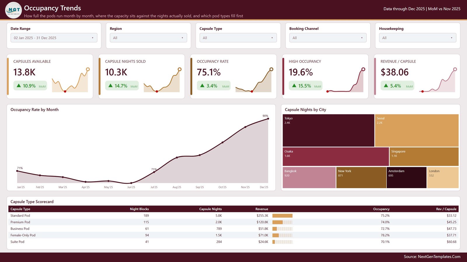
Capsules Available, Capsule Nights Sold, Occupancy Rate, High Occupancy and Revenue / Capsule head an Occupancy Rate by Month area chart, a Capsule Nights by City treemap and a Capsule Type Scorecard listing night blocks, capsule nights, revenue, occupancy and revenue per capsule for all five pod types.
Page 4 – Property Performance
Revenue & Occupancy by Property ranks all nine properties, Revenue vs Margin by Property plots turnover against margin as a bubble field, and the Property Scorecard carries night blocks, revenue, operating profit, occupancy, margin and rating per site.
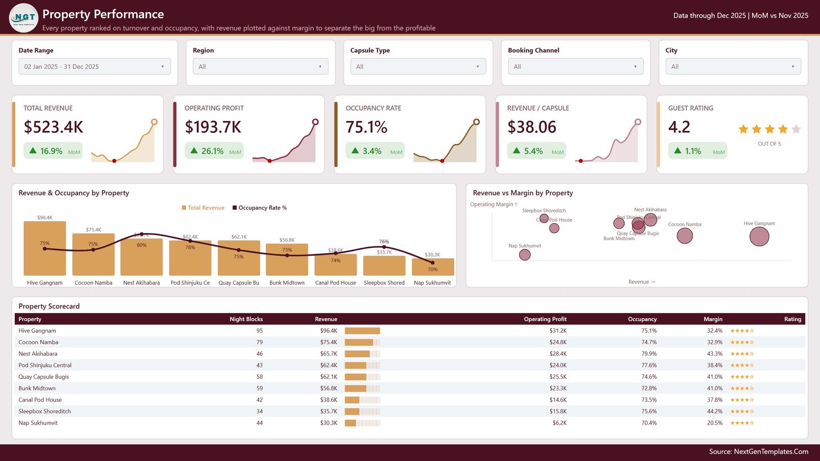
Honest note on this page: in the exported screenshot the occupancy line crosses the third bar’s $65.7K data label, three property names on the x-axis are truncated to fit, and several bubble labels overlap near the centre of the scatter. These are cosmetic export artefacts in the picture; in Power BI Desktop you can drag the visual wider, switch the labels off or resize the plot area in seconds. We would rather you see them here than after you buy.
Page 5 – Guest Experience
Guest Rating, Check-In Wait, Housekeeping Ready, Cancellation Rate and Booking Reliability over Revenue vs Operating Profit by Channel, Capsule Nights by Guest Segment and a Guest Segment Scorecard covering tourists, business travellers, backpackers, transit passengers and digital nomads.

In the download
One zip holding the .pbix, the Data.xlsx sample table (500 rows x 19 columns: stay ID, stay date, region, city, property, capsule type, guest segment, booking channel, guest origin, housekeeping status, capsules available, capsules occupied, no shows, cancellations, room revenue, ancillary revenue, operating cost, guest rating, check-in wait) and a PDF user manual.
Capsule Hotels Dashboard in Power BI vs. a Tableau Build vs. a Paid Hospitality BI Suite – Where This Fits
| This template | Tableau / Qlik build | Paid hospitality BI suite | |
|---|---|---|---|
| Cost | 29.99 one-off (17.99 on sale) | Licence plus build time | Monthly per property |
| Platform | Power BI Desktop (free) | Tableau Desktop / Qlik Sense | Vendor cloud |
| Setup time | Open it, repoint one query | Days to model and lay out | Onboarding call plus data mapping |
| Real-time team collaboration | Via Power BI Service if you publish | Via Tableau Server | Built in |
| Mobile access | Power BI mobile app once published | Vendor app | Vendor app |
| Customisable fields | Every measure and visual is editable | Fully editable, you build it | Vendor-defined |
| Share with link | Yes, after publishing to the Service | Yes, via server | Yes |
| Year-1 cost at 5 users | 29.99 | Licences plus consultant days | Recurring subscription |
| Connects to your PMS or channel manager | No – you load an export | Only if you build the connector | Usually yes |
| Who defines occupancy and rate | You do – plain DAX you can rewrite | You do | The vendor does |
Who This Template Is For – and Who It’s Not For
It fits operators running two to twenty capsule, pod or hostel-style properties who already export stay data to Excel or CSV; revenue and operations managers who want one file that holds occupancy, margin and guest feedback side by side; and analysts who want a finished Power BI layout to rebrand rather than a blank canvas.
It does not fit a single-site operator with fifteen stays a month – a spreadsheet is enough. It is not a booking engine, a channel manager or a PMS, and it will not take reservations or push rates. It has no live connector: something has to hand it a file or a table. And if you need occupancy or rate figures signed off against an external standard, this is not that – it is your data, your definitions, in a file you control.
How to Use the Capsule Hotels Dashboard in Power BI
- Unzip the download and open the .pbix in Power BI Desktop (free from Microsoft).
- Click through all five pages with the sample data first, so you know what each card and chart is doing before you touch anything.
- Open Data.xlsx and replace the sample stays with your own export, keeping the 19 column headers exactly as they are.
- In Power BI, Transform data – Data source settings, point the query at your file, then Close & Apply.
- Open the measure list and read the occupancy, daily rate and revenue-per-capsule definitions. Rewrite them if your house rules differ – that is the point of shipping them unlocked.
- Set the occupancy target on the Overview gauge to the number your team actually works to.
- Swap the theme colours and drop in your own logo, then publish to the Power BI Service if you want a shareable link.
Real-World Use Cases
Mei runs four pod hotels across Tokyo and Osaka. Every Monday she exported four separate stay reports and pasted them into one sheet. Now she appends them into Data.xlsx, refreshes, and the Property Scorecard on page 4 ranks all four on revenue, occupancy and margin in one view – and the bubble chart shows her that the busiest site is not the most profitable one.
Diego manages revenue for a nine-property capsule group. He lives on page 2, where Revenue by Booking Channel and Operating Profit by Capsule Type sit together. When the OTA share climbs, he can see immediately what it costs him in margin rather than arguing about it from memory.
Priya is the operations lead who owns guest satisfaction. Page 5 is hers: check-in wait, housekeeping ready rate, cancellation rate and rating by segment on one screen. She right-clicks a segment, drills through to Details, and takes the underlying stays into the morning stand-up.
Frequently Asked Questions
Does this connect to my PMS, channel manager or OTA account?
No. It reads a file. You export your stay data, drop it into Data.xlsx or point the query at your own table, and refresh. There is no live integration and none is implied.
Are the occupancy, ADR and revenue-per-capsule figures industry-standard?
They are whatever the DAX in the file says they are, calculated from the rows you load. We do not claim they match any external hospitality standard or benchmark. Open the measures, read them, and change them to match your own definitions before you circulate the numbers.
Do I need a Power BI Pro licence?
Not to open, edit or use it. Power BI Desktop is free. A Pro or Premium licence is only needed if you want to publish to the Power BI Service and share a link with colleagues.
Can I use it for hostels, pod hotels or micro-stay properties?
Yes. The model is built around a stay row with a unit count, so anything sold as a bed, pod or capsule night fits. Rename Capsule Type to Room Type and it works for a small hotel too.
How many properties can it handle?
The sample carries nine properties, eight cities and five pod types across 500 stay rows. Power BI’s import engine handles far more than that – the layout stays readable well past the sample size, though a scorecard with sixty properties will need scrolling.
Is the file locked or protected in any way?
No. No macros, no add-ins, no password, no login. Every measure, colour, visual and page is editable, and you can white-label it for your own team.
What exactly do I get in the download?
A single zip containing the .pbix report, the Data.xlsx sample table and a PDF user manual. Nothing else, no subscription, no account to create.
About the Author
Built by PK – Microsoft Certified Professional with 15+ years of Excel, Google Sheets, and Power BI experience. Founder of NextGenTemplates, reaching 300K+ subscribers across YouTube channels. Every template is hand-built and tested before release.
Explore Related Templates
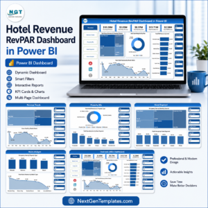
- Hotel Revenue RevPAR Dashboard in Power BI – a rate-and-revenue view for conventional room stock.
- Eco Lodges Dashboard in Power BI – the same analytical layout for lodge and cabin operators.
- Hospitality & Resorts Dashboard in Google Sheets – if your team lives in a browser rather than in Power BI.
- Housekeeping Service Analytics Dashboard in Google Sheets – pairs with page 5’s ready-rate view.
- Hotel Room Booking Data Entry System in Excel – a front-desk capture form if you have no export to start from.
- Browse the full Power BI Dashboard category or the whole Power BI library.
Download the Capsule Hotels Dashboard in Power BI, open it in free Power BI Desktop, and swap in your own stay export. Instant download, no subscription, nothing locked. Prefer to read the full page-by-page walkthrough first? It is on the PK-AnExcelExpert blog.
Last updated: 18 August 2026.














Reviews
There are no reviews yet.