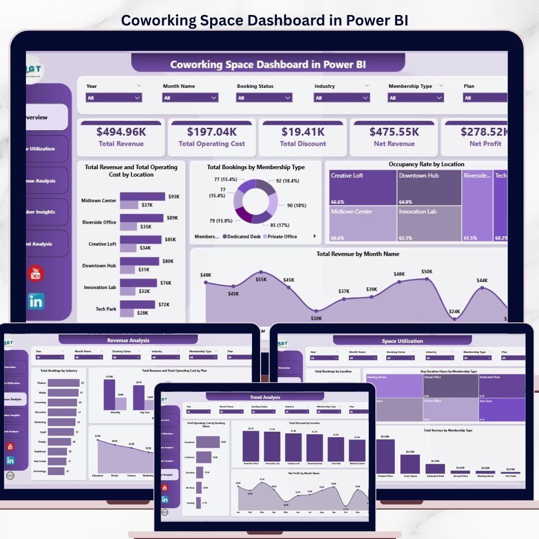
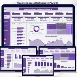
The Coworking Space Dashboard in Power BI tracks 5 headline KPIs, 14 interactive visuals, and 5 analysis pages across revenue, occupancy, membership mix, and profitability. Setup takes under 10 minutes — open the .pbix file, point it at your coworking booking data, and every chart, card, and slicer refreshes automatically. Multi-location operators running 1–10 flex-office branches get portfolio-level visibility for a one-time $17.99 instead of $149–$499 per location per month for platforms like OfficeRnD, Nexudus, or Cobot.
🌍 Join 8,400+ teams in 40+ countries using NextGenTemplates to replace paid SaaS tools with one-time-purchase Excel, Google Sheets, Power BI, and HTML templates.
✅ Instant download · One-time payment · No subscription · No per-user fees · Lifetime access
 Coworking Space Dashboard in Power BI
🔑 Key Features of Coworking Space Dashboard in Power BI
📊 5 Headline KPI Cards — Total Revenue, Total Operating Cost, Total Discount, Net Revenue, and Net Profit sit on top of the Overview page and refresh instantly when any slicer is applied.
🗂️ 5 Dedicated Analysis Pages — Overview, Space Utilization, Revenue Analysis, Member Insights, and Trend Analysis. Each page answers a different operational question coworking managers face every month.
🎛️ 14 Interactive Visuals Driven by DAX Measures — Every chart is backed by a Power BI DAX measure, so filtering by Location, Membership Type, Plan, Industry, or Referral Source cascades across every visual in under 1 second.
💰 Location-Level Profitability View — The Total Revenue and Total Operating Cost by Location clustered chart exposes which branches are subsidizing the others and which are quietly eating margin.
📈 Occupancy Rate by Location — A single chart that shows occupancy percentage per branch, so you know which locations are under-utilized and which are running hot before the monthly review.
🎯 Membership Mix Analysis — Total Bookings and Total Revenue broken down by Hot Desk, Dedicated Desk, Private Office, and Virtual Office members. Spot which plan is pulling revenue and which is pulling volume.
🔄 Referral Source ROI View — Revenue and booking counts mapped against Instagram, LinkedIn, Google, walk-ins, and partner referrals so you can cut the channels that bring bookings but not profit.
🏢 Industry Segmentation — Total Bookings and Total Revenue by Industry reveal which verticals (tech, agencies, freelancers, finance) pay the most per booking.
📦 What’s Inside the Coworking Space Dashboard in Power BI
The dashboard ships as a single .pbix file with 5 interactive report pages. Each page is engineered to answer a specific set of operational questions.
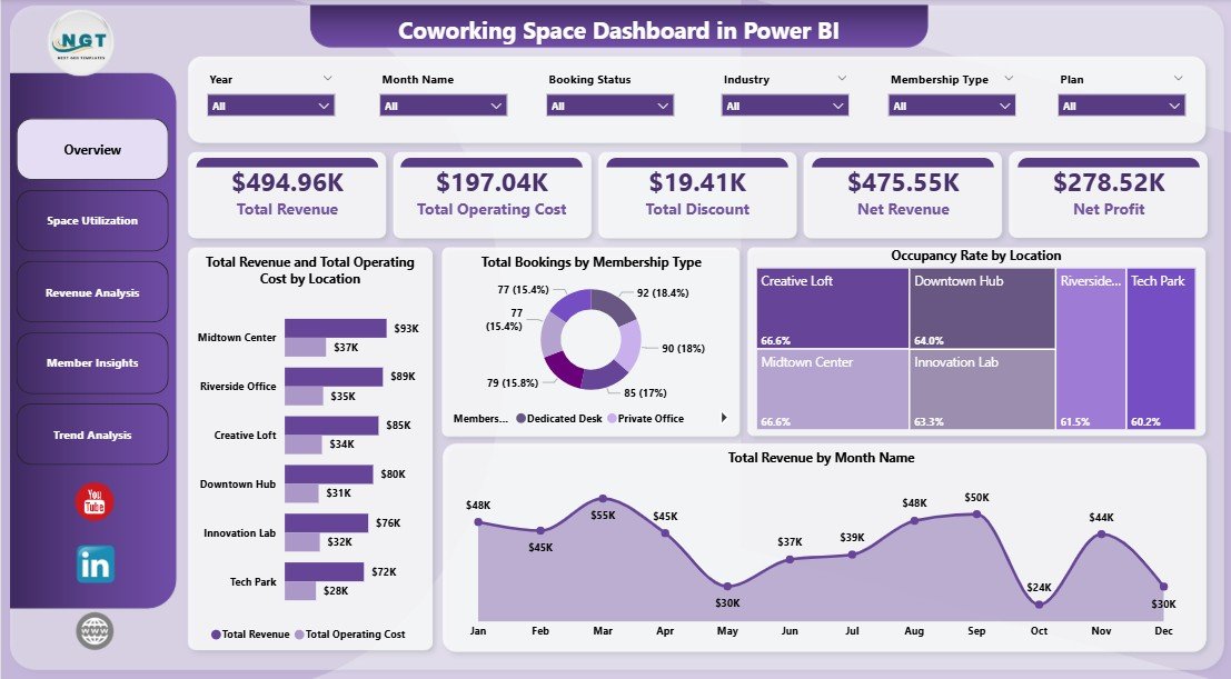
1. Overview Page
The Overview is the command center. At the top, you see 5 KPI cards — Total Revenue, Total Operating Cost, Total Discount, Net Revenue, and Net Profit. Below the cards sit four analytical charts with slicers along the right side that filter every visual simultaneously.
🔹 Total Revenue and Total Operating Cost by Location — A clustered column chart that puts revenue and operating cost side by side for every branch, so the profitability gap per location is visible at a glance.
🔹 Total Bookings by Membership Type — Breaks down booking volume across Hot Desk, Dedicated Desk, Private Office, and Virtual Office to show where demand is concentrated.
🔹 Occupancy Rate by Location — The classic utilization chart showing what percentage of each branch’s capacity is being used, filtered live by the slicers on the right.
🔹 Total Revenue by Month Name — A 12-month seasonality view that surfaces your strongest and weakest revenue months at a glance.
Coworking Space Dashboard in Power BI
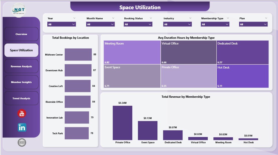
2. Space Utilization Page
This page answers the question every coworking operator obsesses over: are we using our space efficiently? It contains three analysis visuals.
🔹 Total Bookings by Location — Which branch is busiest, which is struggling, and where should you reallocate marketing spend.
🔹 Avg Duration Hours by Membership Type — Private Office members typically stay the longest; Hot Desk users turn over fastest. This visual exposes the average stay duration per plan.
🔹 Total Revenue by Membership Type — Shows which membership tier actually generates revenue, regardless of booking count — often different from where volume comes from.
 Space Utilization Page
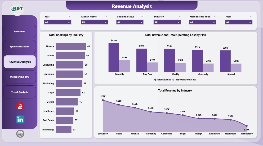
3. Revenue Analysis Page
The Revenue Analysis page zooms into monetization and plan-level profitability. Three charts anchor this page.
🔹 Total Bookings by Industry — See which verticals (tech, agencies, freelancers, finance) book the most often.
🔹 Total Revenue and Total Operating Cost by Plan — A clustered comparison that exposes whether your Monthly, Daily, or Hourly plans are profitable once operating cost is factored in.
🔹 Total Revenue by Industry — Some industries book rarely but pay more per booking. This chart reveals which ones are worth prioritizing in your sales pitch.
 Revenue Analysis Page
4. Member Insights Page
Member Insights focuses on acquisition quality and monthly profitability trends. Three charts anchor this page.
🔹 Total Revenue and Total Operating Cost by Month Name — A monthly profitability trend line showing where margin compresses and where it expands across the year.
🔹 Total Revenue by Referral Source — Identifies which acquisition channel actually pays back: Instagram, LinkedIn, Google, walk-ins, or partner referrals.
🔹 Total Bookings by Referral Source — Volume from each channel, complementing the revenue view so you can compare quantity versus quality of leads per source.
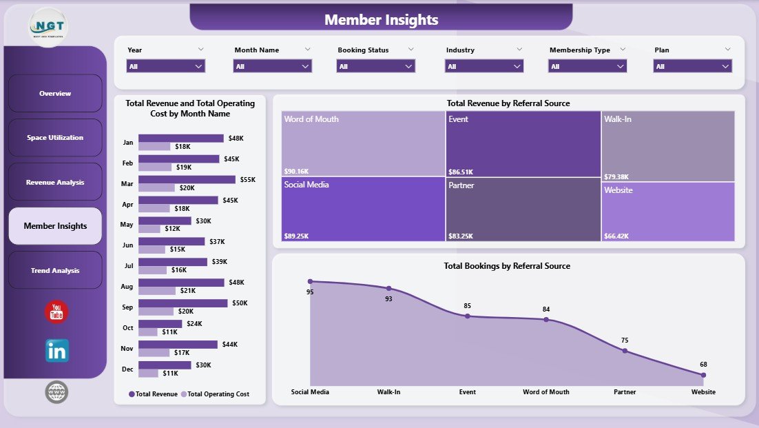 Member Insights Page
5. Trend Analysis Page
The Trend Analysis page is where you zoom out for budgeting, forecasting, and investor reporting. Three charts anchor this page.
🔹 Total Operating Cost by Booking Status — Breaks operating cost down by Confirmed, Pending, and Cancelled bookings so you know how much cost is locked against uncertain revenue.
🔹 Total Discount by Location — Shows which branches are giving away the most revenue through discounts and promotions — critical for margin protection decisions.
🔹 Net Profit by Month Name — Your bottom-line trend line, essential for year-over-year budgeting and investor updates.
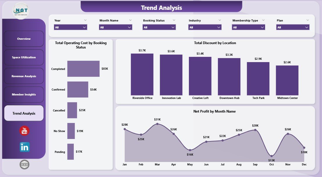 Trend Analysis Page
📊 Coworking Space Dashboard in Power BI vs. Tableau / Qlik Alternative vs. OfficeRnD / Nexudus — Where This Fits
| Feature | Coworking Space Dashboard in Power BI | Tableau / Qlik Sense Equivalent | OfficeRnD / Nexudus / Cobot |
|---|---|---|---|
| Cost | $17.99 one-time | $70–$75 / user / month | $149–$499 / location / month |
| Platform | Power BI Desktop (free) | Tableau Desktop / Qlik Sense | Cloud SaaS |
| Setup time | 10 minutes | 2–4 hours to rebuild | 2–6 weeks onboarding |
| Pre-built coworking KPIs | ✅ 5 KPIs + 14 visuals | ❌ Build from scratch | ⚠️ Vendor-defined only |
| Mobile access | ✅ Power BI mobile app | ✅ Native mobile | ✅ Native mobile |
| Customizable fields & DAX | ✅ Unlimited | ✅ Unlimited | ❌ Vendor-locked |
| Your data stays with you | ✅ Fully local .pbix file | ⚠️ Server-dependent | ❌ Vendor servers |
| Share via Power BI Service | ✅ With Power BI Pro | ✅ With Tableau Server | ✅ Native |
| Year-1 cost at 5 users / 3 locations | $17.99 | $4,200+ | $5,364–$17,964 |
For coworking operators who already use Power BI for other reports and want portfolio-level visibility without paying $5K–$18K a year for SaaS, the Coworking Space Dashboard in Power BI sits in the sweet spot.
👥 Who This Template Is For — and Who It’s Not For
✅ This template is built for:
- Coworking space founders and owner-operators running 1–10 locations who already have Power BI Desktop installed
- Flex-office and hybrid workspace managers tracking occupancy, revenue, and membership mix across multiple branches
- Real-estate and hospitality investors analyzing coworking portfolio performance before acquisition or quarterly reporting
- Business center and serviced-office managers replacing manual monthly Power BI rebuilds with a ready-made template
- Consultants and analysts building coworking investor decks who want a reusable Power BI foundation
❌ This template is NOT for:
- Enterprise coworking chains with 50+ locations needing SSO, SOC 2 compliance, and real-time API feeds from door access systems
- Operators who want automated invoicing, contract management, and mailroom workflows built into the same tool
- Teams that do not use Power BI Desktop — the Coworking Space Dashboard in Excel is a better fit
⚙️ How to Use the Coworking Space Dashboard in Power BI
1️⃣ Download and unzip — Extract the .zip file and open the .pbix file in Power BI Desktop (free from Microsoft).
2️⃣ Locate the data source — Click Transform data → Data source settings in the Power BI ribbon to see where sample data is pointed.
3️⃣ Replace with your data — Point the data source at your own booking Excel file or database, keeping column names identical.
4️⃣ Refresh the model — Click Home → Refresh. Every KPI card, chart, and slicer updates in one action.
5️⃣ Apply slicers and publish — Use the slicers to filter by Location, Membership Type, or Referral Source. Publish to Power BI Service if your team has Pro licenses.
💼 Real-World Use Cases
Priya operates three coworking hubs in Bangalore, Mumbai, and Pune. Before using the Coworking Space Dashboard in Power BI, her analytics team was hand-building Power BI reports every month from three separate booking exports. Now she opens the .pbix file, refreshes the model, and has a 5-page interactive report ready for her investors by lunch — without paying ₹12,000 per location per month for OfficeRnD.
Marcus runs a 40-desk boutique coworking space in Berlin. He uses the Member Insights page of the Coworking Space Dashboard in Power BI to track which referral source — Instagram ads, LinkedIn, or walk-ins — delivers the highest-paying members. Within two quarters he shifted his marketing budget entirely toward LinkedIn, cutting acquisition cost per member by 34%.
Lena is a real-estate asset manager overseeing a mixed-use building in London. She publishes the Coworking Space Dashboard in Power BI to Power BI Service and shares the Trend Analysis page with the building owner every quarter, replacing a $299/month white-label dashboard tool.
❓ Frequently Asked Questions
What KPIs does the Coworking Space Dashboard in Power BI track?
The Coworking Space Dashboard in Power BI tracks 5 headline KPIs on the Overview page — Total Revenue, Total Operating Cost, Total Discount, Net Revenue, and Net Profit — plus 14 supporting visuals across Space Utilization, Revenue Analysis, Member Insights, and Trend Analysis pages. Every metric refreshes in under 1 second when slicers are applied.
How long does setup take?
Setup takes about 10 minutes for most coworking operators. Download the .pbix file, open it in Power BI Desktop, point the data source at your own booking Excel or database, and click Refresh. Every visual in the Coworking Space Dashboard in Power BI updates instantly — no DAX editing required for standard setup.
How does the Coworking Space Dashboard in Power BI compare to OfficeRnD or Nexudus?
The Coworking Space Dashboard in Power BI is a $17.99 one-time purchase, while OfficeRnD and Nexudus charge $149–$499 per location per month. For 3 locations, the Power BI template saves you $5,364–$17,964 in year one. The trade-off is no real-time door access, no automated invoicing, and no API integrations — this template handles analytics, not operations.
Do I need Power BI Pro to use this dashboard?
No. The Coworking Space Dashboard in Power BI runs fully inside Power BI Desktop, which is free from Microsoft. You only need Power BI Pro if you want to publish the report to Power BI Service and share it with teammates who have view-only access.
Can I track multiple coworking locations in this dashboard?
Yes. Every page in the Coworking Space Dashboard in Power BI has a Location slicer and charts like “Total Revenue and Total Operating Cost by Location” and “Occupancy Rate by Location” built in. The template scales from 1 to 10 locations without any DAX changes.
Do I need to know DAX to customize this Power BI dashboard?
No for basic use — just replace the data source and refresh. For adding new KPIs or building custom measures, basic DAX knowledge helps. The Coworking Space Dashboard in Power BI uses standard DAX patterns (SUM, DIVIDE, CALCULATE) that any Power BI user can extend.
Will this template work on Mac or Power BI Service?
Power BI Desktop runs only on Windows, but you can publish the Coworking Space Dashboard in Power BI to Power BI Service and view it from any browser including Mac and mobile devices through the Power BI mobile app.
👤 About the Author
Built by PK — Microsoft Certified Professional with 15+ years of Excel, Google Sheets, and Power BI experience. Founder of NextGenTemplates, reaching 300K+ subscribers across YouTube channels (@PK-AnExcelExpert, @NextGenTemplates, @NeoTechNavigators). Every template is hand-built and tested before release.
🔗 Explore Related Templates
🔸 Also available as: Coworking Space Dashboard in Excel — the pivot-table Excel version for teams without Power BI access.
🔸 Virtual Office Services KPI Dashboard in Power BI — MTD/YTD KPI scorecard version for virtual office and serviced-office providers.
🔸 Property Management Dashboard in Power BI — For landlords managing multi-tenant commercial properties.
🔸 Hotel and Hospitality Revenue Dashboard in Power BI — For hotels, boutique stays, and hospitality operators tracking occupancy and ADR.
🔸 Browse all Power BI Dashboard Templates on NextGenTemplates.
📖 Click here to read the Detailed Blog Post
🎥 Visit our YouTube channel for step-by-step video tutorials
👉 YouTube.com/@NextGenTemplates
📅 Last updated: April 2026


Reviews
There are no reviews yet.