


Running a Coaching & Tutoring Dashboard institute today is no longer limited to delivering quality teaching 📚. You must track student enrollments, attendance, fees, subjects, cities, coaching centers, and academic performance—all at the same time. When this information stays scattered across Excel sheets or manual reports, decision-making becomes slow and inaccurate.
That is exactly where the Coaching & Tutoring Dashboard in Power BI becomes a powerful growth enabler 🚀.
This ready-to-use Power BI dashboard transforms raw coaching and tutoring data into clear, interactive, and actionable insights. Instead of manually preparing reports, institute owners and managers can instantly monitor business performance and academic outcomes from a single dashboard.
Because the dashboard is built using Microsoft Power BI with Excel as a data source, it remains flexible, scalable, and easy to maintain. You simply update your data, refresh the dashboard, and gain real-time insights—without technical complexity.
Whether you manage a single coaching center or multiple branches across cities, this dashboard helps you increase student engagement, improve academic quality, and optimize revenue using data-driven decisions.
🔑 Key Features of Coaching & Tutoring Dashboard in Power BI
📊 Centralized academic & business analytics
🏫 Coaching center-wise performance tracking
🌆 City-wise enrollment & revenue insights
📚 Subject-level academic analysis
🎯 Attendance & ongoing training monitoring
💰 Monthly fee & revenue trend analysis
📈 Time-based performance tracking
🖱️ Interactive slicers & filters
⚡ Real-time Power BI visuals
📂 What’s Inside the Coaching & Tutoring Dashboard in Power BI
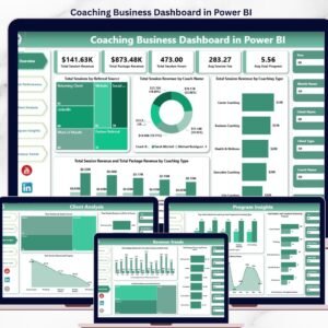
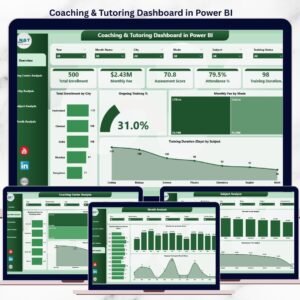
📊 Overview Page – Complete Performance Snapshot

Coaching & Tutoring Dashboard
The Overview Page acts as the command center of the dashboard.
Key insights available:
-
📍 Total Enrollment by City – Identify high-performing locations
-
🎯 Ongoing Training % – Measure student engagement
-
💻 Monthly Fee by Mode – Compare online vs offline revenue
-
⏱️ Training Duration by Subject – Analyze subject-wise effort
With interactive slicers, leadership teams gain instant clarity without manual reports.
🏫 Coaching Center Analysis – Branch-Wise Performance
This page compares performance across different coaching centers.
Charts included:
-
Cost Assessment Score by Coaching Center
-
Monthly Fee by Coaching Center
-
Attendance % by Coaching Center
👉 Helps management identify top-performing branches and fix underperforming centers quickly.
🌆 City Analysis – Location-Based Insights
The City Analysis Page highlights geographic performance differences.
Key metrics:
-
Assessment Score by City
-
Monthly Fee by City
-
Ongoing Training % by City
👉 Supports expansion planning, pricing strategy, and regional marketing decisions.
📚 Subject Analysis – Academic Performance Review
This page focuses on subject-level outcomes.
Charts included:
-
Assessment Score by Subject
-
Monthly Fee by Subject
-
Attendance % by Subject
👉 Enables academic heads to improve curriculum quality and optimize faculty allocation.
📅 Month Analysis – Trend & Growth Tracking
The Month Analysis Page tracks performance over time.
Key insights:
-
Total Enrollment by Month
-
Monthly Fee by Month
-
Ongoing Training % by Month
👉 Helps institutes forecast demand, plan campaigns, and stabilize revenue.
⚙️ How to Use the Coaching & Tutoring Dashboard in Power BI
1️⃣ Update student, fee, and attendance data in Excel
2️⃣ Refresh the Power BI dashboard
3️⃣ Apply slicers for city, subject, center, or month
4️⃣ Review KPIs and trends
5️⃣ Take faster, smarter academic and business decisions
No coding. No complexity. Just insights ✔️
🎯 Who Can Benefit from This Dashboard?
🏫 Coaching Institutes
🎓 Tutoring Centers
📘 Training Academies
🧑🏫 Education Service Providers
🌐 Multi-city & franchise coaching businesses
### 👉 Click here to read the Detailed blog post
▶️ Visit our YouTube channel to learn step-by-step video tutorials
https://youtube.com/@PKAnExcelExpert


Reviews
There are no reviews yet.