Container shipping is the backbone of global trade, yet it operates under extreme pressure. Rising fuel prices, delay penalties, detention costs, tight margins, and demanding customers leave very little room for error. Container Shipping Dashboard in Power BI Unfortunately, many shipping companies still depend on static Excel reports and delayed summaries, which makes decision-making reactive rather than proactive.
Container Shipping Dashboard in Power BI That is exactly why the Container Shipping Dashboard in Power BI becomes a critical performance management solution.
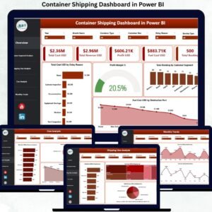
Container Shipping Dashboard in Power BI This ready-to-use Power BI dashboard converts complex container shipping data into clear KPIs, interactive visuals, and actionable insights. Instead of reviewing multiple files and manual reports, operations teams, finance leaders, and executives gain one centralized, real-time view of costs, revenue, fuel usage, profit margins, and bookings. As a result, shipping organizations respond faster, reduce inefficiencies, and protect profitability.
🔑 Key Features of Container Shipping Dashboard in Power BI
🚢 Centralized Shipping Performance View
Track cost, revenue, profit, fuel expenses, and bookings in one dashboard.
⛽ Fuel Cost Monitoring by Route & Port
Identify fuel-heavy destinations and optimize routing decisions.
📊 Interactive KPI Cards
Instantly view Total Cost, Revenue, Profit, Fuel Cost, and Total Bookings.
🎯 Customer Segment Profitability Analysis
Understand which customer segments drive margins and which drain profits.
📦 Shipping Line Performance Comparison
Analyze detention, fuel cost, and revenue across shipping lines.
📈 Monthly Trend Analysis
Track cost, fuel, and profit margin trends over time to detect early risks.
🧭 Dynamic Slicers for Deep Analysis
Filter insights by month, customer segment, shipping line, service type, and port.
⚙️ Excel-Powered & Power BI Ready
Easy Excel data source with powerful Power BI visuals—no complex integrations.
📦 What’s Inside the Container Shipping Dashboard in Power BI
This dashboard includes 5 professionally designed analytical pages, each answering a key business question:
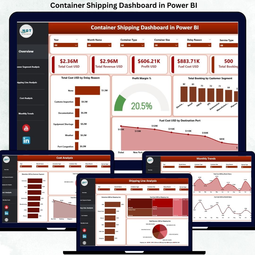
📊 Overview Page
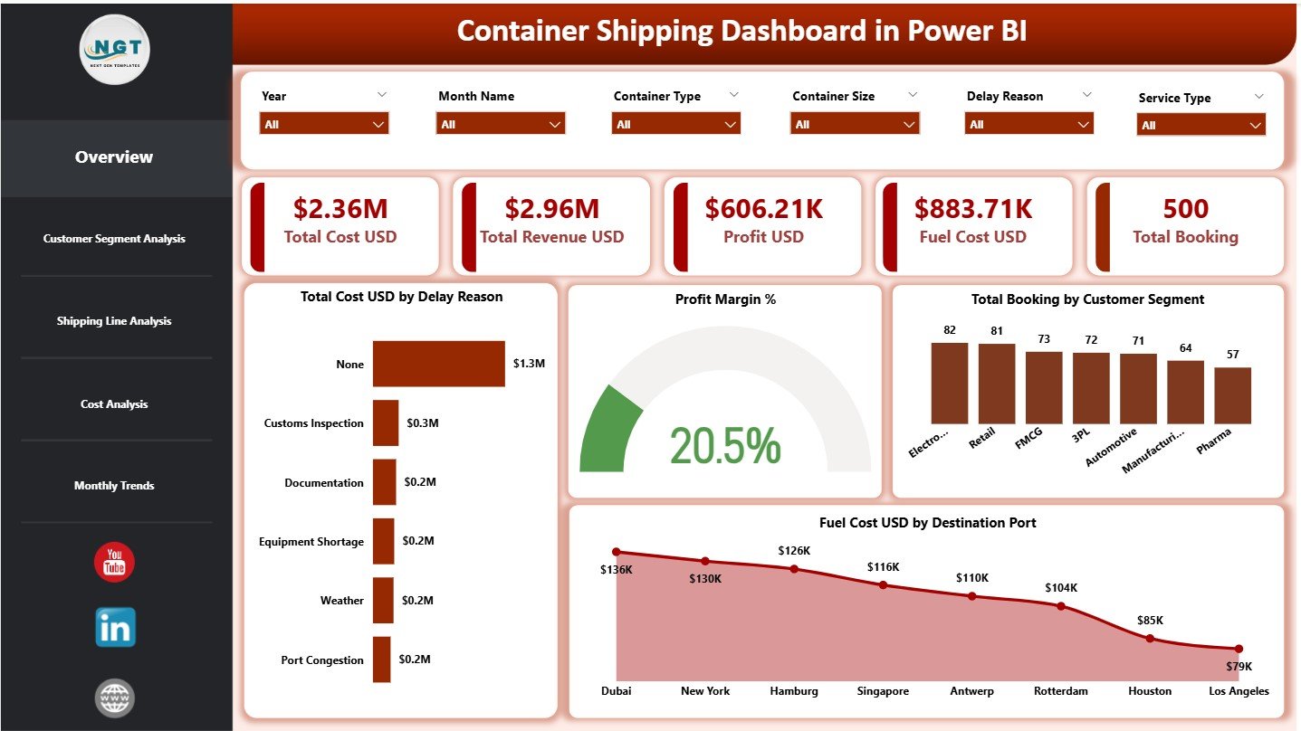
The command center showing:
-
Total Cost USD
-
Total Revenue USD
-
Profit USD
-
Fuel Cost USD
-
Total Bookings
Includes charts for:
-
Total Cost by Delay Reason
-
Profit Margin %
-
Total Bookings by Customer Segment
-
Fuel Cost by Destination Port
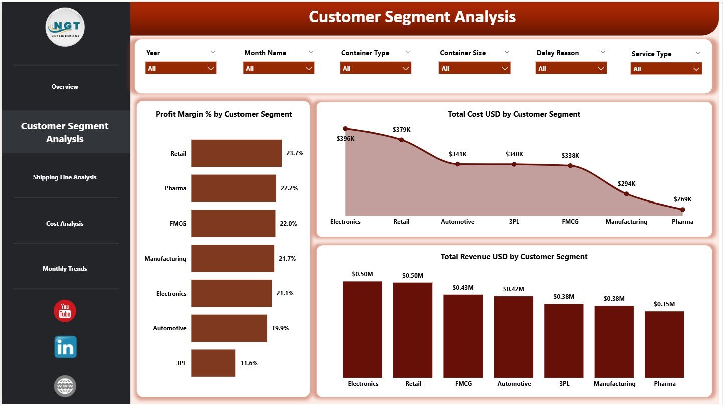
📦 Customer Segment Analysis Page
Reveals customer-wise performance using:
-
Profit Margin % by Customer Segment
-
Total Cost by Customer Segment
-
Total Revenue by Customer Segment
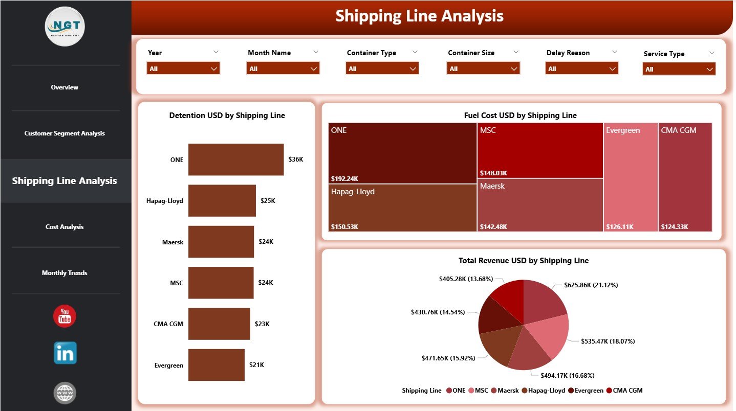
🚢 Shipping Line Analysis Page
Compares shipping partners using:
-
Detention USD by Shipping Line
-
Fuel Cost USD by Shipping Line
-
Total Revenue USD by Shipping Line
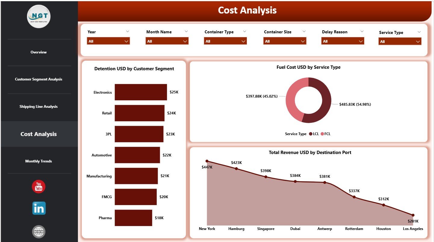
💰 Cost Analysis Page
Focuses on cost and revenue drivers with:
-
Detention USD by Customer Segment
-
Fuel Cost USD by Service Type
-
Total Revenue USD by Destination Port
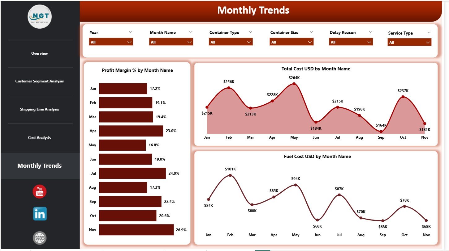
📅 Monthly Trends Page
Highlights time-based insights using:
-
Profit Margin % by Month
-
Total Cost USD by Month
-
Fuel Cost USD by Month
All pages include slicers for fast, flexible analysis.
▶️ How to Use the Container Shipping Dashboard in Power BI
Using the dashboard is straightforward and business-friendly:
1️⃣ Capture shipping data in the Excel data file
2️⃣ Load or refresh the data in Power BI
3️⃣ Apply slicers to filter by month, customer, port, or line
4️⃣ Review KPIs on the Overview Page
5️⃣ Analyze costs, fuel usage, and profitability
6️⃣ Track monthly trends and performance shifts
7️⃣ Take corrective actions with confidence
No advanced Power BI expertise is required—basic navigation is enough.
🎯 Who Can Benefit from This Container Shipping Dashboard in Power BI
🚢 Container Shipping Companies – Improve cost control and margins
📦 Freight Forwarders – Analyze customer and route profitability
⚓ Port Operations Teams – Monitor fuel and delay-related costs
💰 Finance & Cost Control Teams – Track margins and expense drivers
📊 Supply Chain & Logistics Analysts – Perform deep operational analysis
🏢 Senior Management – Access decision-ready insights instantly
This dashboard supports both operational control and strategic planning.
👉 Click here to read the Detailed Blog Post
🔔 Visit our YouTube channel to learn step-by-step video tutorials
👉 YouTube.com/@PKAnExcelExpert


Reviews
There are no reviews yet.