


The best university dashboard template for most higher education teams in 2026 is the Colleges & Universities Dashboard in Excel ($13.99): five analysis pages covering faculty ratings, tuition collected vs due, placement likelihood and department results. Department heads should add a KPI scorecard, and Google Sheets or Power BI editions start at $9.99.
Last updated: September 2026
Key takeaways
- Our top pick is the Colleges & Universities Dashboard in Excel ($13.99), with Overview, Department, College, Designation and Month analysis pages.
- For monthly target reviews, the Colleges & Universities KPI Dashboard compares MTD and YTD actuals with targets and last year in Excel ($12.99) or Power BI ($11.99).
- Department heads get their own scorecard: the University Department KPI Dashboard in Excel ($14.99) or Google Sheets ($9.99).
- The best-value pick is the Student Academic Insights Dashboard in Google Sheets at $9.99, with 6 tabs, 15 charts and a Student ID lookup.
- All eight templates cost $9.99 to $14.99 once, against BI and analytics tools that bill per user per month, and university presses get two academic publishing dashboards.
University and higher education templates compared
| Template | Format | Best For | Price |
|---|---|---|---|
| Colleges & Universities Dashboard (Best overall) | Excel | Institution-wide faculty, fee and placement analysis | $13.99 |
| Colleges & Universities KPI Dashboard | Excel | Monthly MTD/YTD target reviews for leadership | $12.99 |
| Colleges & Universities KPI Dashboard | Power BI | Interactive KPI scorecard with drill-through definitions | $11.99 |
| University Department KPI Dashboard | Excel | Department heads tracking academics, faculty and budget | $14.99 |
| University Department KPI Dashboard | Google Sheets | Departments sharing one scorecard by link | $9.99 |
| Student Academic Insights Dashboard (Best value) | Google Sheets | Student scores, attendance and fees in one view | $9.99 |
| Academic Publishing KPI Dashboard | Excel | University presses and journal editorial offices | $14.99 |
| Academic Publishing KPI Dashboard | Power BI | Publishers reporting editorial KPIs to a board | $11.99 |
University and higher education teams share one operational pain: the numbers a dean or provost needs live in half a dozen systems. Admissions sits in the CRM, grades in the student information system, faculty evaluations in survey exports, and tuition receivables in the finance ledger. When the board asks for retention by program or fees still due by college, an institutional research analyst spends days reconciling exports before anyone can read a chart.
The paid fix is an analytics platform. Self-service BI tools such as Tableau and Power BI are licensed per user per month, and higher-education analytics suites from vendors like EAB, Watermark or Anthology are usually sold on custom annual quotes. They are capable systems, but a department that only needs a monthly scorecard rarely needs an enterprise contract. A university dashboard template you buy once for $9.99–$14.99 will not replace your SIS, but it gives each team a ready-made structure for the reporting it already does in spreadsheets.
How we picked these
We searched the NextGenTemplates catalog of several thousand published templates for products built for colleges, universities, academic departments, students and academic publishing, then kept only those that model real higher education work: faculty performance, tuition collection, placements, retention, graduation, research output and editorial throughput. K-12 school tools were left out because principals and deans ask different questions; they are covered in our separate roundup.
Every pick has a live product page, a one-time price and a documented list of sheets and KPIs. We deliberately include the same design in more than one format, because a provost’s office on Microsoft 365 and a department on Google Workspace should each get a native file. Ranking weighs breadth of coverage first, then fit for a specific job, then price.
The 8 best university dashboard templates for 2026
1. Colleges & Universities Dashboard in Excel — best overall

This is the university dashboard template we would hand to a registrar or finance director first, because it analyses transaction-level data rather than pre-summarised KPIs. One data sheet of students, faculty and fees feeds five analysis pages, each reached from a left-side navigator, and every chart refreshes when you update the data.
Who it is for: deans, college administrators, finance teams and placement officers at institutions with several colleges, departments or campuses.
What is inside:
- Overview page with five KPI cards, including faculty rating, fee collection % and placement %
- Department Analysis: faculty rating and tuition collected vs due by department
- College Analysis: faculty rating, tuition fee and fee paid vs due by college type
- Designation Analysis: student satisfaction, faculty rating and marks scored by faculty designation
- Month Analysis for tuition trends, plus a Support Sheet and Data Sheet behind the slicers
Concrete uses: find the department whose fee collection lags the rest before the semester closes; compare faculty ratings between professors and lecturers; show the board placement likelihood by program on one page; and forecast monthly tuition cash flow from the trend chart.
Price: $13.99 — buy the Colleges & Universities Dashboard in Excel.
Best for: one-file analysis of faculty, fees and placements across a whole institution.
2. Colleges & Universities KPI Dashboard in Excel — best for monthly leadership reviews
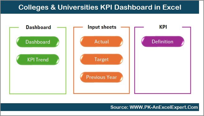
Pick #1 analyses raw records; this one scores the institution against a plan. You enter monthly actuals, targets and last year’s figures, choose a month from one dropdown, and the dashboard compares month-to-date and year-to-date performance with green and red arrows.
Who it is for: provosts, vice-chancellors, IQAC and quality-assurance cells, and planning offices that review a fixed KPI set every month.
What is inside:
- Seven worksheets: Summary navigation, Dashboard, Trend, Actual Numbers, Target, Previous Year and KPI Definition
- Actual vs Target and Actual vs Previous Year for every KPI, for both MTD and YTD
- MTD and YTD trend charts per KPI to reveal seasonal patterns
- A KPI library with unit, formula and type (upper-the-better or lower-the-better)
Concrete uses: track admissions, academic results, attendance, budget and research output on one screen; compare this October with last October; prepare accreditation evidence from a consistent monthly record; and add or remove KPIs without touching formulas.
Price: $12.99 — buy the Colleges & Universities KPI Dashboard in Excel.
Best for: institutions that report against targets to a board, senate or accreditor.
3. Colleges & Universities KPI Dashboard in Power BI — best interactive scorecard
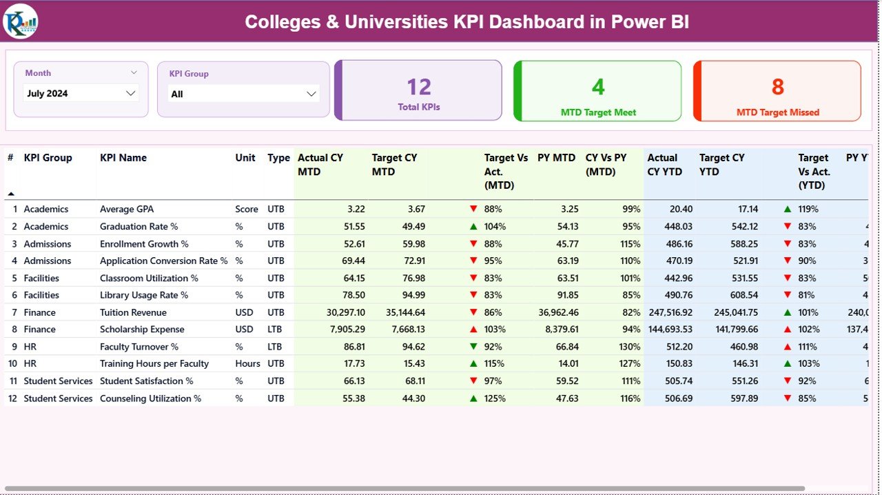
The same KPI structure as pick #2, built for Power BI. An Excel backend with Input_Actual, Input_Target and KPI Definition sheets feeds three interactive pages, so an institution already on Microsoft 365 gets a publishable scorecard without building a data model.
Who it is for: institutional research offices and university leadership teams that share reports through the Power BI service or on mobile.
What is inside:
- Summary page with Month and KPI Group slicers and cards for Total KPIs, MTD Target Met and MTD Target Missed
- A detailed KPI table with MTD, YTD, target achievement %, previous-year comparison and performance icons
- KPI Trend page with two combo charts comparing Actual vs Target vs Last Year
- Drill-through KPI Definition page showing group, unit, formula, definition and type
Concrete uses: count how many KPIs missed target this month before the leadership meeting; filter to one KPI group, such as academic or financial; drill through when a trustee asks how graduation rate is defined; and refresh from the Excel file each month.
Price: $11.99 — get the Colleges & Universities KPI Dashboard in Power BI.
Best for: Power BI institutions that want a target-vs-actual scorecard with drill-through.
Not sure which to buy? For institution-wide analysis of faculty, fees and placements, the Colleges & Universities Dashboard in Excel is $13.99. For monthly target reviews, the Colleges & Universities KPI Dashboard in Excel is $12.99. On a tight budget? The Student Academic Insights Dashboard in Google Sheets is $9.99.
4. University Department KPI Dashboard in Excel — best for department heads

Institution-level dashboards hide department-level problems. This workbook is scoped to a single academic department and tracks the five areas a chair is accountable for: academic outcomes, faculty performance, student engagement, the departmental budget and course delivery.
Who it is for: department heads, chairs, faculty managers and deans who compare several departments.
What is inside:
- Academic performance: average grades, graduation rates, retention and course completion rates
- Faculty performance: teaching evaluations, student feedback and research output
- Student satisfaction and participation in departmental activities
- Departmental income, expenses, grants and research budgets
- Course and curriculum tracking, with summary reports for management review
Concrete uses: show the dean retention and completion for your programs before budget allocation; spot a course whose completion rate is falling; compare research output against grant spend; and bring student feedback trends to the annual faculty review.
Price: $14.99 — buy the University Department KPI Dashboard in Excel.
Best for: chairs who must defend their department’s results and budget with numbers.
5. University Department KPI Dashboard in Google Sheets — best for shared department reporting
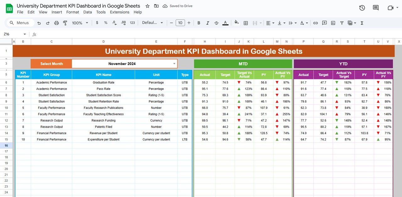
The Google Sheets version of the department scorecard costs $9.99 and opens in a browser, so the chair, the department coordinator and the dean’s office can all read the same live file without emailing attachments.
Who it is for: departments on Google Workspace and faculties that collaborate across campuses.
What is inside:
- Dashboard tab with a month selector driving MTD and YTD Actual, Target and Previous Year values
- Automatic Target vs Actual % and Previous Year vs Actual % with green and red arrows
- KPI Trend tab with a KPI selector showing group, unit, type, formula and definition
- Actual Number and Target tabs, with an adjustable starting month for academic-year reporting
Concrete uses: start the reporting year in August or September instead of January; align targets with accreditation benchmarks; track research output and satisfaction scores month by month; and share view-only access with the dean.
Price: $9.99 — get the University Department KPI Dashboard in Google Sheets.
Best for: Workspace departments that want one shared scorecard by link.
6. Student Academic Insights Dashboard in Google Sheets — best value
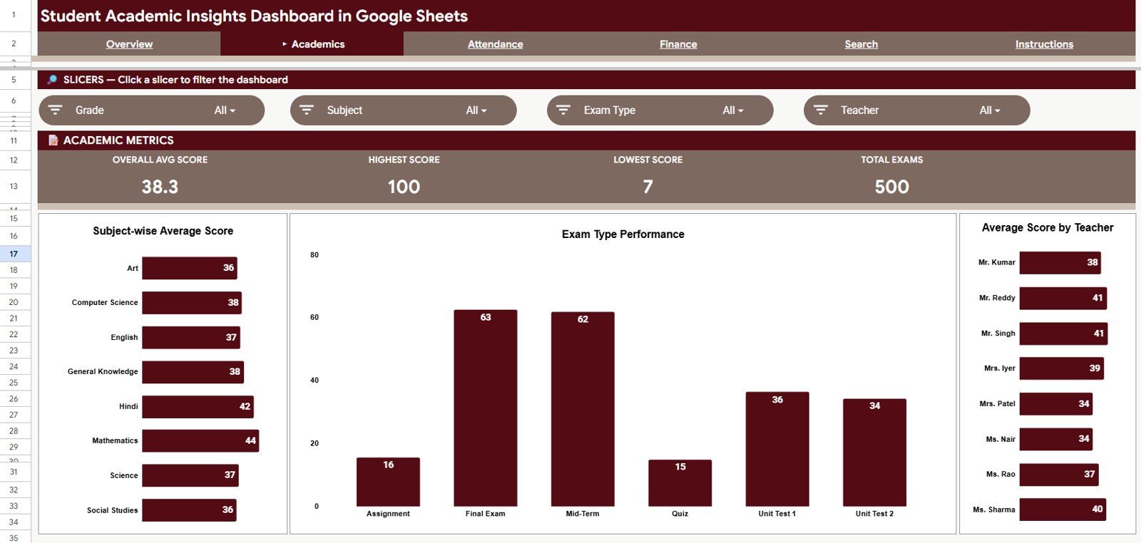
Where picks #2 to #5 score KPIs, this dashboard works from student-level records. Scores, attendance and fees sit in one data sheet, and four pages plus a lookup turn them into a view of how individual students and grades are doing.
Who it is for: college coordinators, academic advisers, tutoring centres and small colleges that want student-level insight without student-analytics software.
What is inside:
- Six tabs: Overview, Academics, Attendance, Finance, Search Sheet and Data Sheet
- Four cards: Total Records, Avg Score, Total Fees and Attendance Rate %
- 15 charts covering scores by grade, subject, exam type and teacher, attendance status, fee type and monthly collection
- A Student ID lookup that returns one student’s record without scanning the data
Concrete uses: identify students whose attendance is slipping before scores fall; compare average score by teacher and section; set average score beside monthly fee collection; and pull one student’s record during an advising meeting.
Price: $9.99 — get the Student Academic Insights Dashboard in Google Sheets.
Best for: the lowest-cost way to see student performance, attendance and fees together.
7. Academic Publishing KPI Dashboard in Excel — best for university presses and journals
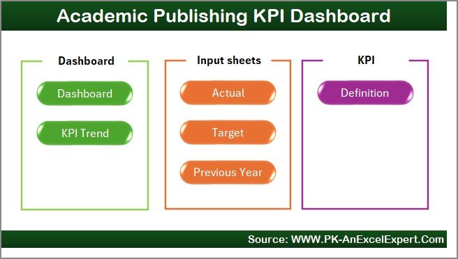
Many universities run journals, a press or a research publication office, and that work has its own pipeline: submission, review, editing, proofs, acceptance and publication. This scorecard tracks it with the same MTD/YTD structure as the institutional dashboards.
Who it is for: journal editors, university press managers, research offices and editorial teams.
What is inside:
- Seven worksheets: Home navigation, Dashboard, Trends, Actual, Target, Previous Year and KPI Definition
- KPIs such as submission volume, acceptance rate, review turnaround time, editor workload and publication delays
- Month dropdown driving MTD and YTD Actual vs Target vs Previous Year
- Two trend charts and an editable definition sheet with formula, unit and type
Concrete uses: measure review turnaround against the target your journal advertises; balance submissions across editors; spot a rising publication delay before authors complain; and report acceptance rate trends to the editorial board.
Price: $14.99 — buy the Academic Publishing KPI Dashboard in Excel.
Best for: editorial offices that manage the publishing pipeline in Excel.
8. Academic Publishing KPI Dashboard in Power BI — best for publishing boards
The Power BI edition of pick #7 presents the same editorial KPIs in three interactive pages, which suits publishers that report to a board or a university research committee.
Who it is for: academic publishers and research offices already on Power BI.
What is inside:
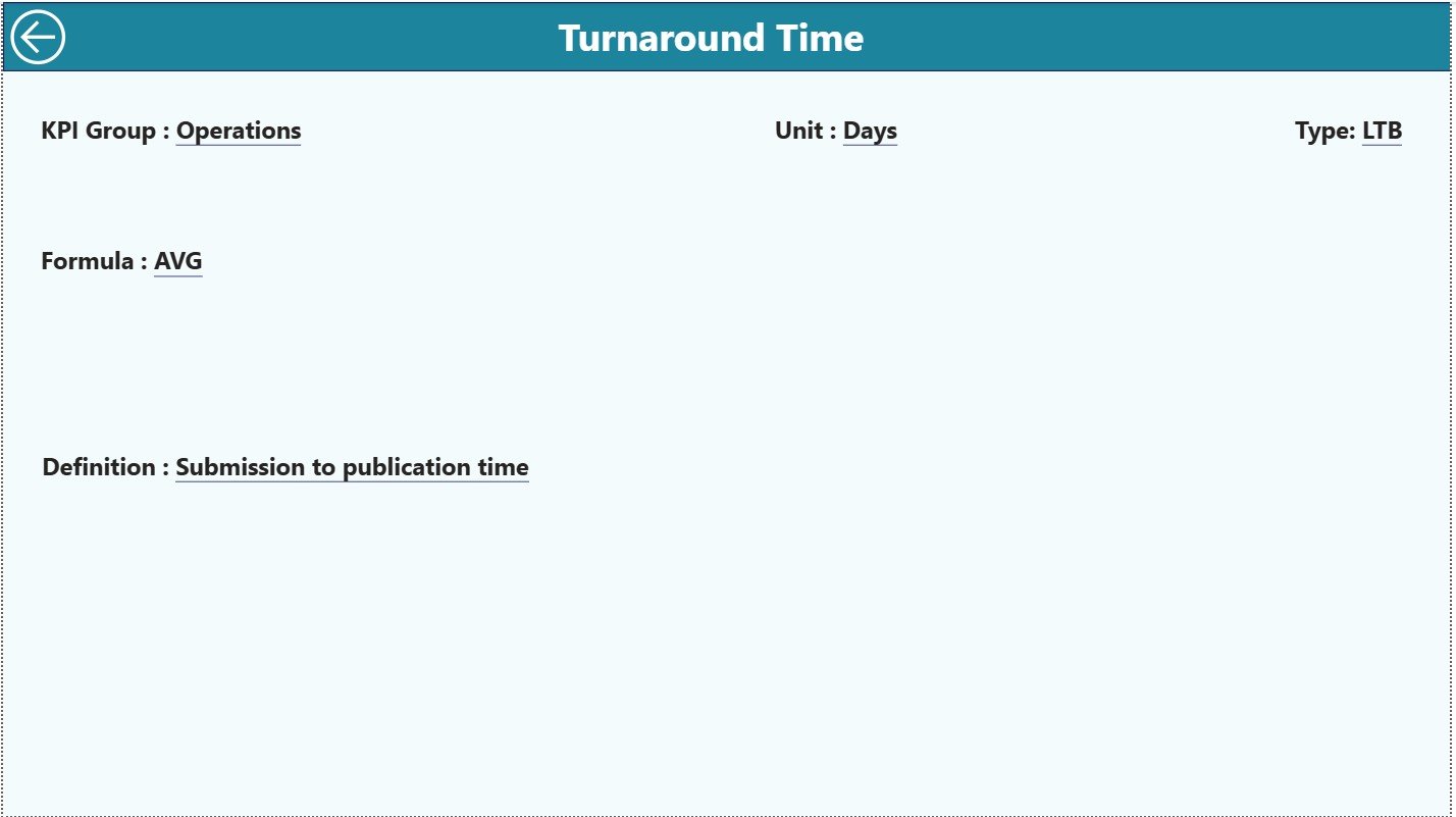
- Summary, KPI Trend and drill-through KPI Definition pages
- KPI cards for total KPIs, targets met and targets missed
- Month and KPI Group slicers with MTD and YTD variance against target and previous year
- An Excel data source with Input Actual, Input Target and KPI Definition sheets
Concrete uses: filter editorial KPIs by group for separate production and review meetings; show a committee which targets were missed this month; track trend lines for delays and bottlenecks; and refresh from Excel each month.
Price: $11.99 — get the Academic Publishing KPI Dashboard in Power BI.
Best for: publishing teams that want an interactive editorial scorecard.
Which higher education KPIs should a university dashboard track?
Whichever template you choose, the useful numbers are similar. Benchmarks vary by country, institution type and mission, so treat the ranges below as commonly cited reference points and set targets from your own baseline. For US comparisons, the NCES Integrated Postsecondary Education Data System (IPEDS) publishes retention, graduation and staffing data by institution.
| KPI | Formula | Commonly cited reference |
|---|---|---|
| First-year retention rate | First-time students enrolled next fall ÷ first-time students in the cohort | US averages are roughly three in four students; selective institutions run far higher |
| Six-year graduation rate | Cohort graduates within 150% of normal time ÷ cohort size | US four-year institutions average roughly 60–65% |
| Student-to-faculty ratio | FTE students ÷ FTE instructional faculty | Often around 14–18 to 1; lower at small private colleges |
| Tuition collection rate | Tuition collected ÷ tuition billed | Track by college and month; aim to close the gap before term end |
| Course completion rate | Students completing a course ÷ students enrolled at census date | Compare by course and delivery mode year over year |
| Placement rate | Graduates employed or in further study ÷ graduates reporting | Report with the survey response rate alongside |
Retention deserves the most attention because it drives tuition revenue and graduation rates at the same time: a student lost in the first year is lost for every year after. Faculty metrics follow the same logic as workforce reporting elsewhere, so our list of HR KPIs to track in 2026 is a useful companion, and staff development follows the pattern in our training and learning dashboard templates. For class-level attendance, see our guide to attendance tracker templates in Excel, Google Sheets and Power BI.
How to choose between them
Use this quick decision path:
- You want one university dashboard template for institution-wide analysis: Colleges & Universities Dashboard in Excel ($13.99).
- Leadership reviews a fixed KPI set against targets every month: Colleges & Universities KPI Dashboard in Excel ($12.99) or Power BI ($11.99).
- You run one academic department: University Department KPI Dashboard in Excel ($14.99) or Google Sheets ($9.99).
- You need student-level scores, attendance and fees: Student Academic Insights Dashboard in Google Sheets ($9.99).
- You manage a journal or university press: Academic Publishing KPI Dashboard in Excel ($14.99) or Power BI ($11.99).
A sensible combination is pick #1 for the finance and faculty view plus pick #2 for the monthly target review, together $26.98. Before you pay, our buying guide on how to evaluate an Excel dashboard template lists the checks that matter, and 7 reasons to use a quality KPI dashboard in Excel, Power BI and Google Sheets explains why the format should follow the software your staff already use. Power BI buyers can compare more options in our Power BI dashboard templates ranked by industry.
Template vs analytics platform: what does it cost over five years?
Per-user licensing grows with every dean, chair and analyst who needs access. At an assumed $15 per user per month, a 20-person reporting group pays $3,600 a year and $18,000 over five years, before any higher-education analytics suite, which is typically priced by custom annual quote. Buying picks #1, #2 and #4 costs $41.97 once. Even with a freelancer adapting the files to your data, you are likely to stay well below one year of licences.
That does not make a platform the wrong choice: you are paying for governed data pipelines, security roles and support. It means you should buy software for those capabilities specifically, not for reporting you could own. Our breakdown of one-time purchase vs SaaS subscription costs walks through the same maths for other tools. Planning a departmental budget too? See our budget templates for Excel and Google Sheets.
When a template is NOT the right answer
A template is the wrong buy in four situations. First, if you need live integration with your student information system or learning management system, a template relies on exports and cannot replace an automated pipeline. Second, if you must submit statutory returns such as IPEDS or national funding-body data in a mandated format, use the system that produces them. Third, if you need early-alert or predictive student-success models that flag at-risk students automatically, that is specialist software. Fourth, if hundreds of staff need governed, row-level access to student records, a managed platform will handle privacy and permissions better than shared files.
For everything short of that, such as a department, college or small institution tracking faculty, fees, placements, retention and publishing KPIs, a $10–$15 template does the job a per-user licence is oversized for. Remember that student records are personal data, so keep files in access-controlled storage and follow your institution’s data-protection policy. Running a K-12 school as well? Our K-12 school administration templates cover admissions, attendance and fees for schools.
Frequently asked questions
What is a university dashboard template?
A university dashboard template is a pre-built Excel, Google Sheets or Power BI file that turns higher education data, such as faculty ratings, tuition, retention, graduation and research output, into charts and KPIs. You enter or paste records into a data sheet, and the dashboard shows results by college, department or month without building formulas yourself.
Which KPIs should a university track every month?
Track enrollment, first-year retention, course completion, average grades, faculty ratings, tuition collected vs billed, research output and placement rate. Retention matters most because it drives both tuition revenue and graduation rates. Graduation rates are usually reported annually, so monitor retention and completion monthly as the leading indicators.
How do I calculate the student retention rate?
Divide the number of first-time students from a fall cohort who re-enroll the following fall by the number of students in that cohort, then multiply by 100. For example, if 1,200 first-year students started and 960 returned next fall, the retention rate is 80%. Track it by program to see where students leave.
How is the six-year graduation rate calculated?
Take a cohort of first-time, full-time students and count how many complete a bachelor’s degree within six years, which is 150% of normal time. Divide completers by the cohort size and multiply by 100. For instance, 650 graduates from a 1,000-student cohort is a 65% six-year graduation rate.
Can a university department use Excel instead of BI software?
Yes, for departmental reporting. An Excel KPI dashboard handles monthly targets, trends and year-over-year comparison well, and a department rarely needs more. You need BI or analytics software when data must refresh automatically from the student information system, or when many users need governed, permission-based access to student records.
Excel, Google Sheets or Power BI: which format should a university choose?
Choose the tool your staff already use. Excel suits administrators who want one self-contained file; Google Sheets suits Workspace campuses that share by link; Power BI suits institutional research offices that want interactive drill-down, mobile viewing and publishing to the Power BI service. Several picks here come in two formats.
How much do these university templates cost?
The eight templates cost $9.99 to $14.99 each as one-time purchases, with no subscription or per-user fees. Self-service BI tools are licensed per user per month and higher education analytics suites are usually sold on custom annual quotes, so a template typically costs less than one month of licences for a small team.
Can I track tuition fees and collections in these dashboards?
Yes. The Colleges & Universities Dashboard in Excel shows tuition fee, fee paid and fee due by department, college type and month. The Student Academic Insights Dashboard in Google Sheets tracks total fees, fee type, fee status and monthly collection alongside student scores and attendance.
Is there a dashboard for academic journals or a university press?
Yes. The Academic Publishing KPI Dashboard, in Excel at $14.99 or Power BI at $11.99, tracks submission volume, acceptance rate, review turnaround time, editor workload and publication delays. It compares month-to-date and year-to-date results against targets and the previous year.
Do I need technical skills to set these up?
No advanced skills are needed. For the KPI dashboards you type monthly actuals and targets into labelled input sheets and the dashboard recalculates. The analysis dashboards refresh from a data sheet. Power BI files open in the free Power BI Desktop, and the Google Sheets files are copied into your own Google Drive.
Get more university and higher education templates
Ready to stop reconciling exports every month? The Colleges & Universities Dashboard in Excel ($13.99) is the university dashboard template for faculty, fee and placement analysis, and the Colleges & Universities KPI Dashboard in Excel ($12.99) runs your monthly target review. For the best value, the Student Academic Insights Dashboard in Google Sheets is $9.99.
See our dashboards in action on the YouTube channel, @NextGenTemplates, and browse more ready-made tools in our list of 25 best-selling business templates, our cheap Excel dashboard templates under $15 or our Google Sheets templates for teams.