

Restaurant KPIs are the operational and financial metrics that tell you whether a restaurant is actually making money, not just taking sales. The 12 that matter most in 2026 are Prime Cost, Food Cost %, Labor Cost %, RevPASH, Average Check, Table Turnover, Sales Per Labor Hour, Gross and Net Profit Margin, Seat Occupancy, Repeat Visit Rate, and Break-Even Point.
Last updated: September 2026
Key takeaways
- Prime Cost is the single most important restaurant KPI — keep the combined cost of food and labor between 55% and 65% of sales or the restaurant loses money regardless of how busy it looks.
- RevPASH (Revenue Per Available Seat Hour) beats table turnover because it captures both how fast you seat guests and how much they spend, in one number.
- Net profit margin in full-service restaurants is only 3–5%, so a two-point swing in Food Cost % or Labor Cost % is the difference between profit and loss.
- You need a formula, a benchmark and a source column for every metric — a KPI with no benchmark is just a number nobody acts on.
- The Restaurants & Food Services KPI Dashboard in Excel ($12.99) calculates all 12 of these restaurant KPIs from your own sales and cost data out of the box.
The 12 restaurant KPIs compared
Every one of the 12 restaurant KPIs below, with its exact formula, a realistic 2026 benchmark range, and the mistake operators most often make when they track it. Use this as your reference table — the metric definitions map directly to the ready-made dashboards in the second half.
| Restaurant KPI | Formula | 2026 benchmark range | Where to see it |
|---|---|---|---|
| 1. Prime Cost | (COGS + Total Labor Cost) ÷ Total Sales | 55–65% of sales | Restaurants & Food Services KPI Dashboard |
| 2. Food Cost % (COGS %) | Food COGS ÷ Food Sales | 28–35% | Restaurants & Food Services KPI Dashboard |
| 3. Labor Cost % | Total Labor Cost ÷ Total Sales | 25–35% | Restaurants & Food Services Dashboard |
| 4. RevPASH | Total Revenue ÷ (Available Seats × Hours Open) | $10–$20 (casual dining) | Restaurants & Food Services Dashboard (Power BI) |
| 5. Average Check | Total Sales ÷ Number of Covers (guests) | Segment-dependent | Restaurants & Food Services Dashboard (Google Sheets) |
| 6. Table Turnover Rate | Parties Served ÷ Number of Tables (per meal period) | 1.5–3.0× per period | Restaurants & Food Services Dashboard |
| 7. Sales Per Labor Hour (SPLH) | Total Sales ÷ Total Labor Hours | $40–$70 | Restaurants & Food Services KPI Dashboard |
| 8. Gross Profit Margin | (Total Sales − COGS) ÷ Total Sales | 65–72% | Food Supply Chain KPI Dashboard |
| 9. Net Profit Margin | Net Profit ÷ Total Sales | 3–9% | Restaurants & Food Services KPI Dashboard |
| 10. Seat Occupancy Rate | Seats Occupied ÷ Total Seats Available | 60–80% at peak | Restaurants & Food Services Dashboard (Power BI) |
| 11. Repeat Visit Rate | Repeat Customers ÷ Total Customers | 25–35% | Restaurants & Food Services Dashboard |
| 12. Break-Even Point | Fixed Costs ÷ (1 − Variable Cost Ratio) | Expressed as daily/monthly sales | Food Manufacturing KPI Dashboard |
The 12 restaurant KPIs explained (definition, formula, benchmark, mistake)
1. Prime Cost
Definition: Prime Cost is the combined total of your cost of goods sold and your labor cost, expressed as a percentage of sales — the two costs you control day to day.
Formula: (COGS + Total Labor Cost) ÷ Total Sales. Benchmark: 55–65% of sales; full-service restaurants sit near 60%, quick-service around 60–65%. Mistake teams make: tracking food cost and labor cost in separate reports so nobody ever sees the combined number, or leaving payroll taxes and benefits out of the labor side — which understates Prime Cost by 5–8 points and hides a restaurant that is quietly unprofitable.
2. Food Cost Percentage (COGS %)
Definition: Food Cost % is the share of every dollar of food sales that goes to the ingredients on the plate.
Formula: Food COGS ÷ Food Sales, where COGS = Beginning Inventory + Purchases − Ending Inventory. Benchmark: 28–35% for most concepts. Mistake teams make: using theoretical (recipe-card) cost instead of actual cost, which ignores waste, over-portioning, spoilage, theft and comps — the gap between theoretical and actual food cost is where the margin leaks.
3. Labor Cost Percentage
Definition: Labor Cost % is total labor spend as a share of sales, covering hourly wages, salaried managers, payroll taxes and benefits.
Formula: Total Labor Cost ÷ Total Sales. Benchmark: 25–35%; full-service skews higher than quick-service. Mistake teams make: counting only hourly wages and forgetting the ~10–15% on top for payroll taxes, insurance and benefits, so the reported number looks healthy while the real cost is bleeding.
4. RevPASH (Revenue Per Available Seat Hour)
Definition: RevPASH measures how much revenue each seat generates for each hour the restaurant is open — the hospitality equivalent of a hotel’s RevPAR.
If you also run rooms, our roundup of the best hotel management dashboard Excel templates explains how to calculate and track RevPAR, ADR and occupancy for a hotel or resort.
Formula: Total Revenue ÷ (Available Seats × Hours Open). Benchmark: roughly $10–$20 for casual dining, higher for fine dining. Mistake teams make: optimising table turnover alone. Turning tables faster looks good until you realise you cut average check to do it; RevPASH catches that trade-off because it blends speed and spend into one figure.
5. Average Check (Average Cover)
Definition: Average Check is the mean spend per guest, the lever behind every upsell, add-on and menu-engineering decision.
Formula: Total Sales ÷ Number of Covers (guests served). Benchmark: segment-dependent — track your own trend, not an industry number. Mistake teams make: dividing by the number of checks or tables instead of guests, which inflates the figure for large parties and makes upsell training look more effective than it is.
6. Table Turnover Rate
Definition: Table Turnover Rate is how many times a table is seated with a new party during a meal period.
Formula: Parties Served ÷ Number of Tables, measured per meal period. Benchmark: 1.5–3.0 turns per period for casual dining. Mistake teams make: measuring per shift rather than per meal period, which smooths away the lunch-versus-dinner difference that actually drives staffing decisions.
7. Sales Per Labor Hour (SPLH)
Definition: Sales Per Labor Hour shows how much revenue each scheduled labor hour produces — the productivity KPI behind smart scheduling.
Formula: Total Sales ÷ Total Labor Hours. Benchmark: $40–$70 depending on service model. Mistake teams make: pooling front-of-house and back-of-house hours into one figure, which hides an overstaffed kitchen behind a lean floor (or vice versa). Segment the two.
8. Gross Profit Margin
Definition: Gross Profit Margin is what remains of each sales dollar after the cost of the food and drink itself, before labor and overhead.
Formula: (Total Sales − COGS) ÷ Total Sales. Benchmark: 65–72%. Mistake teams make: confusing gross margin with net margin and celebrating a 70% gross figure while a 4% net margin quietly says the restaurant barely broke even.
9. Net Profit Margin
Definition: Net Profit Margin is the percentage of sales left after every cost — food, labor, rent, utilities, marketing and interest.
Formula: Net Profit ÷ Total Sales. Benchmark: 3–9%; full-service typically 3–5%, quick-service 6–9%. Mistake teams make: not fully loading occupancy and overhead costs, so the number looks like an operating margin and overstates true profitability.
10. Seat Occupancy Rate
Definition: Seat Occupancy Rate is the share of available seats that are actually filled over a given period.
Formula: Seats Occupied ÷ Total Seats Available. Benchmark: 60–80% at peak service. Mistake teams make: averaging occupancy across all open hours, which buries the peak-hour reality (a 40% daily average can still mean a fully packed, understaffed Friday dinner).
11. Repeat Visit Rate (Customer Retention)
Definition: Repeat Visit Rate is the share of customers who come back, the cheapest source of restaurant revenue there is.
Formula: Repeat Customers ÷ Total Customers over a period. Benchmark: 25–35% for established concepts. Mistake teams make: guessing at it because there is no loyalty program or POS customer ID to measure it, so retention is never managed as a KPI at all.
12. Break-Even Point
Definition: Break-Even Point is the level of sales at which total revenue exactly covers total costs — your survival line.
Formula: Fixed Costs ÷ (1 − Variable Cost Ratio), usually expressed as required daily or monthly sales. Mistake teams make: treating labor as fully fixed when much of it is semi-variable, which sets the break-even line too low and makes a loss-making week look like it should have been profitable.
How we picked these dashboard templates
We searched the full NextGenTemplates catalog for products that calculate these 12 restaurant KPIs from real operating data, then narrowed to 8 that cover Excel, Google Sheets and Power BI so any restaurant can use its existing tools. We prioritised templates where the formulas above are already built in — Prime Cost, Food Cost %, RevPASH and the rest — over generic finance sheets that would need rebuilding. We excluded free single-metric trackers because a restaurant KPIs dashboard needs the metrics linked, not scattered across tabs. Prices shown are the current listed USD prices at time of writing.
The 8 best restaurant KPI dashboard templates for 2026
1. Restaurants & Food Services KPI Dashboard in Excel — best overall

What it is: a single-workbook Excel dashboard that turns your sales and cost inputs into the full restaurant KPIs scorecard — Prime Cost, Food Cost %, Labor Cost %, SPLH and net margin — with visual gauges and month-on-month trends.
Who it is for: independent operators and small groups who already live in Excel and want the 12 metrics calculated automatically.
What is inside:
- Pre-built formulas for Prime Cost, Food Cost % and Labor Cost %
- Trend charts and traffic-light KPI cards against benchmark ranges
- Monthly input tabs so history builds automatically
- Printable one-page summary for weekly manager meetings
Enter one month of sales and cost data and the dashboard flags any KPI outside its benchmark — a restaurant running 63% Prime Cost sees the red immediately instead of at year-end. It pays for itself if it catches a single point of food-cost creep on $40,000 monthly food sales ($400/month).
Price: $12.99. Get the Restaurants & Food Services KPI Dashboard in Excel →
Best for: the operator who wants every restaurant KPI in one Excel file with zero setup.
2. Restaurants and Food Services Dashboard in Power BI — most powerful
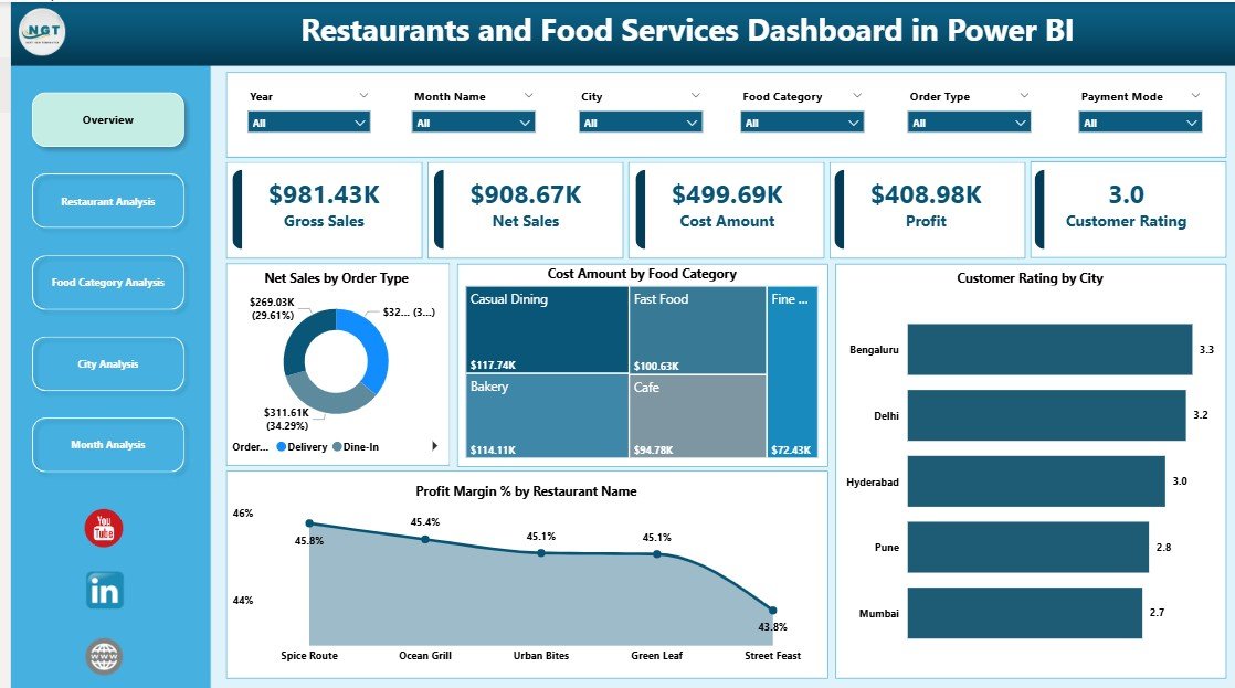
What it is: a fully interactive Power BI dashboard that connects to your POS export and slices RevPASH, seat occupancy and average check by day-part, location and server.
Who it is for: multi-location groups and franchises that need to compare sites and drill into peak-hour performance.
What is inside:
- Interactive RevPASH and seat occupancy visuals by day-part
- Location and server drill-through pages
- Refreshable data model — reconnect the POS export and it updates
- Mobile Power BI layout for on-the-floor managers
A group running five sites can see which location’s Friday dinner RevPASH lags and act the same week. This is the template to buy when spreadsheets can no longer hold the data volume.
Price: $17.99. Get the Restaurants and Food Services Dashboard in Power BI →
Best for: multi-site operators who need interactive, refreshable restaurant KPIs.
3. Restaurants and Food Services Dashboard in Google Sheets — best value
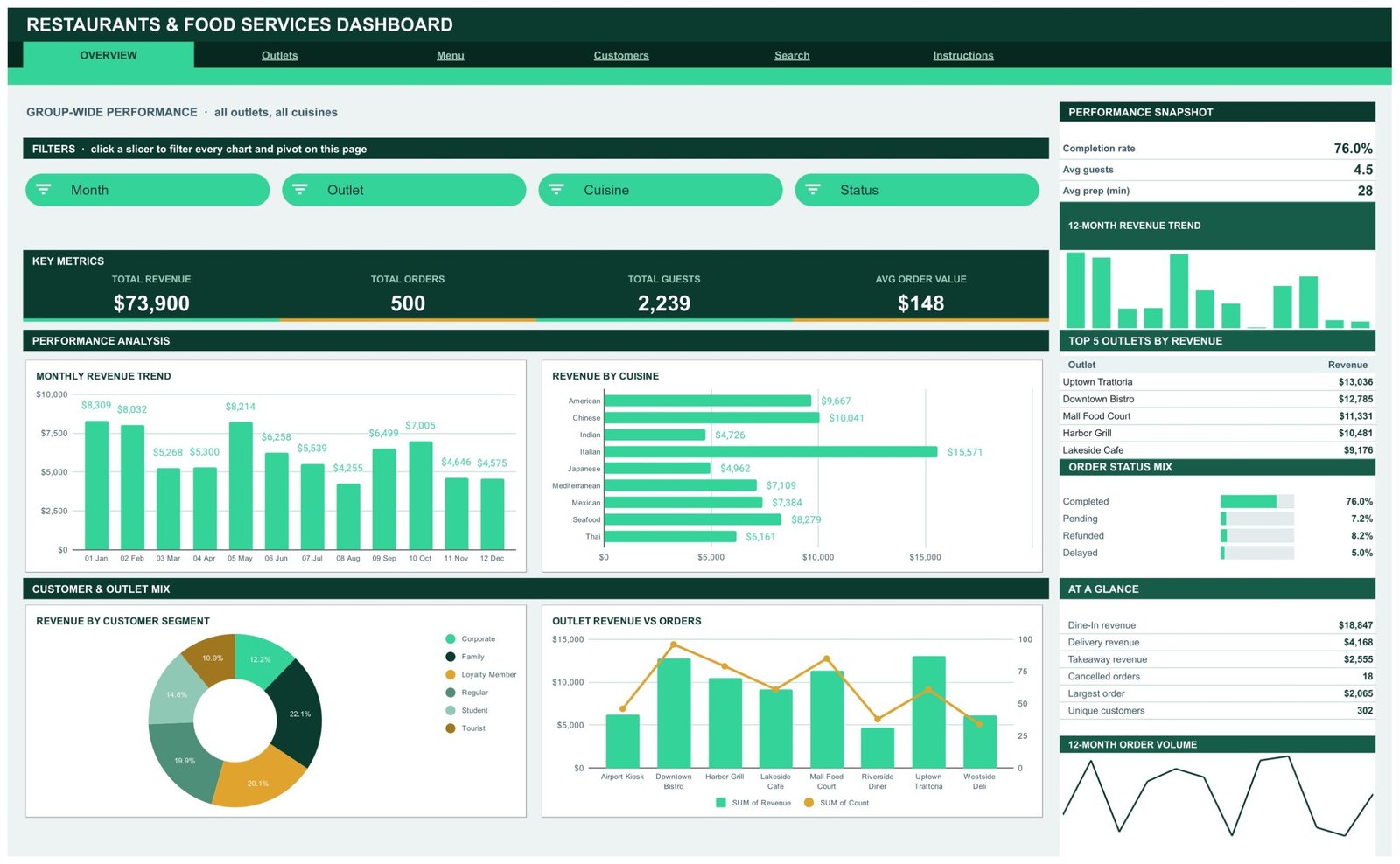
What it is: a cloud-native restaurant KPIs dashboard in Google Sheets, sharable with any manager who has a Google account and editable from a phone.
Who it is for: teams that want live, shared numbers without buying Microsoft or Power BI licenses.
What is inside:
- Average check, table turnover and labor cost tracking
- Live sharing so head office and floor see the same figures
- Works on any device with a browser
- Colour-coded KPI status against benchmarks
At $9.99 with no license cost attached, this is the cheapest way to give three managers the same live restaurant KPIs view.
Price: $9.99. Get the Restaurants and Food Services Dashboard in Google Sheets →
Best for: budget-conscious teams that want shared, cloud restaurant KPIs.
4. Restaurants and Food Services Dashboard in Excel
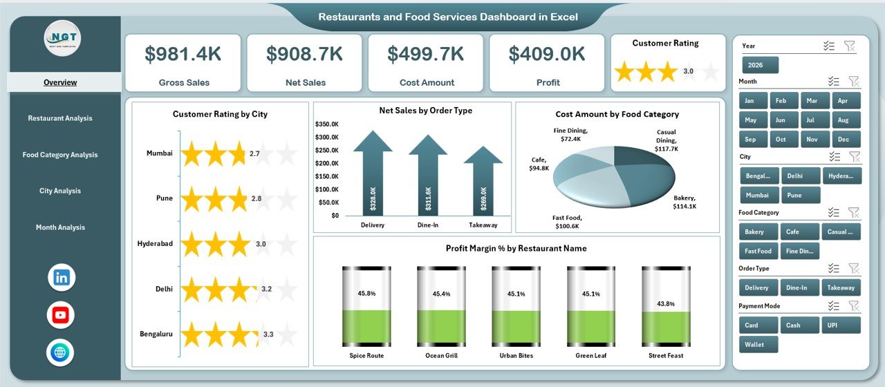
What it is: an operations-first Excel dashboard weighted toward covers, turnover and staffing rather than pure finance — a complement to the KPI dashboard at #1.
Who it is for: floor and kitchen managers who schedule against SPLH and turnover.
What is inside:
- Table turnover and covers-per-shift tracking
- Sales-per-labor-hour by day-part
- Staffing-versus-demand comparison
- Weekly operations summary
Price: $13.99. Get the Restaurants and Food Services Dashboard in Excel →
Best for: operations managers focused on labor and turnover KPIs.
5. Restaurants & Food Services KPI Dashboard in Power BI

What it is: the KPI scorecard version in Power BI — the same 12 restaurant KPIs as #1, but as an interactive, refreshable report.
Who it is for: single sites already on Power BI that want scorecard-style KPI tracking without the full multi-page model of #2.
What is inside:
- KPI cards for Prime Cost, Food Cost %, Labor Cost % and net margin
- Benchmark thresholds with conditional colour
- Month and quarter time intelligence
- Refreshable data source
Price: $11.99. Get the Restaurants & Food Services KPI Dashboard in Power BI →
Best for: single sites wanting a Power BI KPI scorecard.
6. Food Supply Chain KPI Dashboard in Excel

What it is: an Excel dashboard focused on the procurement and inventory side — supplier performance, inventory turns and the gross margin that feeds Food Cost %.
Who it is for: operators whose margin problem is in purchasing, not on the floor, and central kitchens.
What is inside:
- Inventory turnover and days-on-hand tracking
- Supplier price-variance monitoring
- Gross margin by category
- Waste and shrinkage logging
Price: $14.99. Get the Food Supply Chain KPI Dashboard in Excel →
Best for: controlling Food Cost % at the purchasing and inventory level.
7. Food Manufacturing KPI Dashboard in Excel

What it is: a production-focused Excel dashboard with yield, batch cost and break-even analysis — ideal for commissaries, ghost kitchens and central production units.
Who it is for: multi-outlet groups running a central kitchen or any food producer needing break-even by product.
What is inside:
- Break-even point by product line
- Batch and yield costing
- Production efficiency KPIs
- Fixed-versus-variable cost split
Price: $12.99. Get the Food Manufacturing KPI Dashboard in Excel →
Best for: central kitchens and producers needing break-even and yield KPIs.
8. Office Cafeteria Menu Suggestion Tracker in Google Sheets — cheapest entry point
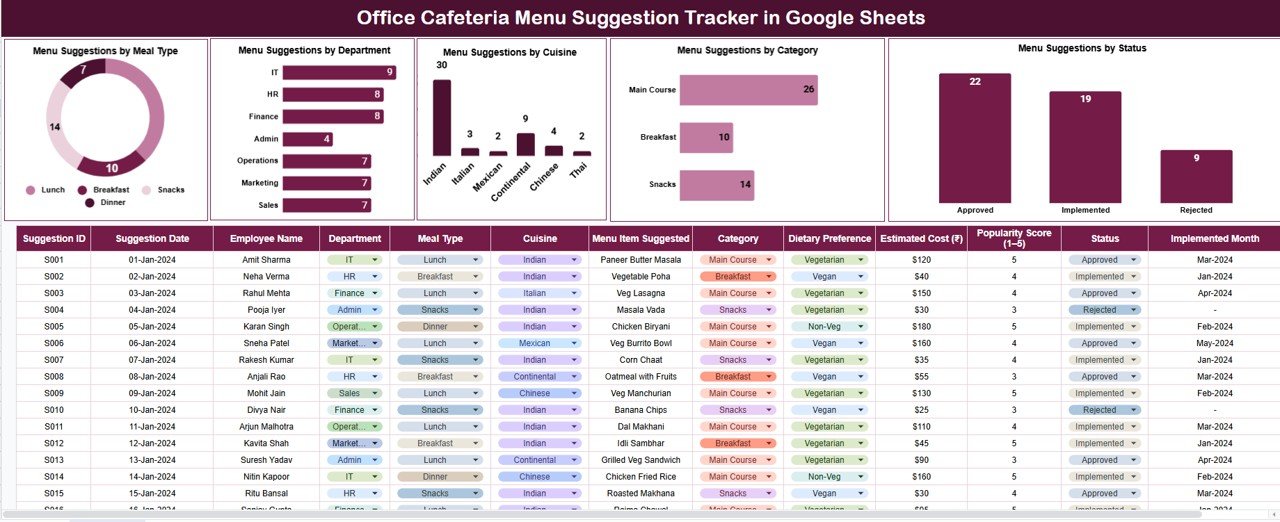
What it is: a lightweight Google Sheets tracker for menu feedback, item popularity and suggestion logging — the entry-level way to start tracking what sells.
Who it is for: cafeterias, canteens and small food-service operations that want menu-level insight before committing to a full dashboard.
What is inside:
- Menu suggestion and feedback logging
- Item popularity ranking
- Simple demand signals to feed average-check decisions
- Fully cloud-based and free to share
Price: $6.99. Get the Office Cafeteria Menu Suggestion Tracker in Google Sheets →
Best for: cafeterias and canteens taking a first step into menu tracking.
Restaurant KPI dashboard price comparison
| Template | Format | Best for | Price |
|---|---|---|---|
| Restaurants & Food Services KPI Dashboard (Best overall) | Excel | All 12 KPIs, zero setup | $12.99 |
| Restaurants and Food Services Dashboard (Most powerful) | Power BI | Multi-site, interactive | $17.99 |
| Restaurants and Food Services Dashboard (Best value) | Google Sheets | Shared cloud KPIs | $9.99 |
| Restaurants and Food Services Dashboard | Excel | Ops, labor & turnover | $13.99 |
| Restaurants & Food Services KPI Dashboard | Power BI | Single-site scorecard | $11.99 |
| Food Supply Chain KPI Dashboard | Excel | Purchasing & inventory | $14.99 |
| Food Manufacturing KPI Dashboard | Excel | Central kitchen, break-even | $12.99 |
| Office Cafeteria Menu Suggestion Tracker | Google Sheets | Menu feedback entry point | $6.99 |
Mid-post pick: If you track only one thing, track Prime Cost — and the Restaurants & Food Services KPI Dashboard in Excel ($12.99) calculates it, plus the other 11 restaurant KPIs, from a single month of data. Get it here →
How to choose between them
- Live in Excel and want everything in one file? Restaurants & Food Services KPI Dashboard in Excel ($12.99).
- Run more than one location? Restaurants and Food Services Dashboard in Power BI ($17.99) for interactive, refreshable drill-down.
- Need managers to share one live view cheaply? Google Sheets version ($9.99).
- Margin problem is in purchasing? Food Supply Chain KPI Dashboard ($14.99).
- Run a central kitchen or commissary? Food Manufacturing KPI Dashboard ($12.99) for break-even and yield.
When a restaurant KPI dashboard is NOT the right answer
A spreadsheet dashboard is the right tool for tracking and reviewing restaurant KPIs — it is not the right tool for real-time operations. If you need live table-status alerts, automatic POS-to-inventory deduction on every sale, or integrated online-ordering, you need a dedicated restaurant management platform, and a dashboard cannot replace it. See our Toast POS alternatives in Excel and Sheets guide for where template-based tools fit against full POS software.
Equally, if your data still lives on paper tickets with no POS export, start there first — a dashboard is only as good as the data feeding it, and manual re-keying of every cover will not scale. And a single-outlet cafe doing $8,000 a month may not need Power BI at all; the Excel or Google Sheets versions carry that volume comfortably. Buy for the scale you have, not the scale you imagine.
Frequently asked questions
What are the most important restaurant KPIs to track?
Prime Cost is the single most important restaurant KPI because it combines your two controllable costs — food and labor — into one number that should stay between 55% and 65% of sales. After Prime Cost, track Food Cost %, Labor Cost %, RevPASH and net profit margin. Together these five tell you whether the restaurant is genuinely profitable.
What is a good Prime Cost percentage for a restaurant?
A good Prime Cost is 55–65% of total sales. Full-service restaurants typically target around 60%, while quick-service concepts run slightly higher at 60–65% because of lower menu prices. Anything consistently above 65% means food cost, labor cost or both need immediate attention, since the remaining margin cannot cover rent and overhead.
How do you calculate RevPASH for a restaurant?
RevPASH equals total revenue divided by available seats multiplied by hours open. For example, a 60-seat restaurant open 6 hours generating $7,200 has a RevPASH of $7,200 ÷ (60 × 6) = $20. It is the best single metric because it captures both how quickly you turn tables and how much each guest spends.
What is a healthy net profit margin for a restaurant?
Restaurant net profit margins are thin: 3–5% is typical for full-service and 6–9% for quick-service. Because margins are so slim, a two-point rise in Food Cost % or Labor Cost % can wipe out the entire profit, which is exactly why tracking restaurant KPIs monthly rather than annually matters so much.
What is the difference between food cost and prime cost?
Food cost measures only the ingredients as a share of food sales, usually 28–35%. Prime Cost adds labor cost on top and measures the combined total against all sales, usually 55–65%. Prime Cost is the more complete profitability signal because labor is often a restaurant’s largest single expense.
How often should restaurants review their KPIs?
Review core restaurant KPIs weekly — Prime Cost, Food Cost %, Labor Cost % and sales per labor hour — so problems are caught within days, not at month-end. Review deeper metrics like RevPASH, seat occupancy and repeat visit rate monthly. A dashboard that updates from your inputs makes weekly review a five-minute task.
Can I track restaurant KPIs in Excel or Google Sheets instead of software?
Yes. For a single site or small group, an Excel or Google Sheets restaurant KPIs dashboard tracks every metric in this guide from your POS export and cost data at a fraction of the cost of analytics software. You only outgrow spreadsheets when data volume across many locations makes Power BI worth the step up.
What is RevPASH and why is it better than table turnover?
RevPASH (Revenue Per Available Seat Hour) measures revenue per seat per hour of operation. It is better than table turnover alone because turnover only tells you how fast tables cycle, ignoring spend. You can turn tables faster and still lose revenue if average check drops; RevPASH blends both speed and spend into a single figure.
What labor cost percentage should a restaurant aim for?
Aim for a Labor Cost % of 25–35% of sales, with full-service concepts at the higher end because of table service. Crucially, include payroll taxes, benefits and manager salaries — not just hourly wages — or you will understate the figure by 10–15% and schedule as if you have margin you do not.
Which restaurant KPI dashboard template should I buy first?
Start with the Restaurants & Food Services KPI Dashboard in Excel at $12.99 — it calculates all 12 restaurant KPIs in this guide from a single month of data with no setup. Move to the Power BI version at $17.99 only when you run multiple locations and need interactive, refreshable drill-down across sites.
Get more restaurant KPI templates
Ready to track all 12 restaurant KPIs this month? The Restaurants & Food Services KPI Dashboard in Excel is the fastest start at $12.99, or step up to the Power BI dashboard at $17.99 for multi-site drill-down. Browse the full range of restaurant and hospitality dashboard templates to match your exact setup.
Prefer to see the templates in action first? Watch walkthroughs on the NextGenTemplates YouTube channel, and for wider context on industry benchmarks see the National Restaurant Association’s industry research.
More KPI guides from NextGenTemplates: 12 Retail KPIs to track in 2026, 12 IT KPIs to track in 2026, 15 Marketing KPIs to track in 2026, 12 Logistics & OTIF KPIs to track in 2026 and 10 Procurement KPIs to track in 2026.