

The safety KPIs TRIR and LTIFR are the two rates every EHS team must track in 2026: TRIR = (recordable incidents × 200,000) / hours worked, and LTIFR = (lost-time injuries × 1,000,000) / hours worked. Add DART, severity, near-miss and training-completion rates, then track all ten in a ready-made dashboard.
Last updated: September 2026
Key takeaways
- TRIR and LTIFR are the anchor safety metrics: the US private-industry average TRIR is about 2.7 recordable cases per 100 full-time workers (BLS), and world-class sites run below 1.0.
- Leading indicators — near-miss reporting, training completion and corrective-action closure — predict incidents weeks before the trailing rates move.
- The single most common error is mixing multipliers: TRIR uses a 200,000-hour base, LTIFR uses 1,000,000, and swapping them makes one rate look 5× better than it is.
- You do not need SafetyCulture or Intelex to start: the Industrial Safety KPI Dashboard in Google Sheets calculates all ten rates for $12.99.
- All eight NGT safety dashboards below are one-time purchases from $9.99 in Excel, Google Sheets and Power BI — no per-seat SaaS subscription.
Safety KPI dashboard templates compared
| Template | Format | Best for | Price |
|---|---|---|---|
| Industrial Safety KPI Dashboard (Best overall) | Google Sheets | A full TRIR / LTIFR / near-miss scorecard for a plant or site | $12.99 |
| Workplace Safety & Incident Management Dashboard (Best value) | Google Sheets | Incident register plus KPI roll-up at the lowest price | $9.99 |
| Incident Management KPI Dashboard | Excel | Incident-driven operations that live in Excel | $12.99 |
| Construction Safety KPI Dashboard | Excel | Construction sites and contractor safety programs | $12.99 |
| Road Safety Services KPI Dashboard | Excel | Fleet and road-safety programs | $14.99 |
| Transportation Safety KPI Dashboard | Excel | Logistics and transport operators (Excel) | $12.99 |
| Transportation Safety KPI Dashboard | Power BI | Transport analytics teams on Power BI | $11.99 |
| Public Safety KPI Dashboard | Power BI | Municipal and public-sector safety reporting | $11.99 |
The 10 safety KPIs TRIR, LTIFR and 8 more to track in 2026
Every metric below carries a one-line definition, its exact formula, a realistic benchmark range and the mistake teams make. The recordkeeping definitions follow the US OSHA injury and illness recordkeeping rule (29 CFR 1904), and the benchmark averages come from the Bureau of Labor Statistics injury and illness program.
| Metric | Formula | Benchmark range | Where to see it |
|---|---|---|---|
| TRIR | (recordable incidents × 200,000) / hours worked | <1.0 world-class; ~2.7 US average | Safety scorecard, MTD/YTD tiles |
| LTIFR | (lost-time injuries × 1,000,000) / hours worked | <3 strong; 5–10 heavy industry | Frequency-rate trend line |
| DART rate | (DART cases × 200,000) / hours worked | <1.0 strong; ~1.5 US average | Recordable-case breakdown |
| Severity rate | (lost workdays × 200,000) / hours worked | Trend down; <50 target | Severity vs frequency chart |
| Near-miss rate | (near-misses × 200,000) / hours worked | Higher is better; 10:1 to recordables | Leading-indicator panel |
| First-aid rate | (first-aid cases × 200,000) / hours worked | Watch the trend, not an absolute | Minor-injury log |
| LTI severity rate | (days lost to LTIs × 1,000,000) / hours worked | Benchmark to your own 12 months | Lost-day trend |
| Fatality rate | (fatalities × 200,000,000) / hours worked | ~3.5 US per 100,000 FTE | Executive summary tile |
| Training completion % | (completed / required trainings) × 100 | 95–100% target | Compliance panel |
| Corrective-action closure % | (closed on time / raised) × 100 | >90% on-time | Action-tracker panel |
1. Total Recordable Incident Rate (TRIR)
TRIR tells you how many OSHA-recordable injuries and illnesses your organisation records per 100 full-time workers per year. It is the number auditors, insurers and prime contractors ask for first.
Formula: TRIR = (recordable incidents × 200,000) / total hours worked. The 200,000 base is 100 employees working 40 hours across 50 weeks.
Benchmark: the BLS US private-industry average is roughly 2.4–2.7; below 1.0 is world-class and above 4.0 is a red flag.
The mistake teams make: counting first-aid-only cases as recordables. First aid is not OSHA-recordable, and including it inflates TRIR and makes your programme look worse than it is.
2. Lost Time Injury Frequency Rate (LTIFR)
LTIFR measures how often injuries serious enough to keep someone off work happen, expressed per one million hours worked. It is the international counterpart to the US-centric DART rate.
Formula: LTIFR = (lost-time injuries × 1,000,000) / total hours worked.
Benchmark: strong performers sit below 3 per million hours; heavy manufacturing and construction often run 5–10.
The mistake teams make: reusing the 200,000 multiplier from TRIR instead of 1,000,000, which makes LTIFR look five times better than reality and breaks every external comparison.
3. DART Rate
DART isolates the recordable cases that actually cost you availability — those with Days Away, Restricted duty, or job Transfer — per 100 full-time workers.
Formula: DART = (DART cases × 200,000) / total hours worked.
Benchmark: the BLS private-industry figure is about 1.5; below 1.0 is strong.
The mistake teams make: counting every recordable as a DART case. Only cases involving days away, restriction or transfer belong here; the rest inflate the rate.
4. Severity Rate
Severity rate answers “how bad”, not “how often”. It converts lost workdays into a rate so a handful of serious injuries cannot hide behind a low incident count.
Formula: Severity Rate = (total lost workdays × 200,000) / total hours worked.
Benchmark: there is no universal number — trend it down and pair it with TRIR. A flat TRIR with a rising severity rate means fewer but worse injuries.
The mistake teams make: watching frequency alone. A programme can post a proud low TRIR while a single amputation quietly drives severity through the roof.
5. Near-Miss Frequency Rate
Near-misses are the free lessons that did not cost anyone an injury. Tracked as a rate, they are the strongest leading indicator of your reporting culture.
Formula: Near-Miss Rate = (near-misses reported × 200,000) / total hours worked.
Benchmark: higher is better. A healthy near-miss-to-recordable ratio is often cited at 10:1 or more.
The mistake teams make: panicking when near-miss counts rise. A jump usually means people finally trust the system enough to report — that is the goal, not a failure.
6. First-Aid Frequency Rate
First-aid cases sit below the recordable threshold, which is exactly why they are an early-warning signal for the injuries that will become recordable next quarter.
Formula: First-Aid Rate = (first-aid cases × 200,000) / total hours worked.
Benchmark: no universal figure; watch the trend and the first-aid-to-recordable ratio. A ratio that collapses often signals under-reporting, not safer work.
The mistake teams make: not logging first-aid at all, throwing away the leading signal that precedes every recordable spike.
7. Lost Time Injury Severity Rate (LTISR)
LTISR shows how many days your lost-time injuries actually cost, per million hours worked — the severity twin of LTIFR.
Formula: LTISR = (days lost to lost-time injuries × 1,000,000) / total hours worked.
Benchmark: lower is better; benchmark against your own trailing twelve months rather than a public average.
The mistake teams make: using inconsistent “day lost” definitions — calendar days one month, scheduled workdays the next — which makes the trend meaningless.
8. Fatality Rate
The fatality rate expresses work-related deaths per 100,000 full-time-equivalent workers. It is the number no dashboard wants to show but every executive summary must.
Formula: Fatality Rate = (fatalities × 200,000,000) / total hours worked.
Benchmark: the BLS Census of Fatal Occupational Injuries puts the US all-industry rate near 3.5 per 100,000 FTE; construction and transport run well above it.
The mistake teams make: trying to trend it monthly at site level. It is too rare for that; treat it as an absolute, zero-tolerance number.
9. Safety Training Completion Rate
A leading indicator that measures whether the people doing hazardous work have actually completed the training that keeps them safe.
Formula: Training Completion % = (completed required trainings / total required trainings) × 100.
Benchmark: target 95–100%; anything below 90% correlates with higher incident rates.
The mistake teams make: measuring attendance or a sign-off sheet instead of demonstrated competency from a passed assessment.
10. Corrective-Action Closure Rate
Every incident and audit produces corrective actions; this KPI measures whether you actually close them on time before the same hazard bites again.
Formula: Closure Rate % = (corrective actions closed on time / total corrective actions raised) × 100.
Benchmark: above 90% on-time closure. A growing backlog reliably predicts repeat incidents.
The mistake teams make: closing actions administratively without verifying the fix removed the hazard — a closed ticket is not a controlled risk.
How we picked these dashboards
Every product below was chosen because it actually computes the safety KPIs TRIR and LTIFR from your hours-worked data, rather than leaving you to build the formulas by hand. We searched the full NextGenTemplates catalogue of more than 900 paid templates for products that actually calculate the ten rates above — not generic charts that leave you to build the formulas. We kept only dashboards that compute at least the TRIR / LTIFR / severity core, span Excel, Google Sheets and Power BI so teams can self-select, and ship as one-time purchases rather than subscriptions. We excluded healthcare-clinical and pure security-incident templates that do not model workforce injury rates, even though they matched on the word “safety”. Prices and formats were verified live in September 2026.
The 8 best safety KPI dashboard templates for 2026
1. Industrial Safety KPI Dashboard in Google Sheets — best overall
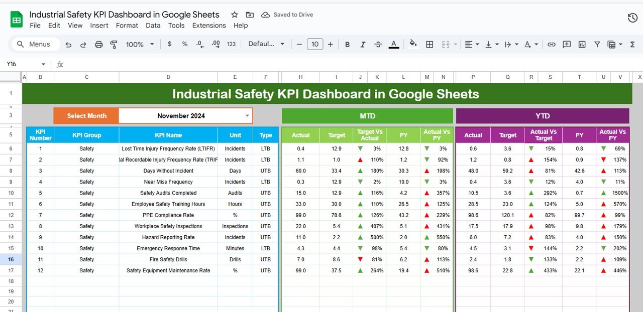
It ranks first because it is the only template here that presents the full rate-based metric set — incident rate, LTIFR, near-miss, severity and training completion — as a single formula-driven MTD/YTD scorecard with traffic lights you can hand to a safety committee unchanged.
Who it is for: plant, factory and site EHS leads who report monthly.
- Auto-calculating TRIR, LTIFR, DART and severity from a single hours-worked input.
- MTD and YTD columns with red/amber/green status against your targets.
- Near-miss and training-completion leading-indicator panels.
- Works in any Google account — no add-ons, no macros.
A 300-worker plant logging incidents weekly can retire three spreadsheets and a manual rate calculation, and cut monthly safety-report prep from a day to under an hour.
Price: $12.99. Get the Industrial Safety KPI Dashboard →
Best for: the one dashboard most industrial teams should start with.
2. Workplace Safety & Incident Management Dashboard in Google Sheets — best value
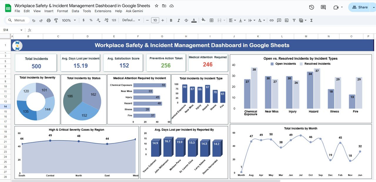
At $9.99 this is the cheapest way to get both an incident register and a KPI roll-up in one file — you log each incident once and the rates update themselves.
Who it is for: small and mid-size offices and workshops formalising safety tracking for the first time.
- Structured incident log with type, severity, body-part and root-cause fields.
- Automatic TRIR, LTIFR and near-miss rates from the log.
- Monthly trend charts that need no manual refresh.
A 40-person company can replace an ad-hoc incident email chain and still produce a board-ready safety summary each month.
Price: $9.99. Get the Workplace Safety Dashboard →
Best for: the lowest-cost entry point that still does the maths.
3. Incident Management KPI Dashboard in Excel

Built for teams whose whole operation lives in Excel, this dashboard turns an incident table into recordable-rate KPIs, resolution-time metrics and status breakdowns.
Who it is for: operations and facilities managers who prefer offline Excel.
- Incident-rate, DART and resolution-time KPIs from one data sheet.
- Slicer-driven filtering by department, site and severity.
- No external connections — opens on any Excel install.
Price: $12.99. Get the Incident Management KPI Dashboard →
Best for: incident-heavy operations that will not leave Excel.
4. Construction Safety KPI Dashboard in Excel
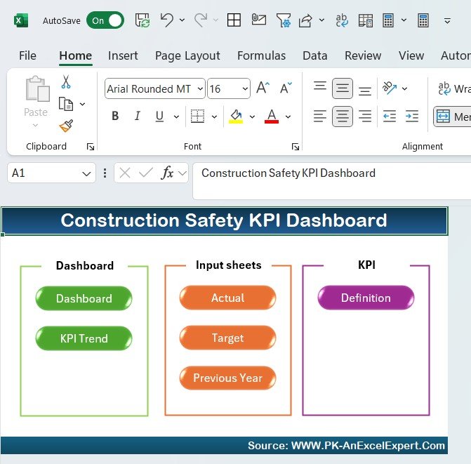
Construction carries one of the highest fatality rates of any sector, so this template foregrounds TRIR, DART and toolbox-talk / training compliance across multiple job sites.
Who it is for: general contractors and construction safety officers.
- Per-site and rolled-up TRIR, DART and severity rates.
- Training and inspection-completion tracking for subcontractors.
- Man-hours input that feeds every rate automatically.
Price: $12.99. Get the Construction Safety KPI Dashboard →
Best for: multi-site construction safety programmes.
5. Road Safety Services KPI Dashboard in Excel
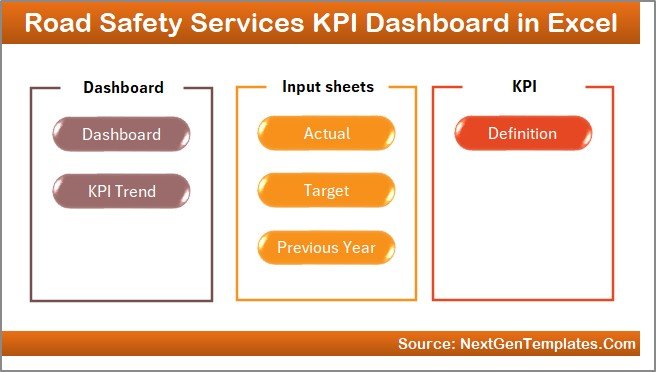
Aimed at road-safety and fleet programmes, this dashboard tracks incident frequency, compliance and response metrics that a general safety template misses.
Who it is for: fleet, transport-authority and road-safety service teams.
- Incident-frequency and severity KPIs tuned to road operations.
- Compliance and response-time tracking.
- Clean Excel layout ready for monthly stakeholder reporting.
Price: $14.99. Get the Road Safety Services KPI Dashboard →
Best for: road-safety and fleet reporting.
6. Transportation Safety KPI Dashboard in Excel
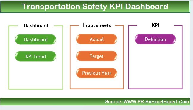
For logistics and transport operators, this Excel dashboard rolls driver and vehicle incidents into the standard frequency and severity rates plus transport-specific safety measures.
Who it is for: logistics, trucking and distribution safety managers.
- LTIFR, incident-rate and severity KPIs across fleets and depots.
- Vehicle and driver incident breakdowns.
- Monthly and YTD trend views.
Price: $12.99. Get the Transportation Safety KPI Dashboard (Excel) →
Best for: logistics operators working in Excel.
7. Transportation Safety KPI Dashboard in Power BI
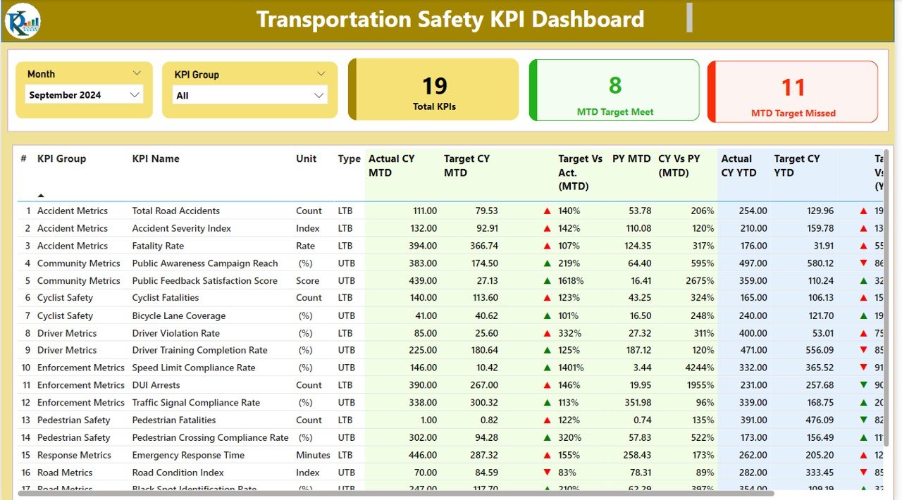
The same transport safety metrics as the Excel version, rebuilt as an interactive Power BI model with drill-through and cross-filtering for analytics teams.
Who it is for: transport analysts already publishing to Power BI.
- Interactive LTIFR, incident and severity visuals.
- Drill-through by route, depot and vehicle class.
- Refreshable data model for scheduled updates.
Price: $11.99. Get the Transportation Safety KPI Dashboard (Power BI) →
Best for: Power BI transport analytics.
8. Public Safety KPI Dashboard in Power BI
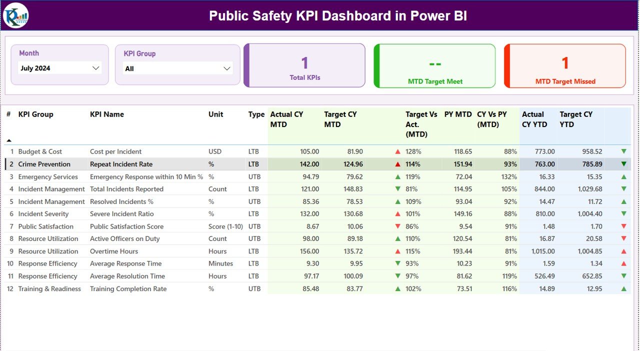
For public-sector and municipal teams, this Power BI dashboard tracks community-safety incidents, response times and outcome metrics that a workplace-injury template does not cover.
Who it is for: local-government, emergency-service and public-safety departments.
- Incident-volume, response-time and resolution KPIs.
- Geographic and category breakdowns.
- Executive-ready visuals for council reporting.
Price: $11.99. Get the Public Safety KPI Dashboard →
Best for: public-sector safety reporting.
Start tracking the safety KPIs TRIR and LTIFR today. The Industrial Safety KPI Dashboard in Google Sheets ($12.99) calculates all ten rates from a single hours-worked input — a one-time purchase, no subscription.
How to choose between them
| If you… | Choose |
|---|---|
| Want the most complete rate scorecard and use Google | Industrial Safety KPI Dashboard (Google Sheets) |
| Need the cheapest incident-log-plus-KPI file | Workplace Safety & Incident Management Dashboard |
| Live entirely in offline Excel | Incident Management KPI Dashboard (Excel) |
| Run construction or multi-site contracting | Construction Safety KPI Dashboard |
| Manage fleet, road or transport safety | Road / Transportation Safety KPI Dashboard |
| Already report in Power BI | Transportation or Public Safety KPI Dashboard (Power BI) |
Rule of thumb: pick by the tool your team already opens every day, then by sector. Every one of these dashboards reports the same safety KPIs TRIR and LTIFR from identical formulas — the difference is the platform and the sector-specific extras.
When a safety KPI dashboard is NOT the right answer
A spreadsheet dashboard is the right tool for calculating and reporting rates. It is the wrong tool in three situations. First, if you need workers to file incidents from their phones in the field with photos and GPS, you need a dedicated EHS platform such as SafetyCulture or Intelex, not a shared sheet. Second, if a regulator requires a validated, audit-trailed system of record with electronic signatures, a template will not satisfy the control requirement. Third, if you have tens of thousands of employees across dozens of legal entities, the data volume and permissions belong in a database-backed tool. For everyone else — the vast majority of sites reporting monthly — a well-built dashboard is faster to deploy, costs a one-time $10–$15 instead of a per-seat subscription, and produces exactly the same safety KPIs TRIR and LTIFR numbers.
Frequently asked questions
What is the difference between TRIR and LTIFR?
TRIR counts all OSHA-recordable cases per 100 full-time workers using a 200,000-hour base, while LTIFR counts only lost-time injuries per one million hours worked. TRIR is the broad US recordable measure; LTIFR is the international frequency rate focused on injuries serious enough to keep someone off work.
How do you calculate TRIR?
TRIR = (number of recordable incidents × 200,000) / total hours worked. For example, 5 recordable cases across 500,000 hours gives (5 × 200,000) / 500,000 = 2.0. The 200,000 constant represents 100 employees working 40 hours a week for 50 weeks a year.
What is a good TRIR score in 2026?
The US private-industry average TRIR is around 2.4–2.7 recordable cases per 100 workers, per BLS data. A TRIR below 1.0 is considered world-class, 1.0–3.0 is typical, and anything above 4.0 signals a programme that needs urgent attention.
Why does LTIFR use a million hours instead of 200,000?
LTIFR follows the international convention of expressing frequency per one million hours worked, which suits large workforces and lost-time-only events. TRIR uses the OSHA 200,000-hour base tied to 100 workers. Keep the two multipliers separate — swapping them is the most common reporting error.
Which safety KPIs are leading versus lagging indicators?
TRIR, LTIFR, DART, severity and fatality rates are lagging indicators — they measure harm that already happened. Near-miss reporting, first-aid frequency, training completion and corrective-action closure are leading indicators that predict future incidents, so a strong programme tracks both together.
Can I track safety KPIs in Excel or Google Sheets instead of buying software?
Yes. For teams reporting monthly, a spreadsheet dashboard calculates TRIR, LTIFR and severity from a single hours-worked input and produces the same numbers as enterprise EHS software, at a one-time cost of $10–$15 instead of a per-seat subscription. Dedicated software only becomes necessary for field mobile capture or regulated systems of record.
How often should safety KPIs be reviewed?
Review lagging rates such as TRIR and LTIFR monthly and roll them up quarterly for leadership. Leading indicators — near-misses, training completion and open corrective actions — are best reviewed weekly, because they give you time to act before an incident occurs.
What is a near-miss and why track its rate?
A near-miss is an unplanned event that could have caused injury or damage but did not. Tracking the near-miss rate matters because a rising count signals a healthy reporting culture, and a high near-miss-to-recordable ratio (10:1 or more) means hazards are being caught before they hurt anyone.
Which dashboard should a small business start with?
The Workplace Safety & Incident Management Dashboard in Google Sheets at $9.99 is the best starting point: it combines an incident register with automatic TRIR, LTIFR and near-miss calculation, needs no macros, and produces a board-ready monthly summary for teams new to formal safety tracking.
Do these templates work outside the United States?
Yes. The formulas are arithmetic, so they work anywhere — just apply your local recordability rules. Teams outside the US typically lead with LTIFR per million hours, while the templates also compute the OSHA-style 200,000-base rates for organisations that report to US standards or global parent companies.
Get more safety KPI templates
Build your 2026 safety scorecard this week. The Industrial Safety KPI Dashboard in Google Sheets ($12.99) and the Workplace Safety & Incident Management Dashboard ($9.99) both calculate TRIR, LTIFR and the leading indicators out of the box. Prefer Power BI? Start with the Public Safety KPI Dashboard ($11.99).
See every template in action on our YouTube channel: youtube.com/@NextGenTemplates.
Tracking KPIs beyond safety? Compare our other ready-made scorecards: manufacturing KPIs to track, warehouse KPIs, inventory KPIs, finance KPIs, sales KPIs and marketing KPIs.