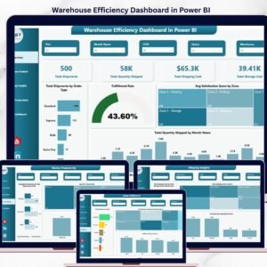
Run a sharper warehouse with the Warehouse Efficiency Dashboard in Power BI — a 5-page Power BI dashboard template that tracks total shipments, total quantity shipped, total shipping cost, and total storage cost across every warehouse, zone, carrier, shift, and priority you operate. Every page connects to the same data model, so one fact table feeds 12+ visuals, 4 KPI cards, and 8+ slicers — the moment you refresh, every chart updates. This template is built for supply chain managers, warehouse operations leads, and logistics analysts who need a single Power BI (.pbix) file they can open in Power BI Desktop and deploy the same day.
Join 8,400+ teams who already use NextGenTemplates to replace manual Excel reporting with clean, audit-ready dashboards. Point this .pbix at your WMS/ERP export, click refresh, and you get fulfillment rate by warehouse, avg pick time by zone and shift, shipping cost by carrier, and completed-vs-total shipments by shift — all in one file.
✅ Instant download · One-time payment of $17.99 · No subscription · No per-user fees · Lifetime access
Warehouse Efficiency Dashboard in Power BI
🔑 Key Features of the Warehouse Efficiency Dashboard in Power BI
📊 Four high-level KPI cards on the Overview page — Total Shipments, Total Quantity Shipped, Total Shipping Cost, and Total Storage Cost are pinned at the top of the Overview page so leadership sees the headline numbers without scrolling. Cards respond to every slicer, so filtering by warehouse or month instantly recalculates all four.
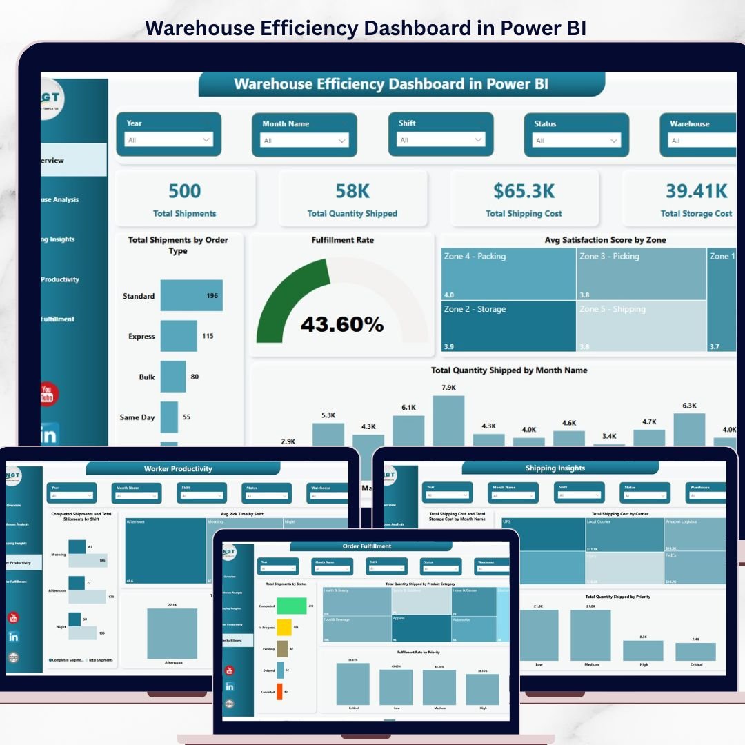
📈 5 connected pages, 12+ visuals, 8+ slicers in one .pbix file — The Warehouse Efficiency Dashboard in Power BI includes Overview, Warehouse Analysis, Shipping Insights, Worker Productivity, and Order Fulfillment pages. Every visual is wired to a shared data model so one refresh updates the entire template.
🎯 Built for real warehouse decisions, not generic reporting — This template tracks fulfillment rate by warehouse, avg pick time by zone and by shift, total shipping cost by carrier, total quantity shipped by priority, and completed shipments vs total shipments by shift — the exact metrics a warehouse manager needs on a Monday morning review.
🧩 Replace sample data with your own in minutes — The model uses a clean shipments fact table; swap the sample rows for your WMS or ERP export and every card, chart, and slicer auto-updates. No DAX editing required for standard use.
🎨 Clean, executive-ready visual design — Consistent color palette, readable fonts, and a professional layout built to present to operations leadership or share as a published Power BI report.
📦 What’s Inside the Warehouse Efficiency Dashboard in Power BI
The template is a single .pbix file with 5 interconnected pages. Below is a page-by-page breakdown.
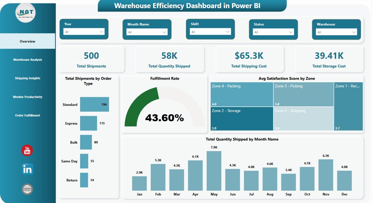
1. Overview Page
The Overview page is the executive summary — four KPI cards on top followed by 4 charts and a row of slicers for quick filtering by warehouse, zone, month, and order type.
KPI Cards: Total Shipments · Total Quantity Shipped · Total Shipping Cost · Total Storage Cost
Charts:
- Total Shipments by Order Type — Breaks shipment volume across order types so you can see which categories dominate throughput. Useful for capacity planning and staffing by order mix.
- Fulfillment Rate — Single-number view of completed shipments as a percentage of total shipments. The top-line health metric for any warehouse operation.
- Avg Satisfaction Score by Zone — Compares customer satisfaction across warehouse zones. Highlights which zones meet service expectations and which need process attention.
- Total Quantity Shipped by Month Name — Monthly trend of units shipped, surfacing seasonality and month-over-month growth patterns.
Overview Page
2. Warehouse Analysis
This page compares performance across every warehouse you run, so regional operations leads can see which sites are carrying the load and which are falling behind.
- Total Shipments and Completed Shipments by Warehouse — Side-by-side comparison of volume handled vs orders completed at each warehouse. The gap between the two bars is your fulfillment shortfall.
- Total Shipping Cost by Zone — Shipping spend broken down by zone so you can identify high-cost lanes and renegotiate carrier rates where needed.
- Avg Pick Time by Zone — Average time to pick an order per zone — the cleanest indicator of layout efficiency and labor productivity inside the warehouse.
- Fulfillment Rate by Warehouse — Warehouse-level fulfillment performance, ranked from best to worst. Use this to benchmark sites and surface process gaps.
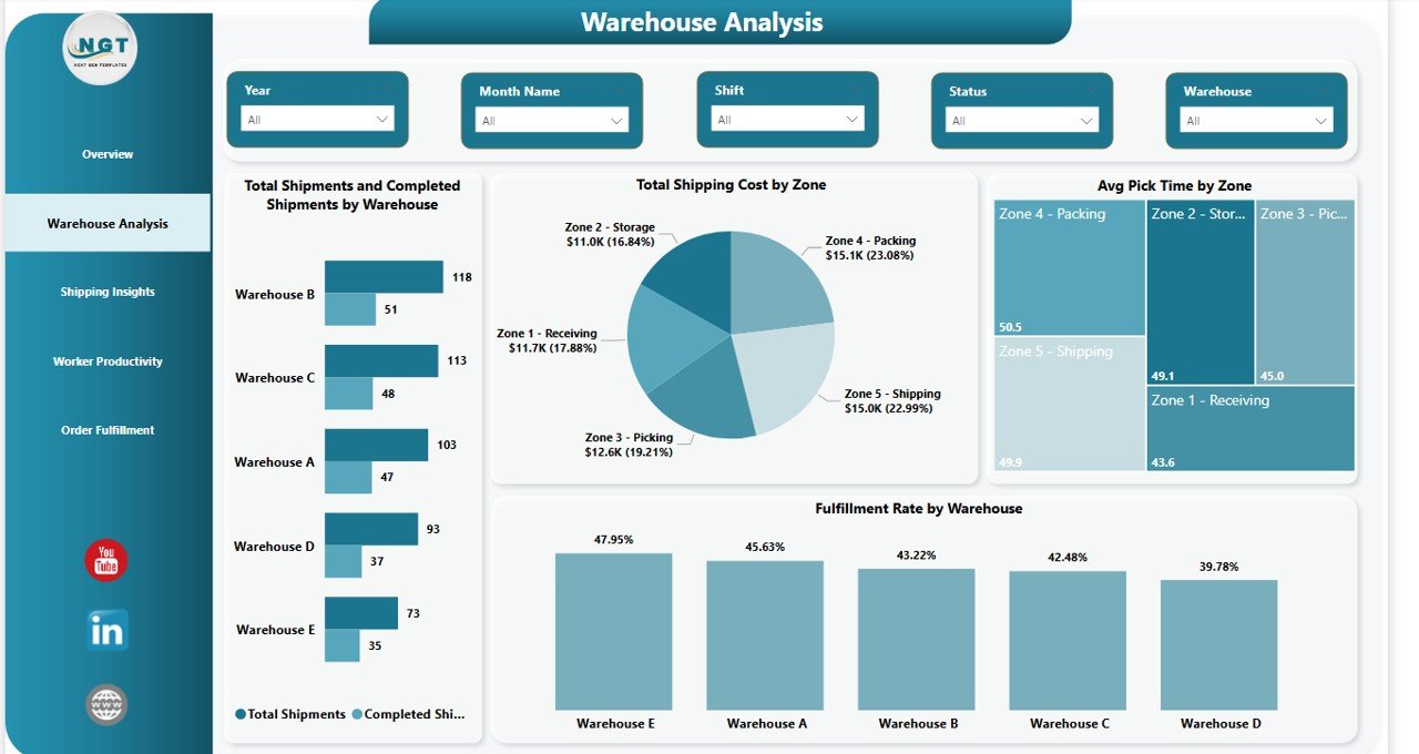
Warehouse Analysis
3. Shipping Insights
Shipping and storage costs are the two biggest lines on any warehouse P&L. This page pulls both apart so finance and ops can have the same conversation from the same view.
- Total Shipping Cost and Total Storage Cost by Month Name — Dual-metric monthly trend showing how shipping spend and storage spend move together. Spot the months when storage is eating your margin.
- Total Shipping Cost by Carrier — Carrier-level spend breakdown for contract review conversations. Shows exactly where the freight dollars are going.
- Total Quantity Shipped by Priority — Volume split across priority levels so you can see how much throughput is express vs standard.
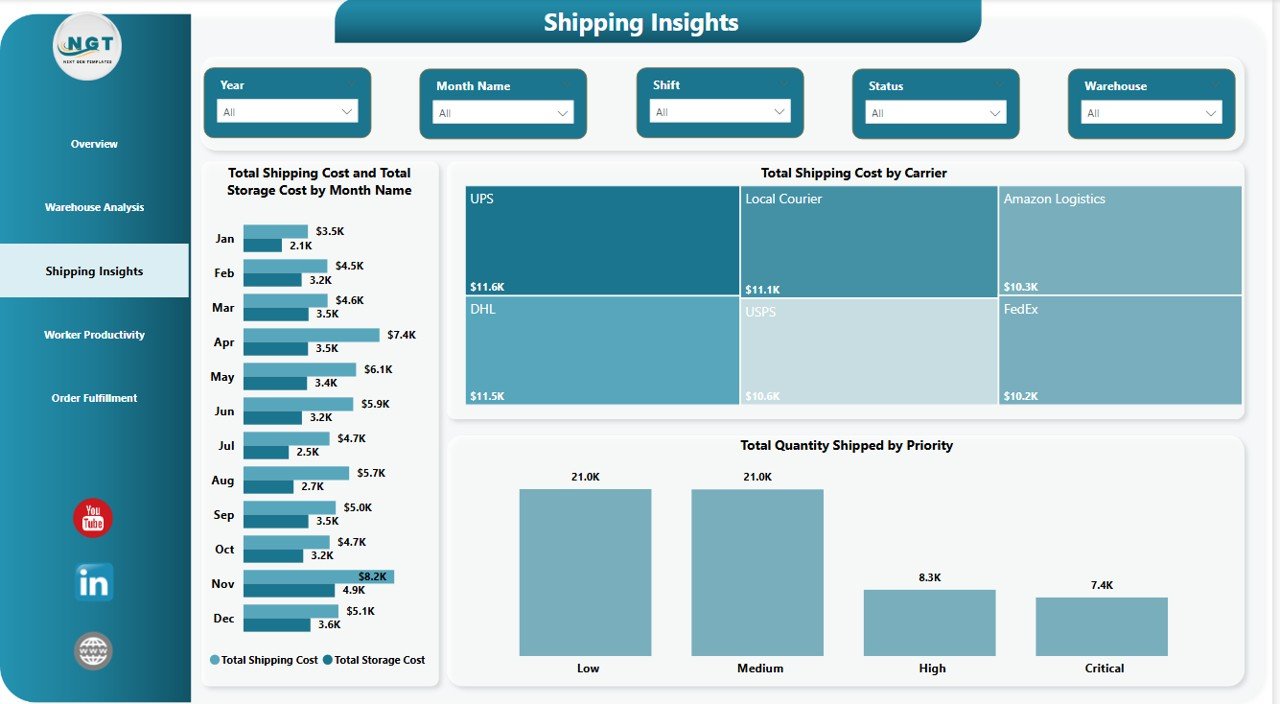
Shipping Insights
4. Worker Productivity
Warehouses run 2 or 3 shifts and productivity varies dramatically between them. This page makes shift performance visible so supervisors can act on it.
- Completed Shipments and Total Shipments by Shift — Shift-by-shift throughput with completion gap highlighted. Makes it obvious which shift is the high performer and which needs coaching.
- Avg Pick Time by Shift — Average pick time per shift — the single cleanest labor productivity metric by shift.
- Total Quantity Shipped by Shift — Total units shipped per shift, useful for volume-based shift incentive programs.
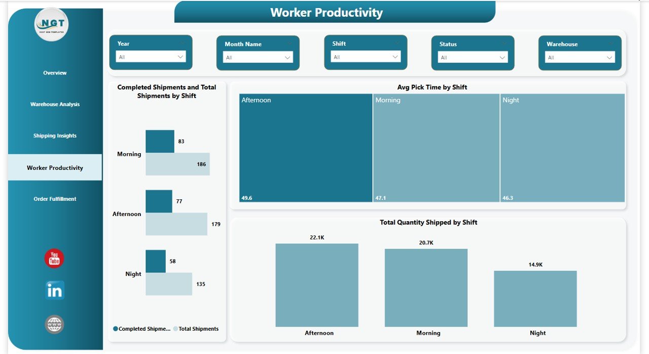
Worker Productivity
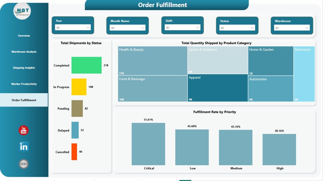
5. Order Fulfillment
The final page drills into the order itself — by status, by product category, by priority — so customer service and ops have a shared view of what is flowing through the warehouse and what is stuck.
- Total Shipments by Status — Shipment volume split across statuses (pending, in-transit, completed, etc.) for pipeline health.
- Total Quantity Shipped by Product Category — Units shipped per product category, highlighting which SKUs drive volume.
- Fulfillment Rate by Priority — Fulfillment percentage broken out by order priority level — surfaces whether express orders are getting the service level they pay for.
Order Fulfillment
📊 Warehouse Efficiency Dashboard in Power BI vs. Tableau / Qlik vs. Zoho Inventory / NetSuite ERP — Where This Fits
| Feature | Warehouse Efficiency Dashboard in Power BI | Tableau / Qlik | Zoho Inventory / NetSuite ERP |
|---|---|---|---|
| Cost | $17.99 one-time ✅ | $70–$115 / user / month | $35–$999+ / user / month |
| Platform | Power BI Desktop (free) ✅ | Tableau / Qlik Sense | Web-based ERP |
| Setup time | Under 30 minutes ✅ | 2–6 weeks | 3–9 months implementation |
| Pre-built warehouse visuals | 12+ visuals, 5 pages ✅ | Build from scratch | Fixed reporting templates |
| Fulfillment rate + pick time included | ✅ Out of the box | Manual calc needed | Report module only |
| Works offline in Power BI Desktop | ✅ | Limited | ❌ Cloud only |
| Customize DAX & visuals freely | ✅ Full access | ✅ | ❌ Locked |
| Year-1 cost at 5 users | $17.99 ✅ | $4,200–$6,900 | $2,100–$59,940+ |
| Ongoing subscription | ❌ None ✅ | Required | Required |
For teams that want executive-ready warehouse analytics without paying $4,000+ per year for Tableau or waiting 6 months for a full ERP rollout, the Warehouse Efficiency Dashboard in Power BI sits in the sweet spot.
👥 Who This Template Is For — and Who It’s Not For
✅ Built for:
- Supply chain and warehouse managers at 3PLs, e-commerce brands, and manufacturers running 1–20 warehouses
- Logistics analysts who need to stop rebuilding the same Power BI report every month
- Operations consultants delivering warehouse performance reviews to clients
- COOs and VP Ops who want a repeatable weekly or monthly warehouse scorecard
- MBA students and supply chain learners building a Power BI portfolio
❌ NOT for:
- Enterprise operations with 50+ warehouses needing real-time IoT sensor integration and SOC 2 certified cloud infrastructure
- Teams that need a full WMS with barcode scanning, goods receipt, and putaway workflows
- Users who want a live-refreshing cloud dashboard shared across 100+ concurrent viewers without a Power BI Pro license
⚙️ How to Use the Warehouse Efficiency Dashboard in Power BI
- Download the .pbix file after purchase and save it to your computer.
- Install Power BI Desktop free from Microsoft if you don’t already have it.
- Open the .pbix file in Power BI Desktop — the dashboard loads with sample data.
- Replace the sample data by clicking Transform Data and pointing the query to your own WMS or ERP export.
- Click Refresh — all 5 pages, 12+ visuals, and 4 KPI cards recalculate automatically.
- Use the slicers to filter by warehouse, zone, month, order type, or shift.
- Publish to Power BI Service (optional) to share with your team via browser.
💼 Real-World Use Cases
Priya leads operations at a 4-warehouse 3PL in North India. She uses the Warehouse Efficiency Dashboard in Power BI to compare fulfillment rate across her four sites every Monday, identify which zone has the longest avg pick time, and surface shift productivity gaps — replacing a 3-hour Excel consolidation her analyst used to do every week.
Arjun runs supply chain analytics for a D2C e-commerce brand. He points the .pbix file at the company’s Shopify + 3PL data export, refreshes daily, and uses the Shipping Insights page to show the CFO exactly which carrier is eating the most shipping budget. The template paid for itself in the first carrier negotiation.
Sandra is a freelance ops consultant doing 30-day warehouse diagnostics for mid-market manufacturers. She drops each client’s data into the same .pbix, customizes the title, and delivers a Power BI report on day 5 instead of day 20 — keeping her billable hours focused on recommendations, not building visuals.
❓ Frequently Asked Questions
What software do I need to open the Warehouse Efficiency Dashboard in Power BI?
You need Power BI Desktop, which is free from Microsoft. The Warehouse Efficiency Dashboard in Power BI opens as a standard .pbix file on any Windows 10 or Windows 11 machine — no Power BI Pro subscription is required to edit it locally.
Can I replace the sample data with my own warehouse data?
Yes. The Warehouse Efficiency Dashboard in Power BI uses a clean shipments fact table. Open Transform Data, point the query to your WMS or ERP export (CSV, Excel, or SQL), and click Refresh — every card, chart, and slicer recalculates automatically with your own data.
How does this compare to paying for Tableau or NetSuite ERP?
Tableau runs $70–$115 per user per month, and NetSuite ERP starts around $999 per month. The Warehouse Efficiency Dashboard in Power BI is a $17.99 one-time purchase. For 5 users over one year, you save roughly $4,200–$12,000 while getting the same warehouse, shipping, and productivity analytics.
How long does setup take?
Most users have the Warehouse Efficiency Dashboard in Power BI running on their own data in under 30 minutes. Install Power BI Desktop (5 min), open the .pbix file (instant), replace the sample data (10–15 min), and click Refresh. No DAX knowledge required for standard use.
Are the DAX measures editable?
Yes. Every DAX measure in the Warehouse Efficiency Dashboard in Power BI is fully editable — Total Shipments, Fulfillment Rate, Avg Pick Time, Total Shipping Cost, and all others. You can modify them, add new measures, or plug them into your own corporate data model.
Is there an Excel or HTML version of this dashboard?
Yes. The Warehouse Efficiency Dashboard is also available as an Excel dashboard and an HTML dashboard on NextGenTemplates — pick the format that matches your team’s tooling.
Do I get free updates?
Yes. Your purchase includes lifetime access to the Warehouse Efficiency Dashboard in Power BI and any future updates we release. One payment, no subscription, no renewal.
👤 About the Author
Built by PK — Microsoft Certified Professional with 15+ years of Excel, Google Sheets, and Power BI experience. Founder of NextGenTemplates, reaching 300K+ subscribers across YouTube channels (@PK-AnExcelExpert, @NextGenTemplates, @NeoTechNavigators). Every template is hand-built and tested before release.
🔗 Explore Related Templates
Also available as:
- Warehouse Efficiency Dashboard in Excel — same analytics, built in Microsoft Excel
- Warehouse Efficiency Dashboard in HTML — browser-based version, no software needed
Related Supply Chain & Warehouse templates:
- Procurement Management Dashboard in Power BI — PO tracking, supplier analysis, spend visibility
- Transportation and Logistics Dashboard in HTML — fleet and delivery analytics
- Vendor Performance Dashboard in HTML — supplier scorecard and SLA tracking
💎 Save 36% — Get all 8 warehouse & inventory templates in the Inventory & Warehouse Master Kit Bundle for $69.99 →
📖 Click here to read the Detailed Blog Post
Watch the step-by-step video tutorial:
🎥 Visit our YouTube channel for step-by-step video tutorials
👉 YouTube.com/@NextGenTemplates


Reviews
There are no reviews yet.