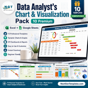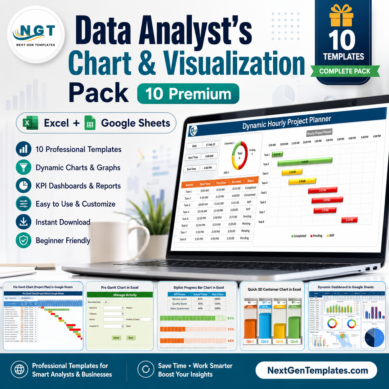

The Data Analyst’s Chart & Visualization Pack Data Analyst’s Chart & Visualization Pack is a curated set of 10 premium chart templates built for people who have to turn raw numbers into something a manager will actually look at. Instead of rebuilding a Gantt bar, a gauge needle or a scatter-based timeline from scratch every reporting cycle, you paste your data into a prepared sheet and a polished, presentation-ready visual appears. Seven templates run in Microsoft Excel and three run in Google Sheets, so this one pack covers both your offline reporting workbooks and your shared cloud files.Data Analyst’s Chart & Visualization Pack
Purchased one at a time, these ten templates cost $56.90. As a bundle they are $29.99 — a saving of $26.91, or 47% off. As with everything on NextGenTemplates, it is a one-time purchase: no subscription, no seat limits, no recurring fee.Data Analyst’s Chart & Visualization Pack
🎯 Get All 10 Chart Templates in One Download
Individual total $56.90 → Bundle price $29.99
You save $26.91 — 47% off
🔑 Key Features of the Data Analyst’s Chart & Visualization Pack
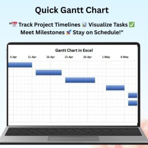
📊 Four Gantt Chart Variants: Daily, hourly and weekly planning grids plus a Pro Excel version with a built-in data entry form — enough coverage for almost any project reporting cadence.
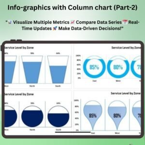
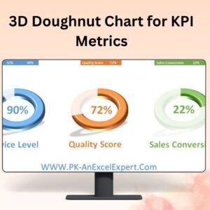
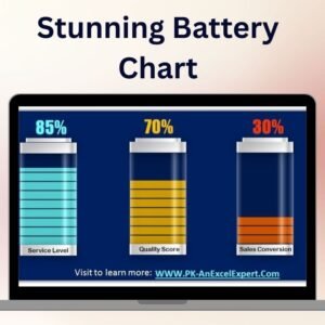
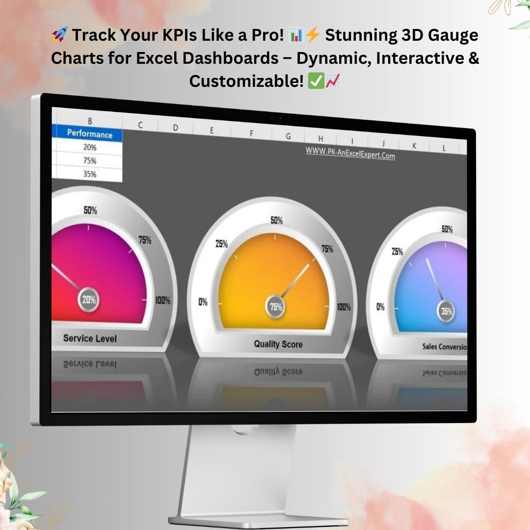
🎯 3D Gauge & Container Charts: Eye-catching KPI dials and fill-level visuals built purely from native Excel chart types, with no third-party add-ins or plugins to install.
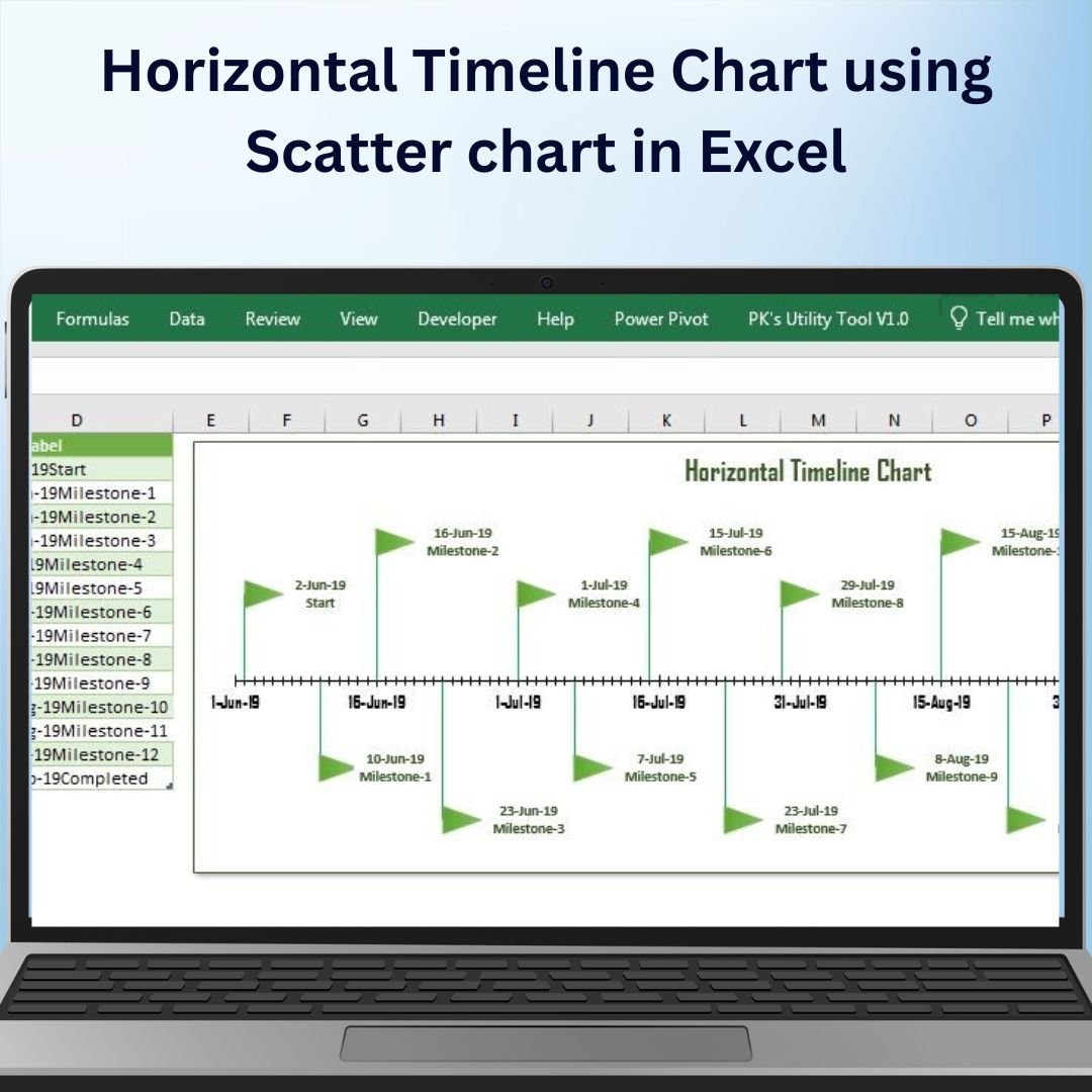
📈 Scatter-Based Timeline Chart: A horizontal milestone timeline created from an XY scatter chart — a technique most analysts never discover on their own.
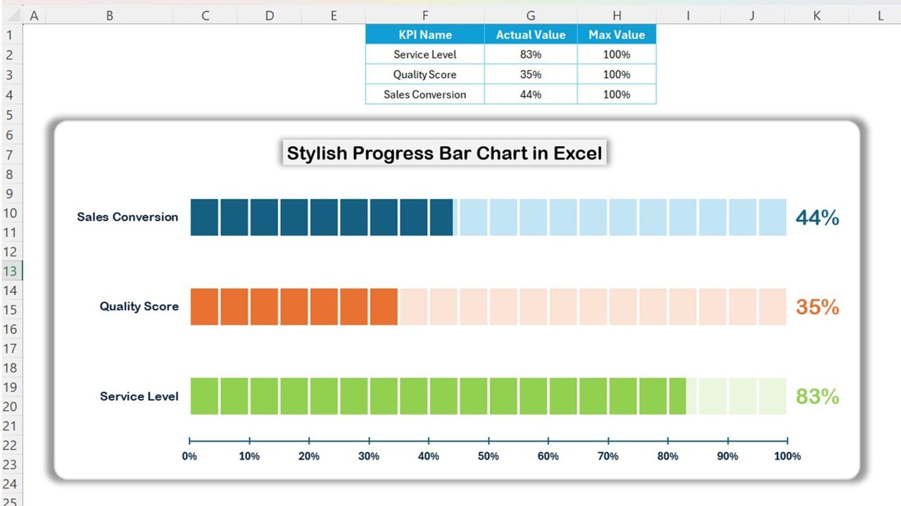
🟩 Stylish Progress Bar Chart: Clean, modern completion bars driven by a single percentage column, ideal for status decks and one-page summaries.
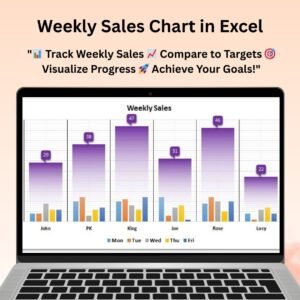
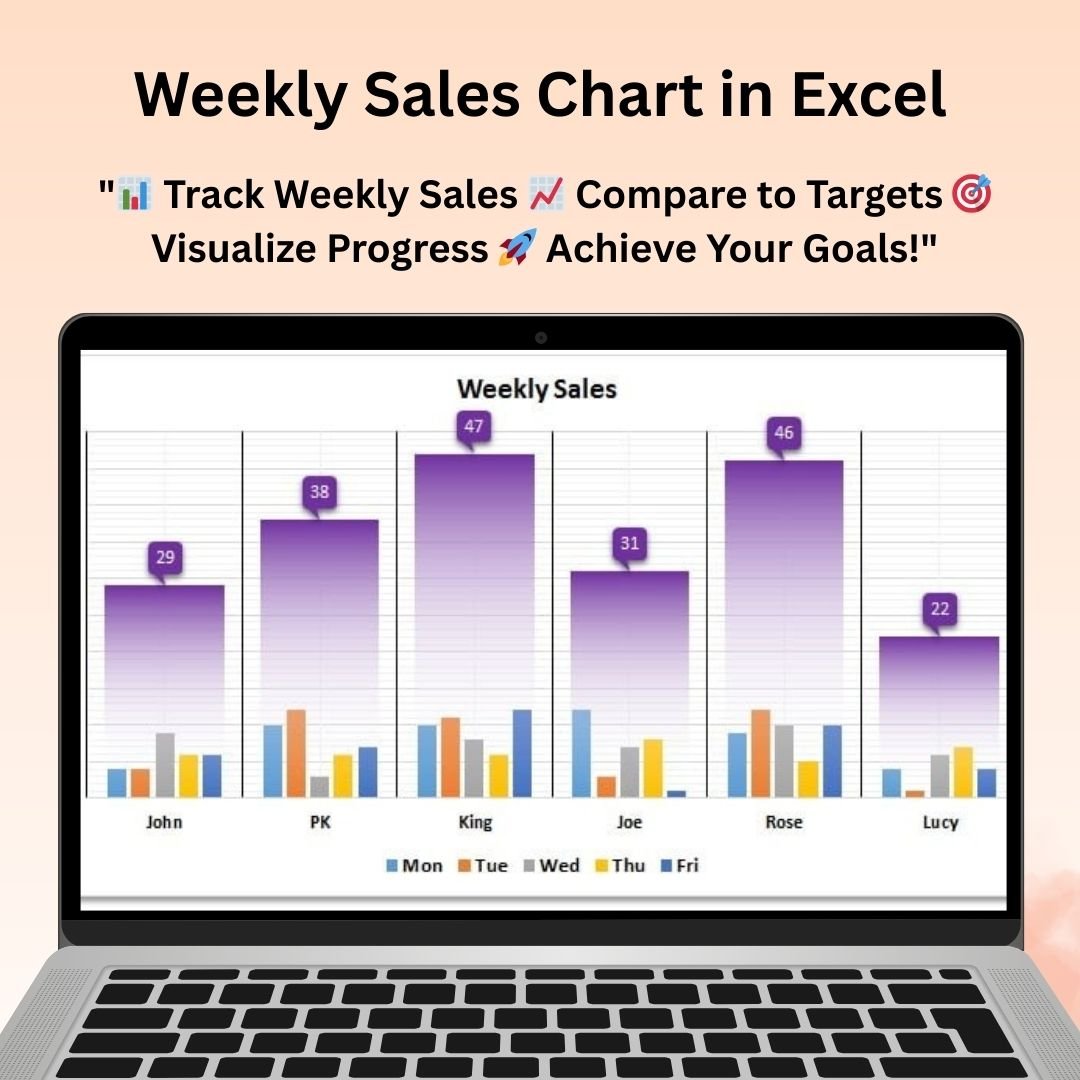
📅 Weekly Sales Chart: A week-over-week sales visual that refreshes the moment you drop in a new week of figures.
⚡ Formula-Driven, Not Hard-Coded: Every chart reads from a clearly labelled input range, so updating a report takes seconds rather than an afternoon.
☁️ Excel and Google Sheets Together: Keep the heavy Excel builds on your desktop and share the Google Sheets versions with collaborators — no format conversion needed.
🎨 Fully Editable Design: Colours, fonts, axis formats, gridlines and labels are all unlocked so you can match your own brand palette.
🧩 Reusable Building Blocks: Copy any chart into an existing dashboard and repoint it at your own data — each file doubles as a technique reference.
🚀 Instant Download: One ZIP, ten templates, delivered the moment your payment clears.
📦 What’s Inside the Data Analyst’s Chart & Visualization Pack
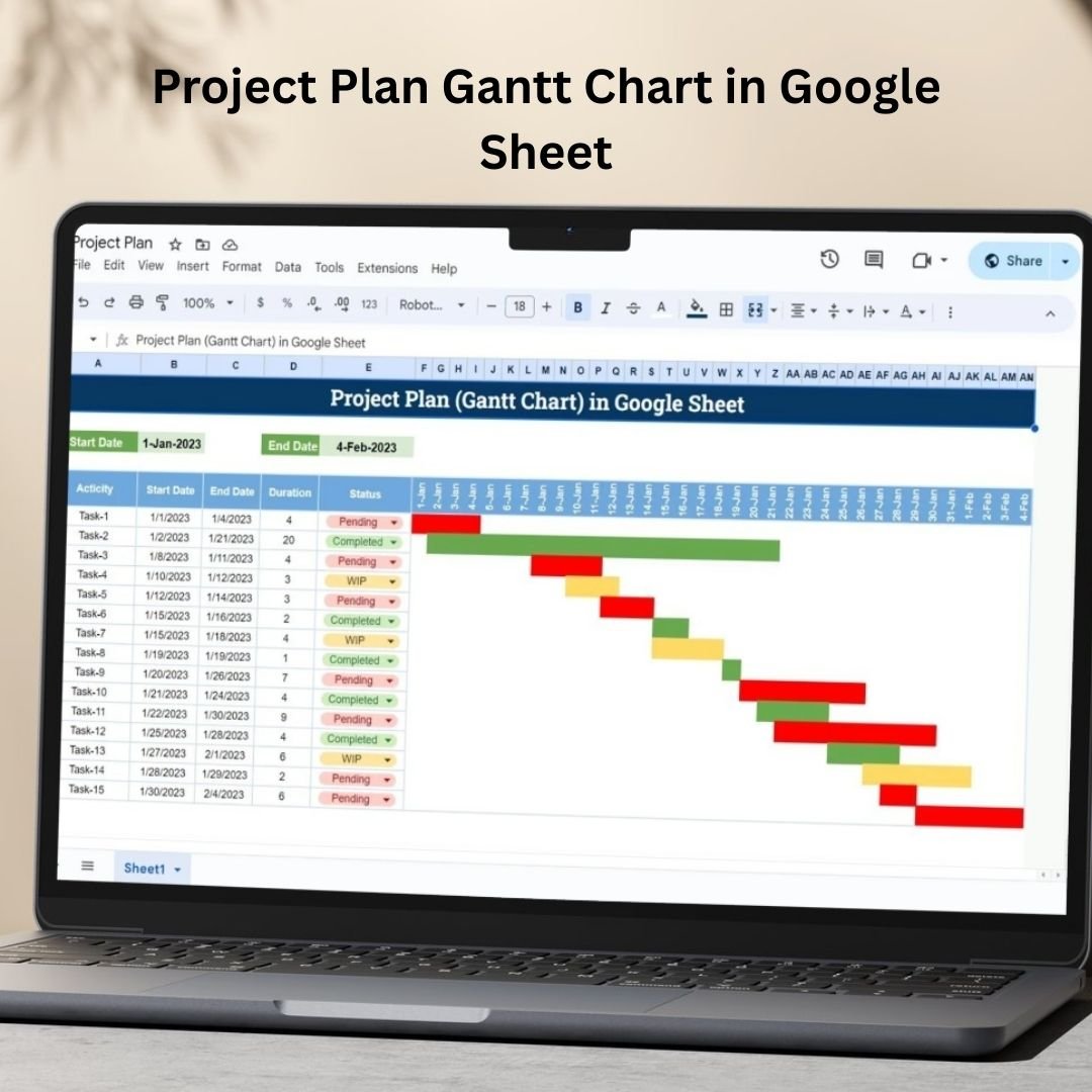
- Project Plan Gantt Chart in Google Sheet — A collaborative Gantt planner with task breakdown, owners, deadlines and dependency tracking, all live-editable by your whole team.

Data Analyst’s Chart & Visualization Pack Project Plan Gantt Chart in Google Sheet
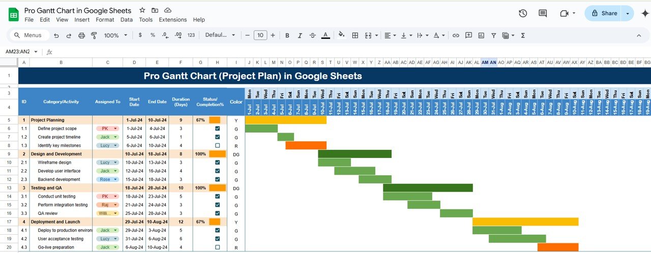
- Pro Gantt Chart Project Planner in Google Sheets — The advanced Sheets planner, adding resource allocation and a richer timeline view on top of standard Gantt tracking.
Pro Gantt Chart Project Planner in Google Sheets
- Dynamic Hourly Gantt Chart for Projects — An hour-by-hour Excel Gantt for shift planning, maintenance windows, event schedules and anything too granular for a daily grid.
Dynamic Hourly Gantt Chart for Projects
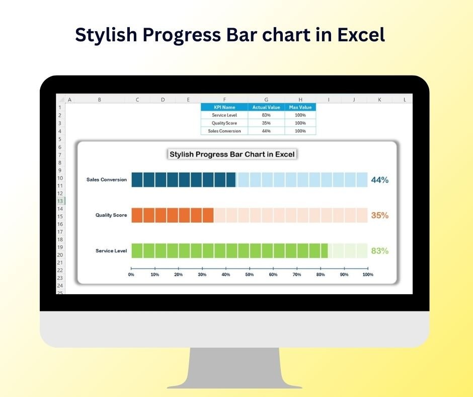
- Stylish Progress Bar chart in Excel — Modern, rounded completion bars that turn a plain percentage column into a status visual worth putting on slide one.
Stylish Progress Bar chart in Excel
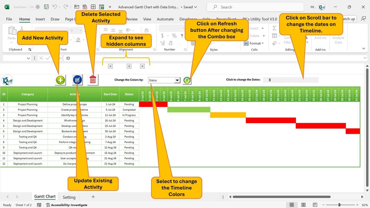
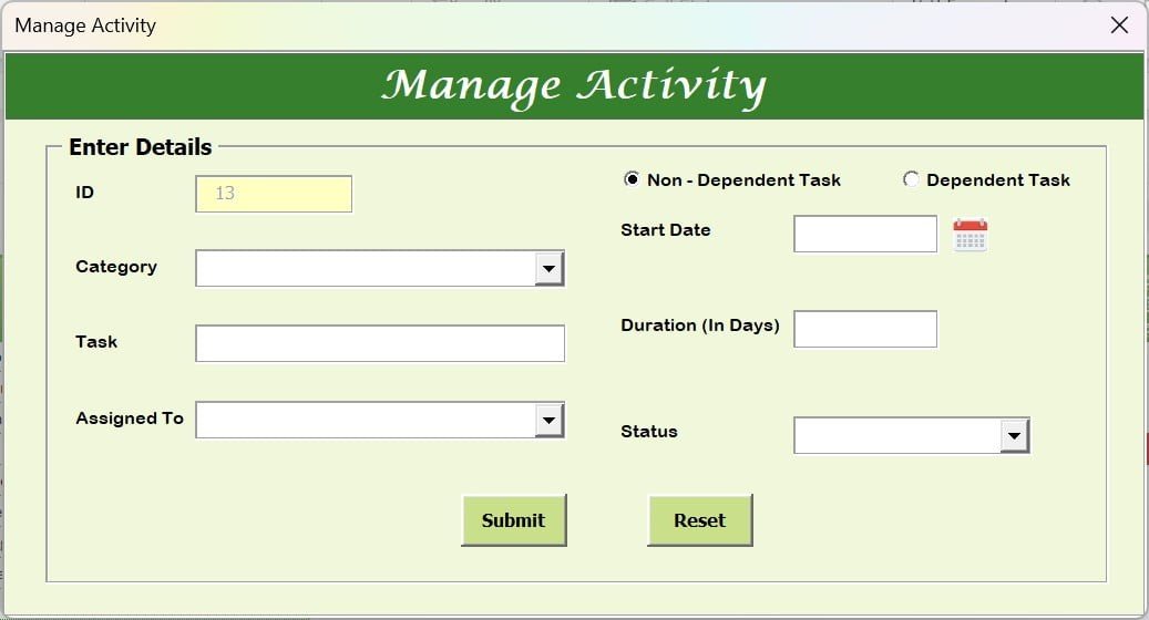
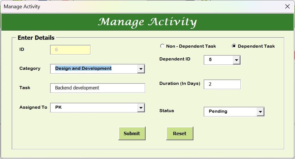
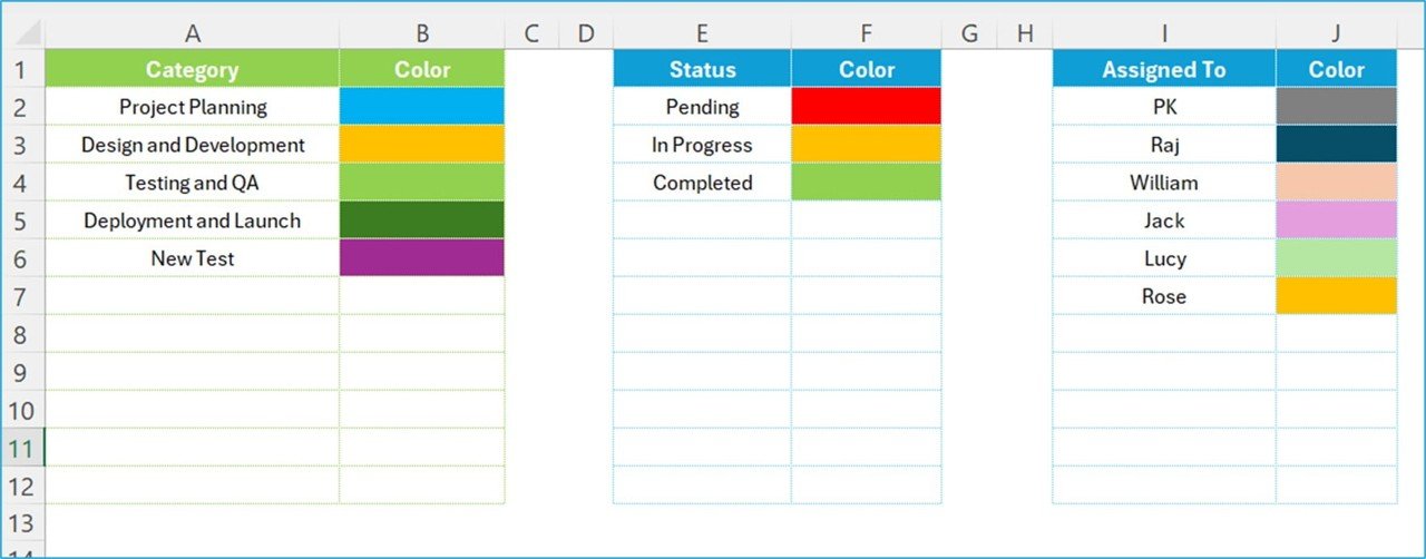
- Pro Gantt Chart in Excel with data entry form — The flagship Excel Gantt, with a VBA-powered form for adding, editing and deleting tasks so nobody types over your formulas.
Pro Gantt Chart in Excel with data entry form
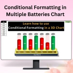
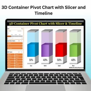
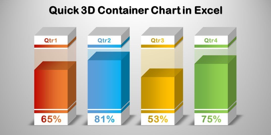
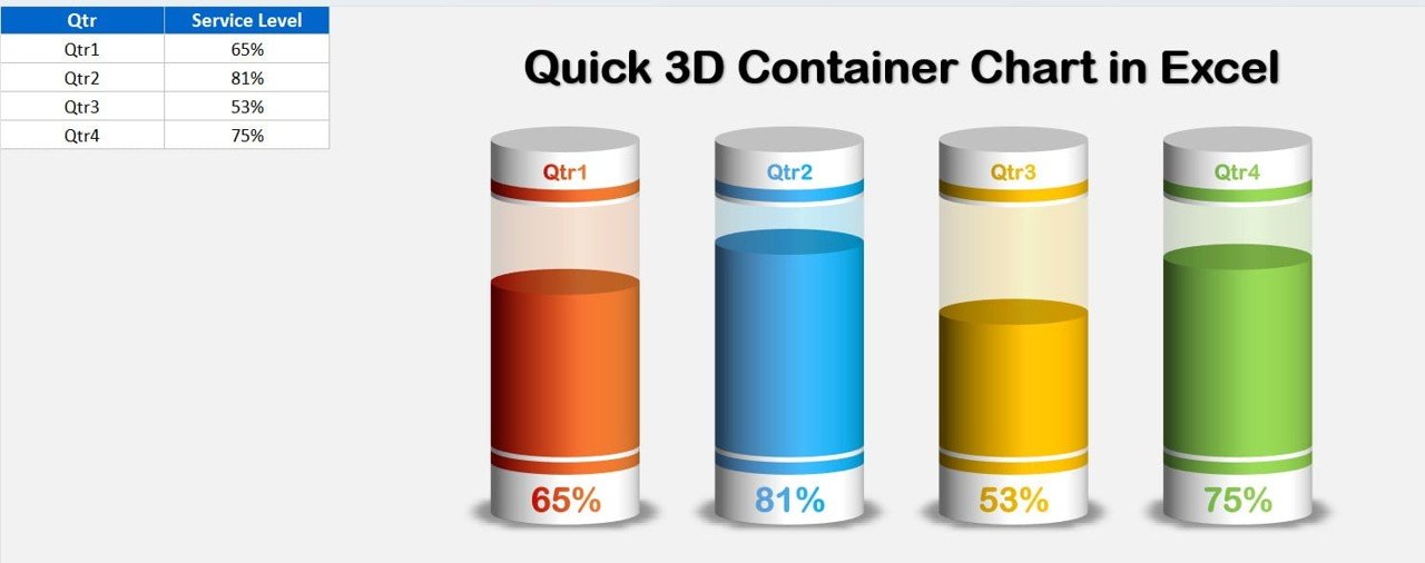
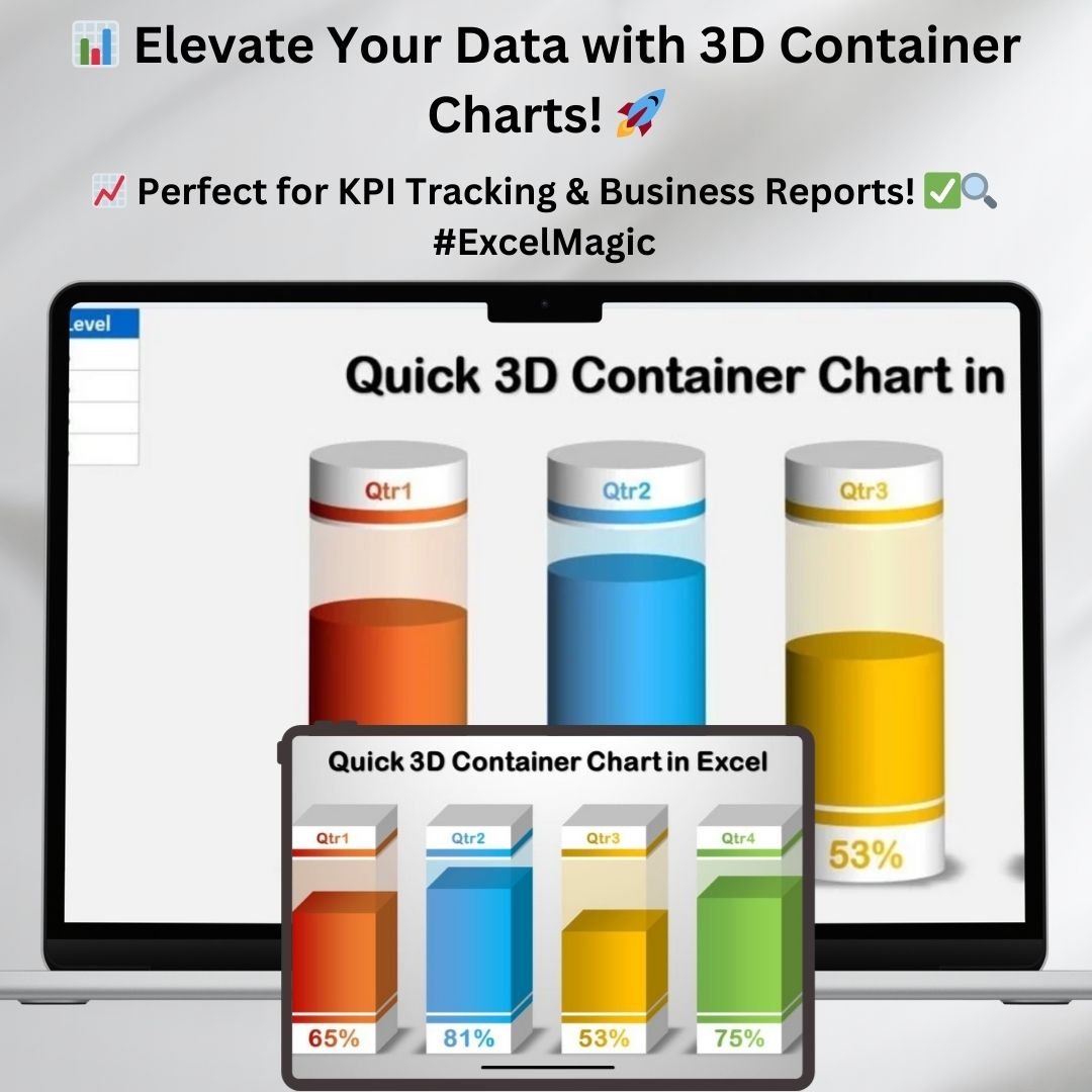
- Quick 3D Container chart in Excel — A fill-level container visual for capacity, stock, budget consumption or target attainment, built entirely with native shapes and charts.
Quick 3D Container chart in Excel
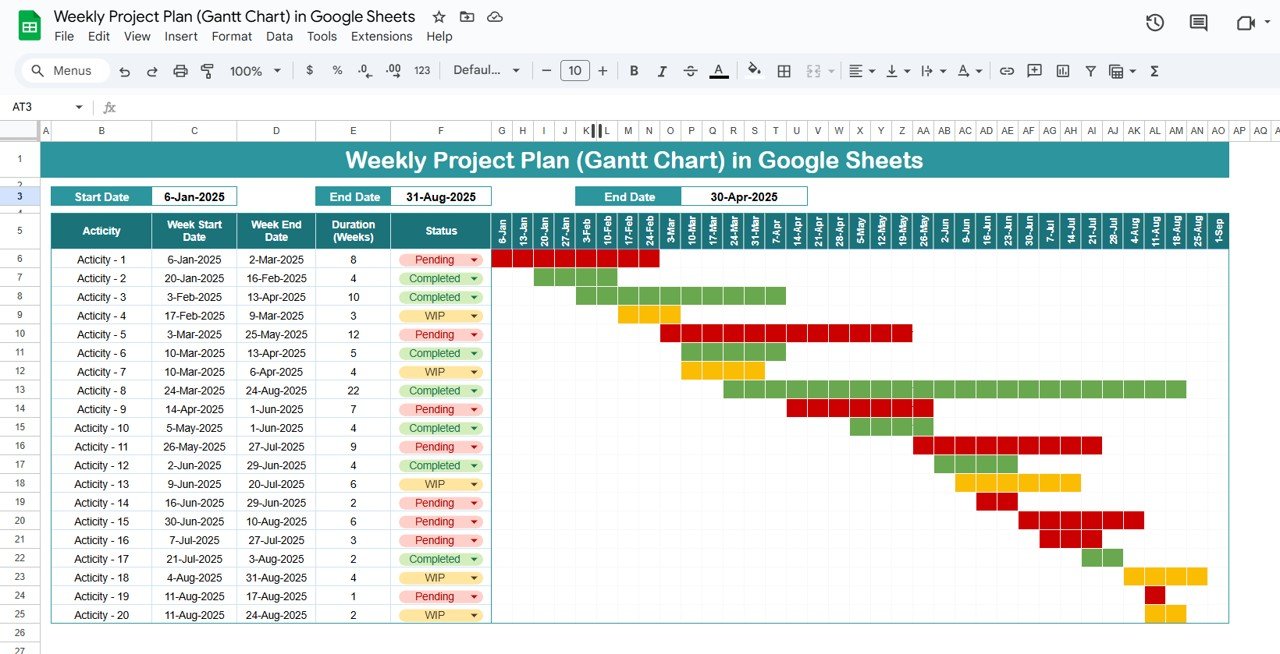
- Weekly Project Plan (Gantt Chart) in Google Sheets — A week-bucketed Gantt for longer programmes, where a daily grid becomes unreadable past a couple of months.
Weekly Project Plan (Gantt Chart) in Google Sheets
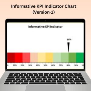
- 3D Gauge Chart in Excel — A speedometer-style KPI dial with a 3D finish, perfect for headline metrics like OEE, SLA attainment or revenue against target.
3D Gauge Chart in Excel
- Weekly Sales Chart in Excel — A week-over-week sales comparison chart with clean labelling, ready for your Monday morning review pack.
Weekly Sales Chart in Excel
- Horizontal Timeline Chart using Scatter chart in Excel — A milestone timeline built from an XY scatter chart, giving you roadmap-quality visuals without leaving Excel.
Horizontal Timeline Chart using Scatter chart in Excel




💡 Smart Comparison — Individual vs Bundle
| What You Get | Buying Individually | This Bundle |
|---|---|---|
| Number of templates | Pick and choose | All 10 included |
| Total cost | $56.90 | $29.99 |
| You save | — | $26.91 (47%) |
| Effective price per template | $5.69 | $3.00 |
| Platforms covered | Whatever you buy | Excel + Google Sheets |
| Chart techniques learned | One or two | Gantt, gauge, 3D, scatter, progress |
| Number of checkouts | Up to 10 | 1 |
| Best value | ❌ | ✅ Recommended |
Product Breakdown
| # | Template | Platform | Individual Price |
|---|---|---|---|
| 1 | Project Plan Gantt Chart in Google Sheet | Google Sheets | $4.99 |
| 2 | Pro Gantt Chart Project Planner in Google Sheets | Google Sheets | $4.99 |
| 3 | Dynamic Hourly Gantt Chart for Projects | MS Excel | $4.99 |
| 4 | Stylish Progress Bar chart in Excel | MS Excel | $4.99 |
| 5 | Pro Gantt Chart in Excel with data entry form | MS Excel | $9.99 |
| 6 | Quick 3D Container chart in Excel | MS Excel | $4.99 |
| 7 | Weekly Project Plan (Gantt Chart) in Google Sheets | Google Sheets | $6.99 |
| 8 | 3D Gauge Chart in Excel | MS Excel | $4.99 |
| 9 | Weekly Sales Chart in Excel | MS Excel | $4.99 |
| 10 | Horizontal Timeline Chart using Scatter chart in Excel | MS Excel | $4.99 |
| — | Individual Total | Excel + Sheets | $56.90 |
| ★ | Bundle Price | All 10 | $29.99 — save 47% |
⚙️ How to Use the Data Analyst’s Chart & Visualization Pack
1️⃣ Download and unzip — one ZIP arrives after checkout containing all ten templates plus the Google Sheets access PDFs.
2️⃣ Open the template you need — Excel files open directly; for the Google Sheets templates, open the PDF and use the copy link to add the file to your own Drive.
3️⃣ Replace the sample data — each workbook has a clearly marked input range. Type over the demo rows with your own tasks, dates, targets or sales figures.
4️⃣ Restyle to match your brand — nothing is locked, so change the fill colours, fonts and axis formats to fit your reporting standards.
5️⃣ Copy the chart into your report — paste any chart into an existing dashboard or deck and repoint it at your live data range.
👥 Who Can Benefit from This Chart & Visualization Pack
🔹 Data Analysts & Business Analysts — a ready visualization library instead of rebuilding charts every sprint
🔹 MIS & Reporting Executives — faster turnaround on recurring weekly and monthly report packs
🔹 Project Managers & PMO Teams — four Gantt variants covering hourly, daily and weekly planning
🔹 Operations & Production Managers — gauge and container charts for capacity, utilisation and target tracking
🔹 Sales Managers — weekly sales visuals and progress bars for pipeline and quota reporting
🔹 Finance & Budget Owners — spend-versus-budget visuals that read clearly in a board pack
🔹 Consultants & Freelancers — reusable, client-ready chart assets you can rebrand per engagement
🔹 Excel Trainers & Students — ten worked examples of chart techniques that are hard to learn from documentation alone
If you build reports for a living, the chart is the part people remember. This pack gives you ten of them, already built, already tested, ready for your data.
📊 10 Premium Chart Templates — One Simple Price
Excel + Google Sheets | One-time purchase | Instant download
$56.90 $29.99 save $26.91
Click here to read the detailed blog post on the Data Analyst’s Chart & Visualization Pack
Browse more in Excel Charts and Visualization, Project Management Templates and Template Bundles.
Visit our YouTube channel to learn step-by-step video tutorials