

Payroll KPIs are the metrics that tell you whether your payroll is accurate, on time and affordable. The ten that matter most in 2026 are payroll accuracy rate, payroll error rate, payroll cost as a percentage of revenue, cost per payslip, processing time, overtime percentage, labor cost per employee, on-time payment rate, off-cycle payment rate and benefits cost as a share of compensation.
Last updated: September 2026
Key takeaways
- The essential payroll KPIs split into three jobs: accuracy (error rate), timeliness (on-time payment rate) and cost (payroll cost as a percentage of revenue).
- World-class payroll accuracy runs at or above 99.5%, and a healthy overtime share sits below 5% of total hours worked.
- US employers spend roughly 30% of total compensation on benefits, so a benefits-cost KPI belongs on every payroll scorecard.
- Each KPI needs a defined formula and a benchmark range before you track it — a number with no target is just noise.
- You do not need new software to start: the Payroll Management KPI Dashboard in Excel calculates most of these metrics for $12.99, and eight ready-made templates below cover Excel, Google Sheets and Power BI from $6.99.
Payroll KPI dashboard templates compared
| Template | Format | Best for | Price |
|---|---|---|---|
| Payroll Management KPI Dashboard (Best overall) | Excel | Tracking the core payroll KPIs out of the box | $12.99 |
| Payroll & Salary Management System Web App | Excel web app | Running payroll and reporting in one system | $39.99 |
| Payroll Management Dashboard | Excel | Department-level cost and headcount analysis | $17.99 |
| Payroll Accuracy KPI Dashboard | Excel | Error rate and accuracy tracking | $14.99 |
| Employee Benefits Dashboard | Excel | Benefits cost as a share of compensation | $17.99 |
| Employee Benefits Dashboard | Power BI | Interactive benefits analytics for larger teams | $17.99 |
| Monthly Payroll Manager & Dashboard (Best value) | Google Sheets | Cloud payroll management for small teams | $9.99 |
| Employee Benefits Dashboard | Google Sheets | Lowest-cost benefits tracker | $6.99 |
How we picked these payroll KPIs
We reviewed how payroll, finance and HR teams actually report performance, then narrowed the field to the ten payroll KPIs that answer the three questions every leader asks: is pay correct, is it on time, and can we afford it? We excluded vanity metrics that look impressive but drive no decision — headcount alone, for example, tells you nothing about payroll health. Every KPI below has a defined formula, a published or widely accepted benchmark range, and a clear owner. We then mapped each metric to a ready-made NextGenTemplates dashboard, drawn from a catalog of more than a hundred paid Excel, Google Sheets and Power BI templates, so you can start measuring today rather than building from scratch.
What are the 10 payroll KPIs to track in 2026?
Below is the quick-reference table, followed by a full breakdown of each payroll KPI: a one-sentence definition, the exact formula, a realistic benchmark range, and the mistake teams most often make.
| Payroll KPI | Formula | Benchmark | Where to see it |
|---|---|---|---|
| 1. Payroll accuracy rate | (Error-free payslips ÷ total payslips) × 100 | 98%–99.5%+ | Payroll Accuracy KPI Dashboard |
| 2. Payroll error rate | (Payroll errors ÷ total payslips) × 1,000 | <10 per 1,000 | Payroll Accuracy KPI Dashboard |
| 3. Payroll cost % of revenue | (Total payroll cost ÷ revenue) × 100 | 15%–30% | Payroll Management KPI Dashboard |
| 4. Cost per payslip | Total payroll-run cost ÷ payslips issued | $3–$15 | Payroll Management Dashboard |
| 5. Payroll processing time | Total hours per cycle ÷ cycles | <4 hrs (automated) | Payroll Management KPI Dashboard |
| 6. Overtime percentage | (Overtime hours ÷ total hours) × 100 | <5% | Payroll Management Dashboard |
| 7. Labor cost per employee | Total labor cost ÷ average headcount | Trend vs. revenue/head | Payroll & Salary Management System |
| 8. On-time payment rate | (On-time correct payments ÷ total) × 100 | ≥99.5% | Monthly Payroll Manager |
| 9. Off-cycle payment rate | (Off-cycle payments ÷ total) × 100 | <2%–3% | Payroll Management KPI Dashboard |
| 10. Benefits cost % of compensation | (Benefits cost ÷ total compensation) × 100 | ≈30% (US) | Employee Benefits Dashboard |
1. Payroll accuracy rate
The share of payslips issued with no errors of any kind. It is the single best headline measure of payroll health.
Formula: (Error-free payslips ÷ total payslips) × 100.
Benchmark: 98%–99.5%. Best-in-class teams hold 99.5% or higher; anything under 98% is costing you in corrections and trust.
The mistake teams make: counting only gross-pay mistakes. A payslip with the right net pay but the wrong tax code, wrong deduction or wrong cost centre is still an error, and those are the ones that trigger compliance problems later.
2. Payroll error rate
The inverse view of accuracy, expressed as errors per 1,000 payslips so small teams and large ones can be compared on the same scale.
Formula: (Payroll errors ÷ total payslips) × 1,000.
Benchmark: under 10 errors per 1,000 payslips (roughly 1%); best-in-class is under 5.
The mistake teams make: not logging errors that were caught and fixed before payday. If you only count errors that reached employees, the rate looks artificially low and you lose the early-warning signal that your process is drifting.
3. Payroll cost as a percentage of revenue
Total payroll spend measured against revenue — the KPI finance cares about most because it links people cost directly to the top line.
Formula: (Total payroll cost ÷ total revenue) × 100.
Benchmark: 15%–30% for most businesses. Service and professional firms run higher (up to 50%), capital-intensive businesses lower.
The mistake teams make: using base salaries only. True payroll cost includes employer payroll taxes, benefits, bonuses and paid time off; leave them out and the ratio understates your real labor burden by a third or more.
4. Cost to process one payslip
The fully-loaded cost of running payroll, divided by the number of payslips produced — your efficiency-per-transaction number.
Formula: Total payroll-run cost ÷ payslips issued.
Benchmark: $3–$15 per payslip depending on automation; heavily manual processes run higher.
The mistake teams make: counting only software subscription fees. The real cost is dominated by staff hours — data collection, checking and approvals — so a “cheap” manual process is often the most expensive one per payslip.
5. Payroll processing time
How long a full payroll cycle takes from data collection to payment, averaged across runs.
Formula: Total hours per cycle ÷ number of cycles.
Benchmark: an automated small-business payroll should finish in under 4 hours; manual processes commonly take one to two days.
The mistake teams make: timing only the final calculation step. Most of the elapsed time is spent gathering timesheets and chasing approvals, so measuring just the calculation hides where the delay really lives.
6. Overtime percentage
Overtime hours as a share of total hours worked — an early indicator of understaffing, poor scheduling or burnout.
Formula: (Overtime hours ÷ total hours worked) × 100.
Benchmark: under 5% is healthy; a sustained figure above 10% signals a staffing or planning problem.
The mistake teams make: tracking overtime hours but not overtime cost. Because overtime is typically paid at 1.5×, a 5% share of hours can be an 8%–10% share of cost, so always report both.
7. Labor cost per employee
The average fully-loaded cost of employing one person, used to spot cost creep and to compare against revenue per head.
Formula: Total labor cost ÷ average headcount.
Benchmark: varies too much by industry for a single figure — track the trend and compare it against revenue per employee.
The mistake teams make: using salary only. Fully-loaded cost includes taxes, benefits, bonuses and equipment; the salary-only version can be 25%–40% below the true number and leads to bad hiring-budget decisions.
8. On-time payment rate
The percentage of employees paid the correct amount on the scheduled pay date — the KPI employees feel most directly.
Formula: (On-time correct payments ÷ total payments) × 100.
Benchmark: 99.5% or higher. Late or wrong pay is one of the fastest ways to lose staff trust.
The mistake teams make: counting a late-but-corrected payment as on time. If the money landed after payday, it was late — recording it otherwise hides a real service failure.
9. Off-cycle payment rate
The share of payments made outside the normal payroll run — corrections, advances and manual adjustments.
Formula: (Off-cycle payments ÷ total payments) × 100.
Benchmark: under 2%–3%. A rising off-cycle rate usually means your main run is not capturing data correctly.
The mistake teams make: treating off-cycle runs as free. Each one carries processing cost and a higher error risk, so a low headline error rate can hide a lot of expensive rework happening off to the side.
10. Benefits cost as a percentage of compensation
How much of total compensation goes to benefits rather than wages — the KPI that keeps your total reward strategy honest.
Formula: (Total benefits cost ÷ total compensation) × 100.
Benchmark: roughly 30% for US private-industry employers, according to the US Bureau of Labor Statistics Employer Costs for Employee Compensation series.
The mistake teams make: reviewing it once a year at renewal. Benefit costs creep up monthly; an Employee Benefits Dashboard that refreshes every pay run catches the drift while you can still act on it.
The 8 best payroll KPI dashboard templates for 2026
Every KPI above is only useful if something calculates it for you each pay run. These eight ready-made templates already do — mapped to the metrics they track, ranked, with real prices. Our number-one pick is the Payroll Management KPI Dashboard in Excel because it covers the widest set of core payroll KPIs out of the box for the lowest sensible price.
1. Payroll Management KPI Dashboard in Excel — best overall
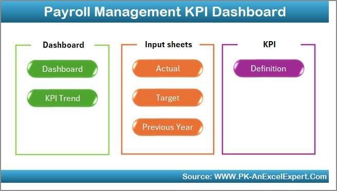
A purpose-built scorecard that turns raw payroll data into the headline KPIs — accuracy, cost, processing time and off-cycle rate — on one screen.
- Who it is for: payroll and finance leads who want a KPI view without building formulas.
- Inside: definition, target and previous-year sheets; accuracy and cost KPIs; processing-time tracking; input tabs for actuals and targets.
Track payroll accuracy against a 99.5% target, watch cost as a percentage of revenue trend month over month, and flag any off-cycle rate creeping past 3%. At $12.99 it is the fastest way to stand up a payroll KPIs scorecard.
Price: $12.99. View the Payroll Management KPI Dashboard.
Best for: the single best starting point for tracking payroll KPIs.
2. Payroll & Salary Management System Web App — most complete
A full Excel-based web app that runs payroll and reports on it, so your KPI numbers come straight from the system of record rather than a manual re-key.
- Who it is for: growing teams that want to run and measure payroll in one place.
- Inside: employee master, salary structure, attendance-to-pay processing, payslips and management reporting.
Because pay is processed inside the tool, labor cost per employee and on-time payment rate are calculated automatically. For a business tired of spreadsheets that only report after the fact, this is the upgrade.
Price: $39.99. View the Payroll & Salary Management System.
Best for: running and measuring payroll in a single system.
3. Payroll Management Dashboard in Excel
A department-level analytics dashboard focused on where the money goes — cost by department, overtime share and headcount.
- Who it is for: managers who need to defend payroll cost by team.
- Inside: gross-to-net breakdown, department cost analysis, overtime and payment-mode views.
This is the natural home for overtime percentage and cost per payslip. Spot the department running 12% overtime before it becomes a budget overrun.
Price: $17.99. View the Payroll Management Dashboard.
Best for: department-level cost and overtime analysis.
4. Payroll Accuracy KPI Dashboard in Excel
A specialist dashboard built around a single job: measuring and driving down payroll error rate.
- Who it is for: teams recovering from accuracy problems or under audit pressure.
- Inside: error logging by type, accuracy-rate trend, root-cause categorisation.
Log every error — including ones caught before payday — and watch the accuracy rate climb toward 99.5%. This is the tool that makes KPIs 1 and 2 above real.
Price: $14.99. View the Payroll Accuracy KPI Dashboard.
Best for: error-rate and accuracy tracking.
5. Employee Benefits Dashboard in Excel
Turns benefits spend into a KPI you can manage monthly instead of discovering at renewal.
- Who it is for: HR and finance owners of total-reward cost.
- Inside: benefit-type cost breakdown, cost as a share of compensation, enrolment and utilisation views.
Keep benefits cost near the ~30% US benchmark and catch creep early. Pairs naturally with the payroll dashboards above for a full compensation picture.
Price: $17.99. View the Employee Benefits Dashboard.
Best for: benefits cost as a share of compensation.
6. Employee Benefits Dashboard in Power BI
The same benefits analytics in an interactive Power BI model, for teams that want slicers and drill-down.
- Who it is for: larger organisations already using Power BI.
- Inside: interactive visuals, filterable benefit categories, trend and cost-per-head measures.
Slice benefits cost by location, plan or department and refresh straight from your source data.
Price: $17.99. View the Employee Benefits Dashboard in Power BI.
Best for: interactive benefits analytics at scale.
7. Monthly Payroll Manager & Dashboard in Google Sheets — best value
A cloud-native payroll manager and dashboard for small teams who live in Google Workspace.
- Who it is for: small businesses that want shared, cloud payroll management under $10.
- Inside: monthly payroll register, startup payroll calculator, dashboard summary and on-time tracking.
Run monthly pay, track on-time payment rate and share the dashboard with your accountant — no software install, all in Google Sheets.
Price: $9.99. View the Monthly Payroll Manager.
Best for: the best value for cloud payroll management.
8. Employee Benefits Dashboard in Google Sheets
The lowest-cost way onto this list — a shareable benefits tracker in Google Sheets.
- Who it is for: very small teams or anyone piloting benefits KPIs before investing more.
- Inside: benefit cost table, share-of-compensation calc, simple summary charts.
At $6.99 it is the cheapest way to start tracking benefits cost as a percentage of compensation.
Price: $6.99. View the Employee Benefits Dashboard in Google Sheets.
Best for: the lowest-cost benefits KPI tracker.
How to choose between them
Match the tool to your platform and your priority:
- Want the fastest KPI scorecard? Start with the Payroll Management KPI Dashboard ($12.99).
- Want to run payroll too, not just report it? The Payroll & Salary Management System ($39.99).
- Fixing accuracy? The Payroll Accuracy KPI Dashboard ($14.99).
- Live in Google Workspace? The Monthly Payroll Manager ($9.99).
- Own the benefits budget? The Employee Benefits Dashboard in Excel, Power BI or Google Sheets.
If you need help calculating the underlying pay first, the payroll calculation in Excel formulas guide and the complete payroll Excel template toolkit cover the mechanics behind these KPIs, and the Gusto alternatives payroll templates guide is worth a look if you are weighing a spreadsheet against payroll software.
When a payroll KPI dashboard is NOT the right answer
A template is the wrong choice in a few honest cases. If you run multi-state or multi-country payroll with complex tax filings, you need dedicated payroll software with compliance updates, not a spreadsheet — track KPIs on top of it, not instead of it. If you have more than a few hundred employees, a spreadsheet will strain and you should push these metrics into a BI tool or your HRIS. And if your underlying pay data is unreliable, fix the source first: a beautiful dashboard built on bad timesheets just reports wrong numbers faster. Templates shine for small and mid-sized teams that already process pay correctly and simply lack a clear, consistent way to measure it.
Frequently asked questions
What are payroll KPIs?
Payroll KPIs are measurable indicators of how well payroll performs across accuracy, timeliness and cost. Common examples include payroll accuracy rate, on-time payment rate, payroll cost as a percentage of revenue and overtime percentage. Each has a defined formula and a benchmark you compare actual performance against.
What is a good payroll accuracy rate?
A good payroll accuracy rate is 98% or above, and best-in-class teams sustain 99.5% or higher. Accuracy counts every error type — not just wrong net pay, but wrong tax codes, deductions and cost centres. Anything below 98% typically means expensive corrections and eroding employee trust.
How do you calculate payroll cost as a percentage of revenue?
Divide total payroll cost by total revenue and multiply by 100. Total payroll cost must include employer taxes, benefits, bonuses and paid time off, not just base salaries. Most businesses land between 15% and 30%; service firms run higher and capital-intensive businesses lower.
What is a healthy overtime percentage?
Under 5% of total hours worked is healthy. A sustained figure above 10% usually signals understaffing, poor scheduling or burnout risk. Always report overtime cost alongside hours, because overtime is paid at about 1.5×, so its share of cost is higher than its share of hours.
Which payroll KPIs should a small business track first?
Start with three: payroll accuracy rate, on-time payment rate and payroll cost as a percentage of revenue. Together they tell you whether pay is correct, on time and affordable. The $12.99 Payroll Management KPI Dashboard calculates all three, so a small business can begin tracking payroll KPIs the same day.
How often should payroll KPIs be reviewed?
Review accuracy, error rate and on-time payment every pay run, because problems there need immediate fixes. Review cost KPIs — payroll cost as a percentage of revenue, cost per payslip and benefits cost — monthly, and trend them over a rolling 12 months so seasonal swings do not mislead you.
What is the difference between payroll accuracy rate and payroll error rate?
They measure the same thing from opposite directions. Accuracy rate is the percentage of error-free payslips; error rate is the number of errors per 1,000 payslips. Accuracy is easier to communicate to leadership, while error rate is more sensitive for spotting small process changes early.
Can I track payroll KPIs in Google Sheets?
Yes. Google Sheets handles payroll KPI tracking well for small teams and adds easy sharing. The Monthly Payroll Manager & Dashboard ($9.99) and Employee Benefits Dashboard ($6.99) both run natively in Google Sheets, so you can measure on-time payment and benefits cost without any software install.
What does cost per payslip include?
Cost per payslip is the fully-loaded cost of running payroll divided by payslips issued. It includes staff time for data collection, checking and approvals, software fees, and any outsourcing charges. Because staff hours dominate, a manual process often costs far more per payslip than an automated one.
Do I need payroll software or is a template enough?
For small and mid-sized teams with reliable pay data, a template is usually enough to track payroll KPIs and often replaces a manual reporting habit entirely. Choose dedicated software when you have complex multi-jurisdiction filings, several hundred employees, or need automated compliance updates.
Get more payroll KPI templates
Ready to measure your payroll KPIs this pay run? The Payroll Management KPI Dashboard in Excel ($12.99) is the fastest start, the Monthly Payroll Manager & Dashboard in Google Sheets ($9.99) is the best value, and the Payroll & Salary Management System Web App ($39.99) is the most complete. Explore the full range of payroll, HR and KPI templates — and see them in action — on the NextGenTemplates YouTube channel. If your next metric project is elsewhere in the business, our procurement KPIs, recruitment KPIs and manufacturing KPIs guides follow the same formula-plus-benchmark approach.