

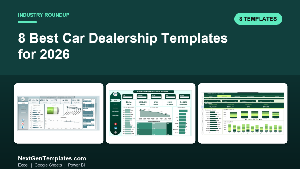
The best car dealership dashboard template for most showrooms is the Car Dealership Dashboard in Excel ($17.99), which tracks units sold, gross per unit, F&I income and inventory aging in one file. Google Sheets ($9.99) is the best-value cloud option, and Power BI ($17.99) suits multi-rooftop groups reporting to ownership.
Last updated: September 2026
Running a dealership means stitching numbers together from a DMS export, an F&I log, a used-car aging report and a service RO summary — usually in four different tabs that never agree. By the 5th of the month the GM wants front-end gross, back-end per unit retail (PVR), floorplan cost and 30/60/90-day aged inventory on one screen, and the controller is still reconciling. A purpose-built car dealership dashboard template collapses that scramble into a file you refresh in minutes.
The alternative is a dealership-specific SaaS reporting tool, which typically runs $150–$500 per rooftop per month once you add seats — $1,800 to $6,000 a year before a single custom view. Every template below is a one-time purchase between $9.99 and $17.99, yours to edit and reuse across as many months and stores as you like. Below we rank the eight best car dealership templates in the NextGenTemplates catalog by use case, with real prices and an honest “best-for” verdict on each.
Key takeaways
- The Car Dealership Dashboard in Excel ($17.99) is our best overall pick — full new/used, F&I and inventory view in one offline file.
- The Google Sheets version ($9.99) is the best value and the right call for cloud-based, multi-user teams.
- For multi-rooftop groups, the Power BI dashboard ($17.99) adds cross-store slicers and drill-down.
- Used-car desks should look at the dedicated Used Car Sales KPI Dashboard ($14.99) built around days-to-turn and reconditioning cost.
- All eight are one-time purchases from $9.99 to $17.99 — a fraction of the $1,800+/year a dealership SaaS reporting seat costs.
Car dealership dashboard templates compared
| Template | Format | Best for | Price |
|---|---|---|---|
| Car Dealership Dashboard (Best overall) | Excel | Single-rooftop GM wanting the full picture offline | $17.99 |
| Car Dealership Dashboard | Power BI | Multi-rooftop groups & ownership reporting | $17.99 |
| Car Dealership Dashboard (Best value) | Google Sheets | Cloud-first, multi-user showroom teams | $9.99 |
| Automotive KPI Dashboard | Excel | KPI-focused ops and fixed-ops managers | $14.99 |
| Used Car Sales KPI Dashboard | Excel | Used-car / pre-owned desks tracking turn | $14.99 |
| Used Car Sales KPI Dashboard | Google Sheets | Used-car teams working in the cloud | $12.99 |
| Autonomous Vehicle KPI Dashboard | Excel | EV / AV programs and forward-looking metrics | $14.99 |
| Automotive KPI Dashboard | Power BI | Budget-conscious Power BI adopters | $11.99 |
How we picked these
We searched the full NextGenTemplates catalog of 1,000+ paid templates for products built specifically for automotive retail — new-car, used-car and fixed-ops reporting — and shortlisted the eight that a working dealership could deploy the same day. We judged each on metric coverage (does it track the numbers a GM and controller actually review), how much manual rework the layout demands, format flexibility, and price-to-value. We excluded generic sales trackers that mention cars only in passing, and anything without an editable data model behind the charts. Prices shown are the current one-time USD list prices on nextgentemplates.com at the time of writing.
The 8 best car dealership dashboard templates for 2026
1. Car Dealership Dashboard in Excel — best overall
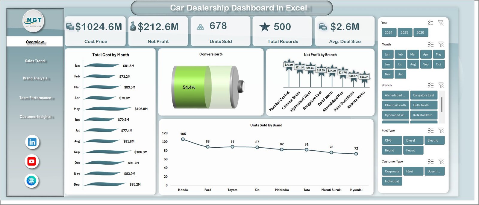
This is the template most single-rooftop stores should start with. It brings new and used sales, F&I income, deal count and inventory into one refreshable Excel file — no add-ins, no subscription, works fully offline on any laptop the desk manager already owns.
What’s inside:
- Overview page with total cost, net profit, units sold and average deal size cards
- Units-sold-by-brand and profit-by-branch breakdowns
- Conversion rate by fuel type and by lead source
- A structured data-entry sheet so charts update when you paste your DMS export
- Month, brand and drive-type slicers for fast filtering
Who it’s for: a GM or controller at a single store who wants front-end and back-end performance on one screen without paying monthly. Use cases: a 300-unit-a-month store reviewing PVR by salesperson; a controller closing the month who needs gross by department in one export; an owner spotting that units are up 8% but average deal size slipped $212. At $17.99 it pays for itself against one hour of manual report-building. Best for: the dealership that wants the complete picture, offline, in the tool it already knows.
2. Car Dealership Dashboard in Power BI — best for multi-rooftop groups
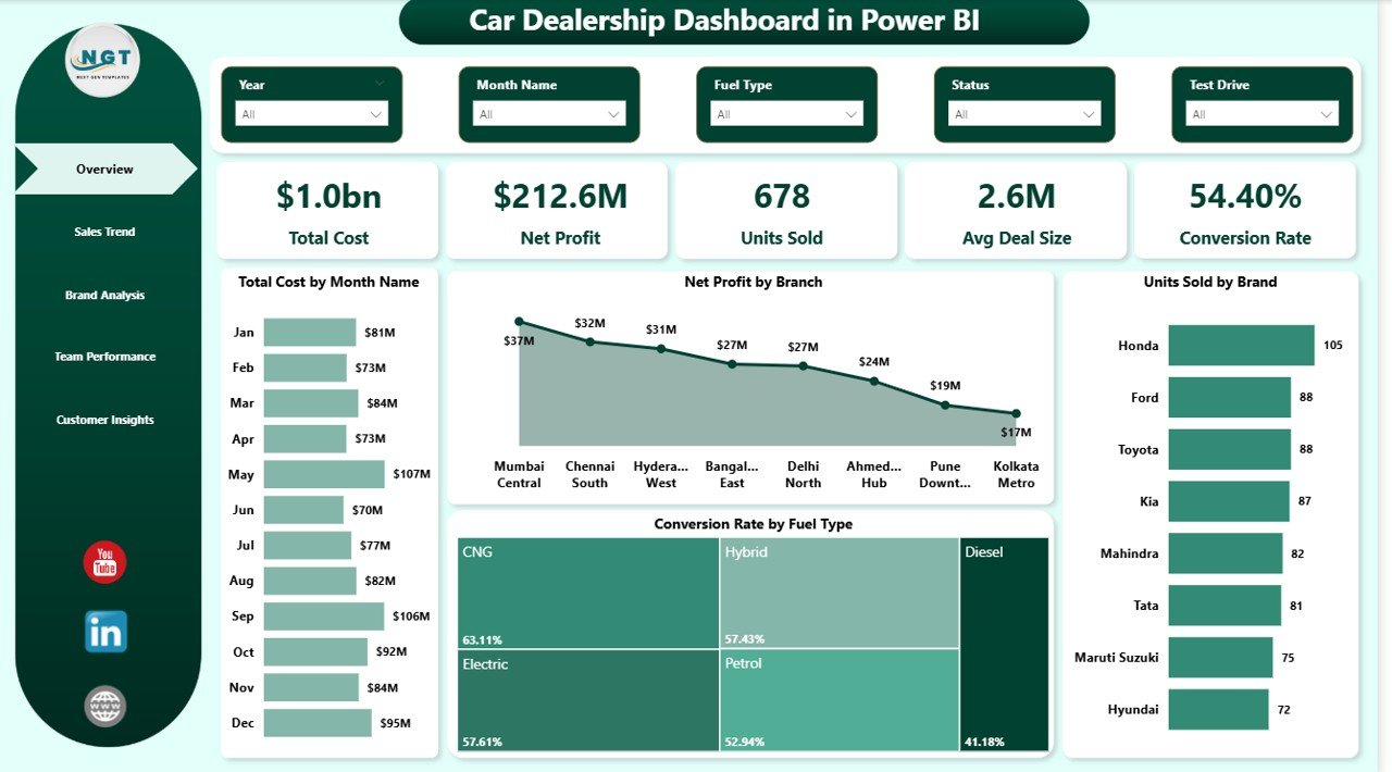
The same dealership metric set, rebuilt for Power BI so ownership can slice across stores and drill from group totals down to a single rooftop or salesperson. This is the version to buy once you run more than one location and want a single source of truth for the whole group.
What’s inside:
- Total cost, net profit, units sold and conversion-rate KPI cards
- Total cost by month and net profit by branch visuals
- Conversion rate by fuel type and units sold by brand
- Interactive slicers for month, branch, salesperson and drive type
- A clean data model you can point at a folder of monthly exports
Who it’s for: dealer groups and multi-store operators who report to a principal or private-equity owner. Use cases: a five-rooftop group comparing gross-per-unit across stores in one click; a regional director drilling into the one location dragging the group’s conversion rate; a Monday-morning ownership review where the same file refreshes from last week’s data. Building this level of cross-store analytics from scratch is a consultant project; here it’s $17.99. Pair it with our Power BI dashboard templates ranked by industry if you report on other departments too. Best for: multi-rooftop groups that live in Power BI.
3. Car Dealership Dashboard in Google Sheets — best value

At $9.99 this is the lowest-priced dealership dashboard we recommend, and for cloud-first teams it’s the smartest buy. Because it lives in Google Sheets, the sales desk, F&I and the GM can all be in the same live file at once — no emailing versions back and forth.
What’s inside:
- Sales-metrics header with completed profit, retail and unit totals
- Top-salesperson-by-revenue and branch-sales-by-vehicle-type charts
- Monthly sales by branch and category-level breakdowns
- Click-to-filter controls over the whole dashboard
- A data tab your team updates from any browser or phone
Who it’s for: showrooms that run on Google Workspace and want real-time, shared visibility without a Microsoft licence. Use cases: a used-car manager updating the board from the lot on a tablet; a GM checking month-to-date units from home on a Sunday; a small group giving accountants view-only access instead of exporting PDFs. If your team already collaborates in Sheets, see our roundup of Google Sheets templates for teams. Best for: cloud-based dealerships that value shared, always-current data over offline power.
4. Automotive KPI Dashboard in Excel — best for KPI-focused operations
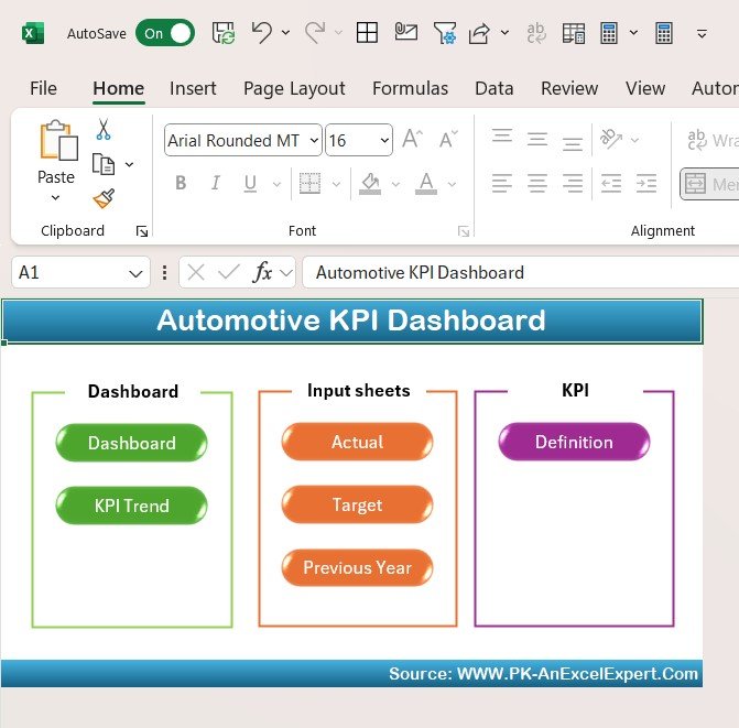
Where the store dashboards are built around deals and inventory, this template is built around KPIs — targets versus actuals, trends and variance across the whole automotive operation. It’s the right tool when your monthly rhythm is a scorecard review rather than a deal log.
What’s inside:
- A KPI scorecard with target, actual and variance for each metric
- Month-over-month trend lines and traffic-light status
- Sales, service and parts KPI groupings
- An editable KPI definition tab so you set your own benchmarks
Who it’s for: operations and fixed-ops managers who manage to numbers and want a clean, repeatable monthly scorecard. Use cases: a fixed-ops director tracking hours-per-RO and effective labor rate against target; an ops manager who reports a red/amber/green KPI pack to ownership; a store rolling out accountability where every department owns three numbers. At $14.99 it turns a scattered set of metrics into one governed scorecard. For the metric definitions behind it, our 15 sales KPIs to track in 2026 guide is a useful companion. Best for: teams that manage by KPI, not by deal ledger.
5. Used Car Sales KPI Dashboard in Excel — best for used-car desks

The used-car department lives and dies by different numbers than new-car, and this dashboard is built for them: days-to-turn, reconditioning cost, front-end gross and aged-unit exposure. If pre-owned is your profit engine, a generic store dashboard hides exactly what you need to watch.
What’s inside:
- Average days-to-turn and aged-inventory (30/60/90-day) tracking
- Front-end gross per used unit and reconditioning cost views
- Sales-by-source and by-price-band breakdowns
- A data-entry sheet aligned to a typical used-car inventory export
Who it’s for: used-car and pre-owned managers who need to move aged units before they cost more in floorplan than they’ll ever make back. Use cases: a manager cutting a 74-day unit loose before it hits 90; a desk watching recon spend creep past $1,400 average; an owner comparing turn between two buyers. At $14.99 it gives the used-car desk its own command screen. Best for: pre-owned departments focused on turn and aging.
6. Used Car Sales KPI Dashboard in Google Sheets — best for cloud used-car teams
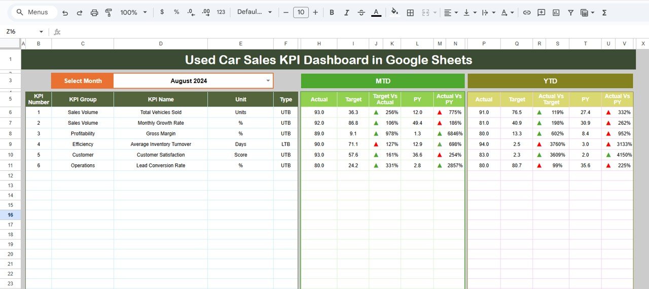
The same used-car metric focus as the Excel version, delivered in Google Sheets for $12.99. Choose this when the pre-owned team needs the aging and turn view but works from the lot, from home and from the desk — all in one live file that never gets emailed around.
What’s inside:
- Days-to-turn, aged-unit and gross-per-unit KPI cards
- Sales-by-source and price-band charts that filter live
- Reconditioning and profit tracking per vehicle
- A browser-based data tab any team member can update
Who it’s for: used-car desks on Google Workspace that want mobility over offline horsepower. Use cases: a buyer updating recon status from an auction on a phone; a manager sharing view-only turn numbers with the GM; a two-store group keeping both pre-owned desks on one sheet. It’s $2 more than the new/used store dashboard in Sheets but sharpened entirely on used-car economics. Best for: cloud-first pre-owned teams that need turn and aging visible anywhere.
7. Autonomous Vehicle KPI Dashboard in Excel — best for EV/AV programs
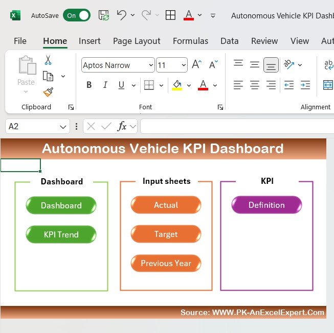
A more specialized pick for dealers and groups building an EV or autonomous-vehicle program and reporting on metrics traditional store dashboards never touch — charging, uptime, safety and adoption. If you’re standing up an EV desk or reporting an AV pilot to ownership, this saves you inventing a scorecard from scratch.
What’s inside:
- Fleet-level KPI cards for uptime, utilization and safety events
- Adoption and mileage trend visuals
- Cost-per-mile and efficiency tracking
- An editable KPI tab you can re-point at your own EV/AV data
Who it’s for: forward-looking dealers, EV specialists and fleet operators piloting autonomous or electric programs. Use cases: a group reporting EV charging-uptime to a manufacturer; a fleet manager watching cost-per-mile fall as adoption climbs; an owner building the business case for an EV service bay. At $14.99 it’s a ready framework for metrics most dealerships have never had to report before. Best for: EV and autonomous-vehicle programs that need a purpose-built scorecard.
8. Automotive KPI Dashboard in Power BI — best budget Power BI option
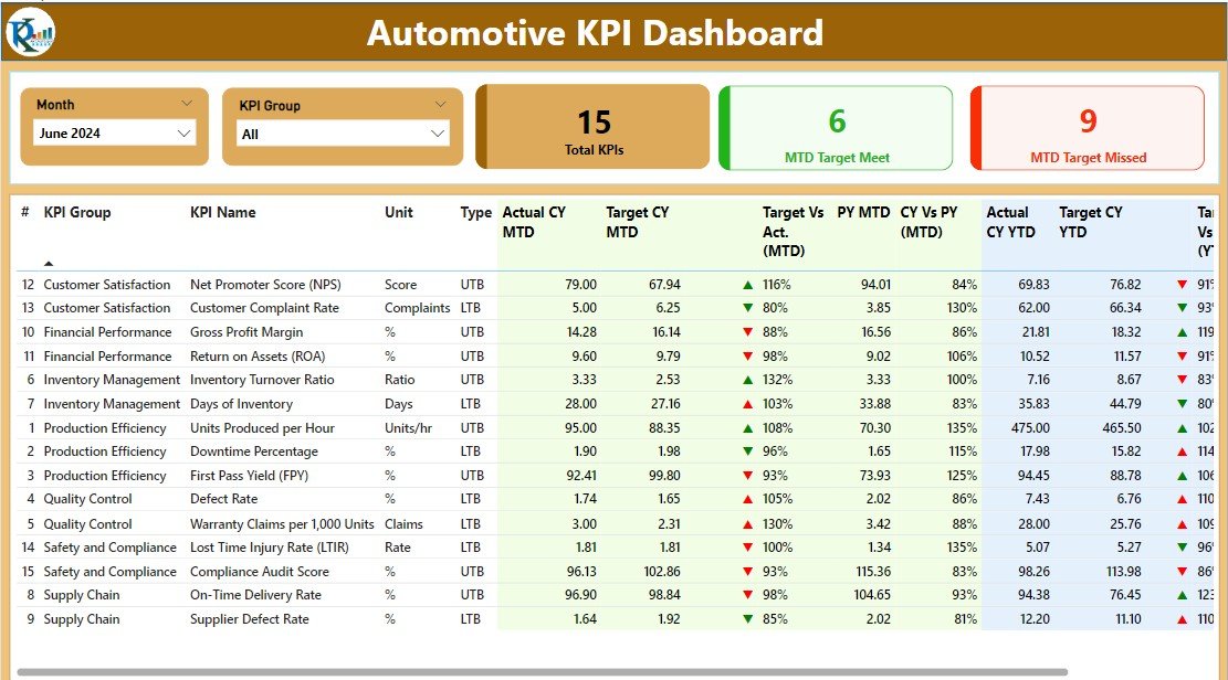
If you want interactive, drill-down KPI reporting but don’t need the full multi-rooftop store model, this is the value entry point into Power BI for automotive at $11.99 — the lowest-priced Power BI option in this roundup.
What’s inside:
- Automotive KPI cards with target-vs-actual and variance
- Trend and comparison visuals across sales, service and parts
- Interactive slicers for period and department
- A data model ready for your monthly exports
Who it’s for: single stores and ops managers who’ve standardized on Power BI and want a KPI scorecard rather than a deal-level dashboard. Use cases: an ops manager publishing an interactive KPI report to a Power BI workspace; a controller who wants filterable trends without building DAX; a store trialing Power BI before committing to the full group model. At $11.99 it’s the cheapest way to get automotive KPIs into Power BI. Best for: budget-conscious teams already using Power BI.
Not sure which to start with? For most single-rooftop stores the Car Dealership Dashboard in Excel at $17.99 is the fastest path to a complete monthly view. Cloud teams should take the Google Sheets version at $9.99. Both are one-time purchases you can edit forever.
How to choose between them
Match the template to how your team already works and what you report on:
- Single store, want the full picture, work offline → Car Dealership Dashboard in Excel ($17.99).
- Cloud-first team, need shared live access, tight budget → Car Dealership Dashboard in Google Sheets ($9.99).
- Multiple rooftops, ownership reporting, drill-down → Car Dealership Dashboard in Power BI ($17.99).
- You manage to a KPI scorecard, not a deal log → Automotive KPI Dashboard in Excel ($14.99) or Power BI ($11.99).
- Used-car is your profit center → Used Car Sales KPI Dashboard in Excel ($14.99) or Google Sheets ($12.99).
- Building an EV/AV program → Autonomous Vehicle KPI Dashboard in Excel ($14.99).
A simple rule: pick your format first (Excel for offline power, Google Sheets for sharing, Power BI for multi-store drill-down), then pick the focus (whole-store, KPI scorecard, or used-car). If you’re weighing formats in general, our comparison of Excel vs Google Sheets vs Power BI dashboards lays out the trade-offs that apply to automotive too.
When a car dealership template is NOT the right answer
These templates are honest, editable spreadsheets and BI files — not a replacement for your systems of record. Skip them, or treat them as a reporting layer only, when:
- You need live, automatic DMS integration. A template refreshes when you paste or connect an export, not in real time from CDK, Reynolds or Tekion. If you need push-button live sync, that’s a paid DMS reporting module.
- You need deal-level compliance and F&I menu tracking. A dashboard summarizes; it won’t replace a compliant F&I platform or audit trail.
- Fifty people need role-based, permissioned access. At that scale a governed BI deployment beats a shared file.
- You want inventory syndication or pricing tools. That’s vAuto/HomeNet territory, not a dashboard.
For everyone else — the single store, the small group, the used-car desk that just wants its numbers on one screen for a one-time price — a template is exactly right, and cheaper by orders of magnitude. Industry benchmarks from NADA are a good reality check for the targets you set inside whichever template you choose.
Frequently asked questions
What is a car dealership dashboard template?
A car dealership dashboard template is a pre-built Excel, Google Sheets or Power BI file that turns your sales, F&I, inventory and service data into charts and KPI cards automatically. You paste or connect your data and the dashboard updates, giving a GM or owner units, gross, PVR and aging on one screen.
How much does a car dealership dashboard template cost?
The templates in this guide range from $9.99 for the Google Sheets version to $17.99 for the full Excel and Power BI dashboards. Each is a one-time purchase you own and can edit forever — far cheaper than dealership SaaS reporting tools that charge $150–$500 per rooftop per month.
Which format is best — Excel, Google Sheets or Power BI?
Choose Excel for offline power and the most complete single-store view, Google Sheets for shared cloud access and the lowest price, and Power BI for multi-rooftop drill-down and ownership reporting. All three cover the same core dealership metrics; the right one depends on how your team already works.
What KPIs should a car dealership track?
Core dealership KPIs include units sold (new and used), front-end and back-end gross, PVR (per-vehicle retail), F&I income per unit, days-to-turn on used inventory, aged inventory (30/60/90 days), closing ratio and fixed-ops hours-per-RO. Every dashboard in this roundup tracks a working subset of these out of the box.
Can I use these templates for a multi-rooftop dealer group?
Yes. The Car Dealership Dashboard in Power BI ($17.99) is built for groups, with slicers to compare stores and drill from group totals to a single rooftop or salesperson. The Excel and Google Sheets versions work per store and can be consolidated, but Power BI is the cleanest choice above two or three locations.
Do I need to know Excel or Power BI to use them?
Basic spreadsheet skills are enough. Each template has a dedicated data-entry sheet — you paste your DMS export there and the charts update automatically. No formulas to write and no DAX to learn. The Power BI files open in the free Power BI Desktop and refresh from your data folder.
Will these connect directly to my DMS (CDK, Reynolds, Tekion)?
Not automatically. These are template files, so you export from your DMS and paste or point the data model at that export. They’re a fast, low-cost reporting layer on top of your DMS, not a live integration. If you need real-time sync, that’s a paid DMS reporting module instead.
What’s the difference between the store dashboard and the KPI dashboard?
The Car Dealership Dashboard templates are built around deals and inventory — units, gross, sales by brand and branch. The Automotive KPI Dashboards are built around a scorecard — target vs actual vs variance with traffic-light status. Buy the store dashboard for a deal view, the KPI dashboard for accountability reporting.
Is there a template just for used-car sales?
Yes. The Used Car Sales KPI Dashboard comes in Excel ($14.99) and Google Sheets ($12.99), both built around used-car economics: days-to-turn, aged inventory, reconditioning cost and front-end gross per unit. Choose these over the whole-store dashboard when pre-owned is your primary profit center.
Can I customize the colors, metrics and branding?
Yes. Every template is fully editable — change the theme colors, add your dealership logo, rename metrics and adjust targets on the definition tab. Because you own the file outright, there are no per-edit or per-seat fees, unlike a SaaS reporting subscription.
Get more car dealership templates
Ready to put your numbers on one screen? Start with the Car Dealership Dashboard in Excel at $17.99 for the complete offline view, or the Google Sheets version at $9.99 if your team works in the cloud. Multi-store groups should go straight to the Power BI dashboard ($17.99). Every template is a one-time purchase you can edit and reuse forever.
Explore more automotive and KPI reporting tools across the Power BI dashboard templates ranked by industry the retail KPIs to track in 2026 guide and the insurance agency templates roundup, and see setup walkthroughs on the NextGenTemplates YouTube channel.