

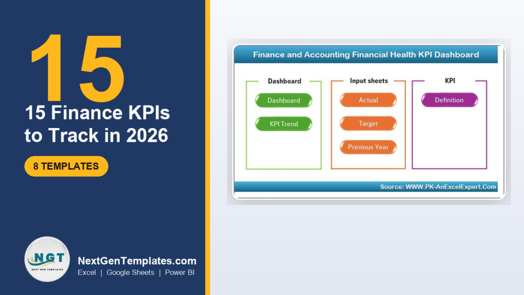
Finance KPIs are the numbers that show whether a business is profitable, liquid and solvent. The 15 to track in 2026 span four groups: profitability (gross margin, net margin, EBITDA margin), liquidity (current ratio, quick ratio, operating cash flow), efficiency (DSO, DPO, cash conversion cycle) and returns (ROA, ROE, debt-to-equity). Each has a formula, a benchmark and a common mistake.
Last updated: September 2026
Key takeaways
- The finance KPIs list that matters splits into four families: profitability, liquidity, efficiency and returns — track at least three from each family, not fifteen vanity metrics.
- Every KPI here comes with a formula, a realistic 2026 benchmark range and the mistake teams make, so you can build a finance KPIs dashboard template that is defensible in a board meeting.
- A healthy net profit margin for most small businesses sits near 10%, a current ratio between 1.5 and 3.0, and Days Sales Outstanding within 1.5× your payment terms.
- The Finance and Accounting Financial Health KPI Dashboard in Excel ($14.99) calculates most of these ratios automatically from an Actual vs Target vs Previous-Year input sheet.
- Eight ready-made NGT dashboards priced $11.99–$14.99 cover Excel, Google Sheets and Power BI — no formula-building required to start reporting this month.
The 8 finance KPI dashboard templates compared
| Template | Format | Best for | Price |
|---|---|---|---|
| Financial Health KPI Dashboard (Best overall) | Excel | Margins, liquidity and returns in one view | $14.99 |
| Cost Efficiency KPI Dashboard | Excel | Spend control and cost-to-revenue ratios | $14.99 |
| Personal Finance KPI Dashboard (Best value) | Google Sheets | Solo founders and household finance | $12.99 |
| Market Expansion KPI Dashboard | Excel | Revenue growth and new-market ROI | $14.99 |
| Sustainability KPI Dashboard | Excel | ESG-linked financial reporting | $14.99 |
| Microfinance KPI Dashboard | Power BI | Loan portfolios and lending metrics | $11.99 |
| Non-Profit KPI Dashboard (Power BI) | Power BI | Grant and fund-based finance teams | $11.99 |
| Non-Profit KPI Dashboard (Sheets) | Google Sheets | Small nonprofits on a cloud workflow | $12.99 |
The 15 finance KPIs to track in 2026, at a glance
This is the finance KPIs list in one table — the definition sits below, but if you only screenshot one thing for your team, screenshot this. Every formula uses figures you already have in your income statement, balance sheet or cash-flow statement.
| Metric | Formula | Benchmark (2026) | Where to see it |
|---|---|---|---|
| 1. Gross Profit Margin | (Revenue − COGS) ÷ Revenue × 100 | 20–60% (industry-dependent) | Income statement |
| 2. Net Profit Margin | Net Income ÷ Revenue × 100 | ~10% healthy for SMBs | Income statement |
| 3. EBITDA Margin | EBITDA ÷ Revenue × 100 | 10–20%+ | Income statement |
| 4. Operating Cash Flow | Cash from operating activities | Positive; > net income over time | Cash-flow statement |
| 5. Current Ratio | Current Assets ÷ Current Liabilities | 1.5–3.0 | Balance sheet |
| 6. Quick Ratio | (Current Assets − Inventory) ÷ Current Liabilities | ≥ 1.0 | Balance sheet |
| 7. Working Capital | Current Assets − Current Liabilities | Positive and stable vs revenue | Balance sheet |
| 8. Days Sales Outstanding | (Accounts Receivable ÷ Credit Sales) × Days | Within 1.5× payment terms | AR ledger |
| 9. Days Payable Outstanding | (Accounts Payable ÷ COGS) × Days | 30–60 days | AP ledger |
| 10. Cash Conversion Cycle | DSO + DIO − DPO | Lower is better; negative is elite | Working-capital report |
| 11. Accounts Receivable Turnover | Net Credit Sales ÷ Avg Accounts Receivable | 6–12× per year | AR ledger |
| 12. Budget Variance | (Actual − Budget) ÷ Budget × 100 | Within ±5–10% | Budget vs actual |
| 13. Return on Assets (ROA) | Net Income ÷ Total Assets × 100 | > 5% | Balance sheet + P&L |
| 14. Return on Equity (ROE) | Net Income ÷ Shareholder Equity × 100 | 15–20% | Balance sheet + P&L |
| 15. Debt-to-Equity Ratio | Total Liabilities ÷ Shareholder Equity | < 2.0 (sector-dependent) | Balance sheet |
For a wider view of how these ratios sit inside a finished report, see our guide to finance dashboard templates for Excel and Power BI, and the definitions maintained by the Corporate Finance Institute.
Each finance KPI explained: definition, formula, benchmark and the mistake to avoid
Profitability KPIs
1. Gross Profit Margin measures how much of each sales dollar survives after the direct cost of goods. Formula: (Revenue − COGS) ÷ Revenue × 100. Benchmark: 20–30% for retail, 50–60%+ for software and services. Common mistake: confusing gross margin with net margin and celebrating a high gross number while operating costs quietly erase the profit below it.
2. Net Profit Margin is the share of revenue left after every cost — COGS, operating expenses, interest and tax. Formula: Net Income ÷ Revenue × 100. Benchmark: around 10% is healthy for most small and mid-sized firms. Common mistake: reading a single month in isolation; a one-off legal bill or asset sale distorts it, so always track the trailing-twelve-month trend.
3. EBITDA Margin shows operating profitability before financing and accounting decisions muddy the picture. Formula: EBITDA ÷ Revenue × 100. Benchmark: 10–20%+, rising with asset-light models. Common mistake: treating EBITDA as free cash flow — it ignores capital expenditure, working-capital swings and debt repayments, which is exactly where cash actually goes.
Liquidity KPIs
4. Operating Cash Flow is the cash the core business generates, straight from the cash-flow statement. Benchmark: reliably positive, and above net income across a full year. Common mistake: confusing profit with cash — a profitable company can still fail if receivables and inventory swallow the cash faster than customers pay.
5. Current Ratio tests whether short-term assets can cover short-term bills. Formula: Current Assets ÷ Current Liabilities. Benchmark: 1.5–3.0. Common mistake: assuming higher is always better — a ratio above 4 often means idle cash or bloated inventory that should be reinvested or returned.
6. Quick Ratio (Acid Test) is the stricter cousin of the current ratio, stripping out inventory that cannot be sold overnight. Formula: (Current Assets − Inventory) ÷ Current Liabilities. Benchmark: 1.0 or higher. Common mistake: leaving slow-moving or obsolete stock in the numerator through a loose definition of “liquid” assets.
7. Working Capital is the absolute cash cushion funding day-to-day operations. Formula: Current Assets − Current Liabilities. Benchmark: positive and stable as a percentage of revenue. Common mistake: reading the raw dollar figure without indexing it to sales, so growth that quietly consumes working capital goes unnoticed until a cash crunch.
Efficiency and working-capital KPIs
8. Days Sales Outstanding (DSO) counts how long customers take to pay. Formula: (Accounts Receivable ÷ Total Credit Sales) × number of days in the period. Benchmark: within 1.5× your stated payment terms — under 45 days on net-30 terms. Common mistake: using total sales instead of credit sales, which understates DSO and hides a collections problem.
9. Days Payable Outstanding (DPO) counts how long you take to pay suppliers. Formula: (Accounts Payable ÷ COGS) × number of days. Benchmark: 30–60 days. Common mistake: stretching DPO so aggressively that you lose early-payment discounts or damage supplier goodwill you will need later.
10. Cash Conversion Cycle (CCC) ties the three working-capital metrics together into the number of days cash is locked up. Formula: DSO + Days Inventory Outstanding − DPO. Benchmark: lower is better; a negative cycle (customers pay before you pay suppliers) is elite. Common mistake: optimising one leg — say, squeezing DSO — while ignoring inventory or payables, so the cycle barely moves.
11. Accounts Receivable Turnover measures how many times you collect your average receivables in a year. Formula: Net Credit Sales ÷ Average Accounts Receivable. Benchmark: 6–12 times annually. Common mistake: computing it with year-end AR instead of the average of opening and closing balances, which skews the result in seasonal businesses.
12. Budget Variance quantifies how far actuals drift from plan. Formula: (Actual − Budget) ÷ Budget × 100. Benchmark: within ±5–10%. Common mistake: only investigating unfavourable variances — a large favourable variance often signals an unrealistic budget or unrecorded costs, not outperformance.
Return and leverage KPIs
13. Return on Assets (ROA) shows how efficiently assets generate profit. Formula: Net Income ÷ Total Assets × 100. Benchmark: above 5% is generally solid. Common mistake: comparing ROA across industries with very different capital intensity — a software firm and a factory are not on the same scale.
14. Return on Equity (ROE) measures profit generated on shareholders’ money. Formula: Net Income ÷ Shareholder Equity × 100. Benchmark: 15–20% is strong. Common mistake: admiring a high ROE without checking leverage — heavy debt shrinks equity and inflates the ratio, adding risk rather than quality.
15. Debt-to-Equity Ratio gauges how much of the business is funded by debt versus owners. Formula: Total Liabilities ÷ Shareholder Equity. Benchmark: below 2.0, with under 1.0 considered conservative. Common mistake: comparing the ratio across sectors — utilities and banks run far higher leverage than a typical services firm by design.
How we picked these dashboards
We searched the NextGenTemplates catalog of roughly 6,900 published templates for finance and accounting KPI dashboards that (a) calculate the ratios above from a simple input sheet, (b) ship in Excel, Google Sheets or Power BI, and (c) cost under $15. We excluded single-metric trackers, industry tools that only fit one vertical, and anything without an Actual-vs-Target structure. The eight below survived because each one turns raw ledger figures into board-ready KPIs with definitions, trends and traffic-light targets built in.
We also weighted coverage: a dashboard that computes margins, liquidity ratios and returns from a single input sheet earns its place over one that only tracks a slice. Format mattered too — we deliberately kept Excel, Google Sheets and Power BI options in the list so no reader is forced into a tool they do not own. Finally, we checked that every pick carries a plain-language definition tab, because a KPI number no one on the team can explain is a reporting liability, not an asset. Price was the last filter: everything here is a one-time purchase under $15, which is why a small finance team can own the whole set for less than a single month of most reporting SaaS.
The 8 best finance KPI dashboard templates for 2026
Reading the fifteen formulas above is one thing; wiring them into a workbook that recalculates every month is another. Each dashboard below already carries the definitions, the Actual-vs-Target logic and the trend charts, so your job shrinks to pasting figures and reading the result. They are ranked by how much of the finance KPIs list each one covers out of the box, with format and price called out so you can match the tool to the team that will actually maintain it.
1. Finance and Accounting Financial Health KPI Dashboard in Excel — best overall

What it is: a single-workbook dashboard that turns an Actual / Target / Previous-Year input sheet into the full finance KPIs list — margins, liquidity ratios, returns and leverage — with a KPI Trend page.
Who it is for: finance managers and owners who want one health-check view rather than eight separate reports.
What is inside:
- Definition tab explaining every metric in plain language
- Actual vs Target vs Previous Year comparison with traffic lights
- KPI Trend charts for month-over-month movement
- Pre-built formulas — paste your figures and the ratios calculate themselves
Use it to close the month in an afternoon, to brief a board on profitability and solvency in one screen, or to spot a deteriorating current ratio before it becomes a cash problem. It is why this is the strongest starting point of the eight: it covers the widest slice of the 15 KPIs out of the box.
Price: $14.99. View the Financial Health KPI Dashboard →
Best for: the one dashboard to buy if you buy only one.
2. Finance and Accounting Cost Efficiency KPI Dashboard in Excel
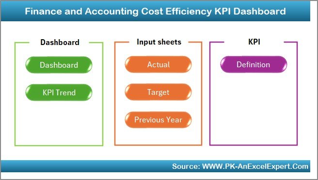
What it is: a spend-focused dashboard built around cost-to-revenue ratios, operating-expense trends and margin protection.
Who it is for: teams whose problem is not revenue but cost creep.
- Cost-to-revenue and expense-ratio KPIs
- Actual vs Target variance with alerts
- Trend view to catch rising costs early
Pair it with the Financial Health dashboard when a shrinking net margin needs a root-cause view of where the money is going.
Price: $14.99. View the Cost Efficiency KPI Dashboard →
Best for: controlling operating expenses and defending margin.
3. Personal Finance KPI Dashboard in Google Sheets — best value
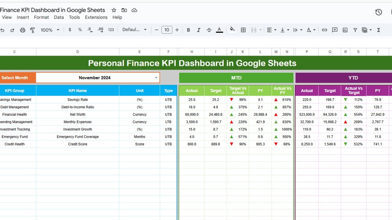
What it is: a cloud-native finance KPIs dashboard template for individuals, solo founders and household budgets — savings rate, cash flow, net worth and budget variance.
Who it is for: anyone who wants finance KPIs in Google Sheets without owning Excel.
- Income, expense and savings-rate KPIs
- Budget vs actual variance tracking
- Shareable, editable from any browser
At $12.99 in a free-to-run app, it is the cheapest way to put the core cash-flow and variance metrics on a live dashboard.
Price: $12.99. View the Personal Finance KPI Dashboard →
Best for: solo founders and personal finance on a budget.
4. Finance and Accounting Market Expansion KPI Dashboard in Excel
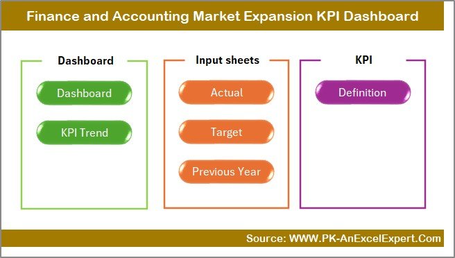
What it is: a growth-oriented dashboard linking revenue KPIs to the return on new-market and new-product investment.
Who it is for: finance teams supporting an expansion decision.
- Revenue growth and contribution KPIs
- ROI on expansion initiatives
- Actual vs Target with previous-year context
Price: $14.99. View the Market Expansion KPI Dashboard →
Best for: quantifying growth bets before you fund them.
5. Finance and Accounting Sustainability KPI Dashboard in Excel

What it is: a dashboard that ties financial performance to ESG and sustainability reporting, increasingly demanded by investors and lenders in 2026.
Who it is for: finance teams that now report ESG-linked metrics alongside the P&L.
- Financial and sustainability KPIs in one workbook
- Target tracking with trend charts
- Board-ready layout
Price: $14.99. View the Sustainability KPI Dashboard →
Best for: ESG-linked financial reporting.
6. Microfinance KPI Dashboard in Power BI
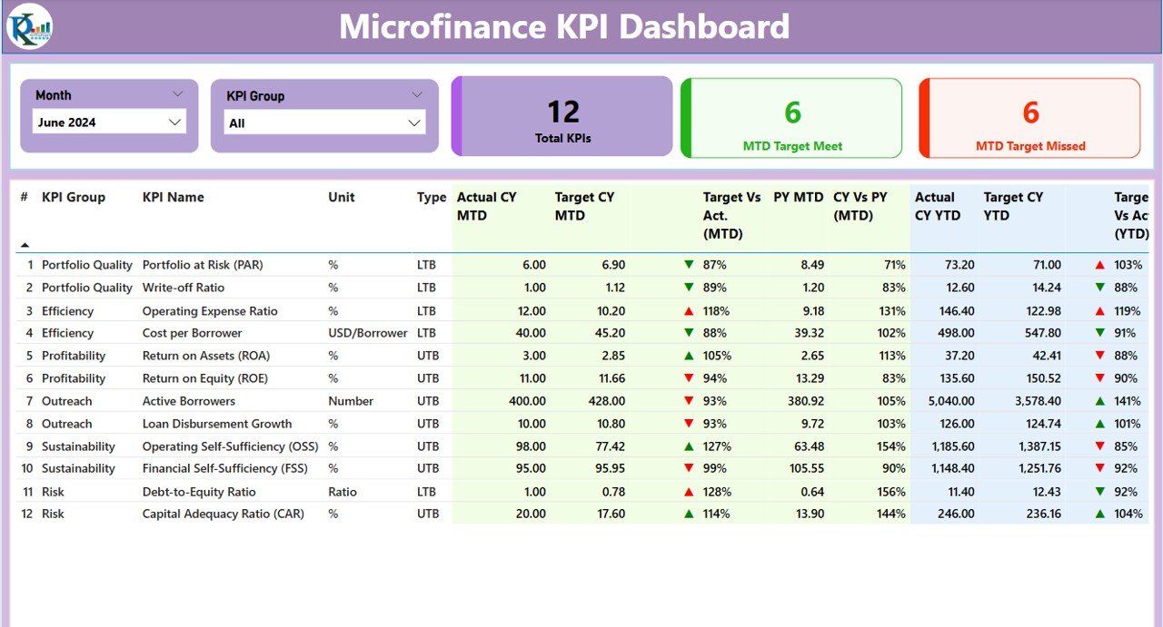
What it is: an interactive Power BI report for lending portfolios — portfolio at risk, repayment rates, disbursement and the financial ratios lenders live by.
Who it is for: microfinance institutions and lending teams that want slice-and-dice interactivity.
- Portfolio-at-risk and repayment KPIs
- Interactive filters by branch, product and period
- Refreshable from your data source
Price: $11.99. View the Microfinance KPI Dashboard →
Best for: loan portfolios and lending metrics in Power BI.
7. Non-Profit KPI Dashboard in Power BI

What it is: a fund-accounting dashboard for nonprofits — program vs admin spend, grant utilisation, fundraising efficiency and reserves.
Who it is for: nonprofit finance teams reporting to a board or funder.
- Fund and grant utilisation KPIs
- Program-efficiency and reserve ratios
- Interactive Power BI visuals
Price: $11.99. View the Non-Profit Power BI Dashboard →
Best for: grant and fund-based finance teams.
8. Non-Profit KPI Dashboard in Google Sheets

What it is: the same nonprofit finance KPIs in a free-to-run Google Sheets workflow for small teams that live in the cloud.
Who it is for: small nonprofits without Excel or Power BI licences.
- Fund utilisation and efficiency KPIs
- Shareable with trustees and volunteers
- Editable from any browser
Price: $12.99. View the Non-Profit Sheets Dashboard →
Best for: small nonprofits on a cloud workflow.
How to choose between them
- Want the widest KPI coverage in one file? Financial Health KPI Dashboard (Excel).
- Fighting cost creep? Cost Efficiency KPI Dashboard (Excel).
- On Google Sheets or a tight budget? Personal Finance ($12.99) or Non-Profit Sheets.
- Need interactive filtering? Microfinance or Non-Profit in Power BI.
- Reporting growth or ESG? Market Expansion or Sustainability dashboards.
When a template is NOT the right answer
A KPI dashboard template is the wrong buy if you need real-time, transaction-level accounting — that is what QuickBooks, Xero or a full ERP are for, and a spreadsheet should sit downstream of them, not replace them. If dozens of people must edit the same live ledger with an audit trail, buy accounting software. If your reporting is genuinely bespoke — unusual consolidations, multi-currency eliminations, statutory formats — a template gets you 80% there but you will still pay an analyst to finish it. Templates win when your books already exist somewhere and you simply need to turn those numbers into clear, repeatable KPIs each month.
Frequently asked questions
What are finance KPIs?
Finance KPIs are quantifiable metrics that show a business’s profitability, liquidity, efficiency and solvency. Examples include net profit margin, current ratio, days sales outstanding and return on equity. Each is calculated from standard financial statements and compared against a target or benchmark to judge financial health over time.
What are the most important finance KPIs to track in 2026?
The core set is net profit margin, gross margin and EBITDA margin for profitability; current ratio, quick ratio and operating cash flow for liquidity; DSO, DPO and the cash conversion cycle for efficiency; and ROA, ROE and debt-to-equity for returns and leverage. Together these fifteen cover how a business earns, holds and returns cash.
What is a good net profit margin?
For most small and mid-sized businesses, a net profit margin around 10% is considered healthy, though it varies widely by industry. Software and services often exceed 20%, while high-volume retail can be healthy at 3–5%. Track the trend over twelve months rather than judging any single period.
How do I build a finance KPIs dashboard?
Start with an input sheet holding Actual, Target and Previous-Year figures, then add formula-driven KPI tiles, traffic-light targets and a trend chart. A ready-made finance KPIs dashboard template such as the Financial Health KPI Dashboard in Excel ($14.99) does this out of the box, so you paste figures instead of building formulas.
What is the difference between the current ratio and the quick ratio?
Both measure short-term liquidity, but the quick ratio is stricter. The current ratio divides all current assets by current liabilities; the quick ratio removes inventory first, because inventory cannot always be sold quickly. A current ratio of 1.5–3.0 and a quick ratio of 1.0 or above are typical targets.
What is the cash conversion cycle and why does it matter?
The cash conversion cycle is DSO plus days inventory outstanding minus DPO — the number of days cash is tied up between paying suppliers and collecting from customers. A shorter cycle frees cash; a negative cycle means customers effectively fund your operations. It matters because profitable firms still fail when this cycle stretches too far.
Which is better for finance KPIs, Excel, Google Sheets or Power BI?
Excel suits detailed monthly reporting and heavy formulas; Google Sheets is best for cloud collaboration and free access; Power BI wins when you need interactive filtering across large datasets. NGT offers finance KPI dashboards in all three so you can match the tool to your team rather than the other way round.
How often should I review finance KPIs?
Review profitability and liquidity KPIs monthly at close, cash-flow and receivables metrics weekly if cash is tight, and returns or leverage ratios quarterly. The point of a dashboard is to make the monthly review a five-minute glance rather than a day of spreadsheet assembly.
How much do NGT finance KPI dashboard templates cost?
The eight finance KPI dashboards in this guide range from $11.99 for the Power BI options to $14.99 for the Excel Financial Health, Cost Efficiency, Market Expansion and Sustainability dashboards. Each is a one-time purchase with no subscription.
Related: Watch your liquidity too — see our guide to the 10 cash flow KPIs to track in 2026 and the ready-made dashboard templates that calculate them.
Get more finance templates
Track all fifteen KPIs without building a single formula: start with the Finance and Accounting Financial Health KPI Dashboard in Excel at $14.99, then add the Cost Efficiency or a Power BI option as your reporting grows. Explore the full finance dashboard template collection for CFO-level reports, and browse related metric guides: 15 sales KPIs, 15 marketing KPIs, 10 recruitment KPIs, 12 inventory KPIs, 12 manufacturing KPIs, 12 customer service KPIs and 10 churn and retention metrics. For walkthroughs of every dashboard, subscribe to the NextGenTemplates YouTube channel.