

The 15 HR KPIs worth tracking in 2026 are employee turnover, voluntary turnover, retention, time to hire, time to fill, cost per hire, offer acceptance, absenteeism, eNPS, employee satisfaction, training cost per employee, training completion, revenue per employee, overtime rate and internal promotion rate. Each has a simple formula and a public benchmark you can measure against today.
Last updated: September 2026
Key takeaways
- A healthy annual employee turnover rate sits around 10-15%; above 20% usually signals a retention or management problem.
- Cost per hire averages roughly $4,700 (SHRM), and time to fill averages about 36 days – track both or you cannot budget recruiting.
- Every KPI below ships with a formula and a benchmark range, so you can score your own numbers in minutes.
- Our top pick, the HR KPI Dashboard in Power BI ($11.99), calculates the widest slate of these metrics in one refreshable model.
- Ready-made HR dashboards in Excel, Google Sheets and Power BI start at $6.99, far cheaper than building formulas from scratch.
The 15 HR KPIs to track in 2026 (at a glance)
| Metric | Formula | Benchmark range | Where to see it |
|---|---|---|---|
| Employee turnover rate | (Separations ÷ average headcount) × 100 | 10-15% / year | HR KPI Dashboard (Power BI) |
| Voluntary turnover rate | (Voluntary exits ÷ average headcount) × 100 | 6-13% / year | Employee Retention Dashboard |
| Employee retention rate | (Stayers ÷ headcount at start) × 100 | 85-90%+ | Employee Retention Dashboard |
| Time to hire | Days from application to offer accepted | 20-30 days | HR KPI Dashboard (Power BI) |
| Time to fill | Days from requisition open to start date | 30-45 days | HR Employee Management System |
| Cost per hire | (Internal + external recruiting cost) ÷ hires | $4,000-$4,700 | HR KPI Dashboard (Power BI) |
| Offer acceptance rate | (Offers accepted ÷ offers extended) × 100 | 85-90%+ | HR Employee Management System |
| Absenteeism rate | (Absence days ÷ (headcount × workdays)) × 100 | 1.5-3% | Employee Attendance Tracker |
| Employee Net Promoter Score (eNPS) | % promoters − % detractors | +10 to +30 (good) | Employee Satisfaction Dashboard |
| Employee satisfaction (eSAT) | (Survey score ÷ maximum score) × 100 | 70-80%+ | Employee Satisfaction Dashboard |
| Training cost per employee | Total training spend ÷ employees | $1,200-$1,300 | HR Employee Management System |
| Training completion rate | (Completed ÷ assigned) × 100 | 85-95% | Performance Analytics Dashboard |
| Revenue per employee | Total revenue ÷ FTE headcount | $150k-$250k* | HR KPI Dashboard (Power BI) |
| Overtime rate | (Overtime hours ÷ regular hours) × 100 | Below 5% | Employee Wellness Dashboard |
| Internal promotion rate | (Internal moves ÷ roles filled) × 100 | 15-30%+ | Performance Analytics Dashboard |
*Revenue per employee varies widely by industry; use it to track your own trend, not to compare across sectors.
The 8 HR dashboard templates compared
| Template | Format | Best for | Price |
|---|---|---|---|
| HR KPI Dashboard (Best overall) | Power BI | Full HR KPI slate, drill-down | $11.99 |
| HR Performance Analytics Dashboard (Best value) | Google Sheets | Performance & promotion metrics | $6.99 |
| Employee Satisfaction KPI Dashboard | Excel | eNPS & eSAT tracking | $14.99 |
| Employee Retention KPI Dashboard | Excel | Turnover & retention | $12.99 |
| Employee Wellness KPI Dashboard | Power BI | Absenteeism & overtime | $11.99 |
| HR Employee Management System | Excel web app | End-to-end HR records | $39.99 |
| Attendance & Payroll Management System | Excel web app | Attendance, overtime, payroll | $39.99 |
| Employee Attendance Tracker | Google Sheets | Absenteeism on a budget | $6.99 |
How we picked these
We searched the NextGenTemplates catalog of 130+ HR and analytics templates and shortlisted the eight that between them calculate every KPI in the table above. Selection criteria: each must use a documented formula, cover a distinct HR area, and be available in a mainstream format (Excel, Google Sheets or Power BI). We excluded generic org-chart and leave-request templates that hold data but compute no KPIs, and single-metric trackers that duplicate a broader dashboard.
The 15 HR KPIs explained (formula, benchmark, common mistake)
1. Employee turnover rate
Turnover is the share of your workforce that leaves in a period. Formula: (separations ÷ average headcount) × 100. Benchmark: 10-15% a year is normal; below 10% is strong, above 20% is a red flag. Common mistake: lumping voluntary and involuntary exits together, which hides whether people are quitting or being managed out. Segment by department and tenure to find where the leak is.
2. Voluntary turnover rate
This isolates the people who chose to leave. Formula: (voluntary exits ÷ average headcount) × 100. Benchmark: 6-13% annually. Common mistake: not separating “regretted” departures (high performers you wanted to keep) from “non-regretted” ones. A 10% voluntary rate made up entirely of top talent is far worse than 15% you were comfortable losing.
3. Employee retention rate
Retention is the mirror image of turnover, but measured on the people present at the start of the period. Formula: (employees who stayed the whole period ÷ employees at the start) × 100. Benchmark: 85-90%+ is healthy. Common mistake: assuming it is exactly 100% minus turnover – new hires who join and leave inside the period distort the two figures differently.
4. Time to hire
Time to hire measures candidate experience and recruiter speed. Formula: days from a candidate applying to accepting the offer. Benchmark: 20-30 days for most roles. Common mistake: confusing it with time to fill. Time to hire starts when a specific candidate enters the pipeline; time to fill starts when the requisition opens. Reporting one as the other flatters or damages your numbers.
5. Time to fill
Time to fill is the business-planning metric: how long a seat stays empty. Formula: days from requisition approval to the new hire’s start date. Benchmark: 30-45 days; the SHRM average is around 36 days. Common mistake: counting calendar days inconsistently across teams. Fix the definition once (calendar or business days) and apply it everywhere so trend lines stay comparable.
6. Cost per hire
Cost per hire tells you what recruiting actually costs. Formula: (internal + external recruiting costs) ÷ number of hires. Benchmark: roughly $4,000-$4,700; SHRM puts the average near $4,700. Common mistake: counting only job-board spend and agency fees while ignoring internal recruiter time, referral bonuses and onboarding – which are often the bigger half.
7. Offer acceptance rate
This exposes whether your offers are competitive. Formula: (offers accepted ÷ offers extended) × 100. Benchmark: 85-90%+ is healthy. Common mistake: not logging decline reasons. A rate dropping below 80% usually points to pay, slow process, or a weak candidate experience – and you only learn which by asking every declining candidate one structured question.
8. Absenteeism rate
Absenteeism flags disengagement and burnout early. Formula: (unplanned absence days ÷ (average headcount × scheduled workdays)) × 100. Benchmark: 1.5-3%. Common mistake: counting approved holiday or PTO as absence, which inflates the number and hides the unplanned pattern that actually matters. Track only unscheduled absence, then watch for clustering by team.
9. Employee Net Promoter Score (eNPS)
eNPS is a one-question pulse on loyalty. Formula: % promoters − % detractors, on a scale of −100 to +100. Benchmark: +10 to +30 is good, above +50 is excellent. Common mistake: surveying too often and then chasing the score. Quarterly is plenty; act on the verbatim comments, not just the number, or people stop answering honestly.
10. Employee satisfaction (eSAT)
eSAT captures how content staff are with role, pay and environment. Formula: (sum of survey scores ÷ maximum possible score) × 100. Benchmark: 70-80%+. Common mistake: blending engagement and satisfaction questions into one index. Satisfaction (“I am happy here”) and engagement (“I go the extra mile”) move independently, so keep them as separate scores.
11. Training cost per employee
This shows how much you invest in development. Formula: total training spend ÷ number of employees. Benchmark: about $1,200-$1,300; the ATD average is roughly $1,280. Common mistake: counting only course fees while ignoring the paid hours employees spend learning, which are usually the larger cost and the one finance asks about.
12. Training completion rate
Completion tells you whether learning actually happens. Formula: (completed courses ÷ assigned courses) × 100. Benchmark: 85-95%. Common mistake: counting “started” as “completed.” A high assignment rate with a low completion rate means your content is too long or poorly timed – split it into shorter modules and re-measure.
13. Revenue per employee
A blunt but useful productivity measure. Formula: total revenue ÷ full-time-equivalent headcount. Benchmark: highly industry-specific, often $150k-$250k for services firms – use it to track your own trend, not to compare across sectors. Common mistake: excluding contractors and part-timers from the FTE count, which quietly overstates the figure.
14. Overtime rate
Overtime is an early-warning signal for burnout and understaffing. Formula: (overtime hours ÷ total regular hours) × 100. Benchmark: below 5%. Common mistake: looking only at the company-wide average. Chronic overtime concentrated in one team is invisible in the total but is exactly where your next resignations will come from – always segment.
15. Internal promotion rate
This shows whether people can grow with you. Formula: (internal promotions and transfers ÷ total roles filled) × 100. Benchmark: 15-30%+ depending on company size. Common mistake: counting lateral moves inconsistently. Decide whether a sideways move counts as internal mobility, document it, and apply the rule every quarter so the trend is meaningful.
The 8 ready-made HR dashboards that calculate these KPIs
Rather than build 15 formulas by hand, these templates already compute the metrics above. They are ranked by how much of the full KPI slate each one covers and how quickly you can go live.
1. HR KPI Dashboard in Power BI – best overall
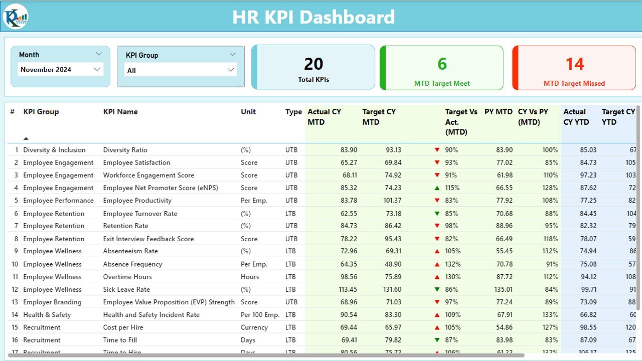
Why it wins: it calculates the widest slate of the 15 KPIs – turnover, retention, headcount, cost per hire, time to hire and revenue per employee – in a single refreshable model with drill-down by department and period. Who it is for: HR and people-analytics teams that already use Power BI. Best for: one connected view of the whole HR scorecard. Price: $11.99. Get the HR KPI Dashboard in Power BI.
2. HR Employee Performance Analytics Dashboard (Google Sheets) – best value
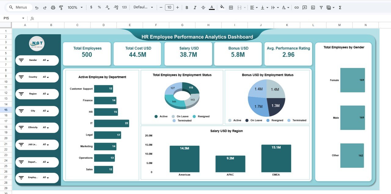
What it is: a live Google Sheets dashboard for performance, training completion and internal promotion metrics. Who it is for: teams that want zero-install, shareable analytics. Best for: the productivity and development side of the KPI list at the lowest price. Price: $6.99. Get the HR Performance Analytics Dashboard.
3. Employee Satisfaction KPI Dashboard (Excel)
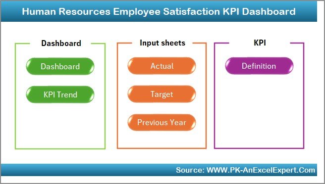
What it is: an Excel dashboard purpose-built for eNPS and eSAT, with survey inputs and trend charts. Who it is for: HR teams running quarterly engagement surveys. Best for: turning raw survey responses into board-ready satisfaction scores. Price: $14.99. Get the Employee Satisfaction Dashboard.
4. Employee Retention KPI Dashboard (Excel)
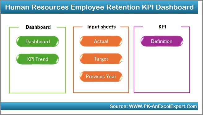
What it is: a focused Excel model for turnover, voluntary turnover and retention rate by department and tenure. Who it is for: anyone with a retention problem to diagnose. Best for: finding exactly where and when people leave. Price: $12.99. Get the Employee Retention Dashboard.
5. Employee Wellness KPI Dashboard (Power BI)
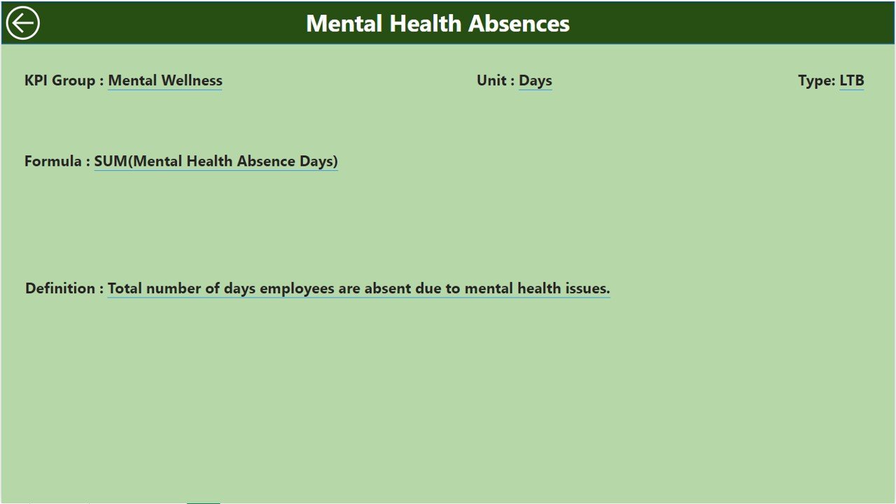
What it is: a Power BI dashboard for absenteeism, overtime and wellbeing indicators. Who it is for: teams watching burnout risk. Best for: pairing absenteeism and overtime so you spot pressure before people quit. Price: $11.99. Get the Employee Wellness Dashboard.
6. HR Employee Management System (Excel web app)
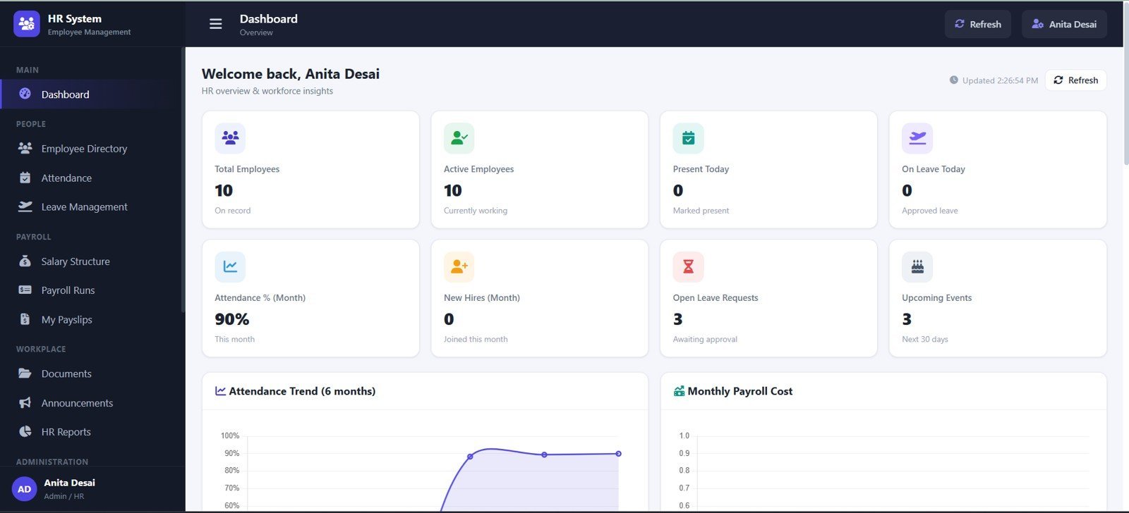
What it is: a full HR records system that stores employees, recruiting and training data – the source that feeds time-to-fill, offer acceptance and training cost. Who it is for: small teams that need a system of record, not just a chart. Best for: running HR end to end in one file. Price: $39.99. Get the HR Employee Management System.
7. Attendance & Payroll Management System (Excel web app)
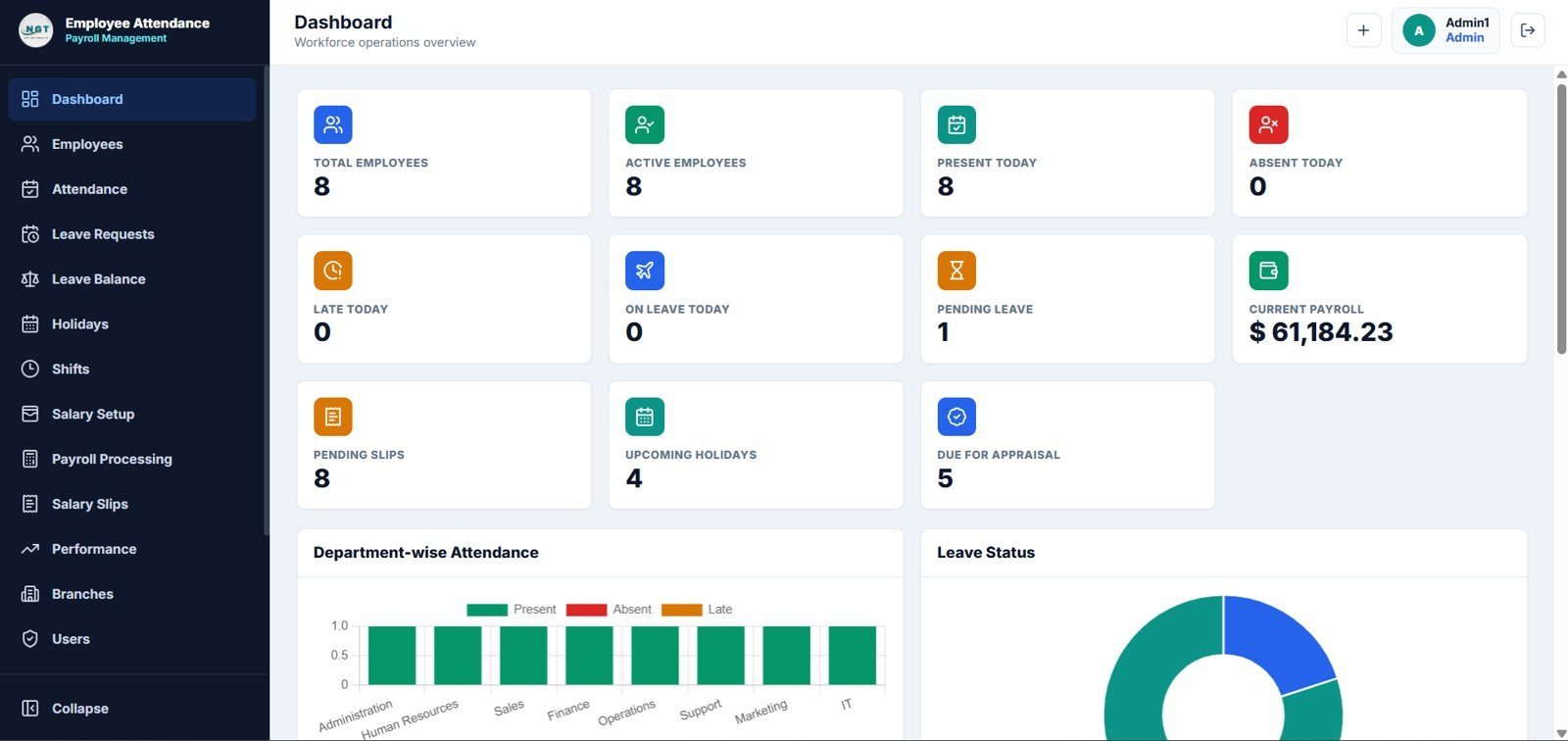
What it is: an attendance and payroll web app that captures the hours behind absenteeism and overtime rate. Who it is for: teams that run payroll in-house. Best for: tying attendance data straight to pay. Price: $39.99. Get the Attendance & Payroll System.
8. Employee Attendance Tracker (Google Sheets)
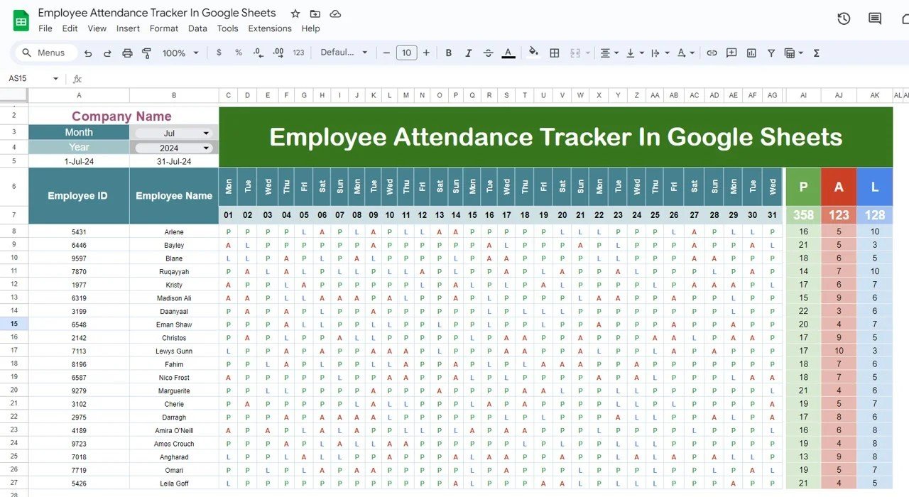
What it is: a lightweight Google Sheets tracker for daily attendance and absenteeism. Who it is for: small teams on a budget. Best for: measuring absenteeism rate without any software. Price: $6.99. Get the Employee Attendance Tracker.
Ready to stop building formulas by hand? The HR KPI Dashboard in Power BI calculates most of these 15 metrics out of the box for just $11.99, or start with the Google Sheets analytics dashboard from $6.99.
How to choose between them
Match the tool to the question you need to answer:
- Want the whole scorecard in one place? Use the HR KPI Dashboard in Power BI.
- No Power BI licence and need to share a link? The Google Sheets analytics dashboard is the best value.
- Fixing a specific problem – retention, satisfaction or wellbeing? Buy the focused Excel or Power BI dashboard for that area.
- Need a system of record, not just charts? Start with the HR Employee Management System.
For a wider gallery of pre-built options, see our roundup of the 10 best HR dashboard templates in Excel for 2026 and our guide to employee satisfaction dashboards.
When tracking HR KPIs is NOT the right answer
KPIs are not always the fix. If your team is under about 15 people, most of these ratios are too small to be statistically meaningful – one resignation swings turnover by double digits, so a monthly one-to-one will tell you more than a dashboard. Metrics also fail when they become targets: managed hard, eNPS and completion rates get gamed instead of improved. And a dashboard cannot substitute for a real cause: if exit interviews already point to a specific manager or pay band, act on that rather than waiting for another quarter of data. Buy a template when you have enough headcount to see trends and a genuine question to answer – not to look data-driven.
Prefer to see these ideas in action? Watch template walkthroughs on the NextGenTemplates YouTube channel.
Frequently asked questions
What are the most important HR KPIs to track?
If you can only track a handful, start with employee turnover rate, retention rate, time to fill, cost per hire and eNPS. Together they cover whether people are leaving, how expensive and slow hiring is, and how your workforce feels – the four questions leadership asks first.
What is a good employee turnover rate in 2026?
A healthy annual turnover rate is roughly 10-15%, though it varies by industry – retail and hospitality run higher, professional services lower. Below 10% is strong. Above 20% usually signals a retention, pay or management problem worth investigating by department and tenure.
How do you calculate cost per hire?
Cost per hire is total recruiting cost divided by the number of hires. Include external spend (job boards, agencies) and internal costs (recruiter time, referral bonuses, onboarding). SHRM puts the average near $4,700, so if yours is far lower you are probably omitting internal costs.
What is a good eNPS score?
Employee Net Promoter Score runs from −100 to +100. Anything positive means more promoters than detractors; +10 to +30 is good and above +50 is excellent. The number matters less than the trend and the comments behind it, so survey quarterly and act on the feedback.
What is the difference between time to hire and time to fill?
Time to fill measures days from opening a requisition to the new hire’s start date – a business-planning metric. Time to hire measures days from a specific candidate applying to accepting the offer – a candidate-experience metric. They are related but not interchangeable, so define and report each separately.
Which format is best for an HR dashboard – Excel, Google Sheets or Power BI?
Choose Excel for offline control and rich formulas, Google Sheets for free sharing and collaboration, and Power BI for large datasets and interactive drill-down. Many teams keep records in Excel or Sheets and visualise them in Power BI. NextGenTemplates offers HR dashboards in all three formats.
How often should HR KPIs be reviewed?
Review operational metrics like absenteeism and overtime monthly, recruiting metrics such as time to fill and cost per hire per hiring cycle, and sentiment metrics like eNPS quarterly. Reviewing survey scores too often causes fatigue and gaming, so match the cadence to how fast each metric actually moves.
Can I track these HR KPIs without expensive HR software?
Yes. A well-built spreadsheet dashboard calculates every KPI in this article. Ready-made Excel, Google Sheets and Power BI templates start at $6.99, far cheaper than an HRIS subscription, and you keep full control of your data. They are ideal for small and mid-sized teams that do not need enterprise software.
How many HR KPIs should a small team track?
Five to eight is plenty for most small teams. Tracking all 15 at once dilutes focus and creates busywork. Pick the metrics tied to your current goal – if retention is the priority, track turnover, voluntary turnover, retention and eNPS – and add others only as questions arise.
Get more HR templates
Turn these 15 KPIs into a live scorecard today. Ready-made HR dashboards in Excel, Google Sheets and Power BI range from $6.99 to $39.99 – the HR KPI Dashboard in Power BI ($11.99) is our top pick, and the Google Sheets analytics dashboard ($6.99) is the best value. Browse the full range and see walkthroughs on the NextGenTemplates YouTube channel.
More KPI explainers: 12 inventory KPIs to track in 2026, 10 procurement KPIs to track, 15 supply chain KPIs and 12 manufacturing KPIs.