

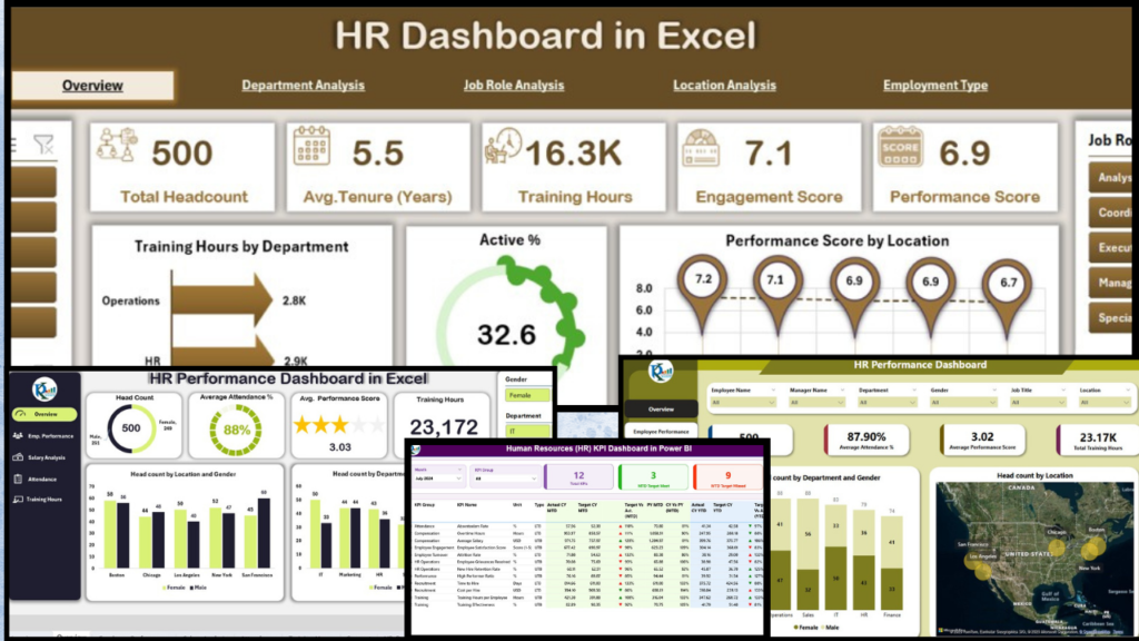
The global HR software market crossed $30 billion in 2025 and is projected to hit $43 billion by 2030, yet most mid-market companies still drown in scattered spreadsheets when it’s time to review headcount, attrition, engagement, or training. Enterprise HRIS platforms like Workday and SAP SuccessFactors solve this — at $400,000 to $1.3 million per 1,000-employee implementation. BambooHR and similar cloud tools cost $10–$25 per employee per month and still leave you dependent on their reporting templates. For teams that just need sharp, board-ready dashboards without a six-figure budget, a well-built Excel template does the same job for $12.99 to $17.99, once.
This post ranks the 10 best HR dashboard templates in Excel we’ve built at NextGenTemplates, grouped by use case — from general HR KPIs and attrition analysis to engagement surveys, workload balancing, diversity reporting, and employee recognition. Every template is one-time purchase, fully editable, and works offline on Excel 2016 or newer (desktop).
Why an Excel HR Dashboard Still Beats a SaaS Subscription in 2026
- Cost math is brutal for SaaS. A 200-person company running BambooHR at $15/employee/month pays $36,000/year. Our HR dashboard templates are a one-time $12.99–$17.99 — no seats, no renewals, no per-user caps.
- HR teams already live in Excel. Gartner’s 2025 HR Tech survey shows 73% of HR analysts export SaaS data back to Excel for custom analysis. Starting in Excel cuts the round-trip.
- Data stays on your laptop. For companies with strict data-residency rules (healthcare, finance, government), an offline Excel workbook avoids the compliance review that a cloud HRIS triggers.
- Full control of the formulas. Every KPI, pivot, and chart is editable. You can add custom metrics — internal mobility rate, 9-box grid, team NPS — that canned SaaS reports don’t expose.
- Zero learning curve. If your team knows pivot tables and VLOOKUP, they can run these dashboards on day one. No onboarding calls, no admin console.
Related guide: If the subscription you are weighing up is an all-in-one HRIS rather than a reporting tool, see our Rippling alternatives — 6 HR & IT asset templates in Excel & Sheets, which prices the modules against one-time files.
Quick Comparison: All 10 HR Dashboard Templates at a Glance
Use this table to shortlist 2–3 templates before scrolling the detailed reviews below. All prices are current sale prices on NextGenTemplates.com.
| Template | Format | Best For | Price |
|---|---|---|---|
| HR Dashboard in Excel | Excel (.xlsx) | All-round HR analytics — headcount, attrition, gender split, department view | $17.99 |
| Human Resources (HR) KPI Dashboard | Excel (.xlsx) | Budget-friendly monthly HR KPI reporting | $12.99 |
| Employee Engagement Dashboard | Excel (.xlsx) | Consolidating engagement surveys and pulse results | $17.99 |
| Employee Retention Dashboard | Excel (.xlsx) | Attrition analysis and supervisor-level retention | $17.99 |
| Employee Diversity Dashboard | Excel (.xlsx) | DEI reporting and workforce composition | $13.99 |
| Employee Workload Dashboard | Excel (.xlsx) | Task allocation and workload balancing across teams | $17.99 |
| Employee Recognition Dashboard Report | Excel + Power Pivot | Leadership-ready recognition presentations | $17.99 |
| Employee Recognition Dashboard | Excel (.xlsx) | Branch and awarder-level recognition tracking | $17.99 |
| Employee Advocacy KPI Dashboard | Excel (.xlsx) | Employer brand and social-media advocacy measurement | $14.99 |
| Thrift Stores KPI Dashboard | Excel (.xlsx) | Nonprofit retail — HR + store ops in one workbook | $14.99 |
The 10 Best HR Dashboard Templates in Excel, Reviewed
1. HR Dashboard in Excel — Best Overall for Mid-Market HR Teams
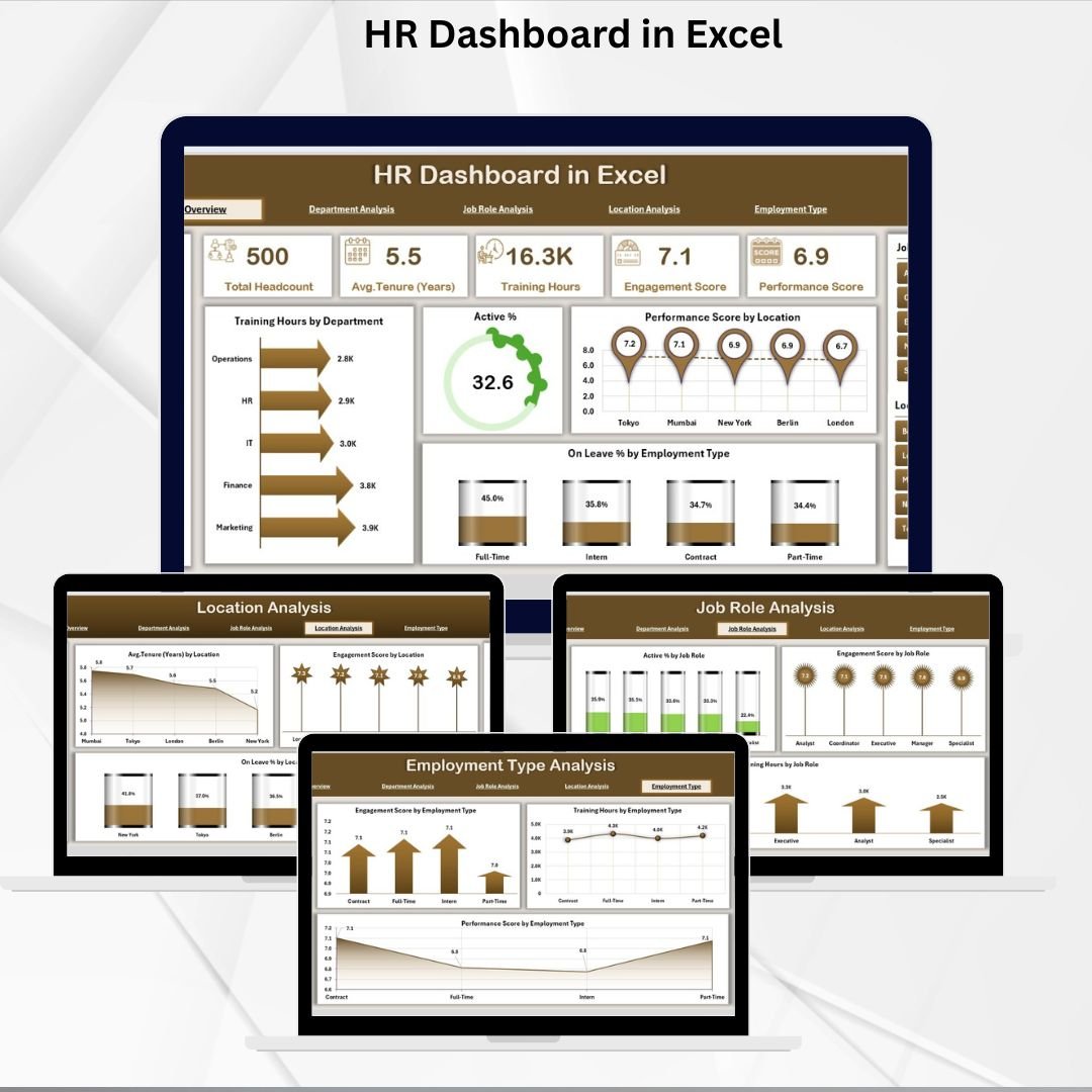
Our flagship HR analytics template, and the one we recommend first for any HR team with 50–2,000 employees. It’s a five-page Excel workbook: Overview, Department, Job Role, Location, and Employment Type, plus a Page Navigator and Support sheet. The Overview page covers headcount, new hires, attrition rate, average tenure, gender split, and age distribution — all refreshed the moment you paste new rows into the data sheet.
- Use case 1: Monthly HR review deck for the leadership team — export any page as PDF and it’s board-ready.
- Use case 2: Department-head 1:1s — filter to a single department and walk through headcount, attrition, and hiring gaps in 5 minutes.
- Use case 3: Quarterly workforce planning — use the Job Role + Location pages to spot understaffed roles before they become a problem.
- Use case 4: Replacement for a basic BambooHR report subscription — one-time $17.99 vs $36K/year for a 200-person team.
Price: $17.99. Download the HR Dashboard in Excel →
2. Human Resources (HR) KPI Dashboard — Best Budget Pick
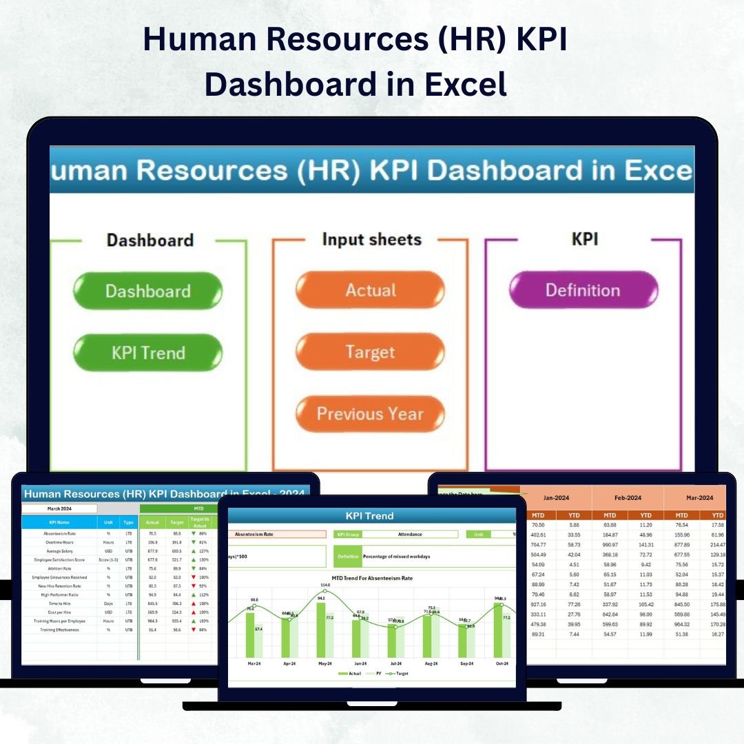
If you want clean monthly HR KPI reporting at the lowest possible price, this is the one. At $12.99, it’s the cheapest general-purpose HR dashboard we ship — and the reporting scope is deliberately focused on the metrics that CHROs actually ask about: headcount, hiring funnel conversion, attrition rate, training completion, and absenteeism. Input sheet uses monthly MTD/YTD targets against actuals, so you get variance at a glance.
- Use case 1: Startups (10–100 employees) who want an HR scorecard without overhead.
- Use case 2: HR analysts reporting into Finance — the MTD/YTD structure mirrors how Finance reviews any KPI.
- Use case 3: Practice template for HR certification students who need a portfolio dashboard.
- Use case 4: Fractional HR consultants who want a reusable deliverable for multiple clients.
Price: $12.99. Get the HR KPI Dashboard →
Need More Than One Template?
Our HR & Payroll bundle gives you access to the full category at a fraction of individual pricing. Browse all HR & Payroll templates →
3. Employee Engagement Dashboard — Best for Survey Analysis
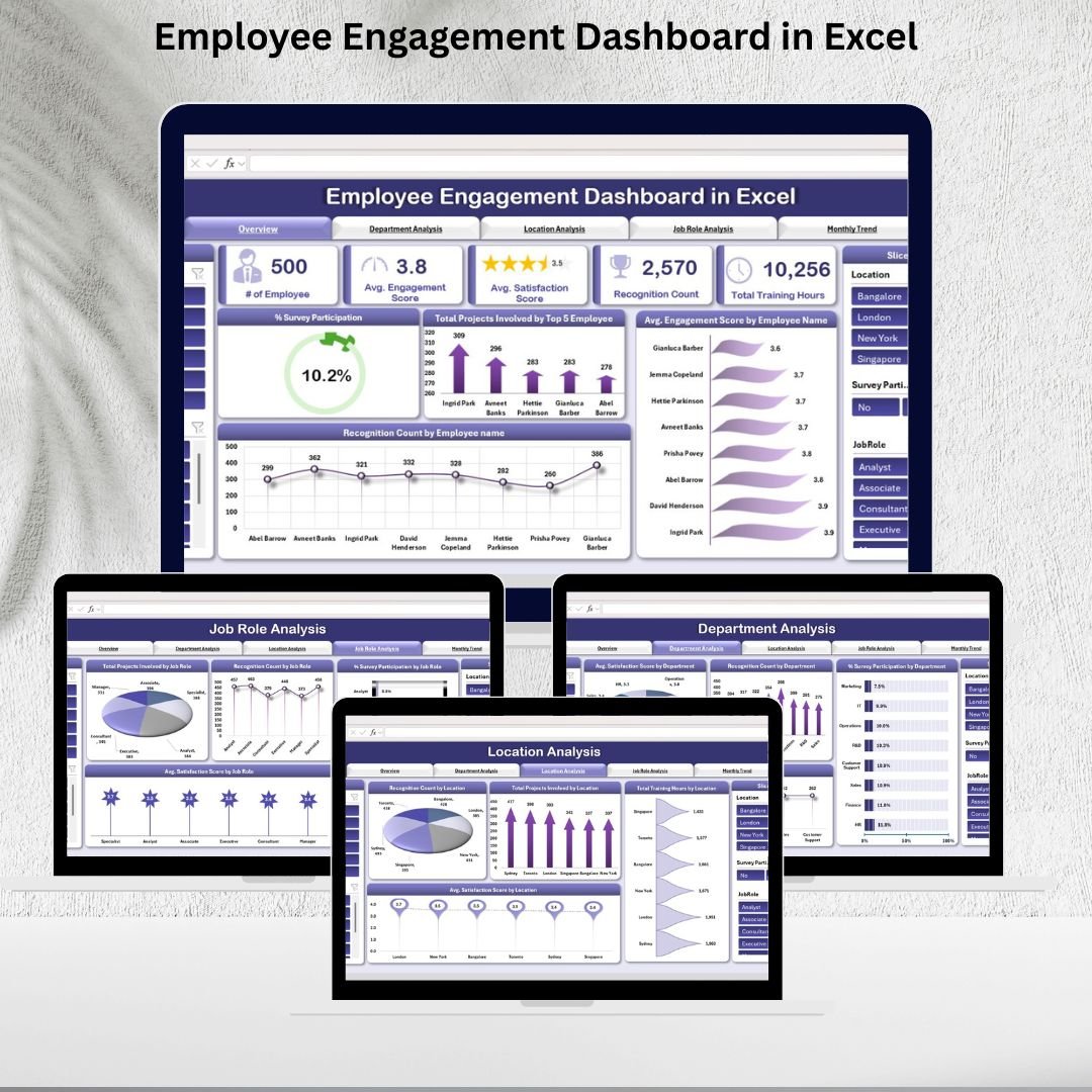
Engagement surveys are useless the moment the CSV sits unopened in someone’s inbox. This dashboard consolidates pulse-survey results into an engagement score by department, tenure band, and manager — turning raw Likert-scale data into a conversation leadership can act on. Built-in filters let you slice by office, role, and survey wave so you can compare quarter-over-quarter trends without rebuilding pivots.
- Use case 1: Quarterly engagement pulse reporting after a Culture Amp / Officevibe / Google Forms survey.
- Use case 2: Pre-restructuring diagnostics — flag departments where engagement dropped before attrition spikes.
- Use case 3: Manager-effectiveness reviews — correlate engagement score with manager tenure and span of control.
- Use case 4: Board ESG reporting — engagement is a standard “social” metric in ESG frameworks.
Price: $17.99. Download the Engagement Dashboard →
4. Employee Retention Dashboard — Best for Attrition Analysis

The SHRM 2025 research puts average US voluntary attrition at 17.3% — a number that costs a 500-person company roughly $4.3 million a year in backfill and lost productivity. This dashboard drills into why people leave: stay-to-exit ratio by supervisor, attrition by tenure band, exit-reason distribution, and a regretted-vs-non-regretted loss split. If your leadership asks “which managers are bleeding talent?” — this is the workbook that answers them.
- Use case 1: Root-cause analysis when voluntary attrition crosses industry benchmark.
- Use case 2: Supervisor accountability reviews — tie retention to manager KPIs.
- Use case 3: Exit-interview consolidation — turn free-text exit notes into quantified themes.
- Use case 4: Regretted-attrition reporting for CFO budget conversations.
Price: $17.99. Get the Retention Dashboard →
5. Employee Diversity Dashboard — Best for DEI Reporting
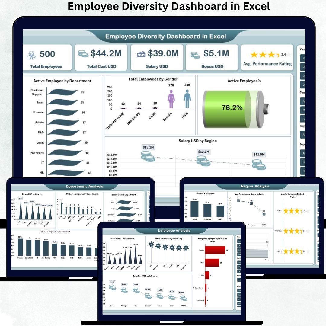
Diversity, Equity & Inclusion reporting is now a standard board-pack line item — and in public companies, it’s audited. This workbook surfaces workforce composition across gender, ethnicity, age band, disability status, and veteran status, with leadership-representation cuts (manager, senior leadership, C-suite). Use the input sheet as your source of truth; every chart and KPI refreshes automatically. At $13.99, it’s the most affordable structured DEI template we ship.
- Use case 1: Annual DEI report for ESG disclosures or annual proxy statements.
- Use case 2: Talent acquisition audits — compare applicant pool diversity vs hire diversity vs workforce composition.
- Use case 3: Promotion equity reviews — representation at each level of the org.
- Use case 4: Supplier diversity + workforce diversity combined reporting for government-contract compliance.
Price: $13.99. Download the Diversity Dashboard →
6. Employee Workload Dashboard — Best for Capacity Planning

Burnout is a retention risk, and uneven workload is the #1 driver of burnout in knowledge-work teams. This dashboard visualizes task allocation by employee, team, and project — flagging overloaded individuals and underutilized capacity before either becomes a problem. Input your task list with hours, owner, due date, and status; the dashboard does the rest. Works for HRBPs managing cross-functional teams and for operations leaders balancing service-desk tickets.
- Use case 1: Identifying burnout risk before annual engagement surveys catch it.
- Use case 2: Redistributing work after a resignation or new joiner onboarding.
- Use case 3: Project staffing decisions — who has bandwidth this sprint?
- Use case 4: Headcount justification — data-backed case for hiring additional FTE.
Price: $17.99. Get the Workload Dashboard →
7. Employee Recognition Dashboard Report — Best for Leadership Presentations
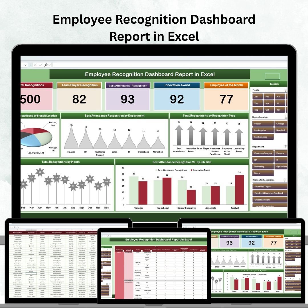
This variant is designed for the “report-out” use case — when you need a polished, print-ready recognition summary for a quarterly review or all-hands. Built on Power Pivot under the hood, it scales comfortably past 100,000 rows of recognition events without the slowness that plain pivot tables show at that scale. Sections cover recognition volume, top awarders, award-type distribution, and recipient density by department.
- Use case 1: Quarterly recognition review presented to the C-suite.
- Use case 2: Large enterprises (5,000+ employees) where row count breaks standard pivots.
- Use case 3: ROI analysis of recognition programs — spend vs engagement-score correlation.
- Use case 4: Vendor evaluation — benchmark Bonusly / Kudos / Workhuman usage against your own program.
Price: $17.99. Download the Recognition Report →
8. Employee Recognition Dashboard — Best for Branch-Level Tracking

If the Recognition Report (above) is for leadership decks, this is the working dashboard HR ops uses daily. Tracks recognition events by branch/location and by awarder, so you can see which managers are actively recognizing their people and which branches have gone quiet. Excellent early-warning indicator: low awarder density in a branch is often a leading signal for engagement and attrition problems 2–3 quarters out.
- Use case 1: Multi-location retail, banking, or QSR HR teams managing 20+ branches.
- Use case 2: Monitoring “awarder participation rate” as a manager KPI.
- Use case 3: Geographic comparison of recognition volume per employee.
- Use case 4: Programs funded by HR centrally but executed by branch managers — need both views.
Price: $17.99. Get the Recognition Dashboard →
9. Employee Advocacy KPI Dashboard — Best for Employer Brand Teams
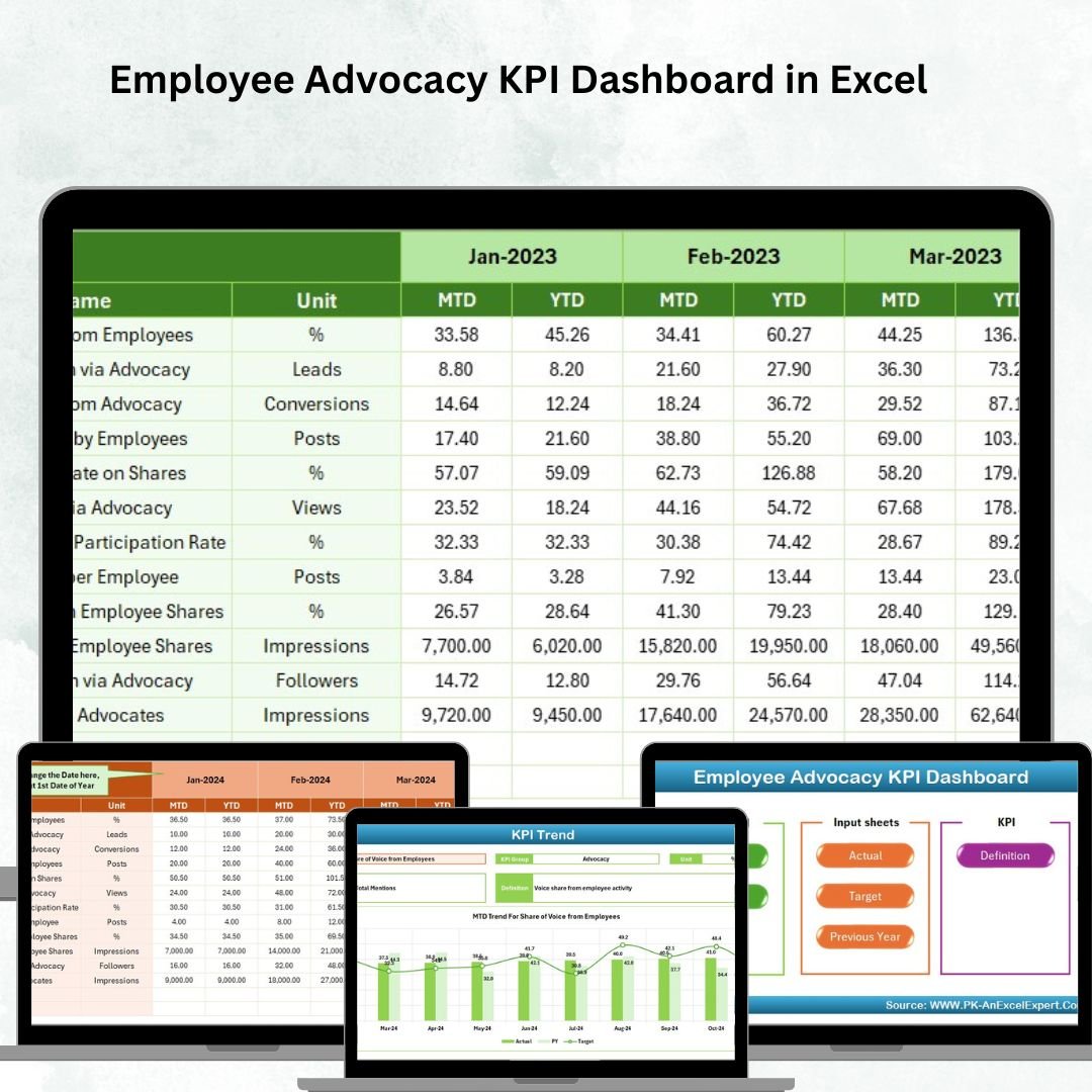
Employee advocacy — when your employees share company content on LinkedIn and other platforms — drives 8x more engagement than branded posts, according to LinkedIn’s own benchmark. This dashboard tracks participation rate, reach, click-throughs, and referral hires from advocacy programs. Useful for HR + Marketing + Talent Acquisition teams running programs on EveryoneSocial, Haiilo, PostBeyond, or a simple internal Slack channel.
- Use case 1: Proving ROI of an employee-advocacy platform subscription to the CMO.
- Use case 2: Talent Acquisition — measuring referral hires sourced through employee social shares.
- Use case 3: Employer-brand scorecard for the annual Glassdoor / LinkedIn Top Employers submission.
- Use case 4: Recognizing top advocates — build a quarterly leaderboard.
Price: $14.99. Download the Advocacy Dashboard →
10. Thrift Stores KPI Dashboard — Best for Nonprofit Retail HR
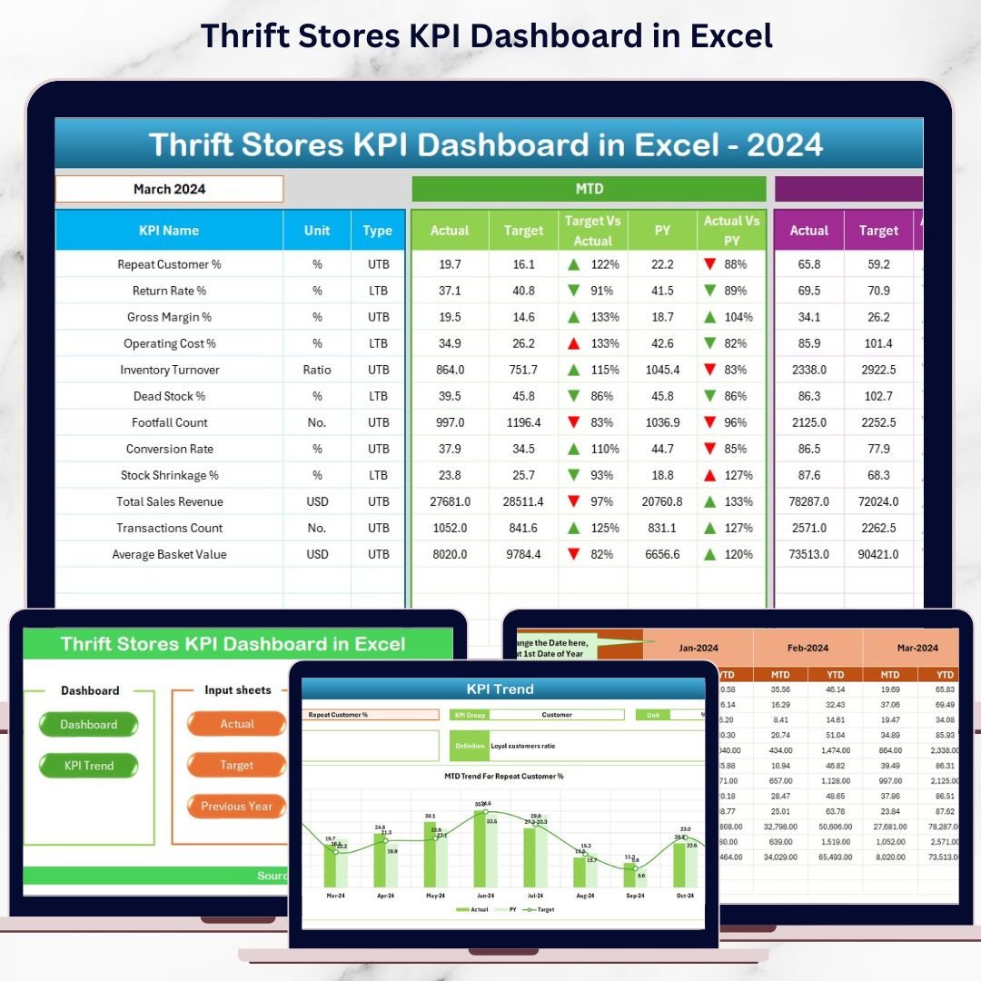
The odd one out on this list — and on purpose. If you run HR for a nonprofit thrift chain (Goodwill-style operations, hospice resale shops, church-run stores), you need both retail KPIs (sales per square foot, donations processed, volunteer hours) and HR KPIs (staff retention, scheduling, labor cost). This template combines them into one workbook, so executive directors aren’t juggling two separate files. The only Excel dashboard we know of that does this combination at this price.
- Use case 1: Goodwill-style nonprofit chains reporting to a board that cares about both mission and labor efficiency.
- Use case 2: Volunteer-coordinator reporting — hours contributed, retention of volunteers vs paid staff.
- Use case 3: Multi-store thrift operations comparing branch performance.
- Use case 4: Grant applications requiring combined operational and workforce data.
Price: $14.99. Get the Thrift Stores Dashboard →
How to Choose Between These HR Dashboard Templates
Pick based on the specific problem on your desk right now, not the template name. Here’s the decision tree we give consulting clients:
- If you need one dashboard to cover everything: start with the HR Dashboard in Excel — it’s the most complete.
- If budget is < $15: the HR KPI Dashboard at $12.99 is the cheapest general-purpose option.
- If attrition is your #1 problem: the Retention Dashboard drills down to supervisor level.
- If you’re presenting DEI to the board: the Diversity Dashboard.
- If engagement scores just landed: the Engagement Dashboard.
- If workload and burnout are on your radar: the Workload Dashboard.
- If recognition is the program: pick the Recognition Report for leadership decks or the Recognition Dashboard for ongoing ops.
And if two or three of these speak to you, buying them individually still costs less than a single month of enterprise HRIS seat licenses. Most teams end up with 2–3 templates in their HR toolkit — overall + one or two problem-specific.
Frequently Asked Questions
What is an HR dashboard in Excel?
An HR dashboard in Excel is a pre-built workbook that turns raw employee data (headcount, hires, exits, engagement, training hours) into visual KPI reports, charts, and slicers — refreshable by pasting new data each month. No coding, no BI tool, no SaaS subscription.
What KPIs should an HR dashboard track?
Core HR KPIs are headcount, new hires, voluntary and involuntary attrition rate, average tenure, time-to-fill, training completion, absenteeism, and engagement score. Advanced dashboards add diversity ratios, workload distribution, and recognition participation. All 10 templates in this post cover 3–8 of these depending on specialty.
Is an Excel HR dashboard better than BambooHR or Workday?
For pure reporting, yes — Excel dashboards give you full formula control at 1/1000th the cost. For transactional workflows like payroll, leave requests, and onboarding, you still need an HRIS. Most teams pair a lightweight HRIS for workflow with Excel dashboards for executive reporting.
How many rows of data can these templates handle?
Standard pivot-based dashboards in this list handle 50,000–100,000 rows comfortably. The Employee Recognition Dashboard Report (#7) uses Power Pivot and scales to millions of rows. All templates work on Excel 2016, 2019, 2021, and Microsoft 365 desktop.
Can I customize the templates after purchase?
Yes. All templates are fully unlocked — no VBA password, no protected cells. Change KPIs, add departments, rebuild charts, swap in your logo and brand colors. If you want us to customize one for you, paid customization services are available.
Do these templates work on Excel for Mac and Google Sheets?
All templates are tested on Excel for Windows desktop (2016 and newer). Excel for Mac works for 90%+ of features but some Power Query refresh behaviors differ. We build Google Sheets versions of our most popular dashboards separately — see our Google Sheets category for those.
Is HR data in Excel secure?
The workbook itself is just a file — it’s as secure as the machine and folder it lives on. For sensitive HR data, protect the file with a password, store it on an access-controlled drive (SharePoint, OneDrive for Business), and anonymize employee identifiers when sharing beyond the HR team.
What’s the difference between an HR dashboard and an HR scorecard?
A dashboard is dynamic — filters, slicers, drill-downs, visual charts for exploration. A scorecard is a fixed-layout snapshot comparing actual vs target KPIs, usually one page. Several of the templates here (especially the HR KPI Dashboard) behave like a hybrid: a scorecard summary on page 1 with dashboard-style exploration behind it.
How often should I refresh an HR dashboard?
Most HR teams refresh monthly for routine reporting and weekly during hiring surges or restructuring. Engagement dashboards refresh per survey wave (quarterly or semi-annually). The effort to refresh these templates is 5–15 minutes once your data source is stable.
Do I get future updates when I buy a template?
Yes — major version updates for any template you purchase are free for life. If we ship a v2 with new KPIs, extra pages, or Excel compatibility fixes, you receive the update via the same download link in your account.
Ready to Replace Your Scattered HR Spreadsheets?
Every template in this list is a one-time purchase, instant download, and fully editable. Start with the HR Dashboard in Excel if you want the most complete option — or browse the full HR & Payroll category to compare all our HR workbooks in one place.
About the author: This roundup was compiled by the NextGenTemplates product team, led by PK — a Microsoft Certified Professional and creator of the PK-AnExcelExpert YouTube channel (300K+ subscribers). We’ve built and shipped 5,500+ Excel, Google Sheets, Power BI, and HTML templates to 8,400+ customers across 40+ countries since 2015. Every template in this post was built, tested, and shipped in-house.
Last updated: April 23, 2026. Pricing reflects current NextGenTemplates sale prices and may change. For enterprise volume pricing, contact our team.
Weighing up where to buy your spreadsheet tools? Compare the options in our guide to the best Excel template site for business spreadsheet templates, including a Someka and Vertex42 alternative from $6.99.
Building a wider toolkit? Compare these with the best-selling business templates for 2026 on NextGenTemplates.