

The 15 supply chain KPIs worth tracking in 2026 are Perfect Order Rate, On-Time Delivery, Order Cycle Time, Fill Rate, Inventory Turnover, Days Inventory Outstanding, Inventory Accuracy, Stockout Rate, Cash-to-Cash Cycle, Freight Cost per Unit, Picking Accuracy, Supplier On-Time Delivery, Return Rate, GMROI and Carbon per Shipment. Each has a fixed formula and benchmark, and eight ready-made NGT dashboards calculate them from $9.99.
Last updated: September 2026
Related guide: Drill into the transport and delivery metrics in our 12 logistics & OTIF KPIs to track in 2026.
Related guide: For the factory-floor equivalent, see 12 manufacturing KPIs to track in 2026 (+8 dashboard templates).
Key takeaways
- A supply chain KPI is only useful when three things are fixed: the exact formula, a realistic benchmark range, and the mistake that quietly breaks it – this guide gives all three for all 15 metrics.
- World-class Perfect Order Rate sits at 95%+ while the typical median is around 85%, so most teams are losing roughly one order in seven to a late, short, or damaged delivery.
- The single best all-in-one build is the Supply Chain and Logistics Performance KPI Dashboard in Excel ($12.99); the best value is the Supply Chain & Logistics KPI Scorecard in Google Sheets ($9.99).
- All 8 templates here are one-time purchases between $9.99 and $14.99 across Excel, Google Sheets and Power BI – no per-seat fee, no annual renewal.
- The metrics that predict next quarter are the cash and service ones – Cash-to-Cash Cycle Time and Perfect Order Rate – not raw cost, which is why every dashboard below leads with them.
The 15 supply chain KPIs at a glance
Every metric in this guide, with its formula, a realistic 2026 benchmark range, and where a ready-made dashboard already surfaces it. Read down the list first, then jump to the full definition and the common mistake for any KPI that matters to you.
| Supply chain KPI | Formula | Benchmark range | Where to see it |
|---|---|---|---|
| Perfect Order Rate (OTIF) | Error-free orders / Total orders × 100 | 95%+ world-class; ~85% median | Performance Dashboard (Excel) |
| On-Time Delivery (OTD) | On-time deliveries / Total deliveries × 100 | 95%+ target; <90% red flag | Performance Dashboard (Excel) |
| Order Cycle Time | Σ(Delivery date − Order date) / Orders | B2C 2-5 days; B2B 5-10 days | KPI Scorecard (Sheets) |
| Fill Rate | Units shipped complete / Units ordered × 100 | 95-98% healthy | KPI Dashboard (Sheets) |
| Inventory Turnover | COGS / Average inventory value | Retail 8-12; mfg 4-6 | Performance Dashboard (Excel) |
| Days Inventory Outstanding | Average inventory / COGS × 365 | 30-60 days typical | KPI Dashboard (Sheets) |
| Inventory Accuracy | Accurate records / Records counted × 100 | 97%+ world-class | KPI Scorecard (Sheets) |
| Stockout Rate | Out-of-stock SKUs / Active SKUs × 100 | Under 2-5% | KPI Dashboard (Sheets) |
| Cash-to-Cash Cycle Time | DIO + DSO − DPO (days) | 30-70 days; lower is best | Market Expansion Dashboard |
| Freight Cost per Unit | Total freight spend / Units shipped | Transport ~5-10% of sales | Logistics Efficiency (Power BI) |
| Order Picking Accuracy | Correct picks / Total picks × 100 | 99.5%+ world-class | Performance Dashboard (Excel) |
| Supplier On-Time Delivery | On-time receipts / Total receipts × 100 | 95%+ target | Regulatory Adherence Dashboard |
| Return Rate | Units returned / Units sold × 100 | Retail 8-10%; ecommerce 20-30% | Customer Feedback Dashboard |
| GMROI | Gross margin $ / Average inventory cost | >1.0 profitable; 2-3+ strong | Food Supply Chain (Power BI) |
| Carbon per Shipment | Logistics CO2e / Number of shipments | No standard; track YoY trend | Performance Dashboard (Excel) |
How we picked these metrics
We started from the metrics that recur across the recognised supply chain reference frameworks – the ASCM SCOR model‘s reliability, responsiveness, cost and asset-management categories – then narrowed to the 15 that a small or mid-size operations team can actually calculate from data it already has: order records, an inventory ledger, freight invoices and supplier receipts. We deliberately excluded vanity metrics with no agreed formula and enterprise-only measures that need a dedicated planning suite. Each KPI below had to clear three tests: a single unambiguous formula, a published or widely-cited benchmark, and a direct link to cost or customer experience.
The 15 supply chain KPIs to track in 2026
For each metric: what it means in one sentence, the exact formula, a realistic benchmark range, and the mistake that quietly ruins it.
1. Perfect Order Rate (OTIF)
The share of orders delivered on time, in full, undamaged, and with correct documentation – the closest thing supply chain has to a single north-star metric.
Formula: (Error-free orders ÷ Total orders) × 100. Benchmark: 95%+ is world-class; the cross-industry median sits near 85%. Common mistake: tracking only the “on time” component and ignoring in-full, damage and documentation, which flatters the number by 5-10 points and hides the errors customers actually feel.
2. On-Time Delivery (OTD)
The percentage of orders that arrive by the promised date – the most visible service metric and the first one customers complain about.
Formula: (On-time deliveries ÷ Total deliveries) × 100. Benchmark: aim for 95%+; anything under 90% is a red flag. Common mistake: measuring against your internal ship date instead of the customer-requested delivery date, so a warehouse can score 98% while customers experience chronic lateness.
3. Order Cycle Time
The average elapsed time from a customer placing an order to receiving it – the metric that sets buyer expectations before delivery even starts.
Formula: Sum of (delivery date − order date) ÷ number of orders. Benchmark: B2C ecommerce 2-5 days; B2B 5-10 days depending on lane. Common mistake: reporting one blended average that hides the long tail – segment by product line and shipping lane or the outliers stay invisible.
4. Fill Rate
The proportion of customer demand met directly from available stock, without a backorder or split shipment.
Formula: (Units shipped complete ÷ Units ordered) × 100. Benchmark: 95-98% is healthy for most distributors. Common mistake: conflating line fill, order fill and unit fill – each answers a different question, and quoting whichever looks best makes trend comparison meaningless.
5. Inventory Turnover
How many times you sell and replace your entire inventory in a period – the headline efficiency measure for working capital.
Formula: COGS ÷ Average inventory value. Benchmark: retail 8-12; manufacturing 4-6; slow-moving B2B 2-4. Common mistake: using period-end inventory instead of the average of opening and closing balances, which overstates turns during a seasonal draw-down.
6. Days Inventory Outstanding (Days of Supply)
The average number of days your current inventory would last at the present sales rate – turnover expressed in a form planners can act on.
Formula: (Average inventory ÷ COGS) × 365. Benchmark: 30-60 days is typical; leaner operations run lower. Common mistake: driving the number down without a service-level guardrail, trading a smaller balance sheet for stockouts that cost far more than the carrying saving.
7. Inventory Accuracy
How closely your system records match what is physically on the shelf – the foundation every other inventory KPI is built on.
Formula: (Accurate records ÷ Records counted) × 100. Benchmark: 97%+ is world-class. Common mistake: cycle-counting only high-value or fast-moving SKUs and extrapolating to the whole catalogue, which masks the drift in the long tail.
8. Stockout Rate
The frequency with which an item is unavailable at the moment a customer wants it – lost sales you rarely see in the ledger.
Formula: (Out-of-stock SKUs ÷ Total active SKUs) × 100. Benchmark: keep it under 2-5%. Common mistake: measuring only at the distribution centre and missing channel- or shelf-level stockouts, where the customer-facing gap actually happens.
9. Cash-to-Cash Cycle Time
The number of days between paying your suppliers and collecting from your customers – the metric that best predicts whether growth will strain cash.
Formula: DIO + DSO − DPO (all in days). Benchmark: 30-70 days for most firms; best-in-class operators push it toward zero or negative. Common mistake: improving it purely by stretching supplier payment terms (DPO) until suppliers deprioritise your orders and OTD quietly slips.
10. Freight Cost per Unit
The transportation spend attributable to each unit shipped – the number that tells you whether logistics is scaling with you or against you.
Formula: Total freight spend ÷ Units shipped (also track freight as a % of net sales). Benchmark: transportation typically runs 5-10% of sales. Common mistake: watching only total freight dollars, so rising volume masks a per-unit rate that is quietly creeping up lane by lane.
11. Order Picking Accuracy
The share of warehouse picks completed without an error – the warehouse metric most directly tied to returns and Perfect Order Rate.
Formula: (Correct picks ÷ Total picks) × 100. Benchmark: 99.5%+ is world-class. Common mistake: counting picks rather than order lines, which hides multi-line orders where a single wrong item spoils the whole shipment.
12. Supplier On-Time Delivery
The reliability of your inbound suppliers against their committed dates – the KPI that governs how much safety stock you are forced to carry.
Formula: (On-time supplier receipts ÷ Total receipts) × 100. Benchmark: 95%+ for a healthy supplier base. Common mistake: leaving the on-time tolerance window undefined, so each buyer scores “on time” differently and the number cannot be compared across suppliers.
13. Return Rate
The proportion of sold units that come back – a reverse-logistics cost and, more importantly, a quality and expectation signal.
Formula: (Units returned ÷ Units sold) × 100. Benchmark: retail 8-10%; apparel and ecommerce 20-30%. Common mistake: lumping every return reason together, which loses the crucial split between defect, wrong-item, and buyer’s-remorse returns that each need a different fix.
14. GMROI (Gross Margin Return on Inventory Investment)
The gross profit earned for every dollar tied up in inventory – the metric that reconciles the merchandising and finance views of stock.
Formula: Gross margin $ ÷ Average inventory cost. Benchmark: above 1.0 means you are making money on the stock; 2-3+ is strong retail performance. Common mistake: reading GMROI only at the aggregate level, where profitable winners subsidise loss-making SKUs that should be delisted.
15. Supply Chain Carbon Emissions per Shipment
The average CO2-equivalent emitted to move one shipment – increasingly a reported metric, and a genuine efficiency proxy.
Formula: Total logistics CO2e ÷ Number of shipments (kg CO2e). Benchmark: no universal standard yet – set your own baseline and track the year-on-year trend. Common mistake: counting only your owned fleet (Scope 1) and ignoring purchased transportation (Scope 3), which is usually the majority of the footprint.
8 ready-made dashboards that calculate these KPIs for you
Knowing the 15 formulas is half the job; wiring them to live data with charts, targets and traffic lights is the other half. These eight NextGenTemplates builds already do it – across Excel, Google Sheets and Power BI – so you enter your numbers and the KPIs calculate themselves. Two rows are flagged: one best overall and one best value.
| Template | Format | Best for | Price |
|---|---|---|---|
| Supply Chain & Logistics Performance KPI Dashboard (Best overall) | Excel | All-in-one performance, cost & service KPIs | $12.99 |
| Supply Chain & Logistics KPI Scorecard (Best value) | Google Sheets | Month-picker scorecard with traffic lights | $9.99 |
| Supply Chain & Logistics KPI Dashboard | Google Sheets | Cloud, collaborative KPI tracking | $12.99 |
| Logistics Efficiency KPI Dashboard | Power BI | Interactive freight & fleet analytics | $11.99 |
| Food Supply Chain KPI Dashboard | Power BI | Perishable & cold-chain operations | $11.99 |
| Supply Chain & Logistics Customer Feedback KPI Dashboard | Excel | Returns, complaints & satisfaction | $14.99 |
| Supply Chain & Logistics Regulatory Adherence KPI Dashboard | Excel | Compliance & supplier audit KPIs | $14.99 |
| Supply Chain & Logistics Market Expansion KPI Dashboard | Excel | New-market rollout & cash metrics | $14.99 |
1. Supply Chain & Logistics Performance KPI Dashboard in Excel – best overall
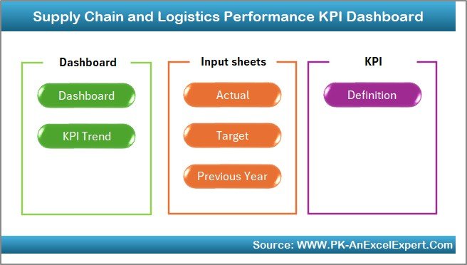
This is the closest single-file match to the 15-metric list above. It ships with an Actual / Target / Previous-Year input model and calculates the core performance, cost and service KPIs in one place, with a Dashboard, KPI Trend and Definition tab.
Who it is for: an operations or logistics manager who wants the whole scorecard in the tool their team already lives in.
What is inside:
- Order Accuracy Rate, Average Delivery Time, Lead Time and Supplier On-Time Performance
- Transportation Cost per Order, Transportation Cost per Unit and Vehicle Utilization Rate
- Order Picking Accuracy, Return Rate, Damage Rate and Freight Claims Rate
- Warehouse Capacity Utilization, Inventory Turnover Ratio and Carbon Emissions per Shipment
Because it already covers On-Time Delivery, Picking Accuracy, Inventory Turnover, Freight Cost per Unit and Carbon per Shipment, it maps to more than half of the 15 KPIs out of the box. It is the fastest way to go from raw order data to a management-ready one-page review, and it pairs naturally with our inventory management Excel templates when stock depth matters.
Best for: the single most complete supply chain scorecard in Excel. $12.99 – view the template.
2. Supply Chain & Logistics KPI Scorecard in Google Sheets – best value
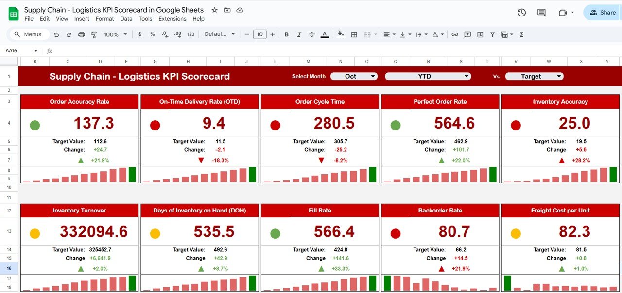
A month-picker scorecard that shows each KPI against target with red/amber/green traffic lights – the cheapest way to run a monthly supply chain review, and it lives on a free Google account.
Who it is for: a lean or distributed team that wants a shared, live scorecard link without paying for Excel or a BI seat.
What is inside:
- Month selector that repoints every KPI to the chosen period
- Actual-vs-target variance with automatic traffic-light status
- KPI Trend and KPI Analysis tabs for month-over-month movement
- Cloud sharing – reps get edit access, managers view-only
At $9.99 once it is the lowest-friction switch here: send the link and the team is on the same numbers in minutes. It is the ideal companion to the Performance Dashboard above when leadership wants a lighter, at-a-glance status view.
Best for: monthly reviews on the tightest budget. $9.99 – view the template.
3. Supply Chain & Logistics KPI Dashboard in Google Sheets
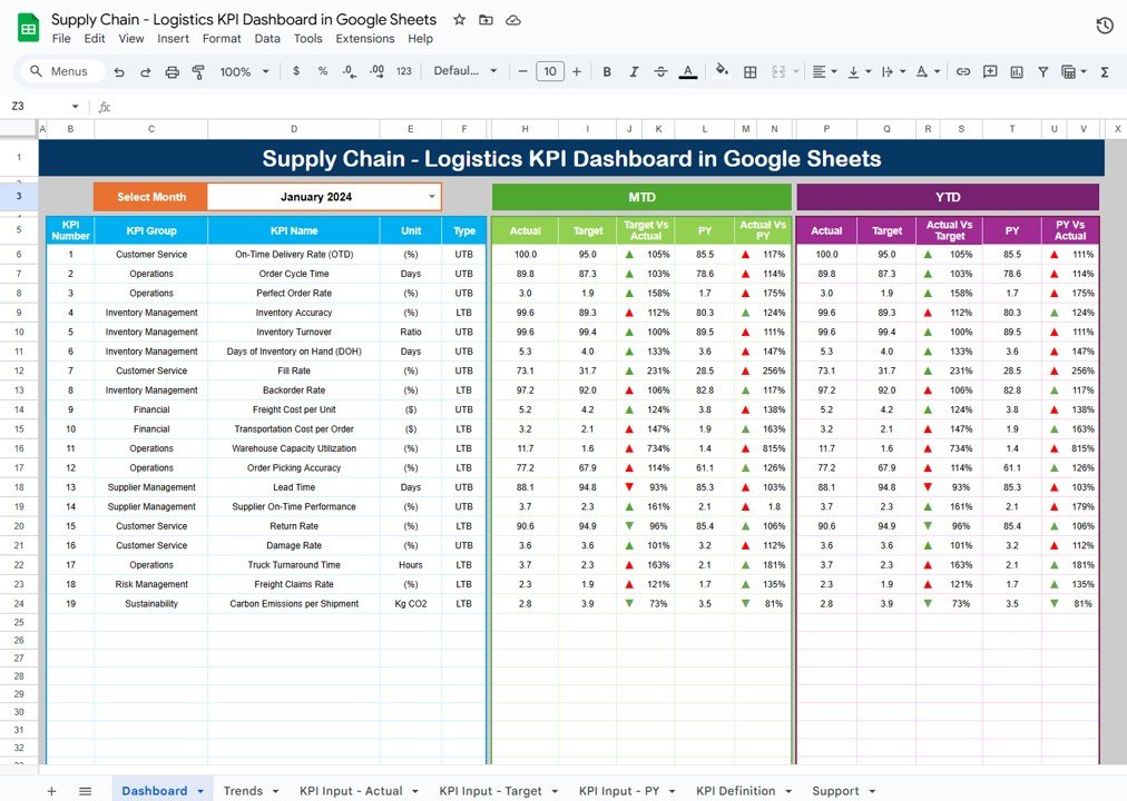
The cloud twin of the best-overall pick. Same performance, inventory and service KPIs, but built in Google Sheets so the whole team edits one live copy with full version history.
Who it is for: teams that value real-time collaboration over Excel’s raw power and want Fill Rate, Stockout Rate and Days Inventory Outstanding tracked in the cloud.
What is inside:
- Actual-vs-target input model with instant KPI recalculation
- Charts for delivery, cost and inventory trends
- Native Google sharing, comments and revision history
- Dropdown-driven categories that expand as you add data
Because Google Sheets is free, the only cost is the $12.99 file. It is a strong fit for operations that already run on Workspace and want the dashboard beside their other logistics dashboard templates.
Best for: real-time collaborative KPI tracking. $12.99 – view the template.
4. Logistics Efficiency KPI Dashboard in Power BI
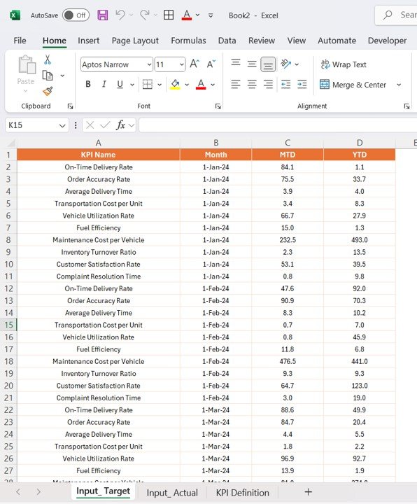
When you outgrow a single sheet, this Power BI report gives Freight Cost per Unit, vehicle utilisation and delivery performance the interactive-slicer treatment – filter by lane, carrier, region or period on the fly.
Who it is for: a team with freight and fleet data in a CSV export or database that wants drillable transport analytics.
What is inside:
- Semantic model with a date table and pre-built DAX measures
- Slicers for carrier, lane, region and period
- KPI cards with period-over-period deltas
- Drill-through detail pages for any route or vehicle
Load a weekly export and the report refreshes with no per-seat charge to view it inside your organisation. See our Power BI dashboard templates ranked by industry for the wider range.
Best for: interactive freight and fleet efficiency analysis. $11.99 – view the template.
5. Food Supply Chain KPI Dashboard in Power BI
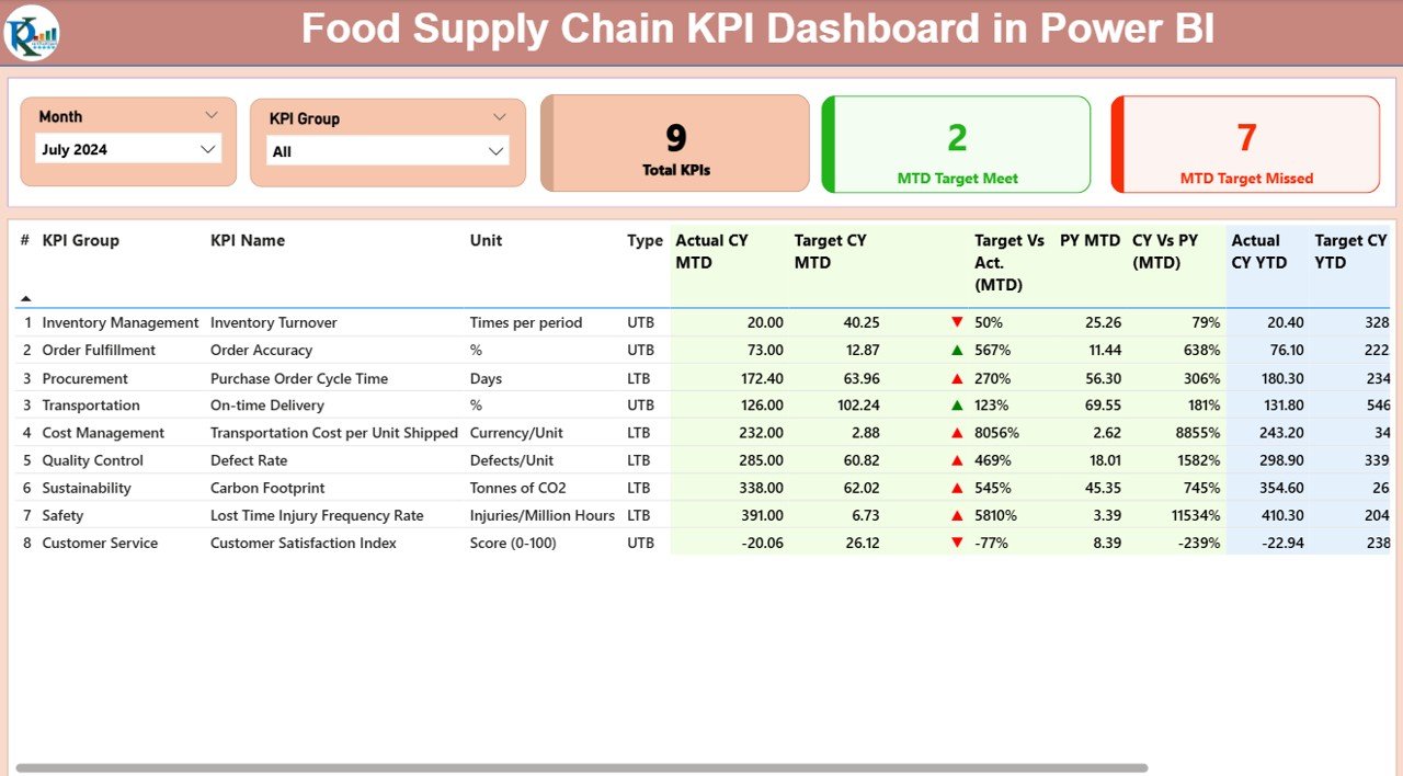
A Power BI report tuned for perishable goods, where spoilage, shelf life and cold-chain compliance sit alongside the standard delivery and inventory KPIs. GMROI and Stockout Rate matter more here because waste is the enemy.
Who it is for: grocery, foodservice and cold-chain operators who need traceability and freshness metrics next to cost and service.
What is inside:
- Spoilage, wastage and shelf-life KPIs with trend visuals
- Cold-chain and temperature-compliance tracking
- Inventory turnover and GMROI tuned for short-life stock
- Slicers for category, supplier and location
It is the specialist pick when a generic dashboard would miss the metrics that make or break a food operation. Pair it with our finance dashboard templates to tie waste back to margin.
Best for: perishable and cold-chain supply chains. $11.99 – view the template.
6. Supply Chain & Logistics Customer Feedback KPI Dashboard in Excel
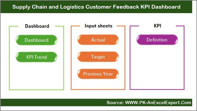
The half of the supply chain that a pure logistics dashboard ignores: what customers say after delivery. This Excel build tracks Return Rate, complaint volume, resolution time and satisfaction so service quality is measured, not assumed.
Who it is for: teams where repeat business and reputation ride on the post-delivery experience, not just the on-time number.
What is inside:
- Return Rate and return-reason breakdown
- Complaint volume, resolution time and satisfaction KPIs
- Actual-vs-target model consistent with the other Excel dashboards
- One-page management view with trend charts
Run it beside the Performance Dashboard and you have both the operational and the customer view of the same supply chain. Best for: returns, complaints and satisfaction. $14.99 – view the template.
7. Supply Chain & Logistics Regulatory Adherence KPI Dashboard in Excel
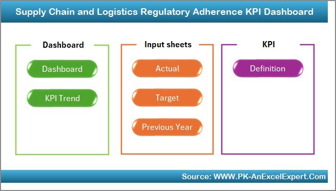
Compliance is a supply chain KPI too. This dashboard tracks Supplier On-Time Delivery against SLA, audit pass rates, documentation completeness and regulatory adherence so risk is visible before it becomes a fine.
Who it is for: regulated industries – pharma, food, automotive – where supplier and documentation compliance is non-negotiable.
What is inside:
- Supplier On-Time Delivery and SLA-adherence KPIs
- Audit pass rate and non-conformance tracking
- Documentation-completeness and certification-expiry views
- Target-driven traffic-light status per requirement
It turns a compliance spreadsheet into a monitored scorecard. Best for: compliance and supplier audit KPIs. $14.99 – view the template.
8. Supply Chain & Logistics Market Expansion KPI Dashboard in Excel
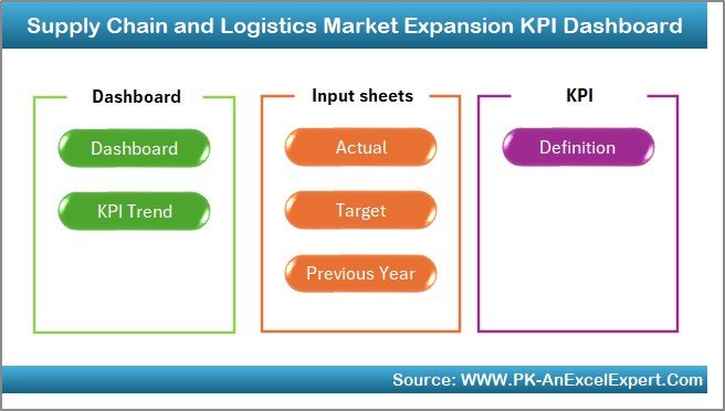
Built for the moment a supply chain scales into new regions, where Cash-to-Cash Cycle Time, coverage and expansion cost matter as much as day-to-day delivery. It frames the KPIs around growth rather than steady-state operations.
Who it is for: operations leaders planning or running a rollout into new markets or channels.
What is inside:
- Market coverage, penetration and expansion-cost KPIs
- Cash-to-Cash Cycle and working-capital views
- New-lane delivery performance against target
- Region-by-region comparison charts
It answers the growth question a performance dashboard cannot: is each new market pulling its weight? Best for: new-market rollout and cash metrics. $14.99 – view the template.
How to choose the right supply chain dashboard
Match the build to how your team already works and what you most need to see:
| If you… | Buy this | Price |
|---|---|---|
| Want the most complete scorecard and live in Excel | Performance KPI Dashboard (Excel) | $12.99 |
| Need a shared monthly review on a free account | KPI Scorecard (Google Sheets) | $9.99 |
| Run operations on Google Workspace | KPI Dashboard (Google Sheets) | $12.99 |
| Have freight data and want drillable analytics | Logistics Efficiency (Power BI) | $11.99 |
| Handle perishable or cold-chain goods | Food Supply Chain (Power BI) | $11.99 |
| Operate in a regulated, audit-heavy industry | Regulatory Adherence Dashboard (Excel) | $14.99 |
Still unsure? Start with the $9.99 Google Sheets scorecard. It is the cheapest way to prove a KPI review works for your team, and you can add the Excel or Power BI depth later. If price alone is the question, our guide to what a business dashboard template should cost and our Excel dashboard buying guide both help you avoid overpaying.
When a dashboard template is NOT the right answer
We would rather keep a customer than sell the wrong thing, so here is the honest version. A spreadsheet or Power BI KPI dashboard is the wrong tool when any of these is true:
- You need real-time, transactional control. If you must reserve stock, trigger replenishment and route orders automatically as events happen, that is an ERP or WMS job. A dashboard reports the past; it does not run the operation.
- Your data lives in ten disconnected systems with no clean export. A template needs a reasonably tidy feed. If pulling the numbers is itself the hard part, fix the data pipeline before buying any dashboard.
- You have hundreds of concurrent editors and need role-based governance. A single file gets fragile past a handful of heavy users; enterprise planning suites exist for exactly this.
- Your KPIs change weekly and nobody owns them. A dashboard rewards a stable, agreed metric set. If the definitions are still in flux, settle the 15 formulas first – which is what the first half of this guide is for.
The sweet spot is a small-to-mid operation that has the data but not the time to build the reporting layer. If that is you, a one-time template pays for itself in the first review. For heavier internal tooling, our Power BI templates by industry sit between a spreadsheet and full software.
Frequently asked questions
What are the most important supply chain KPIs to track?
The most important supply chain KPIs are Perfect Order Rate and On-Time Delivery for service, Inventory Turnover and Days Inventory Outstanding for working capital, and Cash-to-Cash Cycle Time for financial health. Together they cover whether customers are happy, whether stock is efficient, and whether growth will strain cash – the three questions every operation must answer.
What is a good Perfect Order Rate?
A Perfect Order Rate of 95% or higher is considered world-class, meaning at least 19 of every 20 orders arrive on time, in full, undamaged and correctly documented. The typical cross-industry median sits around 85%. Because it combines four sub-metrics, even small gains are hard-won and highly visible to customers.
How do you calculate inventory turnover?
Inventory turnover equals cost of goods sold divided by average inventory value over the same period. Use the average of opening and closing inventory, not the period-end figure, to avoid overstating turns. Retail typically runs 8-12 turns a year, manufacturing 4-6, and slow-moving B2B distribution 2-4.
What is the difference between OTD and OTIF?
On-Time Delivery (OTD) measures only whether an order arrived by the promised date. OTIF, or Perfect Order Rate, is stricter: the order must be on time, in full, undamaged and correctly documented. A warehouse can score high on OTD while OTIF exposes the short shipments and damage that customers actually experience.
What is a healthy cash-to-cash cycle time?
Most firms run a cash-to-cash cycle of 30-70 days. It equals days inventory outstanding plus days sales outstanding minus days payable outstanding. Best-in-class operators push it toward zero or negative, but improving it by simply stretching supplier payments can backfire if suppliers respond by deprioritising your orders.
Can I track supply chain KPIs in Excel or Google Sheets?
Yes. Every KPI in this guide can be calculated in a spreadsheet from order records, an inventory ledger and freight invoices. Ready-made templates like the Supply Chain and Logistics Performance KPI Dashboard in Excel ($12.99) or the Google Sheets scorecard ($9.99) pre-build the formulas, charts and targets so you only enter your numbers.
How often should supply chain KPIs be reviewed?
Operational KPIs such as On-Time Delivery, Fill Rate and Stockout Rate are best reviewed weekly so problems surface fast. Financial and efficiency KPIs like Inventory Turnover, GMROI and Cash-to-Cash Cycle Time are better read monthly against target. A month-picker scorecard makes both cadences easy to run from one file.
What is GMROI and why does it matter?
GMROI – Gross Margin Return on Inventory Investment – is gross margin dollars divided by average inventory cost. It tells you how much profit each dollar of stock earns. Above 1.0 means the inventory is making money; 2-3 or higher is strong retail performance. It reconciles the merchandising and finance views of the same stock.
Which supply chain KPI dashboard is best value?
The Supply Chain and Logistics KPI Scorecard in Google Sheets is the best value at $9.99. It offers a month-picker, traffic-light status and trend tabs on a free Google account, making it the cheapest way to run a real monthly KPI review before investing in the fuller Excel or Power BI builds.
Do these dashboards work for a food or cold-chain business?
Yes – the Food Supply Chain KPI Dashboard in Power BI ($11.99) is built for it, adding spoilage, shelf-life and cold-chain compliance metrics to the standard delivery and inventory KPIs. For non-perishable operations, the general Performance Dashboard or Google Sheets scorecard is the better starting point.
Get more supply chain templates
Fifteen KPIs, three platforms, one-time pricing. For under the cost of a single BI seat-month you can run your entire supply chain scorecard on a file you own outright. Start with the Supply Chain and Logistics Performance KPI Dashboard in Excel ($12.99) for the fullest coverage, or the Google Sheets KPI Scorecard ($9.99) for the cheapest monthly review. Browse the full range of logistics and transportation dashboard templates to mix formats.
Prefer to see the templates in action first? Watch build walk-throughs and tutorials on our YouTube channel: youtube.com/@NextGenTemplates.
Related: Tracking factory metrics too? See 12 manufacturing KPIs to track in 2026.
People-team metrics too? See our guide to the 15 HR KPIs to track in 2026.