

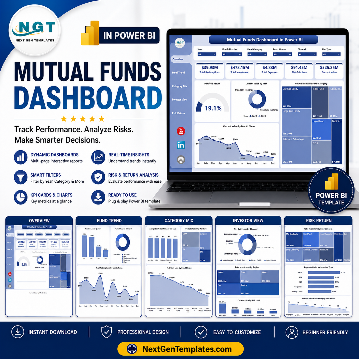
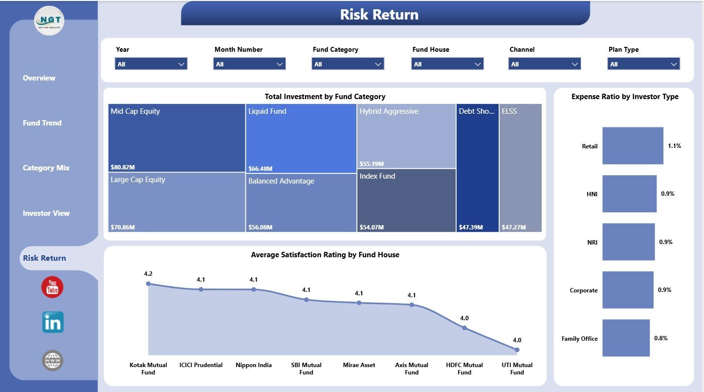

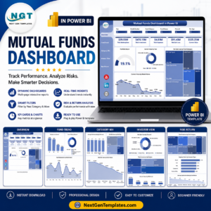
Mutual Funds Dashboard in Power BI gives advisors, fund analysts, distributors, and finance teams a 5-page Power BI report for tracking Total Redemptions, Total Investment, Total Expenses, Net Gain Loss, and Current Value. Mutual fund reporting gets difficult when investment, redemption, expense, return, risk, fund category, investor, and channel data live in separate files. This downloadable PBIX dashboard brings those views into one interactive report for a $17.99 sale price, with slicers for fast filtering and no recurring analytics subscription.
Key Features of Mutual Funds Dashboard in Power BI
- 5 Power BI pages: Overview Page, Fund Trend, Category Mix, Investor View, and Risk Return.
- 5 headline KPI cards: Total Redemptions, Total Investment, Total Expenses, Net Gain Loss, and Current Value.
- Interactive slicers: Filter the report quickly by available month, year, region, channel, risk level, category, investor type, and plan fields.
- Portfolio performance views: Analyze current value, net gain/loss, portfolio return, dividends, redemptions, expenses, active folios, and satisfaction ratings.
- Power BI format: Open the PBIX in Power BI Desktop, connect or replace sample data, and customize visuals as needed.
What’s Inside the Mutual Funds Dashboard in Power BI
1 – Overview Page
The Overview Page shows high-level portfolio performance using cards and charts. The top KPI cards summarize Total Redemptions, Total Investment, Total Expenses, Net Gain Loss, and Current Value so users can read fund performance in seconds.
Portfolio Return by Overall Portfolio: This chart summarizes portfolio return at the overall level. It helps users judge whether the complete fund portfolio is producing positive or negative performance.
Current Value by Year: This chart shows year-wise movement in current value. It helps identify whether portfolio value is growing, stable, or declining over time.
Net Gain Loss by Fund Category: This view compares gain or loss across fund categories. It helps users see which categories are contributing more value and which need closer review.
Current Value by Month Name: This chart tracks current value by month. It is useful for spotting seasonal movement and monthly portfolio changes.
2 – Fund Trend
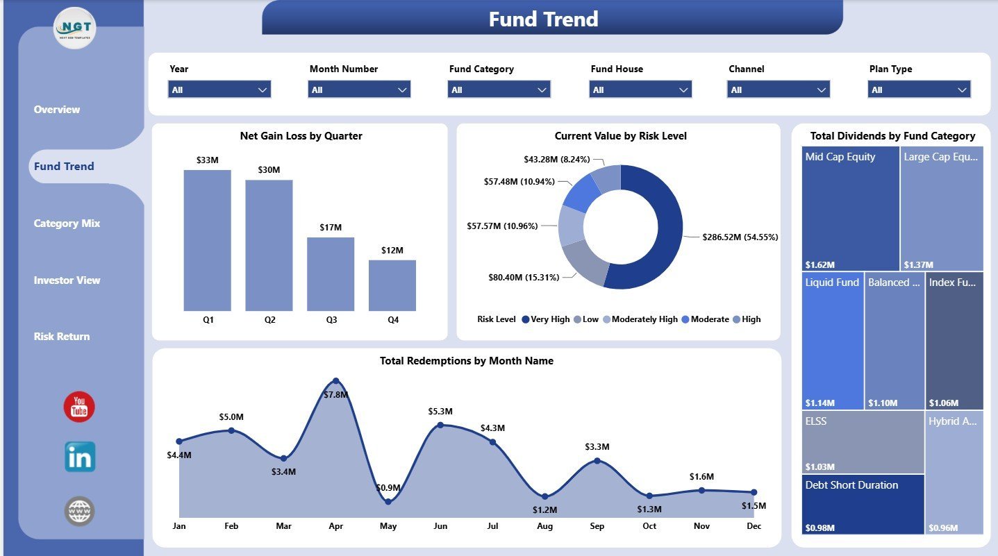
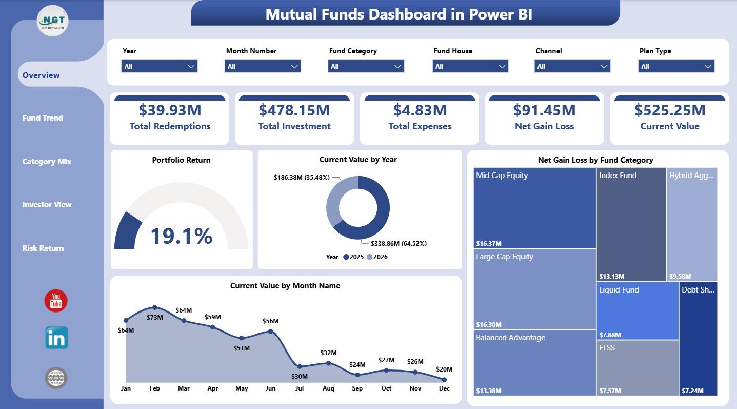
The Fund Trend page focuses on time-based performance and fund grouping. It helps users review quarter-wise gain/loss, current value by risk, dividends by category, and redemptions by month.
Net Gain Loss by Quarter: This chart compares gain or loss across quarters. It supports periodic portfolio reviews and quarterly performance discussions.
Current Value by Risk Level: This chart shows current value across risk bands. It helps users understand how much money is exposed to low, medium, or high-risk funds.
Total Dividends by Fund Category: This view compares dividend value by category. It helps identify which fund categories contribute more income.
Total Redemptions by Month Name: This chart shows redemption value by month. It helps detect periods where investors withdrew more capital.
3 – Category Mix
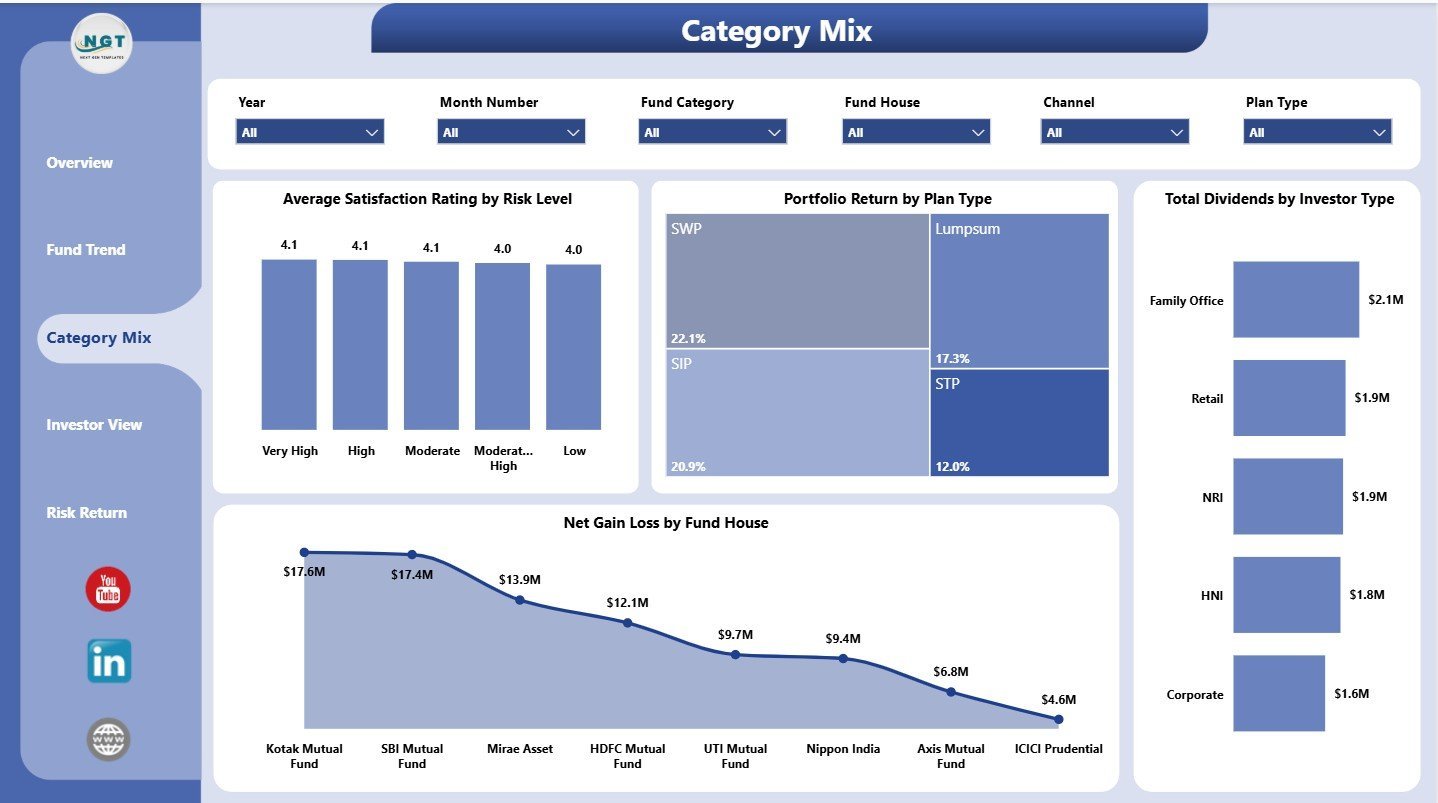
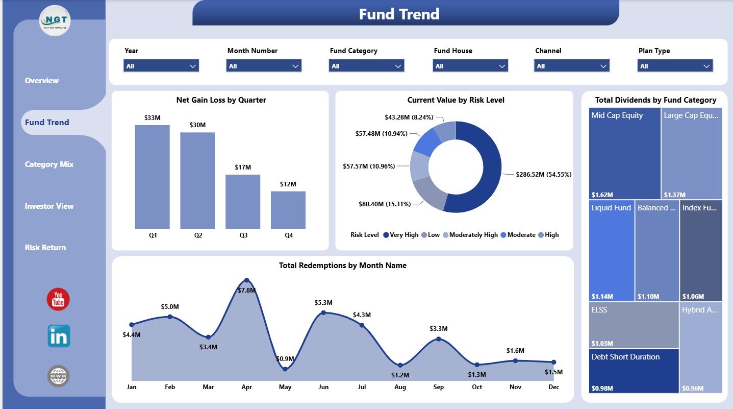
The Category Mix page reviews risk level, plan type, investor type, and fund house performance. It helps users compare how different portfolio segments contribute to results.
Average Satisfaction Rating by Risk Level: This chart compares satisfaction across risk bands. It helps connect portfolio risk with investor experience.
Portfolio Return by Plan Type: This chart compares return by plan type. It helps users evaluate whether plan structures are performing differently.
Total Dividends by Investor Type: This view shows dividend distribution by investor segment. It helps advisors understand which investor groups receive more income.
Net Gain Loss by Fund House: This chart compares gain or loss by fund house. It highlights which fund houses are adding or reducing portfolio value.
4 – Investor View
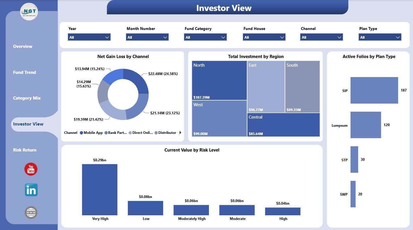
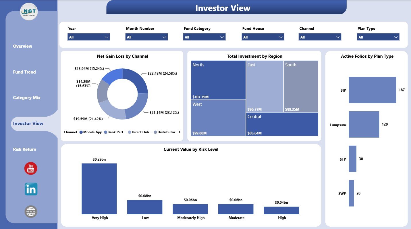
The Investor View page connects portfolio performance with investor and distribution dimensions. It is useful for reviewing region, channel, plan type, and risk exposure.
Net Gain Loss by Channel: This chart compares gain or loss across distribution channels. It helps show whether direct, advisor, online, or other channels are performing differently.
Total Investment by Region: This chart compares invested amount by region. It helps identify where portfolio capital is concentrated.
Active Folios by Plan Type: This view shows active folios across plan types. It helps users see where investor accounts are most active.
Current Value by Risk Level: This chart shows current value by risk band. It helps users evaluate portfolio exposure by risk level.
5 – Risk Return
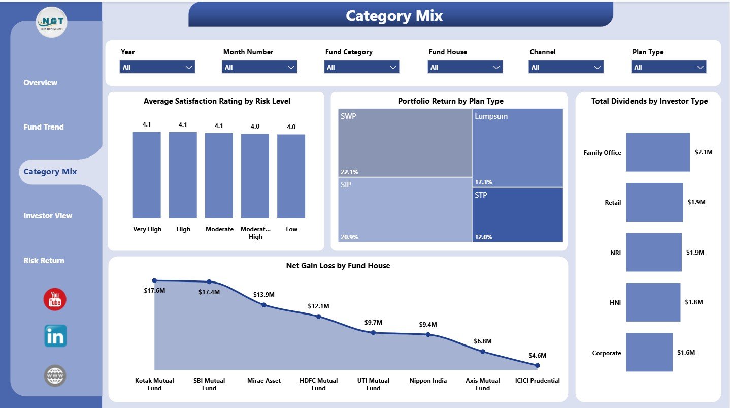
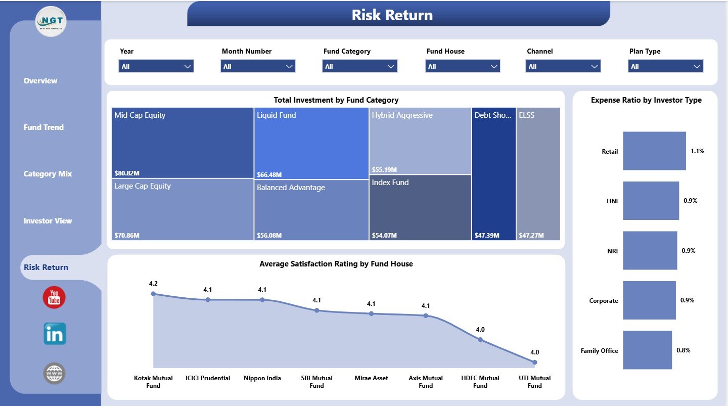
The Risk Return page focuses on investment allocation, fund house experience, and expense ratio analysis. It helps users balance value, cost, satisfaction, and investor mix.
Total Investment by Fund Category: This chart compares investment by category. It helps users understand allocation across equity, debt, hybrid, or other fund groups.
Average Satisfaction Rating by Fund House: This chart compares satisfaction by fund house. It can support fund manager review and advisor-client discussions.
Expense Ratio by Investor Type: This view compares expense ratio across investor segments. It helps identify where cost levels differ by investor type.
Mutual Funds Dashboard in Power BI vs. Tableau vs. Paid Investment SaaS – Where This Fits
| Feature | This Power BI dashboard | Tableau alternative | Paid investment SaaS |
|---|---|---|---|
| Cost | $17.99 one-time template purchase | Requires Tableau setup and licensing | Recurring subscription or platform fee |
| Platform | Power BI Desktop and Power BI Service | Tableau Desktop/Cloud | Vendor-hosted app |
| Setup time | Open PBIX and replace or connect data | Build or adapt workbook manually | Vendor onboarding required |
| Custom visuals | Editable Power BI report pages | Editable with Tableau skills | Often limited by vendor plan |
| Year-1 cost at 5 users | $17.99 plus any Microsoft licensing needed | License and build cost | Often hundreds or thousands per year |
| Mutual fund analytics | 5 focused pages for value, gain/loss, risk, categories, investors, redemptions, dividends, and expense ratio | Must be designed or purchased | Depends on product module |
Who This Template Is For – and Who It’s Not For
This dashboard is for financial advisors, mutual fund distributors, wealth management teams, portfolio analysts, and Power BI users who want a ready report structure for mutual fund performance review.
It is not a live NAV feed, trading tool, compliance system, investor portal, or CRM. Use it when your data can be loaded into Power BI and reviewed through dashboard visuals.
How to Use the Mutual Funds Dashboard in Power BI
- Download and unzip the product file.
- Open the PBIX file in Power BI Desktop.
- Review the sample data structure and replace it with your own source data.
- Refresh the report and confirm the slicers, cards, and charts update correctly.
- Customize page names, colors, measures, and data source connections if needed.
- Publish to Power BI Service if you want controlled sharing with your team.
Real-World Use Cases
Meera, financial advisor: reviews current value, gain/loss, risk level, dividends, and redemptions before investor review meetings.
Daniel, mutual fund distributor: compares investment by region, gain/loss by channel, and active folios by plan type to understand business mix.
Priya, portfolio analyst: uses fund category, fund house, quarter, and expense ratio views to prepare monthly fund performance commentary.
Frequently Asked Questions
What does this Power BI dashboard track?
It tracks total redemptions, investment, expenses, net gain/loss, current value, portfolio return, dividends, active folios, satisfaction ratings, and expense ratio.
Can I use my own mutual fund data?
Yes. Replace or connect the sample data in Power BI Desktop, then refresh the report.
Do I need Power BI Desktop?
Yes. The PBIX file should be opened in Power BI Desktop, which is available from Microsoft.
Can I customize the report pages?
Yes. You can edit visuals, measures, slicers, colors, and data model settings in Power BI Desktop.
Is this a live market data feed?
No. This is a dashboard template. Live or scheduled refresh depends on your own data source setup.
Is this a one-time purchase?
Yes. It is a one-time downloadable template from NextGenTemplates.
About the Author
Built by PK – Microsoft Certified Professional with 15+ years of Excel, Google Sheets, and Power BI experience. Founder of NextGenTemplates, reaching 300K+ subscribers across YouTube channels. Every template is hand-built and tested before release.
Explore Related Templates
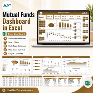
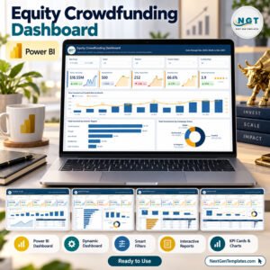
You may also like Mutual Funds Dashboard in Excel, Wealth Tech Dashboard in Power BI, and Emergency Fund Savings Tracker in Google Sheets. Browse more Power BI templates and Power BI dashboard templates.
Download the Mutual Funds Dashboard in Power BI to review mutual fund value, returns, risk, expenses, investor mix, dividends, redemptions, and category performance in one editable PBIX report.
Last updated: July 11, 2026.

























Reviews
There are no reviews yet.