

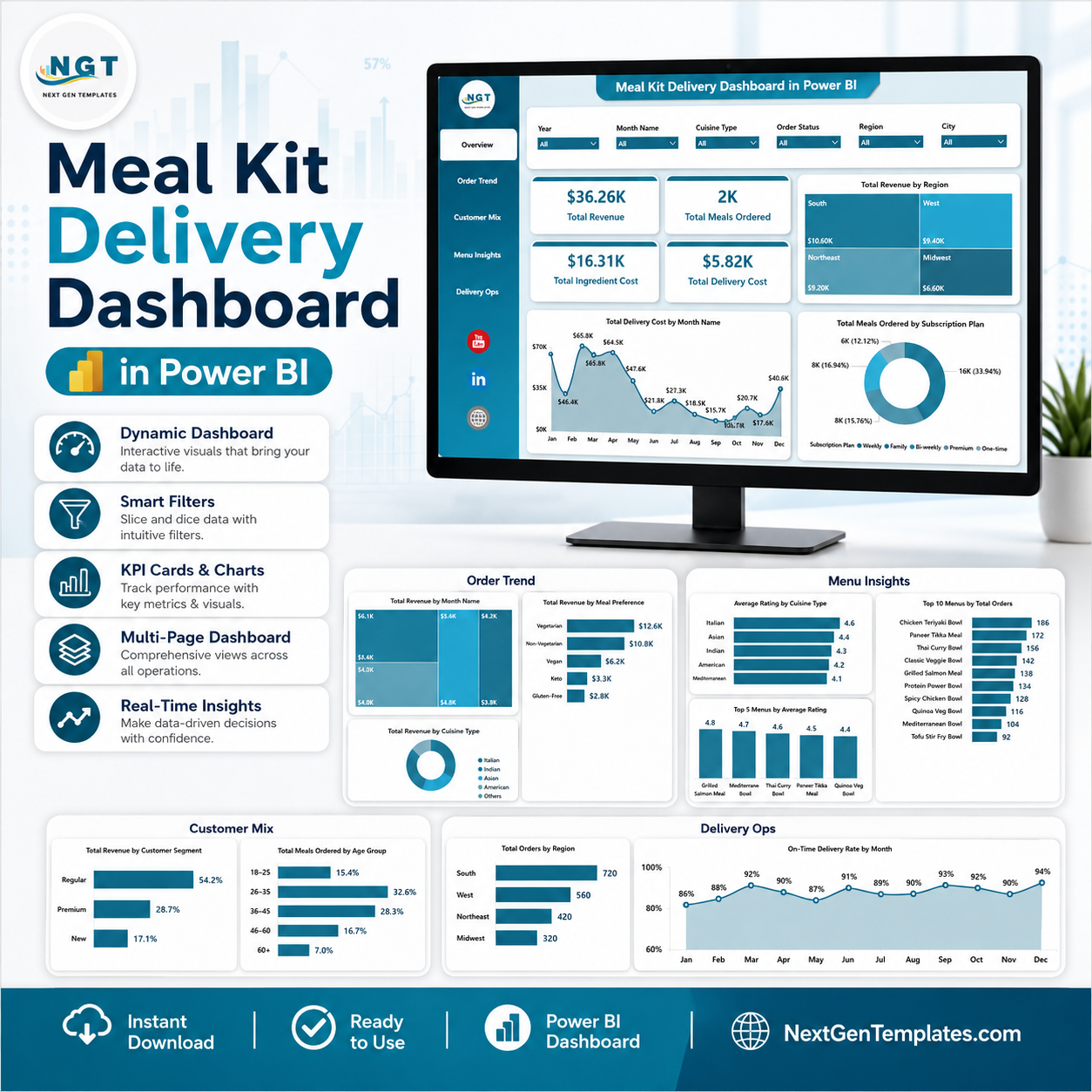
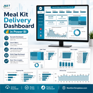
Meal Kit Delivery Dashboard in Power BI helps subscription food teams review revenue, meals ordered, ingredient cost, delivery cost, customer mix, menu demand, and delivery operations from one editable PBIX report. The template includes 5 report pages, 4 executive KPI cards, 15 analysis visuals, and slicers for fast filtering. Built by PK, a Microsoft Certified Professional with 15+ years of Excel and Power BI experience and 300K+ YouTube subscribers across channels, this dashboard gives you a practical risk reversal: one-time download, no monthly SaaS fee, and a report you can adapt in Power BI Desktop.
Key Features of Meal Kit Delivery Dashboard in Power BI
- 5 Power BI pages: Overview Page, Order Trend, Customer Mix, Menu Insights, and Delivery Ops.
- 4 high-level KPI cards: Total Revenue, Total Meals Ordered, Total Ingredient Cost, and Total Delivery Cost.
- 15 focused analysis visuals: Review revenue, meals, ingredient cost, delivery cost, gross profit, gross margin, ratings, cuisine type, customer segment, payment method, subscription plan, acquisition channel, and delivery partner performance.
- Interactive slicers: Filter the report quickly during weekly operations, finance, and menu planning meetings.
- Power BI-ready PBIX file: Open in Power BI Desktop, replace or connect your prepared data, refresh the model, and customize visuals as needed.
- Food delivery reporting focus: Built for meal kit subscriptions, meal prep brands, delivery operators, food analysts, and founders.
What’s Inside the Meal Kit Delivery Dashboard in Power BI
1 – Overview Page
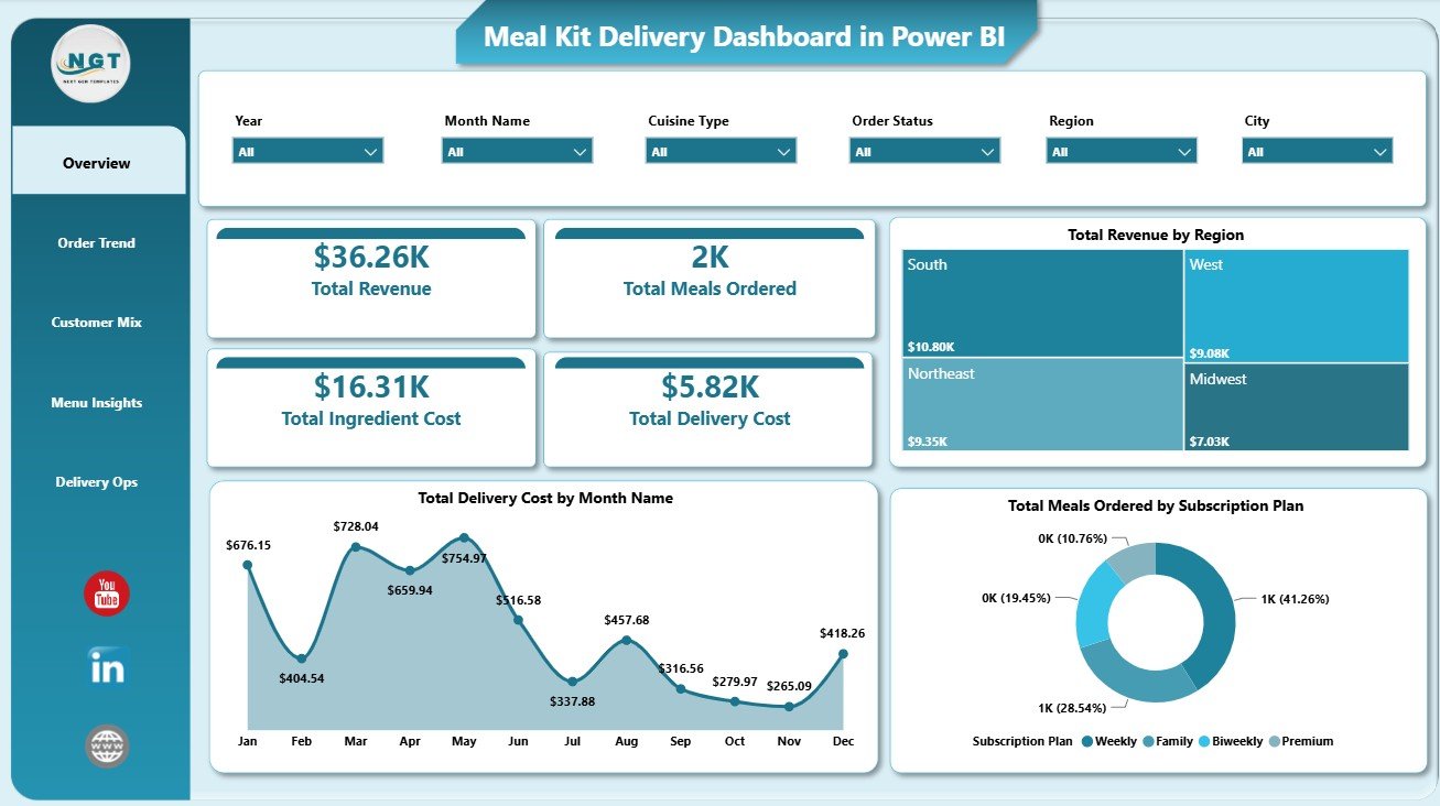
The Overview Page gives leaders a quick snapshot of business health. The top cards show Total Revenue, Total Meals Ordered, Total Ingredient Cost, and Total Delivery Cost so teams can compare sales volume with the cost base behind every fulfilled order.
Total Revenue by Region: This visual compares sales across delivery markets. It helps identify regions that are driving the strongest demand and where expansion or local campaigns may deserve more attention.
Total Delivery Cost by Month Name: This trend shows how logistics spending changes month by month. It helps operations teams spot cost spikes caused by seasonality, volume changes, failed deliveries, or delivery partner mix.
Total Meals Ordered by Subscription Plan: This chart compares meal volume across plan types. It helps teams understand which subscriptions create the most operational demand and where plan-level pricing or capacity decisions may be needed.
2 – Order Trend
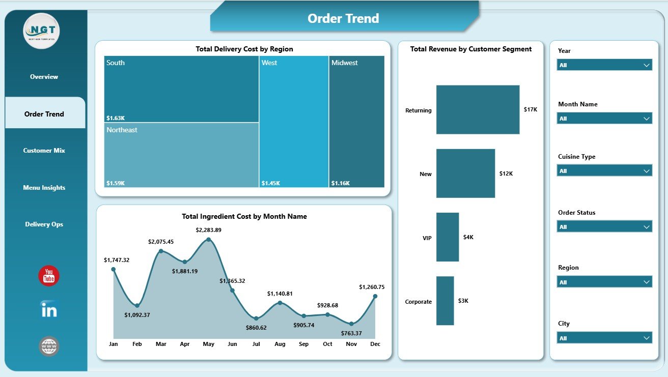
The Order Trend page focuses on how cost and revenue move across major operational dimensions. It is useful for finance and operations teams that need to explain changes in delivery cost, ingredient cost, and customer revenue.
Total Delivery Cost by Region: This visual compares logistics expense by market. High-cost regions can be reviewed for delivery route efficiency, partner pricing, failed delivery rates, or minimum-order rules.
Total Ingredient Cost by Month Name: This trend shows food cost movement over time. Procurement teams can use it to review supplier changes, seasonal ingredient pricing, and menu-cost pressure.
Total Revenue by Customer Segment: This chart shows which customer groups generate the most revenue. It helps marketing and customer success teams focus campaigns on segments with stronger value.
3 – Customer Mix
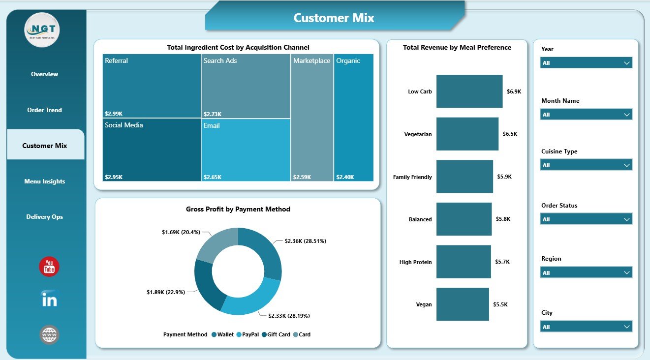
The Customer Mix page explains how acquisition, payment, and preference patterns affect the business. It helps teams move beyond total revenue and see where cost, profit, and demand are coming from.
Total Ingredient Cost by Acquisition Channel: This visual connects marketing source with food cost. It helps identify channels that attract customers with higher-cost meal choices.
Gross Profit by Payment Method: This chart compares profitability across payment methods. It can highlight where settlement fees, refunds, discounts, or customer behavior may affect profit.
Total Revenue by Meal Preference: This visual compares revenue by dietary or meal preference. It helps teams plan menus, promotions, and inventory around the preferences that generate the most sales.
4 – Menu Insights
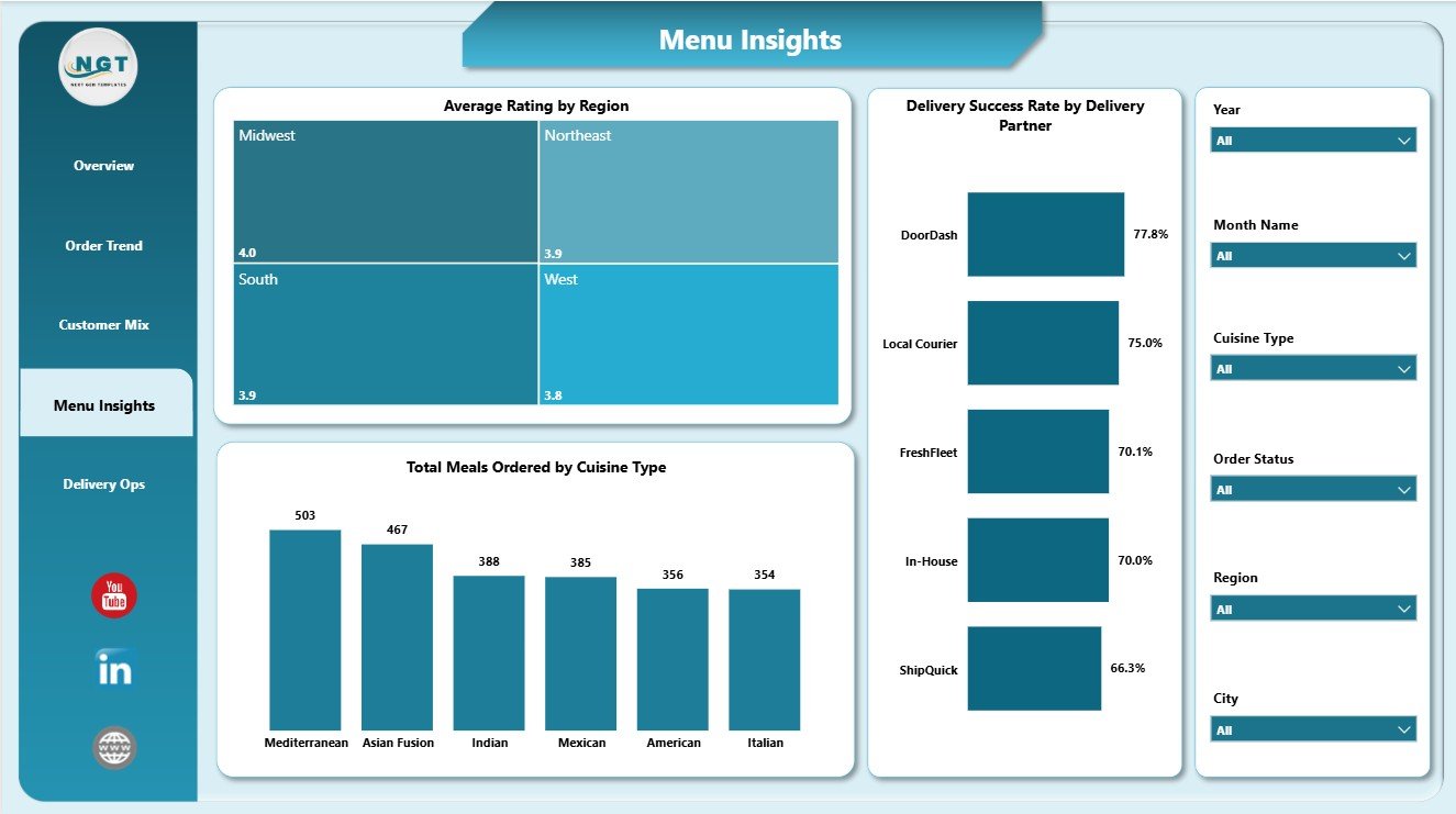
The Menu Insights page is built for menu planning, customer experience, and delivery partner review. It connects ratings, cuisine demand, and delivery reliability in one place.
Average Rating by Region: This visual compares satisfaction across markets. A lower rating in one region may point to menu fit, freshness, packaging, or delivery timing problems.
Total Meals Ordered by Cuisine Type: This chart shows which cuisines customers order most. Culinary and procurement teams can use it for recipe planning, ingredient forecasting, and campaign calendars.
Delivery Success Rate by Delivery Partner: This visual compares partner reliability. It supports delivery partner scorecards and helps operations teams discuss service issues with evidence.
5 – Delivery Ops
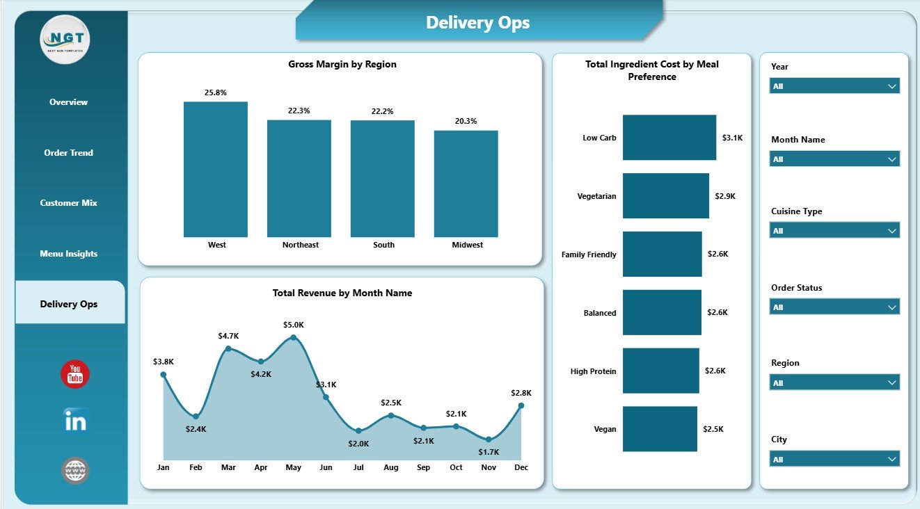
The Delivery Ops page brings profitability and fulfillment together. It is useful for reviewing whether regions, months, and meal preferences are helping or hurting margin.
Gross Margin by Region: This visual compares margin quality across delivery markets. It helps find regions that look strong in revenue but weaker after costs.
Total Revenue by Month Name: This chart shows the monthly revenue trend. It supports monthly reviews, seasonality checks, and campaign impact analysis.
Total Ingredient Cost by Meal Preference: This visual compares food cost by preference. It helps teams see whether certain dietary categories require pricing, sourcing, or menu design attention.
Meal Kit Delivery Dashboard in Power BI vs. Tableau vs. Paid CRM/SaaS – Where This Fits
| Feature | This Power BI dashboard | Tableau or Qlik alternative | Paid food delivery SaaS |
|---|---|---|---|
| Cost | $17.99 sale price, one-time | License plus dashboard build time | Monthly or annual subscription |
| Platform | Power BI Desktop / Power BI Service | Tableau, Qlik, or another BI tool | Vendor-hosted food delivery system |
| Setup time | Open PBIX, replace or connect data, refresh | Build or adapt report pages | Implementation and onboarding |
| Real-time team collaboration | Available through Power BI Service when published | Available with cloud plans | Usually included by paid seats |
| Mobile access | Available through Power BI mobile after publishing | Plan dependent | Usually included |
| Customizable fields | Editable model, visuals, measures, and pages | Editable with BI skills | Depends on vendor permissions |
| Share with link | Available through Power BI Service | Available with cloud publishing | Login controlled |
| Year-1 cost at 5 users | $17.99 plus any Microsoft licensing | License and build cost dependent | Often hundreds or thousands |
| Meal kit analytics focus | Revenue, meals, food cost, delivery cost, customer mix, menu, and delivery ops | Must be designed | Depends on plan and export options |
Who This Template Is For – and Who It’s Not For
This template is for meal kit founders, subscription food brands, meal prep businesses, delivery operations managers, finance analysts, menu planners, and consultants who need repeatable Power BI reporting for customer, menu, cost, and delivery performance.
It is not an order management system, route optimizer, payment processor, inventory purchasing tool, or live delivery app. Use it as a reporting dashboard after your meal kit data is available in a structured source.
How to Use the Meal Kit Delivery Dashboard in Power BI
- Download and unzip the template package.
- Open the PBIX file in Power BI Desktop.
- Review the sample pages, cards, visuals, slicers, and model fields.
- Replace the sample data or connect your prepared meal kit dataset.
- Refresh the report and validate revenue, meals ordered, ingredient cost, delivery cost, gross profit, ratings, regions, plans, and dates.
- Customize visuals, measures, colors, page names, or model fields as needed.
Real-World Use Cases
Asha, meal kit founder: reviews revenue, meal volume, ingredient cost, and delivery cost before deciding where to increase marketing spend.
Daniel, delivery operations manager: compares delivery success rate by partner and delivery cost by region before partner review meetings.
Maya, finance analyst: tracks ingredient cost by month and meal preference to explain gross margin movement in the monthly business review.
Frequently Asked Questions
What does this dashboard track?
It tracks total revenue, meals ordered, ingredient cost, delivery cost, gross profit, gross margin, ratings, cuisine type, customer segment, payment method, subscription plan, acquisition channel, region, month, and delivery partner performance.
What software do I need?
You need Power BI Desktop to open, edit, refresh, and customize the PBIX file.
Can I use my own meal kit data?
Yes. Replace the sample dataset or connect your prepared data source, then refresh the report in Power BI Desktop.
Can I customize the report pages?
Yes. You can edit visuals, fields, measures, colors, slicers, page names, and model relationships as needed.
Does it connect directly to delivery apps?
No direct delivery app connector is included. Export, prepare, or connect your own structured data source in Power BI.
Is this suitable for a startup?
Yes. It is useful for early-stage and growing meal kit teams that want reporting structure before investing in larger analytics or operations systems.
About the Author
Built by PK – Microsoft Certified Professional with 15+ years of Excel, Google Sheets, and Power BI experience. Founder of NextGenTemplates, reaching 300K+ subscribers across YouTube channels. Every template is hand-built and tested before release.
Explore Related Templates
- Meal Kit Delivery Dashboard in Excel – Excel version for meal kit reporting.
- Food and Beverage Report in Excel – Food business reporting workbook.
- Food Trucks Dashboard in Excel – Mobile food business dashboard.
- Browse Power BI templates.
- Browse Power BI dashboard templates.
Download the Meal Kit Delivery Dashboard in Power BI and start reviewing revenue, meals, food cost, delivery cost, customer mix, menu performance, and delivery operations in one editable PBIX report.
Last updated: July 7, 2026.


Reviews
There are no reviews yet.