Advocacy is about impact — real, measurable change. But if your organization still depends on scattered Excel files and manual reports, leadership is left guessing instead of deciding.
What if you could monitor campaign reach, stakeholder engagement, fundraising results, and policy impact in one interactive dashboard?
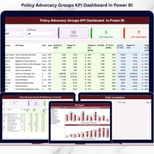
The Policy Advocacy Groups KPI Dashboard in Power BI is a ready-to-use, professionally designed analytics solution that transforms structured Excel data into real-time, visual intelligence. Instead of static summaries, you get dynamic MTD (Month-to-Date) and YTD (Year-to-Date) performance tracking, target comparisons, and year-over-year insights — all in one place.
This dashboard helps advocacy leaders move from reactive reporting to proactive strategy. 🚀
🚀 Key Features of Policy Advocacy Groups KPI Dashboard in Power BI
📊 Real-Time Performance Overview
Refresh your Power BI file and instantly view updated campaign KPIs with interactive visuals.
🎯 Target vs Actual Tracking
Automatically calculate performance gaps and monitor target achievement with clear percentage comparisons.
📈 Year-over-Year Analysis
Compare Current Year vs Previous Year results to evaluate growth and long-term impact.
🧭 Interactive Slicers
Filter performance by Month and KPI Group using dynamic slicers for instant segmentation.
🟢🔴 Smart Performance Icons
Green ▲ and Red ▼ indicators evaluate KPIs correctly using LTB (Lower the Better) and UTB (Upper the Better) logic.
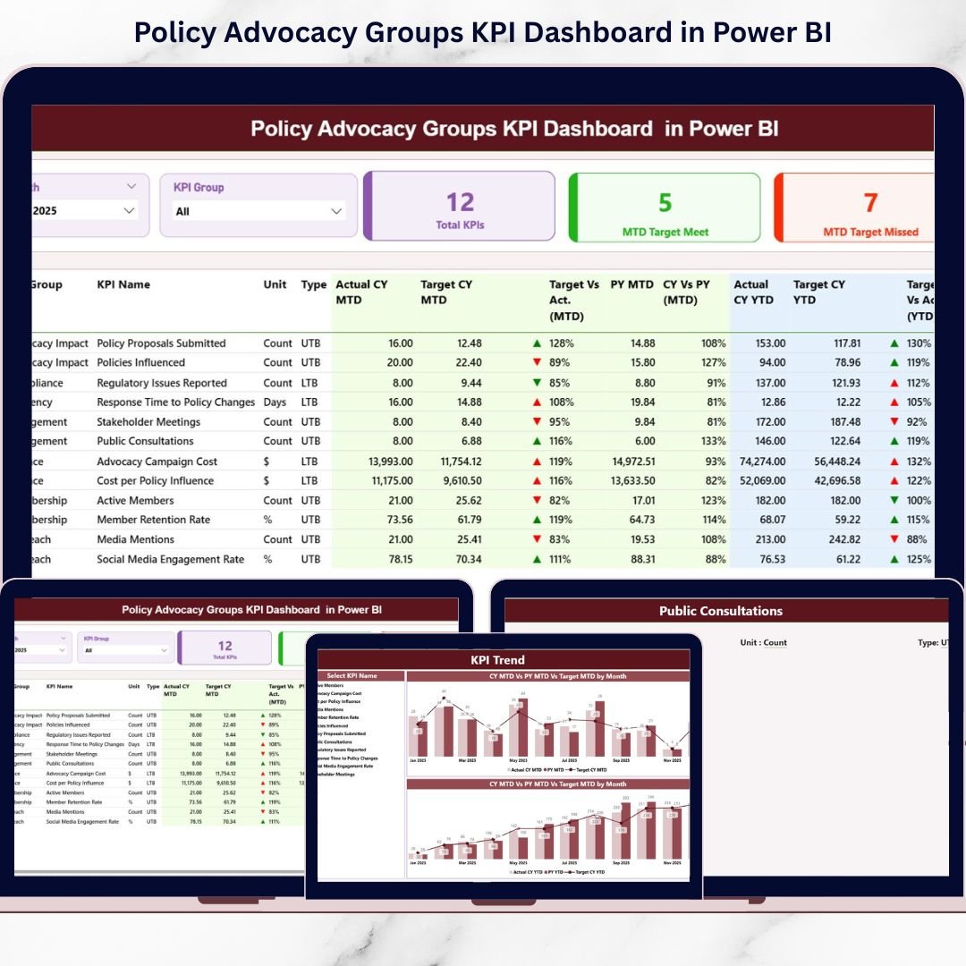
📋 Detailed KPI Performance Table
View KPI Name, Group, Unit, Actual, Target, PY, and variance percentages in one structured summary.
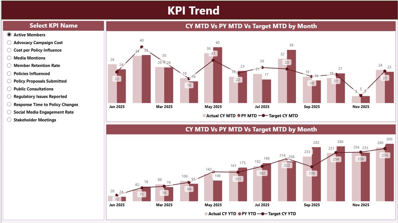
📉 KPI Trend Combo Charts
Analyze MTD and YTD performance using combo charts (Actual, Target, Previous Year).
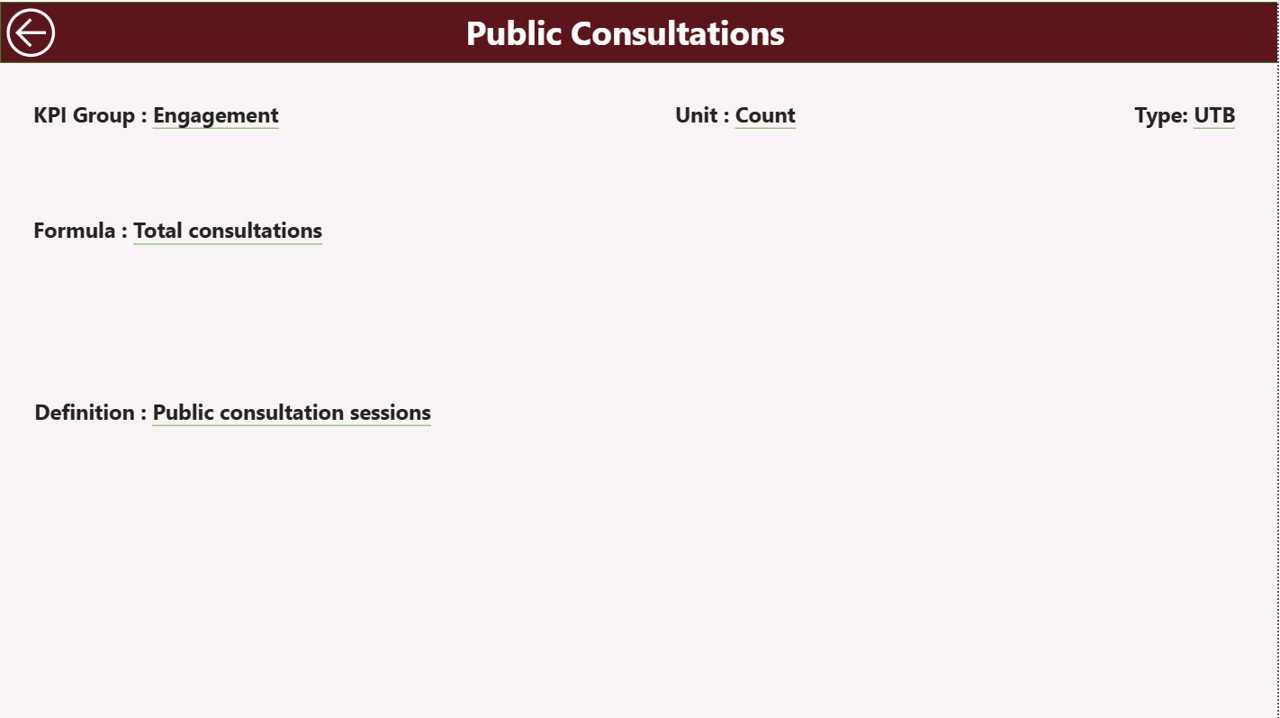
🔎 Drill-Through KPI Definitions
Right-click on any KPI to view its formula, unit, definition, and logic — ideal for transparency and donor reporting.
📦 What’s Inside the Policy Advocacy Groups KPI Dashboard in Power BI
This solution includes 3 fully interactive Power BI pages:
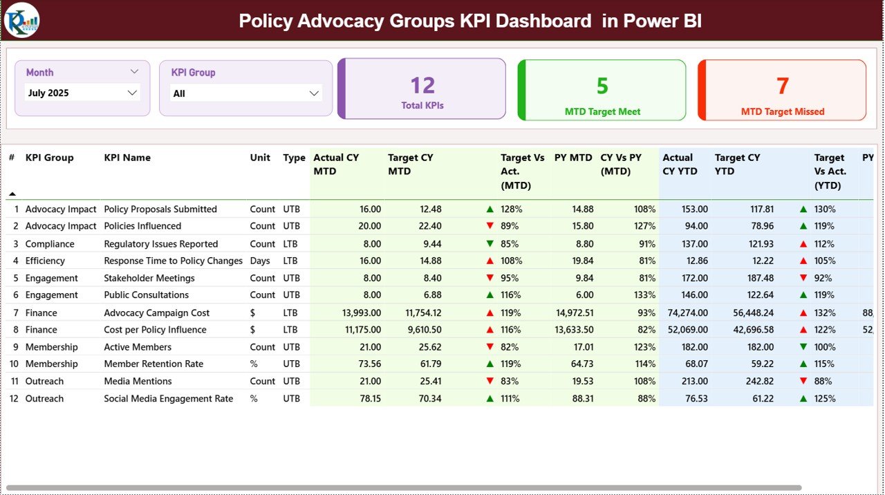
1️⃣ Summary Page
The main performance control center featuring:
-
KPI Count Cards (Total KPIs, Target Met, Target Missed)
-
Month & KPI Group slicers
-
Detailed KPI comparison table
-
Visual ▲ / ▼ performance indicators
Leadership can instantly understand overall performance strength.
2️⃣ KPI Trend Page
Select any KPI and analyze:
-
MTD Combo Chart (Actual vs Target vs Previous Year)
-
YTD Combo Chart (Actual vs Target vs Previous Year)
Trend visualization helps identify declining engagement, fundraising gaps, or campaign performance shifts quickly.
3️⃣ KPI Definition Page (Drill-Through)
Access KPI formulas, definitions, unit types, and performance logic (LTB/UTB) directly from the Summary page.
This improves transparency during board meetings, donor reviews, and audits.
🛠 How to Use the Policy Advocacy Groups KPI Dashboard in Power BI
Getting started is simple:
1️⃣ Enter KPI data into the Excel data file:
-
Input Actual Sheet (MTD & YTD actual results)
-
Input Target Sheet (MTD & YTD targets)
-
KPI Definition Sheet (KPI number, name, formula, unit, type)
2️⃣ Always use the first date of the month for consistency.
3️⃣ Refresh Power BI Desktop.
4️⃣ Use slicers to analyze specific months or KPI categories.
Within seconds, you can evaluate campaign performance, engagement trends, and fundraising outcomes — without complex formulas.
👥 Who Can Benefit from This Policy Advocacy Groups KPI Dashboard in Power BI
This dashboard is ideal for:
-
Policy Advocacy Groups
-
NGOs & Non-Profit Organizations
-
Social Impact Organizations
-
Campaign Managers
-
Fundraising Teams
-
Program Directors
-
Board Members & Donor Relations Teams
Whether you manage local campaigns or national initiatives, this dashboard scales to your reporting needs.
If stakeholder engagement drops below target or fundraising slows down, you detect it immediately and adjust strategy proactively.
That’s smarter advocacy management powered by data.
Why This Dashboard Is a Strategic Advantage 💡
-
Reduces manual reporting time
-
Improves transparency and accountability
-
Enhances donor and board reporting
-
Highlights performance gaps instantly
-
Supports data-driven decision-making
-
Centralizes KPI tracking in one system
-
Scales easily as campaigns grow
Instead of reacting months later, leadership teams see performance indicators immediately and take corrective action fast.
Impact becomes measurable — and actionable.
# Click hare to read the Detailed blog post
Visit our YouTube channel to learn step-by-step video tutorials:
👉 Youtube.com/@PKAnExcelExpert