



Customer renewals are the lifeline of any SaaS business. When customers stay, upgrade, or expand their subscription, revenue grows consistently. But when renewal rates drop or churn increases, SaaS companies face major setbacks. The challenge becomes even bigger when renewal metrics stay scattered across multiple spreadsheets. That’s exactly why the SaaS Renewal KPI Dashboard in Power BI is the ultimate solution every SaaS company needs.
This powerful dashboard converts all renewal, churn, and subscription metrics into clear, interactive visuals. It provides complete insight into customer behavior, renewal performance, and financial indicators—helping SaaS leaders take fast, confident, and data-driven decisions. Whether you want to track MRR, churn %, expansion revenue, renewal rate, contract values, or customer lifetime value, this dashboard brings every KPI into one clean visual system.
Built using Power BI and an Excel data source, this dashboard makes renewal performance tracking effortless. You simply update your Actual, Target, and KPI Definition sheets in Excel, refresh Power BI, and instantly view updated renewal insights. With slicers, drill-throughs, KPI cards, and dynamic comparison charts, teams gain end-to-end clarity over subscription health.
📊 Key Features of the SaaS Renewal KPI Dashboard in Power BI
This dashboard includes three fully interactive pages, each built for deep SaaS renewal insights.
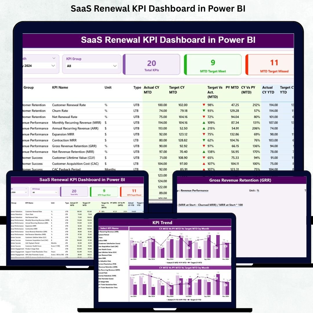
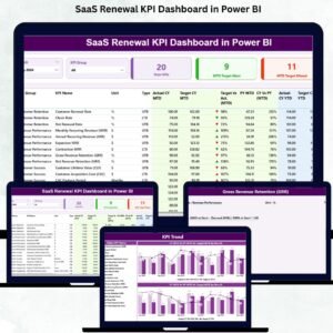
⭐ 1. Summary Page – Complete Renewal Performance Overview
This is your main dashboard page where all renewal KPIs come together.

🔹 What You’ll See Here:
✔ Month Slicer
✔ KPI Group Slicer
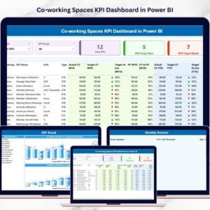
✔ KPI Performance Cards
Total KPIs Count
MTD Target Met Count
MTD Target Missed Count
🔹 Detailed KPI Table
The heart of the dashboard includes:
KPI Number
KPI Group
KPI Name
Unit
Type (LTB / UTB)
Actual CY MTD
Target CY MTD
MTD Icons (▲ green or ▼ red)
Target vs Actual (MTD)
PY MTD
CY vs PY (MTD)
Actual CY YTD
Target CY YTD
YTD Icons
Target vs Actual (YTD)
PY YTD
CY vs PY (YTD)
This page gives a crystal-clear look at your full renewal performance.
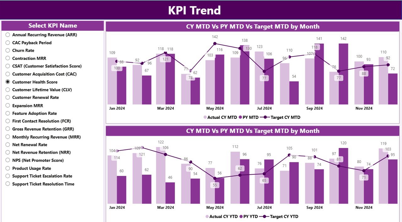
⭐ 2. KPI Trend Page – Track Renewal Trends Over Time
Trends reveal whether customer retention is improving or declining.
🔹 This page includes:
KPI selector slicer
Combo chart for MTD performance
Combo chart for YTD performance
These charts show:
Actual CY vs Actual PY
Actual vs Target
Trend patterns
Year-over-year improvement
This page helps SaaS teams understand progress across different renewal periods.
⭐ 3. KPI Definition Page – Understand Each KPI Clearly
This hidden page opens only through drill-through from the Summary Page.
🔹 It displays:
KPI Number
KPI Group
KPI Name
Unit
Formula
Definition
Type (UTB or LTB)
This ensures complete clarity for every team member interpreting the dashboard.
📦 What’s Inside the SaaS Renewal KPI Dashboard in Power BI
You get an Excel-powered data system with:
📄 Input_Actual Sheet (MTD & YTD actual values)
📄 Input_Target Sheet (MTD & YTD targets)
📄 KPI Definition Sheet (KPI categories, formulas, definitions)
Power BI reads these sheets and updates all visuals automatically.
🧩 How to Use the SaaS Renewal KPI Dashboard
Enter Actual and Target values in Excel
Update KPI definitions
Load data into Power BI
Use Month & KPI Group slicers
Review Summary Page for performance
Open KPI Trend Page for detailed analysis
Drill through KPIs as needed
No coding or technical skills required!
👤 Who Can Benefit from This Dashboard
This dashboard is ideal for:
💼 SaaS Founders
📊 Customer Success Teams
💰 Finance & Revenue Teams
🎯 Renewal Teams
🧭 SaaS Leadership
📈 Growth & Strategy Teams
Anyone responsible for retention, expansion, or customer success will benefit greatly.
### Click hare to read the Detailed blog post
Visit our YouTube channel to learn step-by-step video tutorials
👉 Youtube.com/@PKAnExcelExpert
Watch the step-by-step video tutorial:
Compatibility and Requirements
- Works in Power BI Desktop, which is free. Microsoft explains how to get it in Get Power BI Desktop.
- The data lives in an Excel file with the Input_Actual, Input_Target and KPI Definition sheets, so you also need Excel to edit your numbers.
Frequently Asked Questions
How many pages does the dashboard have?
Three pages: Summary, KPI Trend and KPI Definition. The KPI Definition page is hidden and opens by drill-through from the Summary page.
How do I update the dashboard with my own data?
Enter your actual values in the Input_Actual sheet and your targets in the Input_Target sheet in Excel. Update the KPI Definition sheet if needed, then refresh Power BI.
Can I compare this year with last year?
Yes. The Summary page shows CY vs PY for both MTD and YTD, and the KPI Trend page charts Actual CY against Actual PY.
How do I see whether a KPI met its target?
The Summary page shows green up and red down icons for MTD and YTD, plus Target vs Actual columns. Cards at the top count the KPIs that met and missed the MTD target.
Is there an Excel or Google Sheets version?
Yes. See the SaaS Renewal KPI Dashboard in Excel and the SaaS Renewal KPI Dashboard in Google Sheets.
Related SaaS Templates
- SaaS Renewal KPI Dashboard in Excel: the same renewal KPIs in Excel
- SaaS Renewal KPI Dashboard in Google Sheets: the Google Sheets edition
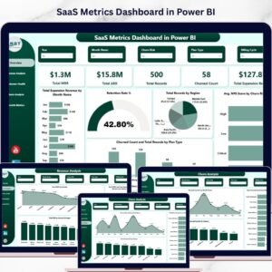
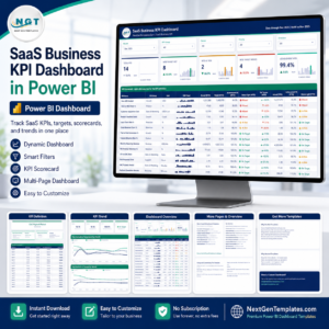
- SaaS Metrics Dashboard in Power BI: wider SaaS metrics in Power BI
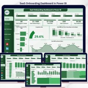
- SaaS Onboarding Dashboard in Power BI: track customer onboarding
- Subscription and SaaS Renewal Calendar in Excel: a calendar for upcoming renewals
Browse all Power BI KPI dashboards.

Reviews
There are no reviews yet.