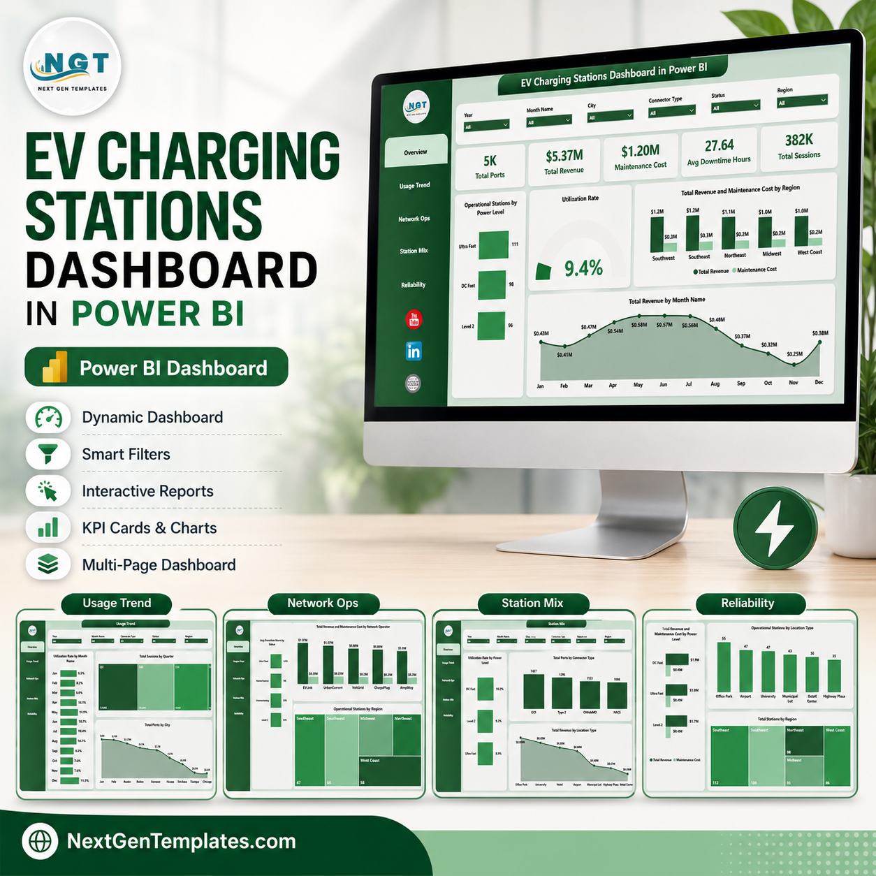
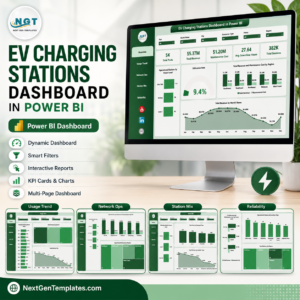
EV Charging Stations Dashboard in Power BI gives charging operators a ready PBIX report with 5 pages, 5 executive KPI cards, 15 chart views, and interactive slicers for revenue, sessions, ports, utilization, downtime, maintenance cost, power level, connector type, city, region, location type, and network operator analysis. For $17.99 one-time, you get an editable reporting layer that opens in Power BI Desktop, uses your own structured charging data, and avoids the cost of a custom dashboard build. Built by PK, Microsoft Certified Professional with 15+ years of analytics experience and 300K+ YouTube subscribers, this template is designed for fast review, customization, and practical business use.
Key Features of EV Charging Stations Dashboard in Power BI
- 5 Power BI pages covering Overview, Usage Trend, Network Ops, Station Mix, and Reliability.
- 5 headline cards for Total Ports, Total Revenue, Maintenance Cost, Avg Downtime Hours, and Total Sessions.
- 15 focused chart views for station operations, usage behavior, infrastructure mix, revenue, maintenance, and reliability.
- Multiple slicers help users filter by available dimensions and review the dashboard quickly during meetings.
- Editable PBIX model lets Power BI users change visuals, fields, relationships, measures, colors, and pages.
- EV infrastructure reporting built for charging operators, utilities, mobility teams, consultants, and network analysts.
What’s Inside the EV Charging Stations Dashboard in Power BI
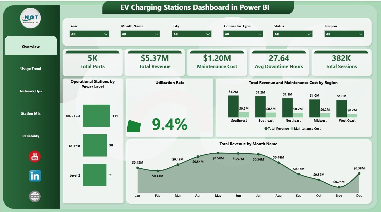
1. Overview Page
The Overview Page gives a high-level view of charging network performance. The cards show Total Ports, Total Revenue, Maintenance Cost, Avg Downtime Hours, and Total Sessions so leaders can see scale, activity, cost, and reliability at a glance.
Operational Stations by Power Level: This chart shows how operational stations are distributed by charger power level. It helps teams understand the active mix of slower, fast, and high-power charging assets.
Utilization Rate: This visual tracks how effectively charging assets are being used. It helps identify underused capacity, busy charging periods, and locations that may need demand or capacity review.
Total Revenue and Maintenance Cost by Region: This comparison connects commercial performance with service cost by region. It helps managers find regions with strong margins and regions where maintenance pressure needs attention.
Total Revenue by Month Name: This chart shows monthly revenue movement. It supports trend review, seasonality checks, and month-end performance conversations.
2. Usage Trend
The Usage Trend page focuses on demand patterns and infrastructure distribution over time. Utilization Rate by Month Name shows how charging activity changes month by month and helps teams spot usage peaks or slow periods. Total Sessions by Quarter summarizes charging activity by quarter for management reporting. Total Ports by City compares city-level charging capacity and helps planners understand network density.

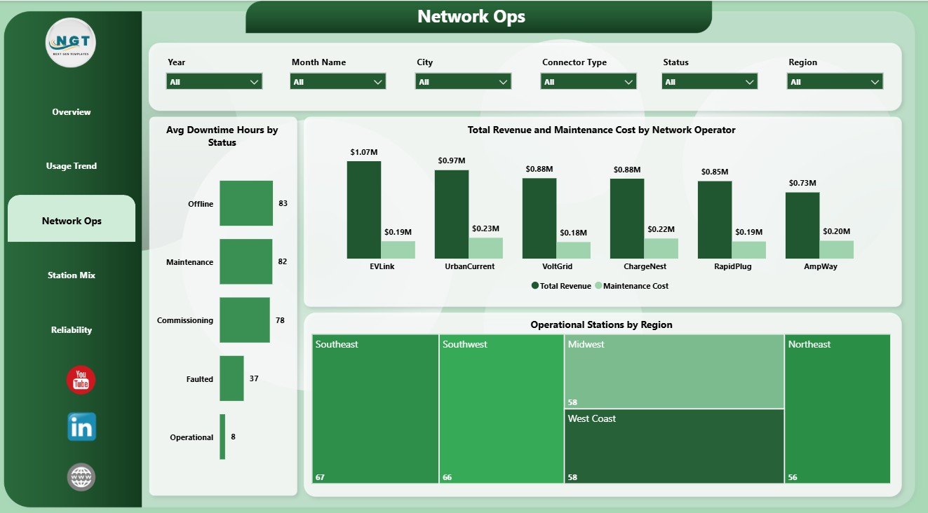
3. Network Ops
The Network Ops page reviews reliability and operator performance. Avg Downtime Hours by Status highlights downtime behavior by operational status. Total Revenue and Maintenance Cost by Network Operator compares operator-level commercial output with support cost. Operational Stations by Region shows where the active charging network is strongest or weakest.
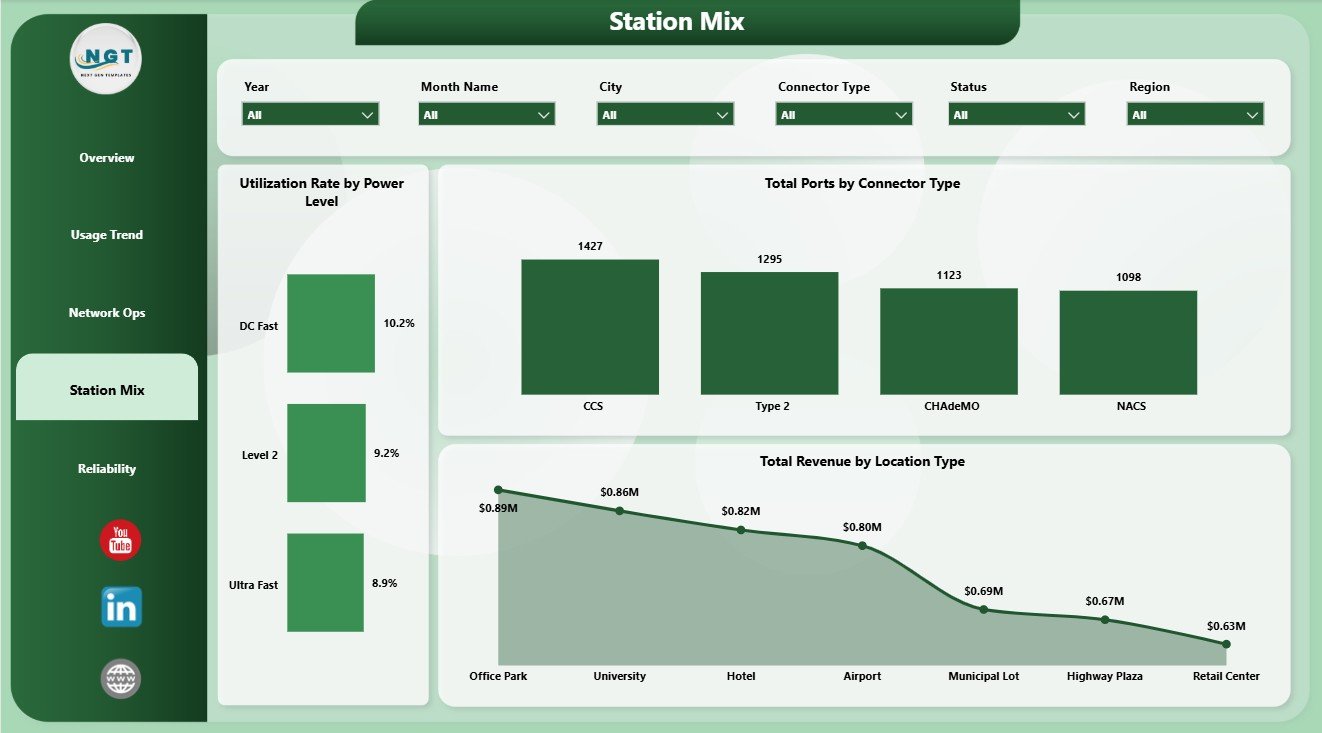
4. Station Mix
The Station Mix page explains how charging infrastructure is distributed by charger class, connector, and site type. Utilization Rate by Power Level compares demand across different charging speeds. Total Ports by Connector Type shows connector compatibility across the network. Total Revenue by Location Type identifies which site types create stronger revenue.
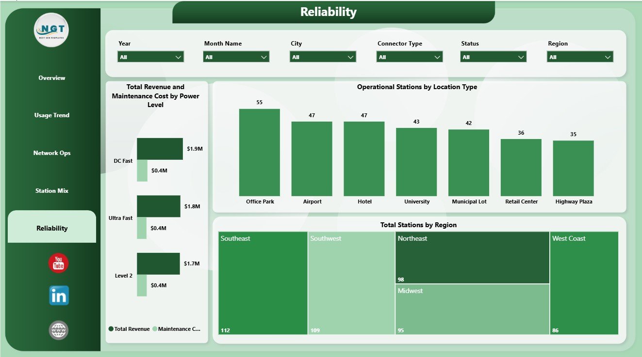
5. Reliability
The Reliability page supports maintenance and uptime review. Total Revenue and Maintenance Cost by Power Level helps compare profitability by charger class. Operational Stations by Location Type shows active infrastructure by site type. Total Stations by Region gives a regional view of overall network footprint.
EV Charging Stations Dashboard in Power BI vs. Tableau vs. Paid CRM/SaaS – Where This Fits
| Feature | This Power BI Dashboard | Tableau Alternative | Paid Charging SaaS |
|---|---|---|---|
| Cost | $17.99 one-time | License plus dashboard build time | Monthly or annual subscription |
| Platform | Power BI Desktop / Service | Tableau Desktop / Cloud | Vendor cloud platform |
| Setup time | Open PBIX, connect or replace data, refresh | Build model and visuals manually | Implementation and configuration |
| Customizable fields | Editable visuals, model, pages, and measures | Editable with Tableau skills | Limited by vendor settings |
| Share with link | Available through Power BI Service permissions | Available through Tableau permissions | Usually login controlled |
| Year-1 cost at 5 users | $17.99 plus any Microsoft licensing | Usually much higher | Often hundreds or thousands |
| EV station analytics | Built across 5 pages | Requires custom design | Depends on plan and integrations |
Who This Template Is For – and Who It’s Not For
This template is for EV charging station operators, energy and utility teams, network operators, fleet charging managers, city mobility teams, infrastructure planners, Power BI analysts, and consultants who need a ready view of ports, sessions, revenue, downtime, maintenance cost, utilization, power level, connector type, location type, city, region, and operator performance.
It is not a live charger control system, payment gateway, OCPP management platform, customer mobile app, real-time fault alerting product, or data warehouse. It works best when your station records are already available in structured rows and columns.
How to Use the EV Charging Stations Dashboard in Power BI
- Download and unzip the product file.
- Open the PBIX file in Power BI Desktop.
- Replace the sample data source or connect your own charging station table.
- Refresh the report and validate the KPI cards.
- Use slicers to filter by the available dimensions.
- Customize visuals, pages, fields, relationships, or measures if needed.
Real-World Use Cases
Priya, charging network manager: Priya uses Overview and Network Ops to review ports, sessions, revenue, downtime, maintenance cost, and active stations before weekly operations calls.
Daniel, utility program analyst: Daniel uses Usage Trend and Station Mix to compare utilization, sessions, connector deployment, city-level capacity, and power-level behavior.
Asha, infrastructure planner: Asha uses Reliability to compare station footprint, operational stations, revenue, maintenance cost, and location type before planning new charging capacity.
Frequently Asked Questions
What does this dashboard track?
It tracks Total Ports, Total Revenue, Maintenance Cost, Avg Downtime Hours, Total Sessions, utilization rate, operational stations, power level, connector type, city, region, location type, status, and network operator performance.
Do I need Power BI Desktop?
Yes. Power BI Desktop is used to open, edit, and refresh the PBIX file. Sharing through Power BI Service may require Microsoft licensing.
Can I use my own EV charging data?
Yes. Replace the sample source or connect your own structured station data, then refresh the model.
Can I customize the dashboard?
Yes. You can edit visuals, slicers, pages, fields, relationships, measures, colors, and Power Query steps.
Is this a replacement for charger management software?
No. It is a reporting dashboard for prepared data, not a live operational control system.
Is there an Excel version?
Yes. You can also review the EV Charging Stations Dashboard in Excel.
About the Author
Built by PK – Microsoft Certified Professional with 15+ years of Excel, Google Sheets, and Power BI experience. Founder of NextGenTemplates, reaching 300K+ subscribers across YouTube channels. Every template is hand-built and tested before release.
Explore Related Templates
- EV Charging Stations Dashboard in Excel
- EV Fleet Dashboard in Power BI
- Solar Energy Dashboard in Power BI
- Browse Power BI Dashboard Templates
Read the detailed blog post: EV Charging Stations Dashboard in Power BI
Download the EV Charging Stations Dashboard in Power BI and turn EV charging station records into clear usage, revenue, operations, station mix, and reliability reporting.
Last updated: June 9, 2026.


Reviews
There are no reviews yet.