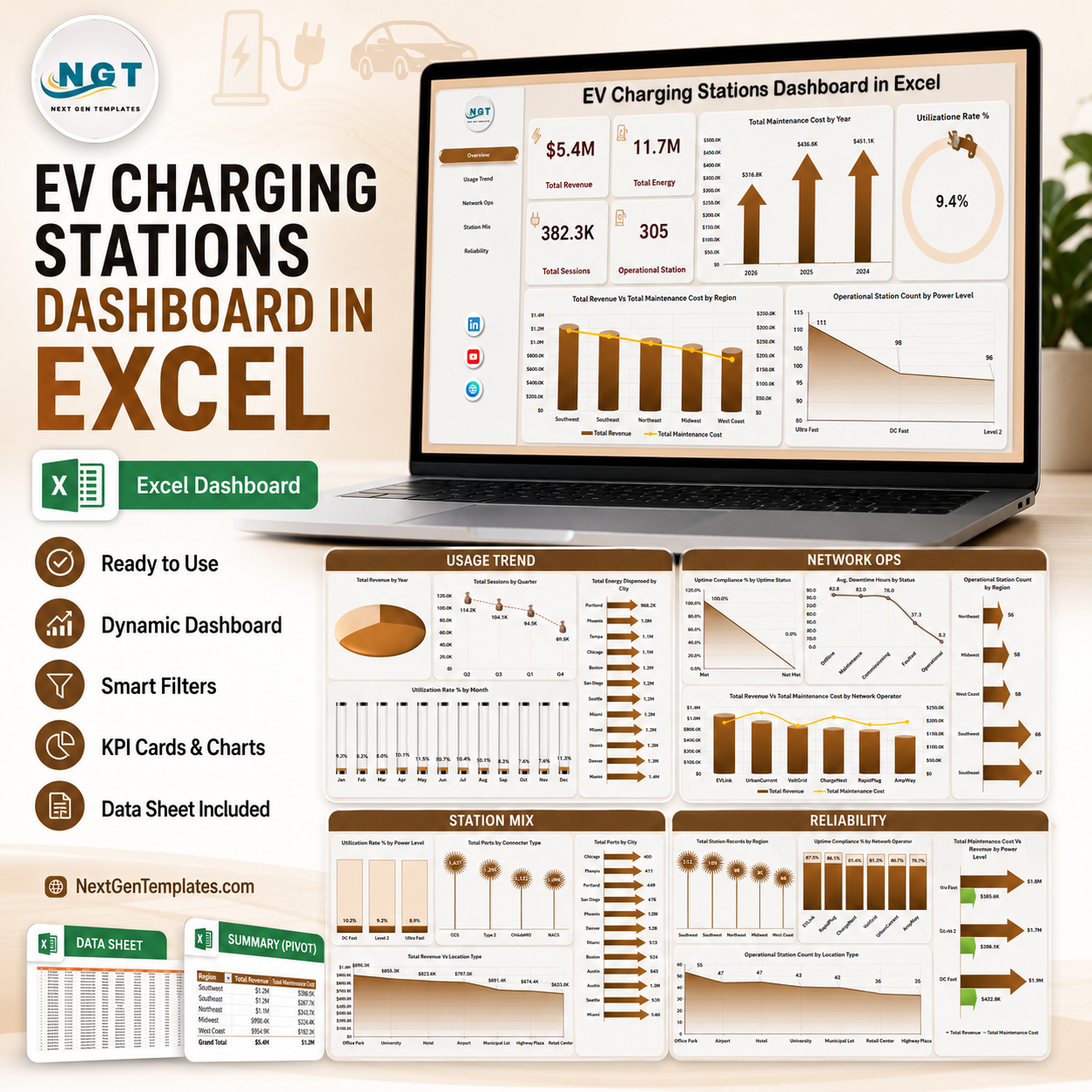


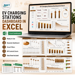
EV Charging Stations Dashboard in Excel helps charging network operators review revenue, energy dispensed, sessions, operational stations, maintenance cost, utilization, uptime, downtime, power level, connector type, region, city, and network operator performance in one editable workbook. The template includes 7 worksheet tabs, 4 headline KPI cards, multiple slicers, pivot-driven charts, a structured Data Sheet, and a Support Sheet that can be hidden after setup. For $17.99 one-time, you get a practical Excel reporting layer with instant download, no subscription, no per-user fee, and lifetime access.
Key Features of EV Charging Stations Dashboard in Excel
- 7 Excel sheet tabs covering Overview, Usage Trend, Network Ops, Station Mix, Reliability, Data Sheet, and Support Sheet.
- 4 high-level KPI cards for Total Revenue, Total Energy, Total Sessions, and Operational Station.
- 20 chart views for maintenance cost, utilization, revenue, sessions, energy, uptime, downtime, ports, power level, location type, city, region, and operator analysis.
- Multiple slicers help users filter the dashboard quickly and see focused views without rebuilding charts.
- Structured Data Sheet lets you replace sample records with your own EV charging station data in the same format.
- Support Sheet with pivot tables powers the dashboard dynamically and can stay hidden for normal users.
- Excel-native workflow with no SaaS subscription, no coding, and no add-ins required.
What’s Inside the EV Charging Stations Dashboard in Excel
1. Overview Page
The Overview Page gives charging operations leaders a fast summary of network performance. The cards at the top show Total Revenue, Total Energy, Total Sessions, and Operational Station so users can understand commercial performance, charging volume, activity, and active infrastructure before moving into detailed pages.
Total Maintenance Cost by Year: This chart shows how maintenance cost changes over time. It helps managers identify years with higher repair pressure or asset reliability issues.
Utilization Rate % by Overall Performance: This visual groups utilization by performance band. It helps users see whether chargers are underused, healthy, or running near capacity.
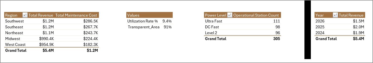
Total Revenue Vs Total Maintenance Cost by Region: This comparison connects revenue with service cost by region. It helps identify regions that generate strong revenue and regions where maintenance spending needs review.
Operational Station Count by Power Level: This chart shows the count of operational stations by charger power level. It helps teams understand the mix of slow, fast, and high-power stations in the active network.

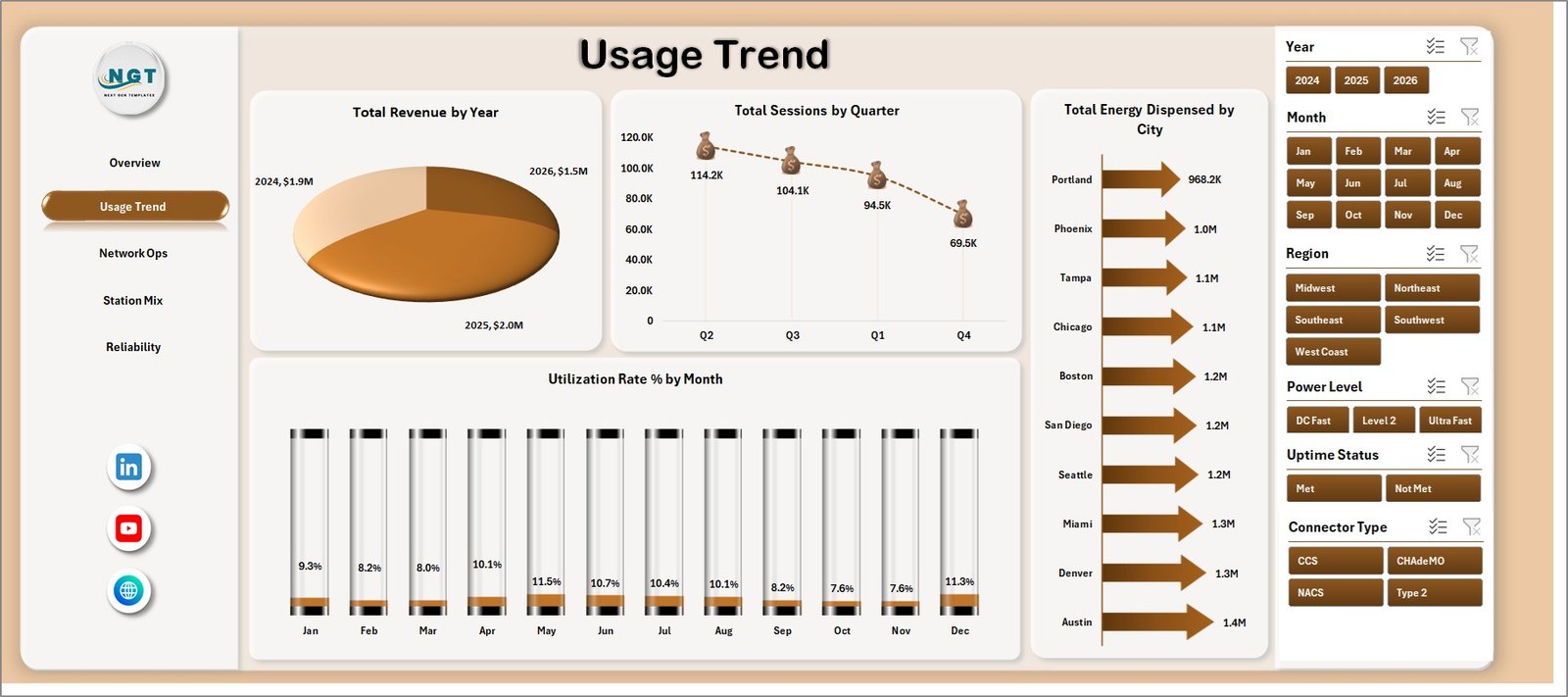
2. Usage Trend
The Usage Trend tab focuses on charging demand, seasonal movement, city-level energy delivery, and monthly utilization. Total Revenue by Year shows long-term commercial growth, while Total Sessions by Quarter helps teams see usage cycles and busy periods. Total Energy Dispensed by City highlights where charging demand is strongest, and Utilization Rate % by Month tracks month-to-month charger usage efficiency.
3. Network Ops
The Network Ops sheet reviews uptime, downtime, station count, and operator-level financial performance. Uptime Compliance % by Uptime Status shows whether stations are meeting reliability expectations. Avg. Downtime Hours by Status highlights service interruption patterns. Operational Station Count by Region compares active coverage, and Total Revenue Vs Total Maintenance Cost by Network Operator helps benchmark operator performance.

4. Station Mix
The Station Mix page explains how infrastructure is distributed across power levels, connector types, cities, and location types. Utilization Rate % by Power Level helps compare charger usage across power classes. Total Ports by Connector Type shows infrastructure compatibility, Total Ports by City reviews network density, and Total Revenue by Location Type identifies which locations produce stronger income.

5. Reliability
The Reliability tab supports operational review by region, network operator, power level, and location type. Total Station Records by Region shows where the dataset is concentrated. Uptime Compliance % by Network Operator compares reliability ownership, Total Maintenance Cost Vs Total Revenue by Power Level highlights profitability by charger class, and Operational Station Count by Location Type shows active site distribution.

6. Data Sheet Tab
The Data Sheet is where users add EV charging station records in the same format. Replace the sample rows with your own station, session, energy, revenue, maintenance, uptime, downtime, city, region, operator, connector, and power level data, then refresh the workbook.

7. Support Sheet
The Support Sheet contains pivot tables used to create the entire dashboard dynamically. After updating the Data Sheet, go to the Data tab in the Excel Ribbon and click Refresh All. All pivots and charts refresh together, and you can keep this sheet hidden.
EV Charging Stations Dashboard in Excel vs. Google Sheets vs. Paid CRM/SaaS – Where This Fits
| Feature | This Excel Dashboard | Google Sheets Alternative | Paid Charging SaaS |
|---|---|---|---|
| Cost | $17.99 one-time | Low direct cost, manual build time | Monthly or annual subscription |
| Platform | Microsoft Excel | Google Sheets | Vendor cloud platform |
| Setup time | Replace data and refresh | Build pivots and charts manually | Implementation and configuration |
| Customizable fields | Fully editable workbook | Editable if built manually | Limited by vendor settings |
| Year-1 cost at 5 users | $17.99 plus existing Excel access | Low tool cost, higher build time | Often hundreds or thousands |
| EV station analytics | Included across 5 analysis pages | Requires manual setup | Depends on plan and integrations |
Who This Template Is For – and Who It’s Not For
This template is for EV charging station operators, energy and utility teams, fleet charging managers, infrastructure planners, network operators, city mobility teams, operations analysts, and finance managers who need Excel reporting for revenue, energy, sessions, uptime, utilization, maintenance cost, downtime, power level, connector type, city, region, and station mix.
It is not a real-time charger management system, payment gateway, remote monitoring platform, OCPP control tool, customer mobile app, or live fault alerting system. It works best when charging records are already available in rows and columns.
How to Use the EV Charging Stations Dashboard in Excel
- Download and unzip the product file.
- Open the workbook in Microsoft Excel.
- Go to the Data Sheet and replace the sample records with your own EV charging station data.
- Keep the same column headers and format for clean pivot refresh.
- Click Data > Refresh All in the Excel Ribbon.
- Use slicers to filter by year, month, region, city, power level, connector type, location type, status, and operator.
- Hide the Support Sheet if you want a cleaner user-facing workbook.
Real-World Use Cases
Priya, charging network manager: Priya uses Overview and Network Ops to review total revenue, sessions, uptime, maintenance cost, and regional station availability before weekly operations calls.
Daniel, utility program analyst: Daniel uses Usage Trend and Station Mix to compare energy dispensed, charging sessions, power level usage, city coverage, and connector deployment.
Asha, fleet infrastructure planner: Asha uses Reliability to compare uptime compliance, downtime, revenue, and maintenance cost before planning new charging capacity.
Frequently Asked Questions
What does this dashboard track?
It tracks revenue, energy dispensed, charging sessions, operational stations, maintenance cost, utilization rate, uptime compliance, downtime hours, power level, connector type, city, region, location type, and network operator performance.
Can I use my own EV charging data?
Yes. Replace the sample rows in the Data Sheet while keeping the same structure, then click Refresh All.
Does it require macros?
No. The dashboard is designed around Excel tables, slicers, pivot tables, and charts.
Can I customize the workbook?
Yes. You can edit fields, labels, colors, charts, slicers, pivot tables, formulas, and worksheet names.
Can I hide the Support Sheet?
Yes. The Support Sheet can remain hidden while still powering the dashboard charts.
Is this a replacement for charger management software?
No. It is an Excel reporting template, not a live operational control platform.
About the Author
Built by PK – Microsoft Certified Professional with 15+ years of Excel, Google Sheets, and Power BI experience. Founder of NextGenTemplates, reaching 300K+ subscribers across YouTube channels. Every template is hand-built and tested before release.
Explore Related Templates
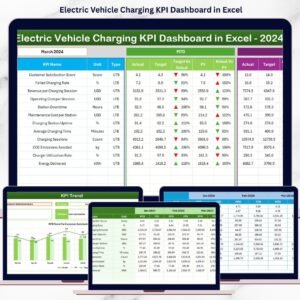
- Electric Vehicle Charging KPI Dashboard in Excel
- Electric Utility Maintenance Dashboard in Excel
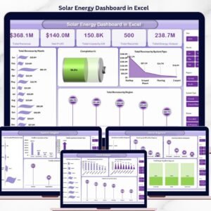
- Solar Energy Dashboard in Excel
- Browse Excel Dashboard Templates
Read the detailed blog post: EV Charging Stations Dashboard in Excel
Download the EV Charging Stations Dashboard in Excel and turn charging station records into clear revenue, usage, station mix, network operations, and reliability reporting.
Last updated: June 9, 2026.


Reviews
There are no reviews yet.