


 Defined KPIs with Trend Charts
 KPI Definitions for Team Alignment
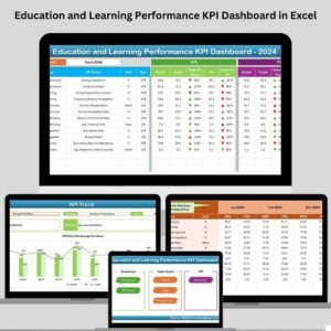
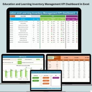
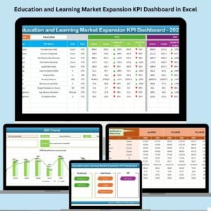
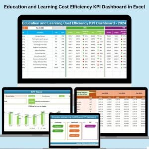
In today’s cost-conscious education and corporate training environments, tracking spending efficiency is just as important as tracking learning outcomes. Whether you run a corporate L&D team, a university program, or a nonprofit training department, the Education and Learning Cost Efficiency KPI Dashboard in Excel offers a complete solution to monitor, analyze, and improve your education-related spending.
This ready-to-use Excel dashboard is designed to provide you with monthly and year-to-date (YTD) performance visibility using interactive visuals, drop-downs, and smart formulas—all built in Excel.
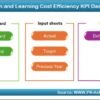
 What’s Inside the Dashboard?
This dynamic Excel tool includes 7 professionally designed worksheets, giving you full control and insight into your cost-efficiency KPIs:
 1. Home Sheet – Easy Navigation

-
Six smart buttons for one-click access to each worksheet.
-
Clean layout, no coding or advanced Excel skills required.
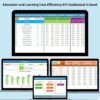
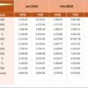
 2. Dashboard Sheet – Performance Snapshot
-
Select a Month (cell D3), and instantly view:
-
MTD and YTD Actuals
-
Comparison vs Targets
-
Comparison vs Previous Year
-
-
 Built-in up/down arrows and conditional formatting highlight performance status at a glance.
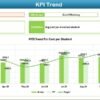
 3. KPI Trend Sheet – Analyze Trends Over Time
-
Pick any KPI from a drop-down.
-
View:
-
KPI Group, Unit, Type (UTB or LTB), and Formula
-
MTD and YTD trend lines across months
-
This is where your data tells a story.
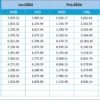
 4. Actual Numbers Input Sheet – Monthly Data Entry
-
Select the starting month once, and the rest of the year populates automatically.
-
Input MTD and YTD actuals for each KPI in an intuitive format.
5. Target Sheet – Set Smart Goals
-
Define monthly and yearly targets for each KPI.
-
Compare actuals with these to gauge performance.
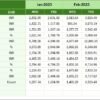
 6. Previous Year Number Sheet – For Long-Term Comparison
-
Record historical values to enable powerful year-over-year analysis.
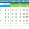
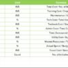
 7. KPI Definition Sheet – Team Alignment
-
Each KPI includes:
-
KPI Name & Group
-
Unit of measurement
-
Formula
-
Clear, concise definition
-
Ensures everyone interprets metrics the same way.
 Benefits of Using This Dashboard
 Transparency – See exactly where your learning budget is being used. Data-Driven Insights – Replace guesswork with reliable performance metrics.
 Benchmarking – Compare progress against previous years and set meaningful targets.
 Cost Optimization – Identify overspending, underutilization, or opportunities for savings.
 Decision Support – Present insights to leadership using visually engaging trend charts.
 Real-Life Example
Let’s say your “Cost per Learner” for Jan 2024 is ₹100, while the target is ₹90. The dashboard immediately shows the variance with a down arrow. By June, if the cost drops to ₹85, a green up arrow appears—visually confirming your efficiency improvement.
 Who Should Use This?
-
 Corporate Training Teams
 -
 Universities & Colleges
 -
Learning & Development (L&D) Managers
-
 HR & Talent Development Teams
 -
Nonprofits & NGOs running skill programs
Best Practices for Success
-
 Update data monthly – consistency drives accuracy.
 -
 Use historical data – benchmark and analyze long-term trends.
 -
Set realistic targets – informed by historical numbers.
-
Train your team – ensure uniform understanding of KPI meanings.
-
 Leverage visuals – trend charts help tell your performance story.
Why Excel?
Excel remains the most accessible and flexible tool:
-
Familiar to most users
-
No internet or software subscription needed
-
Built-in formulas, conditional formatting, and visuals
-
Easy to customize, scale, or export
 Conclusion
The Education and Learning Cost Efficiency KPI Dashboard in Excel is your ultimate tool to track spending, benchmark performance, and make informed decisions for any learning-focused initiative.
Whether you’re cutting costs, improving program ROI, or just ensuring budget utilization is on point—this dashboard will give you the visibility you need.
 Visit our YouTube Channel for step-by-step video guides.
 Click here to read the Detailed blog post


Reviews
There are no reviews yet.