Running a dairy processing plant is not just about production — it is about precision, quality, cost control, and operational efficiency.
When revenue, production cost, yield %, downtime, quality score, energy usage, and supplier performance are managed in separate reports, decision-making becomes slow and reactive.
The Dairy Products Processing Plant Dashboard in Excel gives you a centralized, interactive, and data-driven control system to monitor your entire plant in one structured platform.
With dynamic slicers, automated KPIs, and powerful visual analysis across five detailed pages, this dashboard transforms complex operational data into actionable insights.
This is not just an Excel file.
It is your plant performance command center.
🚀 Key Feature of Dairy Products Processing Plant Dashboard in Excel
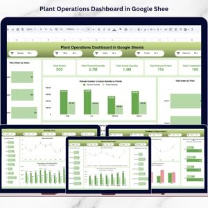
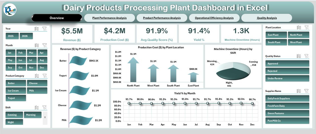
📊 Complete Operational Overview Page
Monitor Revenue, Production Cost, Yield %, Quality Score, and Downtime instantly.
🎯 Interactive Slicers for Smart Filtering
Filter by Year, Month, Product Category, Shift, Plant Location, Quality Status, and Supplier Name.
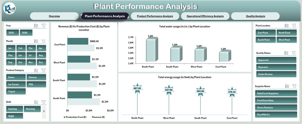
📈 Plant-Level Performance Comparison
Compare revenue, cost, water usage, and energy consumption across locations.
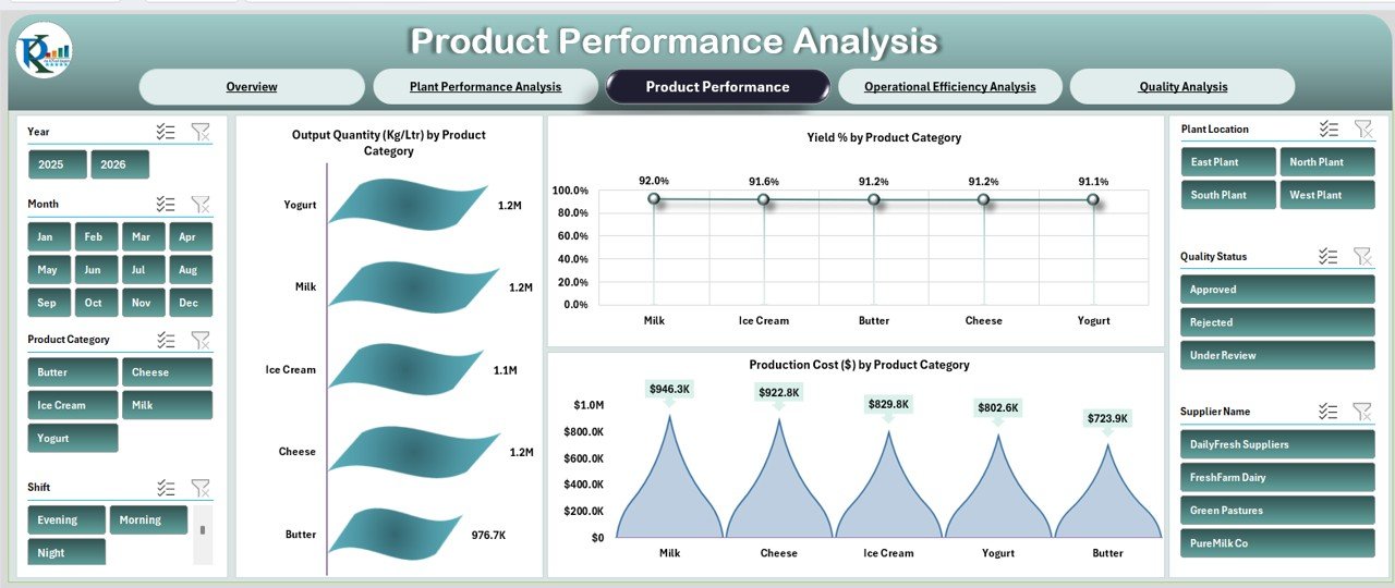
🧀 Product Category Analysis
Evaluate output quantity, yield %, and production cost by Milk, Cheese, Butter, Yogurt, and Ice Cream.
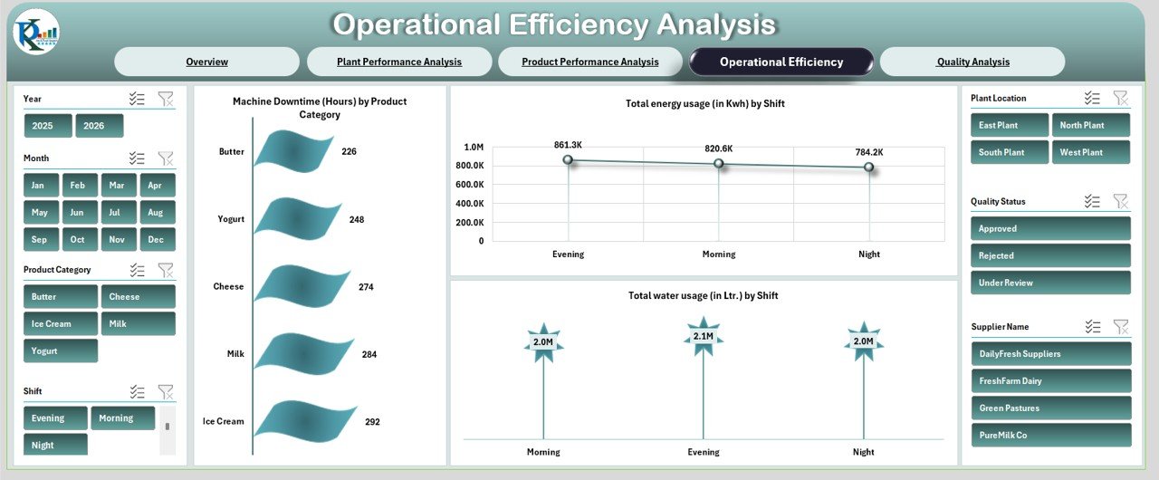
⚙️ Operational Efficiency Tracking
Track machine downtime, energy usage, and water consumption by shift.
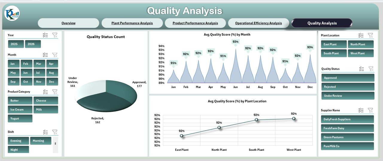
🛡 Quality Monitoring Dashboard
Analyze approval rates, rejection count, and average quality score trends.
💡 Automated KPI Cards
Instantly view plant health with visually designed KPI indicators.
📦 What’s Inside the Dairy Products Processing Plant Dashboard in Excel
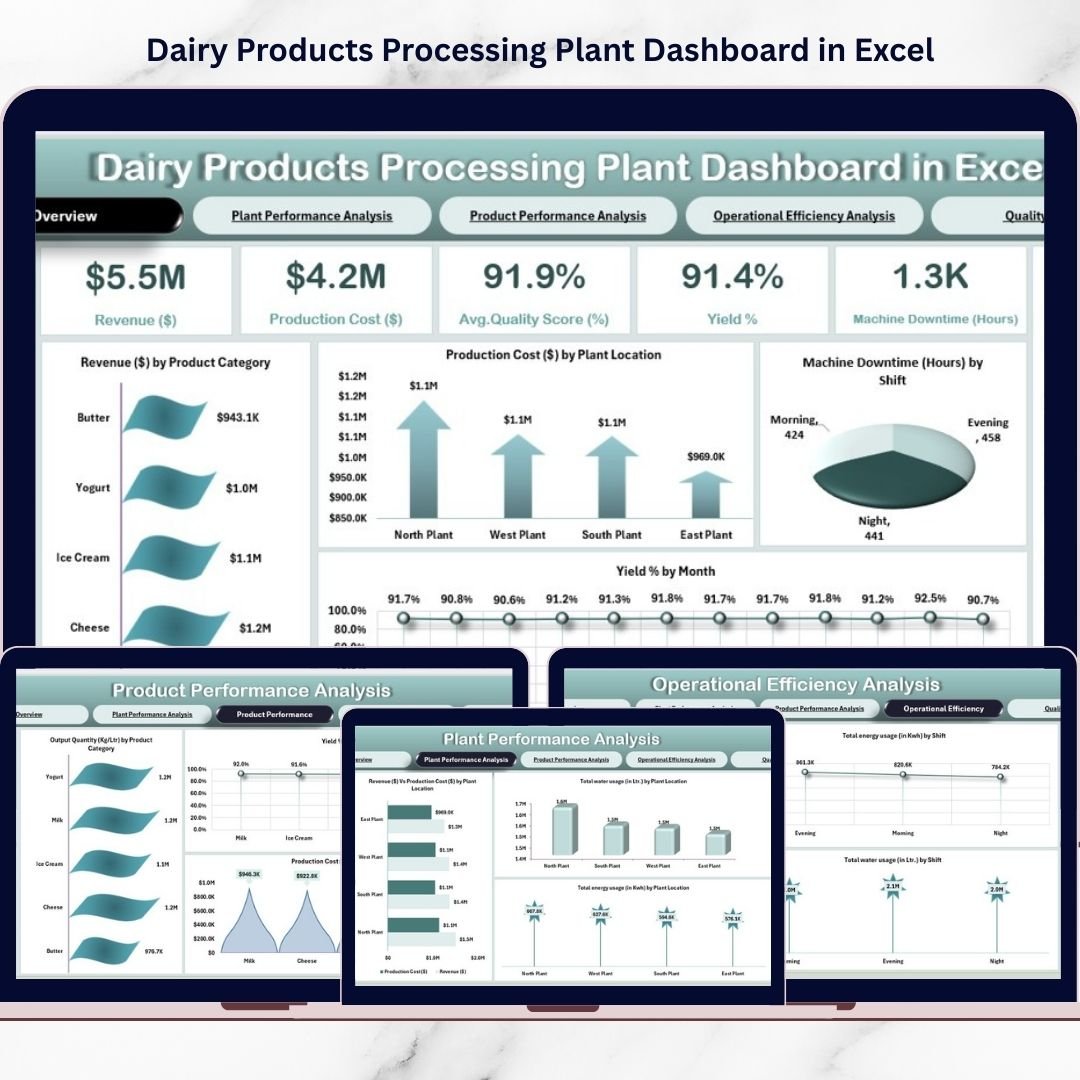
This ready-to-use Excel dashboard includes 5 powerful analytical pages:
📊 Overview Page
Your main control panel displaying:
-
Total Revenue
-
Production Cost
-
Average Quality Score
-
Yield Percentage
-
Machine Downtime
Includes visuals such as Revenue by Product, Cost by Plant, Downtime by Shift, and Yield by Month.
🏭 Plant Performance Analysis
Compare plant locations using:
-
Revenue vs Production Cost
-
Total Water Usage (Liters)
-
Total Energy Usage (KWh)
🧀 Product Performance Analysis
Analyze dairy categories with:
-
Output Quantity (Kg/Ltr)
-
Yield % by Product
-
Production Cost by Product
⚙️ Operational Efficiency Analysis
Track:
-
Machine Downtime by Product
-
Energy Usage by Shift
-
Water Usage by Shift
🛡 Quality Analysis Page
Monitor:
-
Approved, Rejected, Under Review counts
-
Monthly Quality Score Trends
-
Quality Score by Plant
Every page is interconnected, providing structured, real-time operational insights.
🛠 How to Use the Dairy Products Processing Plant Dashboard in Excel
Using the dashboard is simple:
1️⃣ Enter monthly production, cost, utility, and quality data.
2️⃣ Use slicers to filter by plant, shift, product, or supplier.
3️⃣ Review KPI cards on the Overview page.
4️⃣ Analyze plant and product performance trends.
5️⃣ Identify operational inefficiencies and take corrective action.
No advanced Excel skills required. The system updates automatically once data is entered.
👥 Who Can Benefit from This Dairy Products Processing Plant Dashboard?
This dashboard is ideal for:
🏭 Dairy Plant Managers
📊 Operations Heads
💰 Finance Managers
🛠 Maintenance Teams
🛡 Quality Control Managers
📦 Supply Chain Managers
Whether you operate a small processing unit or a multi-location dairy facility, this dashboard gives you full operational control.
When you measure performance, you improve it.
This dashboard helps you reduce cost, improve yield, control utilities, monitor downtime, and maintain consistent product quality.
Stop compiling reports manually.
Start making smarter, faster, data-driven decisions.
Click here to read the Detailed blog post
Watch the step-by-step video tutorial: