

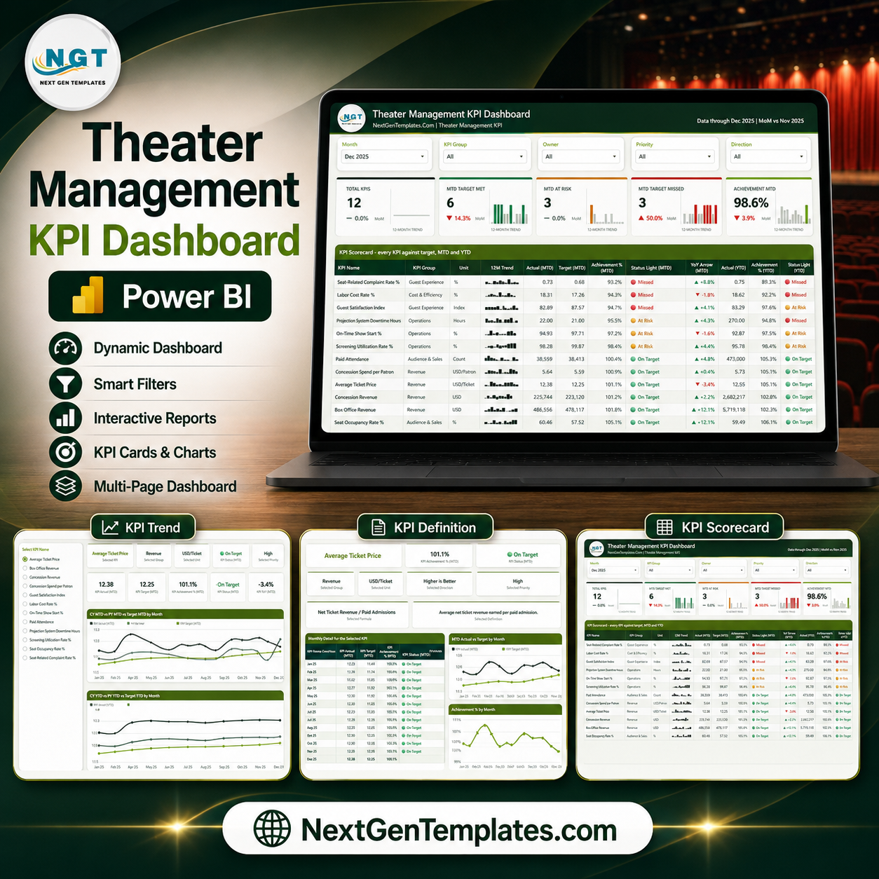
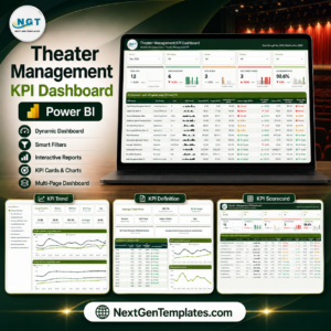
The Theater Management KPI Dashboard in Power BI is a ready-to-use KPI scorecard for cinemas, multiplexes and live-performance venues. Pick a month, and 12 theatre KPIs line up against target with red, amber and green traffic lights, MTD and YTD achievement percentages, month-on-month arrows and a 12-month sparkline on every row. It ships as a fully editable .pbix file with sample data already loaded, so you can open it and see the whole scorecard working before you swap in a single number of your own.
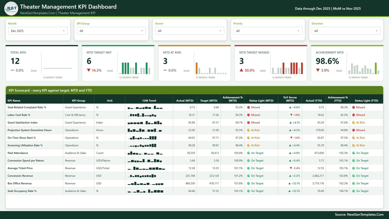
This is the scorecard line, not the analytical dashboard line. Where an analytical Power BI dashboard slices revenue by film, screen and showtime, this one answers a narrower and more useful management question every month: which KPIs hit target, which are drifting, and who owns them? If you want the broad slice-and-dice analysis as well, the analytical dashboards are a natural companion purchase rather than a replacement.
Key Features
- Month picker drives everything. One Month slicer sets the reporting period for the KPI cards, the scorecard table and the achievement maths. The sample file is set to Dec 2025 with MoM comparison against Nov 2025.
- Five summary KPI tiles across the top of the scorecard: Total KPIs, MTD Target Met, MTD At Risk, MTD Target Missed and Achievement MTD, each with a MoM delta and its own 12-month trend micro-chart.
- Traffic-light status on every KPI, in both MTD and YTD columns: On Target (green), At Risk (amber), Missed (red), so a management meeting can start at the red rows.
- 12 theatre KPIs across five groups – Revenue, Audience & Sales, Operations, Guest Experience and Cost & Efficiency – with per-KPI unit, target, actual, achievement %, YoY arrow and an inline 12M trend.
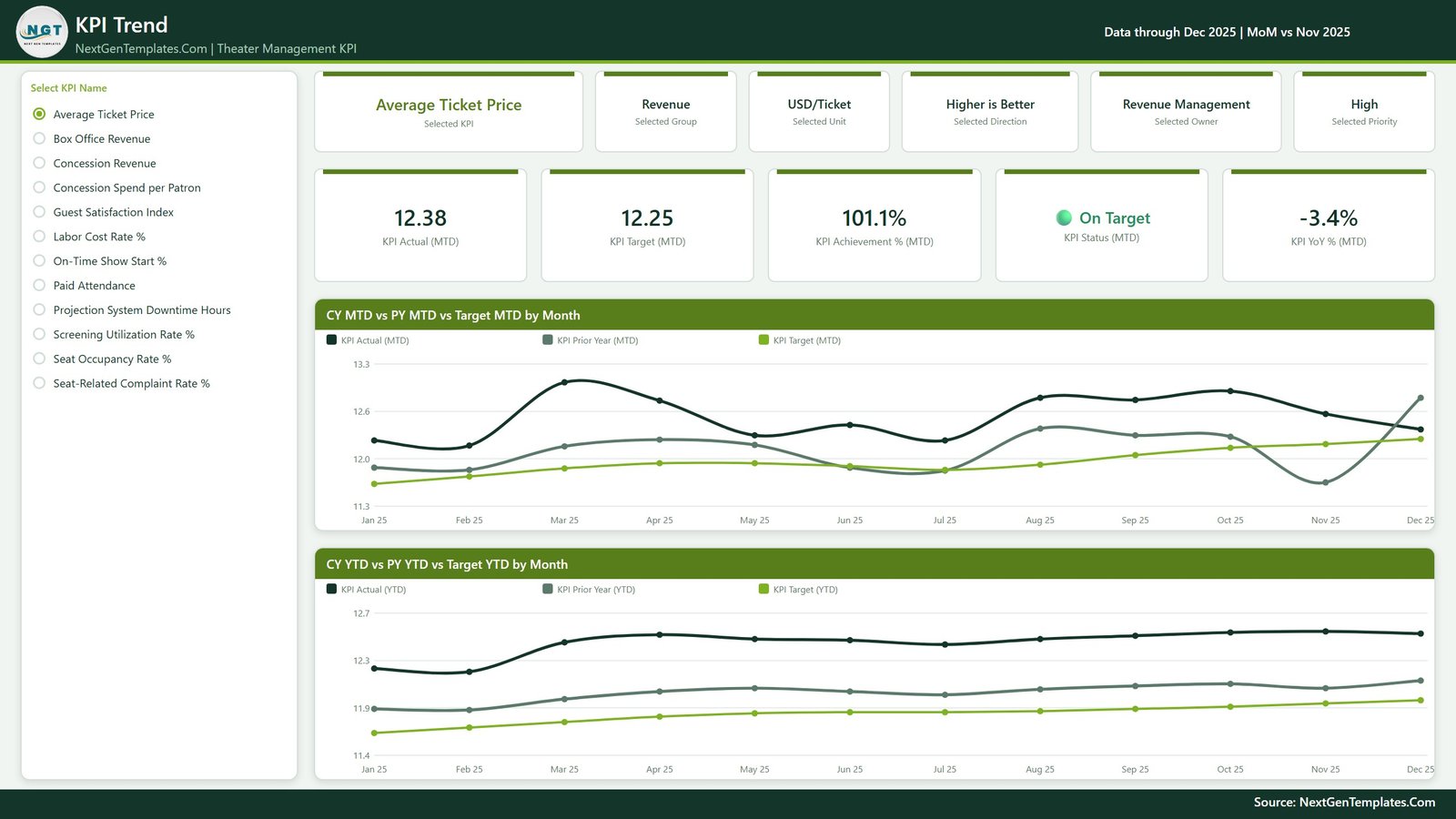
- KPI Trend page with a KPI selector: choose any single KPI and the whole page re-draws as CY MTD vs PY MTD vs Target MTD by Month, plus the same comparison on a YTD basis.
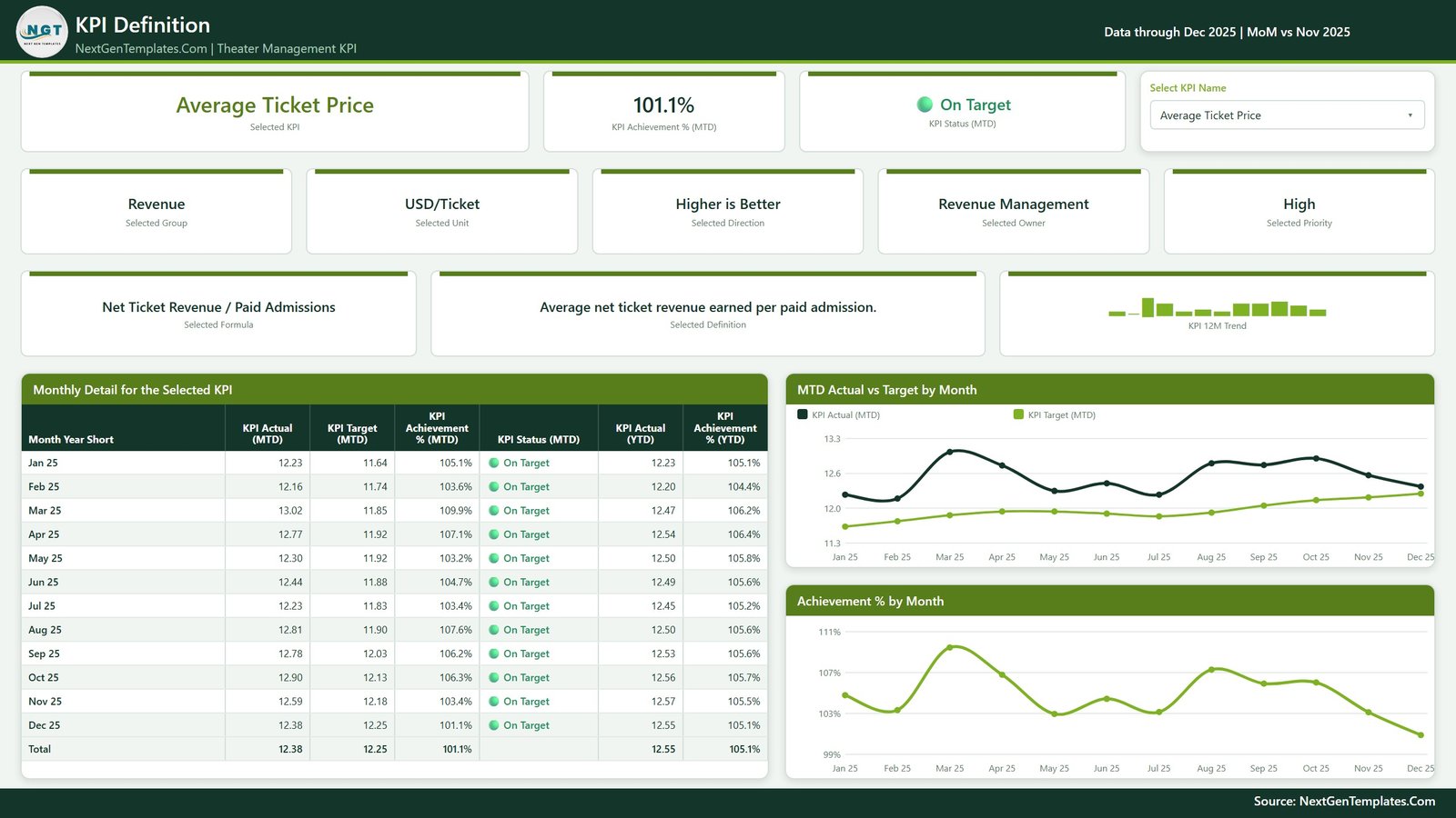
- KPI Definition page showing the selected KPI’s formula, owner, group, unit, direction and priority, alongside a month-by-month detail table and MTD Actual vs Target and Achievement % charts.
- Synced slicers, not drillthrough. The KPI selector is synced across the Trend and Definition pages, so picking a KPI on one page carries it to the other with no right-click menus to teach anyone.
- Higher-is-better and lower-is-better handled correctly. KPIs such as Labor Cost Rate % and Seat-Related Complaint Rate % score above 100% when they come in under target, via upper and lower tolerance bands defined per KPI.
- Filter by KPI Group, Owner, Priority and Direction to give each department head a view of only the KPIs they are accountable for.
- Native Power BI visuals only. Nothing to install, nothing locked, no custom visual approval needed from IT.
- One custom theme file drives every colour on every page, so rebranding to your venue’s palette is a single change.
The 12 KPIs Included
| KPI | KPI Group | Unit |
|---|---|---|
| Box Office Revenue | Revenue | USD |
| Concession Revenue | Revenue | USD |
| Average Ticket Price | Revenue | USD/Ticket |
| Concession Spend per Patron | Revenue | USD/Patron |
| Paid Attendance | Audience & Sales | Count |
| Seat Occupancy Rate % | Audience & Sales | % |
| Screening Utilization Rate % | Operations | % |
| On-Time Show Start % | Operations | % |
| Projection System Downtime Hours | Operations | Hours |
| Guest Satisfaction Index | Guest Experience | Index |
| Seat-Related Complaint Rate % | Guest Experience | % |
| Labor Cost Rate % | Cost & Efficiency | % |
What You Get – Page by Page
1. Theater Management KPI Dashboard
The scorecard itself. Month, KPI Group, Owner, Priority and Direction slicers sit across the top, five summary tiles below them, and then the full KPI Scorecard table – every KPI against target, MTD and YTD, with 12M Trend, Achievement %, Status Light and YoY Arrow columns.
2. KPI Trend
Select one KPI from the list on the left and the page becomes that KPI: header cards for group, unit, direction, owner and priority, value cards for Actual (MTD), Target (MTD), Achievement % (MTD), Status (MTD) and YoY % (MTD), then two line charts – CY MTD vs PY MTD vs Target MTD by Month and CY YTD vs PY YTD vs Target YTD by Month.
3. KPI Definition
The same synced KPI selector, this time showing the metric’s definition and formula in plain language – for example Average Ticket Price as Net Ticket Revenue / Paid Admissions. Below it, a Monthly Detail table for the selected KPI and two charts: MTD Actual vs Target by Month and Achievement % by Month. This is the page that ends the “how is this number calculated?” argument.
4. Get More Templates
A short reference page with customisation notes and links to the wider NextGenTemplates catalogue.
Who Is This For
- Cinema and multiplex general managers running a monthly performance review across screens and sites.
- Theatre and performing-arts venue operators tracking occupancy, ticket yield and front-of-house service quality.
- Revenue and concessions managers who need spend-per-patron and average ticket price against target, not just totals.
- Operations leads watching on-time show starts, screening utilisation and projection downtime.
- Power BI analysts and consultants who want a proven scorecard pattern – traffic lights, tolerance bands, synced KPI slicers – to reuse on any client.
Scorecard vs Analytical Dashboard – Which One Do You Need?
| This KPI Scorecard | An Analytical Dashboard | |
|---|---|---|
| Question it answers | Did we hit target this month, and who owns the misses? | Where is the revenue coming from, and how does it split? |
| Main object | A KPI table with traffic lights | Charts by film, screen, showtime, segment |
| Time model | MTD and YTD vs target and prior year | Free-form period slicing |
| Best used in | The monthly management meeting | Ad-hoc analysis between meetings |
| Setup effort | Fill three sheets in Data.xlsx and refresh | Map your transaction-level data |
Most venues end up using both. Start with the scorecard if your monthly reporting pack is the pain point.
How to Use It
- Download and unzip the package, then open the .pbix file in Power BI Desktop (free).
- Explore with the sample data. Change the Month slicer and watch the tiles, traffic lights and achievement percentages follow.
- Open Data.xlsx – three sheets, already structured: the KPI list with owners, groups, units, direction and tolerance bands, the monthly actuals, and the monthly targets.
- Replace the sample rows with your own months and values. Keep the column headers exactly as they are.
- Hit Home > Refresh in Power BI Desktop. The scorecard, both KPI pages and every trend chart update together.
- Recolour if you want to – the custom theme file drives every visual, so one theme change rebrands the whole report.
- Publish to the Power BI Service if you want to share it, or just send the .pbix around.
Frequently Asked Questions
Is this the same as the Theater Management KPI Dashboard in Excel or Google Sheets?
Same KPI set and the same scorecard idea, three different platforms. This is the Power BI build – a .pbix file with DAX-driven measures and Power BI slicers. Pick the one that matches the tool your team already uses.
Does it use drillthrough?
No. The KPI selector on the KPI Trend and KPI Definition pages is a synced slicer, so you click a KPI name and both pages follow. There is nothing to right-click and nothing to explain to new users.
Can I add or remove KPIs?
Yes. The KPI list is data, not hard-coded. Add a row to the KPI sheet in Data.xlsx with its group, owner, unit, direction and tolerance bands, supply its monthly actual and target rows, then refresh.
How do lower-is-better KPIs work?
Each KPI carries a direction flag and upper/lower tolerance bands. A KPI such as Labor Cost Rate % or Projection System Downtime Hours scores above 100% achievement when the actual comes in below target, and the traffic light follows the same logic.
Do I need a Power BI Pro licence?
Not to use the file. Power BI Desktop is free and opens everything here. A Pro or PPU licence is only needed if you want to publish and share the report through the Power BI Service.
Is the file locked or protected?
No. Every visual, measure and theme colour is editable. You own the file.
Is my own data uploaded anywhere?
No. Everything runs locally in Power BI Desktop against the Excel file you point it at.
What Is in the Download
- Theater Management KPI Dashboard in Power BI (.pbix) – four pages, ready to open
- Data.xlsx – the three-sheet data pack (KPI definitions, monthly actuals, monthly targets) pre-filled with 12 months of sample data
- The custom theme applied to the report
Instant download after purchase, lifetime access to the file, and free minor updates.
Related Templates and Reading
- Full walkthrough of this dashboard on PK: An Excel Expert
- Theater Management KPI Dashboard in Excel – the same scorecard for teams that live in Excel
- Theater Management KPI Dashboard in Google Sheets – the browser-based version
- Arts & Culture KPI Dashboard in Power BI – the wider cultural-venue scorecard
- Museum Operations KPI Dashboard in Power BI – visitor operations for museums and galleries
- Subscription Box KPI Dashboard in Power BI – subscriber retention and churn KPIs
Start Reporting on Your Theatre This Month
Building a scorecard like this from scratch – the tolerance logic, the MTD and YTD measures, the traffic lights, the synced KPI pages – is a week of work. This one is done. Download it, drop in your months, and walk into the next management meeting with every KPI already colour-coded.

Reviews
There are no reviews yet.