

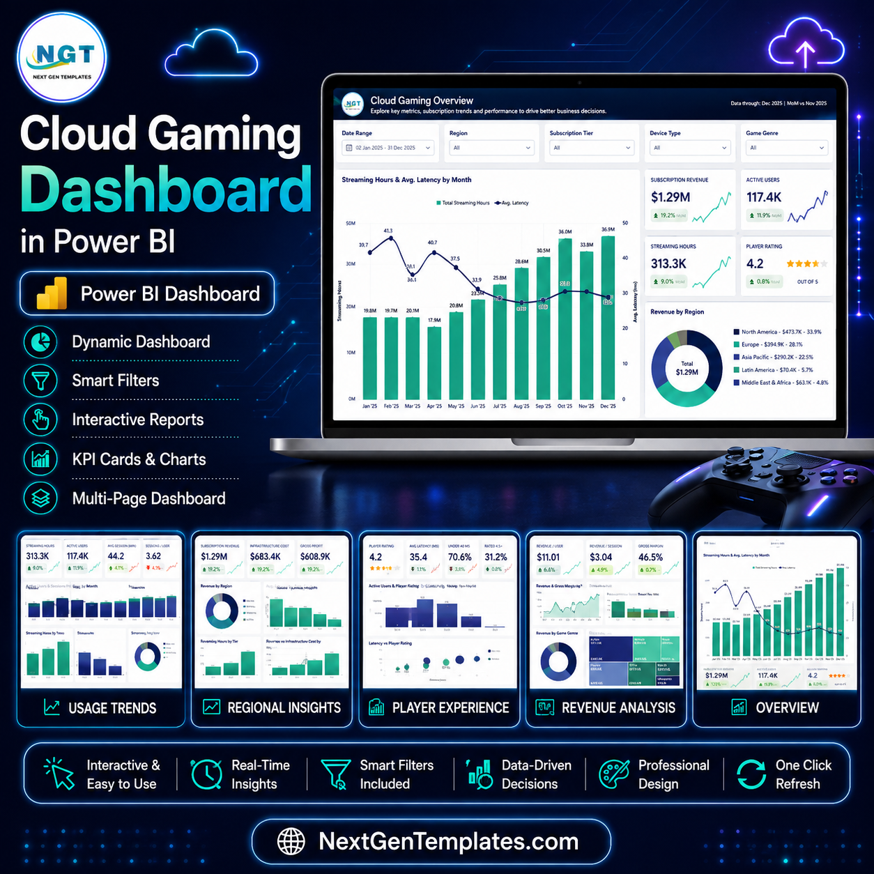
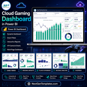
A cloud gaming platform is judged on two numbers at once: what players pay and how fast the pixels arrive. The Cloud Gaming Dashboard in Power BI puts both on the same canvas. The sample model carries 500 usage records across eight data centres, five regions, six device types, four streaming qualities and four subscription tiers for the full 2025 year, and it opens on $1.29M subscription revenue, 117.4K active users, 313.3K streaming hours and a 4.2 out of 5 player rating. Five pages, thirty-plus visuals, synced slicers throughout. Instant download, free lifetime updates, and if the file will not open in Power BI Desktop we refund it.
One thing to be clear about before you buy: this is the analytical Power BI dashboard line. It is built for month-over-month trend analysis, slicing and drillthrough. It is not the KPI scorecard line, which is a month-picker grid of traffic lights. If you wanted the scorecard format, the Gaming KPI Scorecard in Google Sheets is a different template and does that job.
Key Features of the Cloud Gaming Dashboard in Power BI
- Five report pages – Cloud Gaming Overview, Usage Trends, Regional Insights, Player Experience and Revenue Analysis – plus a hidden Details drillthrough page and tooltip pages that surface on hover.
- Five slicers per page, synced. Date Range, Region, Subscription Tier and Device Type stay in step across the report; the fifth slot changes per page to Game Genre, Streaming Quality, Data Center, Service Status or Game Title.
- SVG KPI cards with semantic deltas. Each card carries a MoM arrow and a sparkline – green for the direction you want, red for the direction you do not. Avg Session (min) shows a red 4.1% fall while Sessions / User shows a green 1.6% rise, so a drop in one metric never gets painted as good news.
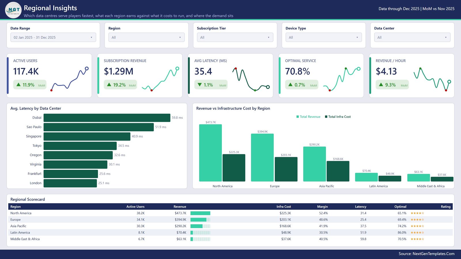
- Latency is a first-class measure. Avg. Latency by Data Center ranks London at 25.1 ms through to Dubai at 59.8 ms, and the Latency vs Player Rating scatter shows whether slower centres actually cost you stars.
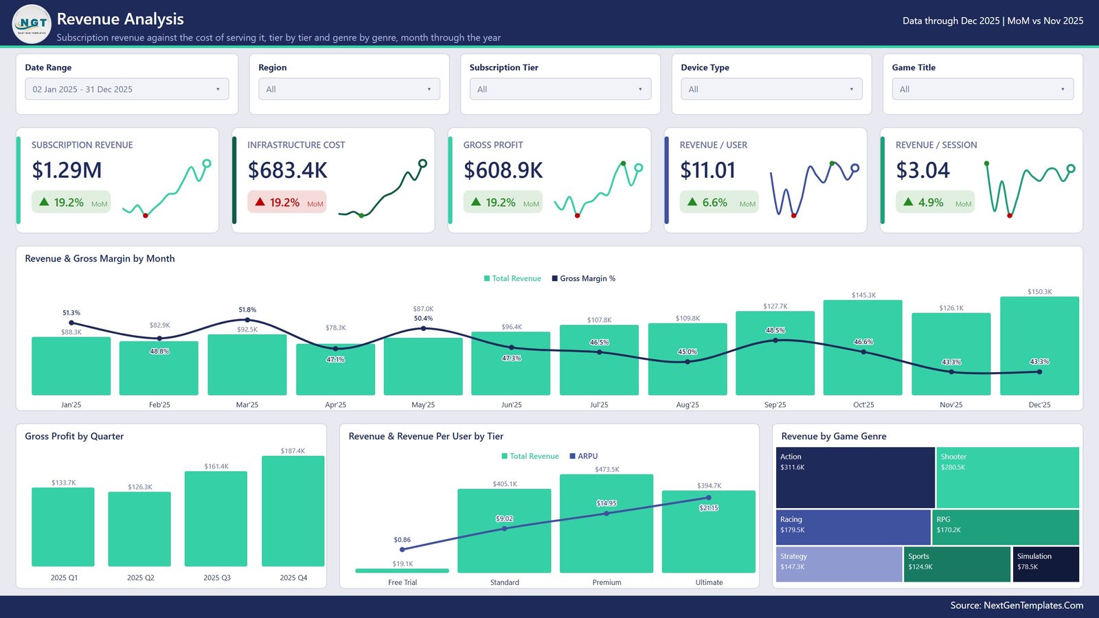
- Cost sits beside revenue. Revenue vs Infrastructure Cost by Region and Revenue & Gross Margin by Month mean margin is never inferred from a separate spreadsheet.
- Two scorecard tables with in-cell data bars and star ratings: a Regional Scorecard (users, revenue, infra cost, margin, latency, optimal share) and a Device Experience Scorecard (records, sessions, hours, latency, under-40ms share).
- A tidy semantic model – an import fact table, an M-generated date table, and named DAX measures you can read, so ARPU, gross margin and optimal-service share are defined once and reused everywhere.
What’s Inside the Cloud Gaming Dashboard in Power BI
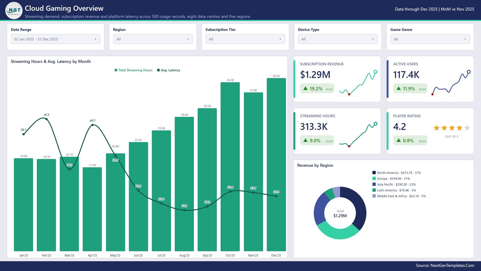
Page 1 – Cloud Gaming Overview. Four KPI cards (Subscription Revenue $1.29M, Active Users 117.4K, Streaming Hours 313.3K, Player Rating 4.2), a combo chart of Streaming Hours & Avg. Latency by Month, and a Revenue by Region donut that reads North America $473.7K, Europe $394.9K, Asia Pacific $290.2K, Latin America $70.4K and Middle East & Africa $63.1K.
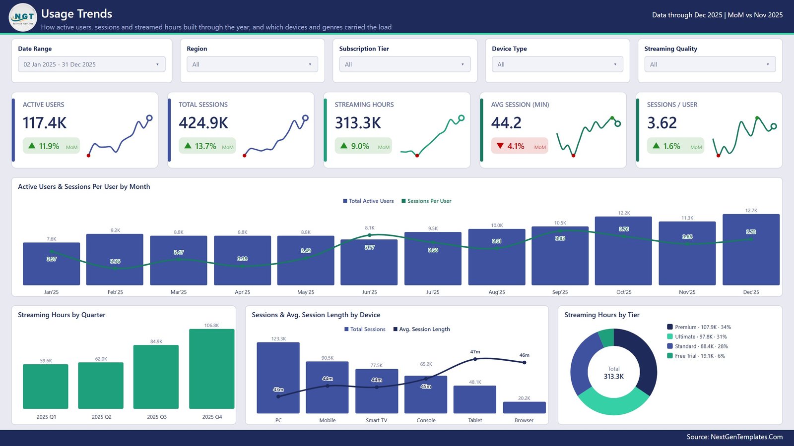
Page 2 – Usage Trends. Five cards ending in Sessions / User 3.62, then Active Users & Sessions Per User by Month, Streaming Hours by Quarter (59.6K, 62.0K, 84.9K, 106.8K), Sessions & Avg. Session Length by Device led by PC at 123.3K sessions, and Streaming Hours by Tier where Premium takes 34% and Free Trial 6%.
Page 3 – Regional Insights. Avg Latency 35.4 ms, Optimal Service 70.8% and Revenue / Hour $4.13 sit above Avg. Latency by Data Center, Revenue vs Infrastructure Cost by Region, and the Regional Scorecard – the table that tells you Latin America runs the highest optimal-service share at 86.0% on the thinnest 30.5% margin.
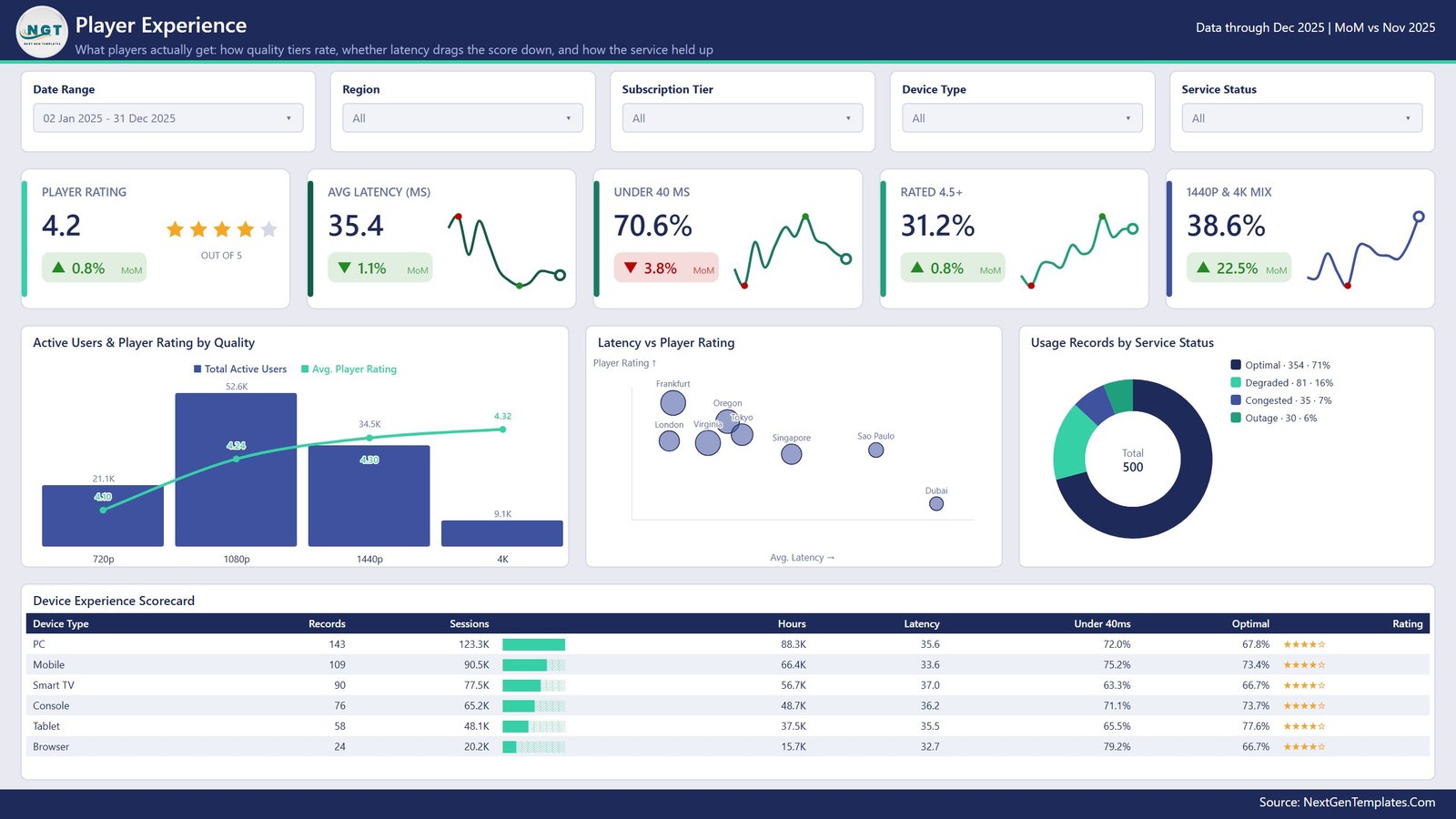
Page 4 – Player Experience. Under 40 ms 70.6%, Rated 4.5+ 31.2% and a 1440p & 4K Mix of 38.6%, with Active Users & Player Rating by Quality (720p rates 4.10, 4K rates 4.32), the Latency vs Player Rating scatter and a Usage Records by Service Status donut splitting the 500 records into Optimal 354, Degraded 81, Congested 35 and Outage 30.
Page 5 – Revenue Analysis. Subscription Revenue $1.29M against Infrastructure Cost $683.4K for $608.9K gross profit, Revenue / User $11.01 and Revenue / Session $3.04, then Revenue & Gross Margin by Month, Gross Profit by Quarter, Revenue & Revenue Per User by Tier (ARPU climbs $0.86 to $21.15 from Free Trial to Ultimate) and a Revenue by Game Genre treemap led by Action at $311.6K.
The file. One .pbix, built in Power BI Desktop, with the sample data loaded and every measure named in plain English.
Cloud Gaming Dashboard in Power BI vs. Tableau vs. a Paid Analytics SaaS – Where This Fits
| This template (Power BI) | Tableau / Qlik build | Paid analytics SaaS | |
|---|---|---|---|
| Cost | $17.99 once | $75/user/month plus build time | $500-$2,000/month |
| Platform | Power BI Desktop (free) | Tableau Desktop licence | Vendor cloud only |
| Setup time | Under an hour – swap the source | 2-6 weeks of build | 4-8 week onboarding |
| Real-time team collaboration | Via Power BI Service if you publish | Via Tableau Server | Built in |
| Mobile access | Power BI mobile app | Tableau mobile | Native apps |
| Customisable fields | Full – it is your model | Full | Vendor-defined |
| Share with link | Yes, once published | Yes | Yes |
| Year-1 cost at 5 users | $17.99 | $4,500+ | $6,000-$24,000 |
| Latency and data-centre analysis | Included on two pages | Build it yourself | Usually an add-on module |
| Revenue vs infrastructure cost | Included | Build it yourself | Often a separate finance product |
Who This Template Is For – and Who It’s Not For
It is for cloud gaming and game-streaming operators, platform and infrastructure teams who need latency and cost in one view, subscription businesses that bill by tier, analysts who would rather edit a finished model than start from a blank canvas, and anyone learning Power BI who wants a real report to take apart.
It is not for live operational monitoring – this reads a periodic export, it is not an alerting or observability tool. It is not a billing or subscription-management system; it reports on revenue, it does not collect it. It does not measure network performance itself – the latency figures come from your data, not from probes. And if you want a single-screen traffic-light scorecard rather than trend analysis, the KPI scorecard line is the other product.
How to Use the Cloud Gaming Dashboard in Power BI
- Unzip the download and open the .pbix in Power BI Desktop (free from Microsoft).
- Explore the five pages with the sample data still loaded so you can see what each measure means.
- Open Transform Data and point the source query at your own usage export, keeping the column names.
- Refresh. The KPI cards, both scorecards and every chart repopulate.
- Set the Date Range slicer to your reporting window; the other slicers stay synced as you move between pages.
- Right-click any bar or row and use Drill through to Details to see the underlying records.
- Rename measures or restyle the theme to your brand, then publish to the Power BI Service if you want to share a link.
Real-World Use Cases
Priya, platform operations lead. Dubai is the slowest data centre at 59.8 ms. She filters Regional Insights to Middle East & Africa, sees a 70.5% optimal-service share on $63.1K of revenue against $37.6K of infrastructure cost, and takes a costed case for a second edge node to the board.
Daniel, subscription growth manager. ARPU runs $9.02 on Standard and $14.95 on Premium. He uses the Revenue & Revenue Per User by Tier chart plus Streaming Hours by Tier to find that Standard players stream nearly as many hours as Premium ones, and builds an upgrade campaign around it.
Meera, player experience analyst. The 720p cohort rates 4.10 against 4.32 at 4K, and only 31.2% of records rate 4.5+. She slices Player Experience by Service Status to separate the 30 Outage records from the 81 Degraded ones before anyone blames the encoder.
Frequently Asked Questions
Do I need a paid Power BI licence?
No. Power BI Desktop is free from Microsoft and opens the file. A Pro or PPU licence is only needed if you want to publish and share the report through the Power BI Service.
Is this the same as the Cloud Gaming KPI scorecard?
No. This is the analytical dashboard – twelve months of trend, drillthrough and slicing. The KPI scorecard line is a different template built around a month picker and traffic lights. Buy the one that matches how you review numbers.
Can I use my own data?
Yes, that is the point. Replace the source query with your usage export and keep the column names, or remap them in Power Query. The 500 sample records are demo data only.
Does it connect to my cloud gaming platform automatically?
No. It reads a file or a data source you point it at. There is no built-in connector to any specific streaming vendor.
Are the numbers in the screenshots real?
No. Every figure shown – revenue, latency, ratings, regions and data-centre names – is generated sample data used to demonstrate the visuals.
Can I add my own pages and measures?
Yes. Nothing is locked. Add pages, write DAX, change the theme colours or delete visuals you do not need.
Is there an Excel version?
Yes – the Cloud Gaming Dashboard in Excel covers the same topic for teams without Power BI.
About the Author
Built by PK – Microsoft Certified Professional with 15+ years of Excel, Google Sheets, and Power BI experience. Founder of NextGenTemplates, reaching 300K+ subscribers across YouTube channels. Every template is hand-built and tested before release.
Explore Related Templates
- Cloud Gaming Dashboard in Excel – the same topic for an Excel-only team
- Gaming Esports Dashboard in Power BI – tournaments, viewers and prize pools
- Board Game Startups Dashboard in Power BI – a different corner of the games industry
- Subscription Box KPI Dashboard in Power BI – if recurring revenue is your main question
- Browse every Power BI dashboard template or the wider Power BI category
Download the Cloud Gaming Dashboard in Power BI today – instant download, editable .pbix, free lifetime updates. Read the full walkthrough on the Cloud Gaming Dashboard in Power BI blog post, and subscribe at youtube.com/@PKAnExcelExpert for tutorials.
Last updated: 19 August 2026




















Reviews
There are no reviews yet.