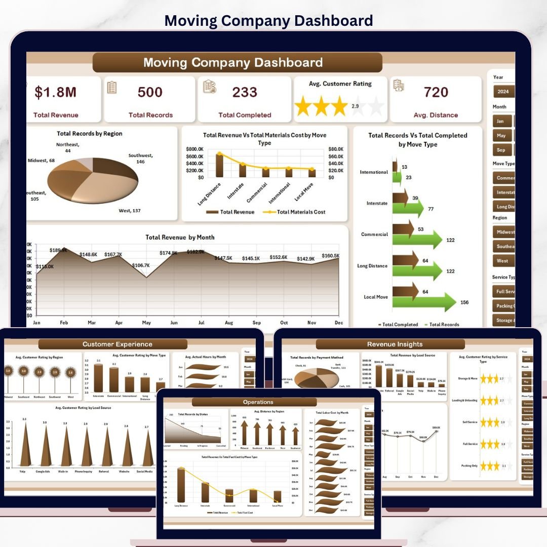

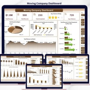
The Moving Company Dashboard in Excel tracks 5 headline KPIs across 5 interactive pages, with 20 pre-built charts covering revenue, move-type analysis, customer experience, and operations. Setup takes under 10 minutes — paste your job-level data into the Data sheet, click Refresh All, and every card, chart, and slicer on the Overview page rebuilds automatically through pivot tables.
🌍 Join 8,400+ teams in 40+ countries using NextGenTemplates to replace paid SaaS tools with one-time-purchase Excel, Google Sheets, Power BI, and HTML templates.
✅ Instant download · One-time payment · No subscription · No per-user fees · Lifetime access
Moving Company Dashboard
🔑 Key Features of the Moving Company Dashboard in Excel
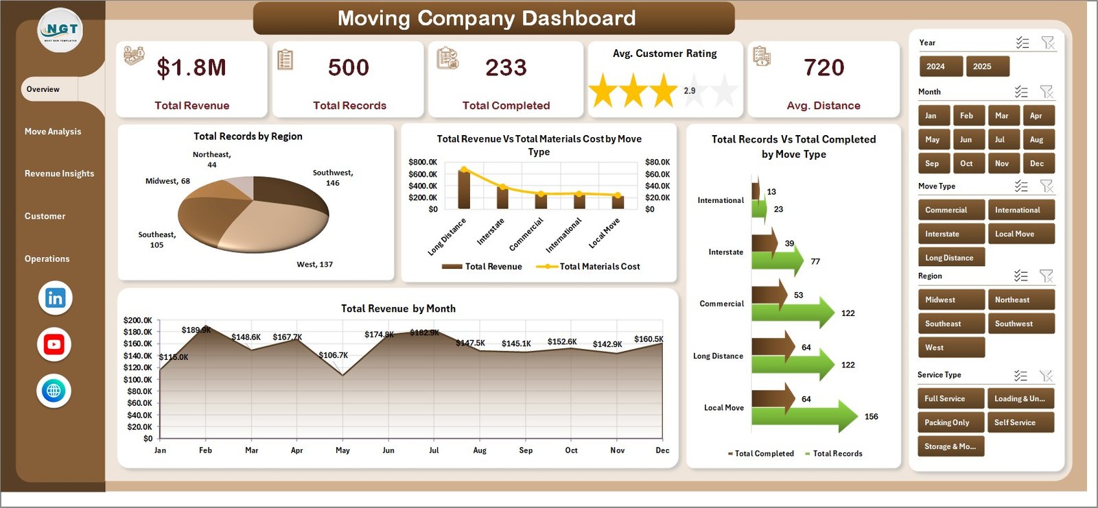
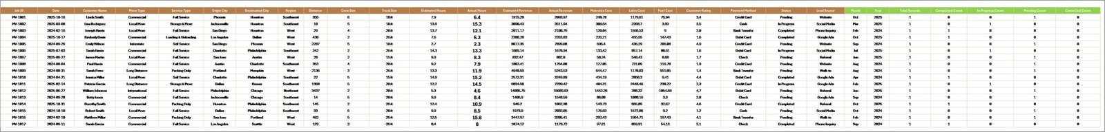
🔹 Five-KPI Overview Page – The top of the Overview page displays 5 card-style KPIs: Total Revenue, Total Records, Total Completed, Avg. Customer Rating, and Avg. Distance. Slicers on the right filter the entire report by region, move type, service type, or month in one click.
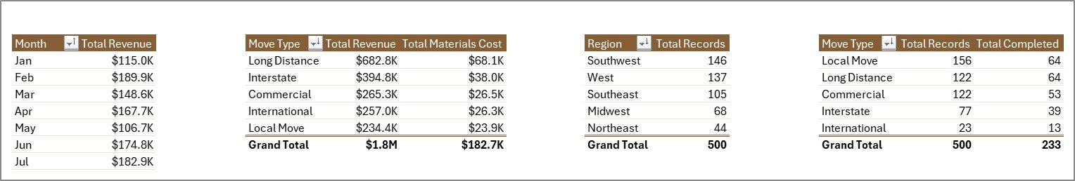
🔹 Total Revenue by Region – Ranks every region by booked revenue so franchise owners and regional managers instantly see which territories are pulling weight and which need sales support. Built directly off the pivot in the Support sheet — no formula edits required.
🔹 Revenue vs. Materials Cost by Move Type – A dual-series view that exposes which move types (Local, Long Distance, Commercial, International) are actually profitable after box, tape, and padding costs are stripped out. The fastest path to cutting a loss-making service line.
🔹 Records vs. Completed by Move Type – Completion-rate visibility at a glance. If Commercial shows 120 records booked but only 95 completed, that 20% attrition flags a crew-capacity or pricing problem before it becomes a refund problem.
🔹 Revenue by Month – 12-month seasonality view so operators can spot summer-peak months, plan crew hiring 60 days ahead, and benchmark year-over-year growth without rebuilding the chart every quarter.
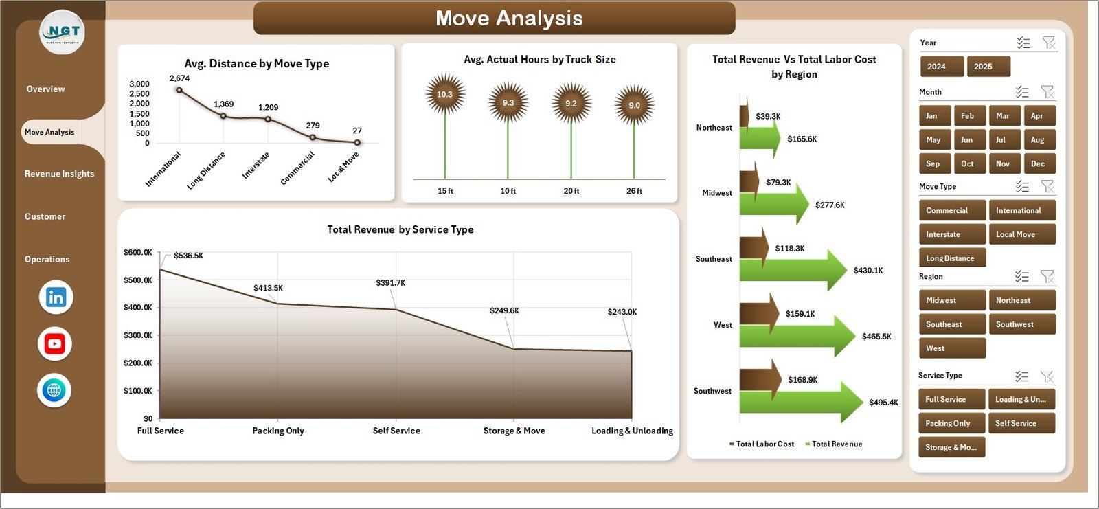
🔹 Move Analysis Page – Four charts: Avg. Distance by Move Type, Avg. Actual Hours by Truck Size, Revenue vs. Labor Cost by Region, and Revenue by Service Type. This is where ops managers diagnose why certain truck sizes run overtime or why labor cost in one region is eating margin.
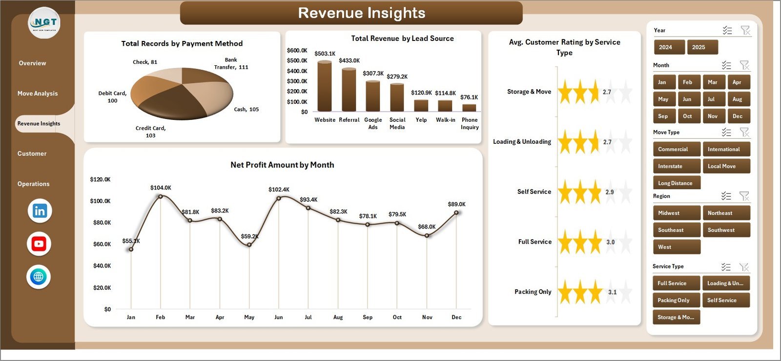
🔹 Revenue Insights Page – Four charts covering Total Records by Payment Method, Total Revenue by Lead Source, Avg. Customer Rating by Service Type, and Net Profit by Month. Exposes which lead channels (Google Ads, referrals, Thumbtack, website) are actually converting to profitable bookings.
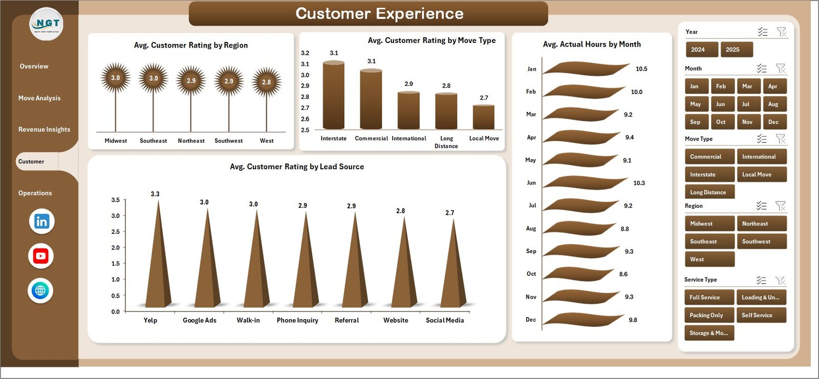
🔹 Customer Experience Page – Four charts on Avg. Customer Rating by Region, Move Type, Lead Source, plus Avg. Actual Hours by Month. The rating-by-lead-source view is especially valuable for filtering out low-intent lead channels that consistently produce 3-star reviews.
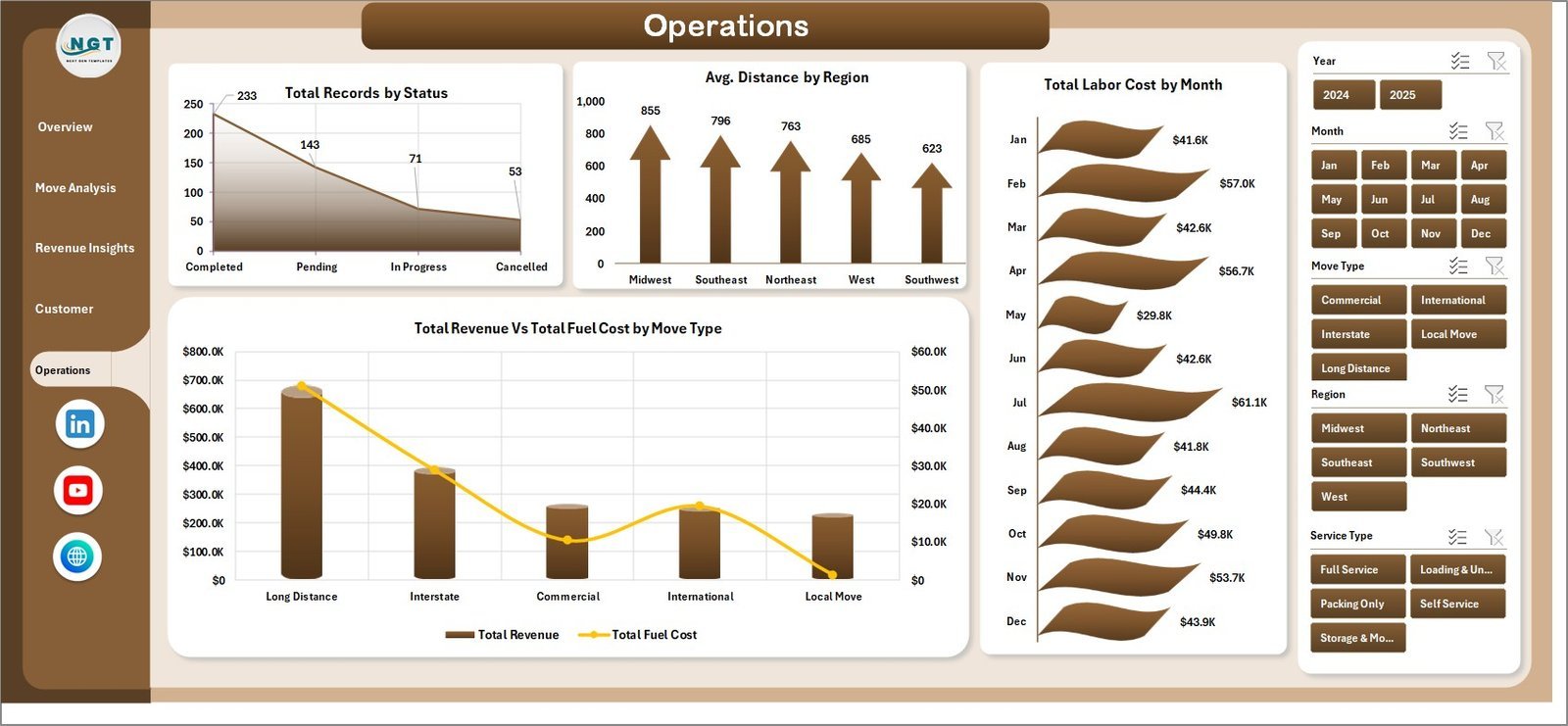
🔹 Operations Page – Four charts covering Total Records by Status, Avg. Distance by Region, Total Labor Cost by Month, and Revenue vs. Fuel Cost by Move Type. Used by dispatchers and operations leads for weekly crew-scheduling and cost-control reviews.
🔹 100% Pivot-Table Driven – Every chart, card, and slicer is fed by pivot tables in a hidden Support sheet. Update one row in the Data sheet, hit Data → Refresh All, and all 5 pages recalculate. No VBA, no macros — runs identically on Windows and Mac Excel 2016 or later.
📦 What’s Inside the Moving Company Dashboard in Excel
The file includes 7 Excel sheets, each with a specific role in the moving-company reporting workflow. Below is a page-by-page breakdown.
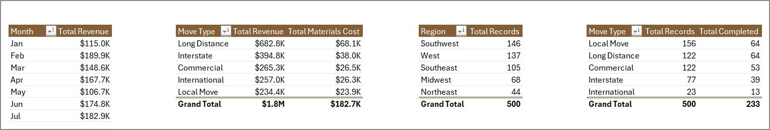
1. Overview Page — The main dashboard view. At the top, 5 KPI cards display Total Revenue, Total Records, Total Completed, Avg. Customer Rating, and Avg. Distance. Slicers filter the entire page by region, move type, service type, or month. Four charts cover the high-level analytical questions: Total Records by Region, Total Revenue vs. Total Materials Cost by Move Type, Total Records vs. Total Completed by Move Type, and Total Revenue by Month.

Move Analysis
2. Move Analysis Page — Four charts focused on operational job-level analytics: Avg. Distance by Move Type, Avg. Actual Hours by Truck Size, Total Revenue vs. Total Labor Cost by Region, and Total Revenue by Service Type. Use this page to diagnose labor cost overruns and identify which service types carry the best revenue-per-hour.

Revenue Insights
3. Revenue Insights Page — Four charts: Total Records by Payment Method, Total Revenue by Lead Source, Avg. Customer Rating by Service Type, and Net Profit Amount by Month. This is the page owners and finance teams use to review lead-channel ROI and monthly profitability trends.
Customer Experience
4. Customer Experience Page — Four charts on Avg. Customer Rating by Region, Avg. Customer Rating by Move Type, Avg. Actual Hours by Month, and Avg. Customer Rating by Lead Source. Quality managers use this page to flag crew-training needs and identify lead sources producing unhappy customers.

Operations
5. Operations Page — Four charts covering Total Records by Status, Avg. Distance by Region, Total Labor Cost by Month, and Total Revenue vs. Total Fuel Cost by Move Type. Dispatchers and operations leads use this view for weekly scheduling, fuel cost control, and backlog management.
Data Sheet tab
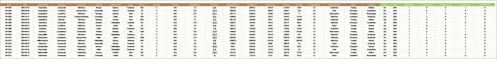
6. Data Sheet — The raw input sheet. Paste your job-level data into the same column structure (Job ID, Date, Region, Move Type, Service Type, Truck Size, Lead Source, Payment Method, Status, Distance, Actual Hours, Revenue, Labor Cost, Fuel Cost, Materials Cost, Customer Rating). Keep the headers identical — the pivot tables depend on them.
Support sheet tab
7. Support Sheet — Holds every pivot table that feeds the five dashboard pages. After updating the Data sheet, click Data → Refresh All in the Excel ribbon and every pivot recalculates. Keep this sheet hidden in production — dispatchers and owners only need to see the five dashboard pages.
📊 Moving Company Dashboard in Excel vs. Google Sheets Equivalent vs. SmartMoving / MoverBase SaaS — Where This Fits
| Feature | Moving Company Dashboard in Excel | Google Sheets equivalent | SmartMoving / MoverBase SaaS |
|---|---|---|---|
| Cost | $17.99 one-time | ~$20 one-time template | $99–$399 / user / month |
| Platform | Microsoft Excel (desktop) | Google Sheets (browser) | Web + mobile SaaS |
| Works offline | ✅ Yes | ❌ Requires internet | ❌ Requires internet |
| Setup time | Under 10 minutes | ~15 minutes | 2–4 weeks onboarding |
| Customizable KPIs & charts | ✅ Fully editable | ✅ Editable | ❌ Fixed reports |
| Per-user licence fees | None — share freely | None | $99+ per user / month |
| Customer data stays on your device | ✅ Yes | ❌ Cloud (Google servers) | ❌ Vendor cloud |
| Year-1 cost at 5 users | $17.99 | ~$20 | $5,940 – $23,940 |
| Revenue, fuel, labor, rating in one view | ✅ Pre-built | Needs rebuild | ✅ Pre-built |
For moving-company owners who want revenue-vs-cost visibility without paying $6,000+ per year in SaaS fees, the Moving Company Dashboard in Excel sits in the sweet spot.
👥 Who This Template Is For — and Who It’s Not For
✅ This template is built for:
- Owners of local moving companies (1–20 trucks) tracking jobs across 2–10 regions
- Long-distance and commercial movers running 50–500 jobs per month
- Franchise operators benchmarking regional performance against HQ targets
- Relocation-services managers reviewing lead-source ROI and service-type profitability
- Dispatchers and operations leads running weekly crew scheduling and cost reviews
❌ This template is NOT for:
- Enterprise carriers running 500+ trucks with integrated dispatch, fuel cards, and DOT compliance (use McLeod or TMW)
- Teams needing live GPS tracking, automated crew SMS, or customer-facing booking portals (use SmartMoving or MoverBase)
- Google Sheets-only teams — browse our Google Sheets Dashboards collection instead
⚙️ How to Use the Moving Company Dashboard in Excel
- Download and open the .xlsx file in Microsoft Excel 2016 or later, on Windows or Mac.
- Go to the Data sheet and replace the sample rows with your job-level data. Keep every column header identical.
- Click Data → Refresh All in the Excel ribbon. Every pivot table in the Support sheet recalculates automatically.
- Open the Overview page. All 5 KPI cards and 4 charts reflect your data. Use the slicers to filter by region, move type, service type, or month.
- Switch between the Move Analysis, Revenue Insights, Customer Experience, and Operations pages to diagnose specific parts of the business.
- Hide the Support sheet before sharing the file with dispatchers or crew — they only need the five dashboard pages.
💼 Real-World Use Cases
Mike runs a 6-truck local moving company in Phoenix with 3 regional service areas. He uses the Moving Company Dashboard in Excel each Monday to review the Revenue vs. Labor Cost by Region chart and spot which of his three territories is eating margin. The Avg. Customer Rating by Lead Source chart helped him cut spend on a lead-gen channel that was producing 3.2-star reviews — saving roughly $2,400 per month in wasted ad spend.
Priya manages operations at a long-distance mover with 18 trucks across 5 US states. She uses the Revenue vs. Fuel Cost by Move Type chart to catch fuel-cost creep on long-haul commercial moves and the Records vs. Completed by Move Type chart to flag jobs stuck in booked status — cutting refund requests by around 30% in one quarter without paying for SmartMoving’s $399/month plan.
Carlos owns a commercial-relocation business in Miami with 25 crew members. He needs monthly P&L reports for his CFO but can’t justify $99/user/month for MoverBase with 6 seats. The Moving Company Dashboard in Excel gives him Net Profit by Month and Revenue by Lead Source views, runs offline on his MacBook, and cost the business $17.99 once.
❓ Frequently Asked Questions
What KPIs does the Moving Company Dashboard in Excel track?
The Moving Company Dashboard tracks 5 headline KPIs on the Overview page: Total Revenue, Total Records, Total Completed, Avg. Customer Rating, and Avg. Distance. It also includes 20 charts across 5 pages covering revenue, move type, labor cost, fuel cost, lead source, payment method, and customer rating analytics.
How does this compare to SmartMoving or MoverBase?
SmartMoving and MoverBase typically charge $99–$399 per user per month — reaching $6,000–$24,000 per year at 5 seats. The Moving Company Dashboard in Excel is a $17.99 one-time purchase with no per-user fees, works offline, and keeps customer contact and pricing data on your device rather than in a vendor cloud.
How long does setup take?
Setup takes under 10 minutes. Open the .xlsx file, paste your job-level data into the Data sheet (keep the column headers identical), then click Data → Refresh All. Every card, chart, and slicer across all 5 dashboard pages updates automatically. No formulas to edit.
Does this template work on Mac Excel?
Yes. The Moving Company Dashboard in Excel is built entirely with pivot tables and slicers — no VBA, no macros — so it runs identically on Windows Excel and Mac Excel 2016 or later. No internet connection required, which matters when reviewing commercially sensitive crew pay and customer pricing data.
Can I add my own regions, move types, or lead sources?
Yes. Add any new regions, move types, service types, lead sources, or truck sizes directly to the Data sheet. After adding rows, click Data → Refresh All and every pivot table on the Support sheet picks up the new values and populates the Overview, Move Analysis, Revenue Insights, Customer Experience, and Operations pages.
Is my customer and pricing data safe with this template?
Data stays on your device. The Moving Company Dashboard in Excel doesn’t connect to any cloud service, API, or external database. Customer contact details, crew pay rates, and move-level pricing data never leave your machine — a critical advantage over SaaS platforms where third parties can access your commercially sensitive records.
Can multiple team members use the same file?
Yes. Email the .xlsx file or share it via OneDrive, Dropbox, or SharePoint. There’s no per-user licence — dispatch, sales, and finance staff can all open and filter the Moving Company Dashboard freely with any Microsoft Excel installation, at zero extra cost.
👤 About the Author
Built by PK — Microsoft Certified Professional with 15+ years of Excel, Google Sheets, and Power BI experience. Founder of NextGenTemplates, reaching 300K+ subscribers across YouTube channels (@PK-AnExcelExpert, @NextGenTemplates, @NeoTechNavigators). Every template is hand-built and tested before release.
🔗 Explore Related Templates
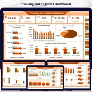
🔹 Trucking Companies Dashboard in Excel — Sister template focused on long-haul fleet operations, driver productivity, and fuel-cost analysis.
🔹 Warehouse Efficiency Dashboard in Excel — Tracks fulfillment rate, pick time, and shipping cost for teams running a warehouse leg of the move.
🔹 Procurement Management Dashboard in Excel — Manage packing-material, fuel-card, and truck-rental vendor spend in one view.
🔹 Also available as: Trucking & Logistics Dashboard in Google Sheets and Trucking & Logistics Dashboard in HTML.
💎 Save on the full logistics ops stack — Get the Manufacturing Excellence Bundle → 8 premium Excel + Power BI operations templates for one bundle price.
Also browse all our Excel Dashboard Templates for more industry-specific reports.
📖 Click here to read the Detailed Blog Post
🎥 Visit our YouTube channel for step-by-step video tutorials
👉 YouTube.com/@NextGenTemplates
📅 Last updated: April 2026


Reviews
There are no reviews yet.