

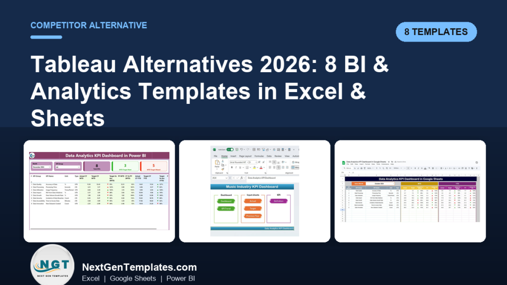
The best Tableau alternative for most small teams is a ready-made BI & analytics template in Power BI, Excel or Google Sheets. Instead of paying $75 per Creator seat every month, you buy an affordable BI & analytics tool once for $7.99–$14.99 and own the dashboard, the model and the data forever.
Last updated: August 2026
Key takeaways
- Tableau’s published list price is $75/user/month for Creator, $42 for Explorer and $15 for Viewer (billed annually) — a five-person team runs past $3,000 a year before a single dashboard ships.
- The strongest one-for-one swap is the Data Analytics KPI Dashboard in Power BI at $11.99 once — the same visual-analytics workflow without the per-seat meter.
- All 8 templates below are a one-time $7.99–$14.99 purchase, in Excel, Google Sheets or Power BI, with no seats, no admin console and no renewal.
- Teams churn off Tableau for three reasons: seat cost, paid-for modules nobody opens, and the admin overhead of Server/Cloud governance.
- Tableau still wins when you need live million-row queries, row-level security across hundreds of users, or a governed enterprise data catalog — we say exactly when below.
 Launch offer
SUMIFS, XLOOKUP, FILTER, LAMBDA and checking AI-written formulas, with real business projects. 11h 47m of video by PK, with practice files, quizzes and a capstone.
Tableau alternative templates compared
| Template | Format | Best for | Price |
|---|---|---|---|
| Data Analytics KPI Dashboard in Power BI (Best overall) | Power BI | A direct Tableau visual-analytics replacement | $11.99 |
| Data Analytics KPI Dashboard in Excel | Excel | Offline, self-contained analytics | $14.99 |
| Data Analytics KPI Dashboard in Google Sheets | Google Sheets | Cloud collaboration (Tableau Cloud swap) | $9.99 |
| Google Analytics KPI Dashboard in Excel | Excel | Web & marketing analytics | $14.99 |
| Regulatory Reporting KPI Dashboard in Excel | Excel | Compliance & regulated reporting | $14.99 |
| Sustainability Reporting KPI Dashboard in Power BI | Power BI | ESG & sustainability analytics | $11.99 |
| Sustainability Reporting KPI Dashboard in Google Sheets | Google Sheets | Collaborative ESG tracking | $9.99 |
| Data Analytics Dashboard Report in Excel (Best value) | Excel | Entry-level analytics report | $7.99 |
Why small teams churn off Tableau
Tableau is a superb enterprise BI platform, but the bill and the busywork rarely fit a team of five. According to the official Tableau pricing page, the published list rates are $75/user/month for a Creator, $42 for an Explorer and $15 for a Viewer, all billed annually. Three patterns push small teams to the exit:
- Seat cost that scales the wrong way. One analyst plus four people who just need to read a chart still costs roughly $75 + (4 × $15) = $135/month, about $1,620 a year — and it climbs every time you add a viewer.
- Modules nobody opens. Data prep, Pulse, Einstein/AI add-ons and Server governance are priced in, yet most small teams use maybe a fifth of them. You pay for the platform, not your usage.
- Admin overhead. Tableau Cloud/Server means site roles, permissions, extract-refresh schedules and version upgrades — a real part-time job before anyone builds a dashboard.
A pre-built template flips all three: you pay once, every KPI and chart is already wired, and there is no console to administer. The head-to-head below maps each Tableau capability to the NGT template that covers it and the price you pay for it.
Tableau feature vs the template that covers it
| What you use Tableau for | NGT template that covers it | Price |
|---|---|---|
| Interactive KPI dashboard & visual analytics | Data Analytics KPI Dashboard in Power BI | $11.99 once |
| Ad-hoc analysis without a server | Data Analytics KPI Dashboard in Excel | $14.99 once |
| Shared cloud dashboards (Tableau Cloud) | Data Analytics KPI Dashboard in Google Sheets | $9.99 once |
| Marketing / web traffic reporting | Google Analytics KPI Dashboard in Excel | $14.99 once |
| Regulated / compliance reporting | Regulatory Reporting KPI Dashboard in Excel | $14.99 once |
| ESG & sustainability scorecards | Sustainability Reporting KPI Dashboard in Power BI | $11.99 once |
How we picked these
We searched the full NextGenTemplates catalog of 900+ paid templates and filtered to the BI, analytics and KPI-dashboard products that reproduce a Tableau workflow — a data model, calculated measures and interactive visuals. We prioritised templates that ship in more than one format (Excel, Google Sheets and Power BI) so a reader can match their existing stack, and that carry a real, published price under $15.
We excluded single-chart freebies, static PDFs and anything without a working data model, because those do not replace Tableau’s analytical layer. Every product here is a paid, supported template with a live product page, gallery preview and one-time price — no subscriptions, no per-seat billing.
The 8 best Tableau alternative templates for 2026
1. Data Analytics KPI Dashboard in Power BI — best overall

Why it is #1: Power BI is the closest mainstream tool to Tableau — the same drag-and-visual-analytics model — and this template hands you a finished analytics report inside it, so you skip both the Tableau seat and the blank-canvas build.
Who it is for: An analyst or founder who wants Tableau-style interactive dashboards but on the Power BI licence they may already have (Power BI Desktop is free).
- Pre-built KPI cards with MTD/YTD, actual-vs-target and variance measures.
- Drill-down visuals, slicers and a clean, filterable model.
- A structured data table you repoint at your own numbers.
- Ships as a ready
.pbix-style project you open and rebrand.
Swap in monthly sales, ops or finance data and you have a boardroom-ready report in an afternoon — the same output a Tableau Creator seat produces, for a one-time $11.99 instead of $75/month. For a wider view of Power BI options, see our roundup of Power BI dashboard templates ranked by industry.
Best for: teams that want a true Tableau-style analytics experience without the recurring seat cost. Get it for $11.99 →
2. Data Analytics KPI Dashboard in Excel
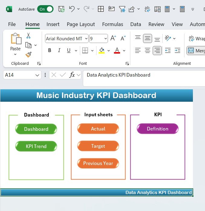
What it is: a full analytics dashboard built entirely in Excel — no server, no add-in, no login.
Who it is for: teams that live in Excel and want their analytics to travel in one file.
- KPI tiles, trend charts and an actual-vs-target block on one page.
- A clean data sheet plus a KPI-definition sheet so the logic is documented.
- Fully offline — open it on a plane, email it to a client, no seat required.
Where a Tableau workbook needs a licensed Reader or a public share to open, this file opens anywhere Excel does. At $14.99 once it is cheaper than three weeks of a single Viewer seat and never expires.
Best for: analysts who want portable, self-contained reporting. Get it for $14.99 →
3. Data Analytics KPI Dashboard in Google Sheets
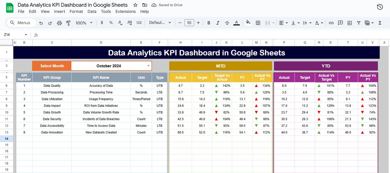
What it is: the same analytics dashboard, re-engineered for Google Sheets so it lives in the browser and updates in real time for everyone with the link.
Who it is for: distributed teams that used Tableau Cloud mainly to share dashboards.
- Live collaboration — comments, simultaneous editing, share-by-link.
- KPI cards and charts that recalculate as data changes.
- Nothing to install; works on any device with a browser.
This is the closest thing to Tableau Cloud’s shared-dashboard experience without the $15/viewer/month floor. At $9.99 once the whole team reads and edits it for free, forever.
Best for: remote teams that need one shared, always-current dashboard. Get it for $9.99 →
4. Google Analytics KPI Dashboard in Excel
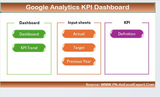
What it is: a marketing-analytics dashboard that turns Google Analytics exports into sessions, users, conversion and channel KPIs.
Who it is for: marketers who built Tableau dashboards just to visualise web traffic.
- Traffic, acquisition and conversion KPI cards.
- Channel and trend charts ready for a GA4 export.
- A structured input sheet so a monthly refresh is copy-paste.
Instead of paying for a BI platform to read one data source, you get a purpose-built web-analytics report for $14.99 once. Pair it with the Google Sheets analytics dashboard if you want the same view in the cloud.
Best for: marketing teams reporting on GA4. Get it for $14.99 →
5. Regulatory Reporting KPI Dashboard in Excel
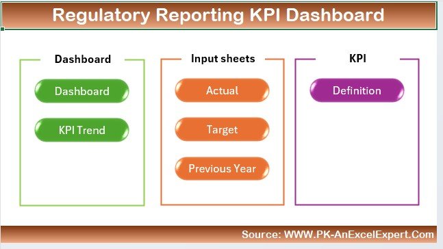
What it is: a compliance-focused dashboard that tracks regulatory KPIs, deadlines and status against targets.
Who it is for: risk, compliance and finance teams that need an auditable file, not a cloud tool IT has to certify.
- Status, breach and deadline KPIs with actual-vs-target logic.
- A documented data model so auditors can trace every number.
- Runs offline — no data leaves the workbook, which regulated teams often require.
Because it lives in one Excel file, there is no platform to include in a security review — a recurring headache with Tableau Server. $14.99 once. See also our NetSuite reporting alternatives for finance-side templates.
Best for: regulated teams needing an offline, auditable report. Get it for $14.99 →
6. Sustainability Reporting KPI Dashboard in Power BI
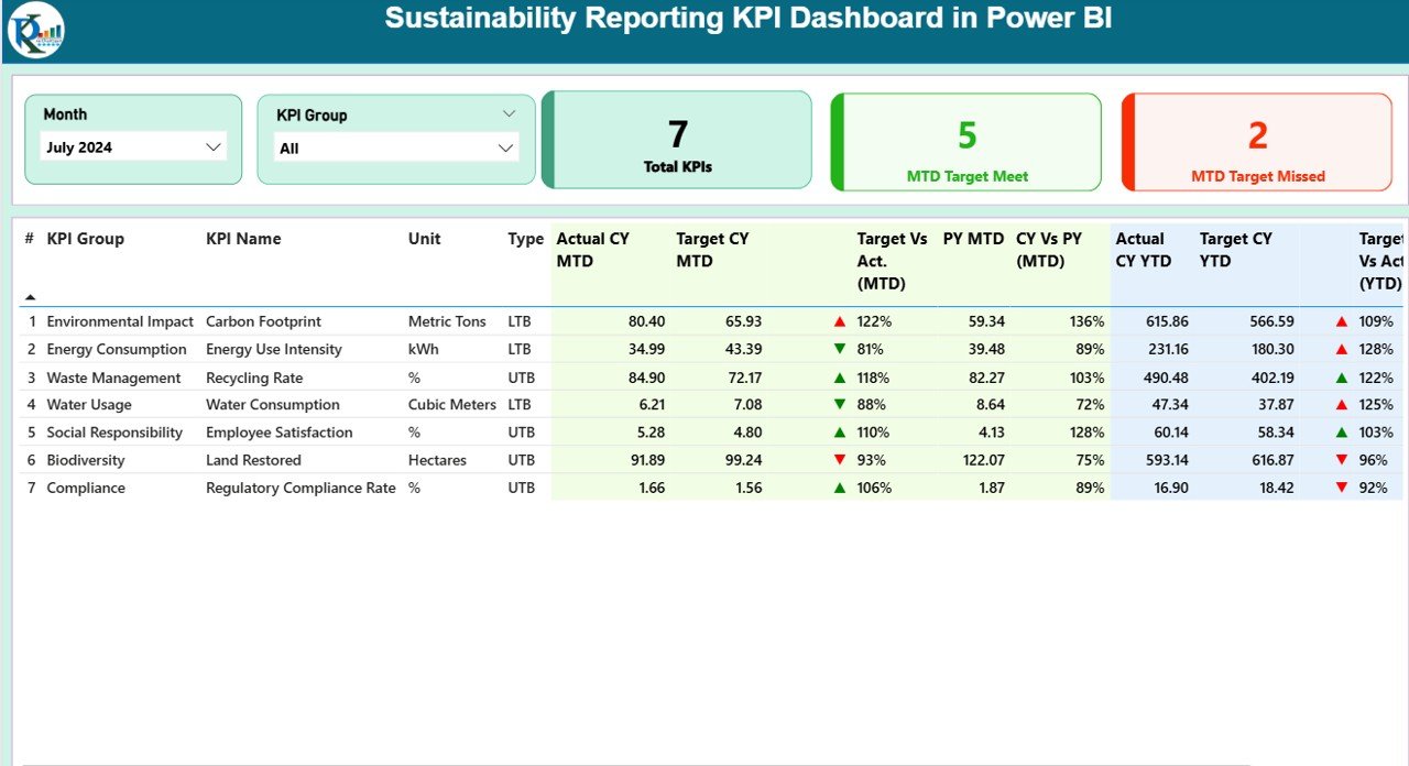
What it is: an ESG dashboard in Power BI tracking emissions, energy, waste and social KPIs against targets.
Who it is for: sustainability teams that need interactive ESG visuals without buying a Tableau Creator seat.
- Environmental, social and governance KPI cards with variance to target.
- Drill-down by site, period or category.
- A model you repoint at your own emissions and energy data.
ESG reporting is exactly the kind of specialised dashboard teams used to spin up in Tableau; here it is pre-built for $11.99 once on free Power BI Desktop.
Best for: ESG teams wanting interactive sustainability analytics. Get it for $11.99 →
7. Sustainability Reporting KPI Dashboard in Google Sheets
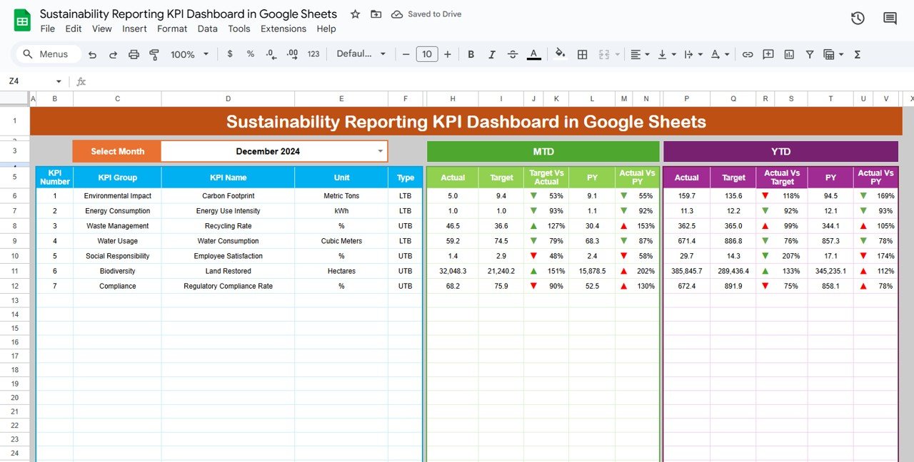
What it is: the same ESG scorecard in Google Sheets, so contributors across sites can enter data and read results in the browser.
Who it is for: multi-site or multi-partner teams that need collaborative ESG data collection.
- Shared, always-current ESG KPIs with target tracking.
- Per-site data entry with instant roll-up.
- No licences — every contributor edits for free.
Where Tableau would meter each contributor, this shares to the whole team for a one-time $9.99. It pairs naturally with the Power BI ESG dashboard when leadership wants the polished visual layer.
Best for: collaborative ESG data collection. Get it for $9.99 →
8. Data Analytics Dashboard Report in Excel — best value
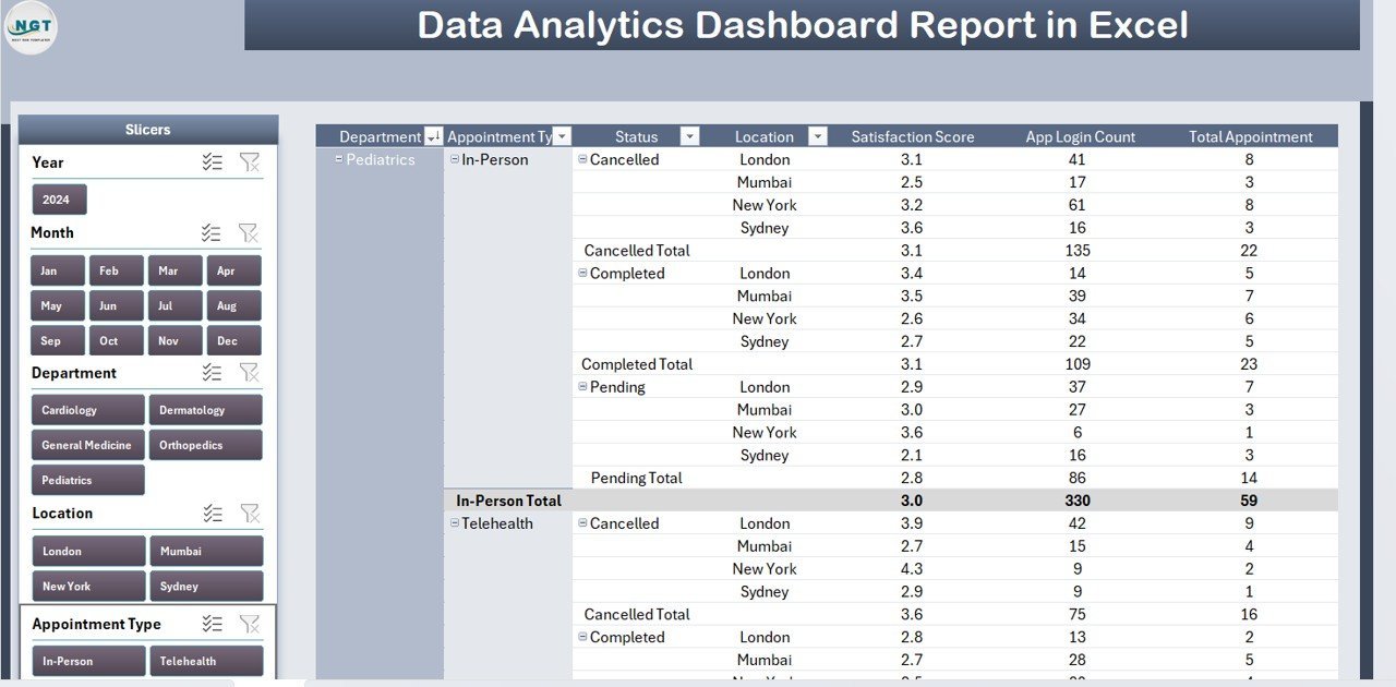
What it is: a lean, report-style analytics dashboard in Excel — the fastest, cheapest way to replace a basic Tableau view.
Who it is for: anyone testing the waters who wants a clean analytics report without committing $15.
- Core KPI summary with charts on a single page.
- Simple data input, minimal setup.
- The lowest-cost entry point in this list.
At $7.99 once it is roughly half the price of a single month of Tableau Viewer, and it is yours permanently. Start here, upgrade to the Power BI or KPI versions later if you need more depth.
Best for: budget-first buyers who want a working analytics report today. Get it for $7.99 →
Ready to drop the Tableau bill? The Data Analytics KPI Dashboard in Power BI gives you a Tableau-style analytics report for a one-time $11.99 — no seats, no renewal.
How to choose between them
| If you… | Buy this | Price |
|---|---|---|
| Want the closest Tableau-style visual experience | Data Analytics KPI Dashboard in Power BI | $11.99 |
| Live entirely in Excel and work offline | Data Analytics KPI Dashboard in Excel | $14.99 |
| Need real-time team collaboration in the cloud | Data Analytics KPI Dashboard in Google Sheets | $9.99 |
| Report mainly on web/marketing traffic | Google Analytics KPI Dashboard in Excel | $14.99 |
| Handle compliance or regulated reporting | Regulatory Reporting KPI Dashboard in Excel | $14.99 |
| Just want the cheapest working report | Data Analytics Dashboard Report in Excel | $7.99 |
Rule of thumb: pick the format your team already uses daily — Power BI for polished visuals, Google Sheets for collaboration, Excel for offline and portable. The topic (analytics, marketing, compliance, ESG) then narrows it to one product.
When a template is NOT the right answer
Templates replace Tableau for the vast majority of small-team reporting, but they are honestly the wrong choice in a few cases. Keep or buy Tableau when:
- You query millions of live rows. Tableau’s live connection to a warehouse (Snowflake, BigQuery, Redshift) handles data volumes a spreadsheet or a single Power BI file cannot refresh comfortably.
- You need governed row-level security across many users. If different viewers must see different slices of the same dashboard, enforced centrally, that is Tableau Server/Cloud territory, not a shared file.
- You run a certified enterprise data catalog. Central data sources, lineage, certified metrics and IT-governed access are platform features templates do not replicate.
- Dozens of people build dashboards daily. At real analyst scale, the per-seat model can be worth it for the shared authoring and publishing environment.
If none of those describe you — a team under ~20 people, monthly or weekly refreshes, data that fits in a workbook — a template does the job for under $15. For adjacent switcher guides, see our Salesforce alternatives, Airtable alternatives and Asana alternatives.
Comparing e-commerce reporting tools? See our guide to Shopify Analytics alternatives in Excel & Sheets for 8 affordable dashboard templates from $6.99.
Frequently asked questions
What is the best Tableau alternative for a small team?
For most small teams, the Data Analytics KPI Dashboard in Power BI ($11.99 once) is the best Tableau alternative. It delivers the same interactive visual-analytics workflow on free Power BI Desktop, with no per-seat billing and nothing to administer.
How much does Tableau actually cost?
Tableau’s published list pricing is $75/user/month for Creator, $42 for Explorer and $15 for Viewer, all billed annually. A five-person team with one analyst therefore runs roughly $1,600–$3,000+ a year, before any enterprise add-ons or Server costs.
Can Excel or Google Sheets really replace Tableau?
For small-team reporting, yes. If your data fits in a workbook and you refresh weekly or monthly, an Excel, Google Sheets or Power BI template reproduces the KPI cards, trends and drill-downs most teams used Tableau for — without live million-row warehouse queries.
Is Power BI a good Tableau alternative?
Power BI is the closest mainstream tool to Tableau, using the same drag-and-drop visual-analytics model. Power BI Desktop is free, so a pre-built Power BI template like ours gives you Tableau-style dashboards with no seat cost at all.
Do these templates require a subscription?
No. Every template here is a one-time purchase between $7.99 and $14.99. You download the file, own it permanently, and there are no seats, renewals or usage limits — the opposite of Tableau’s annual per-user model.
Will I lose Tableau’s interactivity?
You keep the essentials. Power BI and Google Sheets versions offer slicers, filters and drill-downs; Excel versions offer interactive charts and filters. You lose only advanced platform features like live warehouse connections and governed row-level security, which most small teams never use.
Which format should I choose — Excel, Google Sheets or Power BI?
Choose Power BI for the most Tableau-like polished visuals, Google Sheets for real-time team collaboration, and Excel for offline, portable, self-contained files. Pick whichever your team already uses daily so there is no new tool to learn.
Can I connect these templates to my own data?
Yes. Each template has a structured data sheet or model you repoint at your own numbers. You paste or import your data, and the KPI cards, charts and variance calculations update automatically — no formulas to rebuild.
Are the templates a good fit for compliance or ESG reporting?
Yes. The Regulatory Reporting KPI Dashboard handles compliance KPIs offline and auditable, while the Sustainability Reporting dashboards cover ESG metrics in Power BI and Google Sheets.
Where can I see the templates in action?
Every template has a full gallery preview on its product page, and you can watch walkthroughs on the NextGenTemplates YouTube channel. That is the fastest way to confirm a dashboard fits before you buy.
Get more BI & analytics templates
Replace Tableau this week. Start with the Data Analytics KPI Dashboard in Power BI for a one-time $11.99, or the Data Analytics Dashboard Report in Excel for just $7.99. Every template is yours forever — no seats, no renewal.
Browse more Power BI dashboard templates, or watch build walkthroughs on our YouTube channel.
Related: If embedded analytics rather than visual exploration is what you are paying for, read our Sisense alternatives: 6 analytics dashboard templates in Excel & Sheets – including why Sisense never publishes a price and what third-party trackers say it really costs.
Related: Domo is the other end of the same problem – it publishes no list price at all and bills on consumption credits instead of seats. Read our Domo alternatives: 8 BI dashboard templates in Excel & Sheets for what independent deal data says a Domo contract really costs, and eight one-time replacements from $4.99.
Related: Not every BI tool people abandon is expensive. Looker Studio – renamed Data Studio in April 2026 – is genuinely free, and teams still leave it over slow dashboards, $9-per-user-per-project Pro licences and paid third-party connectors. Read our Looker Studio alternatives: 8 reporting templates in Excel & Sheets for the honest version and eight one-time replacements from $4.99.