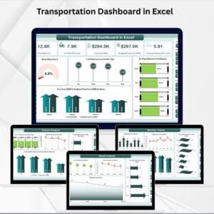
Transportation plays a vital role in supply chain management and logistics. Rising fuel costs, delivery delays, route inefficiencies, and underutilized vehicles are constant challenges for businesses. To stay competitive, managers need more than spreadsheets—they need a clear, visual, and data-driven way to monitor performance. That’s exactly what the Transportation Dashboard in Excel delivers 🚛📊.
This ready-to-use dashboard transforms raw transportation data into interactive KPIs, charts, and trends. Whether you’re managing a logistics fleet, an e-commerce delivery network, or manufacturing supply chains, this tool helps you make faster, smarter decisions while cutting costs and improving on-time delivery.
✨ Key Features of Transportation Dashboard in Excel
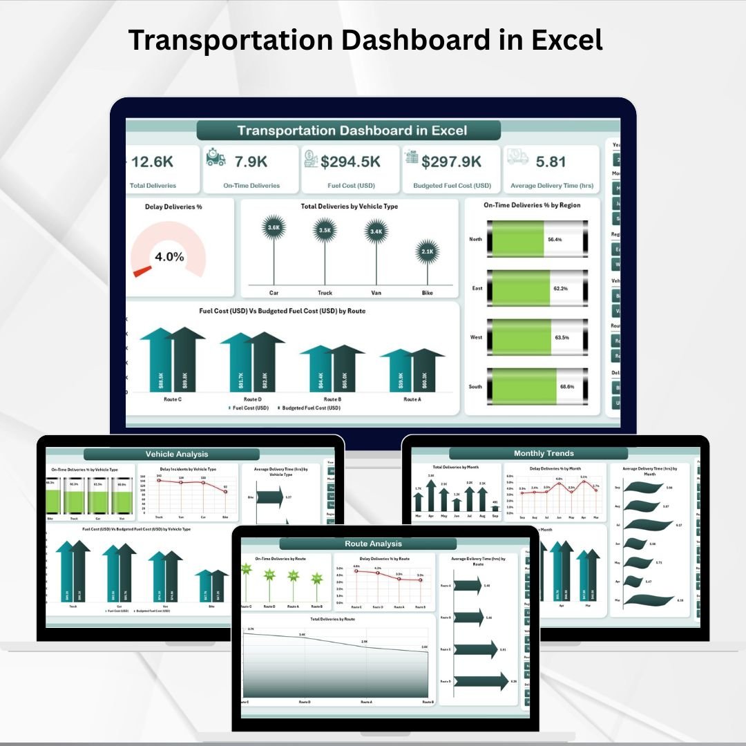
✅ Five Analytical Pages – Overview, Region Analysis, Vehicle Analysis, Route Analysis, and Monthly Trends.
✅ Interactive Slicers – Filter by region, vehicle type, or time frame for instant insights.
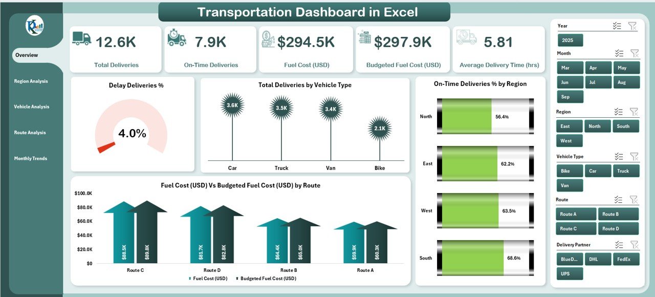
✅ Dynamic KPI Cards – Track delivery delays, on-time rates, fuel costs, and total deliveries at a glance.
✅ Comprehensive Charts – Visuals for costs, delays, delivery times, and efficiency by region, route, and vehicle.
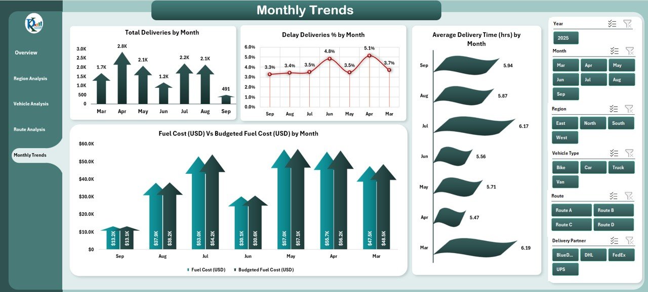
✅ Monthly Trends Analysis – Identify seasonal fluctuations and long-term performance patterns.
✅ Budget Tracking – Compare actual vs budgeted fuel costs to manage expenses.
✅ Data Sheet Integration – Central database for delivery logs, costs, and performance records.
✅ Customizable – Add, remove, or modify KPIs and charts as per your business needs.
📊 What’s Inside the Transportation Dashboard in Excel
When you download this template, you’ll get a fully-structured Excel system:
-
Overview Page – Executive summary with slicers, KPI cards, and quick performance visuals.
-
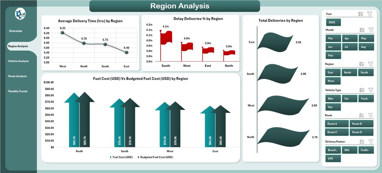
Region Analysis Page – Break down delays, costs, and delivery times across territories.
-
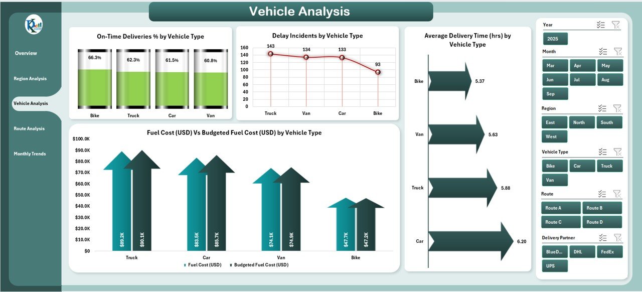
Vehicle Analysis Page – Monitor fleet efficiency by trucks, vans, or other vehicle types.
-
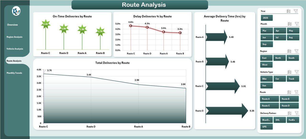
Route Analysis Page – Identify underperforming routes with high costs or frequent delays.
-
Monthly Trends Page – Track changes over time to plan resources more effectively.
-
Data Sheet – Store raw delivery and cost data.
-
Support Sheet – Reference lists for slicers and dropdowns.
🛠️ How to Use the Transportation Dashboard in Excel
1️⃣ Import Data – Enter delivery logs, vehicle details, costs, and performance records into the data sheet.
2️⃣ Refresh Calculations – Update pivot tables to load the latest results.
3️⃣ Apply Filters – Use slicers to drill down by region, vehicle, or route.
4️⃣ Interpret KPIs – Spot trends such as increasing delays, fuel overspending, or underperforming regions.
5️⃣ Take Action – Redesign routes, optimize vehicle usage, or adjust budgets.
No technical expertise needed—if you can use Excel, you can use this dashboard with ease ⚡.
👥 Who Can Benefit from the Transportation Dashboard in Excel
🚚 Logistics Providers – Improve fleet utilization and reduce cost per delivery.
🛒 Retail & E-Commerce Businesses – Track last-mile delivery performance and customer satisfaction.
🏭 Manufacturers – Monitor supply chain transport efficiency and bottlenecks.
📊 Analysts & Managers – Gain instant insights for better decision-making.
💼 Small to Large Enterprises – Scale performance tracking without investing in expensive BI tools.
This dashboard is flexible, cost-effective, and powerful—ideal for businesses of any size managing transportation operations.
Click here to read the Detailed blog post
Visit our YouTube channel to learn step-by-step video tutorials
👉 PKAnExcelExpert


Reviews
There are no reviews yet.