In healthcare, data saves lives — and how hospitals manage that data determines their efficiency, patient outcomes, and financial performance. The Hospitals KPI Dashboard in Power BI is a ready-to-use, interactive solution that brings clinical, operational, and financial KPIs together into one unified system.
Built using Microsoft Power BI and connected to structured Excel data sources, this dashboard helps administrators, finance teams, and healthcare leaders visualize performance, track progress, and take faster, data-driven decisions — all in real time.
It’s more than just a dashboard — it’s a hospital performance command center that empowers you to measure what matters, improve what’s critical, and transform raw data into actionable insight. 🏥📊
⚙️ Key Features of the Hospitals KPI Dashboard in Power BI
📊 Three Interactive Pages: Summary, KPI Trend, and KPI Definition.
📅 Dynamic Slicers: Filter KPIs by Month or Group instantly.
🎯 Performance Cards: View Total KPIs, MTD Target Met, and Missed Counts.
🟢🔴 Color-Coded Icons: Arrows highlight trends and goal achievements.
📈 Trend Analysis Charts: Compare Actual vs Target vs Previous Year for MTD & YTD.
🧾 KPI Definition Drill-Through: Understand each metric’s formula and logic.
💡 Excel Data Integration: Refreshes automatically from your Excel source file.
💻 No Coding Required: Fully built in Power BI using standard visuals and slicers.
🔐 Secure & Scalable: Control access through Power BI Service permissions.
📊 What’s Inside the Hospitals KPI Dashboard
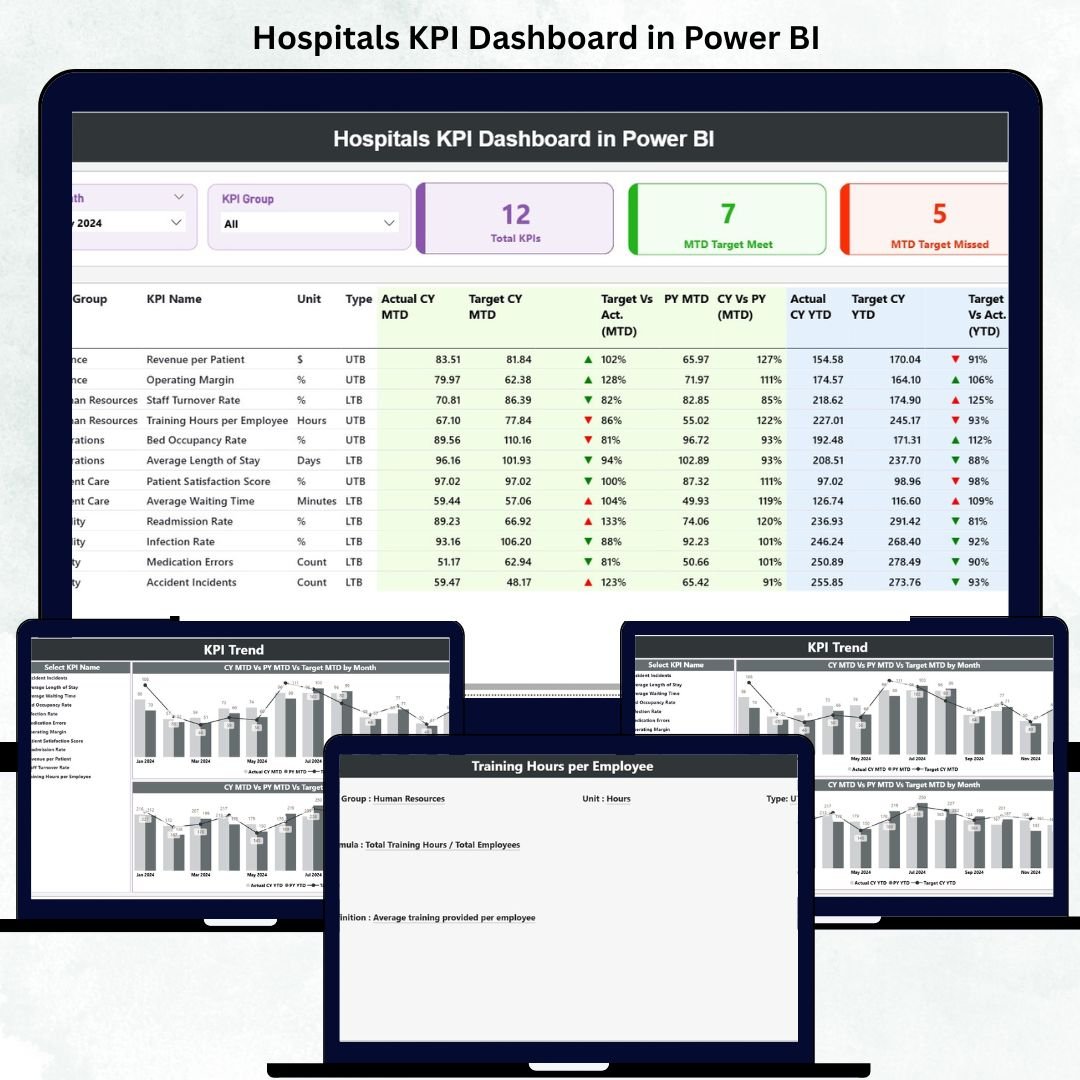
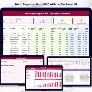
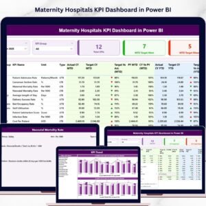
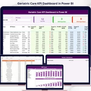
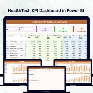
🏠 1️⃣ Summary Page – Hospital Performance Snapshot
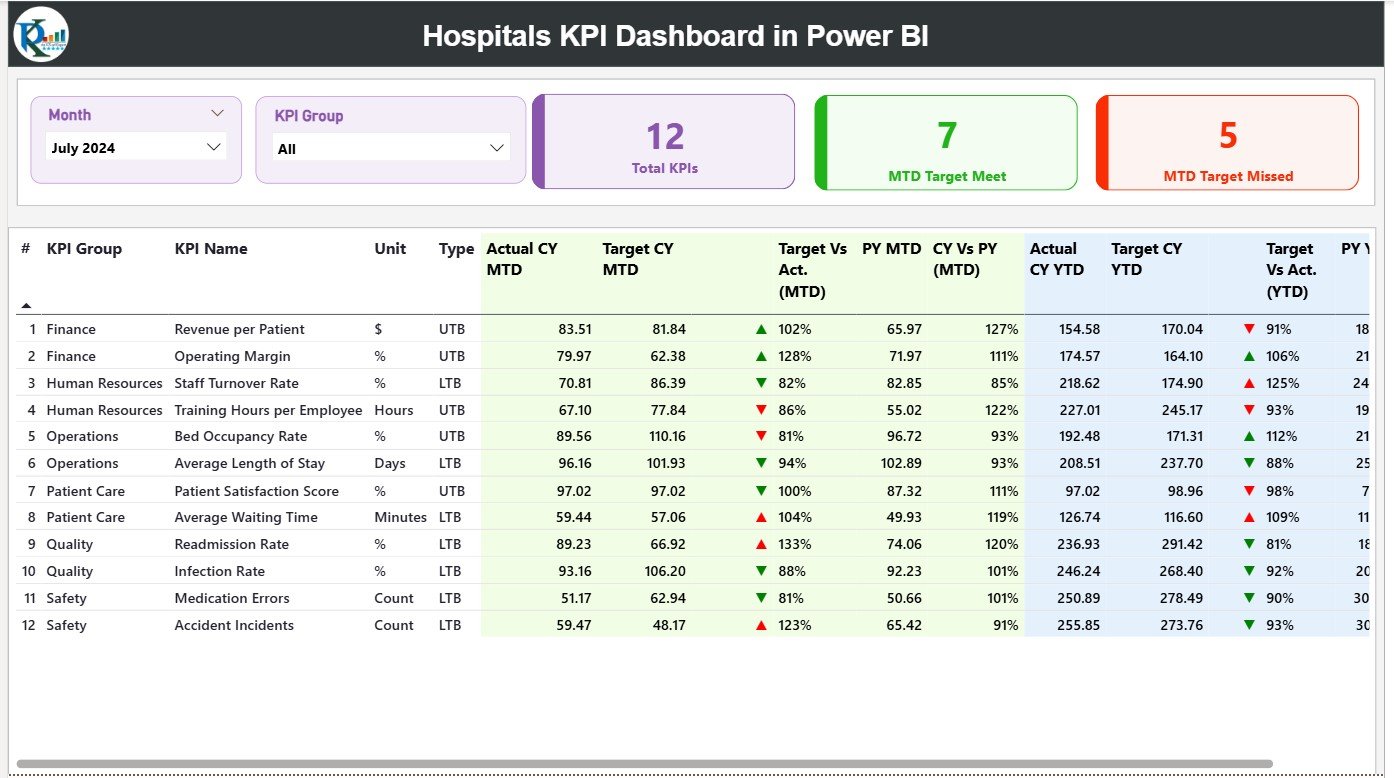
This is the heart of the dashboard — a real-time overview of all hospital KPIs.
-
Month and KPI Group slicers for quick filtering.
-
Cards showing Total KPIs, MTD Target Met, and Missed.
-
A detailed table displaying KPI Number, Group, Unit, Type (UTB/LTB), and performance icons.
-
MTD vs YTD comparisons with red/green arrows for visual clarity.
💡 Purpose: Provide hospital management a single-screen summary of all operations.
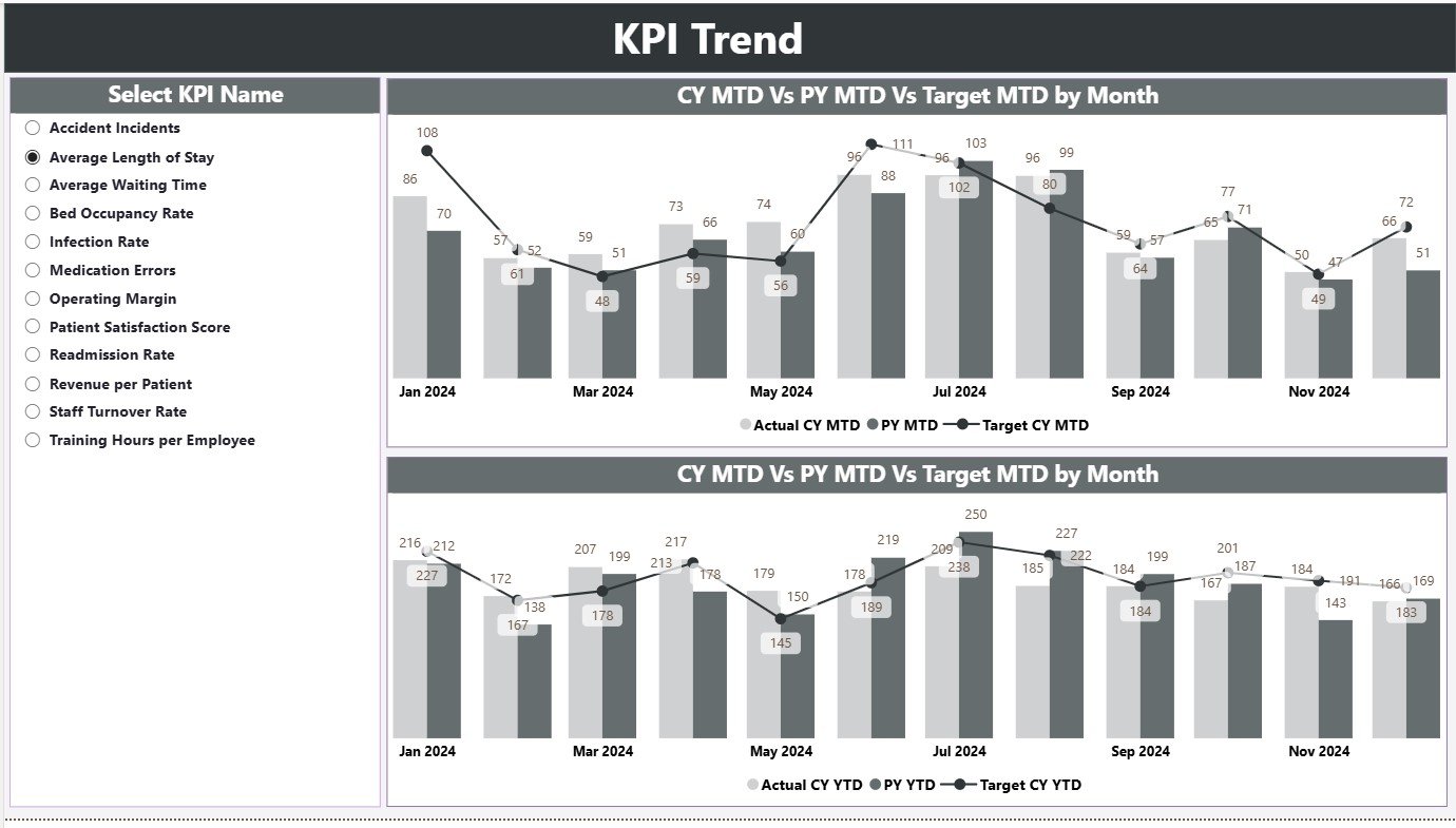
📈 2️⃣ KPI Trend Page – Track Performance Over Time
Visualize month-by-month performance for any selected KPI.
-
Dual combo charts for MTD and YTD trend analysis.
-
Slicer to choose any KPI for detailed review.
-
Auto-highlight deviations from target values.
💡 Purpose: Spot early warning signs, seasonal patterns, and improvement opportunities.
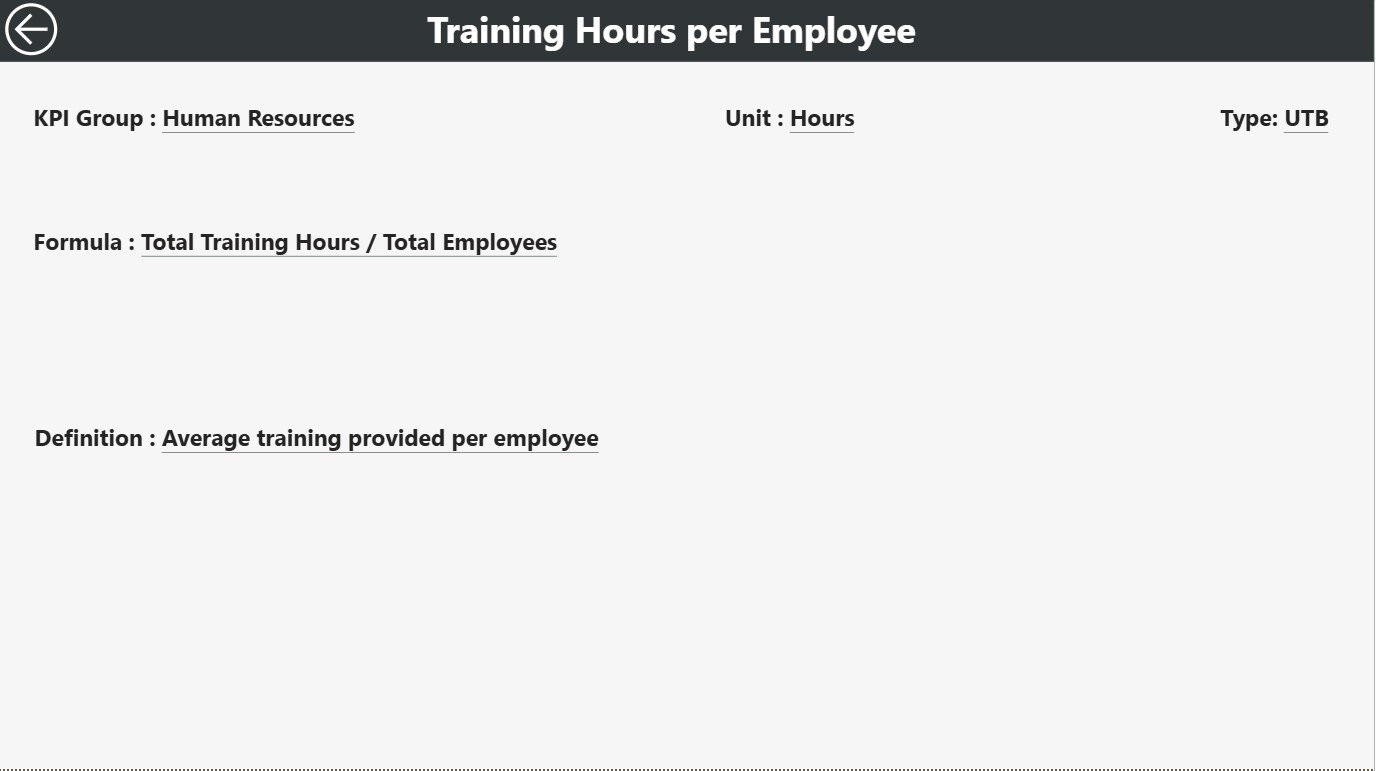
📘 3️⃣ KPI Definition Page – Transparency and Clarity
Drill through from the Summary Page to explore KPI details.
-
See Formula, Definition, and Measurement Unit for each metric.
-
Type of KPI (Lower the Better or Upper the Better).
-
Back button navigation to return to the main dashboard.
💡 Purpose: Promote KPI standardization and data literacy across departments.
📗 Excel Data Source Structure
🧮 Input_Actual Sheet: Stores monthly Actual data (KPI, Month, MTD, YTD).
🎯 Input_Target Sheet: Captures monthly and yearly targets for each KPI.
📖 KPI Definition Sheet: Lists KPI Number, Group, Unit, Formula, and Type.
All updates in Excel automatically reflect in Power BI — ensuring real-time accuracy and easy refresh cycles.
🌟 Advantages of Using Hospitals KPI Dashboard in Power BI
✅ Centralized Monitoring: Track all hospital KPIs — clinical, operational, and financial — in one place.
✅ Real-Time Insights: Instantly visualize how departments are performing.
✅ Better Patient Care: Reduce waiting times and optimize resources.
✅ Informed Decision-Making: Identify trends and root causes quickly.
✅ Regulatory Compliance: Maintain transparency and accurate reporting.
✅ Resource Optimization: Manage beds, equipment, and staff efficiently.
✅ Cost-Effective: Get enterprise-level insights without expensive software.
💡 Best Practices for Using the Dashboard
📌 Define KPI owners and update Excel data monthly.
📌 Use color consistency — Green (Good) / Red (Needs Action).
📌 Validate your formulas and ensure consistent units.
📌 Protect sensitive data — mask patient identifiers.
📌 Leverage Power BI Service for cloud sharing and scheduled refreshes.
📌 Train users to interpret visuals and act on insights.
📌 Add automation with Power Automate for report alerts.
👥 Who Can Benefit from This Dashboard
🏥 Hospital Administrators and Management Teams
👩⚕️ Doctors and Department Heads
💼 Financial and HR Analysts
📊 Healthcare Consultants
🏛️ Government and Accreditation Bodies
🧩 Conclusion
The Hospitals KPI Dashboard in Power BI is more than an analytics tool — it’s a digital backbone for modern healthcare management. By combining operational, clinical, and financial KPIs into one centralized system, it provides unmatched visibility, accuracy, and control.
With real-time updates, interactive filters, and intuitive visuals, this dashboard empowers hospitals to improve performance, optimize resources, and enhance patient care — all powered by the simplicity of Power BI.
🏥 Turn hospital data into actionable healthcare insights with Nextgen Templates’ Hospitals KPI Dashboard in Power BI.


Reviews
There are no reviews yet.