


Customer service plays a direct role in customer satisfaction, retention, and brand trust. However, many organizations still rely on disconnected spreadsheets, manual reports, or static dashboards to track service performance. As a result, trends remain hidden, issues escalate late, and improvement efforts lack direction.
That is exactly why the Customer Service KPI Scorecard in Google Sheets becomes a powerful and practical performance management solution.
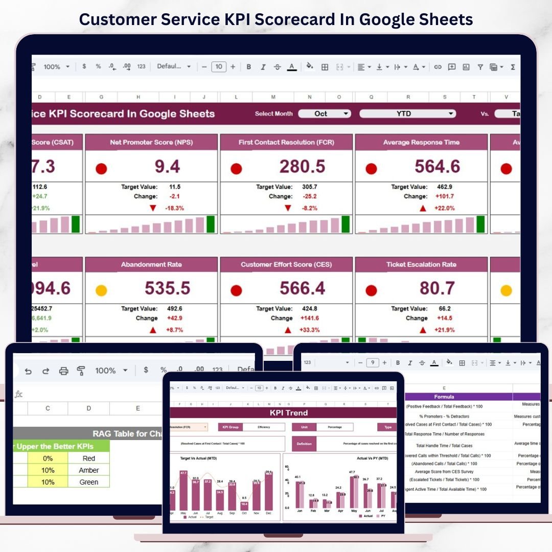
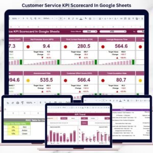
This ready-to-use scorecard transforms raw customer service data into a clear, structured, and visual performance overview. Instead of reviewing multiple reports, managers can track service health using 10 essential customer service KPIs, supported by traffic lights, trend arrows, and percentage change indicators.
Because the scorecard is built in Google Sheets, it is cloud-based, collaborative, flexible, and easy to maintain, without requiring any advanced technical or BI skills.

📊 Key Features of the Customer Service KPI Scorecard
🚀 All KPIs in One Scorecard
Track 10 core customer service KPIs in a single, easy-to-read view.
🚦 Traffic Light Performance Indicators
Instantly see which KPIs are performing well, average, or poorly.
📈 Trend & Percentage Change Analysis
Identify improvement or decline using up/down arrows and % change.
🔁 MTD & YTD Performance Toggle
Monitor short-term execution and long-term service quality together.
🤝 Real-Time Collaboration
Share and update the scorecard easily using Google Sheets.
📦 What’s Inside the Customer Service KPI Scorecard
🧭 Main Scorecard Sheet – Performance at a Glance
This is the primary dashboard where service performance is summarized.
Key Elements Included:
Month selection dropdown
MTD (Month-to-Date) view
YTD (Year-to-Date) view
10 predefined customer service KPIs
Traffic light indicators (Green / Amber / Red)
Percentage change arrows
With this layout, managers can instantly understand service health without deep analysis.
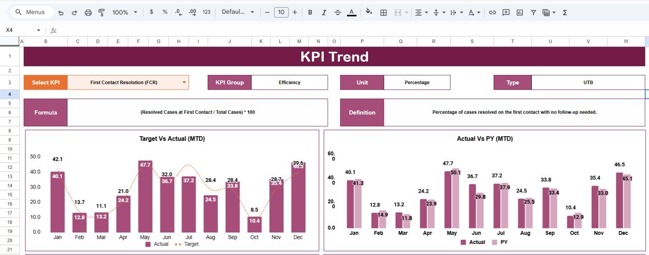
📈 KPI Trend Sheet – KPI-Level Insights
The KPI Trend Sheet explains how each KPI behaves over time.
What You Can View:
KPI selection dropdown (Cell C3)
KPI Group
Unit of Measurement
KPI Type:
UTB (Upper the Better)
LTB (Lower the Better)
KPI Formula
KPI Definition
This sheet is ideal for review meetings, audits, and root-cause analysis.
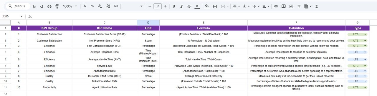
📘 KPI Definition Sheet – Governance & Consistency
This sheet acts as the master reference for all KPIs.
Columns Included:
KPI Name
KPI Group
Unit
Formula
KPI Definition
Because all definitions stay in one place, KPI interpretation remains consistent across teams and time periods.
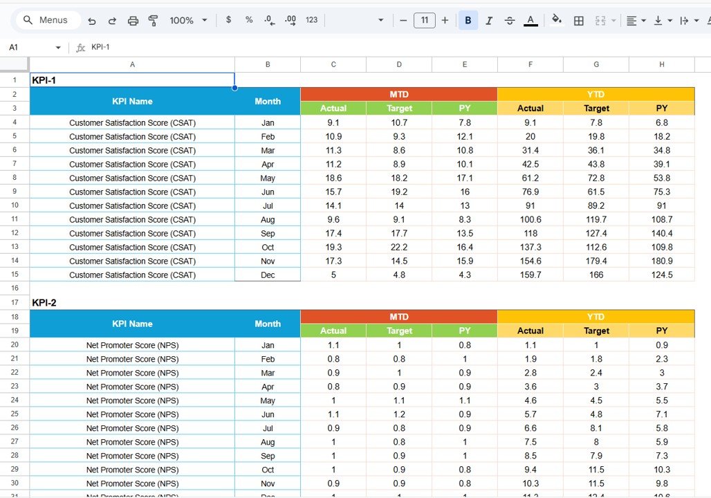
🗂️ Data Input Sheet – Simple & Structured
This is where users enter performance numbers.
Data Captured:
Monthly actual values
Target values
Previous year values
Once data is entered, all KPIs, trends, traffic lights, and arrows update automatically.
🎨 Colour Settings Sheet – Visual Control
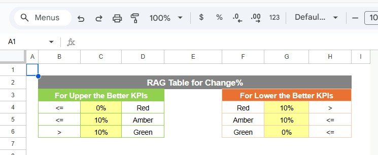
This sheet controls the logic behind KPI colors and indicators.
What You Can Adjust:
Green / Amber / Red thresholds
Arrow direction logic
KPI status rules
This flexibility allows organizations to align visuals with their service standards.
👥 Who Can Benefit from This Scorecard
Customer Service Managers
Call Center & Contact Center Teams
Helpdesk & Support Operations
Quality Assurance Teams
Service Excellence Leaders
It works equally well for small teams and large enterprise service operations.
⚙️ How to Use the Customer Service KPI Scorecard
Enter monthly service data in the Data Input sheet
Define targets and previous year values
Select the reporting month
Switch between MTD and YTD views
Review traffic lights and trends
Take action on red and amber KPIs
No advanced Google Sheets skills required.
### Click here to read the Detailed blog post
Watch the step-by-step video tutorial:
### Visit our YouTube channel to learn step-by-step video tutorials
👉 https://youtube.com/@NeotechNavigators
Compatibility and Requirements
- Works in Google Sheets. You need a free Google account and a web browser.
- You pick the month and the KPI from dropdowns. Google explains dropdowns in Create an in-cell dropdown list.
More Questions About This Template
How many KPIs does the scorecard track?
It tracks 10 customer service KPIs on the main scorecard sheet.
What do the traffic lights and arrows show?
Each KPI gets a green, amber or red indicator, plus an up or down arrow and a percentage change. You can adjust the thresholds and arrow logic on the Colour Settings sheet.
Can I see both month-to-date and year-to-date results?
Yes. Select the reporting month and switch between the MTD and YTD views on the main scorecard sheet.
Where do I enter my data?
Use the Data Input sheet to enter monthly actual values, target values and previous year values. The scorecard, trends, traffic lights and arrows update from there.
Is there an Excel or Power BI version?
There is a Customer Service KPI Dashboard in Excel and a Customer Service KPI Dashboard in Power BI.
Related Customer Service Templates
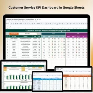
- Customer Service KPI Dashboard in Google Sheets: a dashboard view of the same topic
- Customer Service Dashboard In Google Sheets: a wider service overview
- Customer Service Request Tracker in Google Sheets: log and follow individual requests
- Customer Service KPI Dashboard in Excel: the Excel version
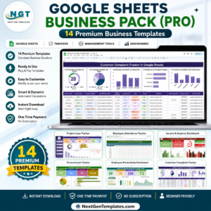
- Google Sheets Business Pack (Pro): 14 business templates in one download
Browse all Google Sheets KPI dashboards.





Reviews
There are no reviews yet.