Managing airline operations is complex, fast-paced, and highly data-driven. Every day, aviation teams work with flight operations, customer service, crew planning, fuel usage, aircraft efficiency, and financial performance. Without a unified reporting system, teams rely on scattered spreadsheets and outdated reports—slowing down decisions and creating blind spots.
The Airlines KPI Dashboard in Power BI solves these challenges instantly. This ready-to-use dashboard transforms raw Excel data into clean, interactive, and visually rich insights. Whether you want to monitor delays, track fuel trends, analyze revenue, or understand operational gaps, this dashboard gives you complete visibility in just a few clicks.
With Month-to-Date (MTD), Year-to-Date (YTD), target comparisons, KPI groups, trend charts, and drill-through definitions, this dashboard becomes the single source of truth for all airline performance metrics.
✈️ Key Features of Airlines KPI Dashboard in Power BI
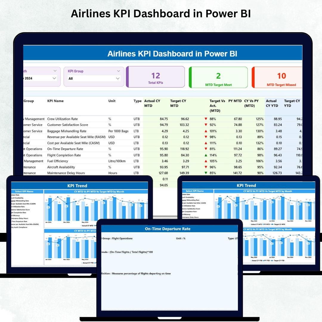
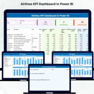
📊 1. Summary Page – Your Complete Airline Performance Snapshot
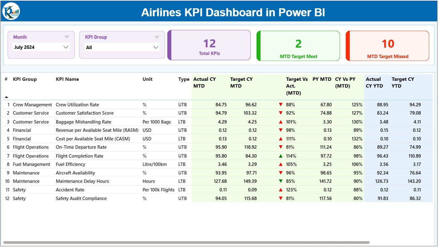
The Summary Page gives you an instant view of how your airline is performing this month and this year.
You get:
✨ Month Slicer & KPI Group Slicer for instant filtering
✨ 3 KPI Cards (Total KPIs, MTD Target Met, MTD Target Missed)
✨ Detailed KPI Table with MTD & YTD Actuals, Targets, Icons, and PY comparisons
Everything updates instantly when you choose a new month or KPI category.
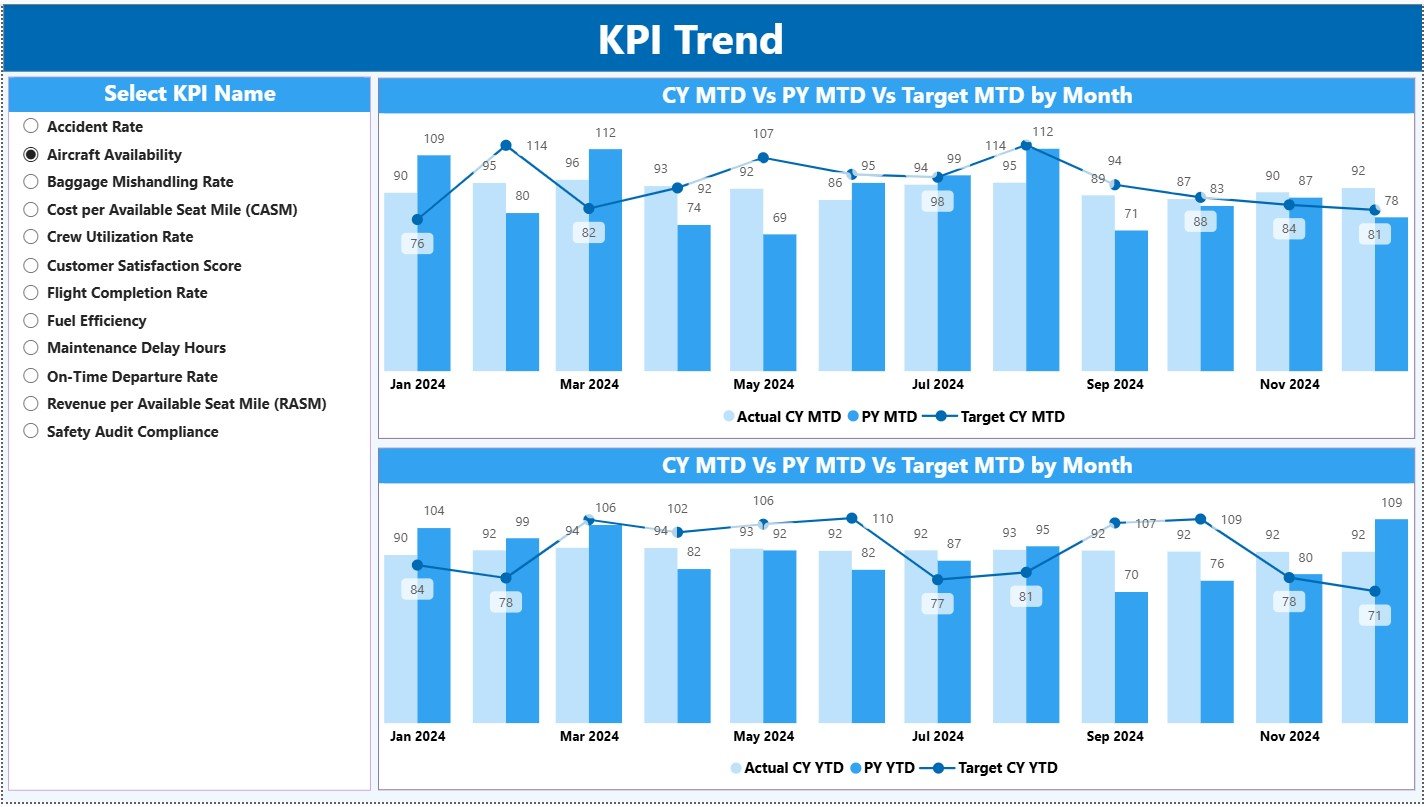
📈 2. KPI Trend Page – Clear Visibility of Yearly & Monthly Patterns
This page shows how each KPI performs across the year.
You get:
📌 Combo charts for CY Actual, PY Actual, and Targets
📌 KPI selection slicer
📌 MTD & YTD comparisons at a glance
Perfect for understanding seasonal behaviour, cost variations, and operational trends.
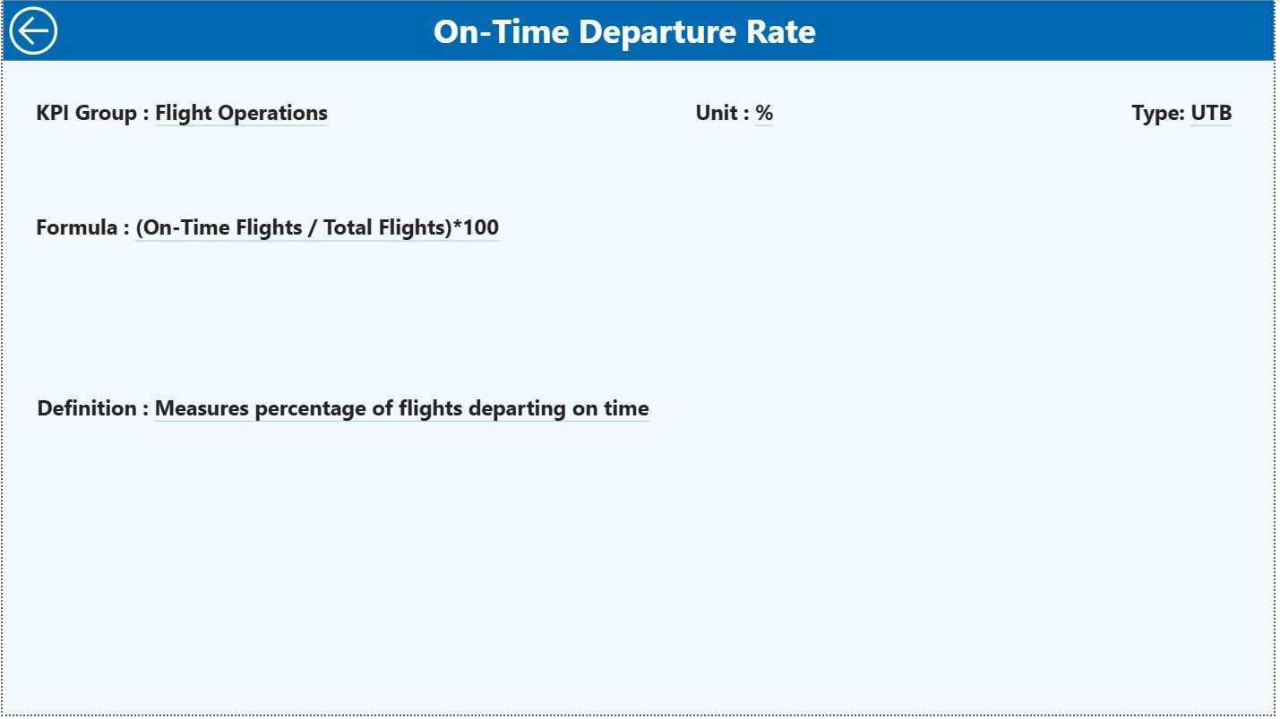
📘 3. KPI Definition Page – Complete Clarity for Every Metric
When you drill through any KPI, you see:
✔ KPI Name
✔ Formula
✔ KPI Group
✔ Unit
✔ Type (UTB/LTB)
✔ Definition
This ensures your team always understands exactly what each KPI means.
📦 What’s Inside the Airlines KPI Dashboard
When you download this product, you get:
⭐ Power BI Dashboard File (.pbix)
Fully designed, formatted, and linked with all visuals.
⭐ Structured Excel Dataset
Built into three sheets:
-
Input_Actual (CY Actuals for MTD & YTD)
-
Input_Target (Monthly MTD & YTD Targets)
-
KPI Definition Sheet (KPI Number, Formula, Unit, Type, LTB/UTB)
⭐ Interactive Pages
-
Summary Page
-
KPI Trend Page
-
KPI Definition Page
⭐ Drill-through functionality
Helps you get deeper clarity on any KPI instantly.
⭐ Clean and modern visual layout
Built to match aviation industry analytics standards.
🛠️ How to Use the Airlines KPI Dashboard in Power BI
Using this dashboard is extremely simple—even for beginners.
1️⃣ Update the Excel File
Enter MTD and YTD Actuals, Targets, and KPI definitions.
2️⃣ Refresh Power BI
Click “Refresh” and all visuals update instantly.
3️⃣ Use Slicers
Change the Month or KPI Group to analyze different segments.
4️⃣ Drill Through Any KPI
Click the KPI → View detailed definition and formula.
5️⃣ Review Trend Charts Before Meetings
See how the airline is performing month-over-month and year-over-year.
6️⃣ Share the Dashboard
Publish it in Power BI Service to allow team-wide access.
That’s it—your dashboard stays ready for daily, weekly, and monthly reviews.
👥 Who Can Benefit from This Airlines KPI Dashboard?
This dashboard is designed for every function inside an airline:
🧑✈️ Flight Operations Teams – Track on-time performance & delays
🏢 Airport & Ground Handling Units – Monitor efficiency and turnaround times
💼 Finance & Cost Control – Compare costs, targets, and profitability
📊 Revenue Management Teams – Track demand, revenue, and seat utilization
🌍 Route & Network Planning – Evaluate route performance trends
🎧 Customer Experience Teams – Review customer satisfaction metrics
🛫 Airline Management & Executives – Monitor KPIs at a strategic level
If your airline needs accurate, real-time insights, this dashboard becomes an essential performance tool.


Reviews
There are no reviews yet.