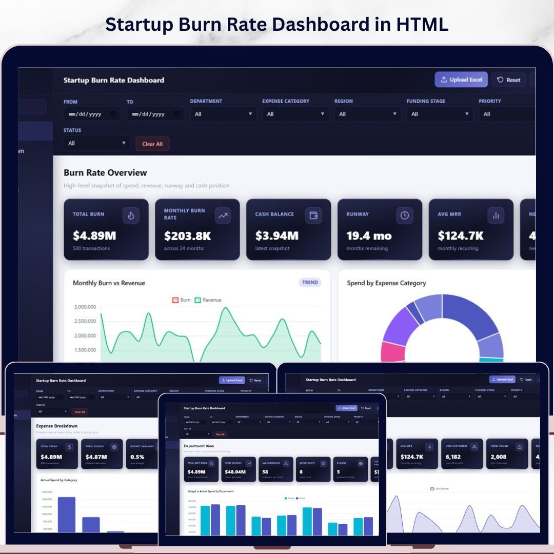

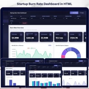
🔑 Key Features of Startup Burn Rate Dashboard in HTML
Startup Burn Rate Dashboard in HTML is a browser-based interactive analytics template designed for startup founders, CFOs, finance managers, and investors who need instant visibility into their company’s cash burn, runway, revenue growth, and expense breakdown. This dashboard includes 5 interactive pages, 6 executive KPI cards, and over 12 dynamic charts that visualize everything from monthly burn rate trends to department-level spending and invoice tracking. Whether you are preparing for a board meeting, investor pitch, or quarterly financial review, this template gives you a complete startup financial command center in seconds.
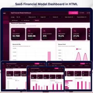
Unlike spreadsheet-based tools, this HTML Dashboard Template runs directly in your browser — no Excel, no Power BI, no software installation required. Simply unzip the file, open index.html, and you are ready to analyze your startup’s financial health. If you are tracking burn rate alongside SaaS metrics, the SaaS Financial Model Dashboard in HTML is a perfect companion template.
📦 What’s Inside the Startup Burn Rate Dashboard in HTML
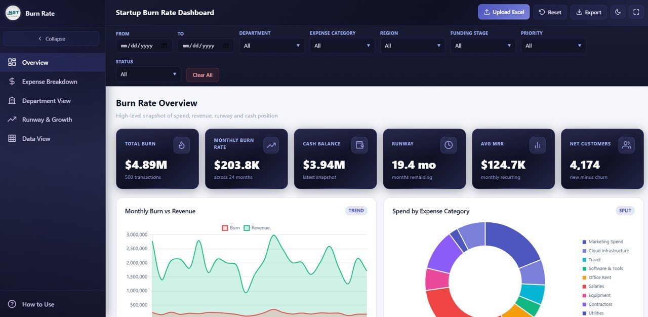
📊 Overview Page — The main command center displays 6 KPI cards: Total Burn, Monthly Burn Rate, Cash Balance, Runway, Average MRR, and Net Customers. Below the cards, four analytical charts provide instant insights: Monthly Burn by Revenue compares your cash burn against incoming revenue month over month, Actual Spend by Expense Category breaks down where your money is going, Actual Spend by Department shows which teams consume the most budget, and Invoice Count by Status reveals the distribution of pending, paid, and overdue invoices. Multiple slicers let you filter the entire dashboard instantly.
 Startup Burn Rate Dashboard
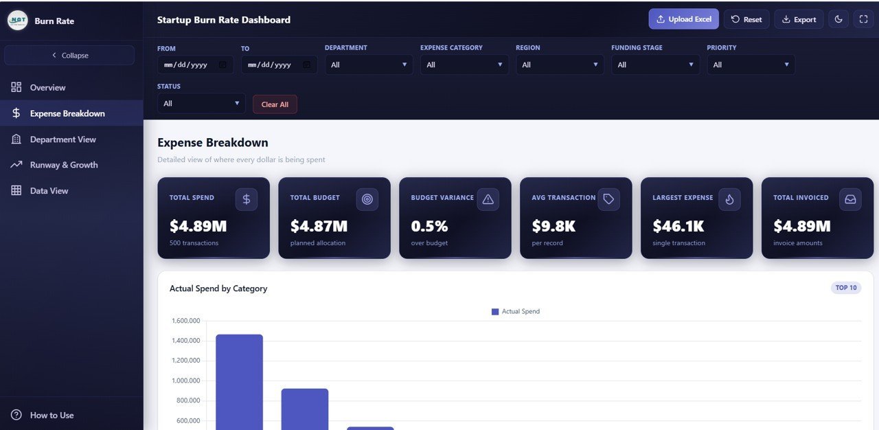
💰 Expense Breakdown — This page provides a deep-dive into your startup’s spending patterns through five focused charts: Actual Spend by Expense Category identifies which cost categories consume the largest portion of your budget, Actual Spend by Vendor shows spending concentration across your vendor base, Actual Spend by Payment Method reveals payment channel preferences, Budget by Expense Category compares planned versus allocated budgets, and Actual Spend by Priority helps you evaluate whether high-priority expenses align with your strategic goals.
 Expense Breakdown
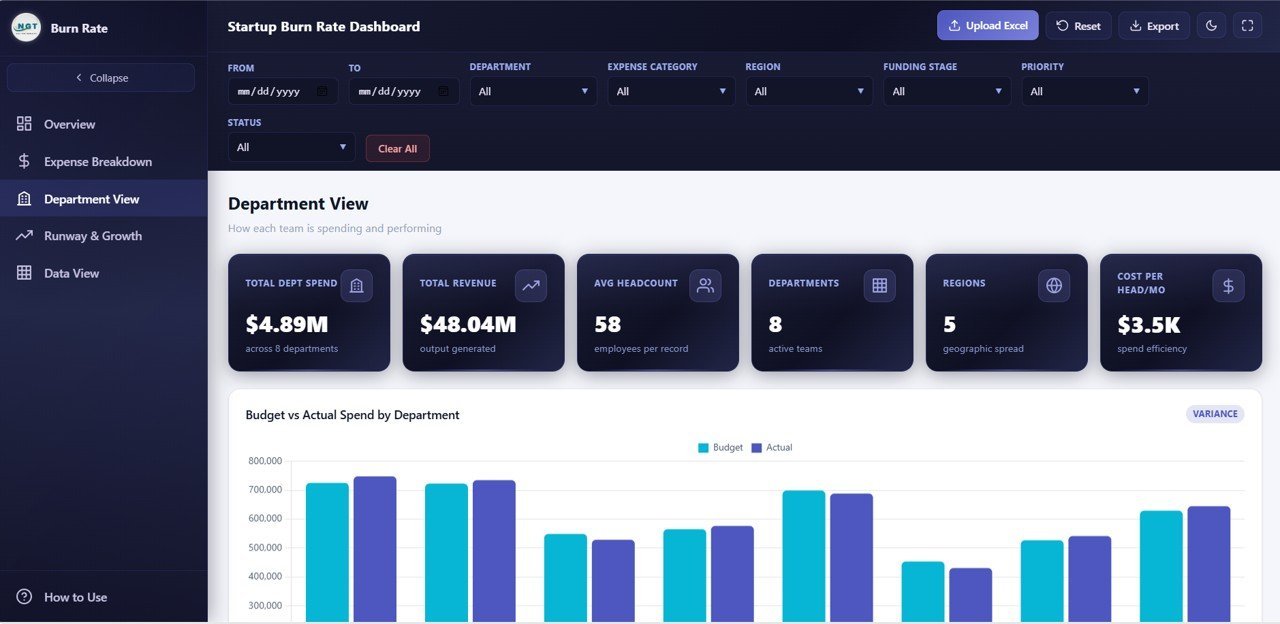
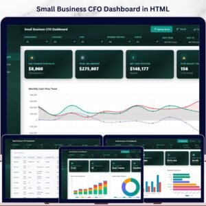
🏢 Department View — Evaluate financial performance at the department level with five analytical charts: Budget by Department compares allocated budgets across teams, Actual Spend by Department tracks real spending against those budgets, Actual Spend by Region breaks down costs geographically, Average Employee Count by Department provides headcount context for spend analysis, and Revenue by Department identifies which teams generate the most income. This page is essential for understanding departmental efficiency and making resource allocation decisions. You may also find the Small Business CFO Dashboard in HTML helpful for broader financial tracking.
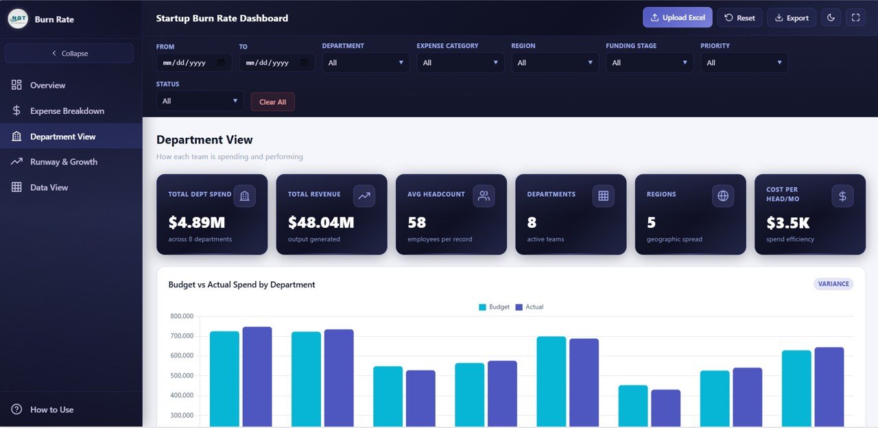 Department View
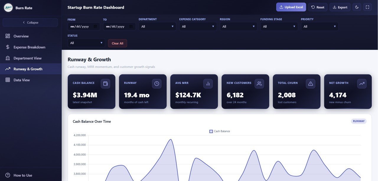
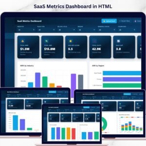
📈 Runway and Growth — This page focuses on the metrics that matter most for startup survival and scaling: Cash Balance by Month tracks your remaining cash over time, MRR by Month monitors monthly recurring revenue growth, New Customers by Month measures acquisition velocity, Churn Count by Month reveals customer retention trends, and Actual Spend by Funding Stage shows how spending patterns shift across seed, Series A, and later stages. This is the page investors care about most. For additional SaaS tracking, check out the SaaS Metrics Dashboard in HTML.
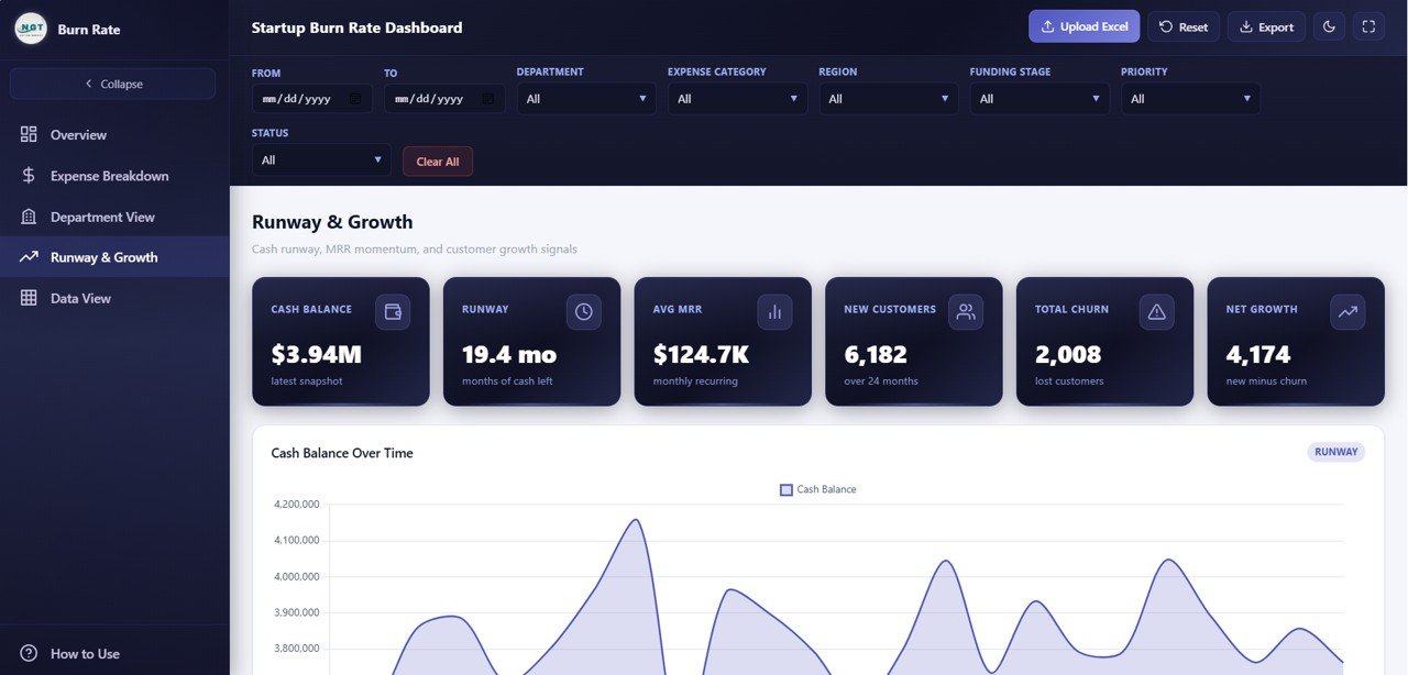 Runway and Growth
📋 Data View — This is the detailed data table page where you can see all your records with search, sort, and pagination features. You can also export the filtered data to CSV for further analysis in Excel or Google Sheets. This page makes the dashboard fully transparent — every chart and KPI can be traced back to its source data.
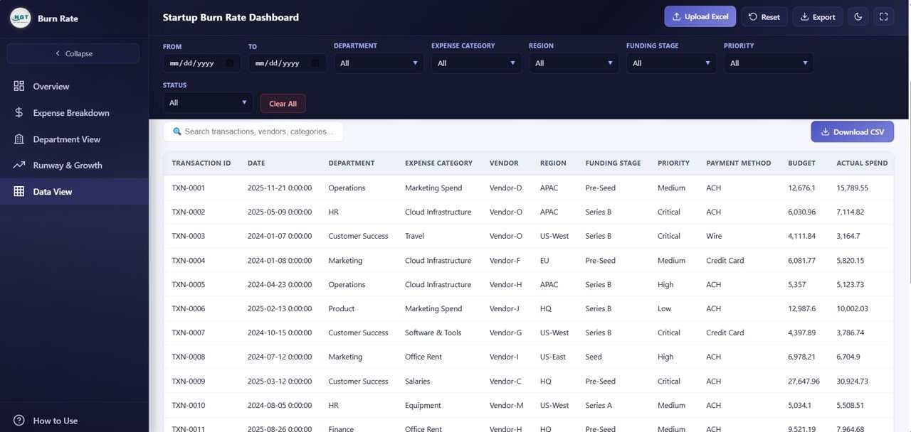 Data View
⚙️ How to Use the Startup Burn Rate Dashboard
1️⃣ Purchase and download the template, then unzip the file to your computer.
2️⃣ Open index.html in any modern web browser — Chrome, Firefox, Edge, or Safari.
3️⃣ Navigate through the 5 dashboard pages using the tab navigation at the top.
4️⃣ Replace the sample data in the data file with your actual startup financial data.
5️⃣ Use the slicers and filters on each page to drill down into specific departments, categories, or time periods.
6️⃣ Export data from the Data View page to CSV for further analysis or investor reporting.
👥 Who Can Benefit from This Dashboard
🔹 Startup Founders and CEOs who need a clear view of cash burn, runway, and growth metrics for decision-making
🔹 CFOs and Finance Managers tracking expenses, budgets, and revenue across departments
🔹 Investors and Board Members reviewing portfolio company financial health and burn rate trends
🔹 Revenue Operations Managers monitoring MRR growth, churn, and customer acquisition
🔹 Financial Consultants preparing burn rate analysis and runway projections for clients
🔹 Startup Accelerators tracking cohort company spending patterns and financial milestones
❓ Frequently Asked Questions
What KPIs does the Startup Burn Rate Dashboard in HTML track?
The Startup Burn Rate Dashboard in HTML tracks 6 key performance indicators: Total Burn, Monthly Burn Rate, Cash Balance, Runway, Average MRR, and Net Customers. It also includes 12+ charts across 5 interactive pages covering expense breakdown, department spending, runway projections, and customer growth.
Do I need any software to use this HTML dashboard?
No. This dashboard runs entirely in your web browser. Simply unzip the downloaded file and open index.html in Chrome, Firefox, Edge, or Safari. No Excel, Power BI, or any other software installation is required.
What is the best dashboard template for tracking startup burn rate?
The Startup Burn Rate Dashboard in HTML from NextGenTemplates is purpose-built for startup financial analysis. It covers burn rate, runway, MRR, churn, expense breakdown, and department spending across 5 interactive pages — all accessible instantly in any web browser.
Can I customize this dashboard with my own startup data?
Yes. The template includes a structured data file where you can replace the sample data with your own financial records. Once updated, all 6 KPI cards and 12+ charts refresh automatically to reflect your real business data.
How do I track startup runway in this dashboard?
The Runway and Growth page includes a Cash Balance by Month chart that shows your remaining cash over time. Combined with the Monthly Burn Rate KPI card, you can calculate and monitor your startup’s financial runway directly from the dashboard.
Who should use this Startup Burn Rate Dashboard?
This template is ideal for startup founders, CFOs, finance managers, investors reviewing portfolio companies, accelerator programs tracking cohort spending, and financial consultants preparing burn rate analysis for clients.
🔗 Explore Related Templates
📊 SaaS Financial Model Dashboard in HTML — Track MRR, ARR, churn, NPS, and gross margin across 5 interactive SaaS analytics pages.
📊 Small Business CFO Dashboard in HTML — Monitor revenue, expenses, cash flow, budget variance, and vendor payments in one interactive dashboard.
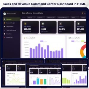
📊 Sales and Revenue Command Center Dashboard in HTML — Track total revenue, deals, win rates, pipeline value, and team performance.
📖 Click here to read the Detailed Blog Post
Watch the step-by-step video tutorial:


Reviews
There are no reviews yet.