Airports are among the most complex transportation infrastructures in the world. Every day, airport authorities must manage passenger movement, aircraft operations, runway utilization, cargo handling, and security systems. Because airports operate 24/7, monitoring operational performance becomes essential for ensuring efficiency, safety, and service quality.
However, many airport management teams still rely on manual reports and disconnected spreadsheets. This often creates delays in identifying operational problems and analyzing performance trends.
The Airport Infrastructure KPI Dashboard in Power BI solves this challenge by providing a powerful and interactive performance monitoring system. This ready-to-use dashboard helps airport authorities monitor key infrastructure KPIs, track operational efficiency, analyze performance trends, and compare results with targets and previous years.
Instead of reviewing multiple reports, airport managers can monitor all critical KPIs from a single interactive Power BI dashboard. With dynamic filtering, visual charts, and performance indicators, the dashboard helps decision-makers quickly identify operational issues and improve infrastructure performance.
✈️ Key Features of Airport Infrastructure KPI Dashboard in Power BI
📊 Centralized KPI Monitoring
Monitor multiple airport infrastructure KPIs from a single Power BI dashboard for better operational visibility.
📅 Interactive Month Filtering
Use the Month slicer to filter dashboard data instantly and analyze performance for specific periods.
📂 KPI Group Filtering
The KPI Group slicer allows users to analyze KPIs by category for deeper operational insights.
📊 KPI Performance Summary Cards
Three KPI cards display a quick summary of total KPIs, target achievements, and missed targets.
📉 MTD Performance Analysis
Track Month-to-Date (MTD) actual performance compared with targets and previous year results.
📈 YTD Performance Analysis
Monitor Year-to-Date (YTD) performance trends and compare results with defined targets.
🎯 Target vs Actual Monitoring
Instantly identify whether KPIs meet their performance targets using visual indicators.
🔼 Performance Status Indicators
Green and red icons highlight KPI performance status to quickly detect operational issues.
📊 Trend Analysis Charts
Interactive combo charts display KPI trends comparing Actual, Target, and Previous Year performance.
⚡ Interactive Drill-Through Analysis
Users can drill into KPI definitions and formulas for deeper performance analysis.
📦 What’s Inside the Airport Infrastructure KPI Dashboard in Power BI
This professional dashboard includes three interactive report pages designed for comprehensive airport performance analysis.
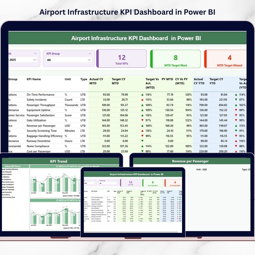
1️⃣ Summary Page (Main Dashboard)
The Summary Page provides a high-level overview of airport infrastructure KPIs.
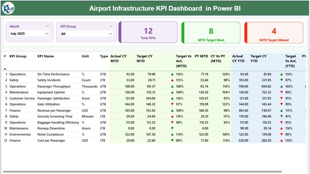
Key features include:
-
KPI performance cards showing total KPIs and performance status
-
Detailed KPI performance table with operational metrics
-
Month and KPI Group slicers for interactive filtering
The KPI table displays detailed information such as:
-
KPI Number
-
KPI Group
-
KPI Name
-
Unit of measurement
-
KPI Type (UTB or LTB)
The dashboard tracks both MTD and YTD performance metrics, including:
-
Current Year Actual values
-
Target values
-
Previous Year comparisons
-
Performance status indicators
This page helps managers instantly identify which KPIs are performing well and which require attention.
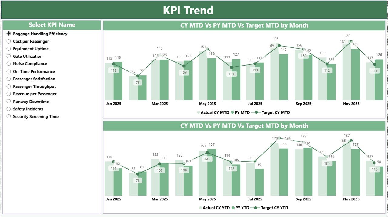
2️⃣ KPI Trend Page
The KPI Trend Page helps airport managers analyze performance trends over time.
Users can select a KPI from the KPI slicer, and the dashboard automatically displays trend analysis charts.
Two interactive combo charts visualize:
-
MTD performance trends
-
YTD performance trends
Each chart compares Current Year performance, Target values, and Previous Year performance, helping airport authorities identify improvements or performance declines.
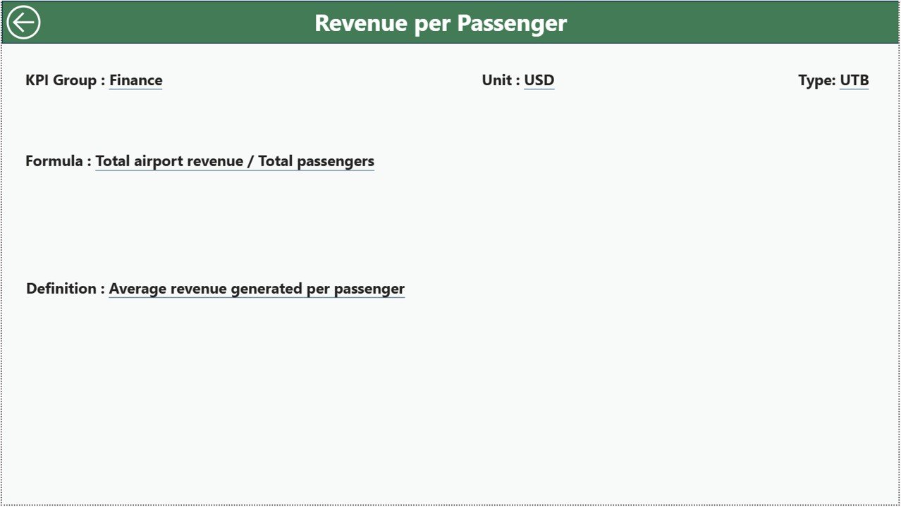
3️⃣ KPI Definition Page
The KPI Definition Page acts as a drill-through information page.
Users can view detailed KPI information such as:
-
KPI formula
-
KPI definition
-
KPI group
-
Unit of measurement
-
KPI type
Because the page is hidden by default, users access it through drill-through navigation from the Summary Page.
⚙️ How to Use the Airport Infrastructure KPI Dashboard in Power BI
Using this dashboard is simple and efficient.
Step 1 – Enter Data in Excel Source File
Fill the Excel data source file with KPI data including actual values, target values, and KPI definitions.
Step 2 – Refresh the Power BI Dashboard
Import the Excel data into Power BI and refresh the dashboard to update all visuals.
Step 3 – Use Interactive Slicers
Filter data using the Month slicer and KPI Group slicer to analyze specific metrics.
Step 4 – Monitor KPI Performance
Analyze MTD and YTD metrics, KPI status indicators, and trend charts.
Step 5 – Perform Drill-Through Analysis
Click on a KPI to access detailed definitions and formulas.
Within seconds, airport managers can analyze infrastructure utilization, operational efficiency, and KPI trends.
👨✈️ Who Can Benefit from This Airport Infrastructure KPI Dashboard in Power BI
This dashboard is designed for professionals responsible for airport infrastructure management and performance analysis.
✈️ Airport Operations Managers
📊 Aviation Data Analysts
🏗 Airport Infrastructure Management Teams
📉 Strategic Planning Departments
📑 Aviation Regulatory Authorities
📊 Airport Performance Monitoring Teams
💰 Airport Financial Analysts
🛫 Airport Authority Decision Makers
These professionals can use the dashboard to monitor operational performance, detect infrastructure bottlenecks, and support data-driven decision-making.
By using this dashboard regularly, airport authorities can improve operational transparency, increase efficiency, and enhance passenger service quality.
Click hare to read the Detailed blog post
Visit our YouTube channel to learn step-by-step video tutorials
https://Youtube.com/@PKAnExcelExpert